Reason 01
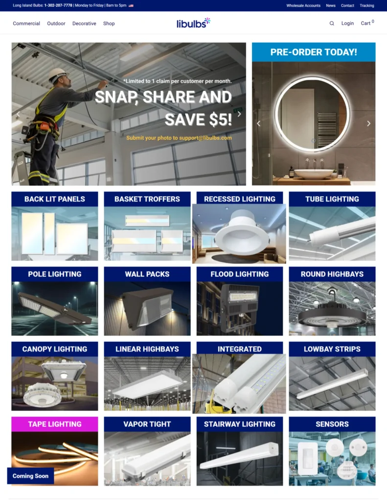
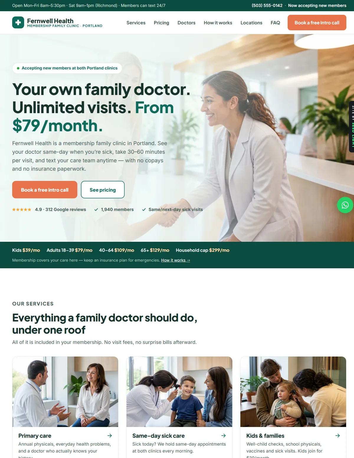
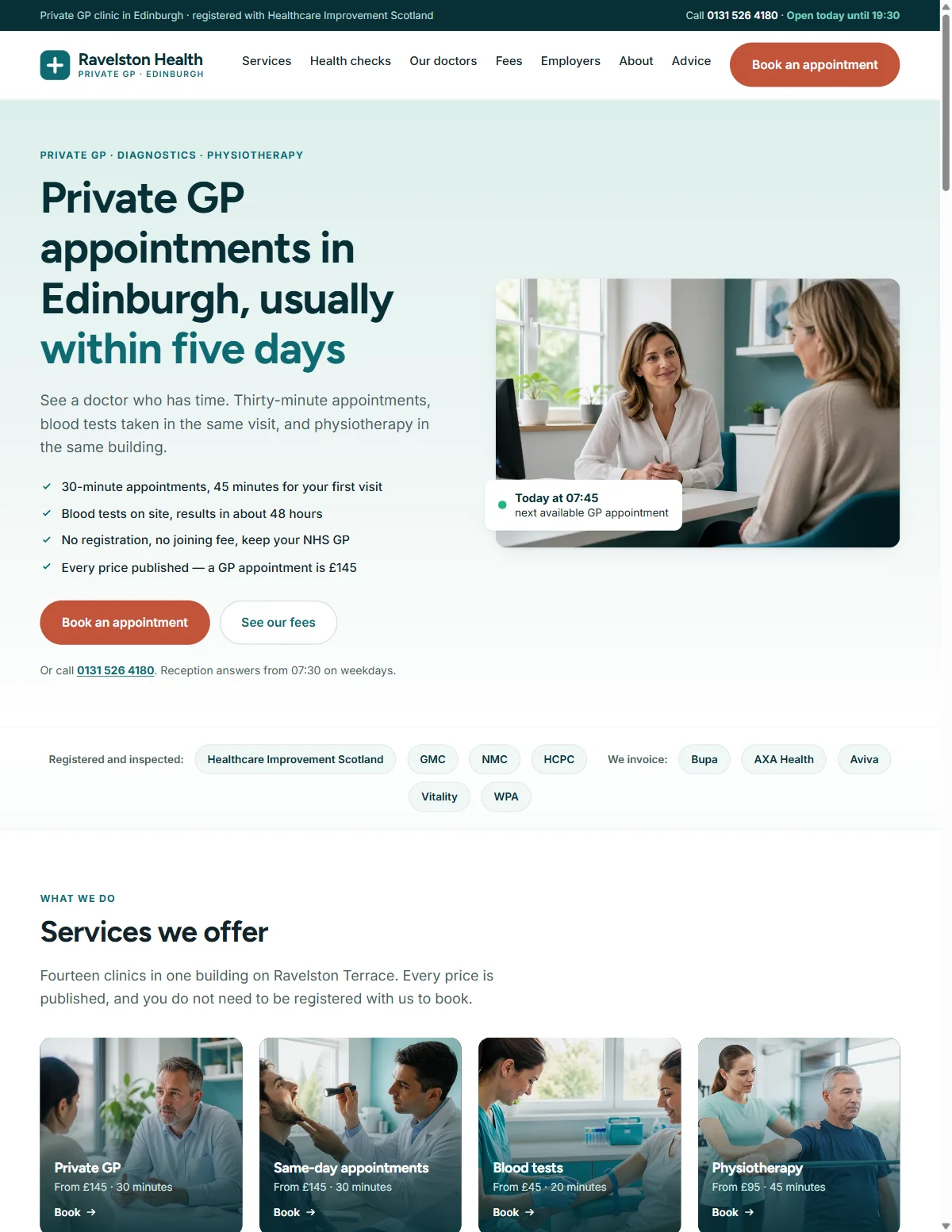
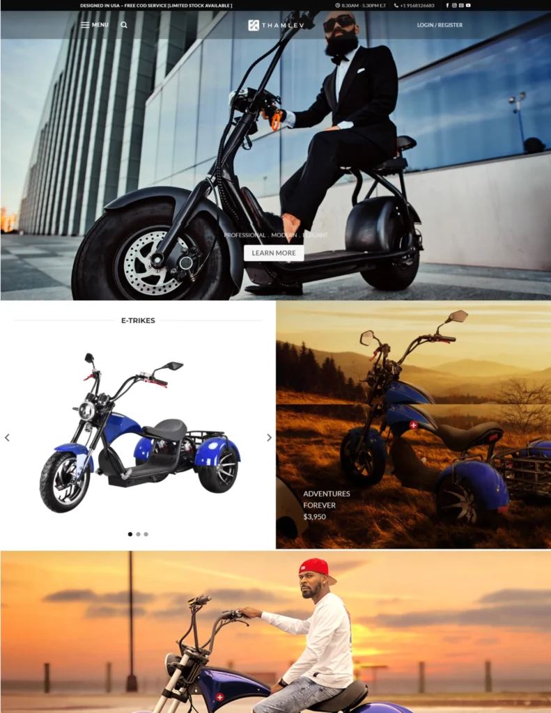
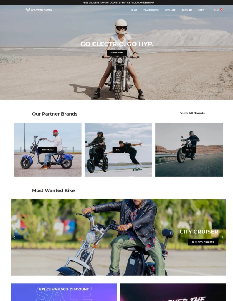
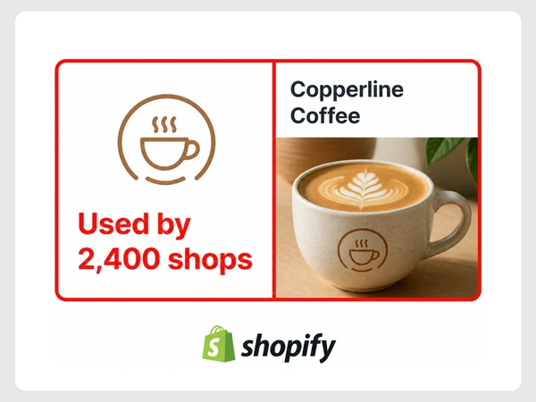
The logo looks like a ready-made template anyone could use.
branding ipoh
Seed Light is a branding agency for Ipoh businesses. We design your logo, colours, fonts and writing style as one clear identity that works in print and online.
The stack
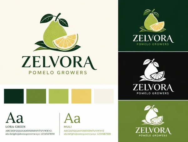
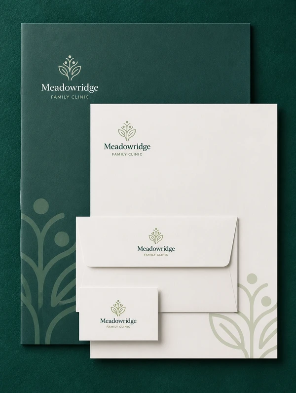
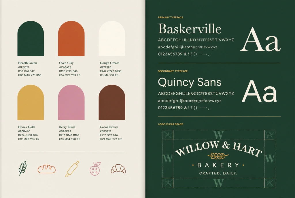
The design tools your brand is built in
Where we work
We plan branding to reflect customer expectations and the local market throughout Ipoh.
We also work with businesses in Menglembu, Simpang Pulai, Chemor, Batu Gajah, Gunung Rapat and Falim.
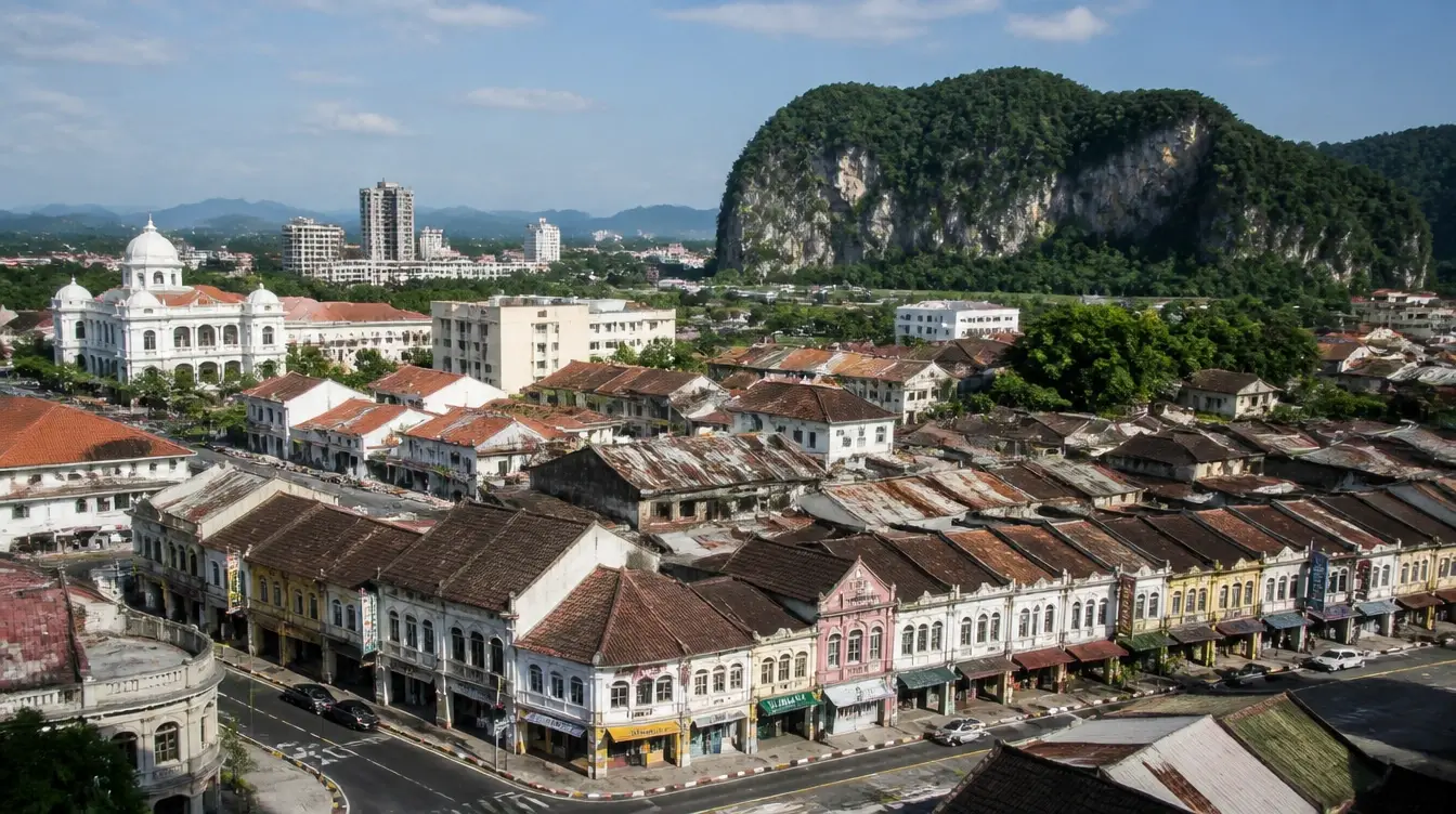
A business on an old street wants to look like it belongs there and still read on a phone. The logo is drawn to suit its surroundings and checked as a round profile picture at the same time.
Businesses based in this area
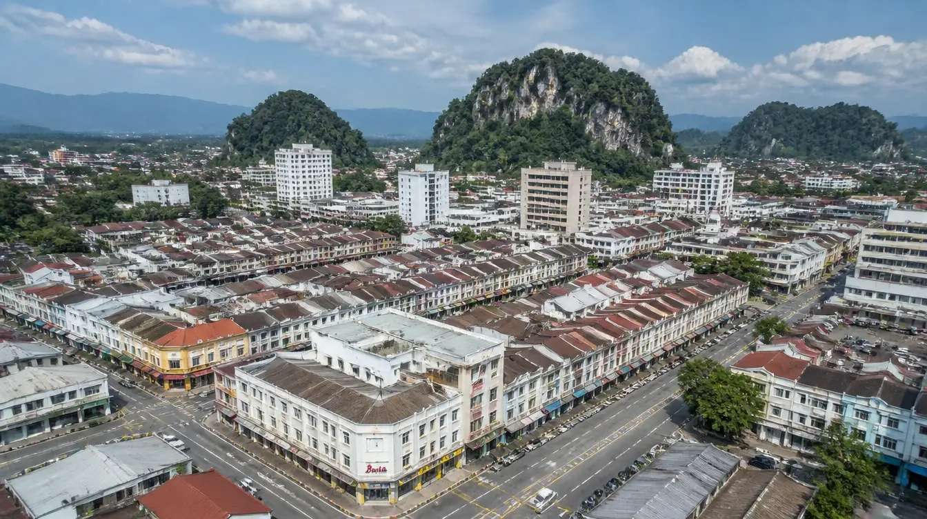
New Town businesses with an established name can refresh their look while keeping familiar recognition. Seed Light redraws the logo and rebuilds the files around it.
Businesses based in this area

Seed Light makes an Ipoh Garden business readable as its own from across the road. Its palette is tested at that distance against the surrounding row.
Businesses based in this area

A Tasek business gets its logo prepared for paint, print and stitching. The identity includes a one-colour version drawn to stay clear on rough materials and at smaller sizes.
Businesses based in this area
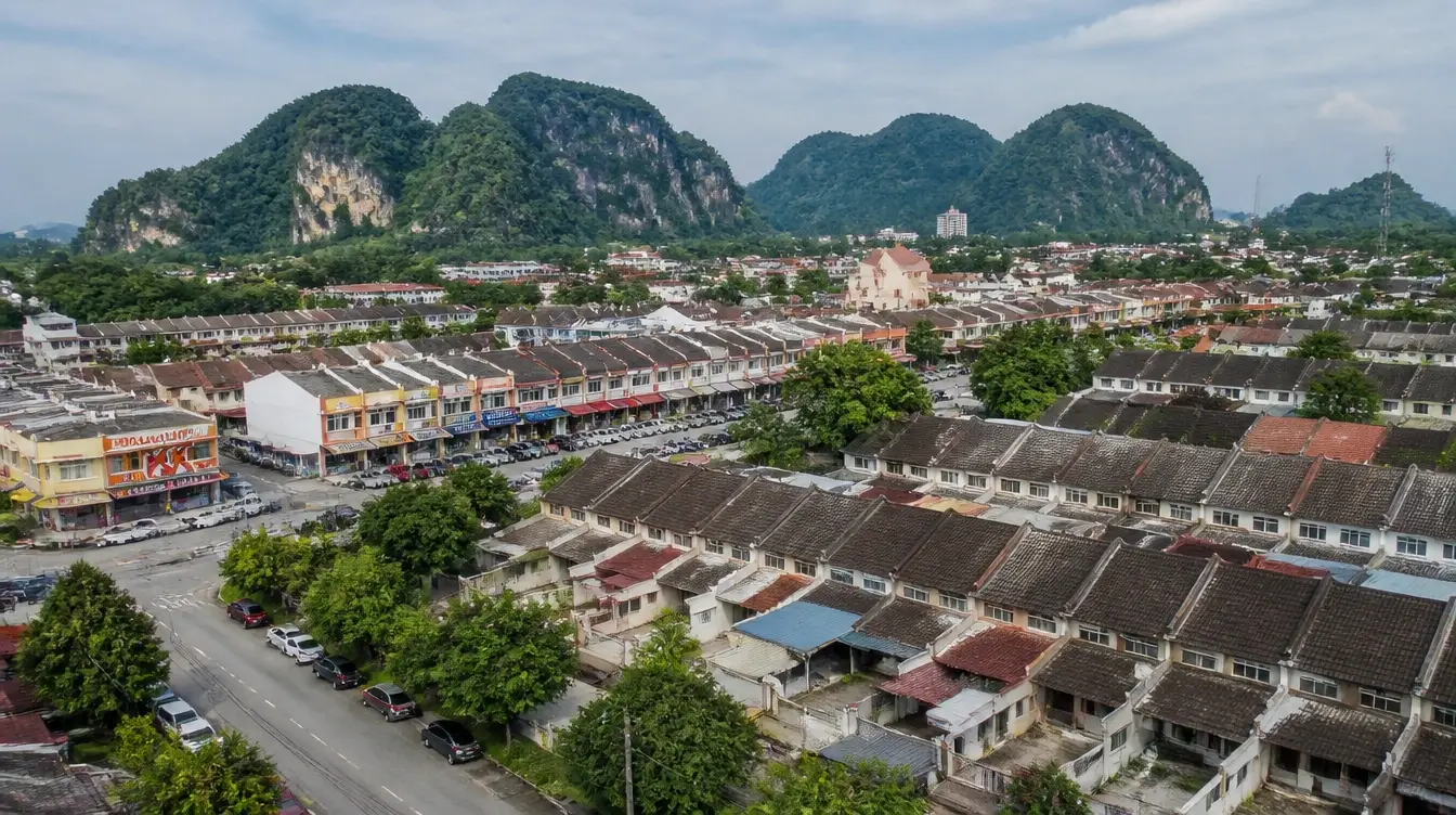
A Bercham business gets stationery templates and a one-colour logo alongside its main identity. The sign and invoice can then use prepared versions drawn from the same original logo files.
Businesses based in this area
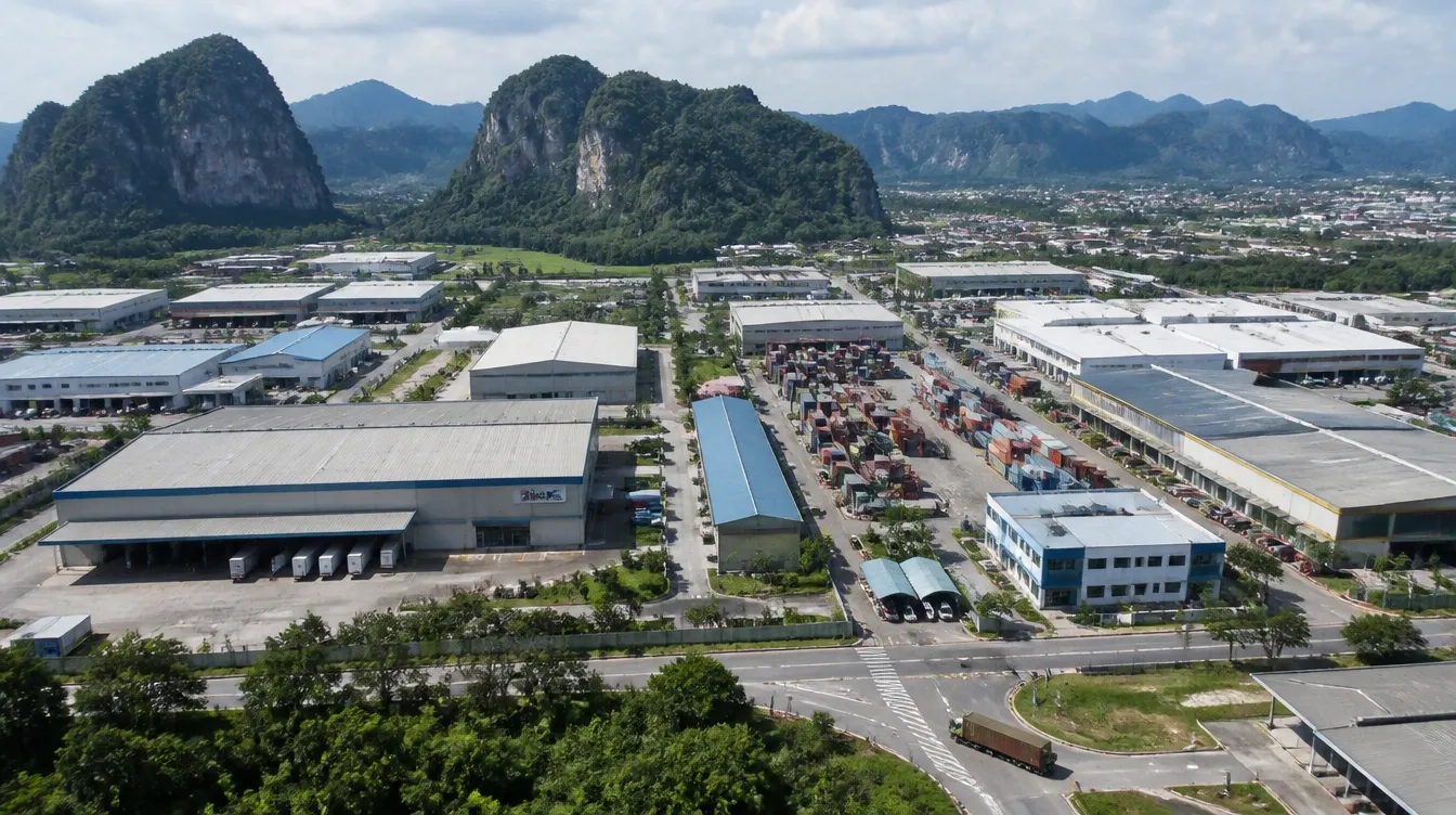
A product sold at retail is judged at arm's length, beside others already there. The logo is tested at that size against the competition before anything goes to print, so it reads at a glance.
Businesses based in this area
Common problems
These branding problems make it harder for people to recognise the business and trust what they see.
The logo looks like a ready-made template anyone could use.
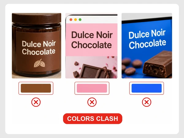
The label, website and banner each show different colours.
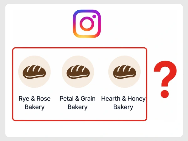
Customers cannot pick the business out from similar ones.
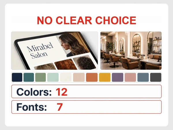
New colours and fonts keep being added without a clear choice.
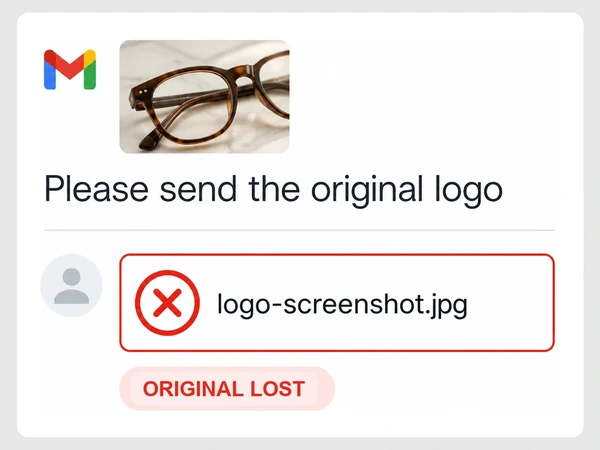
Each artwork job starts again because the original file is lost.
Where we start
Fix the biggest problem first
We prioritise the issues most likely to affect leads, sales or wasted time instead of trying to change everything at once.
What we design
Six branding services for one consistent identity.

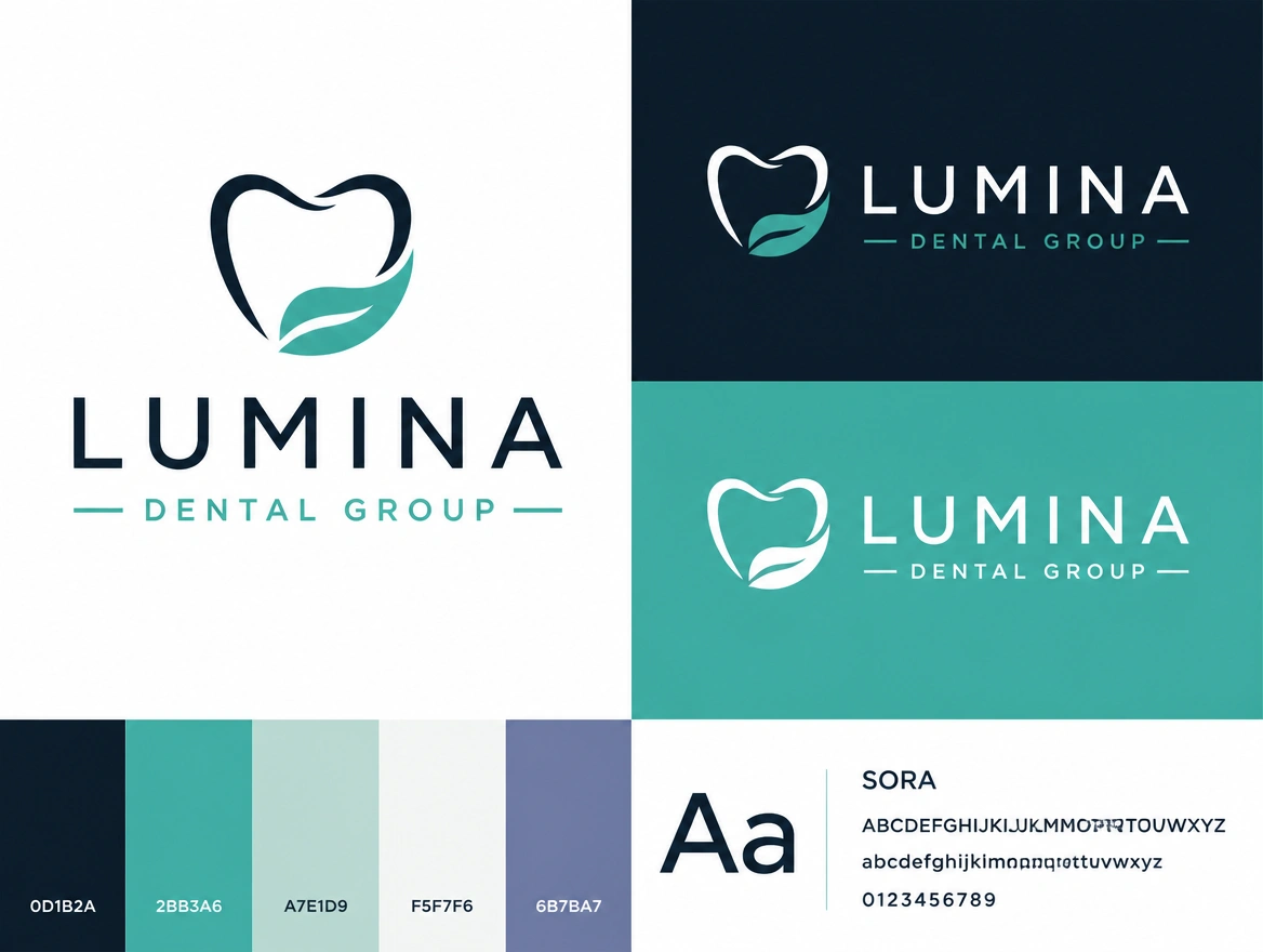
Design a logo for real business uses.
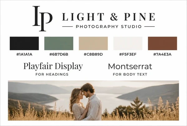
Create a visual system for brand materials.
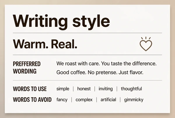
Define a clear voice for customer messages.
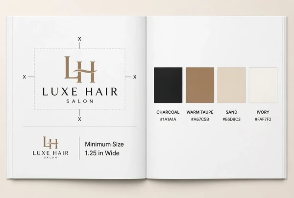
Document rules for applying your brand.
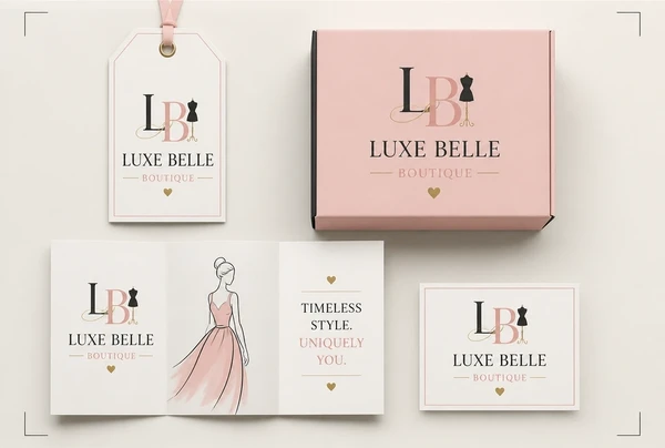
Design packaging, signs and printed pieces.
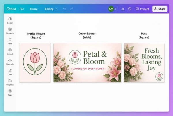
Build branded layouts for social content.
What matters
A professional identity helps the business communicate care and consistency before any sales conversation begins. We make the core visual elements work together across the places customers first encounter the brand.
Built around buyer needs
Create identity for the people you want.
Works across touchpoints
Design for print, screens and signage.
Visual standards defined
Keep colour and typography consistent.
Business documents aligned
Extend identity into customer paperwork.
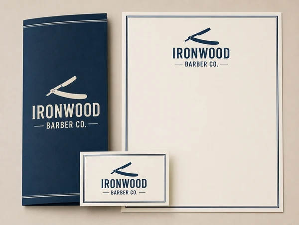
Customers are more likely to remember a business when its position is easy to understand. We sharpen the message and visual identity around the reasons the company is not interchangeable with competitors.
Review competitor sameness
See which visual conventions repeat.
Distinctive colour system
Choose colours that create separation.
Recognisable writing style
Use consistent phrasing across the brand.
Clear at a glance
Keep the identity easy to recognise.
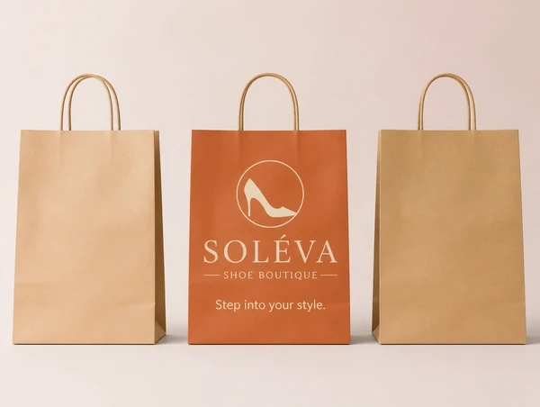
Trust is easier to build when every customer-facing element looks connected and intentional. We create a clear identity system that keeps the business consistent across channels.
Logo supporting credibility
Fit the business, audience and market.
Documents that look
Apply the brand to key paperwork.
Consistent photo style
Keep imagery connected across campaigns.
Aligned profile branding
Make every account reinforce identity.
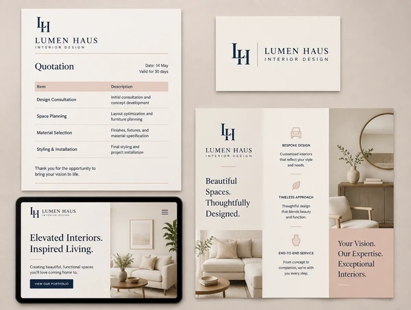
The goal is for customers to recognise the business without needing to relearn it on every channel. We use distinctive and consistent visual elements to support stronger recall.
Strong main logo
Use a clear visual anchor everywhere.
The same colour every time
Repetition is what builds recognition.
Clarity across sizes
Make the identity work small and large.
Usable brand rules
Provide simple everyday guidance.
Case studies
Real client projects, each with its own case study page, shown beside demo concepts built to show our approach across different industries.
100+
Brands worked with
28,441+
Leads generated
$4.1M+
Sales generated for clients
Up to13x
Return on Meta ad spend
Tallied from client ad accounts and store reports. See the numbers on our results page.
How it works
We learn about your business and current brand.
We agree what the new identity needs to achieve.
We create logo ideas and show them in use.
We build the logo, colours, fonts and materials.
We prepare final files, guidelines and templates.
How we compare
| What you get | Seed Light | Other competitors |
|---|---|---|
| Identity direction agreed before design | Buyers and rivals studied first | Design often starts from a mood board |
| Concepts shown on real applications | Every logo shown on a sign and a card | Concepts are commonly shown on white |
| Logo files in every format | Vector, PNG, SVG, dark and light | A single PNG export is common |
| Written brand guidelines | Included with every identity | Guidelines are often a paid extra |
| Templates your team can use | Social brand kit and stationery templates | Templates vary by studio |
| Print files set up for the printer | Bleed, dielines and spot colours set | Print setup is commonly left to you |
| Rebrand rollout planned | Every touchpoint listed and dated | Rollout planning often sits outside scope |
| Ownership of the finished work | Working files handed over, yours | Working files are often kept back |
Packages
Quoted after a call, on how much of the identity you need built.
New businesses needing a first brand system.
What's included
Businesses unifying an existing brand.
What's included
Established brands planning a full identity.
What's included
Every package ends with the working files in your own drive. The brand is yours to keep and take anywhere.
Swipe the table to compare all three.
| Detail | Identity starterNew businesses | IdentityBusinesses needing a full identity | Complete identityEstablished businesses |
|---|---|---|---|
| What you get | |||
| Design options before you pick one | 2 | 3 | 4 |
| Letterhead, business card, invoice and similar | 2 | 4 | 6 |
| A new logo, designed for you | Included | Included | Included |
| Included | Included | Included | |
| Your colours and fonts | Included | Included | Included |
| A guide to the photos you use | Included | Included | Included |
| Files ready for your website | Included | Included | Included |
| Visual rules and writing style | Included | Included | Included |
| Print-ready artwork | Add-on | Add-on | Add-on |
| Files you get | |||
| Master files for designers and printers | Included | Included | Included |
| For your website | Included | Included | Included |
| For social posts and documents | Included | Included | Included |
| For print | Included | Included | Included |
| How the project runs | |||
| Brief to final files | 1 to 2 weeks | 1 to 2 weeks | 2 to 4 weeks |
| Rounds of changes | 2 rounds | 2 rounds | 3 rounds |
| Every working file, yours to keep | Included | Included | Included |
IncludedAdd-onAvailable at extra cost
Straight answers
What owners ask before building a full identity for their business.
 Brand
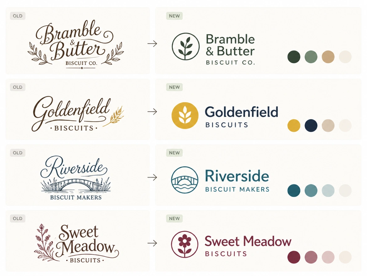
BrandA new identity for a business that outgrew its old one.
 Brand
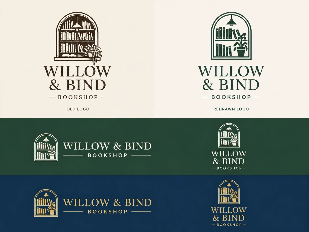
BrandOne logo, its versions and the files to use it anywhere.
 Websites
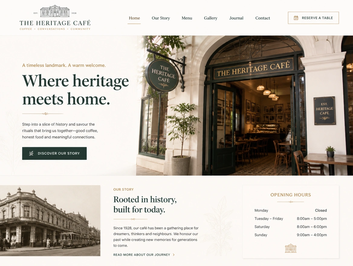
Websites built around enquiries, sales and customer journeys.
 Social
Social content planned and posted around the buyers you want.
 Selling online
An online store built around a checkout that shoppers finish.
 Nationwide
The same service for businesses in more than one state.
See every service and location we currently cover.
Who this is for
Anywhere a customer researches before they buy.
Websites with enquiry forms and booking built in for coaches.
Business, life & fitness coaches
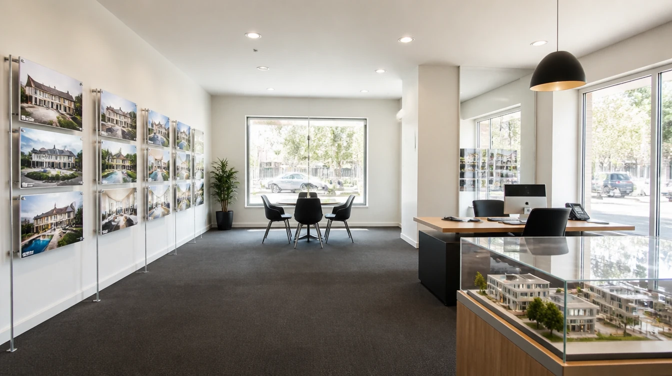
Listing pages that turn lookers into booked viewings and buyers.
Agencies & negotiators
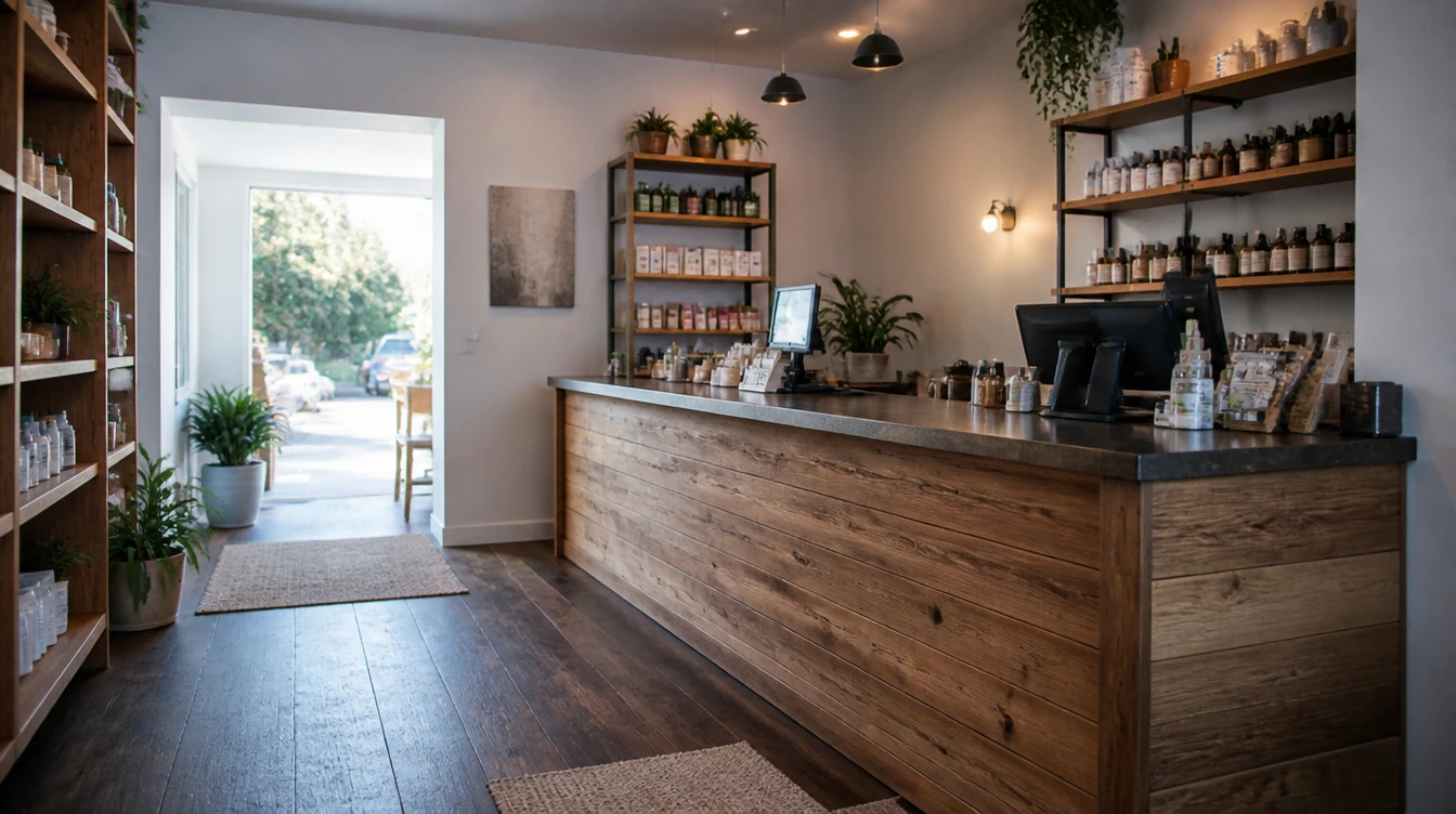
Get found on Google Maps and search, and win more local customers.
Salons, services & shops
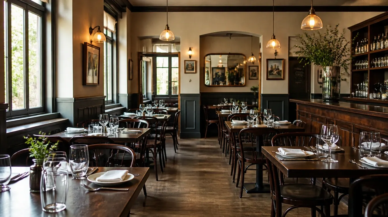
Websites with menus, table booking and online ordering built in.
Restaurants, cafes & bars

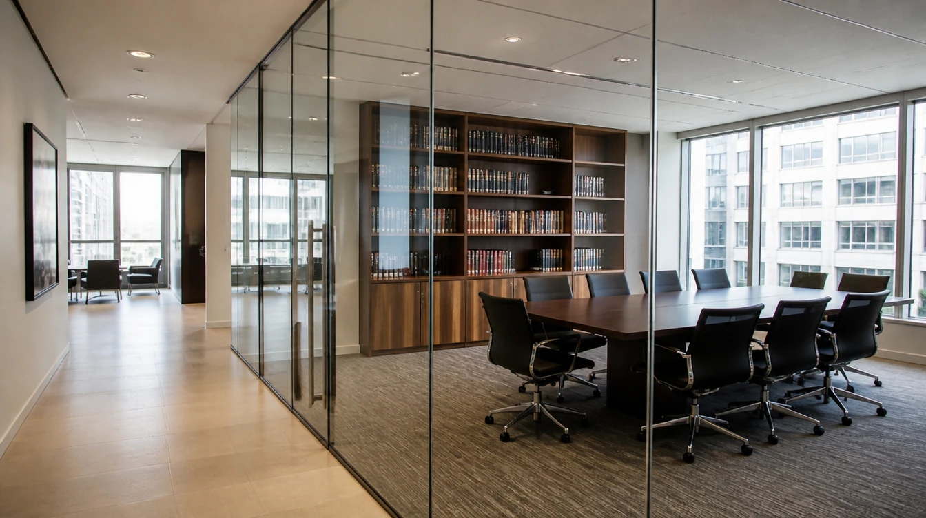
Websites that build trust, explain your services and bring in enquiries.
Law, accounting & consulting
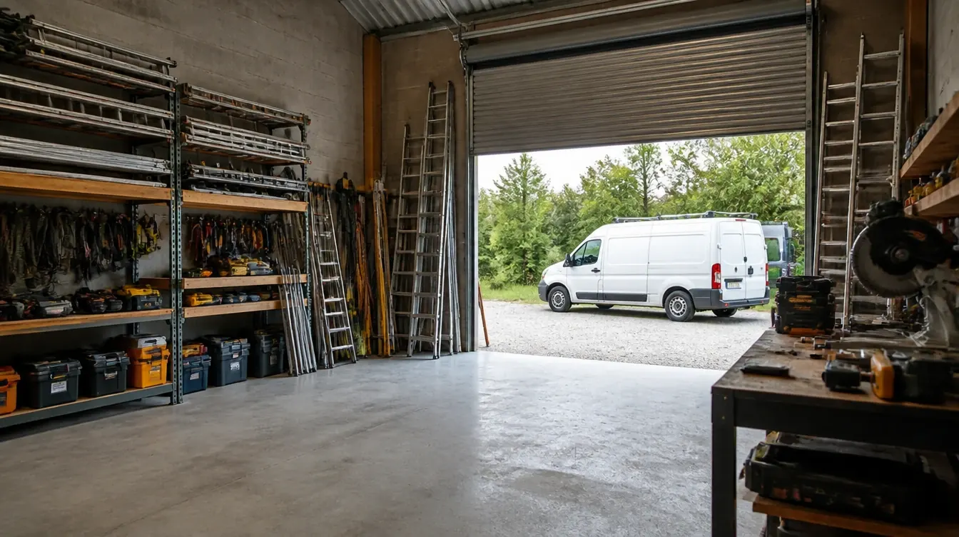
Websites that show your past jobs and bring in more quote enquiries.
Renovation, electrical & aircon
Let’s talk
Tell us what you want to grow or improve. We’ll reply within one working day with honest advice, even if we do not work together.
Prefer email or a call? hello@seed-light.com · +60 16-411 9138
Results so far
Results from real clients100+
Brands worked with
28,441+
Leads generated
$4.1M+
Sales generated for clients
Up to 13x
Return on Meta ad spend
Tallied from client ad accounts and store reports.
Monthly leads