Font Pairing for Websites: 7 Combos That Work
Font pairing made simple: the one rule, how many fonts to use, and 7 free Google Font combinations that just work, with a quick guide on where to use each.
Key takeaways
- The whole rule fits in one line: pick two fonts that contrast but do not conflict, one with personality for headings, one plain and readable for body.
- Two fonts is plenty. Three at most. Fewer fonts means a cleaner look and a faster page.
- Readability is the point. A font better suited to the reader raised reading speed by 35% in a 2022 study from UCF and the Readability Consortium, with comprehension kept.
- Type choice shapes trust. The right typeface lifted positive response by up to 13% in a Monotype study.
- Steal one of our 7 free Google Font combos below. Each one tells you the vibe and where to use it.
What is font pairing?
Font pairing is choosing two fonts that look good together: one for your headings, one for your body text. The rule is simple. Pick two fonts that contrast but do not conflict. One should have personality, the other should be plain and easy to read. They work as a team, not as rivals.
Why bother? Because type does real work. A font that suits the reader raised reading speed by 35% in a 2022 study by the University of Central Florida and the Readability Consortium, and people still understood what they read. Good pairing is not decoration. It helps people read, scan, and stay.
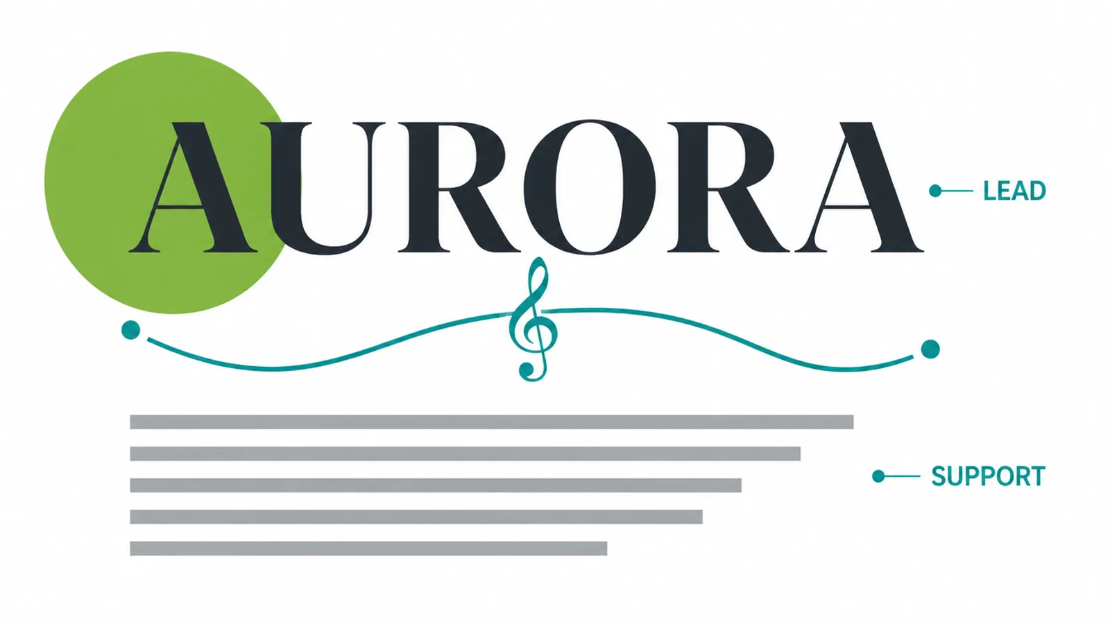
Think of it like a duet. One voice leads (the heading). One voice supports (the body). When both try to lead, it turns into noise.
How many fonts should you use?
Two. Maybe three if the third is just a small accent, like a number or a quote. For most small business sites, two is the right answer: a heading font and a body font.
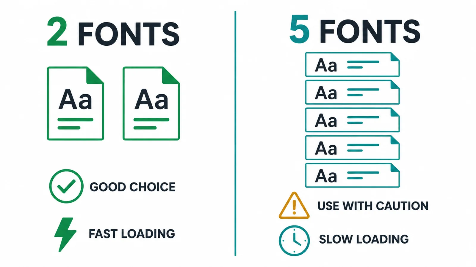
Fewer fonts gives you two wins. First, a more consistent, calmer look, because everything lines up. Second, a faster page, because every font is a file the browser has to fetch. Loading five fonts is a quiet way to slow your site down and hurt your Core Web Vitals scores.
So the math is easy. Start with two. Only add a third if you have a clear reason and you are sure it earns its keep.
How to pair fonts (4 quick checks)
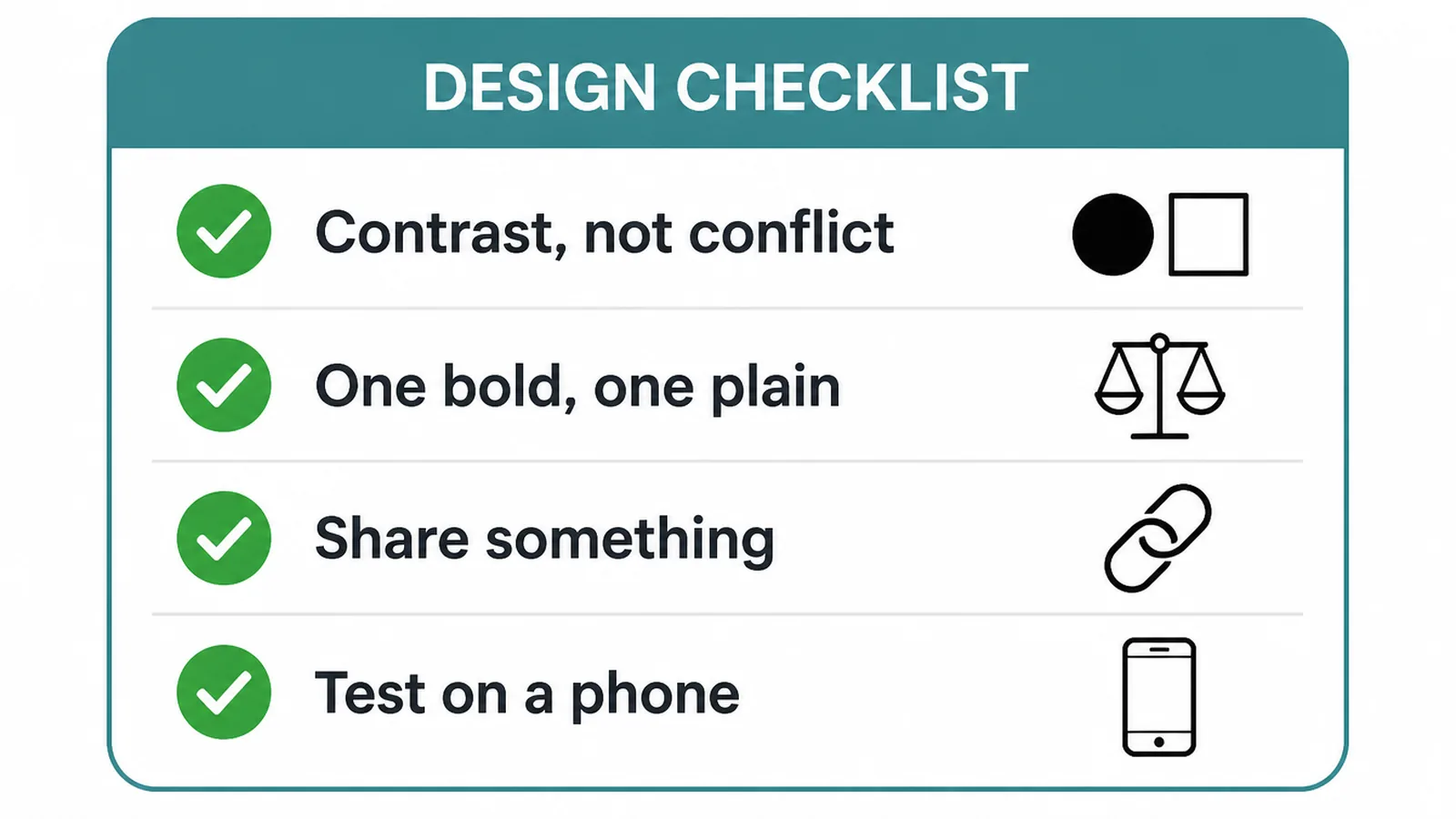
You do not need a design degree. Run any pair through these four checks.
- Contrast, not conflict. The two fonts should look clearly different. A bold display heading over a calm sans body reads as one team. Two fonts that are almost the same look like a glitch.
- One has personality, one is plain. Let the heading carry the mood. Keep the body font simple so paragraphs stay easy to read. The right typeface even nudges how people feel: it lifted positive response by up to 13% in a Monotype study, with memorability and trust up too.
- They should share something. A common thread keeps a pair from feeling random. Maybe both have a modern feel, or similar letter proportions, or a matching weight range. Shared mood, different jobs.
- Test small and on a phone. A heading looks great big. The real test is your body font at a small size on a phone. Keep each line to roughly 50 to 75 characters for comfortable reading. The accessibility guideline WCAG 1.4.8 caps lines at 80 characters and asks for line spacing of at least 1.5.
That last point matters more than the font name. If text is cramped or lines run too wide, even a perfect pair feels hard to read. (More on this in our guides to website accessibility and making a website mobile friendly.)
7 free font pairings that just work
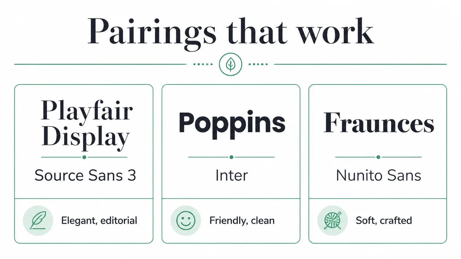
Every pair below is free on Google Fonts and battle-tested on real websites. Each combo is a display or character font for headings and a clean workhorse for body. Pick the row that matches your vibe.
| Heading font | Body font | Vibe | Best for |
|---|---|---|---|
| Playfair Display | Source Sans 3 | Elegant, editorial | Boutiques, weddings, premium services |
| Montserrat | Lora | Modern with a warm read | Agencies, blogs, personal brands |
| Poppins | Inter | Friendly, clean, techy | Startups, apps, SaaS landing pages |
| DM Serif Display | DM Sans | Confident, balanced | Consultancies, finance, professional services |
| Bricolage Grotesque | Inter | Bold, current, characterful | Creative studios, portfolios, new brands |
| Lora | Open Sans | Trustworthy, readable | Law, medical, content-heavy sites |
| Fraunces | Nunito Sans | Soft, crafted, approachable | Food, wellness, lifestyle brands |
Notice the pattern. Six of the seven pair across categories, a serif with a sans or the other way round, because crossing categories is the easiest way to get clean contrast. The one same-category pair (Poppins with Inter) leans on a difference in shape and weight instead. Any of these will look sharp on a small business site without a single tweak.
Serif or sans for body text?
Either works on screen, as long as the text is set at a comfortable size (around 16px or larger) with line spacing of at least 1.5. The old idea that serifs are only for print no longer holds on modern, high-resolution screens.
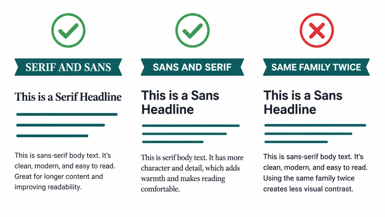
Here is the shortcut. Pair across categories and you get contrast for free. A serif heading with a sans body reads clearly. A sans heading with a serif body reads warmly. Both are good. What you want to avoid is two fonts from the same family fighting for the same job.
If you want maximum safety, use a sans-serif for body text. It is the default for a reason: it stays crisp at small sizes and on every device.
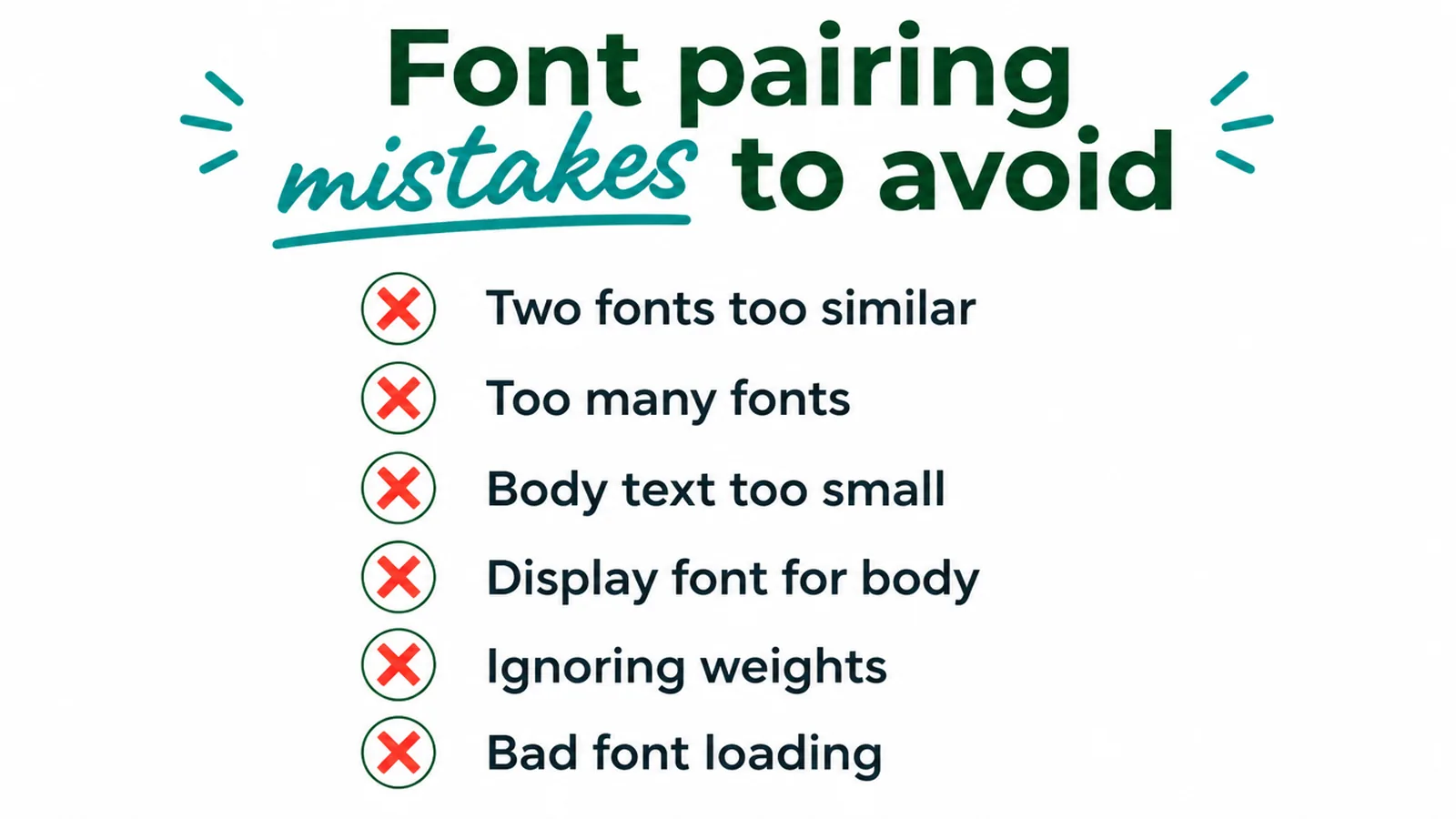
Font pairing mistakes to avoid
Most bad type comes from a handful of repeat offenders. Skip these and you are most of the way there.
- Two fonts that are too similar. If they look almost alike, drop one. You get the cost of two fonts with none of the contrast.
- Too many fonts. Three is the ceiling. Four or more turns a page into a ransom note.
- Body text that is too small. Tiny text loses readers fast. Set body around 16px and up.
- Using a display font for body. Fancy heading fonts are exhausting in paragraphs. Save them for headings only.
- Ignoring weights. A heading and body of the same weight look flat. Lean on a bold heading and a regular body for instant hierarchy.
- Bad loading. If text vanishes while a font loads (a flash of invisible text), people stare at a blank page. We cover the fix below.
These small slips add up. We list more of them, and how to dodge them, in our roundup of common small business website mistakes.
Do custom fonts slow down a website?
They can, but only if you let them. Each font file is a download, and each extra weight (light, regular, bold, italic) is another download on top. Load a font in five weights and you have quietly added real load time.
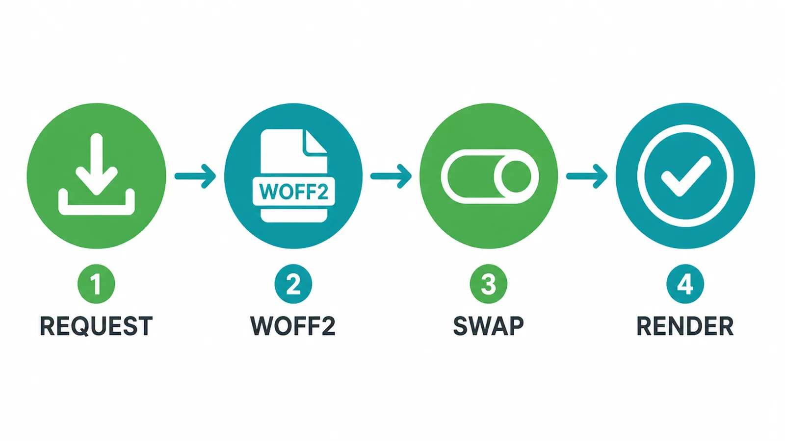
Keep it lean with three habits:
- Serve WOFF2. It is the smallest, fastest web font format and works in every modern browser.
- Use
font-display: swap. Text shows in a fallback font right away, then swaps to your real font when it arrives. No blank page. - Limit your weights. Pick only the weights you actually use, often just regular and bold per font.
Do that and your fonts cost you almost nothing in speed. If speed is on your mind, our guide to Core Web Vitals shows how type fits into the bigger picture.
Want help getting it right?
Type is one of the cheapest ways to make a small site feel pro. Pick one pairing from the table, set your body text big and roomy, and you are ahead of most of the web. If you would rather hand it off, our branding and web design teams build the whole system for you, from font choice to spacing to load speed. For a deeper look at the foundations, start with our pillar guide to small business websites, or just send us a message and we will point you in the right direction.
Frequently asked questions
How many fonts should a website use?
Two is the sweet spot for most websites: one for headings and one for body text. You can stretch to three if one is just a small accent. Fewer fonts means a cleaner look, a more consistent feel, and a faster page. Every extra font is another file the browser has to download.
Can I use two fonts on one website?
Yes, and you usually should. Two fonts give you contrast: a distinctive display font for headings and a plain, readable workhorse for body text. That split makes your pages easy to scan and gives them a bit of personality without looking messy.
What is the rule for pairing fonts?
Pick two fonts that contrast but do not conflict. Pair a font with personality (your heading) against a plain, simple one (your body). They should differ enough to feel like a clear team, yet still share a mood so they belong together. When two fonts are almost the same but not quite, it looks like a mistake.
Should body text be serif or sans-serif?
Either works on screen as long as the text is set at a comfortable size, around 16px or larger, with generous line spacing. Sans-serif is the most common choice for body text on the web. The simplest way to get easy contrast is to pair across categories: a serif heading with a sans body, or the other way around.
What size should body text be on a website?
Aim for at least 16px for body text, larger on big screens. Keep each line of text to roughly 50 to 75 characters and set line spacing to at least 1.5. Comfortable size and spacing matter more for reading than the font name itself.
Do custom fonts slow down a website?
They can, if you load too many fonts or too many weights. Each font file adds download time. Keep it to two fonts and only the weights you use, serve them in the WOFF2 format, and add font-display: swap so text shows in a fallback font while the real one loads.
Can I use the same font for headings and body?
Yes. A single font family with a few weights can look clean and confident, especially a versatile sans-serif. Use a bold, large weight for headings and a regular weight for body. You lose a little personality but gain simplicity and speed.
How do I know if two fonts clash?
Set a real heading above a real paragraph and look at them together. If the two fonts feel almost identical, they clash by being too similar. If they feel like they belong to two different brands, they clash by being too different. The right pair looks like an obvious team at a glance.
About the author
This guide is from the Seed Light team. We are a web design and digital marketing agency that has built and shipped small business websites since 2017. Type, layout, and speed are part of every project we touch, so the advice here is what we actually use when we set a brand on the web.
Put it into practice
Need help putting this to work?
We design, build and market websites that turn attention into revenue. Tell us what you are working on and we will point you the right way.
Keep reading