How to Make a Website Mobile-Friendly: Practical Fixes

Make a website mobile-friendly with a responsive layout, text readable without zooming, tap targets big enough for a thumb, images sized for a phone, and a fast load. Google indexes the mobile version of your site. Seed Light builds and tests every site at phone width first.
Key takeaways
Short on time? Here is how to make a website mobile-friendly in five lines before we break each step down.
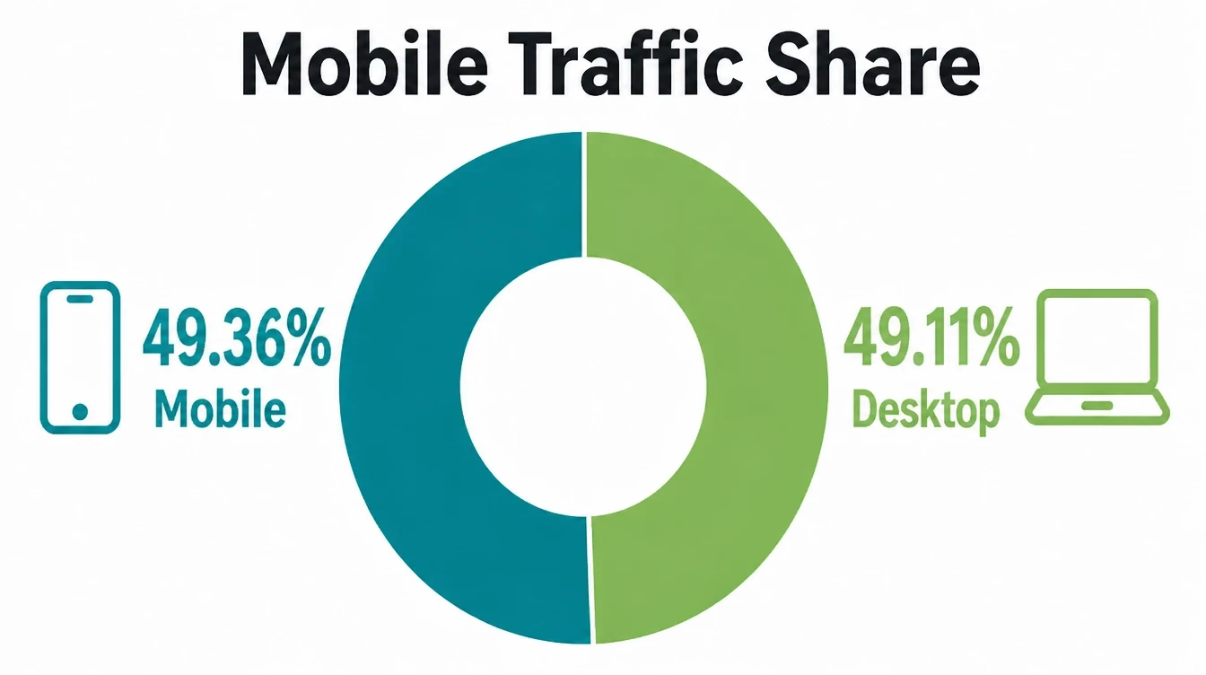
- Phones are the main screen now. Mobile is 49.36% of web traffic worldwide, and Google ranks the mobile version of your site (StatCounter, August 2026).
- Use responsive design. Google recommends building one site that reshapes itself to fit any screen (Google Search Central).
- Make taps easy. Buttons and links should be about 48px with about 8px of spacing (web.dev).
- Speed is part of it. 53% of mobile visitors leave a page that takes longer than 3 seconds to load (Marketing Dive, Google).
- Test on a real phone. Open your site on a device, then run Lighthouse. Google retired its standalone Mobile-Friendly Test.
1. Why mobile-friendly matters now
If you want to know how to make a website mobile-friendly, start with why it matters. About half of worldwide web traffic is mobile.
Mobile now makes up 49.36% of web traffic worldwide, just ahead of desktop on 49.11% (StatCounter, August 2026). That makes the phone version as important as the desktop one.
There is a second reason, and it is about getting found. Google uses the mobile version of a site's content for indexing and ranking (Google Search Central). As a result, if your mobile site is thin, slow, or hard to use, that is what Google judges, even when your desktop site looks great.
It also drives action. 60% of mobile users have contacted a business directly from search results, and 76% of people who search "near me" visit a business within a day (Backlinko).
Therefore a clunky mobile site costs you real calls and visits, on top of looking dated. If you are starting from scratch, our guide to a small business website covers the basics first.
2. Use responsive design
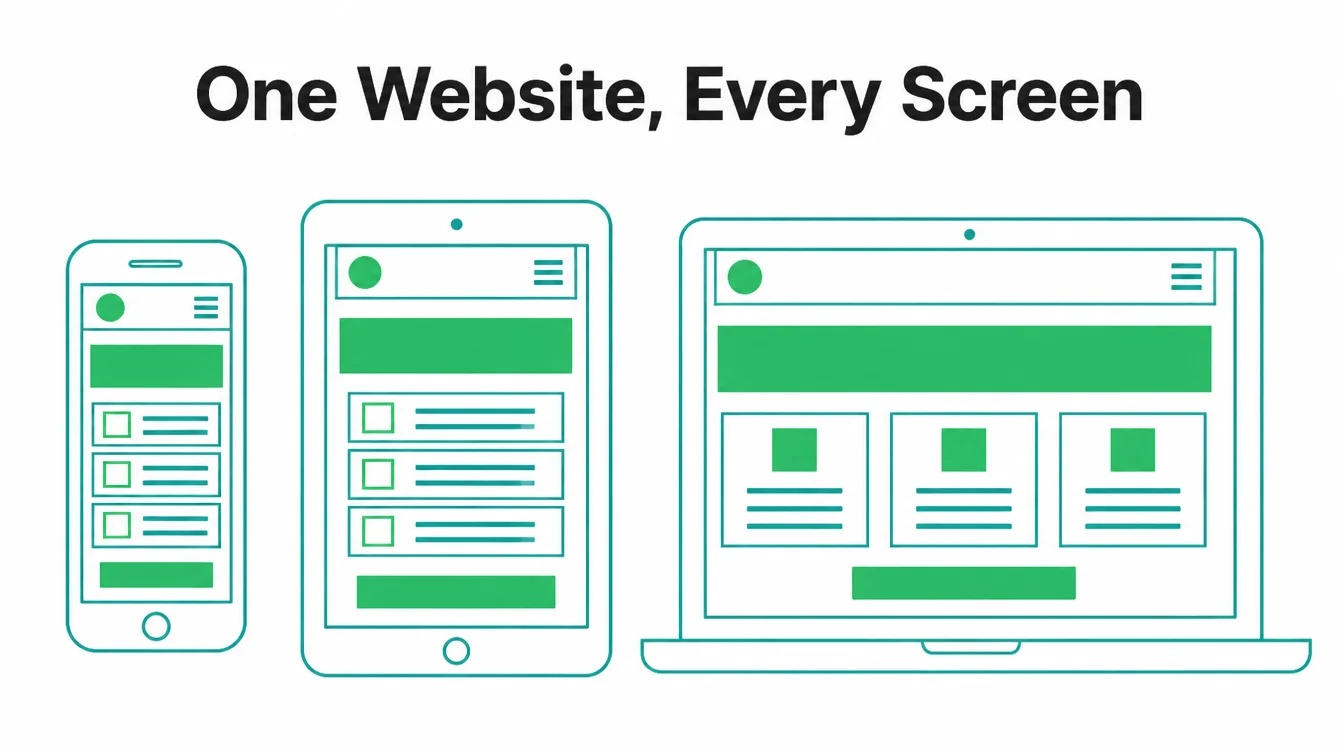
Responsive design is the foundation. It means one website that reshapes itself to fit any screen, from a small phone to a wide desktop.
The same content stacks into one column on a phone and spreads into several on a laptop. Google recommends responsive web design because there is one site and one address to manage (Google Search Central).
By contrast, the old way was a separate "m-dot" mobile site sitting at its own address. That meant two sites to update and two chances to get out of sync. Furthermore, a responsive build is simpler for search engines to crawl.
If your current site only looks right on a laptop, it is probably not responsive, and that is the first thing to fix. See how we handle this in web design.
3. Make your text readable without zooming
Open your site on a phone. If you have to pinch and zoom to read a sentence, your text is too small.
A mobile-friendly site uses body text big enough to read at arm's length, with comfortable spacing between lines. Specifically, aim for body text around 16px or larger and avoid thin grey type on a pale background.
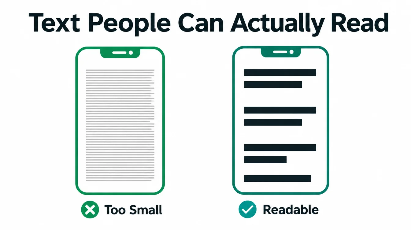
Line length matters too. On a phone, long lines of text feel like work. Keep paragraphs short, break up big blocks, and let the content breathe. However, do not shrink everything to fit more on screen.
Cramming more in just makes people zoom, and zooming is the exact thing a mobile-friendly site removes. Many of these problems show up in our list of common small business website mistakes.
4. Make buttons and links easy to tap
Fingers are not mouse pointers. On a phone, every button, link, and form field needs room to be tapped cleanly.
Tap targets should be about 48px, roughly the size of a finger pad, with about 8px of space between them (web.dev). When taps are smaller or crammed together, people hit the wrong thing and give up.
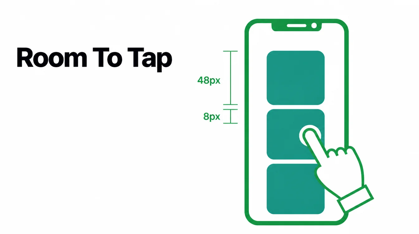
Think about the thumb zone as well. Most people hold a phone in one hand and tap with one thumb, so the buttons that matter most, like "Call" or "Get directions," should sit where the thumb naturally lands.
In addition, give links enough padding that they feel like buttons. This is one of the cheapest wins on the whole list.
5. Make it fast on a phone
Speed is part of being mobile-friendly, not a separate job. People on phones are often on weaker connections and have less patience.
Research found that 53% of mobile visitors leave a page that takes longer than three seconds to load (Marketing Dive, Google). In particular, that means half your visitors can vanish before your page even appears.
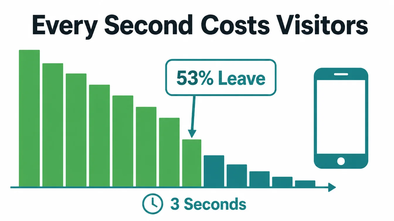
The good news is that even small gains pay off. One study showed a tenth of a second speed improvement lifted retail conversions by 8.4% and travel conversions by 10.1% (web.dev). Meanwhile the usual culprits are simple to name: huge images, too many fonts, and heavy scripts.
Compress your images, cut what you do not need, and the page gets lighter. A website redesign is often the moment to fix speed properly. For a number to work from, our free website speed checker tests the mobile version and names the biggest fixes.
6. Remove sideways scroll and pop-ups that trap people
Two things quietly ruin a mobile experience. The first is horizontal scroll. If the page is wider than the screen and people have to swipe sideways to see it all, something is broken, usually a fixed-width image or table that does not shrink. A mobile-friendly site fits the screen with no sideways drag.
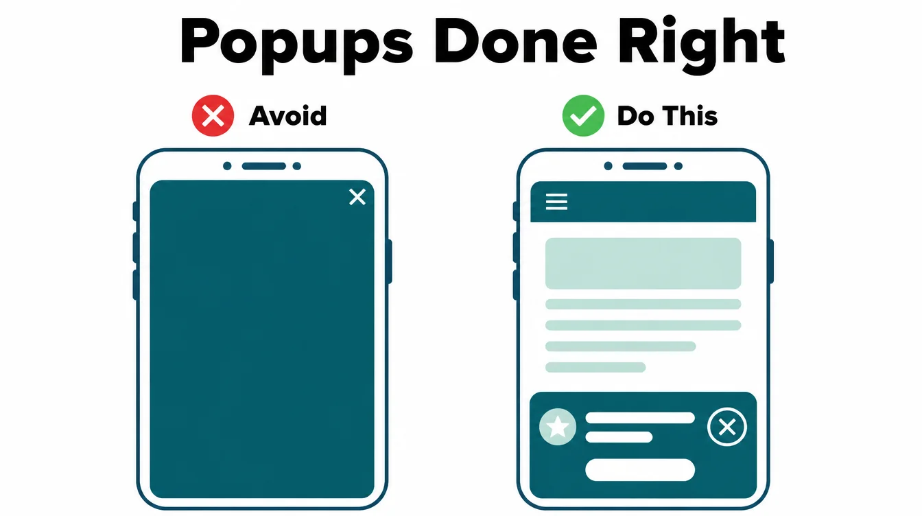
The second is the pop-up that traps people. A full-screen offer with a tiny, hard-to-tap close button is a trap, and on a phone it covers everything. As a result, frustrated visitors leave instead of hunting for the X.
If you must use a pop-up, make it small, easy to close, and never the first thing a new visitor sees. Below is a quick way to check the main items at a glance.
| Mobile check | What good looks like | Quick fix |
|---|---|---|
| Text size | Readable without zooming | Set body text to about 16px or larger |
| Tap targets | Easy to tap with a thumb | Make buttons about 48px with about 8px spacing |
| Speed | Loads in under three seconds | Compress images and remove heavy scripts |
| Horizontal scroll | Page fits the screen | Make images and tables flexible width |
| Pop-ups | Small and easy to close | Delay them and add a big close button |
| Menu | Simple and one-handed | Use a tidy menu icon with clear links |
7. Make the menu simple on a small screen
A desktop menu with ten items across the top does not fit a phone. On mobile, the answer is usually a tidy menu icon that opens a clean list of links.
Keep that list short and put the things people want most near the top, like your services, your hours, and a way to contact you.
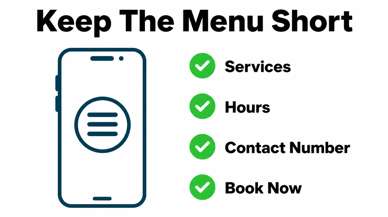
Do not bury your phone number or your booking link three taps deep. A clear "Call" or "Contact" option that is always within reach turns a casual visitor into a lead.
Furthermore, a simple menu helps people who are in a hurry, and on a phone almost everyone is in a hurry. This thinking carries over to local SEO for small businesses, where fast contact wins.
8. How to test your site on mobile
You do not need fancy tools to start. The best test is to pick up your own phone and try to do what a customer would do. Find your hours. Tap to call. Fill in your form. If any step feels awkward, that is a problem worth fixing.
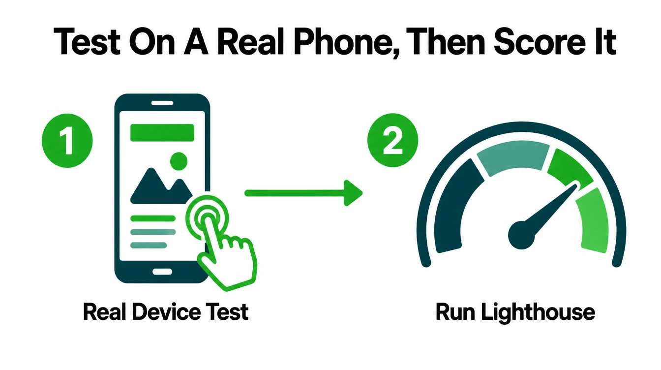
After the real-device check, run a free tool for a score. Lighthouse, built into the Chrome browser, gives you a performance and usability report and points at the slowest parts of your page.
However, do not go looking for Google's old standalone Mobile-Friendly Test, because Google retired it. A real device plus Lighthouse is the simplest, most honest combination now.
One last note. Fixing a site that was never built for phones can be slower than starting fresh. If your site is old and none of these changes are possible, a rebuild is often the faster route.
Browse more practical guides on the Seed Light blog, or tell us about your site and we will tell you straight which path is cheaper.
Frequently asked questions
1. What does mobile-friendly mean?
Mobile-friendly means your website is easy to read and use on a phone without zooming, squinting, or scrolling sideways. The text is big enough, the buttons are easy to tap, the page loads fast, and nothing traps the visitor. About half of worldwide web traffic is mobile, so the phone version needs equal care.
2. How do I make my existing website mobile-friendly?
Start with responsive design so your layout adapts to the screen size. Then make the text readable without zooming, make buttons and links easy to tap, speed up the page, remove sideways scroll and pop-ups that trap people, and simplify the menu. If your site was built years ago and none of that is possible, a rebuild is usually faster than patching it.
3. What is responsive design?
Responsive design is a way of building one website that reshapes itself to fit any screen, from a small phone to a wide desktop. The same content rearranges into one column on a phone and several columns on a laptop. Google recommends responsive design because there is one site and one address to manage, which is simpler for you and clearer for search engines.
4. Does mobile-friendliness affect Google ranking?
Yes. Google uses the mobile version of your site's content for indexing and ranking, so the phone version is the one that counts. If your mobile site is thin, slow, or hard to use, that is what Google judges. Speed is part of it too, because a slow page frustrates visitors and pushes them to leave before they read anything.
5. How big should buttons be on mobile?
Tap targets should be about 48px, which is roughly the size of a finger pad, with about 8px of space between them. When buttons and links are smaller or crammed together, people tap the wrong one, get frustrated, and leave. Bigger, well-spaced taps are one of the cheapest wins for a mobile-friendly site.
6. How do I test if my website is mobile-friendly?
The best test is to open your site on a real phone and try to do what a customer would, like find your hours or tap to call. Then run a free tool like Lighthouse in Chrome for a performance and usability score. Note that Google retired its standalone Mobile-Friendly Test, so a real device plus Lighthouse is now the simplest combination.
7. How fast should a mobile website load?
Aim to load in under three seconds. Research found that 53% of mobile visitors leave a page that takes longer than three seconds to load, so speed is part of being mobile-friendly. Even small gains help, because one study showed a tenth of a second improvement lifted retail conversions by 8.4%.
This is how we work. The Thamlev store presents its product range and guides shoppers through purchase. Ban Zen Motors is a motorcycle dealership whose website supports customers who want to buy online or at a branch.