

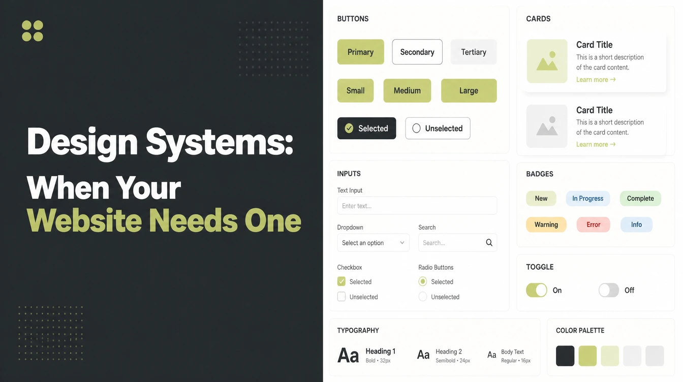
Key takeaways
- A design system is one shared library of reusable design pieces and rules so everything you build looks and works the same.
- It is bigger than a style guide. A style guide is a document of rules. A design system adds real components, tokens, and patterns, per NN/g.
- Looks build trust fast. People form a first impression of visual appeal in about 50 milliseconds, and 46.1% of people judge a site's credibility partly on its design.
- Design tokens are your saved design values. The W3C reached its first stable token format in 2025.
- Most very small businesses do not need a full system. A lightweight one-page style guide gives you most of the benefit.
1. What is a design system?
A design system is a single shared set of reusable design pieces and rules, so everything you build looks and works the same. Think of it as one box that holds your colors, fonts, buttons, cards, and forms, plus instructions for using them. Everyone who touches your brand pulls from that same box.
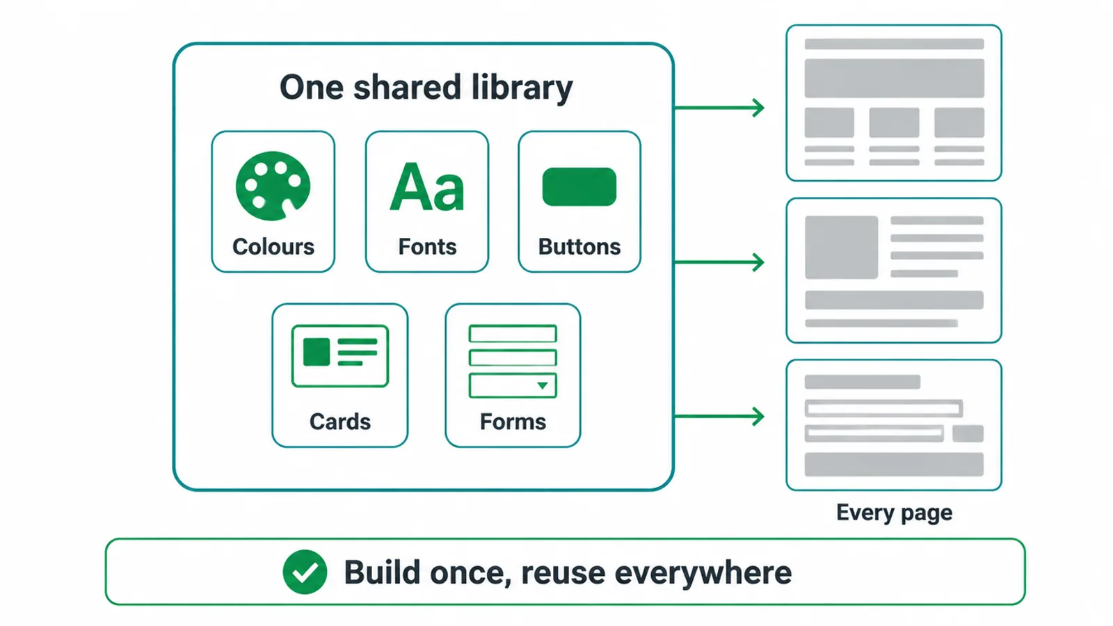
The Nielsen Norman Group calls a design system a living, complete set of standards built with reusable components and patterns. "Living" matters here. A design system is not a file you finish and forget. You update it, and those updates flow into every product that uses it.
Here is the simple version. Without a system, you remake the same button on every page, and they drift apart. With a system, you build the button once. Every page borrows that one button. Fix it in the box, and it is fixed everywhere. That is the whole point: build once, reuse everywhere, stay consistent.
2. What is inside a design system?
A full design system usually has four parts. Each part does a different job, and they stack on top of each other from rules at the bottom to finished pages at the top.
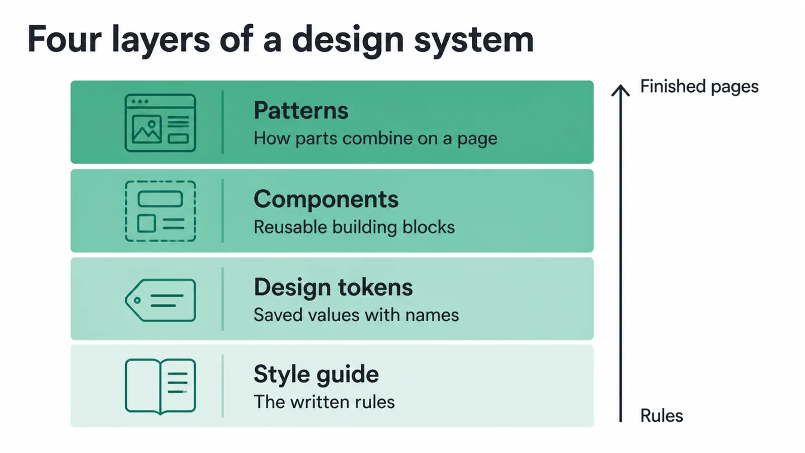
1. A style guide. This is the document of rules: your colors with exact codes, your fonts, your logo dos and don'ts. It is the "what we use and why" layer. Picking the right typefaces sits here, and our guide to choosing fonts that work together covers that choice in detail.
2. Design tokens. These are your saved design values, stored as named bits of data. Instead of typing one exact color into many files, you save it once as a token and reference the name everywhere.
Change the token once, and it updates across the whole product. In 2025 the W3C Design Tokens Community Group reached its first stable token format, a shared way for design tools and code to pass these values around.
3. A component library. These are the reusable building blocks: buttons, cards, menus, form fields. Each is built once and used everywhere. When you fix a component in the library, every copy on the site updates.
4. Patterns. These are the rules for putting components together, like how a contact form should be laid out or how a card grid should space itself. Patterns turn loose parts into pages that feel right.
| Layer | What it is | Plain example |
|---|---|---|
| Style guide | The written rules | "Our blue is this exact shade. Use these two fonts." |
| Design tokens | Saved values with names | color-primary, space-small, radius-round |
| Components | Reusable building blocks | Buttons, cards, form fields, menus |
| Patterns | How parts combine on a page | How a contact form or card grid is arranged |
3. Design system vs style guide vs brand guide
These three terms get mixed up all the time. They overlap, but they are not the same thing. The short version: brand guidelines shape how your brand feels, a style guide writes down your visual rules, and a design system gives your team the working parts to build with.
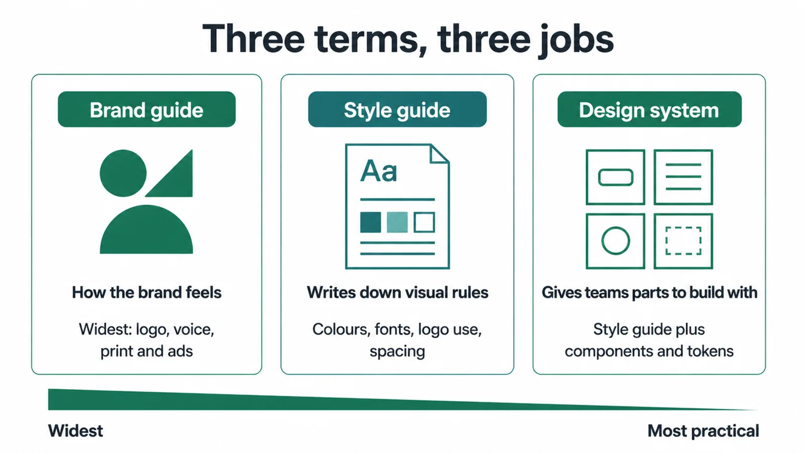
A brand guide is the widest. It covers your logo, your voice, what your colors mean, and how the brand should feel everywhere, including ads and print. If you are still shaping your identity, that is brand and identity work, not design-system work.
A style guide is narrower and more practical. It documents the visual rules for your screens: colors, fonts, logo use, spacing. A design system wraps that style guide and adds the real reusable pieces and code your team builds with. Style guide tells you the rules. Design system hands you the parts.
| Question | Brand guide | Style guide | Design system |
|---|---|---|---|
| Main job | How the brand feels | Write down visual rules | Give teams parts to build with |
| Covers print and ads? | Yes | Sometimes | Rarely, it is digital first |
| Has reusable components? | No | No | Yes |
| Has design tokens? | No | No | Yes |
| Includes code? | No | No | Often |
| Best for | Defining identity | One website, small team | Many pages, products, or teams |
4. Why consistency matters so much
Consistency is the real prize a design system delivers. When every page uses the same colors, spacing, and buttons, your site feels calm and trustworthy. When pages clash, visitors feel something is off, even if they cannot name it.
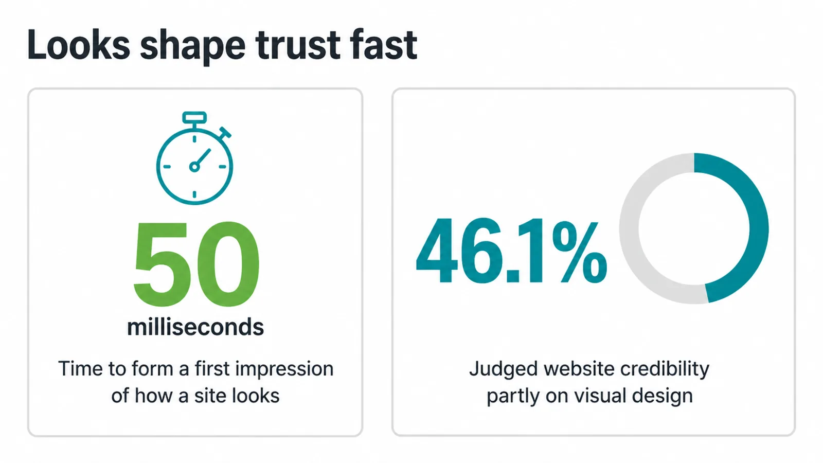
Looks shape trust faster than you think. People form a first impression of a site's visual appeal in about 50 milliseconds. That is faster than a blink.
And it sticks. The Stanford Web Credibility Project found that 46.1% of people judged a site's credibility partly on its visual design, more than any other single factor they named.
Consistency also saves time and money. When a designer or developer reuses a tested button, they do not rebuild or recheck it. Updates are faster too. Change one component, and the fix spreads everywhere instead of needing a hunt across dozens of pages.
A consistent look also helps people remember your brand, because they see the same signals again and again. If your current site feels scattered, our roundup of common small business website mistakes shows where inconsistency usually creeps in.
5. Real design system examples
The famous design systems come from big companies that ship many products with large teams. They are useful to study, but remember the scale gap: these run dozens of products and hundreds of contributors.
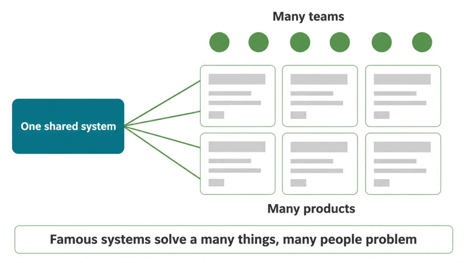
Google's Material Design guides the look of Android and Google's own apps. IBM's Carbon keeps its many enterprise tools consistent. Shopify's Polaris helps thousands of outside developers build apps that feel native inside Shopify. Atlassian uses its system across Jira, Confluence, and Trello so the whole family feels related.
Notice the pattern. Every one of these solves a "many things, many people" problem. They need a shared system because without it, different teams would drift in different directions. A single business with one website does not have that problem yet, which leads to the honest question.
6. Do you actually need a design system?
Here is our honest verdict: most very small businesses do not need a full design system. A full system is real work to build and maintain, and the payoff only shows up at scale.
If you run one website, a lightweight style guide gives you roughly four fifths of the benefit for a fraction of the effort.
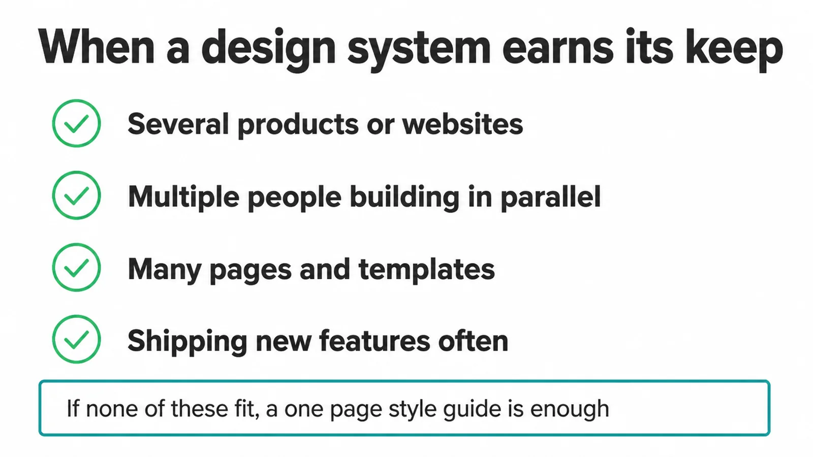
A design system earns its keep when you hit one of these:
- You run several products or websites that need to feel like one brand.
- You have multiple people building in parallel and things keep drifting apart.
- Your site has many pages and templates, and small fixes take forever to apply everywhere.
- You are shipping new features often and want to move faster without breaking consistency.
If none of that is you, do not build a system yet. Build a solid small business website on a clear style guide, and grow into a system only when the website starts fighting you.
Adding a heavy system too early is a cost with no payoff. Not sure where your business sits on that line? Tell us what you are building and we will give you a straight answer.
7. How to start small: a one-page style guide
You do not need a design system to get most of its value. You need one page that everyone follows. Here is a simple checklist you can fill out today.
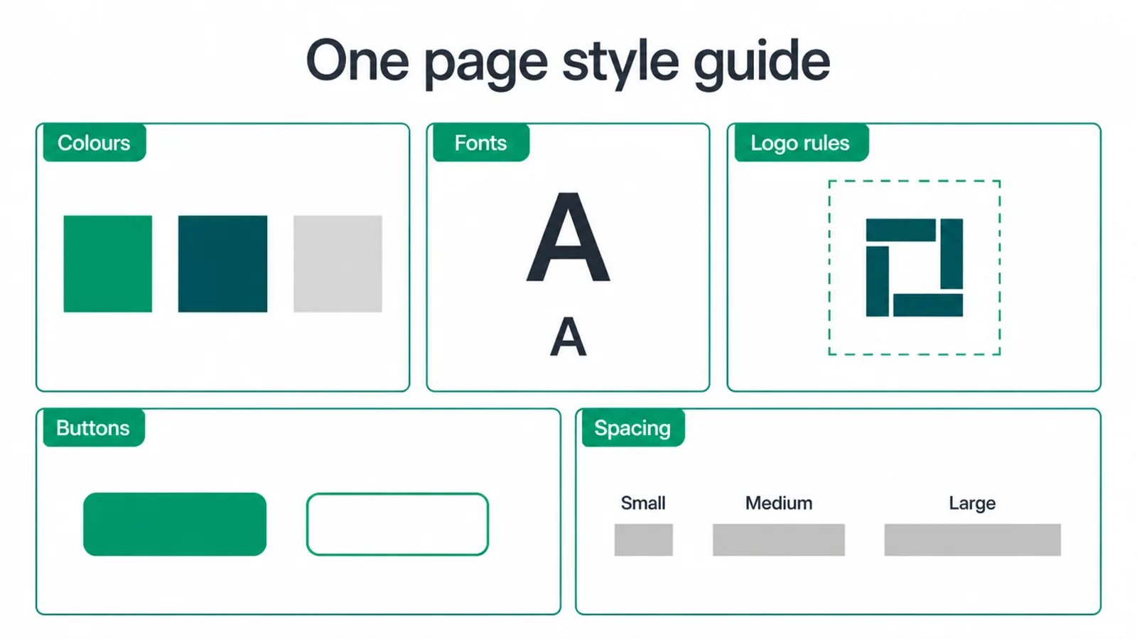
- Colors. List your main colors with their exact codes (the hex values). Two or three is plenty. Note where each one is used.
- Fonts. Pick two fonts, one for headings and one for body text, and write down their sizes. Our font pairing guide helps you choose a combination that works.
- Logo rules. Show the right way to use your logo, the minimum size, and the clear space around it.
- Buttons. Define one main button style and one secondary style. Lock in the color, shape, and text. Our button design tips cover what makes a button easy to tap and trust.
- Spacing. Set a few standard gaps (small, medium, large) and reuse them. Consistent spacing is what makes a page feel tidy.
Save this as one shared page or document. Every time you or anyone else adds a page, they check this guide first. That single habit prevents most of the drift a full design system is built to fix. When your site outgrows the page, you will already have the start of a real system.
Frequently asked questions
1. What is a design system in simple terms?
A design system is one shared set of reusable design pieces and rules. It holds your colors, fonts, buttons, cards, and forms in one place, plus the rules for using them. Everyone building your brand pulls from the same source, so everything looks and works the same way.
2. What is the difference between a design system and a style guide?
A style guide is a document that shows your colors, fonts, and logo rules. A design system is bigger. It includes that style guide plus real reusable components, design tokens, and usage patterns that designers and developers build with. A style guide tells you the rules. A design system gives you the working parts too.
3. What is the difference between a design system and brand guidelines?
Brand guidelines cover your brand identity: logo use, voice, color meaning, and how the brand should feel everywhere, including print and ads. A design system is about building digital products. It is narrower and more practical, focused on the actual screen pieces and code your team reuses to ship websites and apps.
4. What is included in a design system?
A full design system usually has four parts. A style guide with your colors, fonts, and logo rules. Design tokens, the saved values like exact hex colors and spacing sizes. A component library of reusable buttons, cards, and forms. And patterns, the rules for how those pieces fit together on a page.
5. What are design tokens?
Design tokens are your saved design values stored as named bits of data. Instead of writing one exact color in twenty places, you save it once as a token like color-primary and reference that name everywhere. Change the token once and it updates everywhere. The W3C published a stable token format in 2025 so tools can share these values cleanly.
6. Does a small business need a design system?
Most very small businesses do not need a full design system. A full system pays off when you have many pages, multiple products, or a team building in parallel. If you run one website, a simple one-page style guide gives you most of the benefit with far less work. Start small and grow into a system only when the website starts fighting you.
7. What is a component library?
A component library is the collection of reusable building blocks in a design system. Each block, like a button, a card, or a form field, is built once and reused everywhere. When you fix the button in the library, every button across the site updates. It saves time and keeps everything consistent.
8. Are design systems only for big companies?
Big companies built the famous design systems because they ship many products with large teams. But the core idea, save your design choices once and reuse them, helps any size of business. A small business just needs a much lighter version, often a single style guide page instead of a full system with code.