Scroll Animation Website: Add Motion Without Lag
A scroll animation website can look great or feel broken. Learn good uses, the speed and accessibility costs, and how to add scroll animation the right way.
Key takeaways
- Motion is a tool, not decoration. It should use movement to guide the eye, not to show off.
- Speed comes first. Google found that 53 percent of mobile visits are abandoned if a page takes longer than three seconds to load.
- Tiny speed wins pay off. A 0.1 second speed gain raised retail conversions by 8.4 percent in a Google and Deloitte study.
- Some people get sick from motion. Vestibular problems affected 35.4 percent of US adults aged 40 and over, so always respect the reduce motion setting.
- Animate only opacity and transform. Those two are cheap for browsers. Everything else risks lag.
What is a scroll animation on a website?
A scroll animation website is one where things move as you scroll down the page. The scroll itself is the trigger. A section fades in when you reach it, a heading slides up from below, a number counts up, or a progress bar fills as you read. Nothing happens until you scroll, which is what makes it feel responsive.
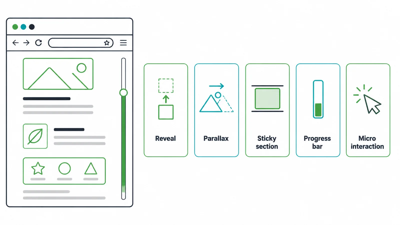
Most scroll animations fall into a few simple groups. There are reveals, where content fades or slides into view. There is parallax, where background layers drift slower than the foreground to fake depth. There are sticky sections that pin in place while text changes beside them. There are progress bars at the top of long articles. And there are micro interactions, the small touches like a button that reacts to your cursor.
Done lightly, these effects make a page feel polished and alive. Done heavily, they make a site slow, jumpy, and tiring. This guide shows you the good uses, the real costs, and how to add motion the right way. If you are still planning the whole project, start with our guide to building a small business website first, then come back for the motion layer.
Good uses of scroll animation
The best scroll animations do a job. They draw your eye to the next thing, show that content is loading, or give feedback when you act. Here are the types that earn their place, and what each one costs you.
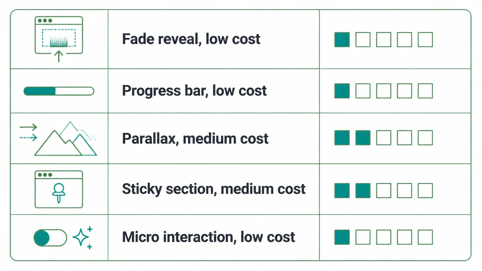
| Type | What it does | Good for | Cost or risk |
|---|---|---|---|
| Fade or slide reveal | Brings a section into view as you reach it | Most pages, headings, product shots | Low, if you animate only opacity and transform |
| Scroll progress bar | Shows how far through a long page you are | Blog posts, guides, case studies | Low, tiny code |
| Gentle parallax | Background drifts slower than foreground for depth | One hero section, not the whole site | Medium, can lag and cause motion sickness |
| Sticky section | Pins content while related text scrolls past | Step-by-step stories, feature lists | Medium, can break on small screens |
| Micro interaction | Tiny reaction to a hover, tap, or filled field | Buttons, forms, menus | Low, often improves usability |
The rules of good motion
Three rules keep scroll animation on the right side of helpful. Break them and your site feels slow and showy.
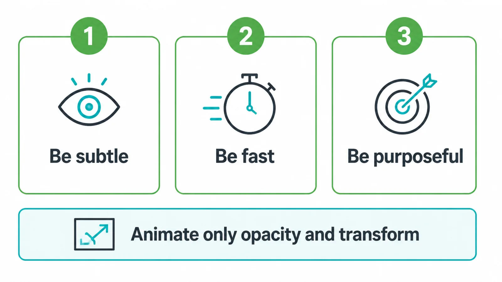
Be subtle. Motion should be felt more than noticed. A short fade or a small slide is plenty. If a visitor stops to watch the animation instead of reading your message, it is too much.
Be fast. Keep every effect under about a third of a second. Long, slow animations make people wait, and waiting is the one thing online visitors hate. Snappy motion feels confident.
Be purposeful. Every animation should answer a question. Where do I look next? Did my click work? How far through am I? If you cannot name the job an effect does, cut it.
One technical rule sits under all three. Animate only the opacity and transform properties. Those two are cheap for the browser to draw smoothly. Animating things like width, height, top, or margin forces the browser to recalculate the whole page on every frame, which is where lag comes from.
The real costs of scroll animation
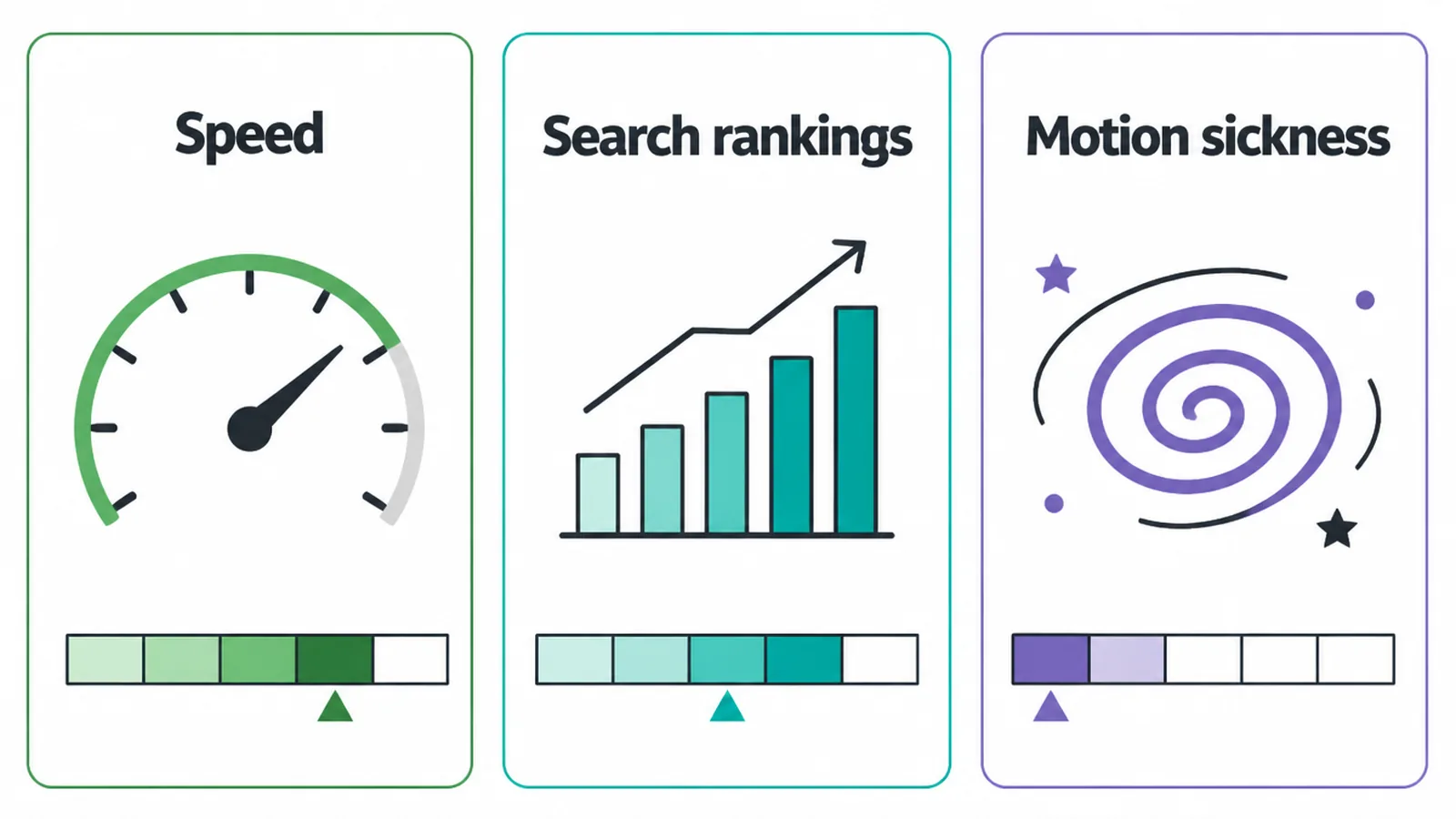
Motion is never free. It costs speed, it can hurt your search rankings, and it can make some people physically unwell. You should weigh all three before adding a single effect.
Speed and page weight
Animation libraries add code that visitors must download before your page can run. Pages are already heavy. The HTTP Archive Web Almanac found the median desktop page weighed 2,652 kilobytes in October 2024, and that number keeps climbing. Piling a big motion library on top makes a slow page slower.
Speed is not a vanity metric. Google reported that 53 percent of mobile visits are abandoned when a page takes longer than three seconds to load. The same research found sites loading in five seconds had 70 percent longer sessions than sites loading in nineteen seconds. And small gains compound. A Google and Deloitte study showed a 0.1 second speed gain lifted retail conversions by 8.4 percent. A heavy scroll effect can quietly cancel out wins like that.
Search rankings
Google does not punish motion on its own. The danger is indirect. If animation slows your load time or makes the layout jump around, your Core Web Vitals scores drop, and Google uses those scores to help rank pages. Learn what they measure in our guide to Core Web Vitals explained so you can keep your effects from costing you visibility.
Motion sickness
Some visitors feel dizzy or sick from on-screen movement. This is more common than most owners think. A study in the Archives of Internal Medicine found vestibular problems affected 35.4 percent of US adults aged 40 and over, roughly one in three. Big parallax and fast scroll effects can trigger real discomfort. Accessible motion is part of an accessible site, which we cover fully in our guide to website accessibility.
Respect the reduce motion setting
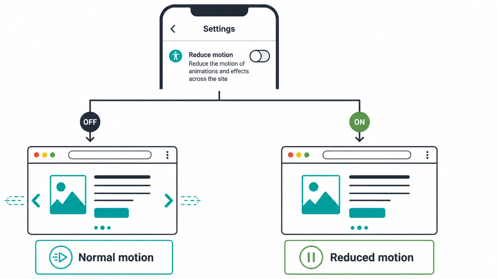
This is the rule most inspiration galleries skip, and it is the most important one. Every phone and computer has a reduce motion setting. When someone turns it on, they are telling websites to calm down the movement.
Browsers expose that choice to your site through a setting called prefers-reduced-motion. Your site can read it and switch off scroll animations for those visitors, or swap them for a plain fade. The content still appears, it just appears without the dizzying movement.
Building this in is not extra polish. It is the baseline for treating your visitors well. A good developer wires it into the site from the start, so the right people get a calm experience without anyone having to ask.
How to add scroll animation the right way
You have three main paths, from lightest to most hands-off.
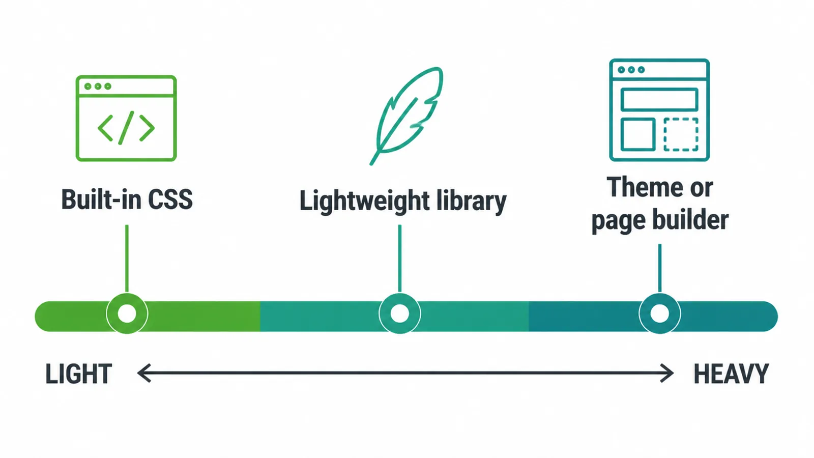
Built-in CSS. Modern browsers can run scroll-driven animations using plain CSS, with no library at all. This is the lightest option because there is no extra code to download. It is also the safest for speed. The trade-off is that it needs someone comfortable writing CSS.
A lightweight library. Small animation libraries handle reveals and timing for you with a few lines of setup. They cost a little download weight, so pick one that does only what you need. Avoid bolting on a giant all-in-one motion library to power a single fade.
A theme or page builder. Many website builders include scroll effects you can switch on with a toggle. This is the no-code route. It is quick, but builders often add the effect to everything by default, so turn off what you do not need and always test the result on a phone.
If you want motion that looks custom and still loads fast, that balance is harder than it looks. It is the kind of thing worth handing to a professional. Our web design and web development teams build motion that respects speed, accessibility, and the reduce motion setting from day one. Tell us what you have in mind and we will tell you what is realistic.
Mistakes to avoid
Most scroll animation problems come down to overdoing it. Watch for these.
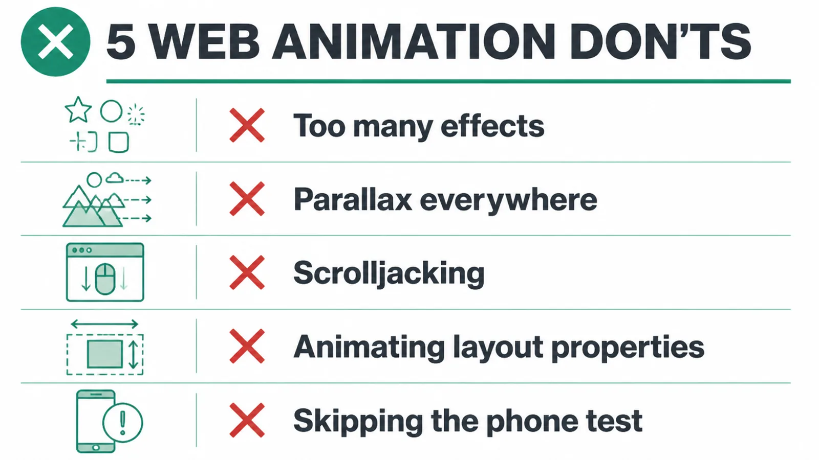
- Too many effects. When every section moves, nothing feels special and the page feels busy. Animate the few moments that matter.
- Parallax everywhere. One gentle parallax hero can look nice. Parallax on every block is a fast way to make people dizzy and slow your page.
- Scrolljacking. Hijacking the scroll so it moves at a speed you control, not the visitor, feels broken and traps people. Let the scroll behave normally.
- Animating layout properties. Moving width, height, or margins makes the browser recalculate the page on every frame, which causes lag. Stick to opacity and transform.
- Skipping the phone test. Effects that feel smooth on a fast laptop can stutter on a phone. Always check on a real device. Our guide on how to make a website mobile friendly walks through the checks.
Frequently asked questions
What is a scroll triggered animation?
A scroll triggered animation is motion that fires as you move down a page. The scroll position is the trigger. A section can fade in, a number can count up, or a bar can fill as you reach it. Nothing moves until you scroll to that point.
Do scroll animations slow your website?
They can. Heavy animation libraries add code to download, and effects that animate the wrong properties make the browser work hard on every frame. Animate only opacity and transform, keep effects light, and the page can stay fast. Speed matters because 53 percent of mobile visits are abandoned if a page takes longer than three seconds to load.
Do scroll animations hurt SEO?
Not directly. Google does not penalise motion. The risk is indirect. If animation slows your page or causes layout to jump around, your Core Web Vitals suffer, and those scores are part of how Google ranks pages. Keep effects fast and stable and your SEO is fine.
Are scroll animations bad for accessibility?
They can be if you ignore people who get motion sick. Vestibular problems, which cause dizziness and nausea from movement, affected 35.4 percent of US adults aged 40 and over in one study. The fix is to honour the reduce motion setting built into every operating system, so sensitive visitors see a still page.
What is prefers-reduced-motion?
It is a setting in your phone or computer that asks websites to cut down movement. When someone turns it on, your site can read that request and switch off scroll animations or replace them with a simple fade. It is the single most important rule for using motion responsibly.
What is the difference between parallax and scroll animation?
Parallax is one type of scroll animation. It makes background layers move slower than foreground ones to fake depth. Scroll animation is the wider term for any motion tied to scrolling, including fades, reveals, progress bars, and sticky sections. All parallax is scroll animation, but not all scroll animation is parallax.
What are micro interactions on a website?
Micro interactions are tiny bits of motion that respond to what a visitor does. A button that nudges when you hover, a form field that turns green when filled, or an icon that wiggles on tap. They give feedback and make a site feel alive without slowing it down.
How many scroll animations are too many?
If a visitor notices the animation instead of the message, you have too many. A good rule is to animate the few moments that matter, like a key heading or a single product reveal. When every section moves, nothing feels special and the page starts to feel slow and busy.
About the author
We are the Seed Light team, a web design and digital marketing studio building sites for small businesses since 2017. In our work we add scroll animation only where it earns its keep, and we wire in the reduce motion setting and fast loading from the first line of code. We would rather a site feel quick and clear than win a prize for movement.
Put it into practice
Need help putting this to work?
We design, build and market websites that turn attention into revenue. Tell us what you are working on and we will point you the right way.
Keep reading