Website Navigation Best Practices That Actually Work
Website navigation best practices, in plain words: structure, the 4 nav types, clear labels, mobile menus, and what to skip. Help people find things fast.
Key takeaways
- Navigation is findability. Its one job is to help people find what they came for with the least effort.
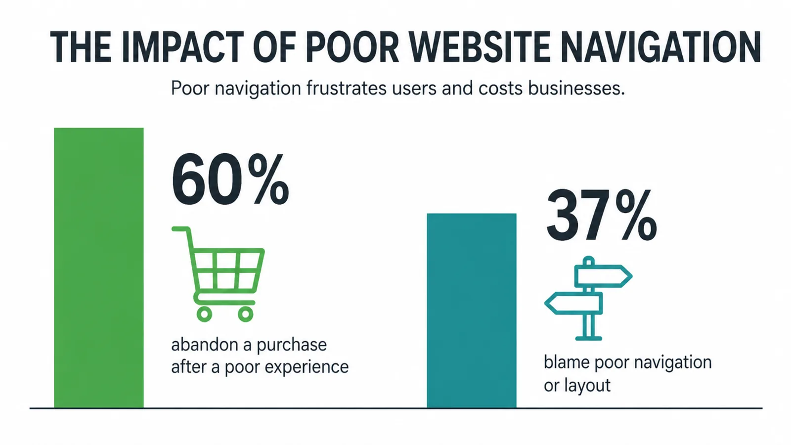
- Bad navigation costs you. In one survey of 6,000 shoppers, 60% abandoned a purchase due to poor experience, and 37% blamed poor navigation or layout (Storyblok, 2022).
- Keep the menu visible. Hidden navigation made desktop users at least 39% slower to find things (Nielsen Norman Group, 2016).
- The 3-click rule is a myth. Dropoff does not rise past three clicks (Nielsen Norman Group, 2019). Clear paths beat fewer clicks.
- Start with structure. Group pages the way your customer thinks, keep it shallow, then pick the right nav types.
What good website navigation actually does
Website navigation best practices come down to one thing: helping people find what they came for with the least effort. Navigation is the map of your site. It is not decoration, and it is not a place to be clever. When someone lands on your page, they have a goal. Good navigation gets them there fast.
Get it wrong and people leave. In a survey of 6,000 shoppers, 60% gave up on a purchase because of a poor experience, and 37% pointed straight at poor navigation or page layout (Storyblok, 2022). That is a lot of lost leads from something you can fix.
This guide stays in one lane: structure, the types of navigation, and the rules of findability. If you want help with the look of the menu bar itself, the dropdowns, the hamburger icon, the hover states, read our companion piece on menu design. Navigation is a core part of the wider user experience of any small business website.
Start with structure, not the menu bar
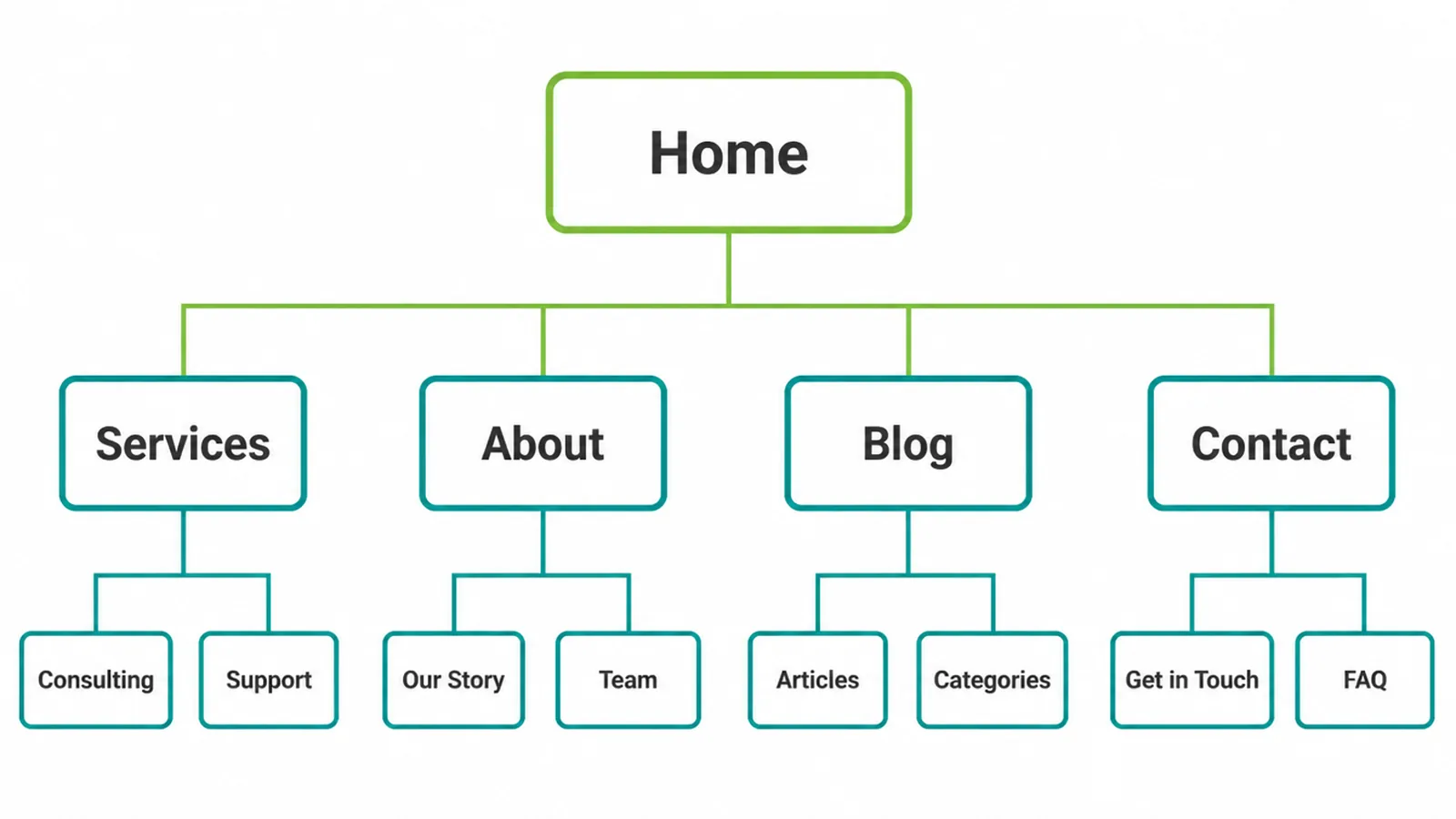
Before you draw a single menu, sort out your structure. This is called information architecture, which is just a fancy term for how your pages are grouped and ordered. Good structure means a customer can guess where something lives without thinking hard.
The trick is to group pages the way your customer thinks, not the way your business is organised. People do not care which department owns a page. They care about their goal. So sort your pages into a few clear buckets that match what visitors want to do.
Keep it shallow. The more layers you stack, the more lost people get. Most small sites work fine with a top level, a second level, and rarely a third. Map this out early in your design process, before you build anything.
Once your structure is clear, you choose how to expose it. There are four main types of navigation, plus search:
- Primary navigation: the main menu at the top of every page.
- Footer navigation: the catch-all menu at the bottom.
- Breadcrumb navigation: the trail that shows where a page sits.
- Mobile navigation: the menu adapted for small screens.
Most sites use the first two. Bigger or deeper sites add the rest.
The website navigation rules worth following
A handful of rules separate menus that work from menus that frustrate. None of them are hard.
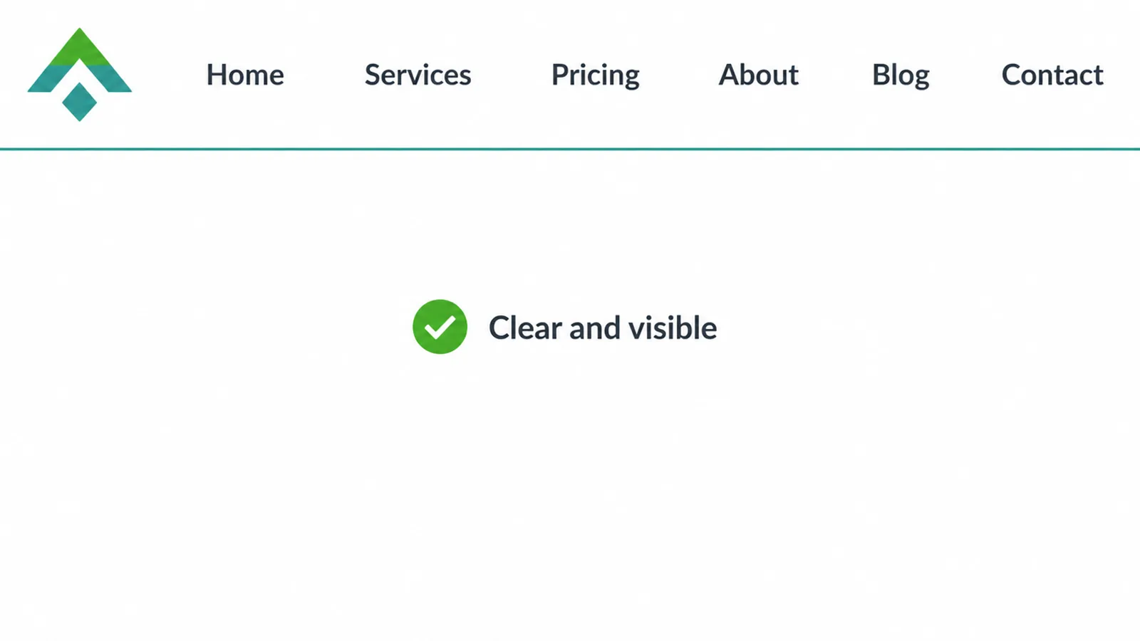
Use clear labels, not clever ones
Label each link with the word your customer would use. Services, Pricing, About, Contact. Plain beats playful every time. If someone cannot tell what is behind a link by reading it, the label has failed. Save your personality for the page content, not the menu.
Keep the top level short
Fewer items are easier to scan. Most small business menus do well with about five to seven top-level links. People recognise options faster than they recall them, so a short list lets them spot the right one without reading everything twice. If you have more pages, tuck them under a few clear headings instead of crowding the top bar.
Forget the 3-click rule
You have probably heard that every page should be three clicks away. It is a myth. The Nielsen Norman Group found the 3-click rule is not supported by data, and user dropoff does not rise once people pass three clicks (Nielsen Norman Group, 2019). What matters is whether each click feels like progress. Five clear clicks beat two confusing ones. Design strong paths and let the count land where it lands.
Keep it visible and consistent
Show your main menu. Do not hide it behind an icon on desktop. Hidden navigation hurt discoverability and slowed people down: desktop users used hidden menus only 27% of the time versus 48% for visible menus, and they were at least 39% slower at finding content (Nielsen Norman Group, 2016). Then keep the menu in the same place on every page. When the menu moves or changes, people lose their footing. Treat your nav links like buttons: easy to see, easy to read, easy to trust.
Footer menus, breadcrumbs, and search
Your primary menu cannot hold everything. That is what the other tools are for.
The footer is your catch-all. It carries the secondary links people look for at the bottom: contact details, policies, social links, and a wider list of pages. Nobody arrives expecting to use the footer, but plenty of people scroll down looking for it, so keep it tidy and useful.
Breadcrumbs are the small trail near the top of a page that shows where you are, like Home, then Category, then the page itself. They supplement your main nav rather than replace it, and they shine on deep sites with several layers (Nielsen Norman Group, 2018). They also help visitors who land deep in your site from a search result and need a quick way to climb back up. On a flat site with one or two levels, skip them. They just add clutter.
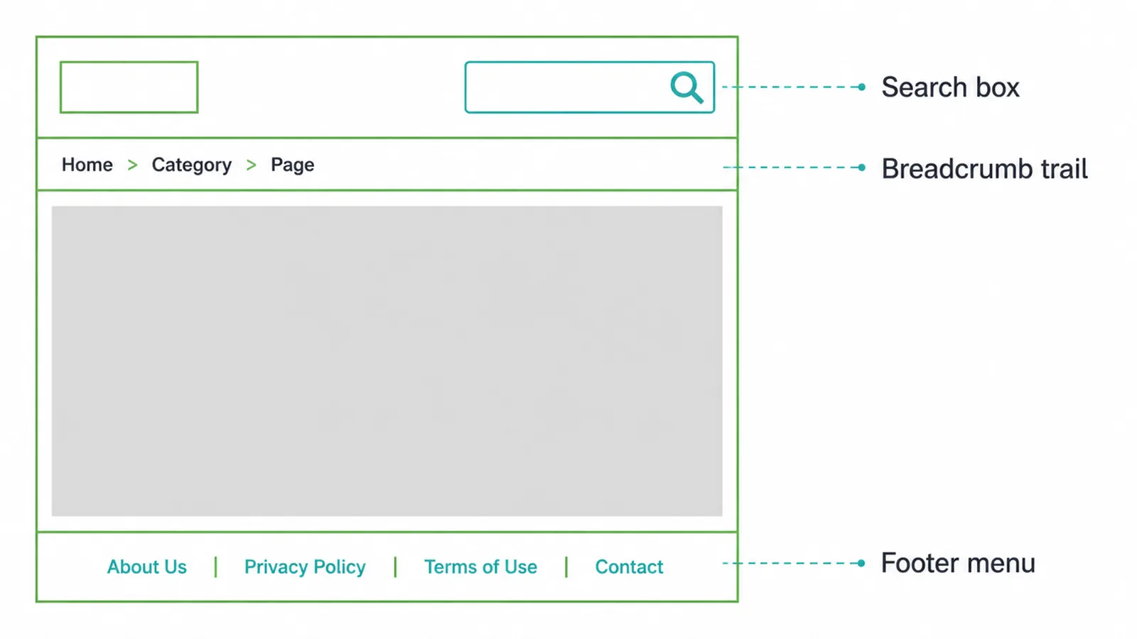
A search box earns its place once you have a lot of pages. Here is the catch: most people browse rather than search when the menu is clear. Only about 14% of users started with search in one study, though they reached for it about 40% of the time when the menus were narrow and gave weak clues (MeasuringU, 2012). So a clear menu does most of the work. If you do add search, make it easy to find. Many sites bury it: 22% of sites do not present the search field prominently on the homepage (Baymard, 2025). A hidden search box is barely a search box.
Mobile navigation best practices
Most of your visitors are on a phone, so mobile navigation is not an afterthought. The screen is small, so you usually collapse the menu behind an icon. That is fine on mobile, where space is tight, as long as you make it obvious.
- Label the icon. A small "Menu" word next to the icon helps people who do not recognise the three lines.
- Use big tap targets. Thumbs are not precise. Give each link plenty of room so people do not mis-tap.
- Put the top actions first. Lead with what most people want, then list the rest.
- Show where they are. Highlight the current page or section. This is a common miss: 95% of mobile sites do not highlight the current scope in the main nav (Baymard, 2025).
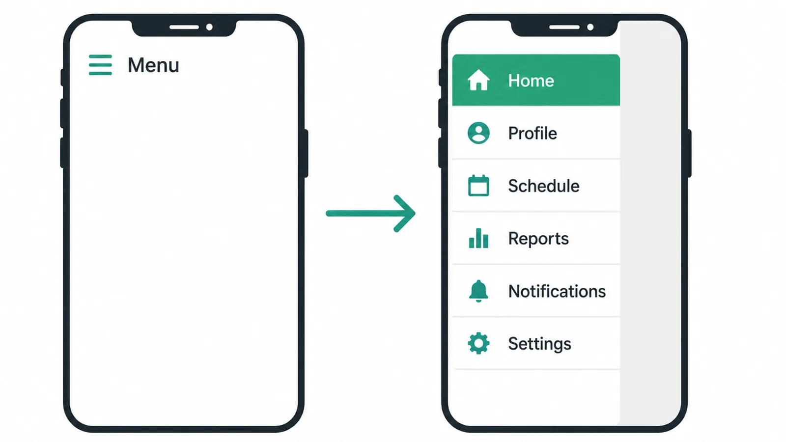
Mobile navigation is part of a bigger job. For the full picture, see our guide to making a mobile-friendly website.
Common website navigation mistakes to avoid
Most navigation problems come from the same short list. Check yours against it.
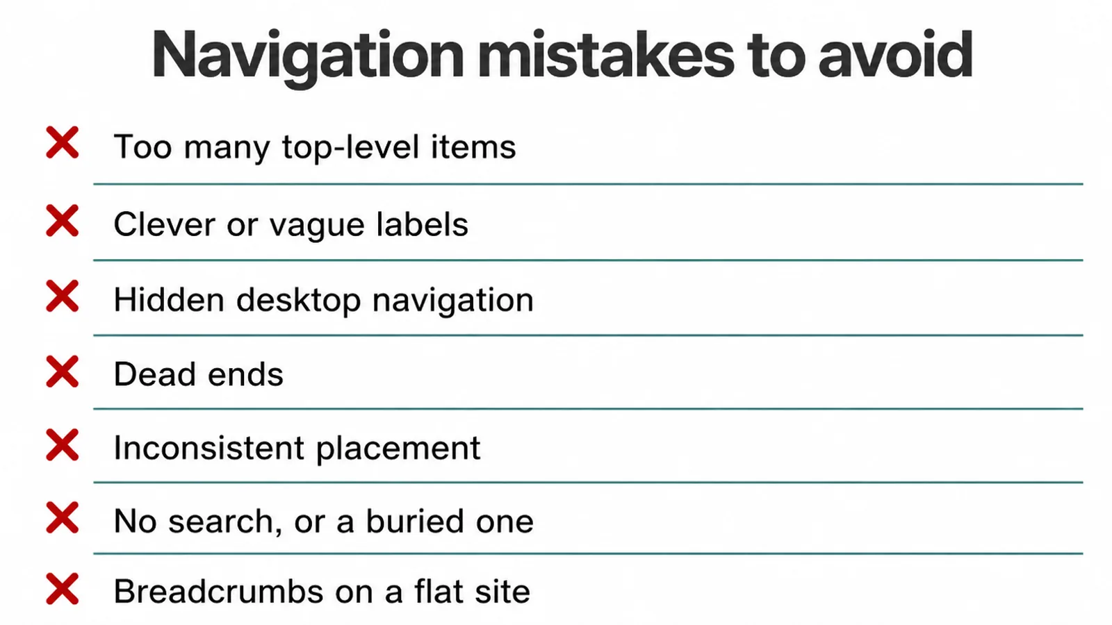
- Too many top-level items. A crowded bar makes people read instead of scan.
- Clever or vague labels. If a link makes someone guess, it is broken.
- Hidden desktop navigation. Tucking the menu behind an icon on a big screen costs you discoverability and speed.
- Dead ends. Every page needs a clear way back or forward. Never trap people.
- Inconsistent placement. A menu that moves between pages makes people relearn your site each time.
- No search on a big site, or a buried one. Large catalogues need findable search.
- Breadcrumbs on a flat site. They add noise when there is nothing to trace.
These show up again and again. We cover the wider set in our roundup of small business website mistakes.
A quick website navigation checklist
Here is each navigation type at a glance, what it is for, when to use it, and what to watch out for.
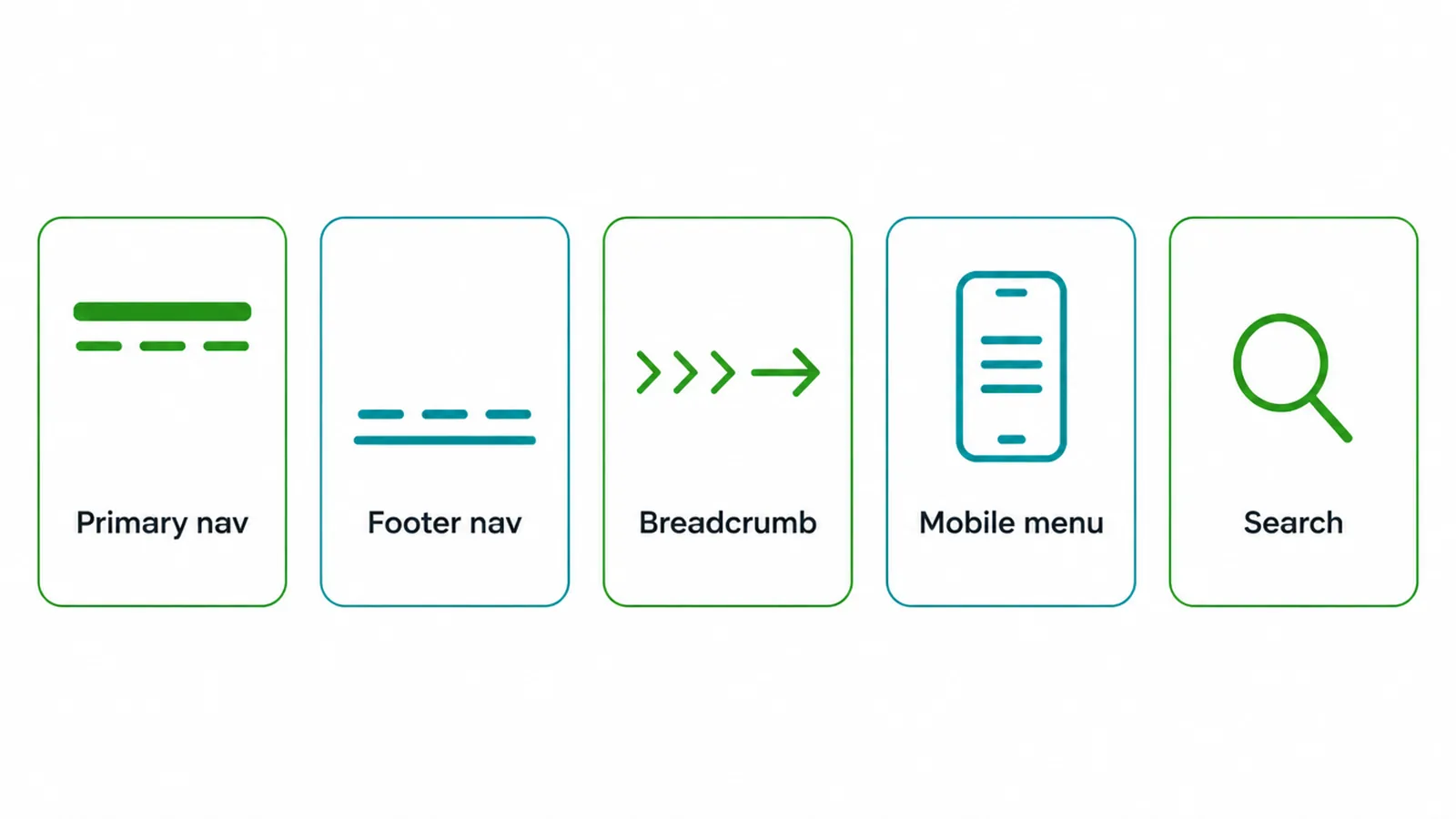
| Type | What it is for | When to use | Watch out for |
|---|---|---|---|
| Primary nav | The main path to your key pages | Every site, on every page | Too many items, clever labels |
| Footer nav | Secondary links and policies | Almost every site | Turning it into a dumping ground |
| Breadcrumb | Showing where a page sits | Deep sites with several layers | Using them on flat sites |
| Mobile menu | Navigation on small screens | Every site, since most traffic is mobile | No label, small tap targets |
| Search | Jumping straight to a page | Large catalogues, blogs, help centers | Hiding or burying the box |
If your navigation fails any of these, fix the structure first, then the menu. When you want a hand, our web design team plans sites around how real customers find things. Tell us what you are building on our contact page and we will map it out with you.
Frequently asked questions
What are website navigation best practices?
Good navigation helps people find what they came for with the least effort. The best practices are simple: group pages the way customers think, keep the structure shallow, use clear labels instead of clever ones, show the main menu instead of hiding it, stay consistent on every page, and make it easy to tap on a phone. Add a footer menu, breadcrumbs for deep sites, and a search box when you have a lot of pages.
How many items should a navigation menu have?
There is no magic number, but fewer is easier. Most small business sites do well with about five to seven top-level items. People recognize options faster than they recall them, so a short, clearly labelled menu beats a long one. If you have more pages, group them under a few clear headings rather than listing everything at the top.
Is the 3-click rule real?
No. The Nielsen Norman Group found the 3-click rule is not supported by data. User dropoff does not rise once people pass three clicks. What matters is whether each click feels like progress toward the goal, not the raw number of clicks. Design clear paths with strong labels, and let the count fall where it falls.
Should I use a hamburger menu on desktop?
Usually not. Nielsen Norman Group found hidden navigation hurts discoverability and slows people down. On desktop, users found content much less often when the menu was hidden, and they were at least 39% slower than with a visible or combo menu. Keep the main menu visible on desktop. Save the hamburger for small mobile screens where space is tight.
Do small sites need a search box?
A small site with a few pages does not need search. Most people browse rather than search when the menu is clear. But once you have a large catalogue, a blog, or a help center, a visible search box helps. Many sites bury or hide it, which makes finding things harder, so if you add search, keep it easy to spot.
When should I use breadcrumbs?
Use breadcrumbs on sites with several layers of pages, like a shop with categories and subcategories or a large content library. They show people where they are and give a quick way back up. They also help visitors who land deep in your site from a search result. Skip breadcrumbs on flat sites with only one or two levels, where they add clutter without helping.
What makes a good menu label?
A good label is the word your customer would use, not your internal jargon. Use plain, specific words like Services, Pricing, About, and Contact. Avoid clever or vague labels that make people guess. If someone cannot tell what is behind a link by reading it, the label is failing its one job.
Where should website navigation go?
Put the main menu at the top of every page, in the same spot, so people always know where to look. Keep a footer menu at the bottom for secondary links like policies and contact details. On phones, place the most important actions first in the menu. Consistency matters more than the exact pixel location: the menu should never move or change as people click around.
About the author
We are the Seed Light team, a web design and digital marketing studio that has built small business sites since 2017. In our work we plan navigation around how real customers find things, then test it until people stop getting lost. We write these guides to share what works, in plain words you can use today.
Put it into practice
Need help putting this to work?
We design, build and market websites that turn attention into revenue. Tell us what you are working on and we will point you the right way.
Keep reading