
Key takeaways
- First impressions are instant. People form a gut feeling about your site in about 50 milliseconds (Lindgaard et al., 2006), and simple and familiar wins (Google Research, 2012).
- The rules already exist. The most trusted are Nielsen's 10 usability heuristics (NN/g) and the Laws of UX. We translate them into plain actions, we do not invent them.
- Fewer choices, familiar patterns. Work like the sites people already know, and trim menus and options so people move forward instead of freezing.
- Accessibility is UX. WebAIM found 94.8% of home pages failed accessibility checks, with low contrast on 79.1% (WebAIM Million 2025). Good contrast is an easy fix.
- Each principle gets one action. You can apply every rule in this post to your own site today, no redesign required.
1. What are UX design principles?
UX design principles are tested rules that make a site easy and pleasant to use, so visitors act instead of leaving. They are not opinions or trends. They come from decades of research into how real people read, click, and decide. Get them right and your site feels obvious. Get them wrong and people bounce, often before they read a word.

That speed matters more than most owners think. A visitor forms a first impression of your site in about 50 milliseconds (Lindgaard et al., 2006). That is faster than a blink. You do not have time to explain yourself. The design has to feel right on its own.
This post is the rules layer. If you want the full definition of user experience first, read what is UX design. Here we skip the theory and get straight to what to do.
2. Where these principles come from
We did not make these rules up. They come from a small group of widely accepted frameworks, and we just turn them into plain language.
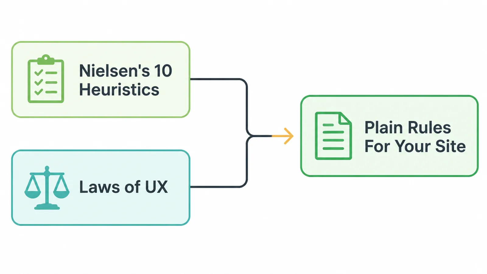
The first is Nielsen's 10 usability heuristics, written by Jakob Nielsen in 1994 and kept current by Nielsen Norman Group (last updated in 2024). These are 10 broad rules of thumb for usable design, used by product teams everywhere.
The second is the Laws of UX, a collection of principles drawn from psychology. The three we lean on here are Jakob's Law (people prefer your site to work like other sites), Hick's Law (more choices mean slower decisions), and Fitts's Law (bigger, closer targets are easier to hit). Google's own research backs the spirit of all of this: people love simple and familiar designs (Google Research, 2012).
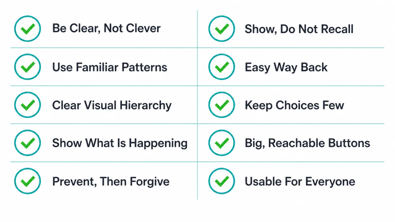
So below are 10 principles. Each one gets a short rule, a one-line reason, and an "On your site:" action you can do without a designer.
3. The 10 UX design principles, with an action for each
1. Be clear, not clever
Plain beats fancy. A clever headline that nobody understands is worse than a boring one that everyone gets. This matches Nielsen's "aesthetic and minimalist design": cut anything that does not help.
On your site: Read your homepage out loud. If a stranger could not say what you do and what to click in five seconds, simplify the words and remove the extras.
2. Work like the sites people already know
This is Jakob's Law. People spend most of their time on other sites, so they expect yours to behave the same way. Familiar is faster than original.
On your site: Logo top left, menu across the top, contact info easy to find, cart top right if you sell. Do not reinvent where things go.
3. Build a clear visual hierarchy
Make the most important thing the most obvious thing. Size, color, and spacing tell people where to look and what to do first. A page where everything shouts is a page where nothing lands.
On your site: Pick one main action per page and make its button stand out. Our guide to button design covers size, color, and labels in detail.
4. Always show what is happening
This is Nielsen's "visibility of system status". People should never wonder if a click worked. Loading, sending, saved, error: show it.
On your site: After someone sends a form, show a clear "Thanks, we got your message" instead of a blank screen. Add a spinner or progress note on slow steps.
5. Prevent mistakes first, then forgive them
The best error message is the one that never appears. Nielsen lists both "error prevention" and helping people recover. Stop the mistake before it happens, and make it easy to fix if it does.
On your site: Label form fields plainly, mark which are required, and explain exactly what went wrong ("Enter a valid email") instead of a vague "Error".
6. Show, do not make people remember
This is "recognition rather than recall". It is easier to pick from a visible list than to remember a hidden option. Do not force people to hold information in their head.
On your site: Keep the menu visible, show selected filters, and show what is in the cart. Never hide steps people need to remember.
7. Give people an easy way back
This is "user control and freedom". People click the wrong thing. They need a clear exit, an undo, a back button that works. A site that traps people loses them.
On your site: Make sure every page links home, breadcrumbs or a clear menu show where people are, and any popup has an obvious close button.
8. Keep choices few
This is Hick's Law: the more options you show, the longer people take to decide, and the more likely they freeze. Less is faster.
On your site: Trim your top menu to the few links that matter. Offer one or two clear next steps per page, not five competing buttons.
9. Make buttons big and reachable
This is Fitts's Law: the bigger and closer a target, the easier it is to hit. On a phone, tiny links jammed together cause mis-taps and frustration.
On your site: Make tap targets large, give them space, and keep key buttons within thumb reach. Our guide on making a website mobile friendly goes deeper.
10. Make it usable for everyone
A site that works for people who use screen readers, keyboards, or higher contrast is more usable for all. Yet WebAIM found 94.8% of home pages failed accessibility checks, with low contrast text on 79.1% of them (WebAIM Million 2025). Contrast is the most common fail and the easiest win.
On your site: Check your text contrast and fix any pale grey on white. See our hands-on guide to website accessibility for the full checklist.
4. Speed is a UX principle too
No principle survives a slow page. A visitor who waits too long leaves before they read a word, so loading time is part of the experience, not separate from it. The fastest design in the world feels broken if it takes ages to appear.
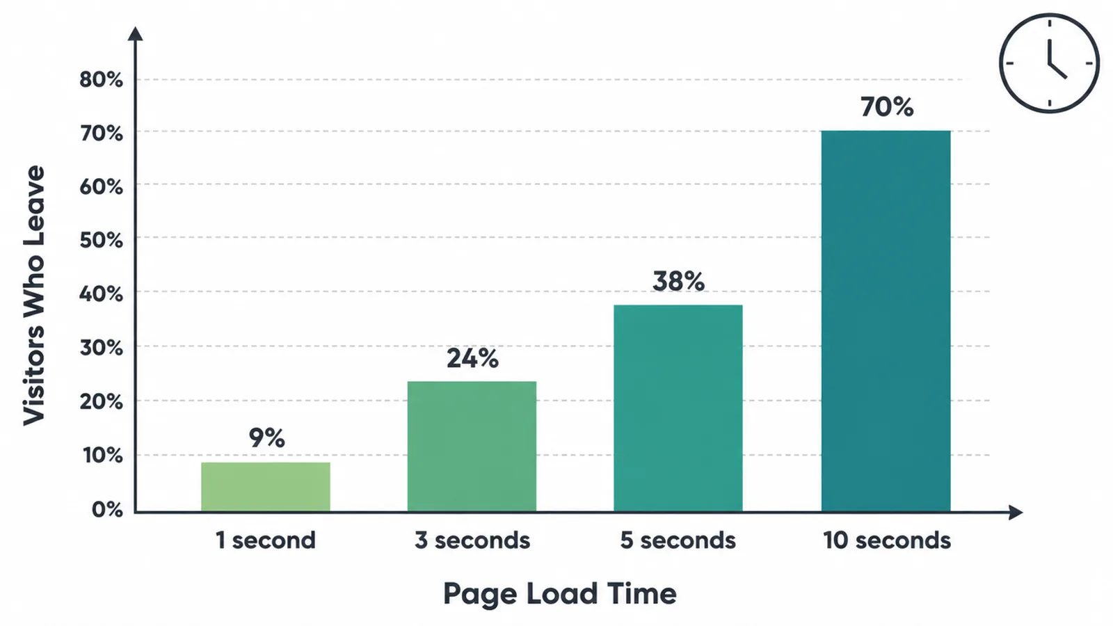
Keep images light, cut heavy scripts, and avoid loading things you do not need. If your pages feel sluggish, our guide to Core Web Vitals explained shows you what to measure and how to fix it.
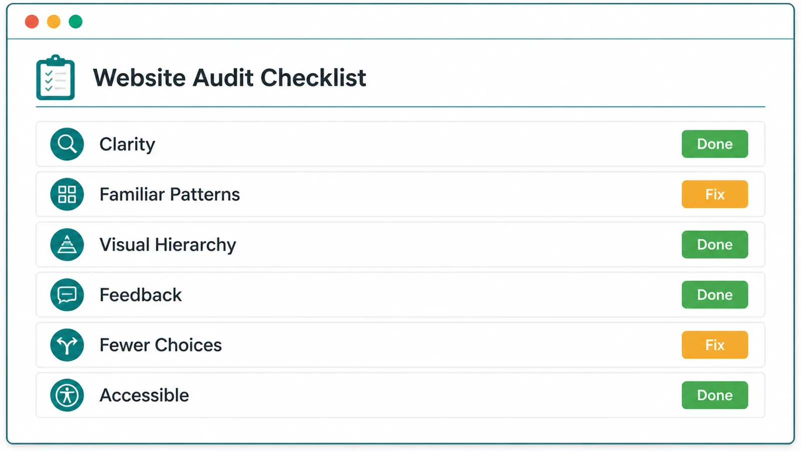
5. Quick reference: the principles at a glance
Here is the whole list in one place. Skim it, then pick the one weak spot on your site and fix that first.
| Principle | What it means | One thing to do |
|---|---|---|
| Be clear, not clever | Plain words beat fancy ones | Make your homepage understandable in five seconds |
| Work like known sites | Familiar patterns feel faster (Jakob's Law) | Put the logo, menu, and contact where people expect |
| Visual hierarchy | Most important thing looks most important | Make one main button stand out per page |
| Show what is happening | Never leave people guessing | Confirm every form with a clear thank you |
| Prevent then forgive | Stop errors, then make them easy to fix | Write specific, helpful error messages |
| Show, do not recall | Display options instead of hiding them | Keep the menu and cart visible |
| Easy way back | People need a clear exit and undo | Add visible close buttons and a working back path |
| Keep choices few | More options slow decisions (Hick's Law) | Trim the top menu to what matters |
| Big, reachable buttons | Large, close targets are easier (Fitts's Law) | Make tap targets large and spaced on mobile |
| Usable for everyone | Works for all visitors and abilities | Fix low contrast text |
6. Where small business sites go wrong
Most small sites break the same handful of rules. Too many menu items overwhelm people. Forms give no feedback after a click. Contact details hide at the bottom. Text sits in pale grey that nobody can read. And pages get bloated: the web keeps getting heavier, with an average of 1,257 elements on a home page in early 2025 (WebAIM Million 2025), which slows everything down.
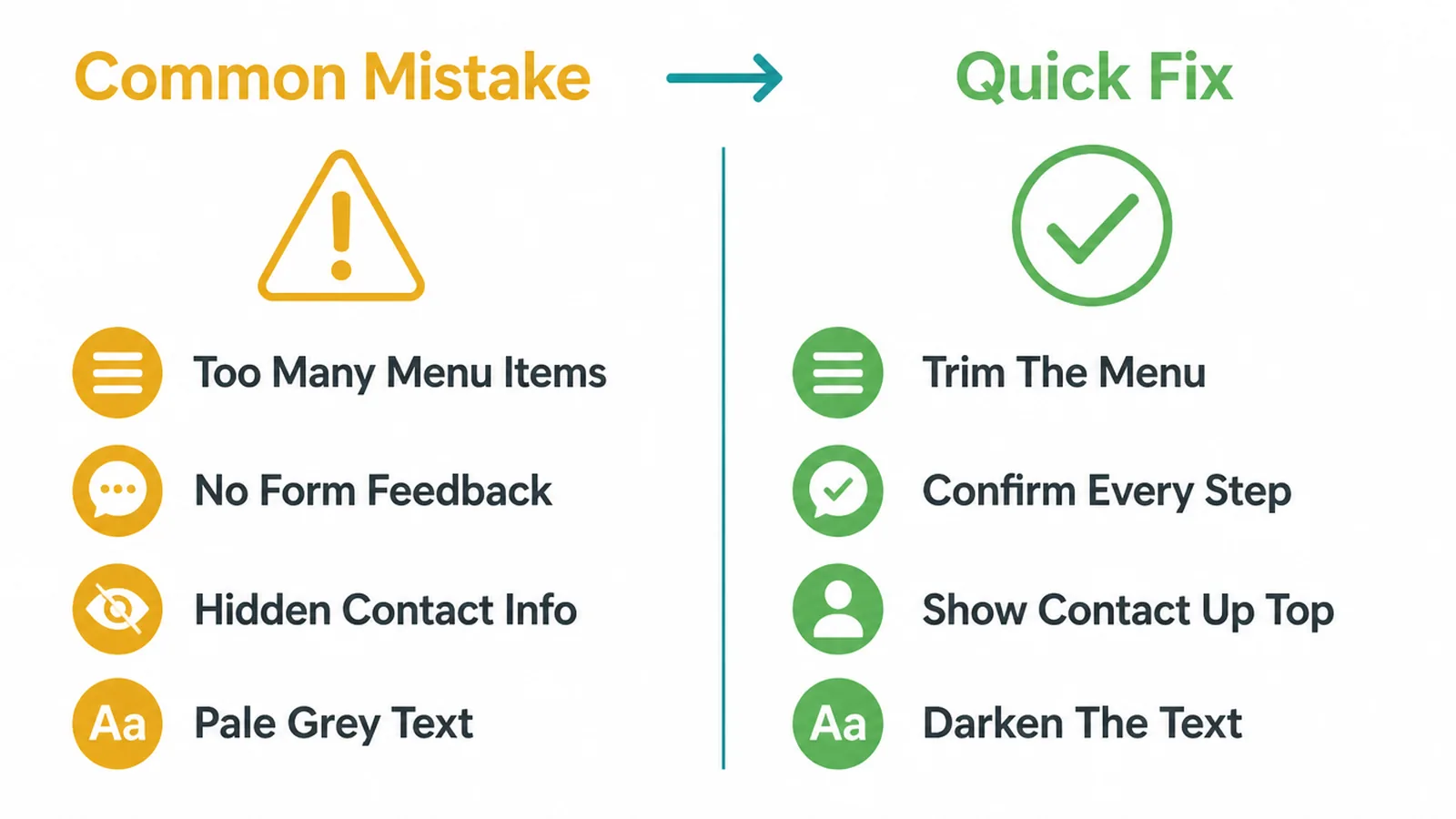
The good news is that these are cheap to fix. You do not need a full rebuild to apply most of the principles above. For a wider list of traps to avoid, read our post on small business website mistakes. And if you are planning or rethinking your whole site, start with the small business website guide for the full picture.
If you would rather have this handled for you, our web design service builds these principles in from the start, and you can always get in touch to talk it through.
Frequently asked questions
1. What are the main UX design principles?
The core UX design principles are tested rules that make a site easy and pleasant to use. The most trusted set is Jakob Nielsen's 10 usability heuristics, plus a few Laws of UX like Jakob's Law, Hick's Law, and Fitts's Law. In plain terms: be clear not clever, work like the sites people already know, show a clear visual hierarchy, always show what is happening, prevent and forgive mistakes, give people fewer choices, use big reachable buttons, and work for everyone.
2. What are Nielsen's 10 usability heuristics?
They are 10 rules of thumb for usable design, first written by Jakob Nielsen in 1994 and kept current by Nielsen Norman Group: visibility of system status, match between the system and the real world, user control and freedom, consistency and standards, error prevention, recognition rather than recall, flexibility and efficiency of use, aesthetic and minimalist design, help users recognize and recover from errors, and help and documentation.
3. What is the difference between UX and UI design principles?
UX principles are about the whole experience: can a person find what they need, understand it, and finish the task without frustration. UI principles are about the look and feel of the screen: spacing, color, type, buttons, and states. UI is part of UX. A site can look beautiful and still have poor UX if people cannot complete what they came to do.
4. What is Jakob's Law?
Jakob's Law says people spend most of their time on other sites, so they prefer your site to work the same way as all the other sites they already know. The practical takeaway is to use familiar patterns. Put the logo top left, the menu across the top, the cart top right, and the search where people expect it. Familiar is faster than clever.
5. What is Hick's Law?
Hick's Law says the more choices you give someone, the longer they take to decide. On a website that means trimming menus, options, and calls to action down to what matters. Fewer, clearer choices help people move forward instead of freezing or leaving.
6. What does recognition over recall mean?
Recognition over recall means you should show people their options instead of making them remember things. It is easier to pick from a visible list than to recall a hidden command. On a site, keep the menu visible, label buttons clearly, and show selected filters and the items in a cart, so nobody has to hold information in their head.
7. How does accessibility relate to UX?
Accessibility is a core part of UX. A site that works for everyone, including people who use screen readers, keyboards, or who need higher contrast, is simply more usable for all. WebAIM's 2025 study found 94.8% of home pages failed automated accessibility checks, and low contrast text appeared on 79.1% of them, so good contrast and clear structure are an easy place to improve.
8. Does speed affect UX?
Yes. Speed is a UX principle too. A slow page tests patience before a visitor reads a single word, and many leave before the page even loads. Keep images light, avoid heavy scripts, and check your loading times so the experience feels instant rather than sluggish.

About the author
Gregory Yeoh is the founder of Seed Light, a web design and digital marketing agency that has helped small businesses get found online since 2017. In his day-to-day work he applies these UX principles on real projects, turning research-backed rules into pages that people actually finish. He believes good UX is mostly common sense done consistently, and he writes these guides to help owners get there faster.