Homepage Design: What to Put Above and Below the Fold

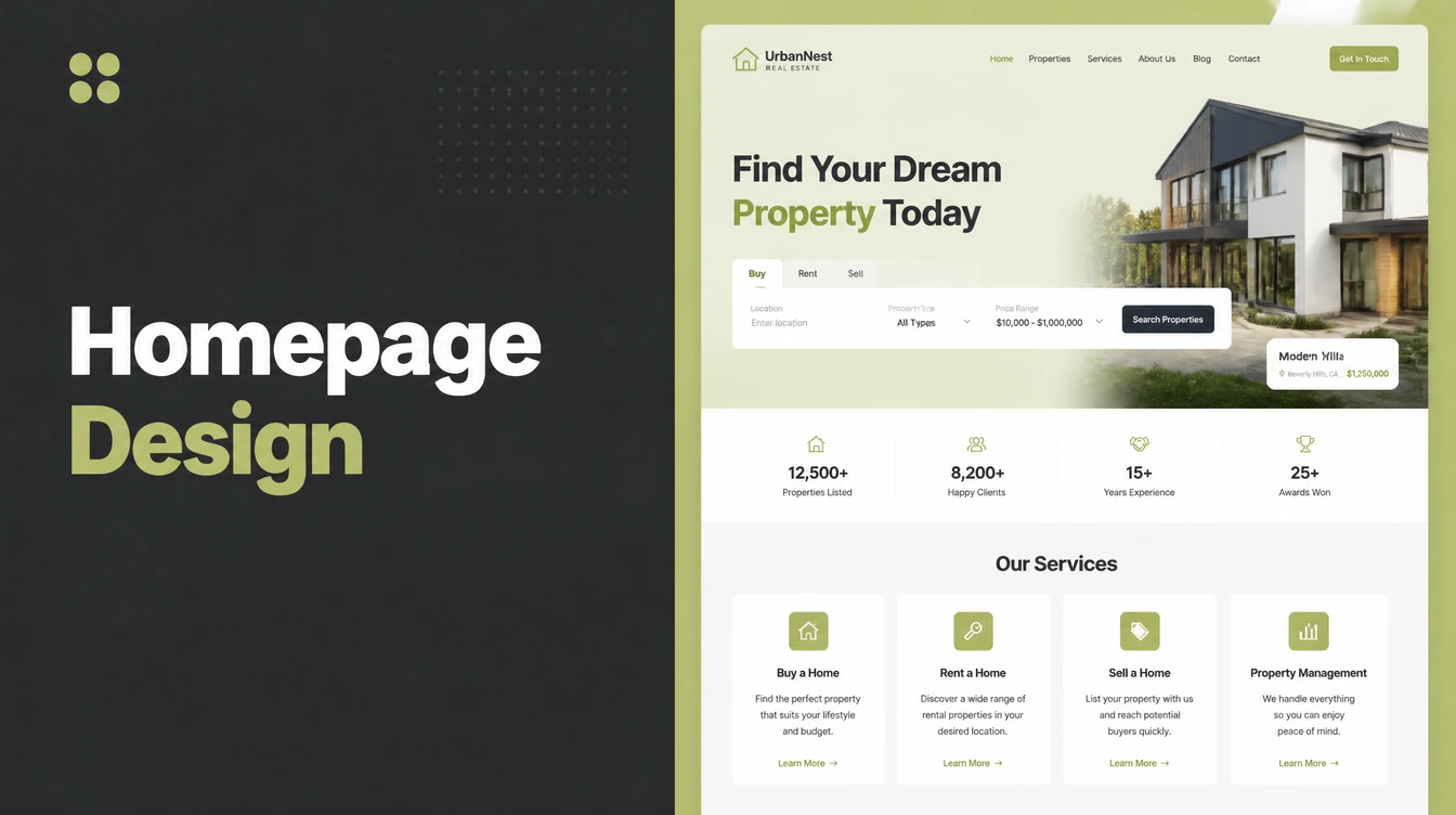
Good homepage design answers three questions fast: who you are, what you do, and what to do next. Above the fold needs a plain headline, a short subhead, one call-to-action button, a supporting visual and a little proof. Below it, show services, proof, how it works and a second call to action. Seed Light builds homepages this way.
Key takeaways
- Aim for quick understanding. A stranger should be able to see who you are, what you do, and what to do next within a few seconds.
- The top still wins attention. Users spent 57 percent of viewing time above the fold (Nielsen Norman Group, 2018), so put your best message first.
- Above the fold needs five parts: a plain headline, a short subhead, one call-to-action button, a supporting visual, and a little proof.
- Below the fold has a job too. Show your services or products, real proof, how it works, a second call to action, and a useful footer.
- Build for phones first. About half of worldwide web traffic is mobile (StatCounter, August 2026), so each section must stack and load fast on a small screen.
1. What homepage design must do in 5 seconds
Good homepage design answers three questions fast: who you are, what you do, and what to do next. A visitor decides in seconds whether to stay or leave, so the top of your page has to make those answers obvious.
If a stranger cannot tell what you sell within about five seconds, the design is not working, no matter how nice it looks.
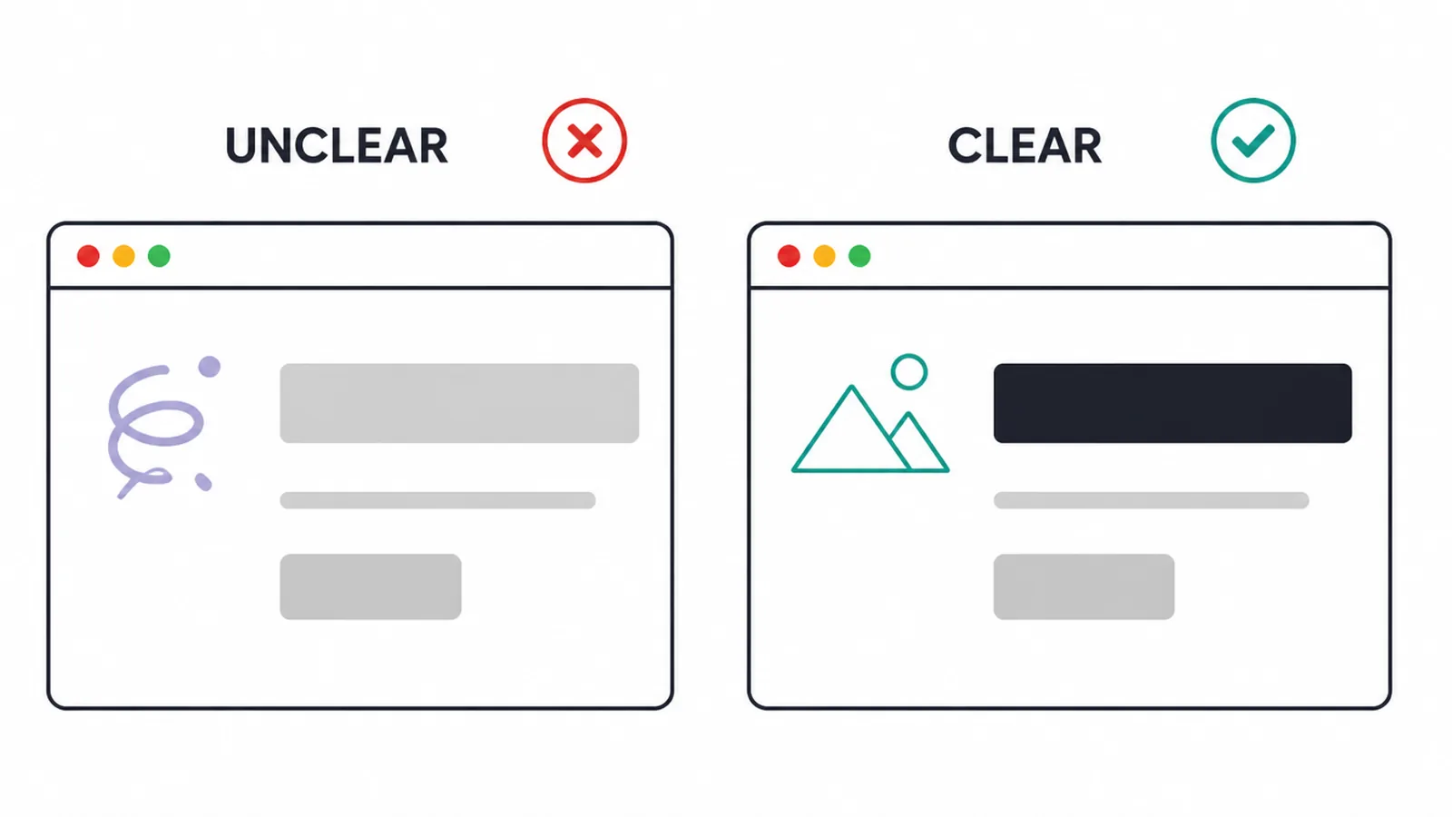
The first screen needs to say what the business does and show the next step. Clear type and structure make that information easier to scan.
That reason is your value proposition, the plain promise of what you do and who you help.
Nielsen Norman Group found you need to communicate that value within about 10 seconds, and that users often leave a page in 10 to 20 seconds unless something clear holds them (Nielsen Norman Group, 2011). A strong, clear message buys you more time. A vague one loses you the visitor.
So homepage design is not decoration. It is a short, clear pitch arranged so the most important thing comes first. This guide walks through it piece by piece.
If you want the wider picture first, start with our pillar guide on building a small business website, then come back here for the homepage. For the latest looks and styles, see our take on modern website design.
2. Above the fold versus below the fold
The fold is simply the line where the screen ends before someone scrolls. Above the fold is what people see right away. Below the fold is everything they reach by scrolling down. The name comes from old newspapers, where the big story sat above the physical fold so it sold copies on the stand.
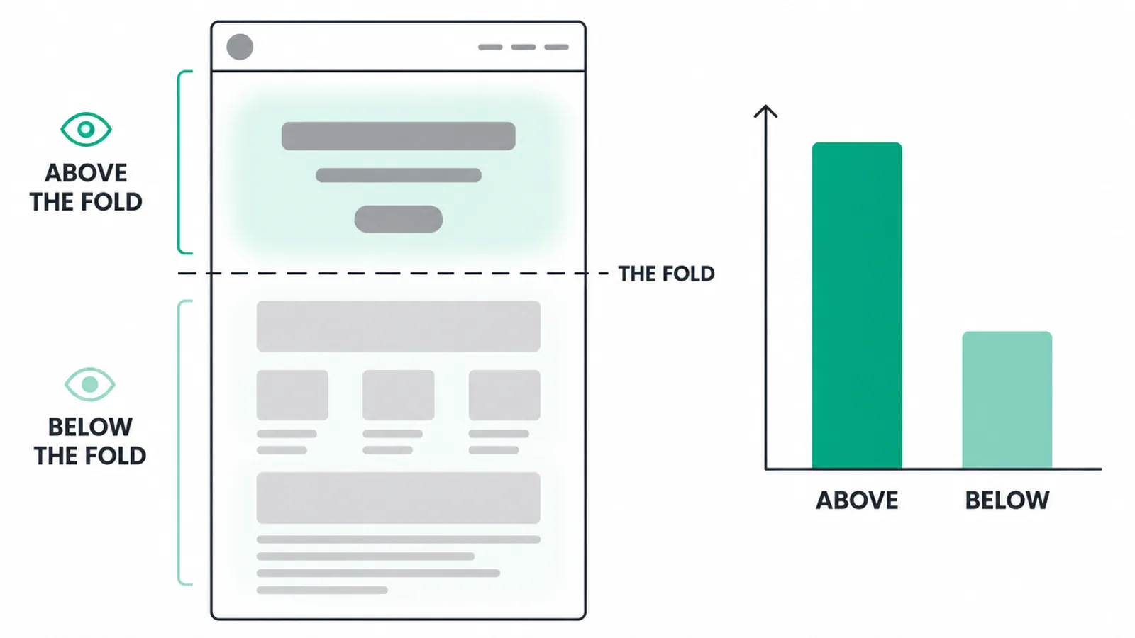
The top still carries the most weight. Nielsen Norman Group found users spent 57 percent of viewing time above the fold in their eye-tracking study, with 74 percent of viewing time spent in the first two screenfuls (Nielsen Norman Group, 2018).
In that same study, 42 percent of viewing time fell in the top fifth of the page and 65 percent in the top two-fifths. So whatever sits near the top gets seen far more than anything lower down.
That does not mean you should cram everything up high. People scroll more than they once did. Back in 2010, about 80 percent of viewing happened above the fold. By 2018 that had dropped to 57 percent (Nielsen Norman Group), which means visitors now expect more below.
The smart move is a clean, focused top that earns the scroll, then a well-ordered set of sections beneath it. Lead with your strongest message, then reward the scroll with proof and detail.
3. What to put above the fold
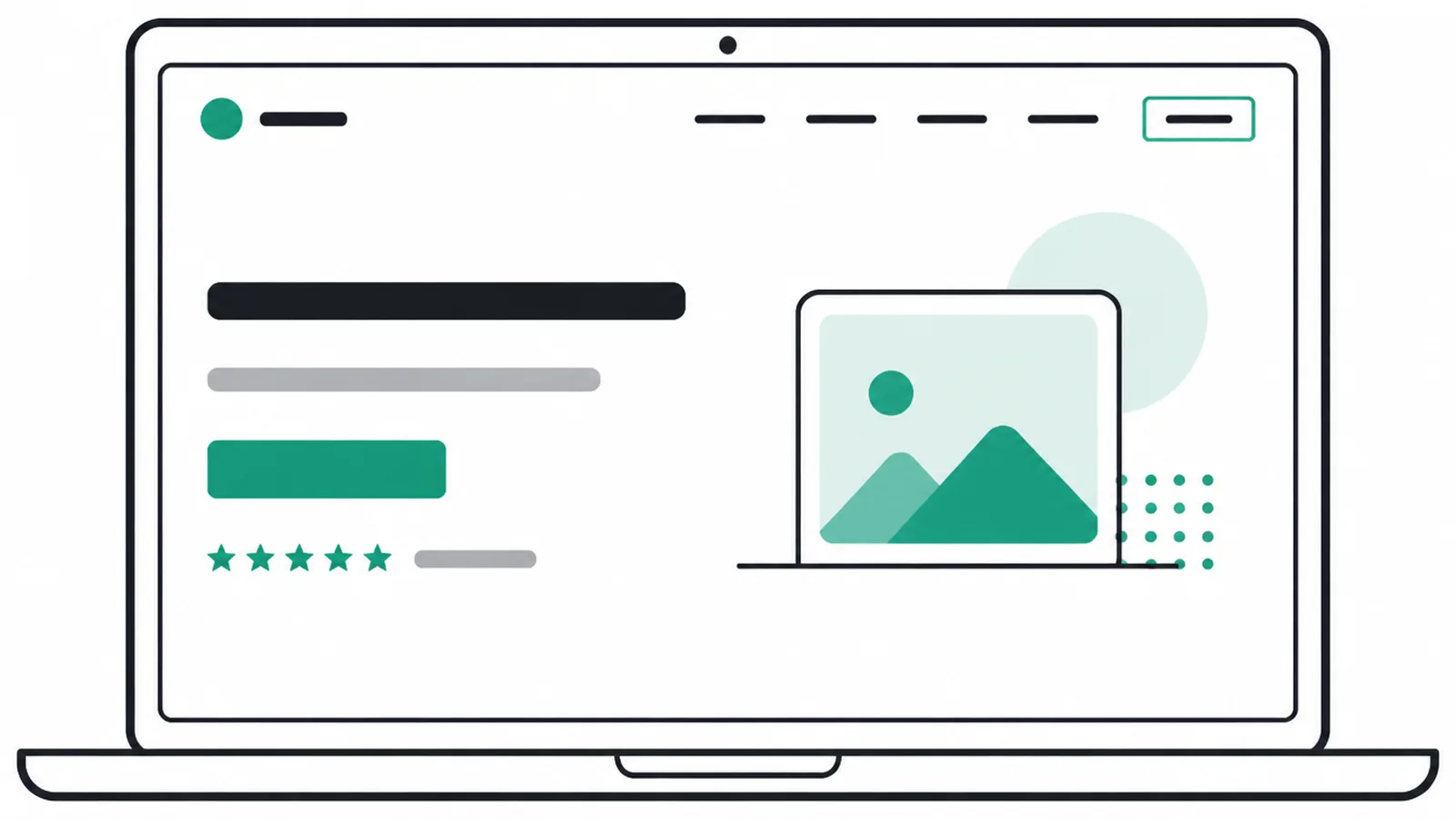
Above the fold is your shop window. Keep it to five parts and give each one room to breathe. Here is the order we use when we build a hero section, piece by piece.
The headline
Your headline is the first thing read, so make it say what you do and who you help. Use plain words, not a clever slogan. "Affordable plumbing for busy homeowners" beats "We turn pipes into peace of mind." If a friend could not repeat your headline back to you, simplify it.
The subhead
One short line under the headline adds a single useful detail. Maybe it is what makes you different, who you serve, or what someone gets. Keep it to a sentence. The headline grabs attention, the subhead earns a few more seconds.
One call-to-action button
Pick the single most important action and put one button there. Book a call, get a quote, shop now, whatever fits your business.
Use clear words on the button, not "submit." One strong button beats three weak links, because a clear next step removes guesswork. For more on this, read our guide to button design that gets clicked.
A supporting visual
Add one image that shows your work, product, or place. Real photos beat generic stock. The visual should support the message, not bury it, so avoid busy backgrounds behind your text. When the picture and the words agree, the page feels trustworthy fast.
A little proof
Add one small trust signal up top. A star rating, a short review line, a logo of a client, or a count of jobs done. Just a touch. The full proof comes later.
A small sign of trust early helps people relax enough to keep reading. If you want a partner to plan this with you, see our web design service.
4. What to put below the fold
Below the fold is where you earn the decision. Each section should have one job and lead toward the same goal. Here is a simple order that works for most small business homepages.
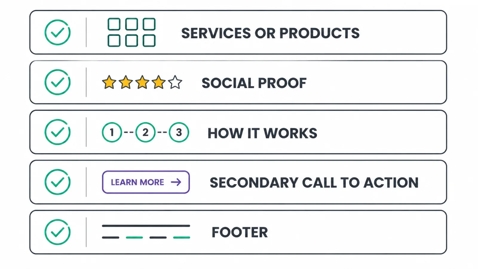
Services or products
Show what you offer in clear blocks, usually three to six. Use a short name, one line, and a link to learn more. Keep it scannable. If you run an online store, the homepage works a bit differently, so read our guide to ecommerce homepage design for categories, featured products, and store-specific trust.
Social proof
This is your trust section. Put real reviews, testimonials, star ratings, or recognizable client logos here. Use real names and real words. Proof works best right after you have shown what you do, because that is when people start to wonder if they can believe you.
How it works
Show your process in three simple steps. People want to know what happens after they click. Three steps feels easy. Five feels like work. If your process is more involved, we break down the full flow in our web design process guide. Keep the homepage version short.
A secondary call to action
By now the visitor has read your pitch and seen proof. Repeat your main action. Use the same goal as the top button so the message stays consistent, the one-action rule that also makes a landing page work.
People who scroll all the way down are interested, so give them an easy way to act without scrolling back up.
The footer
The footer is the safety net. Put your contact details, hours, location, key links, and social profiles here. Many visitors scroll straight to the bottom looking for a way to reach you. Make your contact route easy to find. Our guide to contact page design covers how to make getting in touch simple.
5. Homepage layout at a glance
Here is the whole homepage in one table. Use it as a checklist. Each section has a position, a single job, and the few things it must include.
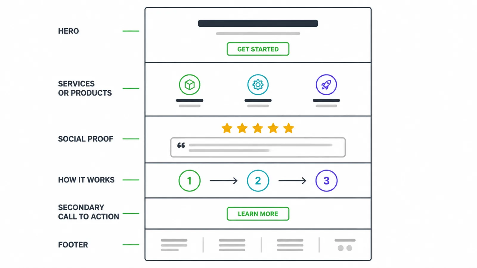
| Position | Section | Job | Must include |
|---|---|---|---|
| Above the fold | Hero | Say who you are and what to do next | Headline, subhead, one button, visual, a little proof |
| Below the fold | Services or products | Show what you offer | 3 to 6 blocks, short names, learn-more links |
| Below the fold | Social proof | Build trust | Reviews, testimonials, ratings, client logos |
| Below the fold | How it works | Remove worry about next steps | 3 simple steps, plain words |
| Below the fold | Secondary call to action | Capture ready visitors | Same goal as the top button |
| Page bottom | Footer | Be the safety net | Contact details, hours, location, key links |
6. Small homepage fixes that make a big difference
Once the structure is right, a few habits keep your homepage design working. None of these are hard. All of them matter.
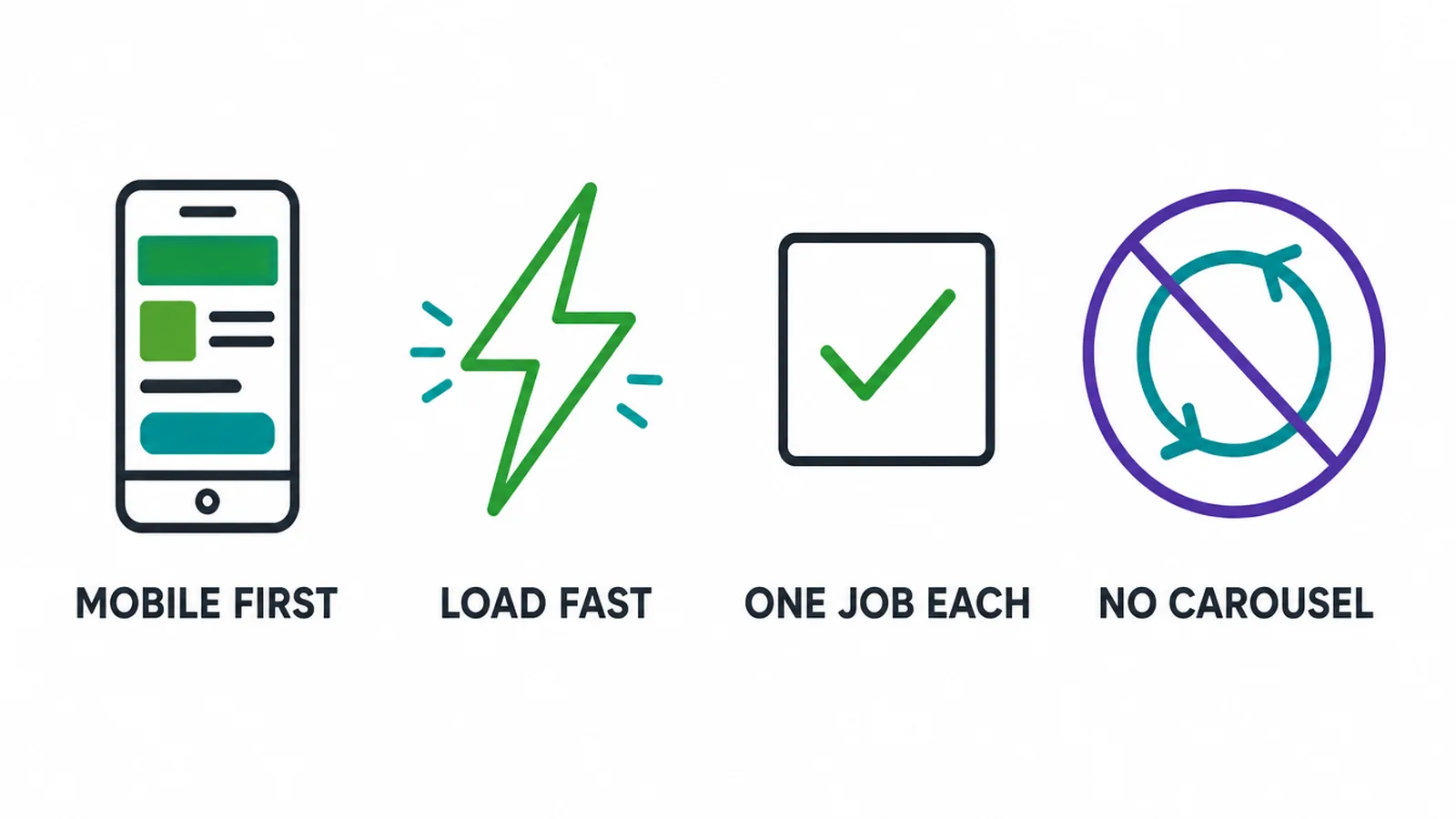
Design for phones first
About half of worldwide web traffic is mobile (StatCounter, August 2026), so your homepage must work well on a small screen. Stack your sections, use big tap targets, and make text readable without zooming. If it works on a phone, it works on a desktop too. Our guide on making a website mobile-friendly covers the details.
Load fast
A slow homepage loses people before they ever read it. Compress your images, keep scripts light, and test your speed. Since the top of the page earns the most attention, it should appear quickly. Learn what to measure in our explainer on Core Web Vitals.
Give each section one job
When a section tries to do three things, it does none of them well. One message, one visual idea, one action per block. Clean sections are easier to scan and easier to build. If you are unsure what to trim, every section should help someone decide.
Skip the carousel
Rotating sliders hide messages behind movement and controls, and they add work for the browser. Replace the carousel with one strong hero. Give additional messages their own sections so visitors can read them in order. This is one of several common small business website mistakes worth avoiding.
Homepage design questions, answered
1. What should a homepage include?
A homepage needs a clear headline that says what you do, a short subhead, one main call-to-action button, a supporting visual, and a little proof. Below the fold it should show your services or products, social proof, a simple how-it-works section, a secondary call to action, and a footer with contact details.
2. What goes above the fold?
Above the fold is the part people see before they scroll. Put your headline, a one-line subhead, one call-to-action button, a supporting image, and a small piece of proof there. The goal is to answer who you are, what you do, and what to do next in about five seconds.
3. Is the fold still a thing?
Yes. People scroll more than they used to, but the top of the page still gets the most attention. Nielsen Norman Group found users spent 57 percent of their viewing time above the fold, so what people see first still matters a lot.
4. How long should a homepage be?
Long enough to tell your story, short enough that every section has a job. A small business homepage usually works well with five to seven sections: hero, services or products, proof, how it works, a second call to action, and a footer. If a section does not help someone decide, cut it.
5. How many calls to action should a homepage have?
Pick one main action and repeat it. Use one clear call-to-action button above the fold, then bring it back lower down as a secondary call to action. Keeping the same goal everywhere makes the next step obvious instead of confusing.
6. What should the hero say?
The hero headline should say what you do and who you help, in plain words. Skip clever taglines. A subhead can add one detail, like where you work or what makes you different. Then add one button so the next step is clear.
7. Where do testimonials go on a homepage?
Put a small piece of proof above the fold, such as a star rating or a short review. Then place a fuller proof section below the fold after you have shown what you offer. This gives visitors evidence near the claim it supports.
8. Should a small business homepage have a carousel?
A sliding carousel is a poor fit for a small business homepage. The format hides content behind controls and movement, while a single strong hero keeps one message visible. Give additional messages their own sections farther down the page, where visitors can read them in order without waiting for slides to rotate.