Ecommerce Homepage Design: 7 Jobs Your Homepage Must Do

An ecommerce homepage has two jobs: send the right shopper to the right product fast, and earn enough trust for them to buy. That means a hero saying what you sell, obvious search, categories and best-sellers, visible trust signals, a mobile-first layout and fast images. Seed Light builds store homepages to those seven jobs.
Key takeaways
- The homepage has one job: send the right shopper to the right product fast, then earn trust. In a 2006 study, Lindgaard and colleagues found that people rated a page's visual appeal after 50 milliseconds of viewing.
- Lead with a clear hero, not a slider. One promise, one image, one button beats an auto-rotating carousel nobody controls.
- Make search and categories impossible to miss, then show a small row of best-sellers. Do not dump every product on the page.
- Put trust near the top. Reviews carry real weight: 98% of shoppers call them an essential resource.
- Give the small screen equal care. About half of worldwide web traffic is mobile, and Baymard puts average cart abandonment above 70%.
1. What an ecommerce homepage must do
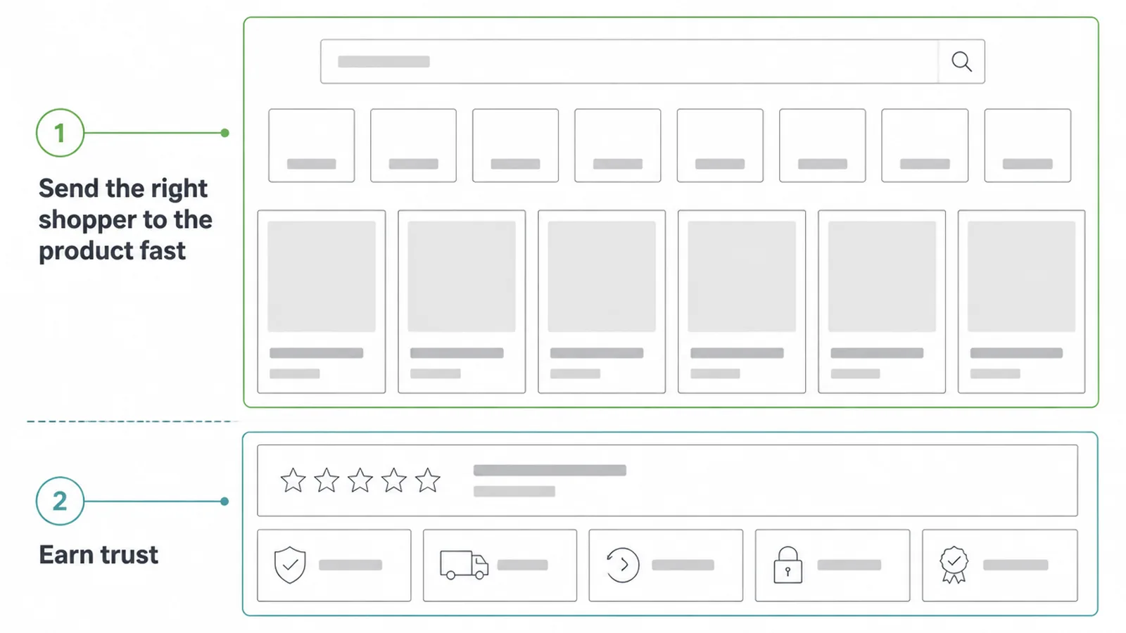
Good ecommerce homepage design does two things: it sends the right shopper to the right product fast, and it earns enough trust for that shopper to buy. That is the whole job.
Everything on the page should help one of those two goals, or it should go. The first screen needs to show what you sell and where to go next.
Here is the hard part. Even on a good store, only a small slice of visits end in a sale. The average ecommerce conversion rate sits near 1.93%. So your homepage is not there to look pretty.
It is there to move people toward a product, and to remove every reason to leave. A store homepage is its own beast. If you want the general small-business version, see our guide to homepage design. This post is about the online-store homepage specifically.
Think of the homepage as a smart receptionist. It greets people, points them in the right direction, and reassures the nervous ones. The next seven sections are the seven jobs that receptionist has to nail.
2. Lead with a hero that says what you sell
The hero is the big top section of your homepage. Most stores get it wrong by stuffing it with a rotating carousel. Auto-sliders move before people finish reading, hide your best message on slide two, and slow the page down. Skip them. Use one still hero with one promise, one image, and one button.
Your hero should answer a simple question in a heartbeat: what do you sell, and why here? A skincare shop might say "Gentle skincare for sensitive skin" over one clear photo, with a button that reads "Shop bestsellers".
That is it. The button text matters more than people think, so keep it specific and active. We cover that in our guide to button design.
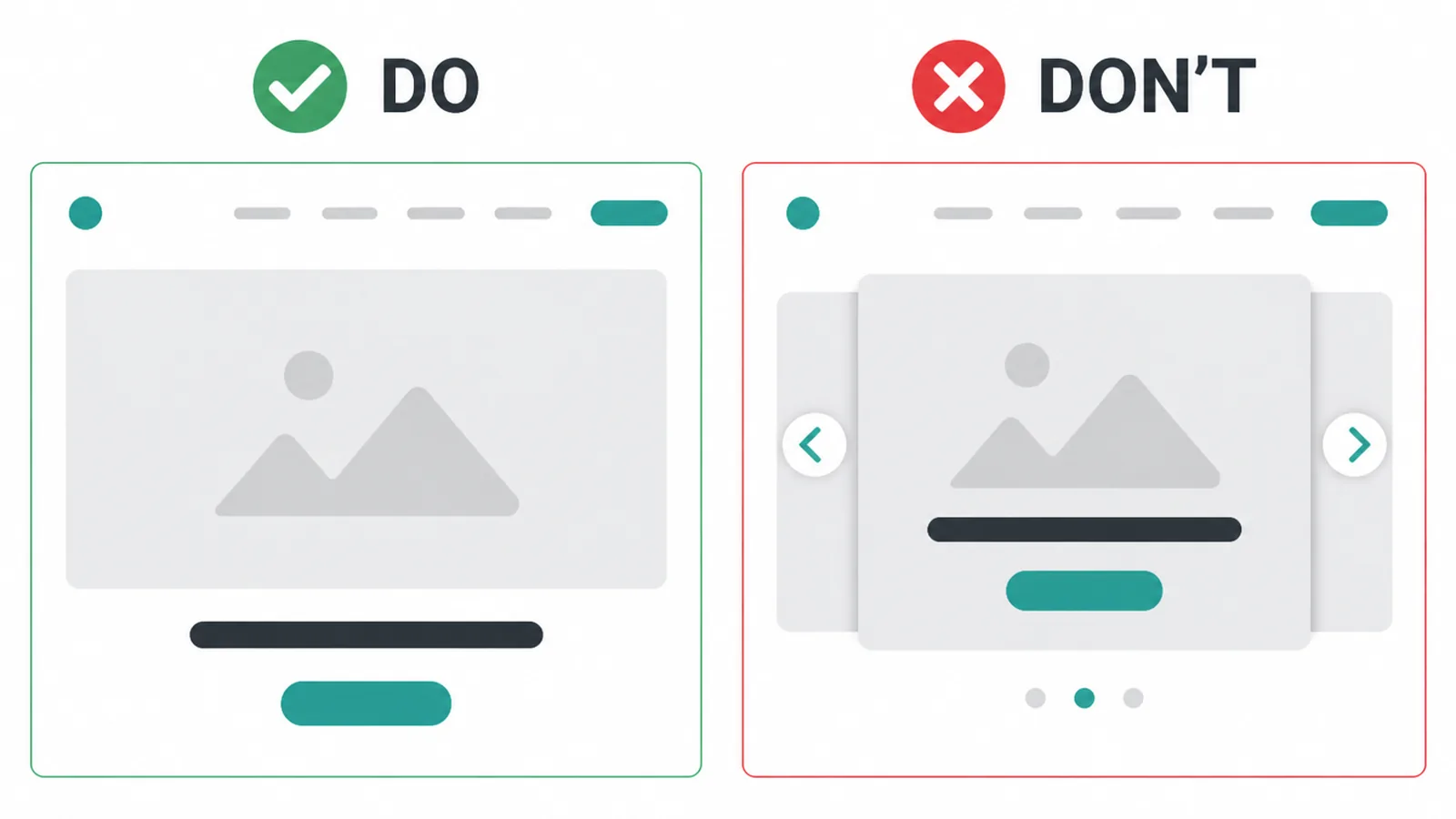
Keep the hero clean and modern so it loads fast and reads at a glance. If you want a wider look at current style, our notes on modern website design go deeper. The rule here is simple: a shopper should know what you sell and have a clear next step before they scroll once.
3. Make search impossible to miss
Shoppers who use search usually know what they want, and they are closer to buying than browsers. So make the search box easy to find. Keep it as an open field near the top, not hidden behind a tiny magnifying-glass icon. The harder search is to spot, the more sales you quietly lose.
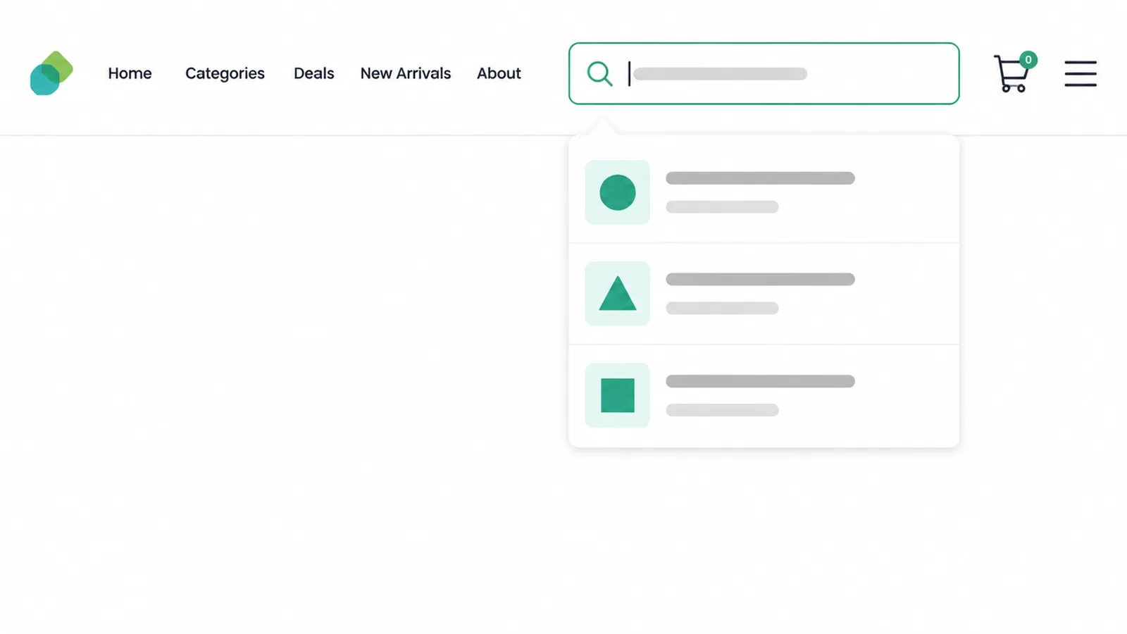
Add autocomplete suggestions so people reach products in fewer taps. As someone types "blue dr", show "blue dress" and a couple of matching products right away.
This is one of the most useful things you can build into a store. It is also good user experience in general, which we break down in what is UX design.
One more thing. On a phone, put search at the very top and keep it sticky as people scroll. A shopper who can search from anywhere on the page is a shopper who stays.
4. Show categories and best-sellers
After the hero and search, give shoppers two clear paths: pick a category, or grab a popular product. Lead with category tiles so people can self-select the area they care about.
Then show a small row of best-sellers or new arrivals to spark a click. Do not dump your entire catalogue on the homepage. That overwhelms people and slows the page to a crawl.
On mobile, category tiles should be swipeable and sit outside the hamburger menu, where everyone can see them. Tucking your whole store behind one menu icon hides your money-makers. A few visible tiles do far more work than a long hidden list.
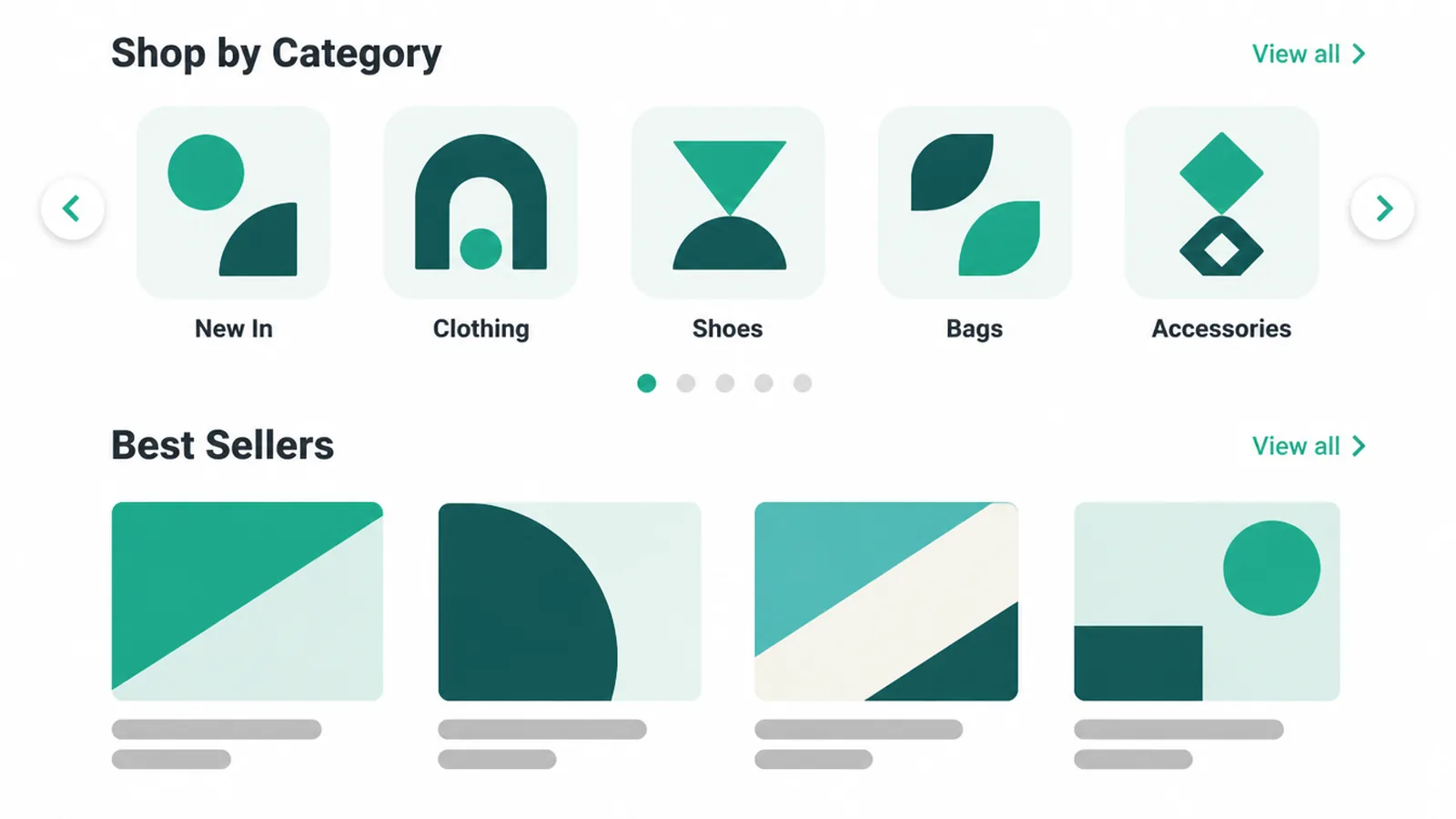
Here is a simple way to plan the whole page. Map each zone to the job it does and what goes there. Keep it tight, because every extra zone is more weight to load.
| Homepage zone | Its job | What to put there |
|---|---|---|
| Top bar | Orient and let people search | Logo, open search box, main nav, cart icon |
| Hero | Say what you sell, give one next step | One promise, one image, one button |
| Category tiles | Help shoppers self-select | 3 to 6 main categories, swipeable on mobile |
| Best-sellers | Give nervous buyers a safe start | A short row of popular or new products |
| Trust strip | Reduce the fear of buying | Star ratings, a quote, payment and returns badges |
| Footer | Answer the small worries | Shipping, returns, contact, policies |
5. Put trust on the homepage
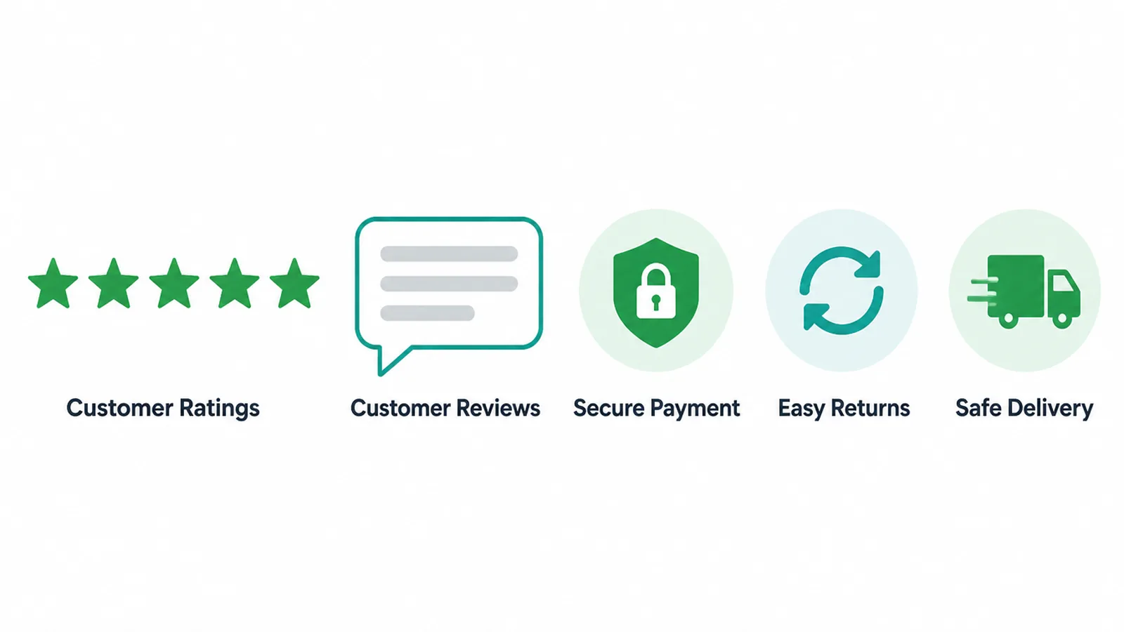
People do not buy from stores they do not trust, and your homepage is where trust starts. Put your strongest signals near the top, where shoppers see them while deciding whether to stay. A star-rating strip, one short customer quote, and clear payment plus returns badges all do real work.
Reviews carry a lot of weight. According to PowerReviews, 98% of shoppers say reviews are an essential resource, and 93% say reviews affect whether they buy. So showing a rating or a snippet on the homepage is not decoration. It is a sale waiting to happen.
Be honest about costs early, too. Unexpected extra costs at checkout are a common reason people walk away. Baymard found that 40% of US shoppers who had abandoned a checkout, excluding those who were just browsing, cited extra costs.
So state your shipping and returns terms on the homepage, not buried at the last step. If a shopper has a question, make it easy to reach you. Our guide to contact page design shows how to do that well.
6. Design mobile-first
Mobile was 49.36% of worldwide web traffic in August 2026, about half. Give the phone layout the same care as the desktop version, then check your own analytics to see how your shoppers split across devices.
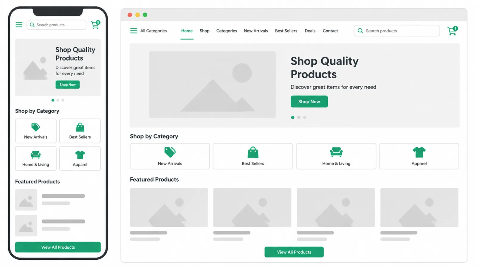
Mobile-first means a few concrete things. Stack content in one column. Make every tap target big enough for a thumb, with space around it. Keep the search box and the cart icon sticky so they follow the shopper down the page. Make category tiles swipeable. And do your testing on a real phone.
None of this is fancy. It is just respect for how people actually shop. For the full checklist, see how to make a website mobile-friendly.
7. Make the storefront fast
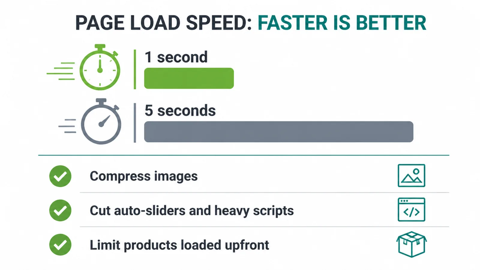
Speed is a feature. A site that loads in one second converts about 2.5 times higher than one that takes five seconds. Every extra second of wait costs you shoppers who never even see your products. So a fast homepage is not a nice-to-have. It is part of the sale.
Slow stores also lose people at the cart. Baymard's review of 50 studies puts average cart abandonment at 70.22%, with billions in recoverable orders sitting in those abandoned carts.
A heavy, sluggish page makes that worse. The fixes are mostly boring and effective: compress your images, cut auto-sliders and heavy scripts, and limit how many products you load up front.
If you want to measure your speed properly, our guide to Core Web Vitals explained shows which numbers matter and how to read them. Get the homepage loading quickly and the rest of the store benefits too.
8. Common ecommerce homepage mistakes
Most store homepages fail in the same few ways. Spotting them is half the fix. Here are the big ones we see again and again.
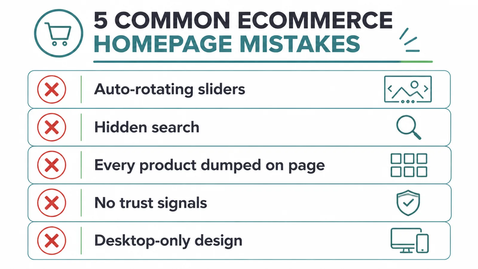
- Auto-rotating sliders. They move before people read, hide your best message, and slow the page. Use one still hero instead.
- Hidden search. A search icon with no visible box buries one of your best tools. Keep search open and, on mobile, sticky.
- Every product dumped on the homepage. It overwhelms shoppers and crushes load time. Lead with categories and a short best-sellers row.
- No trust on the page. No reviews, no badges, no clear shipping or returns. Shoppers leave when they feel unsure.
- Desktop-only thinking. A homepage designed on a big screen and never tested on a phone leaves mobile problems unchecked.
For a wider sweep of what trips up small stores, read our roundup of small business website mistakes. Fixing even two or three of these usually lifts sales further than a full redesign.
9. Bring it together
Strong ecommerce homepage design is not about clever tricks. It is about doing seven plain jobs well. Lead with a clear hero. Make search easy to find.
Show categories and a few best-sellers. Put trust near the top. Design mobile-first. Keep it fast. And cut the common mistakes. Do those, and your homepage starts pulling its weight.
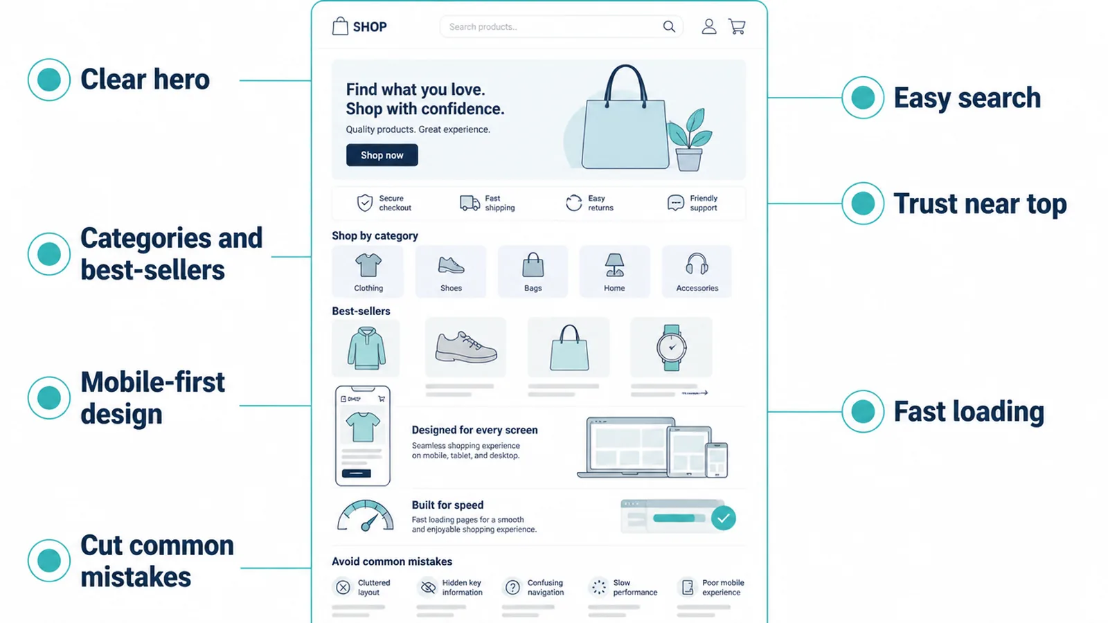
Run this quick checklist on your own store homepage:
- Can a first-time visitor tell what you sell in one glance?
- Is the search box visible, not hidden behind an icon?
- Are your main categories and a few best-sellers easy to reach?
- Do reviews, badges, and shipping terms show near the top?
- Does it feel right on a real phone, and does it load fast?
If your store homepage is missing two or more of those, it is leaving sales on the table. We build store homepages around exactly these jobs through our ecommerce website design service, and we keep the whole site fast and clear, the way we do across all our web design work.
Want a second set of eyes on your store? Get in touch and tell us where shoppers drop off. For the bigger picture of building a site that earns customers, start with our pillar guide to small business websites.
10. How the Ottoman Malaysia and Thamlev front pages are built
This is how we build store front pages. Ottoman Malaysia lets customers search by vehicle make and model, so a visitor can reach the correct custom-fit car mats quickly.
The Thamlev home page opens on the ride itself, with delivery, opening hours and contact details visible for a first-time buyer.
Frequently asked questions
1. What is an ecommerce homepage and what should it include?
An ecommerce homepage is the front door of your online store. It should include a clear hero that says what you sell, a visible search box, category links, a few best-sellers, trust signals like reviews and payment badges, and fast-loading images. Its main job is to send the right shopper to the right product fast and earn enough trust for them to buy.
2. What goes above the fold on a store homepage?
Above the fold you want your logo, a visible search box, your main navigation, and a hero that states what you sell with one clear button. On mobile, keep the search box and the cart icon sticky so they stay in reach. Keep this first screen clean and obvious.
3. Should I show products or categories on the homepage?
Show both, in order. Lead with category tiles so shoppers can pick the area they care about, then show a small row of best-sellers or new arrivals to spark a click. Do not dump every product on the homepage. Categories help people self-select, and best-sellers give nervous buyers a safe place to start.
4. Do I need a search bar on my ecommerce homepage?
Yes. Shoppers who search usually know what they want and are closer to buying. Keep the search box visible as an open field, not hidden behind an icon, and add autocomplete suggestions so people reach products in fewer taps. On mobile, a sticky search bar at the top is one of the highest-value things on the page.
5. How important is mobile for an online store homepage?
Very important. About half of worldwide web traffic is mobile, so the small-screen experience matters. Use tap targets big enough for a thumb, stack content in one column, keep search and cart sticky, and make sure tiles are swipeable. Check your own analytics to see how your shoppers split across devices.
6. How fast should an ecommerce homepage load?
As fast as you can get it. A site that loads in one second converts about 2.5 times higher than one that takes five seconds. Slow pages also push up cart abandonment, which averages over 70%. Compress your images, limit heavy sliders and scripts, and test your homepage on a normal phone connection.
7. Where should reviews and trust signals go on the homepage?
Put your strongest trust signals near the top, where shoppers see them while deciding to stay. A star-rating strip, a short customer quote, and payment plus returns badges all work. Reviews matter a lot: 98% of shoppers call them an essential resource and 93% say reviews affect whether they buy.
8. Do I need a hero slider or carousel?
No. Auto-rotating sliders split attention across several messages and add page weight. Use one still hero with one promise, one image and one button so the first screen has a clear job.