Dark Mode Website: Worth It for Your Business?
Should your dark mode website be a full toggle or just respect the system setting? An honest, evidence-led guide to the real pros, cons, and who should skip it.
Key takeaways
- Most small sites do not need a custom dark mode. The smart move is to respect the visitor's system setting, not build a fragile toggle.
- "Better for your eyes" is a myth. For normal vision, light mode usually reads faster with fewer mistakes. Dark mode is a comfort preference.
- The battery saving is tiny indoors. Purdue found OLED dark mode saves only 3 to 9 percent at normal brightness.
- A half-built toggle is worse than none. If a dark theme fails contrast, it hurts readers more than it helps.
- Who should build a toggle: developer, SaaS, and creative brands. Local service, restaurant, and clinic sites can skip it.
Should your website have dark mode?
Short answer: most small business sites do not need a custom dark mode website at all. The one thing you should do is make your site respect the visitor's system setting, so a phone set to dark looks comfortable and a phone set to light looks normal. A full dark mode toggle is only worth the extra work for specific audiences, like developer tools, software apps, and creative portfolios.
Dark mode looks cool, so it gets hyped a lot. But the honest answer is calmer than the hype. The research does not say dark mode is better. It says it is a preference, and only about a third of people prefer it. Below we walk through what dark mode really is, the real pros and cons, who should bother, and how to do it without breaking your site.
What is dark mode, really?
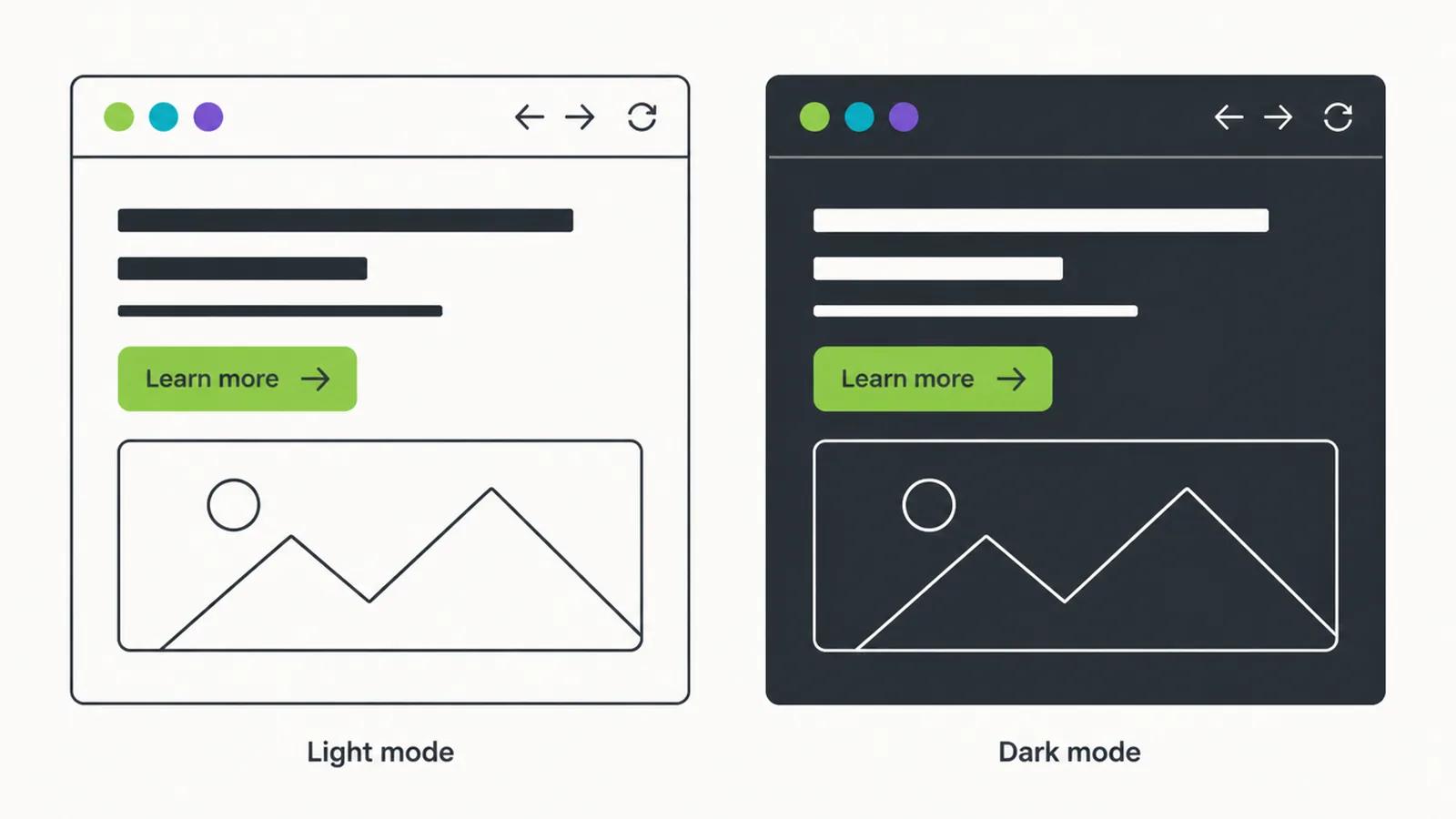
Dark mode is light text on a dark background, instead of the usual dark text on a light background. The same website can show both. Which one a person sees depends on their device setting, or a switch on your site if you build one.
People do not all agree on what they like. In a Nielsen Norman Group poll of mobile users, roughly a third used dark mode, a third used light, and a third used a mix. So the popular claim that almost everyone uses dark mode is just not true. There is no single winner.
That leaves you with two very different jobs:
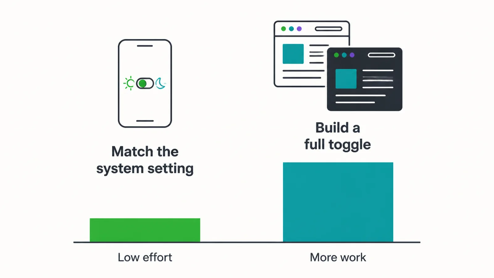
- Respect the setting. Your site quietly matches whatever the visitor's device is already set to. Low effort, big payoff.
- Build a toggle. Your site offers its own dark and light switch, and remembers the choice. More design work, more testing, more to break.
For most small businesses, the first job is enough. The second is a real project.
The real pros of a dark mode website
Dark mode does have genuine upsides. They are just smaller than the hype suggests.
It feels comfortable in low light
Reading a bright white screen in a dark room can feel harsh. A dark page is gentler at night. This is a comfort thing, and it is real, even if it is not an eye-health claim.
It can look modern and premium
For tech, software, and creative brands, a sharp dark theme signals "we know design". The right audience expects it, and a polished dark look can lift how premium your brand feels.
It helps some low-vision users
Dark mode can help certain low-vision users, such as people with cataracts. Giving people the choice is part of good website accessibility, so this matters more than it gets credit for.
A small battery saving, sometimes
On OLED phone screens, dark pixels use less power. But the saving is modest. Purdue University research found dark mode saves only about 3 to 9 percent of power at typical indoor brightness, and 39 to 47 percent only at full brightness. Few people browse at full brightness indoors, so most of the time the saving is too small to feel.
The real cons people skip
Here is the honest side the hype pieces leave out.
Light mode often reads better
For people with normal vision, light mode leads to better reading performance most of the time. People read faster and make fewer mistakes on light backgrounds. So "dark mode is better for your eyes" is not a proven fact. It is a comfort preference, not an upgrade.
It can hurt some readers
People with astigmatism can see a halo or smear effect on white text over a black background. So a dark theme that helps one person can make reading harder for another. That is exactly why forcing a single mode on everyone is a bad idea.
It doubles the work
A real toggle means designing, building, and testing two versions of every page. Every colour, button, image, and chart has to look right in both. That is double the design and double the testing. If you want a robust toggle, plan for the extra development work up front.
A broken dark theme is worse than none
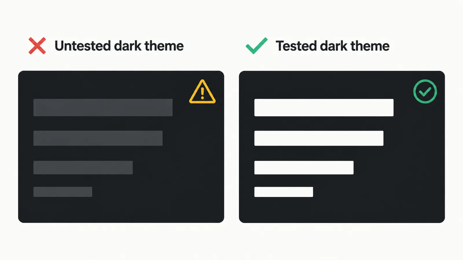
The biggest trap is a half-built toggle. If your dark theme drops text contrast below the readable line, it actively hurts visitors. A dark mode that nobody tested is worse than no dark mode at all.
Who should add a toggle, and who should skip it
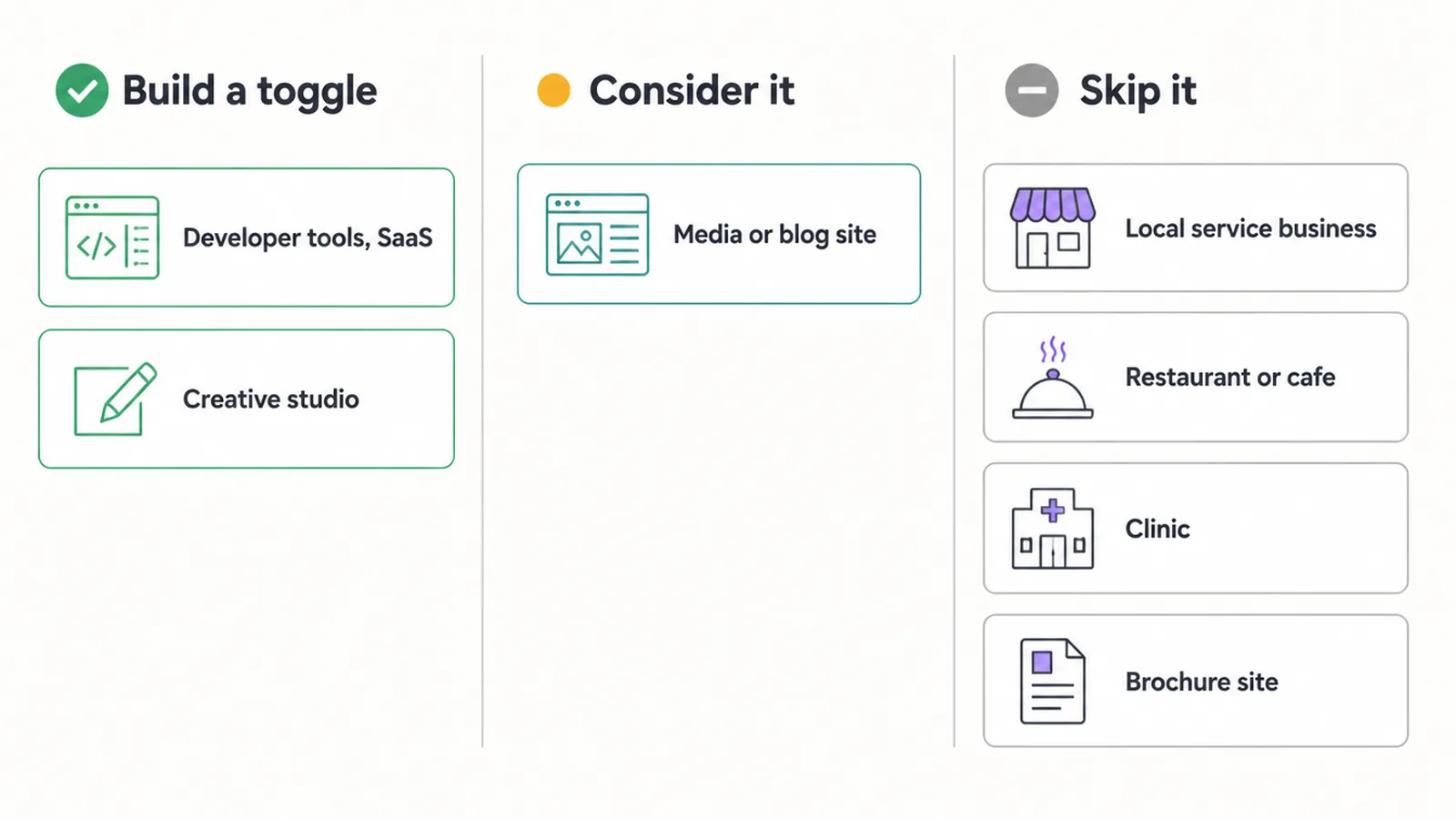
The right answer depends on who visits your site. Use this table as a quick guide.
| Type of business | Build a full toggle? | Why |
|---|---|---|
| Developer tools, SaaS, software app | Yes | Audience expects it and uses it daily |
| Creative studio, design portfolio | Yes | Shows craft, matches audience taste |
| Media site, long-read blog | Consider it | Helps night readers stay longer |
| Local service business | Skip it, respect the setting | Visitors want info fast, not a theme switch |
| Restaurant or cafe | Skip it, respect the setting | Photos and menus carry the work |
| Clinic or professional service | Skip it, respect the setting | Trust and clarity matter more than style |
| Simple brochure site | Skip it, respect the setting | A toggle adds cost with little return |
If you are still planning the whole project, our guide to building a small business website covers the bigger priorities first. And if you are hiring help, knowing how to choose a web design company that asks about your real audience matters more than any single feature.
Accessibility and contrast come first
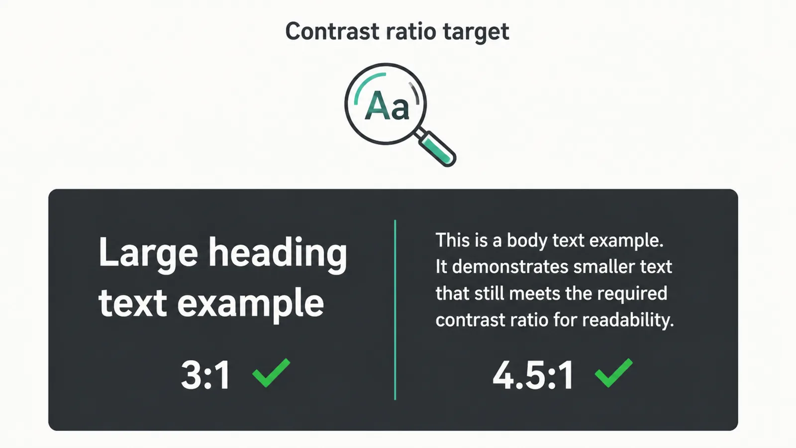
Whatever you choose, contrast is the rule you cannot break. The W3C accessibility guidelines say each theme must hit a contrast ratio of at least 4.5 to 1 for normal text and 3 to 1 for large text. That applies to your dark theme just as much as your light one.
Two practical tips:
- Do not use pure black. A very dark grey, around #121212, paired with off-white text is easier to read than harsh white on pure black.
- Do not force a mode. Let people keep the experience their device is set to. Choice is the accessible option.
For the full picture on readable colour, focus order, and more, see our website accessibility guide.
How to add dark mode the right way
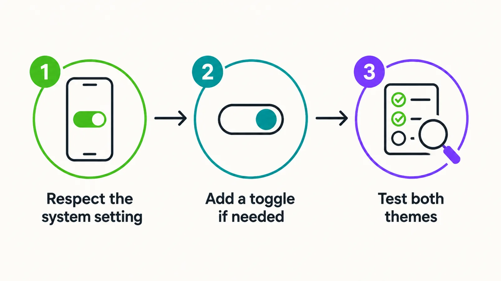
If you decide a dark mode website fits your audience, do it in three steps.
Step 1: Respect the system setting
Modern browsers can detect whether a device is set to light or dark using the prefers-color-scheme setting, which around 94 percent of browsers support. Match it, and your site is instantly comfortable for dark-set visitors with no toggle needed. For most small businesses, this single step is the whole job.
Step 2: Add a toggle only if your audience needs it
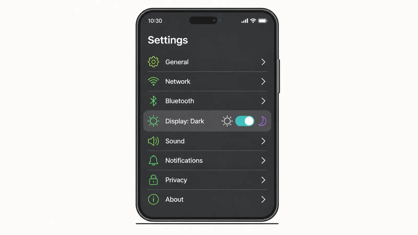
If your visitors expect a switch, add one that remembers their choice between visits. Put it somewhere obvious, like the header. Skip this step entirely if a toggle does not fit your audience.
Step 3: Test both themes fully
Check every page in both modes. Look at text, buttons, forms, images, and charts. Done well, a theme switch should not slow your site down, so keep an eye on your Core Web Vitals after you ship it.
If this sounds like more than you want to manage, that is normal. A good web design team can build a tested, accessible dark theme so you do not ship a broken one.
Does it help SEO or sales?
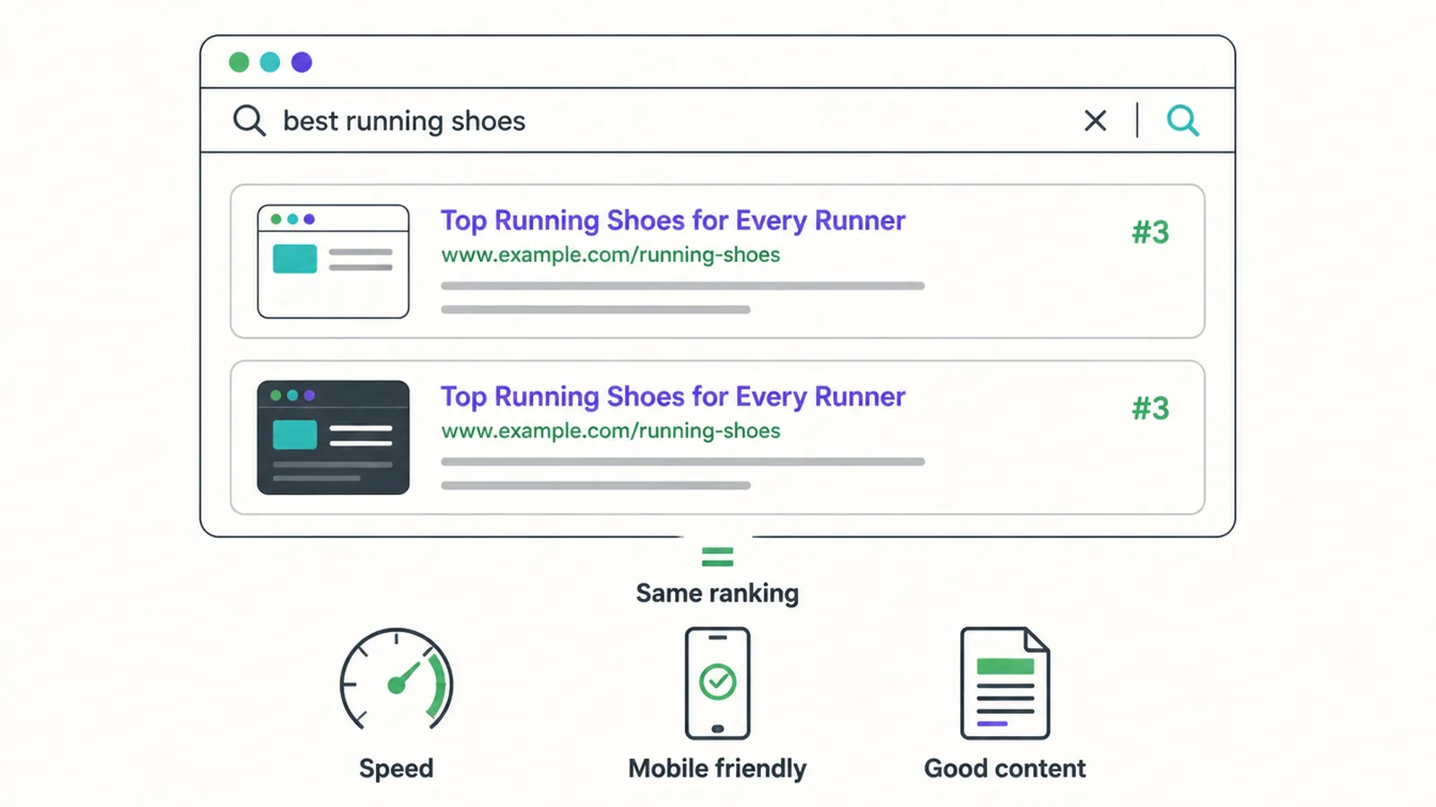
No, not directly. Google does not rank a page higher just for being dark. What helps SEO is the usual list: speed, mobile friendliness, readable text, and content that answers real questions. A dark theme only helps in a roundabout way, if it keeps the right visitors happy and on the page longer.
Sales claims are shakier still. The conversion-lift numbers floating around online are mostly not backed by reliable studies, so do not build a dark mode website expecting more leads from it. The one fair claim is brand perception: for a tech or creative brand, a clean dark look can raise how premium you feel. That is worth something, but it is taste, not a guaranteed result.
The honest verdict
Here is the plain truth. Dark mode is a comfort preference, not an eye-health upgrade and not a sales trick. For people with normal vision, light mode usually reads better. The battery saving is tiny indoors. About a third of people prefer dark, a third prefer light, and a third mix it up. The Nielsen Norman Group calls dark mode a nice-to-have, not a need-to-have in most cases, and we agree.
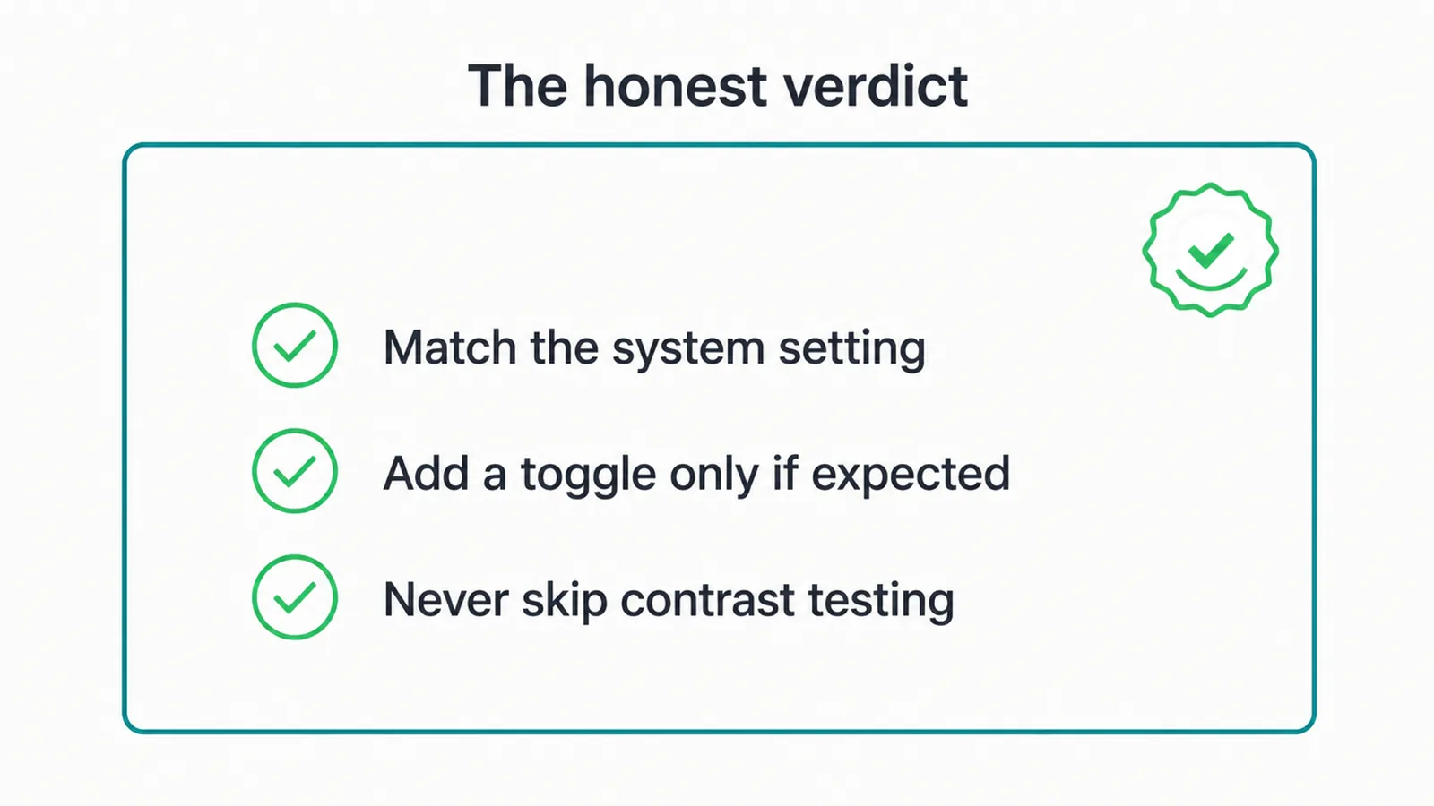
So our advice is simple. Respect the visitor's system setting for everyone, because that is cheap and kind. Build a real toggle only if your audience clearly expects one. And never ship a dark theme that fails contrast, because a broken dark mode is worse than none. Want a second opinion on whether it fits your brand? Get in touch and we will tell you straight.
Frequently asked questions
Is dark mode better for your eyes?
Not as a fact. The evidence is mixed. For people with normal vision, light mode tends to read faster with fewer mistakes (Nielsen Norman Group). Dark mode can feel more comfortable in a dim room and may help some low-vision users, like people with cataracts. People with astigmatism can see a halo effect on white text over black. Treat dark mode as a comfort preference, not an eye-health upgrade.
Does dark mode save battery?
Only a little, and only on OLED screens at high brightness. Purdue University research found dark mode saves about 3 to 9 percent of power at typical indoor brightness (30 to 50 percent), rising to 39 to 47 percent only at full brightness. Most people do not browse at full brightness indoors, so the saving is usually too small to notice.
Should my small business website have dark mode?
Most small business sites do not need a custom dark mode. The best simple step is to respect the visitor's system setting so the page is comfortable on dark-set devices. A full toggle is worth building only for audiences who expect it, like developer, SaaS, or creative brands.
Is a dark mode website good for SEO?
There is no direct SEO benefit. Google does not rank a page higher for being dark. What helps SEO is the usual stuff: speed, mobile friendliness, readable contrast, and good content. A dark theme only helps indirectly if it makes visitors stay longer, and only when the contrast is done right.
What is the difference between light mode and dark mode?
Light mode is dark text on a light background. Dark mode is light text on a dark background. The same site can offer both. Which one a visitor sees can be set by their device, or by a toggle on your site if you build one.
Does dark mode increase conversions?
There is no solid proof that dark mode lifts conversions. Conversion claims you see online are usually not backed by reliable studies. For the right brand, a polished dark theme can raise perceived quality, but it is not a reliable way to win more leads.
What colour should a dark background be?
Use a very dark grey, around #121212, rather than pure black. Pure black with bright white text creates a harsh glare and a halo effect for some readers. A soft dark grey is easier on the eyes and still hits the contrast targets when paired with off-white text.
Should dark mode be the default on my site?
Usually no. The safest default is to follow the visitor's system setting, so a light-set device gets light and a dark-set device gets dark. Force a dark default only if your audience clearly expects it. Forcing any mode on people who did not ask for it tends to annoy more visitors than it pleases.
About the author
This guide was written by the Seed Light team. We are a web design and digital marketing agency that has built and maintained small business websites since 2017. In our work we see plenty of dark mode requests, so we wrote this to give owners the honest version: what helps, what does not, and when to skip the trend.
Put it into practice
Need help putting this to work?
We design, build and market websites that turn attention into revenue. Tell us what you are working on and we will point you the right way.
Keep reading