Information Architecture: How to Organize Your Pages

Information architecture is deciding what content a site holds and how it is grouped, named and related. It is the decision the navigation menu later displays. Seed Light settles the page structure with a card sort before any design work starts, because renaming a section later is cheap and rebuilding one is not.
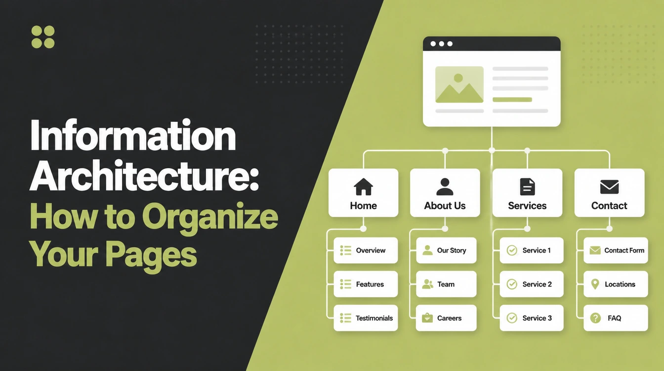
You're staring at a list of pages in a spreadsheet, and you can't tell whether Services should be one page or six. Add About, a blog, three locations and a contact form, and the list stops looking like a website.
This guide covers what information architecture is, why it decides whether anyone finds your services, and a six step way to build a structure using customers instead of opinion. It also kills two rules that don't survive their sources.
By the end you'll have a page list grouped into sections, names taken from customers' words, and a way to check the structure works before anyone opens a design tool.
Key Takeaways
- Structure comes before navigation. NN/g puts it plainly: the information architecture is not part of the on-screen interface, it informs the interface.
- Card sorting has real numbers. NN/g recommends 30 to 50 cards, at least 15 participants for a qualitative sort and 30 to 50 for a quantitative one.
- The seven item menu rule is a myth. Menus rely on recognition rather than recall, so more than seven is fine when grouped meaningfully.
- The middle beats both extremes. A medium mix of depth and breadth outperformed the broadest shallow structure in Larson and Czerwinski's study.
- Google needs a link to find a page. Every page you care about should have a link from at least one other page.
What Is Information Architecture?
Information architecture is the decision about what content your site holds and how it's grouped, labelled and related. It's the plan underneath the website, not the website.
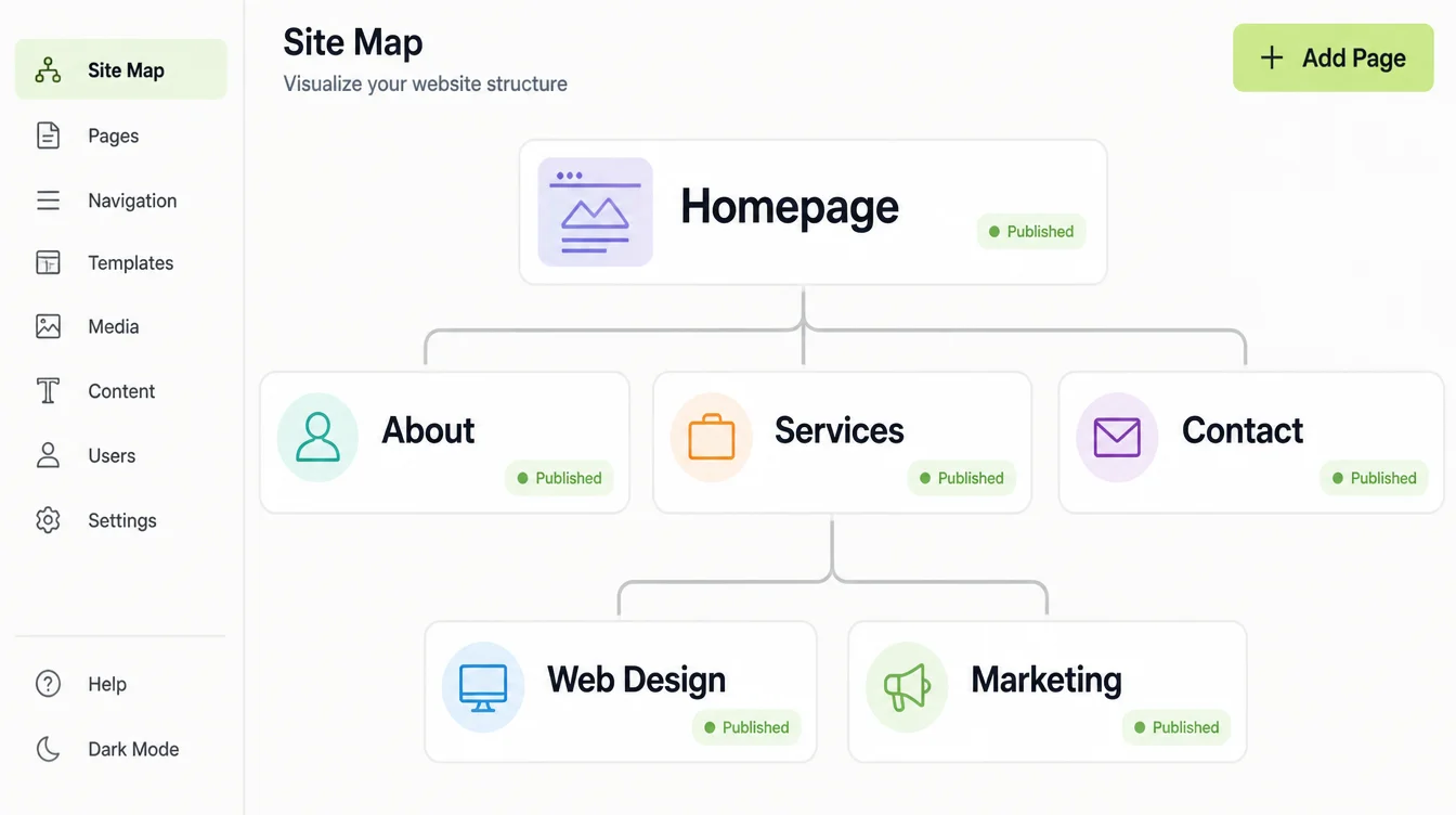
NN/g splits it into two parts: the identification and definition of site content and functionality, and the underlying organisation, structure and nomenclature defining how those things relate.
That second half is the one people skip. Deciding whether "Web design" and "Website maintenance" are siblings, or one sits inside the other, is the actual work.
The same article makes the distinction that saves the most rework: the architecture informs the interface rather than being part of it. Navigation is what the structure looks like on screen.
Here's the failure it prevents. A site gets designed menu first, a page gets added later, and there's nowhere sensible to put it.
Get the grouping right and the menu almost writes itself, which is where website navigation best practices picks up.
Why It Decides Whether Anyone Finds Your Services
Two audiences read your structure: people, and crawlers. Both fail when the grouping is wrong, and the second failure is quieter.
Google is direct about it. Its starter guide says to organise your content in a logical way because it can help search engines and users understand how your pages relate to the rest of your site.
It adds that grouping similar topics into directories helps Google learn how often those URLs change, so folder names carry a signal too.
Then there's discovery. Google says every page you care about should have a link from at least one other page on your site, and that it can generally only crawl a link when it's an <a> element with an href attribute.
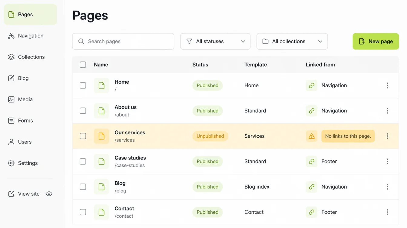
A page with no parent section usually ends up with no links either. That's how a service page you paid for sits unfound.
This post decides what the structure should be, with customers. Making it crawlable and linked is site architecture for SEO.
How to Build Your Page Structure
Six steps, in order. The first two take an afternoon, the middle two need other people, and the last two are checks.
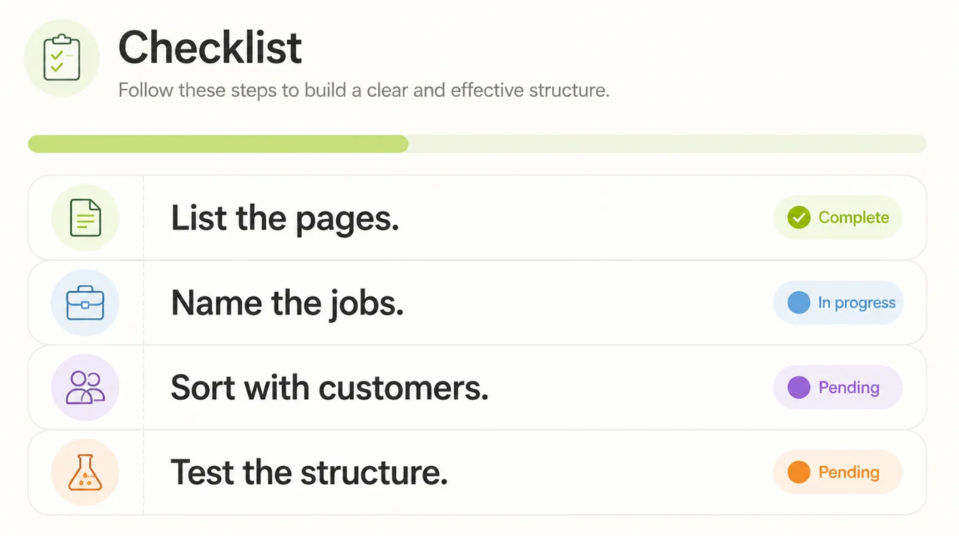
1. List every page you already have
Export your sitemap.xml, or crawl the site, and put every URL in a spreadsheet with its title. Include the pages you forgot about, because those distort the picture.
Mark each row keep, merge or retire before grouping anything. Structuring pages you're about to delete wastes the exercise.
2. Write down the jobs people come to do
Beside the page list, write a second list: what a visitor arrives wanting to do. Compare a price. Check you cover their town. See work like theirs.
Pull them from enquiry emails, phone questions, and your queries in Search Console. A job with no page behind it is a gap, and a page serving no job is a candidate for merging.
3. Sort the pages with real customers
Card sorting is a research method where participants place individually labelled cards into groups that make sense to them. One card per page, and they build the groups, not you.
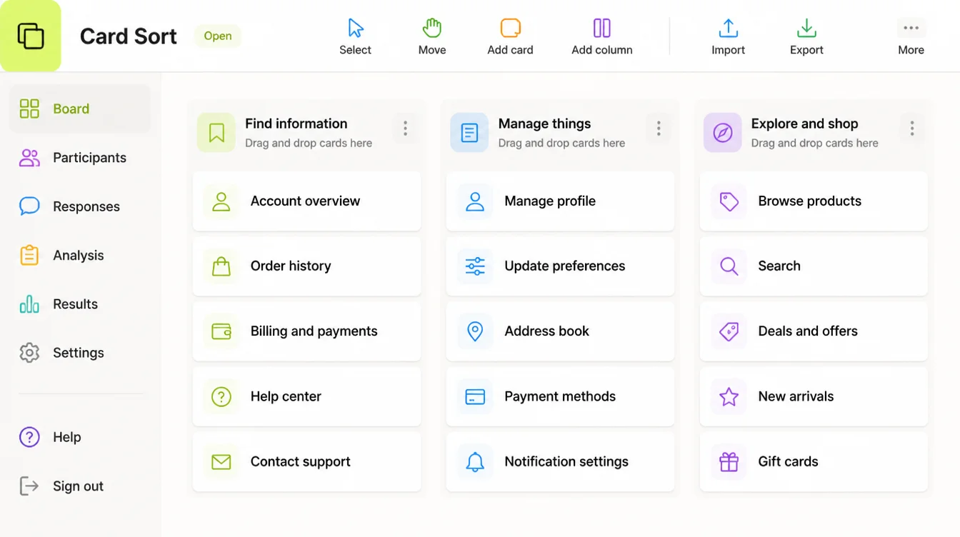
NN/g recommends 30 to 50 cards, at least 15 participants for a qualitative study, and 30 to 50 for a quantitative one so results generalise.
An open sort lets people name their own groups, which is what you want first. A closed sort gives them your categories, for checking labels you've already chosen.
Fifteen people is achievable for a one-person business. Customers, past enquirers, suppliers, the unit next door.
4. Name the groups in your customers' words
Use the group names your participants wrote. If nine people wrote "Prices" and you wanted "Investment", the label is Prices.
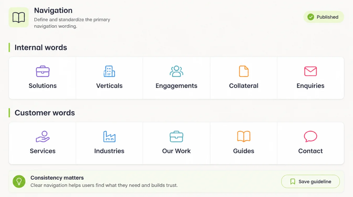
Watch for internal words that mean nothing outside your office: service lines, verticals, solutions, capabilities. Labels get more attention in website menu design.
5. Test the structure before anyone designs it
Tree testing is an evaluation of a hierarchical category structure where people find where a task would live. It reports success rate, time and directness, and runs on a text-only tree with no design.
NN/g splits them cleanly: card sorting works best as a discovery method, while tree testing evaluates an existing or proposed structure. One generates, one checks.
Nielsen's guidance is that the best results come from testing no more than five users and running as many small tests as you can afford.
The same article says you need additional users when a site has several highly distinct groups of users. Sell to homeowners and to contractors, and five is not your number.
6. Link the pages so they can be found
A structure only exists if the links do. Section pages link down to their children, children link back up, related pages link across.
Breadcrumbs help here. Google says a breadcrumb trail indicates a page's position in the site hierarchy, and its BreadcrumbList markup needs at least two list items, each with a name and a position. Cross-linking is a topic of its own, in internal linking strategy.
Structures That Work for Small Sites
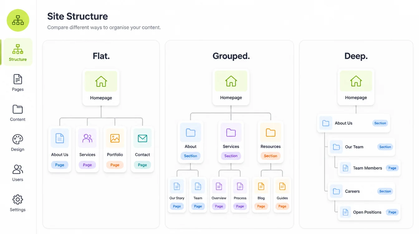
Most small business sites land on one of a few shapes. Pick the one matching how many services you sell.
- The single page service site. Fine if you sell one thing to one audience, and it stops being fine the moment you want a second service to rank.
- Hub and spoke. One Services page linking to a child page per service, the shape a one-person business should usually start from.
- Service by location. A child page per service and town, useful when you genuinely serve distinct areas and painful when the pages repeat each other.
- Grouped rather than flat. Larson and Czerwinski found that a medium condition of depth and breadth outperformed the broadest shallow structure, so flat does not automatically win.
- Three levels, not five. NN/g's example compares a three-layer flat site with a five-level deep one, and says going too far to either extreme will backfire.
- Breadcrumbs once you have levels. NN/g calls them a benefit at almost no cost to the interface, and says they aren't needed on flat sites of one or two levels.
Information Architecture Tools
You need fewer tools than the discipline suggests. A spreadsheet plus one research tool covers a small site.
| Tool | What you use it for |
|---|---|
| A spreadsheet | The page inventory, the jobs list, and the keep, merge or retire decision |
| Your sitemap.xml | The starting list of every URL you publish, including the forgotten ones |
| A card sorting tool | Running open and closed sorts remotely, to reach 15 or more participants |
| A tree testing tool | Checking a text-only structure for success rate, time and directness |
| Google Search Console | The real queries people arrive on, which is where the jobs list comes from |
| Breadcrumb structured data | Telling Google where a page sits, using a BreadcrumbList with two items or more |
Common Structure Mistakes
Most come from designing the menu first and calling it a structure. All are fixable on a spreadsheet.
- Obeying the seven item menu rule. NN/g names this misapplication of Miller's 1956 memory paper directly: menus rely on recognition rather than recall, because every option stays visible, so more than seven is fine when the options are structured meaningfully.
- Attributing the three click rule to Google. It appears on SEO blogs, and Google's own crawl documentation doesn't mention click depth. Keep pages easy to reach because people give up, not because a rule says so.
- Leaving orphan pages live. If nothing links to a page, it fails Google's link instruction above.
- Naming groups after your org chart. Departments make sense internally and mean nothing to a first-time visitor comparing quotes.
- Choosing the structure in a meeting. A card sort with 15 customers can clarify in one afternoon what an internal debate never settles.
- Testing five users on a site with two audiences. The five user guidance carries a caveat about several highly distinct user groups, and dropping it is how people under-test.
FAQs
What's the difference between information architecture and navigation?
NN/g puts it plainly: the information architecture is not part of the on-screen user interface, it informs the interface. The architecture is the decision about what content exists and how it's grouped. Navigation is the menu, links and breadcrumbs built once that decision is made.
How many people do I need for a card sort?
NN/g recommends at least 15 participants for a qualitative card sort, and at least 30 to 50 for a quantitative one so the results generalise. It also suggests 30 to 50 cards. For a small business site, 15 customers and one afternoon is a realistic version of this.
Is there a maximum number of menu items?
No fixed maximum. The seven item rule misapplies a 1956 short-term memory paper, and NN/g says menus rely on recognition rather than recall because the options stay visible. More than seven works when the items are grouped meaningfully. Judge it by grouping quality, not item count.
Does every page need to be within three clicks of the homepage?
That rule is not from Google. It circulates on SEO blogs, and Google's crawl documentation doesn't mention click depth. What Google does say is that every page you care about should have a link from at least one other page on your site. Reachability matters, an exact number doesn't.
Should my site be flat or deep?
Somewhere in between. Larson and Czerwinski found a medium condition of depth and breadth outperformed the broadest shallow structure, and NN/g says going too far to either extreme will backfire. For most small business sites that means around three levels: home, section, page.
Conclusion
Information architecture sounds like a discipline you need to hire for. In practice it's a page list, a jobs list, a stack of cards and fifteen willing people.
Do that work first and the menu, the URLs and the internal links all follow from one decision instead of six arguments. Skip it, and you get a site that makes sense to you and to nobody else.
Start with the inventory this week, because everything else depends on knowing what you have. If you'd rather have someone run the structure work with you, see how we approach web design, or reach out to my team at Seed Light.