Key takeaways
- A call to action tells someone the one thing to do next. It works when it is clear, names a reward, and is the only obvious thing to click.
- Lead with a verb, then a benefit, in two to five words. Get my free quote beats Submit every time.
- One main action per page. Emails with a single call to action get 371 percent more clicks than emails with many. Pages behave the same way.
- Speak as the visitor. In one test, switching from Start your free trial to Start my free trial brought 90 percent more clicks.
- Place it high, then repeat it. Put the main button where it shows without scrolling, and bring it back after each section that earns trust.
1. What makes a call to action work
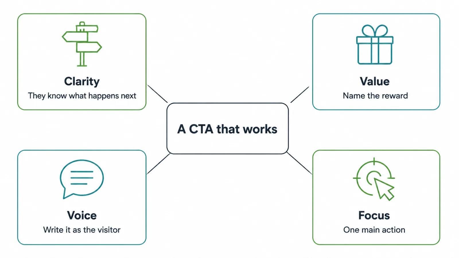
A call to action tells someone the one thing to do next. It works when it is clear, names the reward, speaks as the visitor, and is the only obvious thing to click.
That is the whole game. Most weak buttons fail one of those four tests, and you can usually fix them in a single edit.
Think of your CTA as a tiny promise. The visitor reads it and instantly knows two things: what they get, and what happens when they tap. If either is fuzzy, they hesitate. Hesitation is where leads quietly disappear.
Here are the four levers that decide whether people click.
- Clarity. The visitor should know exactly what happens next. Book a call is clear. Get started is foggy.
- Value. Name the reward, not the chore. Get my free quote sells the quote. Submit sells nothing.
- Voice. Write it the way the visitor would say it. My quote feels personal. Personalized calls to action have converted 202 percent better than generic ones in a study of more than 330,000 CTAs.
- Focus. One main action wins. Five competing buttons just split the attention and freeze people.
The exact words sit at the heart of this. If you want to go deeper on the tiny phrases all over your site, our guide to website microcopy covers the labels, hints, and confirmations that surround the button. Here we are staying on the call to action itself.
2. Call to action examples by goal
The best CTA depends on what you want the visitor to do. A shop needs a buy button. A service business needs a booking or contact button.
Below is a goal-mapped swipe file: the weak version most sites use, and stronger examples you can copy. Notice the pattern. Every good one starts with a verb and names something the visitor wants.
| Your goal | Weak version | Better examples |
|---|---|---|
| Buy a product | Submit | Add to cart, Buy it now, Get mine today |
| Book an appointment | Click here | Book my call, Reserve my spot, See available times |
| Call you | Contact | Call us now, Talk to a real person, Get help today |
| Download a guide | Download | Get my free guide, Send me the checklist, Grab the free template |
| Sign up or start a trial | Sign up | Start my free trial, Create my account, Join free today |
| Send a message | Submit | Send my message, Get my free quote, Tell us what you need |
| Learn more | Learn more | See how it works, See plans and pricing, Read real results |
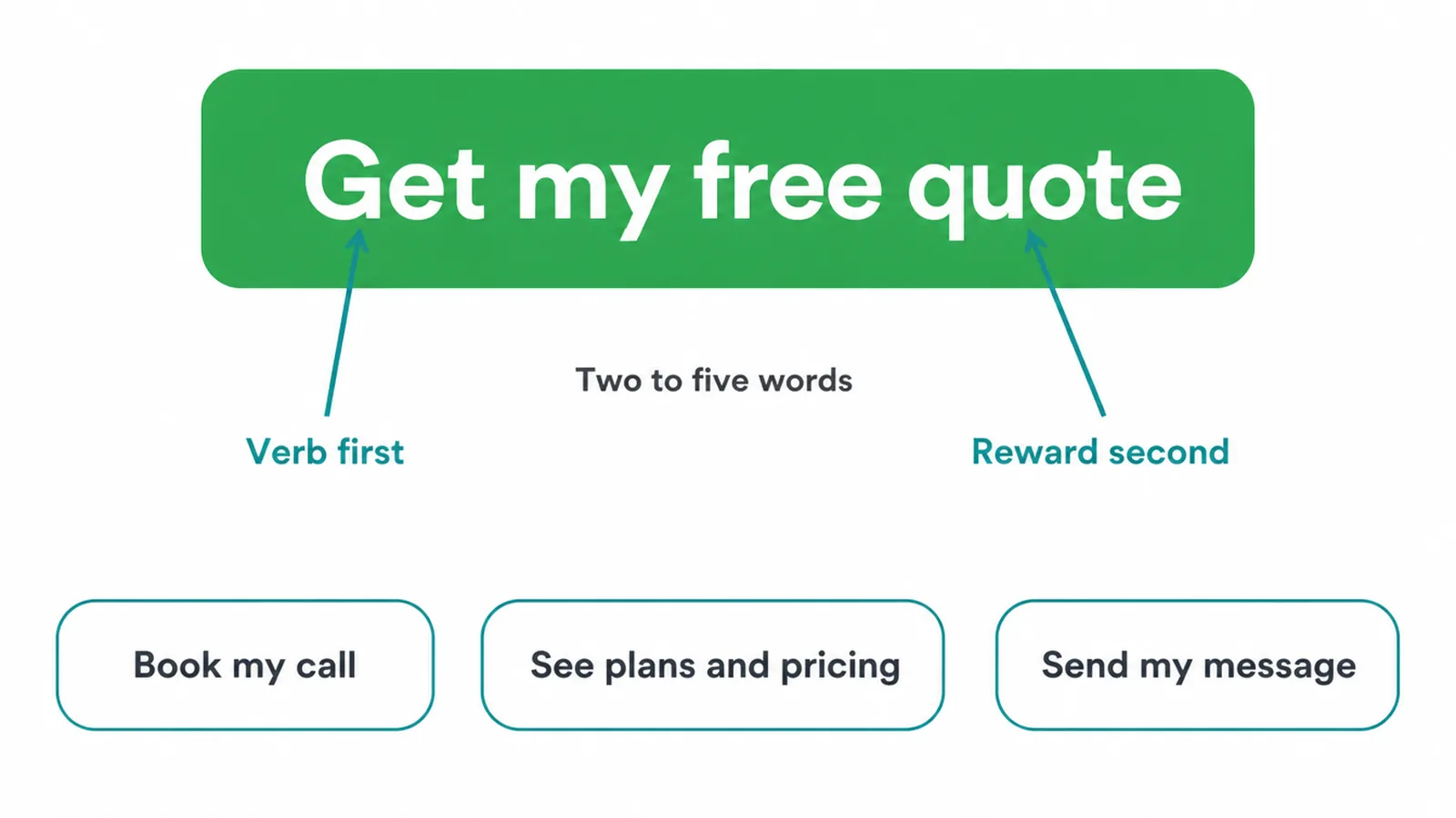
The formula is simple: verb first, reward second, two to five words. Get my free quote. Book my call. See plans and pricing. Each one reads like a tiny finished thought, not a system command.
Notice how the better examples for messaging quietly skip the word Submit. Submit is what your form does. The visitor does not care what your form does. They care about the quote, the call, or the answer waiting on the other side.
3. The words that pull people in
Some words do more lifting than others. You do not need clever copy. You need the right verbs, the right value words, and honest urgency. Here is the short list we reach for.
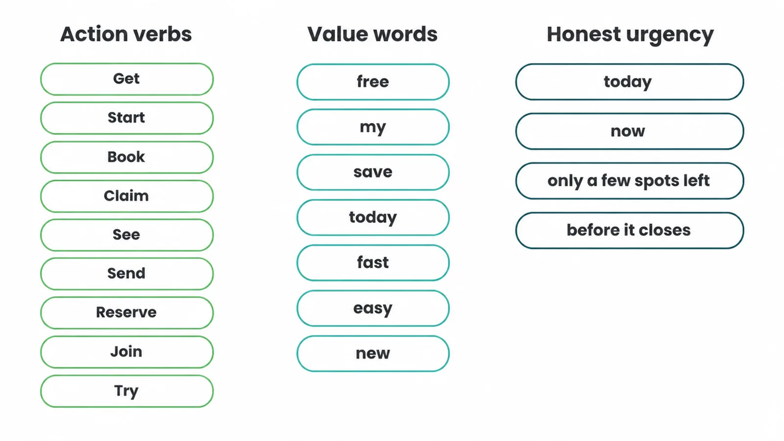
Action verbs that start strong buttons: Get, Start, Book, Claim, See, Send, Reserve, Join, Try. They put the visitor in motion. A button that opens with a verb already feels like progress.
Value words that name the payoff: free, my, save, today, fast, easy, new. The word free earns its keep when something really is free. The word my is the quiet hero.
In one test, swapping Start your free trial for Start my free trial brought 90 percent more clicks, because my makes the button read like the visitor speaking. First-person framing has held up elsewhere too, beating second-person by around 24 percent in one test.
Honest urgency: today, now, only a few spots left, before it closes. Use these only when they are true. Fake countdowns and made-up scarcity train people to ignore you. Real urgency, like a workshop that genuinely fills up, gives a gentle reason to act now instead of never.
Even the verb itself matters. In one test, a company changed its button from Book a Demo to Get Started and lifted conversions by 111.55 percent. Book a Demo asked for a commitment.
Get Started lowered the bar to a small first step. The lesson is not that Get Started always wins. It is that the verb should match how ready your visitor actually feels.
One more tiny lever lives just under the button. Adding a short line that removes doubt, like No card needed or Free, no strings, has lifted conversions in tests too.
In one case, doubt-removal text under a CTA raised conversions by 124 percent. That little reassurance is itself a piece of microcopy, working hand in hand with the button.
4. Where to put your call to action
Great words still fail if nobody sees the button. Placement decides whether your CTA gets a chance. The rule of thumb: put the main action high, repeat it as the page grows, and keep one primary button so the choice stays easy.
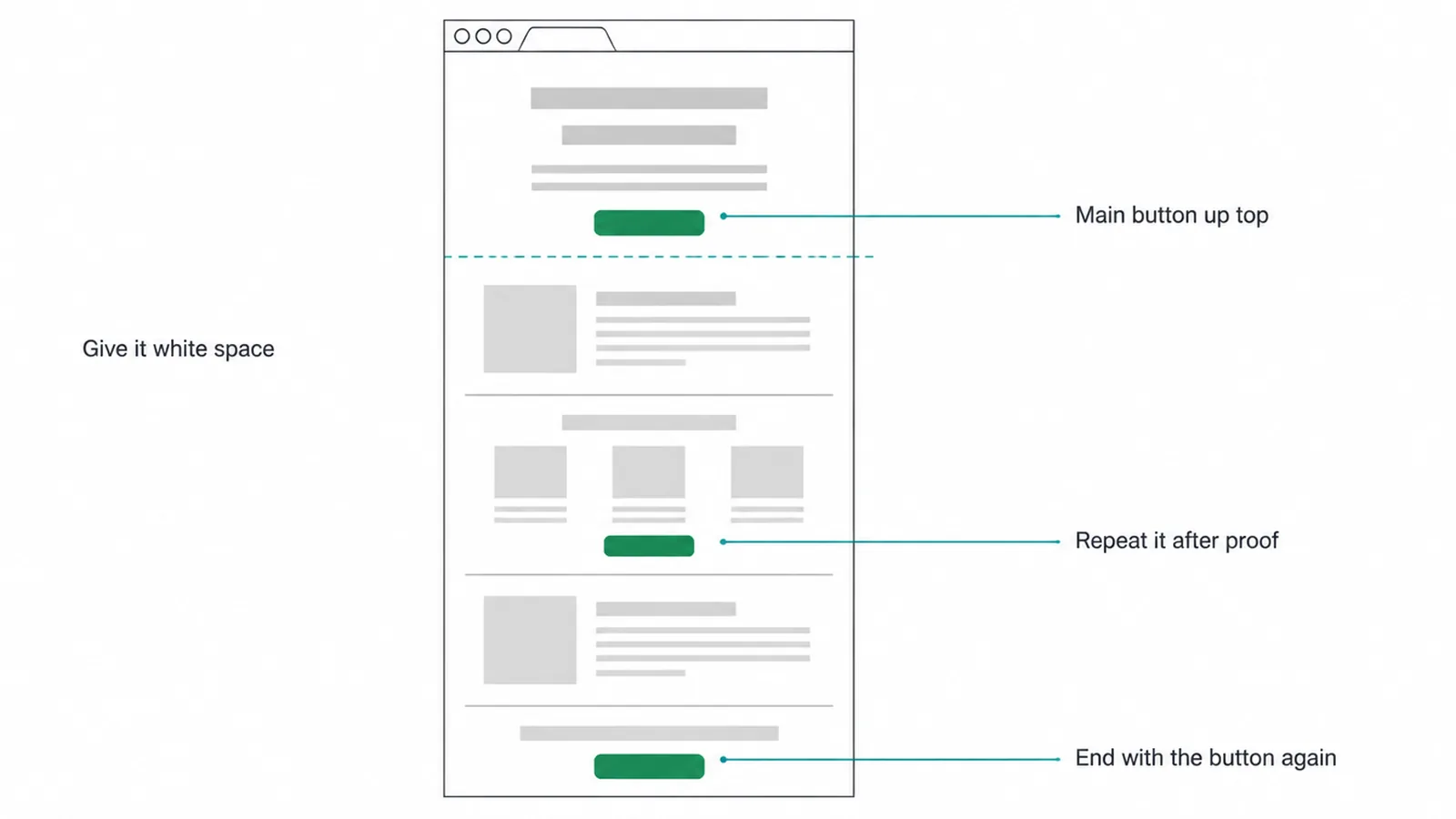
Put the primary CTA high on the page. Many visitors decide in the first screen they see, before they scroll. Your main button should sit right there in the hero, next to the promise.
Our guide to homepage design shows how the headline, the proof, and the button work together near the top, and our guide to the fold covers what really earns that prime spot.
Repeat it on long pages. A visitor who scrolls past three sections of proof should not have to scroll back up to act. Drop the same button after each section that builds trust, then once more at the very bottom. Same goal, same words, several chances.
Keep one primary action per page. You can have a quiet secondary link, like See pricing, but only one button should shout. Emails with a single call to action got 371 percent more clicks than emails crammed with links. Pages reward the same focus.
Make it a button, not a buried text link. A real button reads as the thing to tap. In one test, button-based calls to action improved click-through by 127 percent over plain text links.
We are not going to re-teach button styling here, since our guide to button design already covers shape, size, color, and states. Just know that the button needs to look clickable.
Give it room. Clutter around a button hides it. In one case, clearing the space and noise around a CTA raised conversions by 232 percent. White space points the eye straight at the action.
5. Call to action mistakes to avoid
Most weak CTAs share the same few flaws. Run your buttons past this list and you will catch the ones quietly costing you leads.
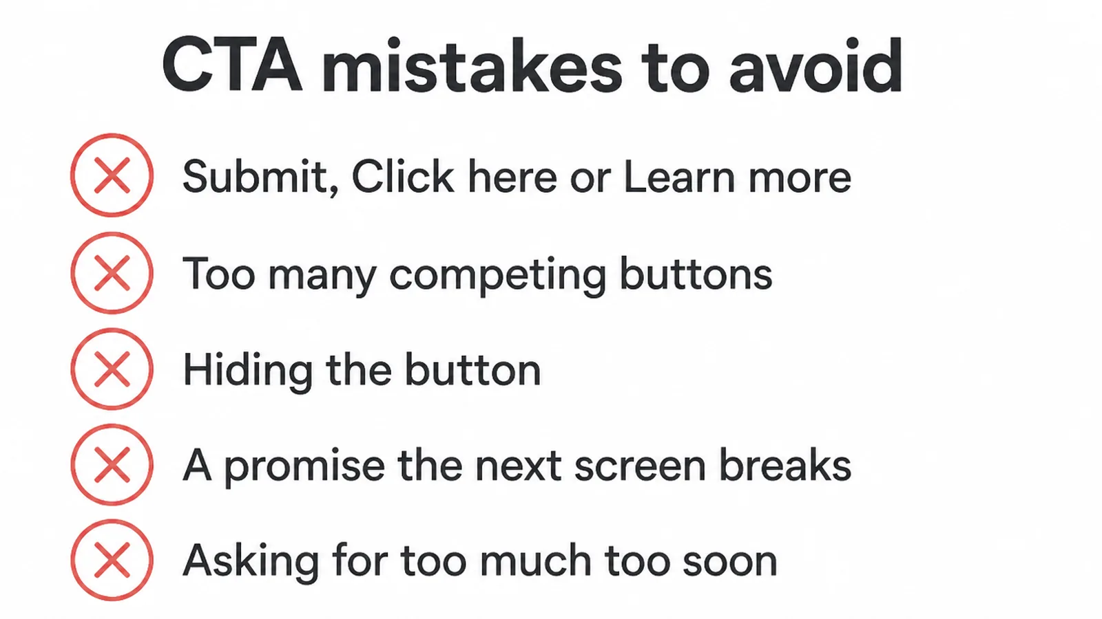
- Submit, Click here, or Learn more with no payoff. These describe a mechanism, not a reward. Replace them with the result the visitor wants.
- Too many competing buttons. Three loud buttons of equal weight give the visitor a decision instead of a direction. Pick one primary action and let the rest go quiet.
- Hiding the button. A CTA stuck at the bottom of a long page, in a faint color, surrounded by clutter, may as well not exist. Lift it up and give it space.
- A promise that does not match the next screen. If the button says Get my free quote and the next page is a fourteen-field form asking for everything, you broke trust. Keep the form short and honest. Our guide to website form design covers how to ask for less.
- Vague verbs that ask for too much too soon. Buy now on a cold visitor is a big jump. See how it works or Get my free quote meets them where they are.
These button slips often travel with other small-site problems. If you want the full audit, our roundup of common small business website mistakes walks through the rest, from slow pages to missing contact details.
The fix is rarely a redesign. It is usually a better sentence on a button you already have, in a spot people already look, whether that is your homepage or a landing page. Start with your most important page, rewrite the one main CTA using the formula above, and watch what happens.
6. How we repeat one action across a client page
We apply this on client pages. The Ecoledco landing page carries one action, repeated at the points where a reader is most likely to take it, so every section leads back to the same next step. On the InfiniteMinds Academy page, sign-up repeats after each section instead of waiting at the bottom.
Frequently asked questions
1. What is a call to action?
A call to action is the line that tells someone the one thing to do next, like Get my free quote, Book a call, or Start now. It is usually a button. A good one names the action and the reward, so the visitor knows what happens when they click and why it is worth it.
2. What are some good call to action examples?
Strong examples lead with a verb and name a reward in two to five words. Try Get my free quote, Book my call, See plans and pricing, Send my message, Start my free trial, or Reserve my spot. Each one is specific, speaks to you, and promises something better than a vague Submit or Learn more.
3. What words make a good CTA?
Start with an action verb like Get, Start, Book, Claim, See, or Send. Add a value word the visitor cares about, such as free, my, save, fast, or today. Skip filler like Submit and Click here, which describe what your form does, not what the visitor gets.
4. Where should I put a call to action?
Put your main call to action high on the page, where it shows without scrolling, and repeat it on long pages after each section that builds trust. Pages that scroll a long way should end with the button too. Keep one main action per page so the choice stays simple.
5. How many CTAs should one page have?
Keep one main call to action per page. You can repeat that same button several times as the page gets longer, but they should all point to the same goal. Emails with a single call to action get 371 percent more clicks than emails packed with competing links, and pages work the same way.
6. Why are Submit and Click here bad CTAs?
Submit and Click here describe a mechanical step, not a benefit. They make the visitor do the mental work of guessing what comes next. Swap them for the result the visitor wants, like Get my quote or See available times, so the reason to click is obvious.
7. Does first-person wording like my instead of your really work?
It can. In one test, changing a button from Start your free trial to Start my free trial brought 90 percent more clicks, and first-person framing has beaten second-person by around 24 percent in other tests. The word my makes the button feel like the visitor speaking, so it reads like their decision.
8. How long should a call to action be?
Aim for two to five words. Long enough to name the verb and the reward, short enough to read in a glance. Get my free quote works. A full sentence on a button does not, because nobody reads a paragraph before deciding to click.