

Key takeaways
- Phone first, then up. Mobile first design means you build the small screen before the desktop, so your most important content leads.
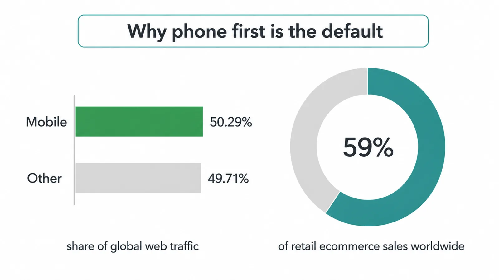
- Most of your visitors are on a phone. Mobile is 50.29% of global web traffic (StatCounter, May 2026), more than half.
- Google ranks on the phone version. It uses the mobile version of your content to index and rank (Google Search Central).
- Constraint is the point. A small screen forces you to rank your content and cut clutter, which makes every screen sharper.
- Speed matters more on a phone. 53% of mobile visitors leave a page that takes over 3 seconds (Google, 2016).
1. What is mobile first design?
Mobile first design means you design the phone version of a page before you design the desktop. You start with the smallest screen, decide what truly matters, and add more only as the screen gets wider. It is a way of thinking, not a code trick.
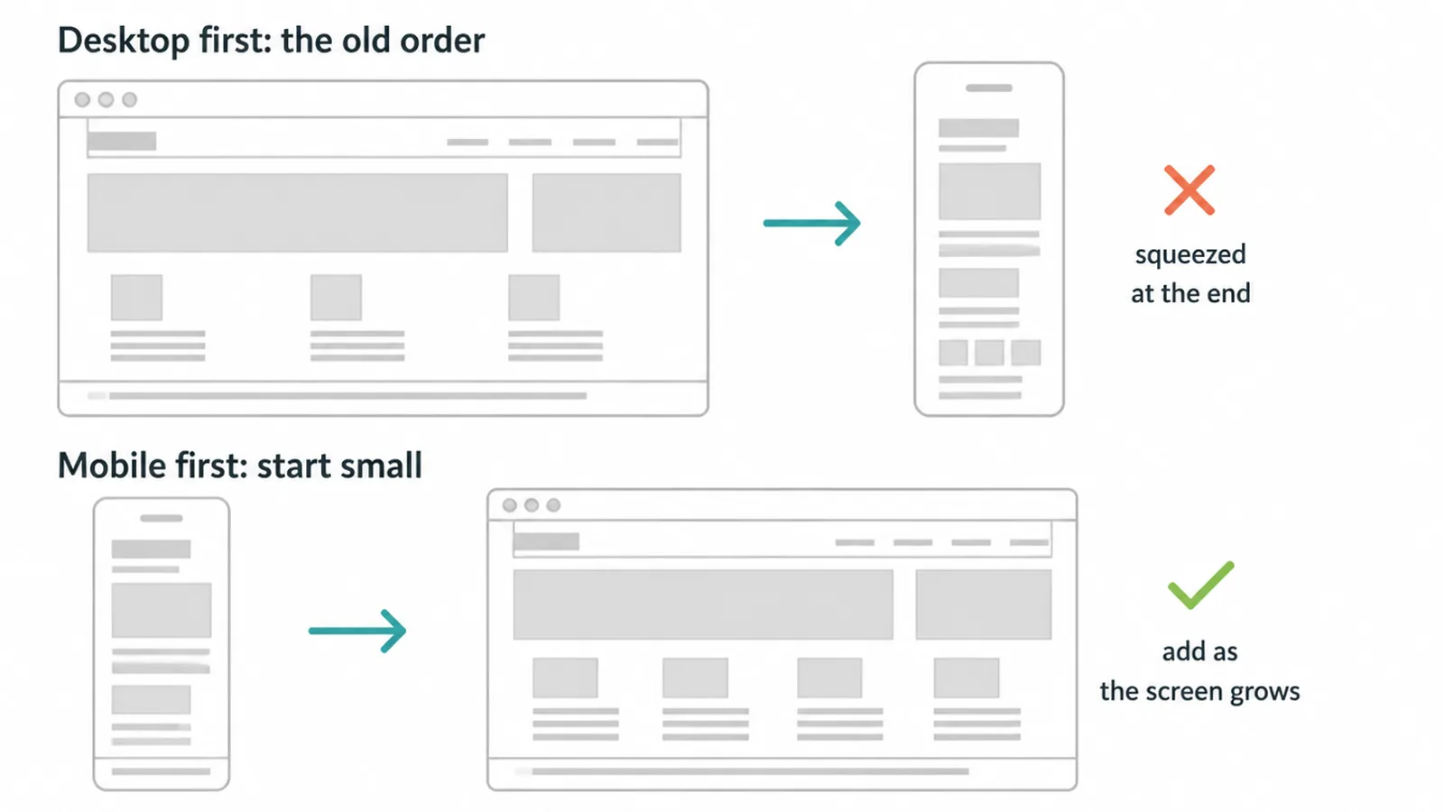
The old habit was the opposite. Designers built a wide desktop page first, packed it with everything, then tried to squeeze it onto a phone at the end. The phone always lost. Menus got cramped, buttons got tiny, and the homepage turned into a long scroll of leftovers.
Mobile first flips the order. You begin where space is tightest. Because you only have a narrow column to work with, you cannot fit everything, so you are forced to choose. What does the visitor need to see right away?
What can wait? That single change of order does most of the work. If you want the bigger picture of how a strong site comes together, our guide to small business websites ties it all in.
2. Mobile first vs responsive vs adaptive
These three terms get mixed up all the time, so let us keep them clean. Mobile first is a strategy: where you start. Responsive and adaptive are techniques: how the layout changes across screens. They are not rivals. You can build a responsive site using a mobile first approach, and most good teams do.
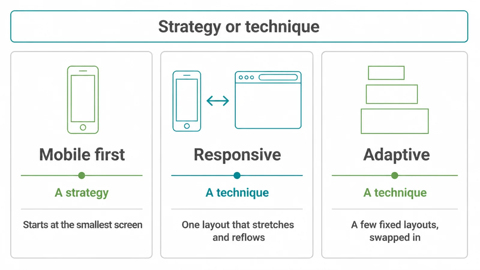
| Approach | What it is | Where you start |
|---|---|---|
| Mobile first | A strategy. You design the phone layout first, then add to it as screens grow. | The smallest screen. |
| Responsive | A technique. One flexible layout that stretches and reflows to fit any screen width. | Either screen, but it flows smoothly between them. |
| Adaptive | A technique. A few fixed layouts, each built for a set screen size and swapped in. | Several set sizes, chosen and served separately. |
So mobile first answers "which screen leads?" Responsive and adaptive answer "how does the layout shift?" When we plan a build, we choose mobile first as the strategy and responsive as the technique. For more on how design choices stay sharp at any size, see our notes on modern website design.
3. Why design the small screen first
The real value of mobile first is the discipline of constraint. A phone screen is small and patience is short. You cannot hide weak content behind a big layout. Every section has to earn its place. That pressure makes you cut clutter, sharpen your message, and lead with the one thing the visitor came for.
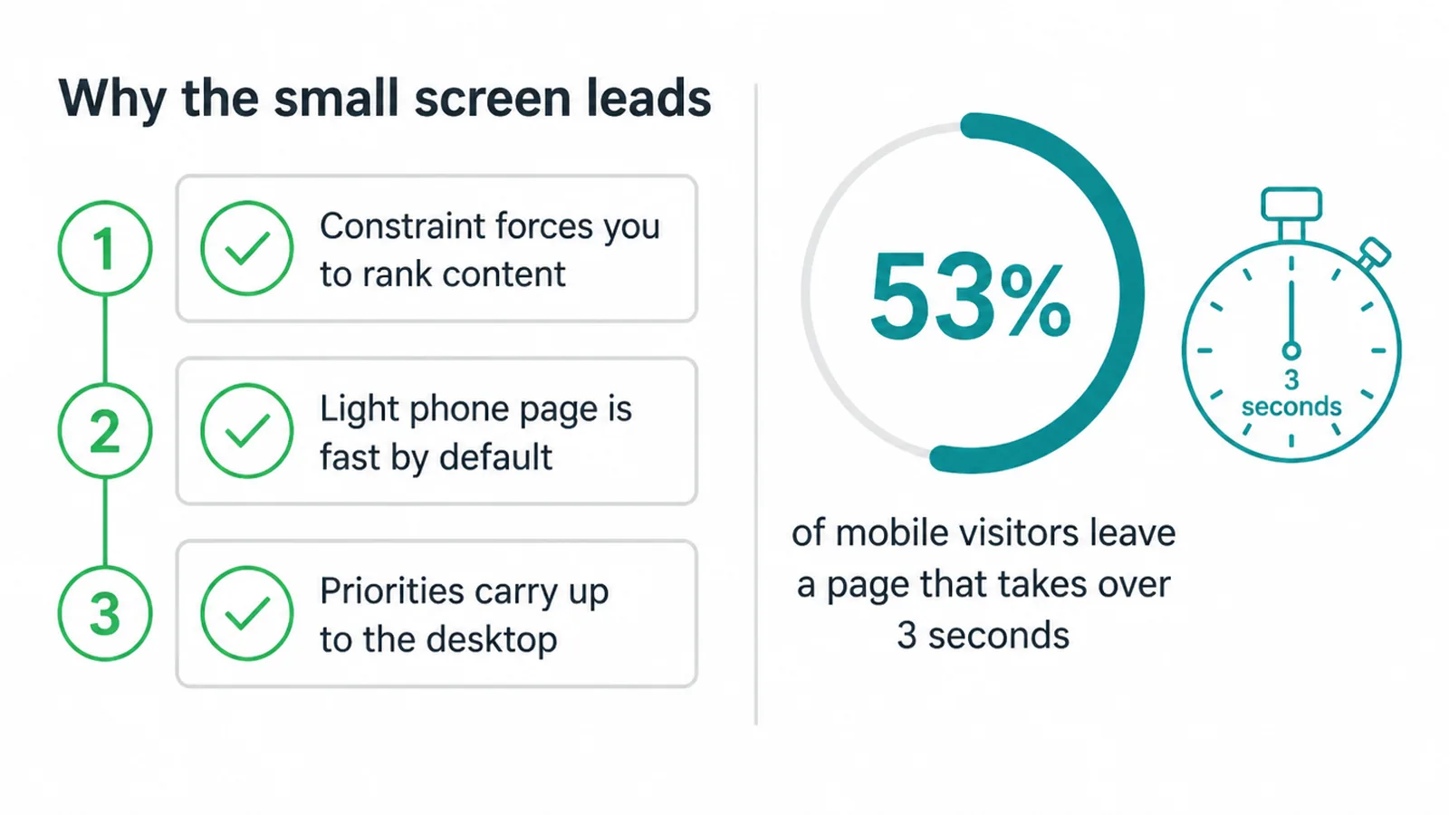
Speed is the other reason. A desktop first page that gets crammed onto a phone tends to be heavy and slow, and slow is expensive. 53% of mobile visitors leave a page that takes longer than 3 seconds to load (Google, 2016).
When you design the light phone version first, speed is baked in from the start instead of patched on later. If load time is your worry, our breakdown of Core Web Vitals shows what Google actually measures.
There is a quieter benefit too. When you decide your priorities on the phone, those same priorities carry up to the desktop. Your whole site gets a clearer order, top to bottom, on every screen.
4. Mobile first design and Google
Here is the part many owners miss. Google reads the phone version of your site to rank you. It uses the mobile version of a page's content for indexing and ranking (Google Search Central). This is called mobile first indexing, and it rolled out for the whole web.
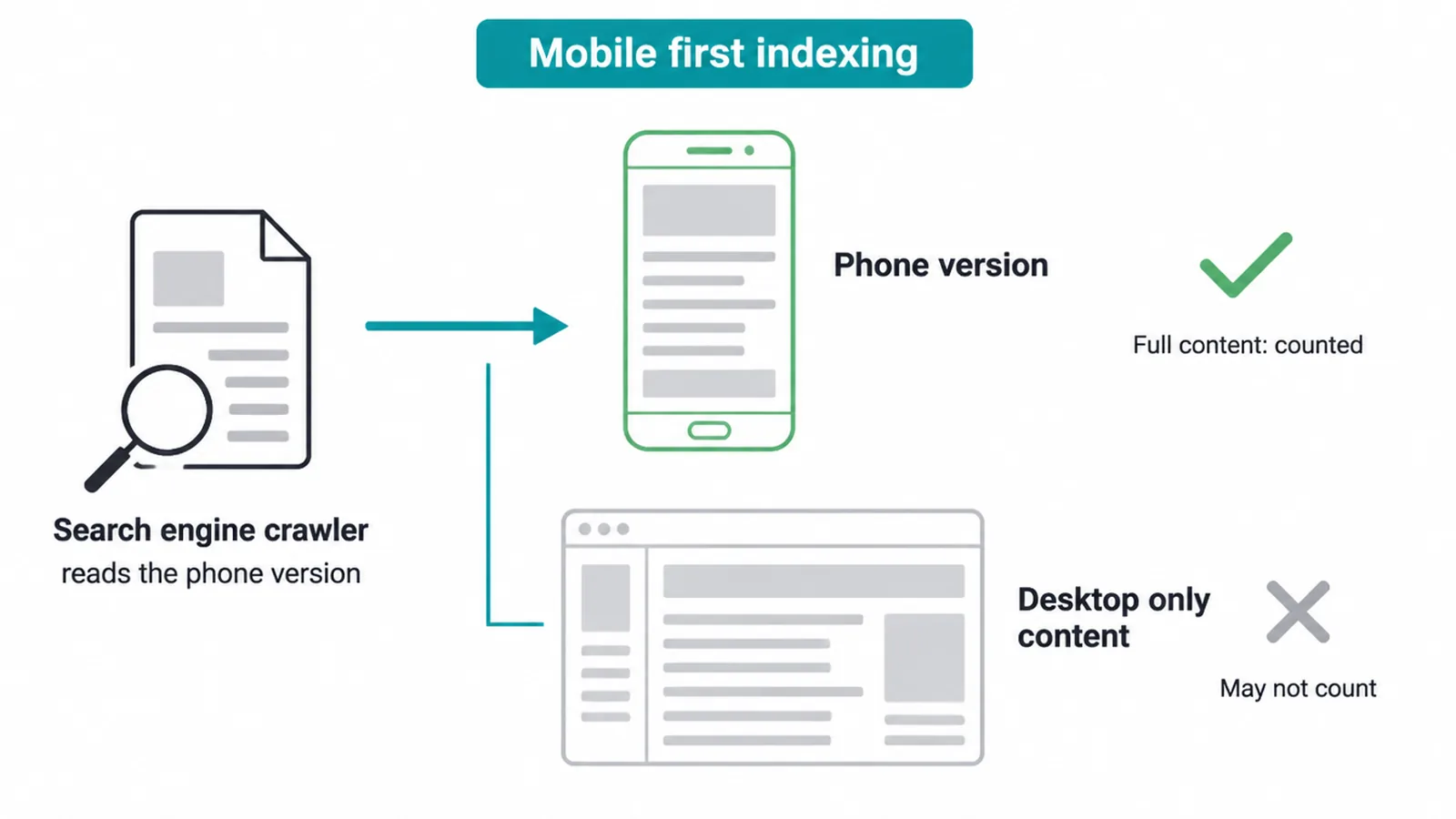
What does that mean in plain terms? If a heading, a paragraph, or a link only shows up on your desktop layout and is missing from the phone, Google may not count it.
Your real content has to live on the phone version, not a trimmed copy of it. Design the phone first and this problem never appears, because the phone version is the full version.
This is also why mobile first quietly supports your search results. The cleaner, faster, well-ordered phone page you build is the exact page Google is judging. If you want to climb the results, start with our guide to ranking higher on Google, or hand the heavy lifting to our SEO service.
5. What mobile first looks like in practice
In practice, mobile first is mostly about ranking your content. Sort everything on a page into three buckets. Must show: the one thing the visitor needs and the one action you want them to take.
Should show: helpful proof and detail. Can show: nice extras. On the phone, you lead with must, fold in should, and tuck away can.
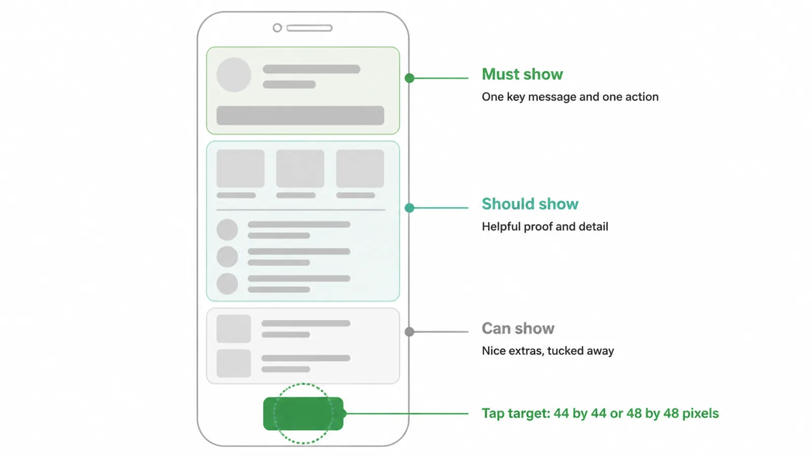
Two more habits matter. Keep one clear action per screen so the visitor never has to guess what to do next. And make tap targets big enough for a thumb.
A safe minimum is around 44 by 44 pixels on Apple and 48 by 48 on Google, with room around each one. Small, crowded buttons get the wrong taps and frustrate people fast.
This is the philosophy. The full hands-on checklist, from viewport settings to font sizes, lives in our guide on how to make a website mobile friendly. We will not repeat it here. If you are designing the button itself, our notes on button design go deeper.
6. Does mobile first hurt the desktop?
No, and this is the worry we hear most. Mobile first does not mean a bare phone page stretched across a wide monitor. It means you start with a focused core, then earn the desktop by adding to it, not by cutting from it.
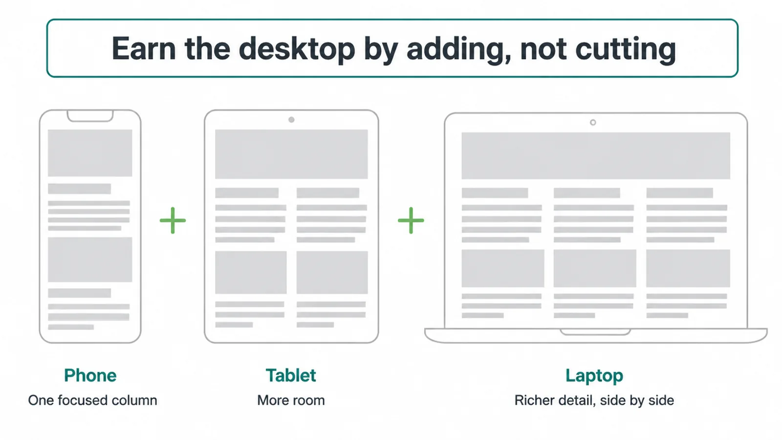
On a wider screen you have room for more columns, bigger images, side by side comparisons, and richer detail. The desktop becomes a generous version of a clear phone page.
Compare that to the old way, where the desktop is crowded and the phone is the sad afterthought. Starting small simply means both screens get the care they deserve.
And the desktop is not where most of the action is anyway. Mobile commerce is now around 59% of total retail ecommerce sales worldwide (Statista, 2025). People are buying on phones. A phone experience built with care is a real business decision, not a nice to have.
7. Is mobile first still the right call?
Yes. Mobile first is the default now, not a fashion. More than half of all web traffic is on a phone, most online buying happens there, and Google ranks on the phone version. Designing desktop first and shrinking it later means you are building for the minority and hoping the majority forgive you.
You do not have to rebuild everything tomorrow. The mindset is the win. Next time you plan a page, sketch the phone first. Ask what one thing the visitor needs and what one action you want. Add the rest as the screen grows.
That simple order keeps your site fast, focused, and built around how people actually see it. To see how mobile first fits a full project, our web design process walks through every step, and our web design service can do it for you. Ready to talk? Get in touch.
Frequently asked questions
1. What is mobile first design?
Mobile first design means you design the phone version of a page before the desktop version. You start with the smallest screen, decide what truly matters, and add more as the screen gets wider. It is a way of thinking, not a set of code tricks.
2. What is the difference between mobile first and responsive design?
Mobile first is the strategy of where you start: the small screen. Responsive design is the technique that makes one layout stretch and reflow to fit any screen. You can build a responsive site that was designed desktop first or mobile first. Mobile first just decides which screen leads the thinking.
3. Why is mobile first design important?
Most people now reach the web on a phone, mobile is more than half of all web traffic. Google also reads the phone version of your site to rank it. Designing the phone first means your content and your rankings are built around how most visitors actually see your site.
4. What is mobile first indexing?
Mobile first indexing means Google uses the mobile version of your content to index and rank your site. If something only appears on your desktop layout and is missing on the phone, Google may not count it. That is why the phone version has to carry your real content, not a trimmed copy.
5. Is mobile first design still relevant?
Yes. It is the default approach now, not a trend. Phones carry most web traffic and most online shopping, and Google ranks on the phone version. Designing desktop first and squeezing it down later usually leaves a cramped, slow phone experience for the majority of your visitors.
6. Does mobile first design make the desktop version worse?
No. You start small and then earn the desktop by adding to it, more columns, more room, richer detail, instead of cutting things away. The desktop then becomes a generous version of a focused phone page.
7. What does designing the small screen first actually mean?
It means you sketch and build the narrow phone layout before anything else. Because space is tight, you are forced to rank your content, keep one clear action per screen, and cut anything that is not pulling its weight. Then you add space and detail as the screen grows wider.
8. Is mobile first design the same as mobile friendly?
Not quite. Mobile friendly describes the result: a site that works well on a phone. Mobile first describes the order you work in: phone before desktop. A mobile first process is one reliable way to end up with a mobile friendly site, but you can also fix a desktop first site to be mobile friendly afterwards.