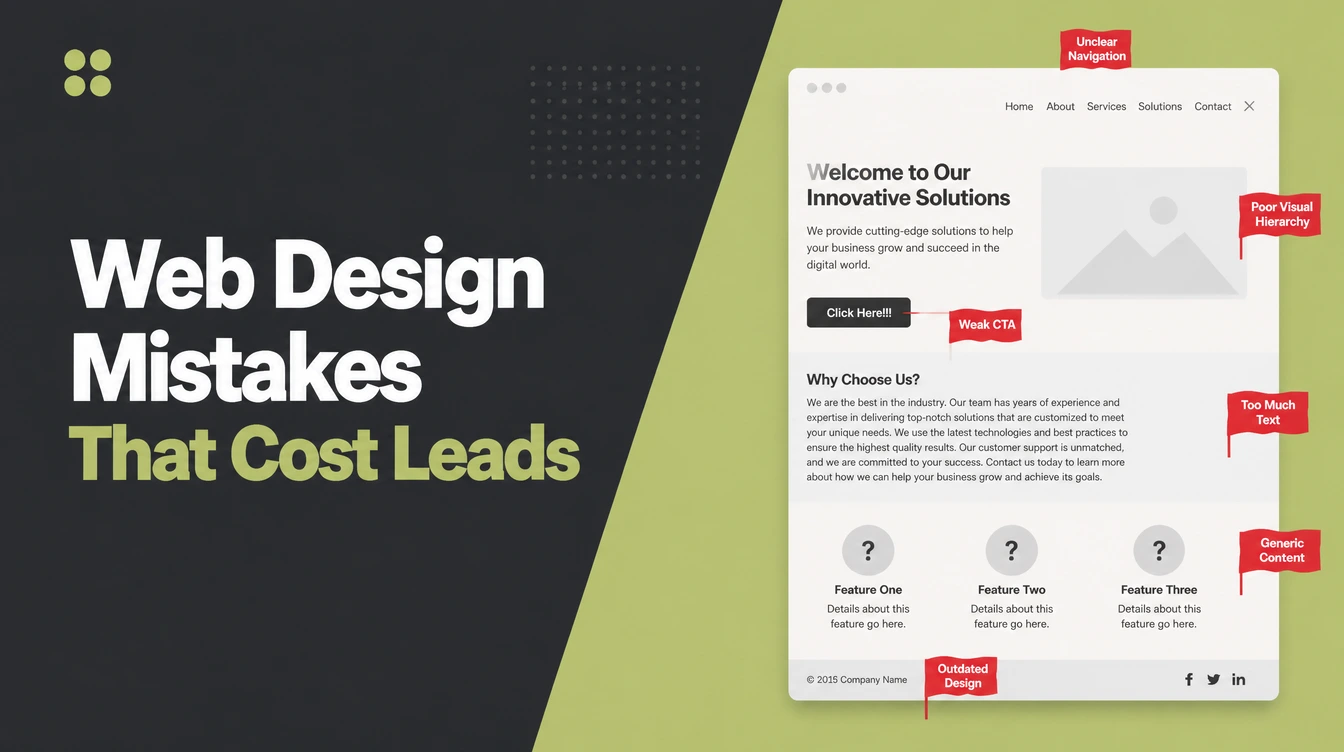
Key takeaways
- People judge in a blink. A first impression of visual appeal forms in about 50 milliseconds, so the design has to land before anyone reads.
- Looks shape trust. Stanford found 46.1 percent of people judged a site's credibility partly on its visual design.
- Speed is design. Google found 53 percent of mobile visitors leave a page that takes longer than 3 seconds to load.
- Ugly loses sales. Adobe found 38 percent of people stop engaging when the layout is unattractive.
- Most fix fast. Each mistake below has a quick fix you can start today.
1. What counts as a web design mistake?
A web design mistake is any visual or layout choice that makes your site harder to read, trust, or use. People decide if your site feels right in about 50 milliseconds, before they read a word. So the design itself can lose a customer who was ready to buy.
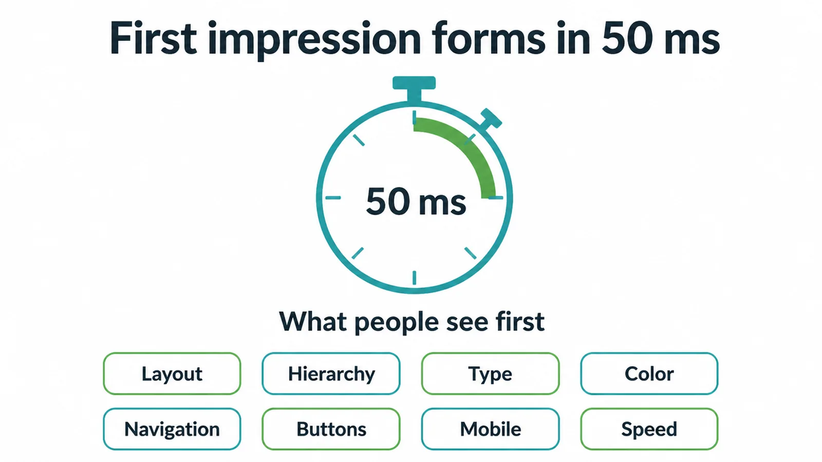
This post stays on design. We mean the visual stuff: layout, hierarchy, type, color, navigation, buttons, mobile, and speed. If you want the broader operational list (things like missing contact details and weak copy), read our roundup of small business website mistakes.
Here, we focus on what your eyes see and why it costs you. For the bigger picture, our pillar on building a small business website ties it all together.
Below are nine mistakes we see most often. For each one, here is what it quietly costs you and the quick fix.
2. Mistake 1: A cluttered, cramped layout
You try to show everything at once. Walls of text, ten links in the header, popups, badges, and three competing offers. The eye has nowhere to rest.
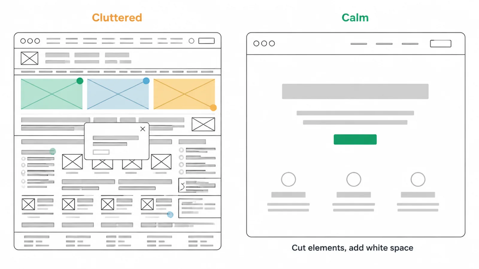
What it quietly costs: a confused visitor is a visitor who leaves. When every element shouts, nothing gets heard, and your main offer disappears in the noise.
The fix: cut what you can, then add breathing room. White space is not empty space, it is a tool that groups what belongs together and separates what does not. Learn how to use it well in our guide to white space in design.
3. Mistake 2: No clear visual hierarchy
Everything is the same size and weight, so nothing stands out. The headline looks like the fine print. Your one key button blends into the rest.
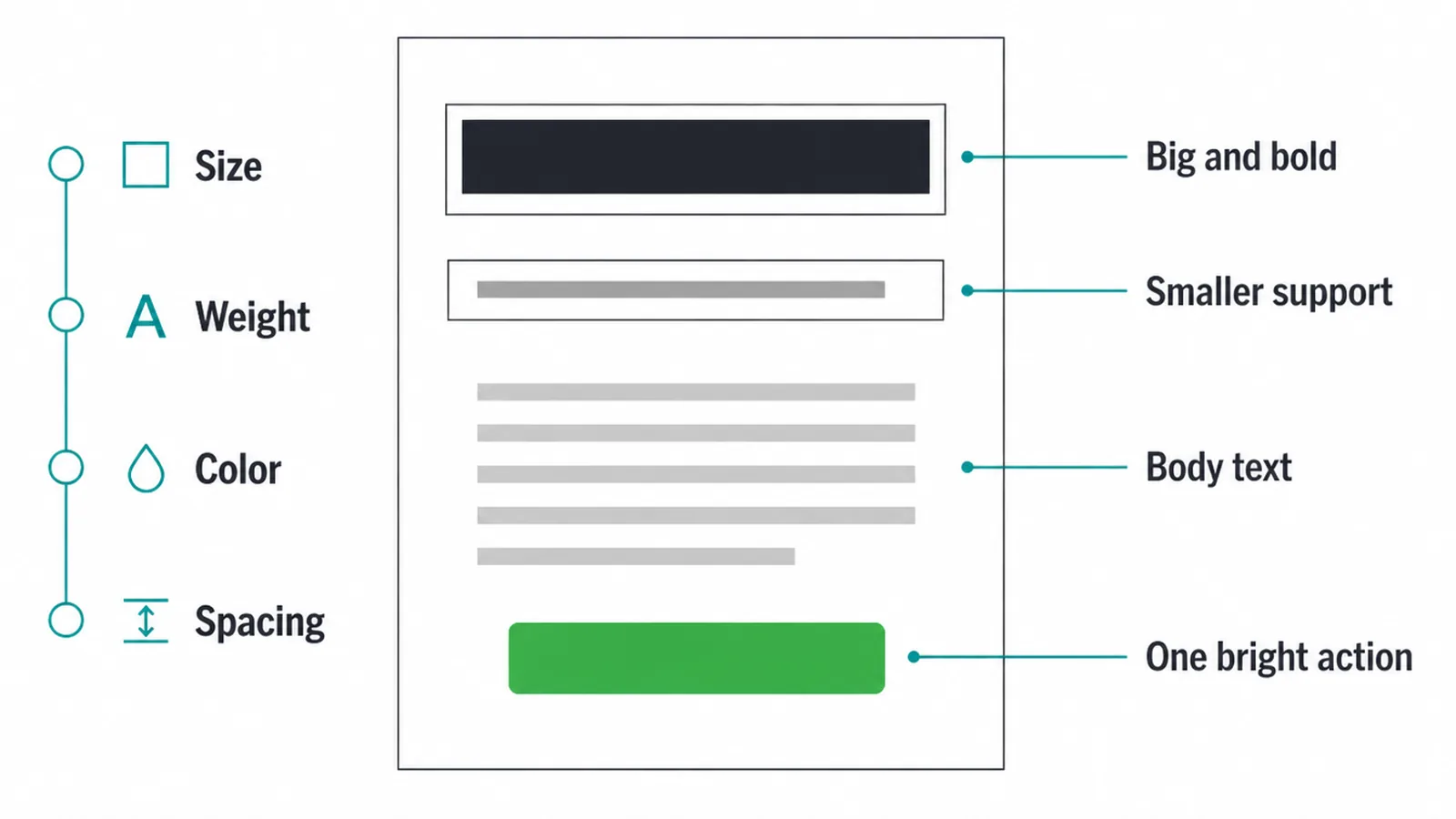
What it quietly costs: visitors cannot find the next step, so they take none. They scroll, they shrug, they go.
The fix: use size, weight, color, and spacing to rank what matters. Big and bold for the main message, smaller for support, one bright accent for the action. Your most-visited page deserves the most care, so start with our walkthrough on homepage design.
4. Mistake 3: Hard-to-read text
Light grey text on a white background. Type so small you squint. Two fonts that fight each other. If reading is work, people stop.
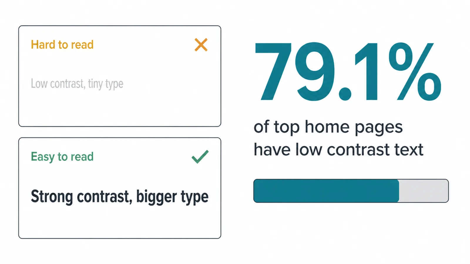
What it quietly costs: low contrast is the single most common design failure on the web. The WebAIM Million report found low-contrast text on 79.1 percent of the top one million home pages. If your text is hard to read, you are in bad company, and your message is not getting through.
The fix: raise the contrast, bump the size, and pick fonts that pair cleanly. Our guide to font pairing shows you combinations that read well and look current.
5. Mistake 4: Confusing navigation
Clever menu labels nobody understands. Twelve items in the top bar. A search box but no clear path. People should never have to hunt.
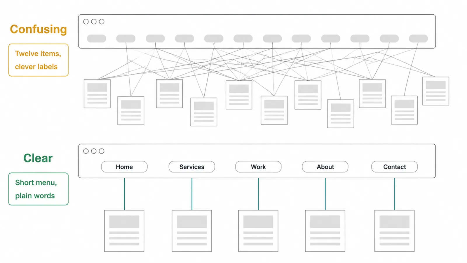
What it quietly costs: if visitors cannot find a page, that page may as well not exist. Lost in the menu means lost as a customer.
The fix: keep the menu short, label items in plain words, and put the important pages first. Start with our website navigation best practices, then tidy the bar itself with our notes on website menu design.
6. Mistake 5: A weak or hidden call to action
Your button says "Submit" and sits in a grey box near the footer. Or there is no clear button at all, just a phone number buried in a paragraph.
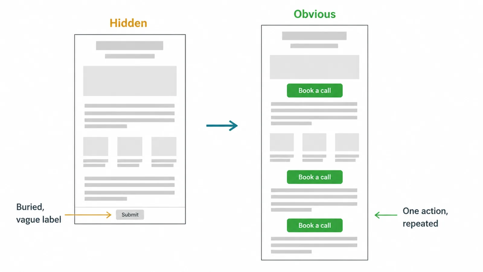
What it quietly costs: people who wanted to act cannot tell how. A ready customer who cannot find the next step becomes a missed message.
The fix: make one main action obvious and repeat it down the page. Give it color, space, and a clear label that says what happens next. Our guide to button design covers the look and wording that get clicks.
7. Mistake 6: It breaks on phones
Text overflows the screen. Buttons sit too close to tap. Images spill past the edge. The site was built for a desktop and never checked on a phone.
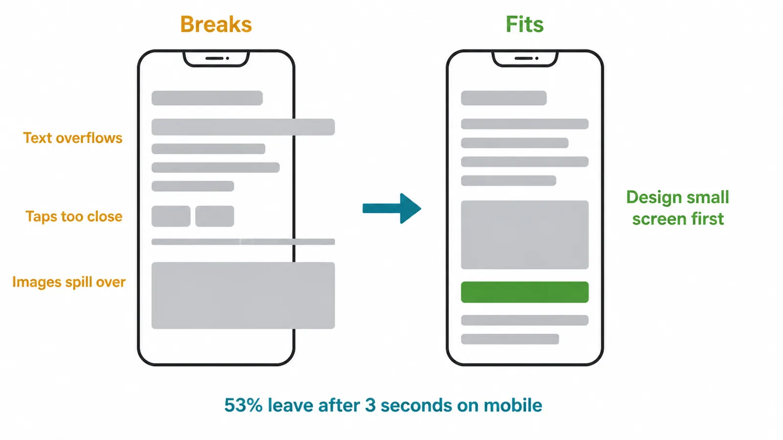
What it quietly costs: most of your visitors are on a phone, and they are impatient. Google found 53 percent of mobile visitors leave a page that takes longer than 3 seconds to load. A broken mobile layout sends them away before they even read your offer.
The fix: design for the small screen first, then scale up. Check every page on a real phone. Our step-by-step guide shows you how to make a website mobile friendly.
8. Mistake 7: A slow, heavy page
Huge images, too many fonts, and clunky effects make the page crawl. Speed is a design choice as much as a technical one. Every heavy element you add slows the load.
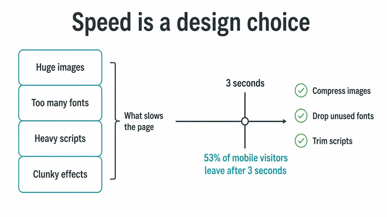
What it quietly costs: a slow page burns through patience. The same Google finding holds here: 53 percent of mobile visitors leave after 3 seconds. You lose them before the page even appears.
The fix: shrink and compress images, drop the fonts you do not use, and trim heavy scripts. Learn what to measure in our guide to Core Web Vitals, the speed and stability scores Google watches.
9. Mistake 8: An untrustworthy, dated look
Stock photos that feel fake. A layout that looks like it is from a decade ago. Mismatched colors. None of it screams scam, but all of it whispers "be careful".
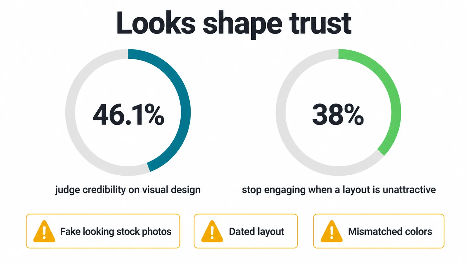
What it quietly costs: looks shape trust. Stanford found 46.1 percent of people judged credibility partly on visual design, and Adobe found 38 percent stop engaging when a layout is unattractive. A dated look makes people doubt your business.
The fix: refresh the design to feel current and clean. Google research also found people prefer simple and familiar designs at first glance. See what current and trustworthy looks like in our guide to modern website design.
10. Mistake 9: Ignoring accessibility
No alt text on images. Color is the only way to tell things apart. Forms with no labels. You build for people who see and click exactly like you do, and shut out everyone else.
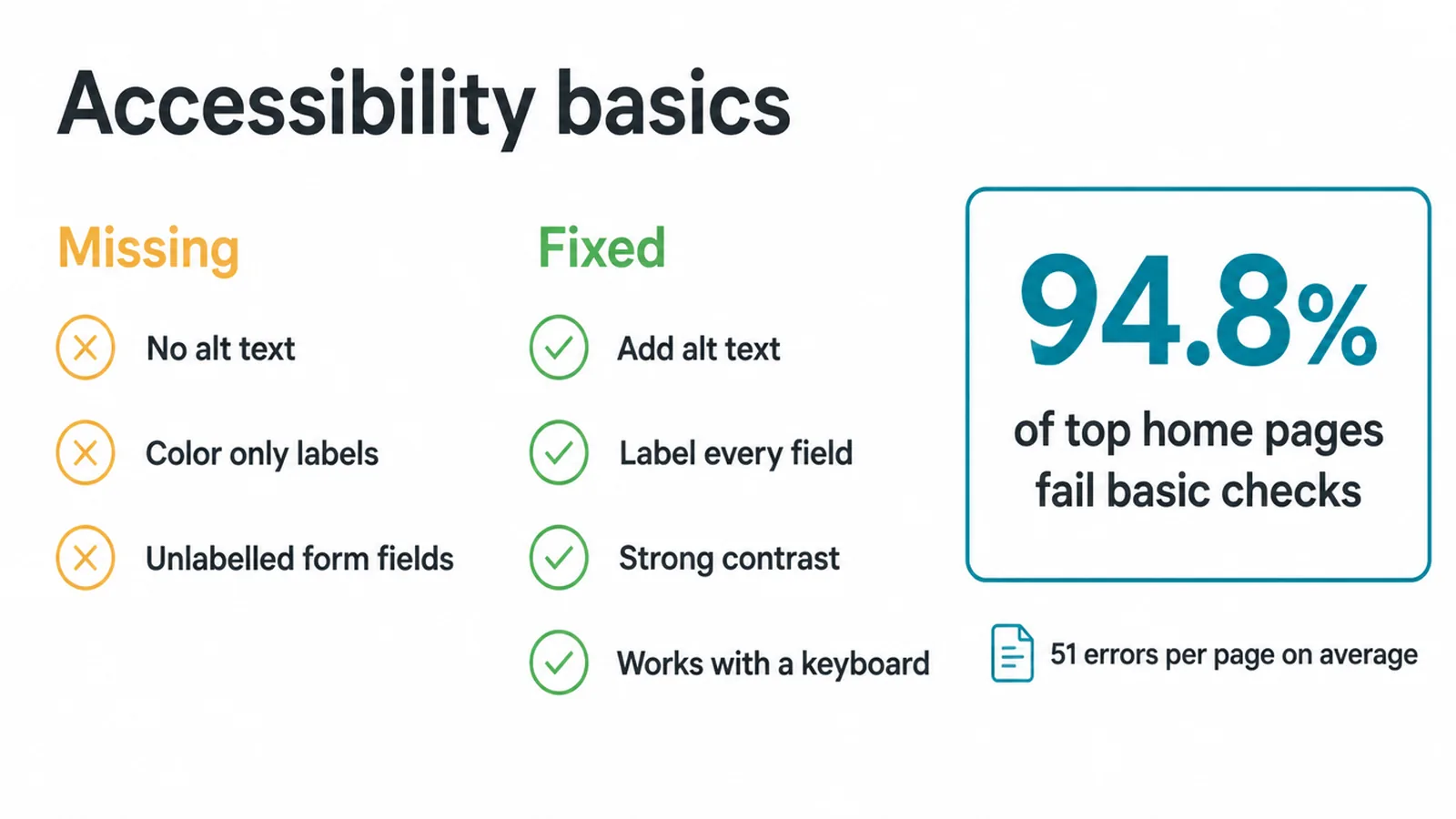
What it quietly costs: you lose real customers, and the same fixes help everyone. The WebAIM Million report found 94.8 percent of top home pages fail basic accessibility checks, with an average of 51 errors per page. Most of those failures are the same low contrast and missing labels that hurt every visitor.
The fix: add alt text, label every form field, keep contrast strong, and make sure everything works with a keyboard. Start with our plain guide to website accessibility.
11. Quick fixes at a glance
Here is the whole list in one place. Pick the mistake that sounds most like your site and start with that fix.
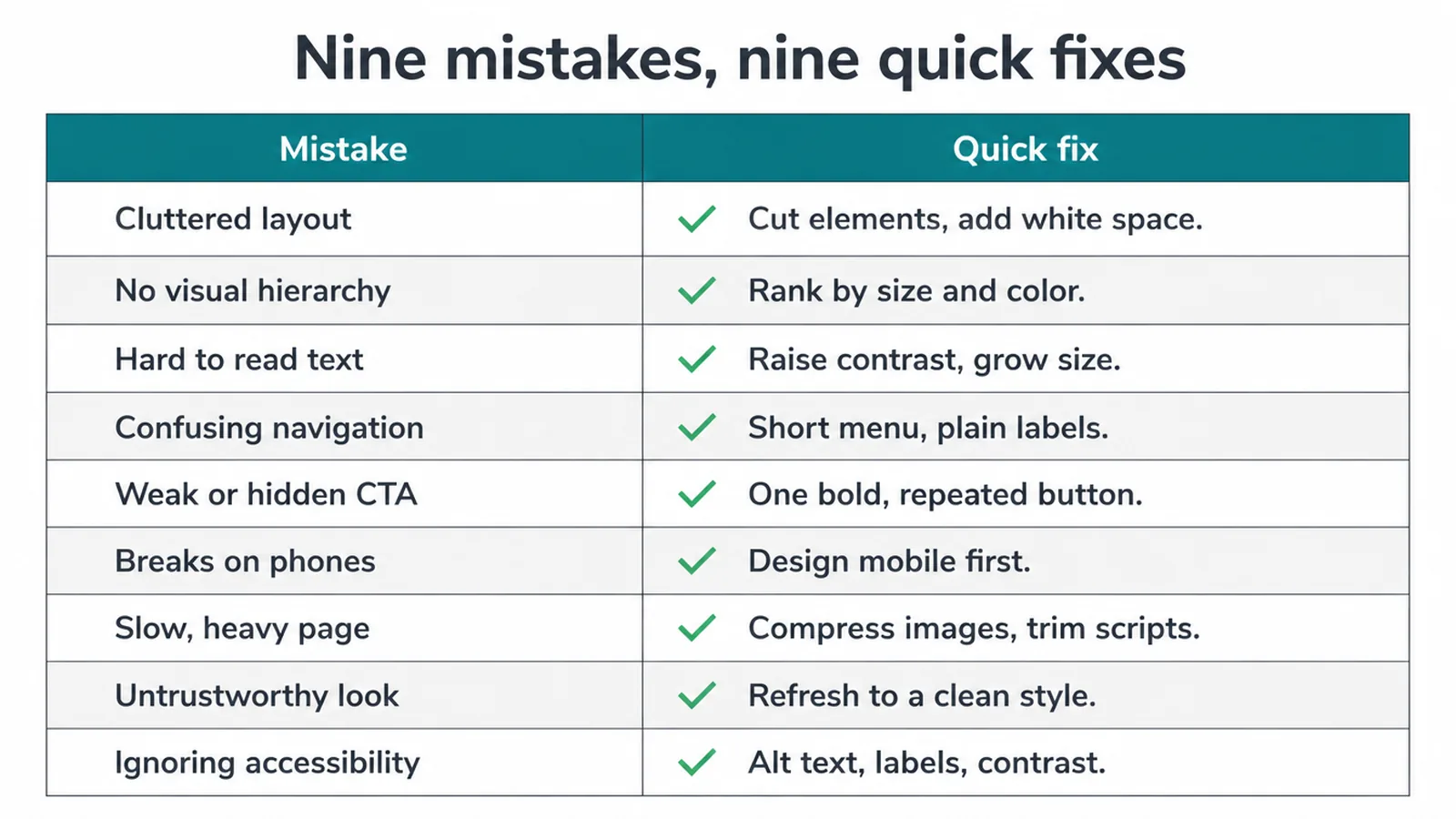
| Mistake | What it quietly costs | The quick fix |
|---|---|---|
| Cluttered layout | Confused visitors who leave fast | Cut elements, add white space |
| No visual hierarchy | Nobody finds the next step | Rank items by size, weight, color |
| Hard-to-read text | Your message never lands | Raise contrast, grow size, pair fonts |
| Confusing navigation | Key pages go unseen | Short menu, plain labels |
| Weak or hidden CTA | Ready buyers cannot act | One bold, repeated button |
| Breaks on phones | Most of your traffic bounces | Design mobile first, test on a phone |
| Slow, heavy page | People leave before it loads | Compress images, trim scripts |
| Untrustworthy look | Doubt instead of action | Refresh to a clean, current style |
| Ignoring accessibility | Lost customers and lost trust | Alt text, labels, strong contrast |
Frequently asked questions
1. What are the most common web design mistakes?
The most common web design mistakes are a cluttered layout, no clear visual hierarchy, hard-to-read text, confusing navigation, a weak or hidden call to action, a site that breaks on phones, slow loading, an untrustworthy look, and ignored accessibility. Each one makes your site harder to read, trust, or use, so people leave before they act.
2. What makes a website look cheap or untrustworthy?
A website looks cheap when the spacing is cramped, the fonts clash, the colors fight, and the photos look low quality. Stanford research found that 46.1 percent of people judged a site's credibility partly on its visual design. A tidy, current look signals you are a real business.
3. Why do people leave my website so fast?
People leave fast because they form a first impression in about 50 milliseconds, and a slow or messy page confirms a bad feeling instantly. Google found that 53 percent of mobile visitors abandon a page that takes longer than 3 seconds to load. Clean the page and speed it up to keep them.
4. How quickly do people judge a website?
Very quickly. Nielsen Norman Group research shows visual appeal forms in about 50 milliseconds, and Google research found first impressions can form within roughly 17 milliseconds. People decide if your site feels right before they read a single word, so the design has to land instantly.
5. Does web design really affect sales and trust?
Yes. Adobe research found that 38 percent of people stop engaging with a site when the layout is unattractive, and Stanford found 46.1 percent judge credibility on visual design. Poor design pushes ready buyers away before they reach your contact form or product page.
6. What are the biggest mobile web design mistakes?
The biggest mobile mistakes are tiny tap targets, text you have to pinch to read, layouts that overflow the screen, and pages that load slowly on a phone. Google found 53 percent of mobile visitors leave after 3 seconds. Most of your traffic is on a phone, so design for the small screen first.
7. How much white space should a website have?
Enough that every section can breathe. White space is not wasted space. It groups related items, separates unrelated ones, and gives the eye a path. Generous spacing around your headline, buttons, and key offer makes the important things easy to find and the page feel calm and trustworthy.
8. How do I know if my design is the problem?
Open your site on your phone and ask a friend who has never seen it to find your main action in five seconds. If they hesitate, squint, or scroll past it, the design is the problem. High exits on the homepage and few messages from a busy site are also strong signs.
12. Fix the ones that hurt most
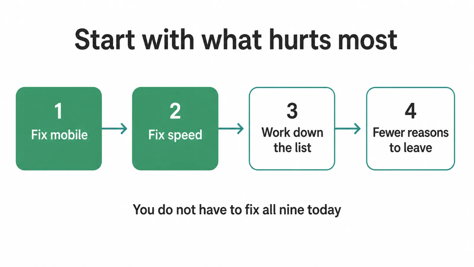
You do not have to fix all nine today. Start with the one losing you the most customers, usually mobile or speed, then work down the table. Small changes add up fast when each one removes a reason to leave.
If you would rather have it handled, our web design team can audit your site and rebuild the parts that are quietly costing you. Want a quick second opinion first? Send us a message and we will tell you straight where your design is losing people.