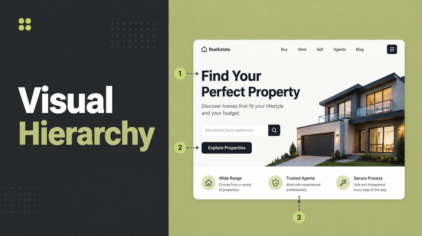
Key takeaways
- Visual hierarchy is the order people notice things. Designers control it with size, weight, color, contrast, spacing, and position.
- First impressions are instant. People form a gut feeling about a page in under 50 milliseconds, per Google Research, so the page must read clearly at a glance.
- People scan, they do not read. The F-pattern, found by watching 232 users, is still common on desktop and mobile.
- Put your best stuff up top. Users spend about 57% of viewing time above the fold.
- One focal point per screen. Two competing buttons cancel each other out and slow the decision.
1. What is visual hierarchy?
Visual hierarchy is the order in which people notice things on a page, and how design controls that order. Your eyes jump to whatever stands out: the biggest word, the brightest button, the thing sitting alone. Designers use that habit on purpose, so the first thing you see is the thing that matters most.
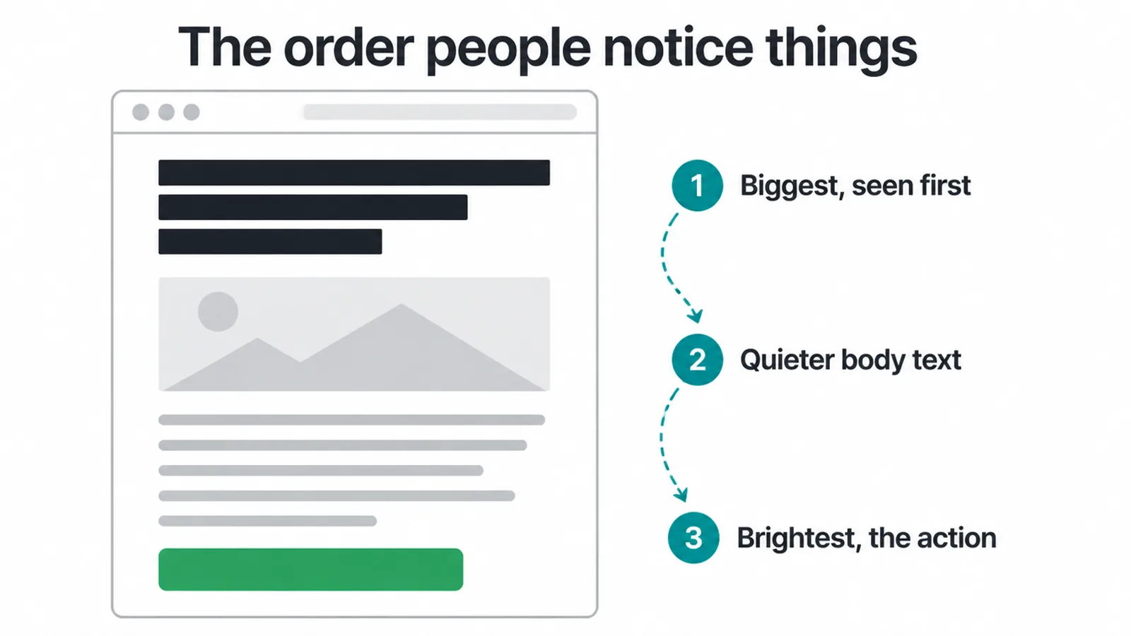
Think of any page you scan. You do not read it left to right like a book. You bounce around, landing on the loud parts first. Visual hierarchy decides which parts are loud.
It is one of the core ideas behind good interface design, and it sits right alongside the broader rules in our guide to UX design principles.
When the hierarchy is clear, a visitor knows in a second what the page is about and what to do. When it is flat, everything shouts at once, which feels the same as nothing standing out at all. The goal is simple: make the important thing obvious, and make everything else quieter.
2. Why visual hierarchy matters for your website
People decide fast. Google Research found that users build a gut feeling about a design in under 50 milliseconds, and they prefer pages that feel simple and familiar. You do not get a slow, careful read. You get a blink. A clear hierarchy wins that blink.
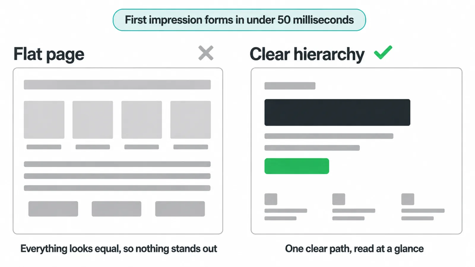
Clear order also means faster understanding. A visitor who instantly sees the headline, then the benefit, then the button, moves through the page without effort. A visitor who has to hunt for the next step gets tired and leaves.
On a small business site, that lost visitor is a lost lead, which is why hierarchy is one of the first things we fix on a small business website.
Hierarchy is not decoration. It is the path you lay down for the eye. Lay a good path and more people reach the end of it. Lay a confusing one and they wander off. The design choices below are how you build that path.
3. The six tools that move the eye
You guide attention with six tools: size, weight, color, contrast, spacing, and position. Each one changes where the eye lands. The trick is using them together, and using them sparingly. If you emphasize everything, you emphasize nothing.
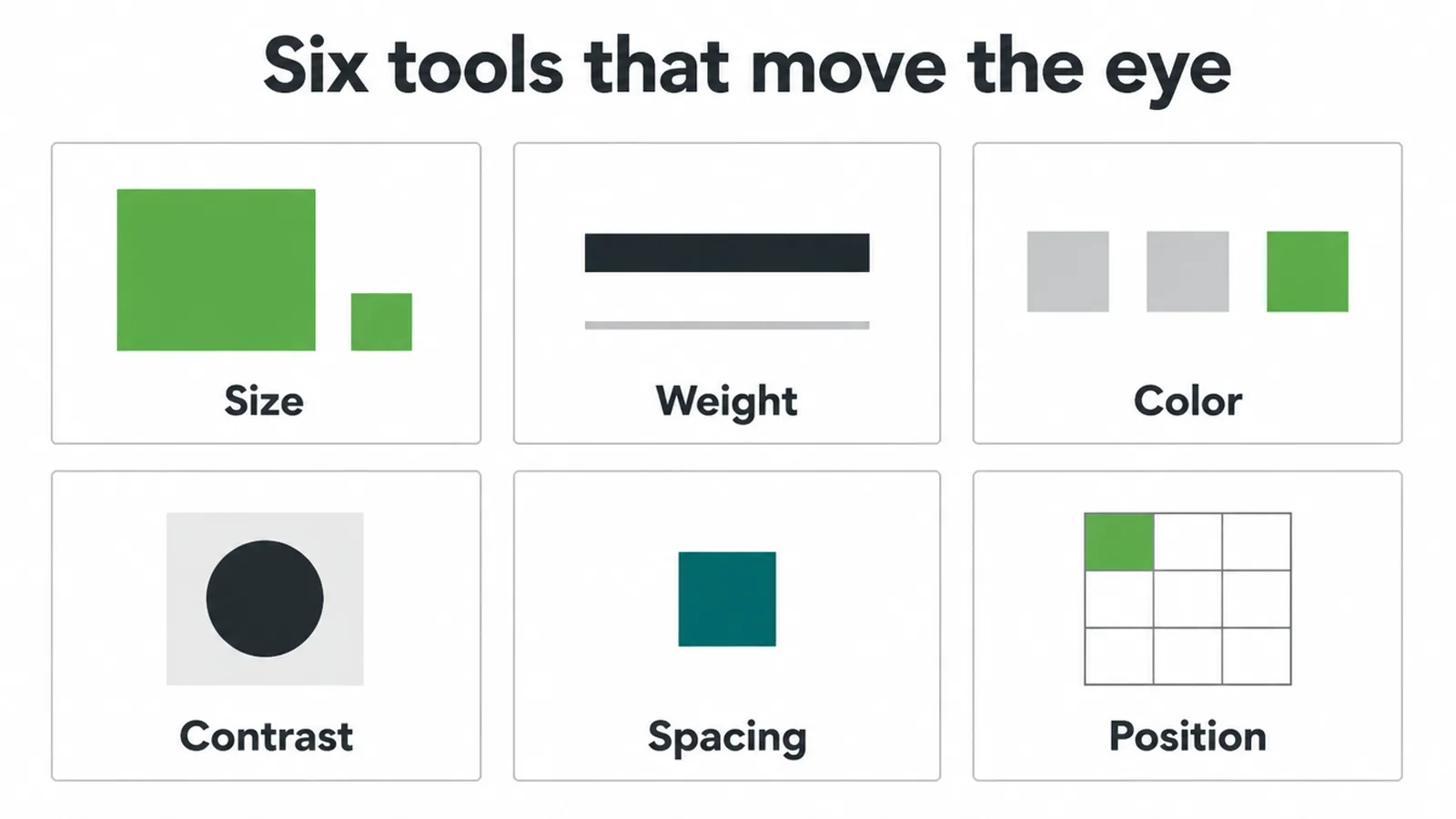
| Tool | What it does | Use it for |
|---|---|---|
| Size | Bigger elements feel more important and get seen first. | Headlines, key numbers, hero images. |
| Weight | Bold and heavy type carries more weight than thin type. | Sub-headings, names, a single emphasized word. |
| Color | A warm or saturated color pulls ahead of muted tones. | One brand color saved for the main button. |
| Contrast | The bigger the gap from its surroundings, the more it pops. | The single most important action on the screen. |
| Spacing | Room around an element makes it feel set apart and clean. | Isolating the focal point, separating sections. |
| Position | The eye starts top-left and weighs the top of the page most. | Logo, headline, primary offer, first button. |
Color and contrast are close cousins. Color picks the shade; contrast is how far that shade jumps from what sits around it. A green button on a busy green page has color but no contrast, so it disappears. Save your brightest color for one action and let it stand against a calm background.
Spacing is the quiet tool most people skip. Empty room is not wasted room. It frames the important thing and tells the eye, look here. We dig into this fully in our piece on white space in design, so we will not repeat it here.
Type choices matter too, since a strong heading font and a calm body font already build order before you touch anything else, as our notes on font pairing explain.
4. How people actually read a page
People scan in patterns, and you can design for them. On text-heavy pages the eye follows an F-pattern: a sweep across the top, a shorter sweep lower down, then a slide down the left edge.
Nielsen Norman Group discovered this shape by watching how 232 users looked at thousands of pages, and later confirmed the F-pattern is still common on desktop and mobile.
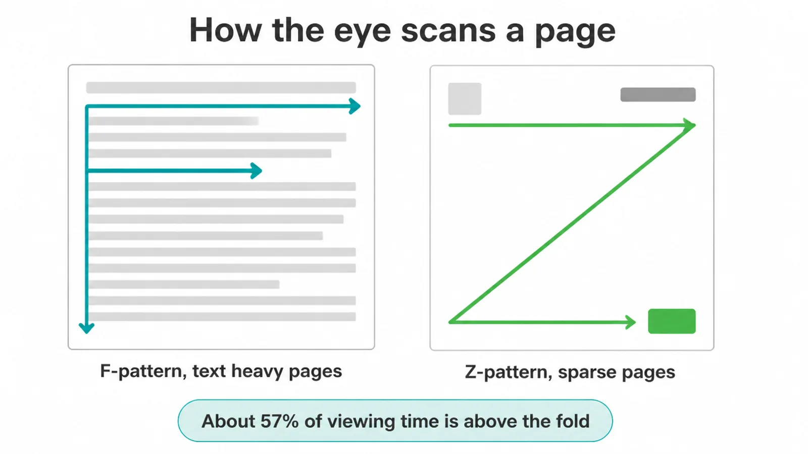
The F-pattern has a lesson built in: front-load the good stuff. Put your strongest words at the start of headings and the start of the first line. If the value is hiding at the end of a long sentence, most people never reach it.
For sparse pages with few words, like a landing page or hero section, the eye tends to trace a Z instead: top-left to top-right, diagonal down, then left to right along the bottom. Place your logo top-left, your offer top-right, and your button at the end of the Z.
And put the important things high. Users spend about 57% of viewing time above the fold, with most of the rest going to the next screenful. People do scroll now, but they still weigh the top of the page heaviest. So your headline and main action belong where they land first, not buried below.
5. Give every screen one focal point
A focal point is the single thing you want a visitor to look at and act on for that screen. Usually it is a headline plus one clear button. One focal point keeps the choice simple, and simple choices get made.
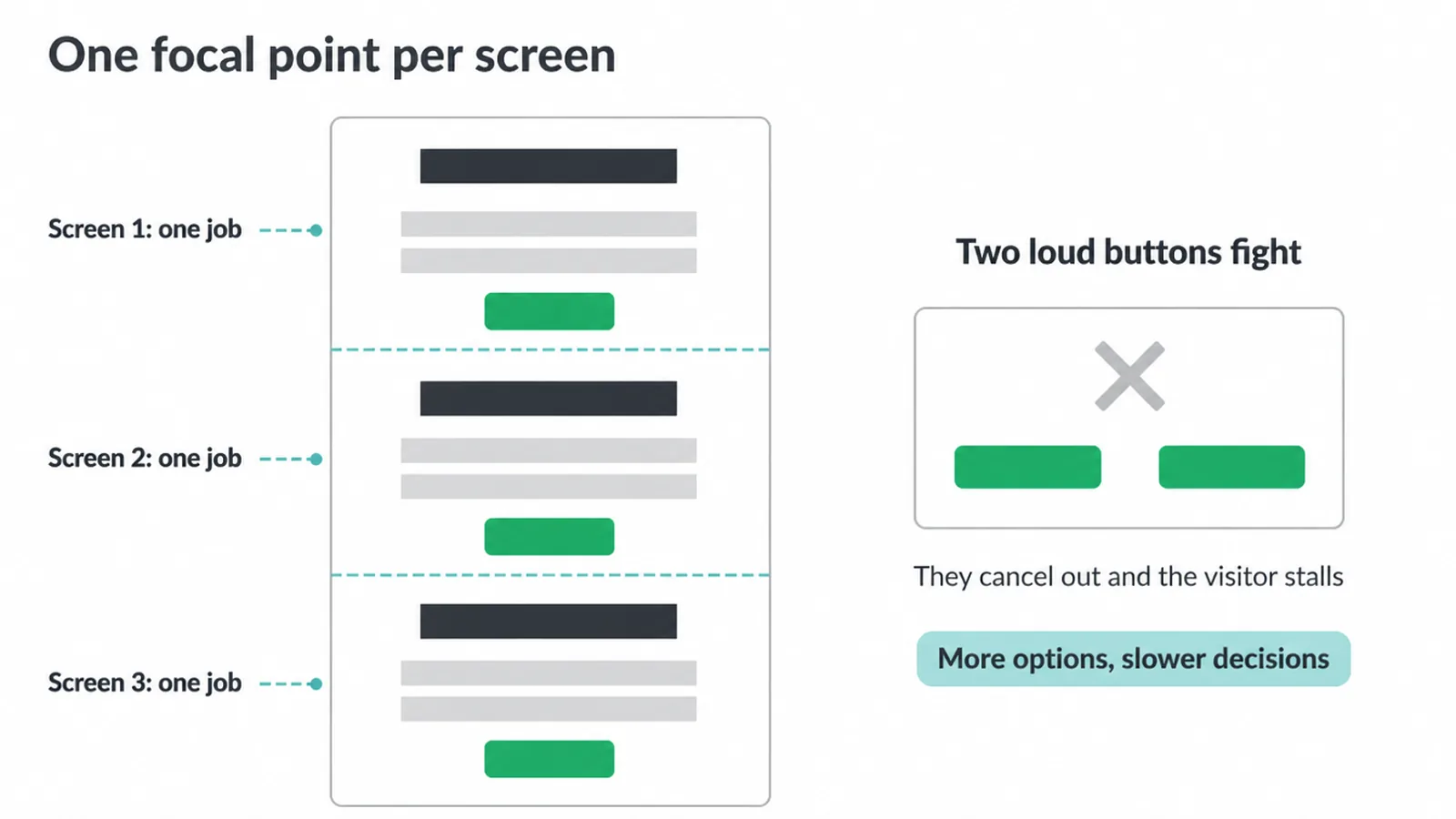
This is where Hick's Law helps. Hick's Law says that the more options you give someone, the longer they take to decide.
More buttons, more links, more competing offers, all of it slows people down. Two equally loud buttons in the same view do not double your results. They fight, cancel out, and leave the visitor stuck.
So pick the one action that matters most on each screen and make it win. Make it the brightest, give it space, and quiet everything around it.
Secondary actions can still be present, just smaller and softer, so they never compete with the main one. The visual design of that main action matters too, which is why we wrote a whole guide on button design.
A long page can hold a few focal points, but only one per screen. Each section gets one clear job, hands off to the next, and the flow stays calm. That is hierarchy working across a whole page, one view at a time.
6. How to test your visual hierarchy
You can check your hierarchy in seconds with three quick tests. None of them need software. All you need is your own eyes and a little honesty.
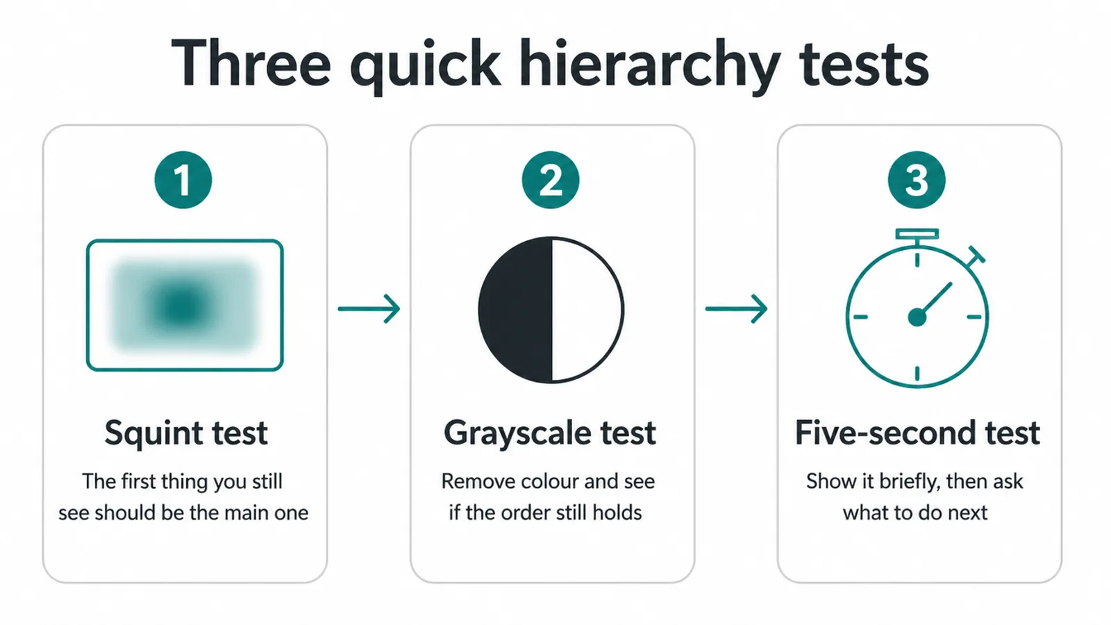
The squint test. Squint at your page until it goes blurry. The first thing you can still make out should be your most important element. If your headline and main button blur into everything else, your hierarchy is flat.
The grayscale test. Turn the page black and white. Now color cannot do the work, so size, weight, contrast, and spacing have to carry the order on their own. If the page falls apart without color, lean harder on the other five tools.
The five-second test. Show the page to someone for five seconds, then hide it. Ask what the page is for and what they would do next. If they cannot say, the eye never found a path. These checks fit naturally into a solid web design process, ideally before you build anything.
Hierarchy is not a one-time fix. As you add content over time, new elements creep in and start competing. Re-run the squint test every few months. If you want a fresh pair of eyes on yours, talk to us and we will tell you where the eye actually goes.
Frequently asked questions
1. What is visual hierarchy?
Visual hierarchy is the order in which people notice things on a page. Designers control that order using size, weight, color, contrast, spacing, and position. Bigger, bolder, and brighter elements get seen first, so you guide the eye to what matters most.
2. Why is visual hierarchy important?
People form a gut feeling about a page in under 50 milliseconds, according to Google Research. A clear hierarchy makes the page instantly readable, so visitors understand it fast and act faster. A flat page where everything looks equal forces people to work, and many just leave.
3. What is the F-pattern?
The F-pattern is how people scan text-heavy pages: a sweep across the top, a shorter sweep below it, then a slide down the left edge. Nielsen Norman Group found this shape by watching how 232 users read thousands of pages, and later research confirmed it is still common on desktop and mobile.
4. How do you create visual hierarchy?
Use the six tools together. Make the most important thing the biggest, boldest, or brightest. Add space around it so it stands alone. Put it high on the page or where the eye naturally lands. Then make everything else quieter so the focal point wins.
5. What is a focal point?
A focal point is the one thing you want a visitor to look at and act on for each screen. It is usually your headline plus a single clear button. One focal point per screen keeps the choice simple, so people decide and act instead of stalling.
6. Does size or color matter more for hierarchy?
Neither wins alone. Size sets the broad order of importance, while contrast and color pull the eye to a single spot. The strongest hierarchy stacks tools together: a big bold headline for structure, plus one bright button for the focal point. Used in isolation, each tool is weaker.
7. How does white space affect visual hierarchy?
Space is a quiet but powerful tool. Empty room around an element makes it feel important and easy to find, while cramped layouts make everything blur together. Give your focal point breathing room and it stands out without needing to be loud.
8. Can a page have more than one focal point?
A long page can have a few focal points, but only one per screen. If two buttons fight for attention in the same view, they cancel each other out and the visitor hesitates. Give each section one clear thing to do, then let the next section take over.