White Space in Design: Why Empty Space Sells
White space in design is the empty room around your text, images, and buttons. Learn why it makes small business sites easier to read, trust, and act on.
Key takeaways
- White space in design is the empty area around your content. It need not be white. It can be a color, a photo, or a gradient.
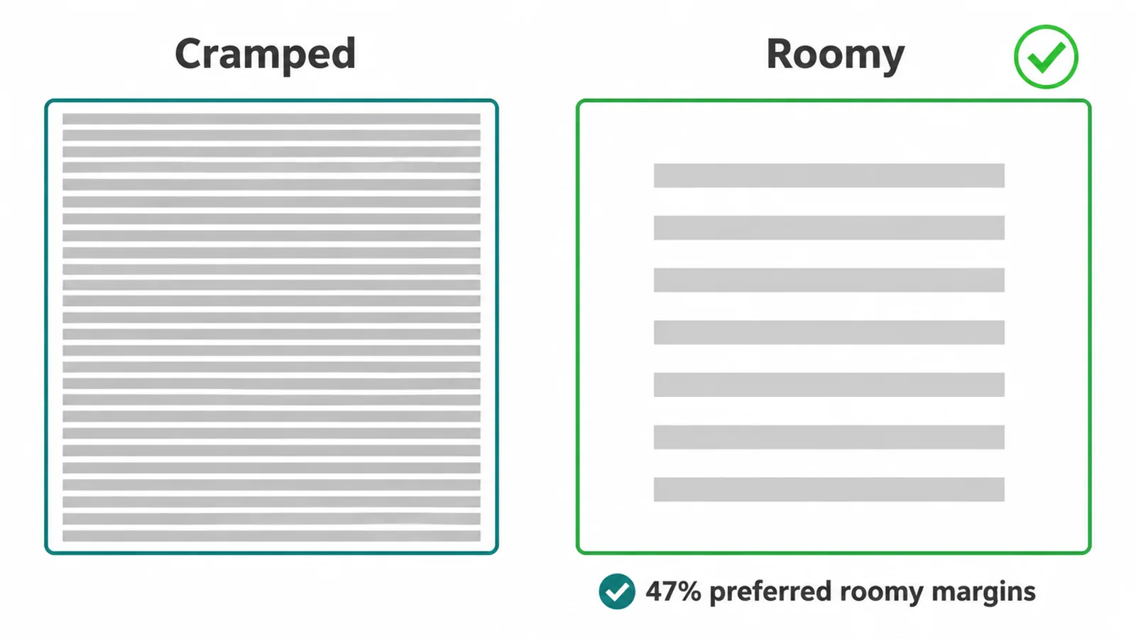
- Space makes text easier to read. In a Wichita State reading study, 47% of readers picked the layout with generous margins and comfortable line spacing as their favorite.
- Space creates focus. Room around one button helps the eye land on the action you want.
- Space signals quality. Calm, uncrowded pages feel more trustworthy and more premium.
- More is not always better. Moderate white space beats both crammed and overly empty layouts.
What is white space in design?
White space in design is the empty area around and between the things on a page, such as your text, images, and buttons. It holds no content of its own. Its only job is to give the real content room to breathe so a visitor can read it, focus on it, and act on it.
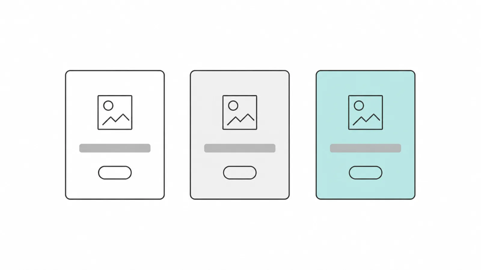
Here is the part that confuses people. White space does not have to be white. The name is a leftover from print, where the paper was usually white. On the web, that empty area can be a soft gray, a brand color, a photo, or a gradient. What makes it white space is that it is empty of content, not that it is the color white.
Designers also call it negative space, the term artists use for the room around a subject. Same idea, different word. Either way, the space is not wasted. It is doing work, even when it looks like nothing is there.
Micro and macro white space
White space comes in two sizes, and both matter. Getting them right is a big part of what makes a site feel calm instead of cramped.
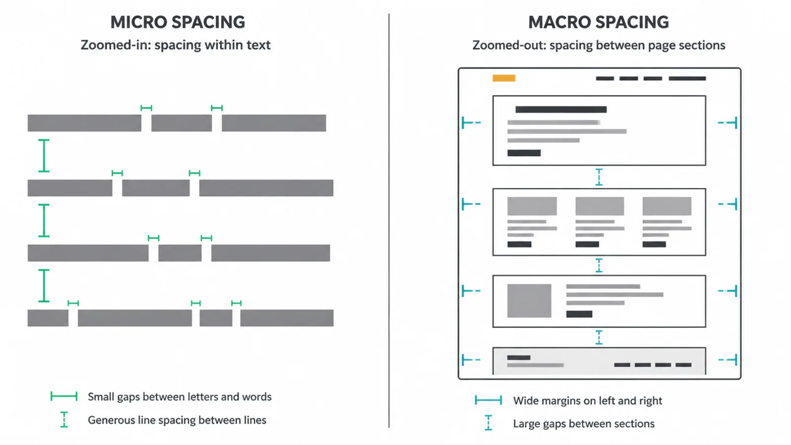
Micro white space is the small stuff. It is the gap between letters, the space between lines of text, the room inside a button, and the padding inside a form field. You barely notice it, but it decides how easy your words are to read.
Macro white space is the big stuff. It is the margin around the whole page, the gap between major sections, and the room around your main image and button. This is the space that creates focus and sets the overall mood of the site.
| Type | Where it lives | What it does |
|---|---|---|
| Micro | Between letters, words, and lines; padding inside buttons and fields | Controls how easy text is to read |
| Macro | Page margins, gaps between sections, room around the hero and main button | Controls focus and the overall feel |
Why empty space sells
Empty space is not just pretty. It does three jobs that help a small business site turn visitors into customers.
It makes your words easier to read. A Wichita State reading study found that readers who saw text with generous margins and comfortable line spacing actually understood more of it. When asked which layout they liked best, 47% of readers chose the version with roomy margins and good spacing. The same work showed that line spacing shaped how satisfied people felt and how much eye strain they reported. People do not read what they cannot comfortably read.
It points to the one thing you want. If your page has ten buttons, none of them stand out. Give a single button clear space on every side and the eye lands on it. That is why a strong call to action needs room around it, not neighbors crowding in. We cover that in our guide to button design that gets clicks.
It makes you look trustworthy. Think about how a premium brand presents a product: one item, plenty of empty room, nothing competing. Apple is famous for this. The space says the product can speak for itself. Crowd that same item with badges and offers and it starts to feel cheap. If you want your brand to feel calm and confident, space is part of how you get there, which ties into your overall brand and visual identity.
It lowers overwhelm. When a page throws everything at someone at once, it gets harder to process and easier to give up on. Research on information overload links it to mental fatigue and lower motivation to act (see this review on information overload and message fatigue). Empty space is how you avoid asking too much of a visitor's attention.
How to add white space to your site
You do not need a full redesign to get more room. Most of these are small changes you can make today.
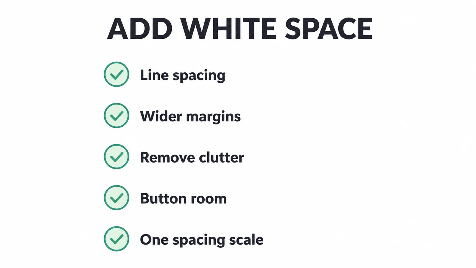
- Open up your text. Increase the space between lines and between paragraphs. Cramped text is the fastest way to lose a reader.
- Widen your margins and padding. Give blocks more room on the sides and more breathing room inside. Do not run content edge to edge.
- Remove what the page does not need. Every extra item eats space and attention. If it is not earning its place, cut it.
- Give your main button room. Keep clutter away from your call to action so it stands alone.
- Use one spacing scale. Pick a small set of gap sizes and reuse them everywhere. Consistent spacing looks deliberate; random spacing looks broken.
Generous, consistent spacing is one of the quiet habits behind a modern website design. It is also a core part of good user experience, because space guides where people look and what they do next.
Two mistakes to avoid
There are two ways to get white space wrong, and most small business sites fall into one of them.
Mistake one: cramming everything in. When a homepage tries to show every service, offer, and badge at once, visitors freeze. This is one of the most common small business website mistakes we see. The fix is almost always to remove, not add.
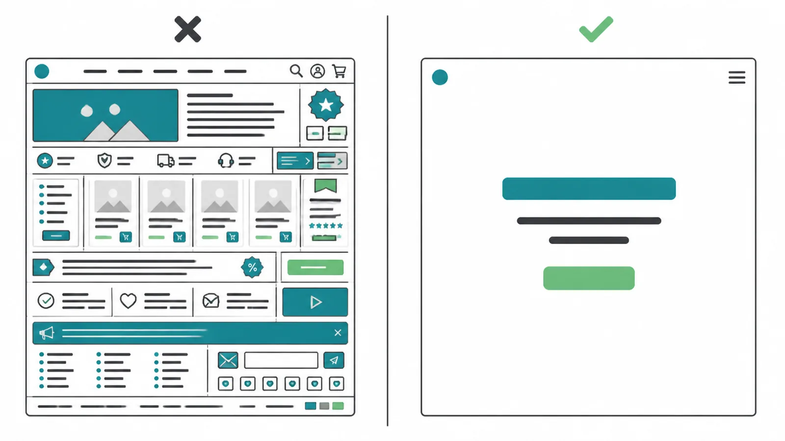
Mistake two: too much empty space. White space is a tool, not a goal. Push related items so far apart that they stop feeling connected, or shove your main content below the fold, and you have a problem too. The Wichita State reading work found that a moderate amount of space was preferred over both crowded and overly sparse layouts. Aim for balanced, not bare.
The goal is simple. Enough room to read and focus, not so much that things feel lost. When you build a small business website that respects a visitor's attention, space is one of your best tools for doing it.
Frequently asked questions
What is white space in design?
White space in design is the empty area around and between the things on a page, like text, images, and buttons. It carries no content of its own. Its job is to give the real content room to breathe so a visitor can read it, focus on it, and act on it without feeling crowded.
Does white space have to be white?
No. White space is just empty space, so it can be any color. It can be a soft gray, a brand color, a photo background, or a gradient. The word white is a leftover from print, where the paper was usually white. What matters is that the area is empty of content, not that it is the color white.
What is the difference between micro and macro white space?
Micro white space is the small gaps inside content, like the space between letters, lines, and words, or the padding inside a button or form field. It controls readability. Macro white space is the big gaps between whole sections, the margins around the page, and the room around your main image and button. It controls focus and the overall feel of the site.
Why is white space important?
White space makes a page easier to read, helps the eye find the one thing you want it to do next, and makes a brand feel calm and trustworthy. It also lowers the feeling of overload. When everything competes for attention, nothing wins, and visitors leave. Empty space gives the important parts a clear path to be noticed.
Can a website have too much white space?
Yes. White space is a tool, not a goal. Too much space can scatter related items so far apart that they no longer feel connected, and it can push your main content below the fold. Research on reading layouts found that a moderate amount of white space was preferred over both crammed and overly sparse layouts. Aim for balanced, not empty.
Is white space the same as negative space?
Yes, the two terms mean the same thing. White space is the common phrase in web and graphic design. Negative space is the term artists and photographers often use for the empty area around a subject. Both describe the parts of a layout with no content, used on purpose to shape what the viewer sees first.
Does white space make a site look premium?
Generous white space tends to read as calm, confident, and high quality. Premium brands often surround a single product with lots of empty room, the way a boutique gives one item a whole shelf. Crowding the same item with offers and badges makes it feel cheaper. Space signals that you do not need to shout.
How do I add white space without a full redesign?
Start small. Increase the line spacing and paragraph spacing in your text, widen the margins and padding around blocks, and remove items the page does not need. Give your main button clear room on every side. Use the same set of spacing sizes everywhere so the gaps feel deliberate. These small changes add room without rebuilding the site.
About the author
We are the Seed Light team, a web design and digital marketing studio founded in 2017. We build small business websites that are easy to read, easy to act on, and built to win customers. If your site feels crowded and you want it to breathe, tell us about your project and we will help you find the room.
Put it into practice
Need help putting this to work?
We design, build and market websites that turn attention into revenue. Tell us what you are working on and we will point you the right way.
Keep reading