Best Web Design Websites 2026: 7 Ideas Worth Borrowing

The best web design websites are the ones that quietly bring in customers. They say one thing clearly at the top, load fast, use real photography, keep navigation obvious, and point to one main action. Simple, familiar layouts make the first screen easier to read. Seed Light applies these patterns to client sites.
Key takeaways
- The best web design websites are not the flashiest. They are the ones that load fast, say one clear thing, and make the next step obvious.
- Visual appeal is rated fast. In a 2006 study, Lindgaard and colleagues found that people rated a page's visual appeal after 50 milliseconds of viewing.
- Simple wins. Google Research found people prefer simple and familiar designs (2012).
- Speed is design too. A site that loads in one second converts about 3x higher than one at five seconds (Portent, 2022).
- Steal patterns, not pages. Copy the principle behind a great site, never its screenshot.
1. What "best" really means in web design
The best web design websites are not the flashiest. They are the ones that work. A site can win awards and still lose customers, and a plain site can quietly bring in messages every day.
So when you go looking for the best designed websites, whether for a first build or a redesign, look for results as well as looks.
The first screen needs to communicate before anyone explores the rest of the page. Clear words and a visible next step do that work.
They are reacting to the feel of the page: is it clean, is it clear, does it look trustworthy. Google Research backs this up. People prefer designs that look simple and familiar (2012).
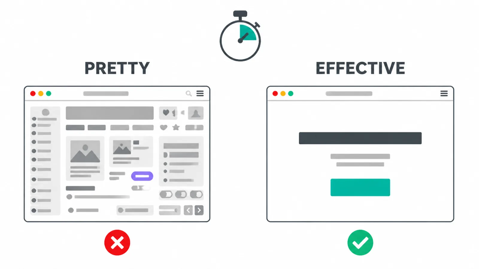
So pretty and effective are not the same thing. Pretty gets a nod from other designers. Effective gets a customer to call you. The good news is that the best sites are usually both, and the way they get there is repeatable.
If you want a wider view of current looks and styles, our guide to modern website design covers the trends. This post is about the patterns underneath them.
2. How to look at great sites without copying them
When you find a site you love, do not ask "how do I make mine look like this." Ask "what is this doing well that I can copy in plain terms." That small shift changes everything. You stop chasing a look and start collecting useful ideas.
Browse two kinds of sites. First, galleries like Awwwards and Dribbble, which show off craft and fresh ideas. Second, the best sites in your own field, because those reflect what your customers already expect to see. Familiar layouts win. People relax when a page works the way they think it should.
Never copy a screenshot. Three reasons. It can look cheap once it lands on your brand. It often breaks in places you cannot fix later.
And it can land you in legal trouble if you lift someone's exact art or words. Copy the idea, not the image. Keep your own layout familiar, then make it yours with your photos, your words, and your colours.
3. 7 patterns to steal from the best web design websites
Look at enough strong sites and the same moves keep showing up. These are the patterns worth stealing. For each one, here is the idea to steal and how to apply it to your own small business site.
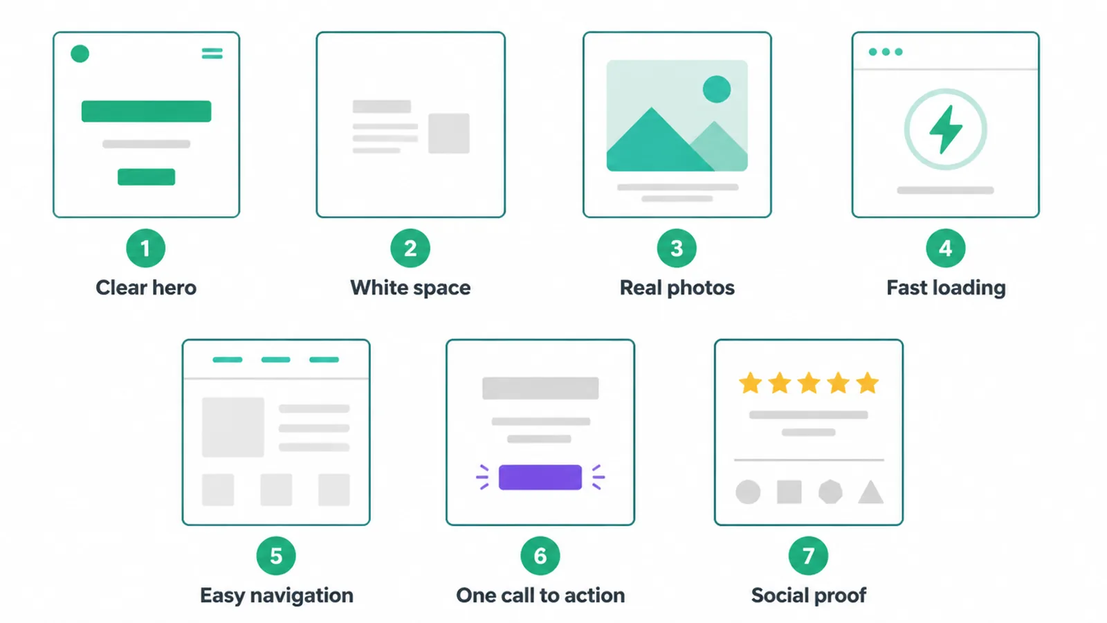
| Pattern | The idea to steal | How to apply it |
|---|---|---|
| Clear hero, one message | Say what you do and who it is for in one line | Put one headline and one button at the top, cut the rest |
| Generous white space | Let the page breathe so the eye knows where to look | Add space around your headline, photos, and buttons |
| Real photos | Show real people, products, and places, not stock clichés | Use your own images and keep file sizes small |
| Fast loading | Speed feels like quality before a word is read | Compress images, drop heavy effects, test on a phone |
| Obvious navigation | Make it easy to find anything in a click or two | Use plain menu labels and keep the bar simple |
| One strong call to action | Point people to a single main next step | Repeat one clear button, not five competing ones |
| Visible social proof | Show that real people trust you, near the action | Place reviews, logos, and counts beside your buttons |
1. A clear hero with one message
The hero is the part you see before scrolling. The best sites use it to say one thing: what you do, who it is for, and what to do next. No riddles. If a stranger cannot tell what you sell in three seconds, the hero has failed. Cut everything that is not the main message.
2. Generous white space
White space is just empty room around things. It is not wasted. It tells the eye where to look and makes a page feel calm and premium. Cramped pages feel cheap and stressful.
If your site feels busy, the fix is usually less, not more. Space is a core part of good UX design, the craft of making a site feel easy.
3. Real photos that actually load
Strong sites use real images of their own work, people, and place. Real beats generic stock every time, because it builds trust. But there is a catch.
Adobe found 39% of people stop engaging if images will not load or take too long (via HubSpot). So use real photos, then shrink them so they load fast.
4. Speed that feels like quality
Speed is design you can feel before you read anything. A site that loads in one second converts about 3x higher than one that takes five seconds (Portent, 2022). The best sites guard their speed fiercely. If you want the technical side, our guide to Core Web Vitals breaks down the numbers that matter.
5. Navigation you cannot get lost in
Great sites make it easy to get anywhere in a click or two. The menu uses plain words, not clever ones. People should never have to guess what a label means. If they cannot find your services or your contact details fast, they leave. Simple menus beat fancy ones.
6. One strong call to action
The best sites point you to one main thing: book a call, get a quote, shop now. They repeat that single button instead of offering ten doors at once.
Too many choices freezes people. Pick the one action you want most and make it stand out. Our guide to button design covers how to make that button impossible to miss.
7. Social proof you can see
Trust is part of design. The best sites show reviews, client logos, ratings, and real numbers right where you make a decision. This is not vanity.
The Stanford Web Credibility Project found 46.1% of people judged a site's credibility partly on its visual design and presentation. Put proof near your buttons. Our guide to contact page design shows where trust signals work hardest.
4. Where to find good web design inspiration
Use three sources, each for a different job. Galleries like Awwwards and Dribbble are for craft and fresh ideas. They show you what is possible and stretch your taste. Just remember most award sites are built to dazzle judges, not to sell your service, so take the spirit and leave the heavy effects.
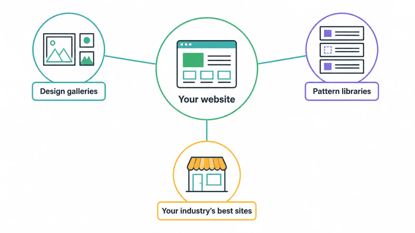
Pattern libraries are for proven, common layouts. They show you the moves customers already understand, the hero shapes, the pricing tables, the nav bars. Familiar is good. Adobe found 38% of people stop engaging if a layout is unattractive (via HubSpot), and unfamiliar often reads as unattractive.
Your own industry is the third source, and the most useful. Look at the best sites your customers already visit. That tells you what feels normal and trustworthy in your field. Steal the patterns, keep your layout familiar, then stand out with your words and photos, not with strange navigation.
5. The common mistake: copying the wrong thing
The biggest mistake is copying a flashy award site you cannot maintain. You see a glossy 3D homepage with scroll effects, you love it, you ask for the same. Then it loads slowly, breaks on phones, and nobody can update it. You copied the look, not the principle.
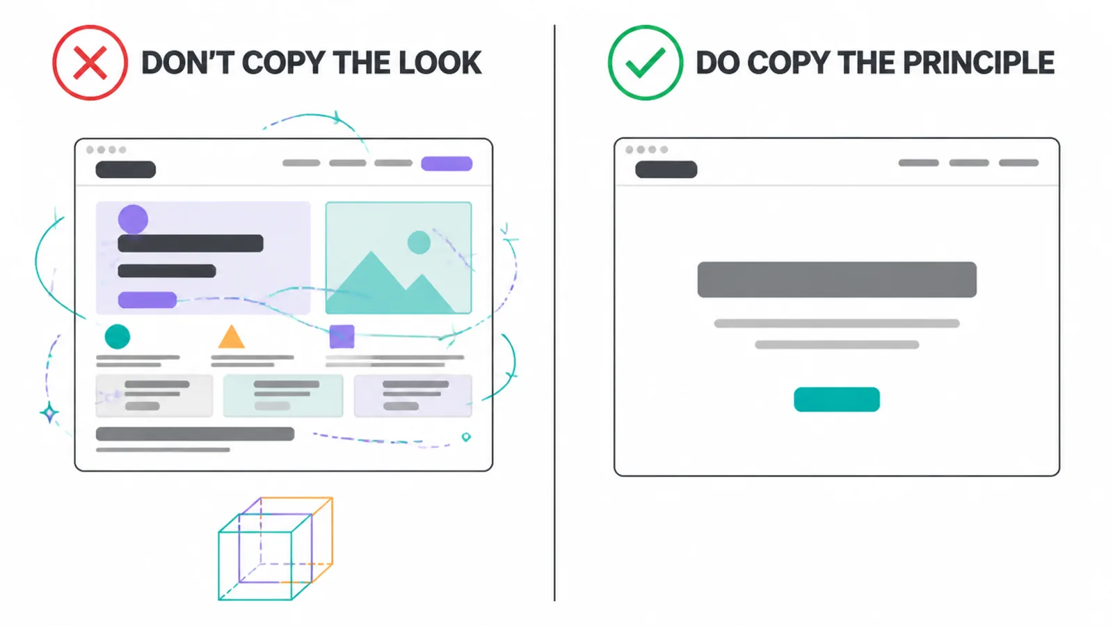
Copy the principle instead. If an award site has a calm, focused hero, steal "one clear message," not their melting animation. If it feels premium, that is usually white space and good type, both of which you can apply on any budget. The principle travels. The exact build often does not.
This trap shows up again and again in real projects. We cover it, and other costly slip-ups, in our guide to small business website mistakes. The short version: chase clarity and speed, not bragging rights. A simple site that loads fast and says one thing will beat a beautiful site nobody can use.
6. How Ottoman Malaysia and Better B2C use these patterns
These patterns show up in our own client work. Ottoman Malaysia, a custom-fit car mat retailer, lets buyers search by vehicle model, with large photography showing the installed fit and product details underneath. Better B2C, a free directory run by a registered non-profit, explains its directory in one short passage at the top and routes visitors to search, free registration or donations.
Frequently asked questions
1. What makes a good website design?
A good website design is clear, fast, and easy to use. It says one thing up top, loads quickly, shows real photos, has obvious navigation, and points you to one main action. Looks matter, but only after the site is easy to understand. Clarity works better than clever wording.
2. What are the best designed websites?
The best designed websites are the ones that quietly do their job. That is hard to put on a list, because the most effective sites often look simple. Instead of chasing a single famous example, look for the shared patterns: a clear hero, lots of breathing room, real images, fast loading, and one strong call to action. Those patterns repeat across almost every site that works.
3. Where can I find web design inspiration?
Browse galleries like Awwwards and Dribbble for craft and fresh ideas. Browse pattern libraries to see common, proven layouts. Then look at the best sites in your own field, because those reflect what your customers already expect. Use galleries for inspiration, not for copying, and keep your own layout familiar.
4. Should I copy another website's design?
Do not copy a screenshot or a whole layout. Copy the principle behind it instead. If a site has a calm hero with one message, steal the idea of one message, not their exact words or art. Copying a design pixel for pixel can look cheap, break in places you cannot maintain, and risk legal trouble. Steal patterns, not pages.
5. Do simple websites work better?
Yes, in most cases. Research from Google found that people prefer designs that look simple and familiar, and they judge a page in well under a second. A simple site is easier to understand, faster to load, and cheaper to maintain. Flashy effects can impress designers but confuse the customer who just wants to find your phone number.
6. How fast do people judge a website?
Visual appeal is judged quickly, so the first screen needs a clear message, readable type and a useful next step. The hero section and loading speed shape what visitors can see and use first.
7. How many websites should I look at for ideas?
Look at a handful in your field and a handful of award sites, then stop. You are not trying to see everything. You are trying to spot the patterns that keep showing up. Once you notice the same clear hero, the same white space, and the same single button appearing again and again, you have found what to steal.
8. What is the most important part of a website's design?
The hero, the part you see first without scrolling. It has to say what you do, who it is for, and what to do next, in plain words. A clear hero gives visitors the context they need to continue.