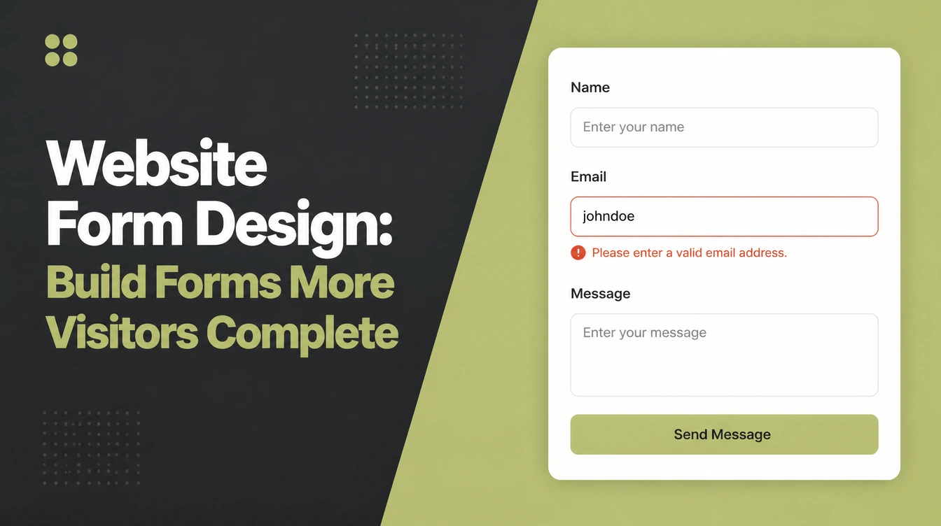
Website Form Design: Build Forms More Visitors Complete

Website form design works best with few fields, one column, visible labels and checks as people type. HubSpot reports that Imagescape cut a form from 11 fields to 4 and recorded a 120% conversion lift. Seed Light builds forms for phones first, then tests them on real devices.
Key takeaways
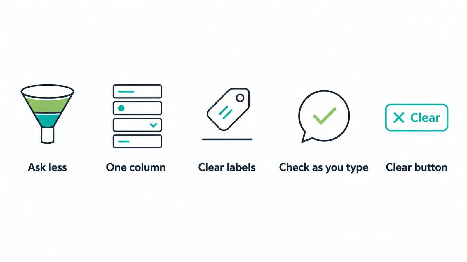
- Ask for less. One company cut a form from 11 fields to 4 and lifted conversions by 120 percent (HubSpot).
- Use one column. Single-column forms were completed about 15.4 seconds faster than multi-column ones.
- Drop fields you do not need. Requiring a phone number lost 39 percent of signups in one study.
- Help as people type. About 31 percent of sites have no inline validation, so clear, instant feedback is an easy win.
- Build for the phone first. Mobile completion trails desktop, roughly 42 percent versus 47 percent.
1. What makes a form people finish?
Good website form design asks for as little as possible, stacks every field in one column, labels each field clearly, helps people fix mistakes as they type, and ends with a button that says what happens next.
That is the whole job. A signup form, a checkout, a lead form, a booking form, and a contact form all follow the same rules.
Most forms fail for the same boring reasons. They feel long. They ask for things that feel risky. They throw errors with no clue how to fix them. They break on a phone. None of that is hard to solve once you know what to look for.
This guide is the field manual we use in our own client work building small business sites. If you want the bigger picture of how a whole site fits together, start with our small business website guide. This post zooms all the way into one piece: the form.
2. Ask for less
Every field is a tiny "are you sure?" Each one gives the visitor a fresh reason to stop. So treat every field as a cost, not a freebie.
The company Imagescape cut a form from 11 fields down to 4 and saw conversions climb by 120 percent (HubSpot). Same offer, fewer questions, far more finishers.
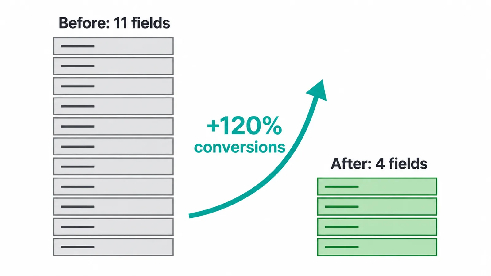
Watch the risky fields most of all. Requiring a phone number cost one site 39 percent of its signups. People guard their phone number, so unless you truly need to call, leave it out or make it optional.
One nuance. Field count is not perfectly tied to completion (Zuko). A short form that feels confusing can still lose people, and a slightly longer form that feels easy can win. So the rule is not simply "fewer boxes".
It is "cut what you do not need, then make what is left feel light". Measure the change either way: our free conversion rate calculator turns visits and form fills into a percentage you can compare month to month.
3. One column, top to bottom
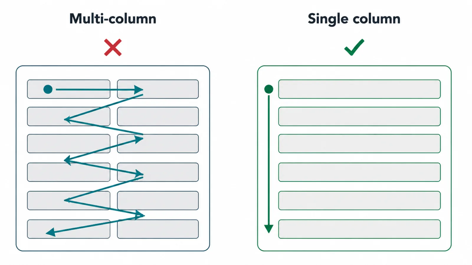
Stack your fields in a single column. People completed single-column forms about 15.4 seconds faster than the same fields spread across columns. One column gives the eye a single straight path, so nobody has to zigzag or guess what comes next.
Order matters too. Put the easy, low-risk fields first, like a name or an email, and save the personal or fiddly ones for last. By the time someone reaches the harder questions, they are already invested and far more likely to push through.
4. Labels above the field
Put a clear, visible label above each field and keep it there. A popular shortcut is to hide the label inside the box as grey placeholder text. Skip that.
Placeholders used as labels hurt usability (NN/g), because the hint vanishes the second someone starts typing. Now they cannot check what the field was for, and they cannot scan back over what they entered.
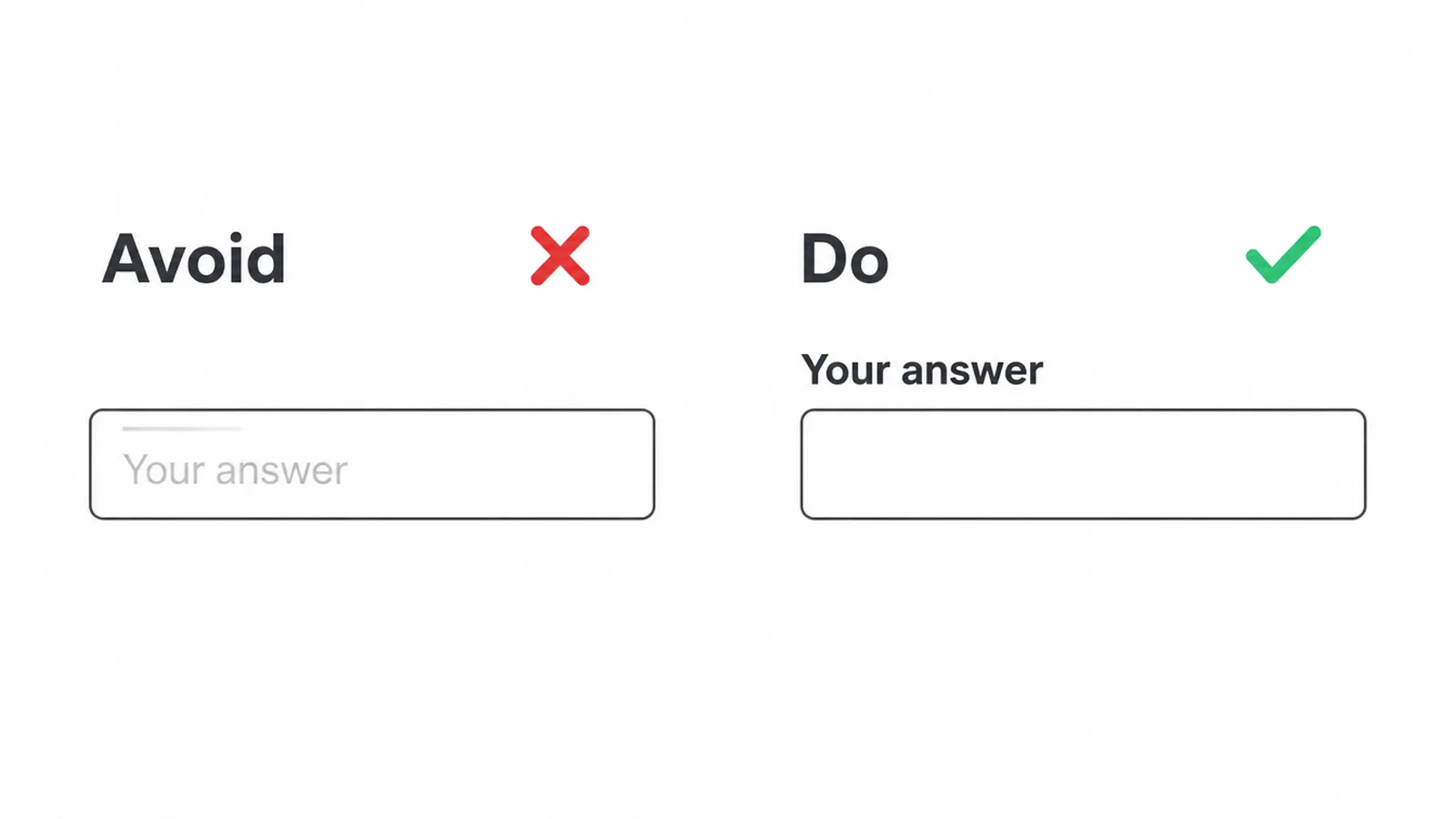
A label that lives outside the field stays put the whole time. If you need an example or format hint, add a short helper line under the field that also stays visible.
Clear labels are a core habit of good interface work, which is why we cover them in our guide to what UX design really means.
5. Help as they type
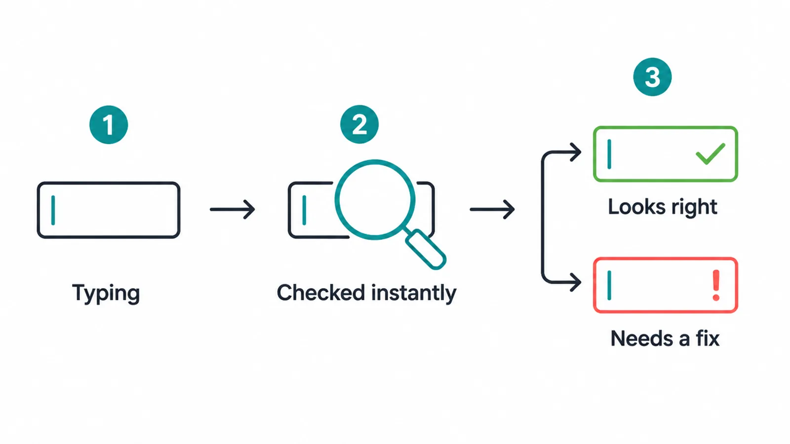
Check answers as people go, not only after they hit the button. This is called inline validation: a green tick when a field looks right, or a plain message right beside the field when it does not.
It works because people fix the problem while it is still fresh, instead of scrolling back through a wall of red later.
This is rarer than you would think. About 31 percent of sites have no inline validation at all (Baymard), so getting it right puts you ahead of a third of the web. Validate when someone leaves a field, not on every keystroke, so you are not yelling before they finish typing.
Write errors like a helpful person, not a robot. "Please enter a valid email" beats "Error 400". Say what is wrong and how to fix it, and place the message next to the field it belongs to.
6. Build for the phone first
Design the form on a phone screen first, then let it grow for desktop. Mobile completion usually trails desktop, around 42 percent on mobile versus 47 percent on desktop (Zuko), with tablet near 41 percent. A phone-first form closes that gap instead of widening it.
A few small things do most of the work. Use big tap targets so thumbs do not miss. Keep one column, since side-by-side fields get cramped fast.
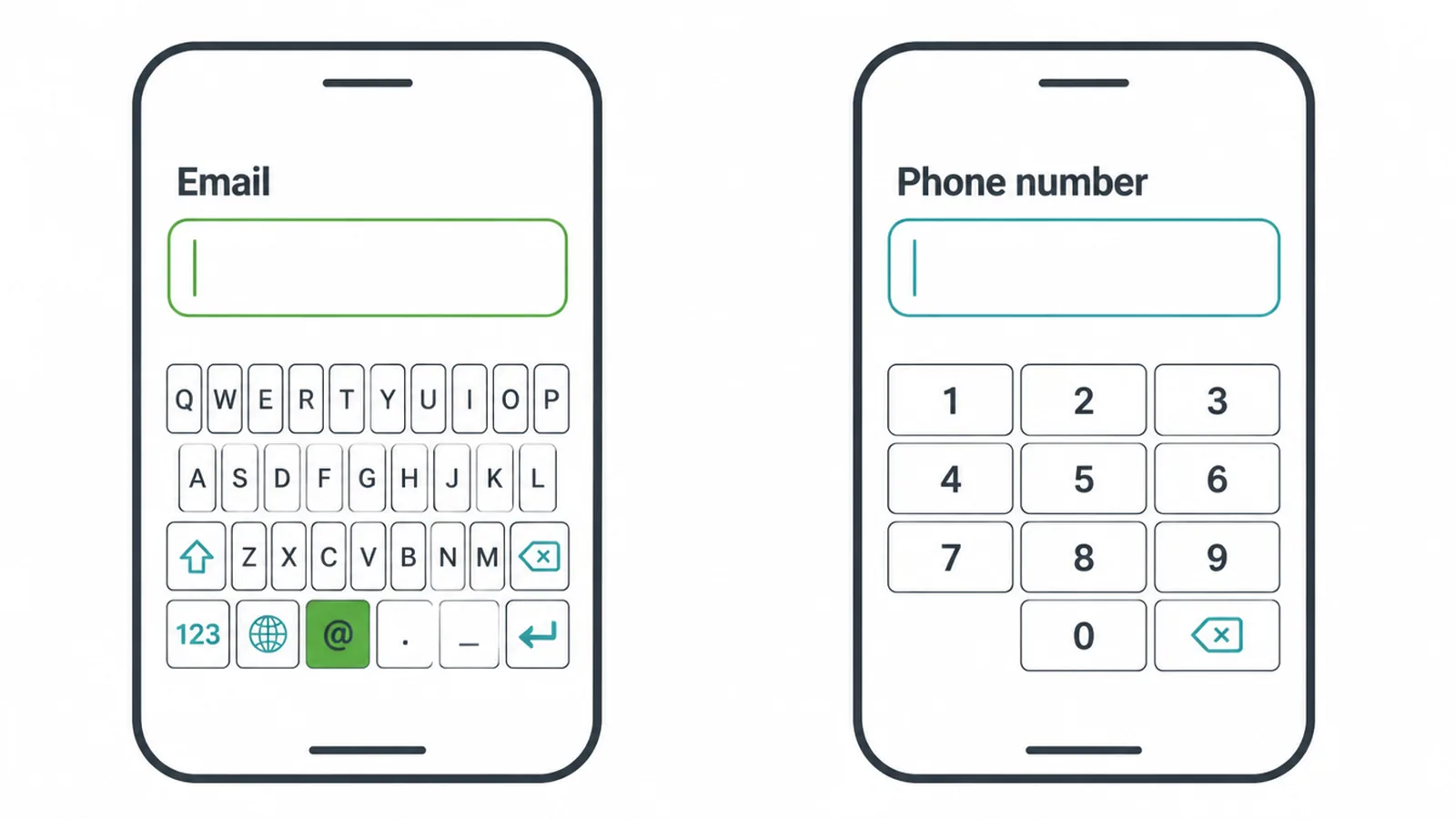
And trigger the right keyboard for each field, so an email field opens the email keyboard and a number field opens the number pad. For the wider playbook, see our guide on making a site mobile friendly.
7. Make people feel safe
People hesitate when a form feels nosy. So tell them why you need each piece. A tiny note beside a field, like "so we can send your booking confirmation", removes the worry. When the question makes sense, people answer it.
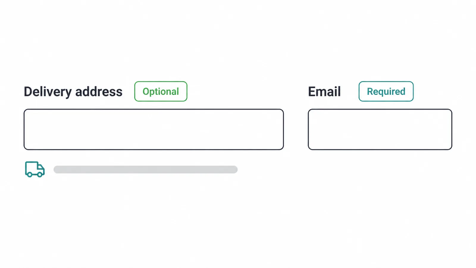
Mark which fields are required and which are optional, plainly, in words. Add one short line about what you do with their details and what happens after they submit.
A simple "we will reply within one working day" beats a black hole. Clear, readable forms also serve people using assistive tech, which is why label clarity overlaps with website accessibility.
8. One clear button, or a few short steps
End with one button that names the outcome. "Get my quote" or "Book my slot" beats a vague "Submit", because it tells the visitor exactly what they get. We dig into the wording, size, and colour of that button in our guide to button design.

For longer forms, break the work into two or three short steps with a progress bar. A booking or checkout that asks for six or more things feels lighter when it arrives a handful of questions at a time.
One small example shows how much a single field can swing things: a travel site quietly removed a single confusing field and the fix was widely reported to recover a huge amount of lost revenue, all from one box that did not belong.
If your form is mostly a way for people to reach you, our contact page design guide covers that specific build in full, so we will not repeat it here.
9. Do and avoid: a quick checklist
Here is the whole guide on one screen. Use it as a final pass before any form goes live.
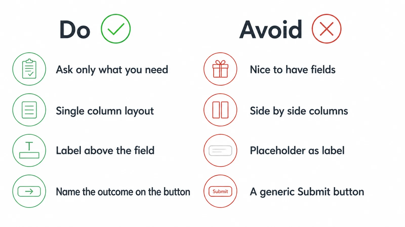
| Do | Avoid |
|---|---|
| Ask only for what you truly need | Adding "nice to have" fields that scare people off |
| Stack fields in a single column | Side-by-side columns that make the eye zigzag |
| Put a visible label above each field | Hiding the label inside the box as a placeholder |
| Validate as people go, with friendly messages | Saving every error for after they hit the button |
| Design for the phone first, with the right keyboard per field | Tiny tap targets and a desktop-only layout |
| Say why you need each field and what happens next | Asking for personal details with no reason given |
| Name the outcome on the button | A generic "Submit" that promises nothing |
| Split long forms into short, clear steps | One endless scroll that feels like a chore |
Frequently asked questions
1. What makes a good website form?
A good website form asks for as little as possible, stacks fields in one column, uses clear labels above each field, helps people fix mistakes as they type, and ends with a button that says what happens next. Every form type follows the same rules, whether it is a signup, checkout, lead, booking, or contact form.
2. How many fields should a form have?
Use the fewest fields you truly need. One company cut a form from 11 fields to 4 and lifted conversions by 120 percent. Field count is not perfectly tied to completion, so the goal is to remove anything you do not need and make what is left feel light.
3. Should labels go above or inside the field?
Put a visible label above each field. Using the placeholder text inside the field as the label hurts usability, because the hint disappears the moment someone starts typing and they can forget what the field was for. A persistent label outside the field stays readable the whole time.
4. Is a single column or multiple columns better?
A single column is the safer default. In one study, participants completed single-column forms about 15.4 seconds faster than the same fields in multiple columns. Use one column to keep the field order clear from top to bottom.
5. What is inline validation and does it help?
Inline validation checks an answer as someone types or moves to the next field, then shows a green tick or a clear error right away. It helps because people fix problems while the field is still fresh in mind. Yet about 31 percent of sites still have no inline validation at all, so doing it well is an easy edge.
6. Why do people abandon forms?
People abandon forms when they feel too long, ask for things that feel risky or pointless, throw confusing errors, or break on a phone. Asking for a phone number when it is not needed is a common culprit. One study found that requiring a phone number lost 39 percent of signups.
7. Should fields be required or optional?
Make a field required only if you genuinely need that answer to do your job. Everything else should be optional or removed. Mark optional fields plainly so people know they can skip them, and never force an answer just because it would be nice to have.
8. How do you make a form work on a phone?
Use a single column, big tap targets, and the right keyboard for each field, so an email field opens the email keyboard and a number field opens the number pad. Mobile completion tends to trail desktop, around 42 percent versus 47 percent, so a phone-first form closes a real gap.