Contact Page Design: Turn More Visits Into Enquiries

A contact page gets messages when it is short, clear and human: a plain headline, a three-field form, your phone number and email in view, your hours, and a stated reply time. Give people several ways to reach you and make it work on a phone. Seed Light builds contact pages this way.
Key takeaways
- Short forms win. Forms with three fields convert at about 23.1%, while ten or more fields drop to 6.9%, per Digital Applied (2026). Ask for name, email, and message only.
- Show your phone number. Most people would rather call a real person than fill in a form, and a missing number reads as suspicious, per the Nielsen Norman Group.
- Give more than one way to reach you. Phone, email, and a form together. A form should be supplementary, never the only door.
- Reply fast. Contacting a lead within an hour makes you about seven times more likely to qualify it, per the Harvard Business Review.
- Make it work on a phone. One column, big buttons, the right keyboard for each field.
1. What makes people reach out
Good contact page design makes reaching out feel quick, safe, and human. People send a message when the page is short and clear, gives them a few easy ways to get in touch, and tells them when they will hear back.
That is the whole job. Everything else on the page is just support for those three things.
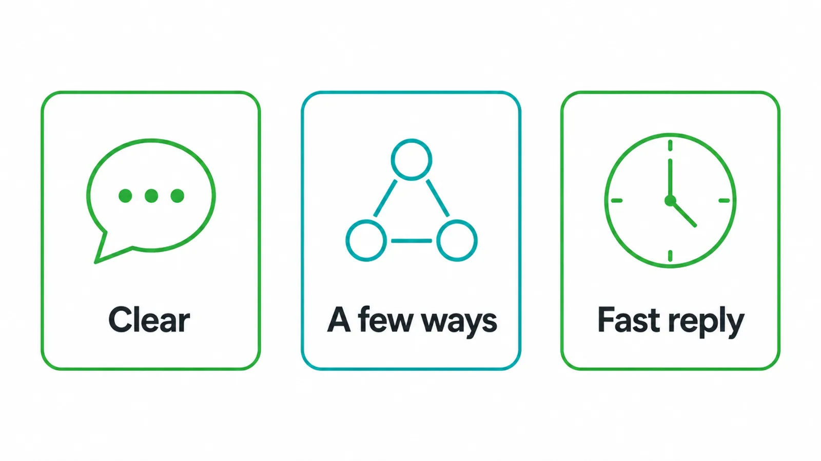
Think about how you feel when you want to contact a business. You want to know they are real, you want the fastest way to reach them, and you want to know someone will actually reply.
A page that answers those worries gets messages. A page that hides the phone number behind a long form does not.
Your contact page is one of the most important pages on your site. If you are still planning the rest of it, our guide to building a small business website covers the full picture, and this post zooms in on the page where people decide to reach out.
2. What every contact page needs
Every contact page should have a friendly headline, a short form, your phone number, your email, your hours, a line about when you will reply, and one clear button. That is the core. You can add a map or social links, but those are extras, not the foundation.
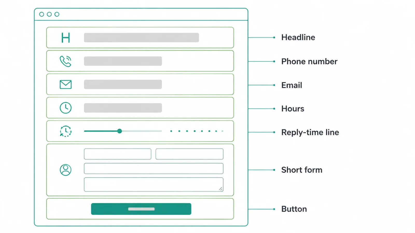
Start with a headline that sounds like a person, not a robot. Something like "Tell us what you need" beats a plain "Contact" sign. Then put your phone number and email near the top, before the form, so people who want to skip the form can.
The form sits below those, and it stays short. A form is one way to reach you, not the only way.
The Nielsen Norman Group found that many people see forms as barriers and recommends keeping them supplementary. So a form is fine, as long as a phone number and an email sit right beside it.
3. Keep the form short
Fewer fields means more messages. This is the single biggest fix most contact pages need. Every extra box you ask people to fill in scares some of them off, and the drop is bigger than most owners expect.
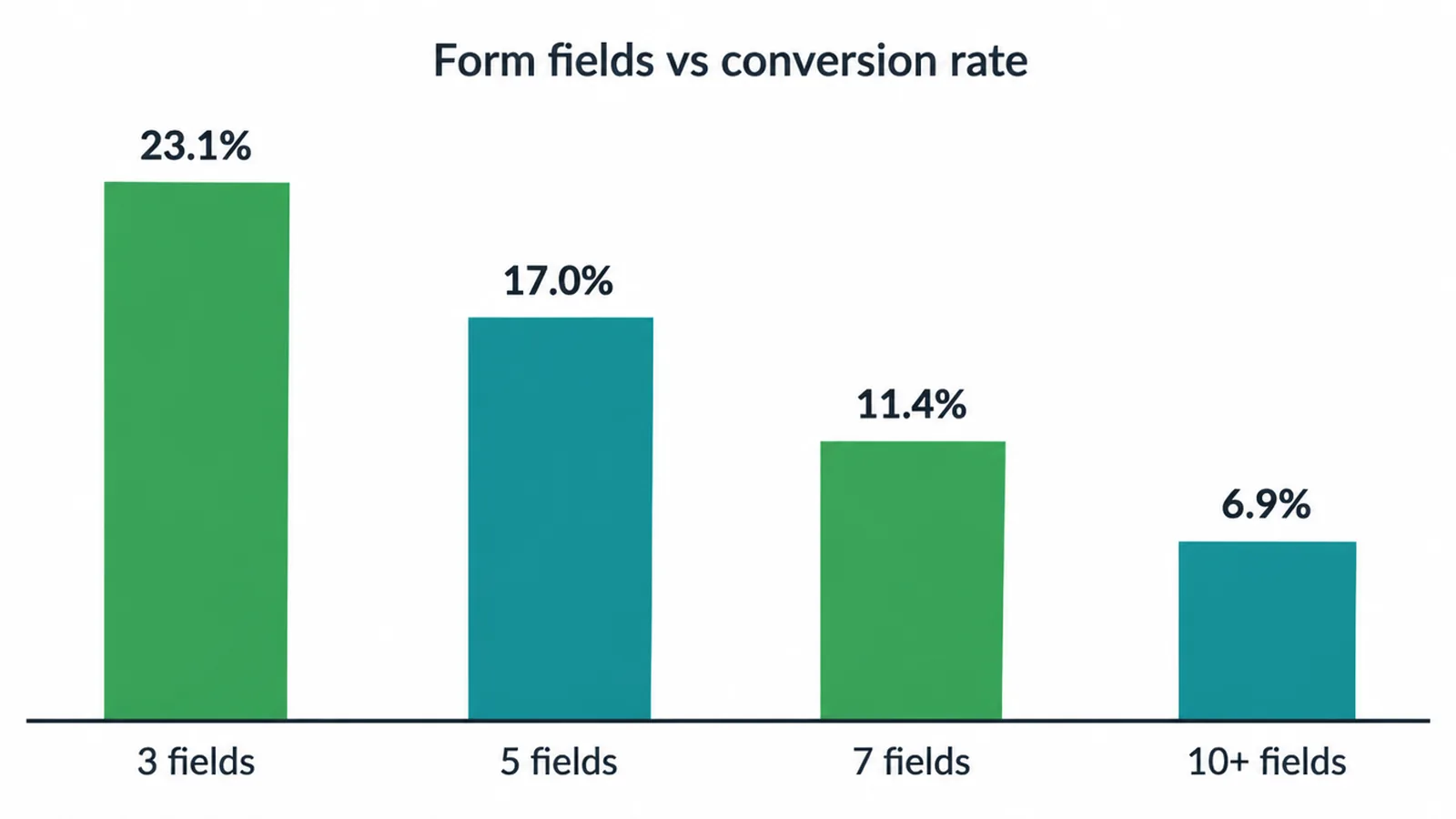
The numbers are clear. According to Digital Applied (2026), forms with three fields convert at about 23.1%, five fields at 17.0%, seven fields at 11.4%, and ten or more fields at just 6.9%.
There is a real cliff between five and seven fields, where each new field roughly doubles what it costs you to get one message.
So keep it to three fields for most small businesses: name, email, and message. That is all you need to start a conversation. You can ask for the rest once they reply.
Two more small wins. Name your button by what it does, like "Send message" or "Get a quote", instead of the cold word "Submit". And do not mark every field as required if you do not need it.
If you want a developer to wire the form up properly with spam protection that does not block real people, our web design and development team handles that part.
4. Give people more than one way to reach you
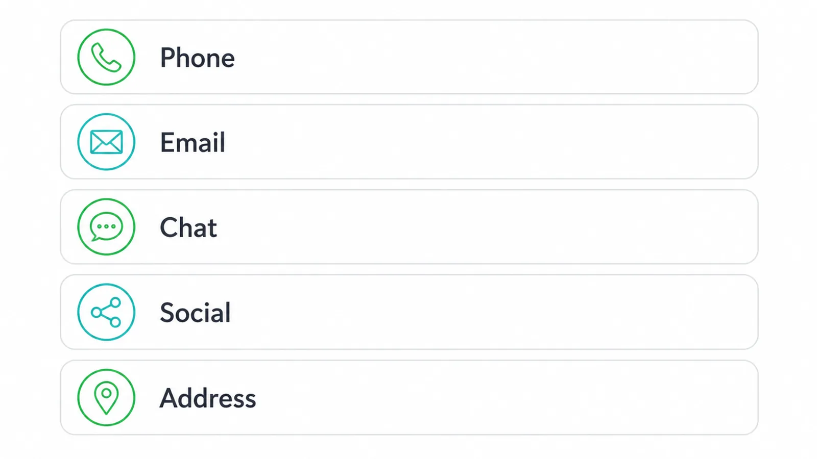
Different people like to reach out in different ways, so offer a few. Show your phone number, your email, a chat or messaging link if you use one, your social profiles, and your address. Let each person pick the way that feels easy to them.
Phone matters more than many owners think. The Nielsen Norman Group reports that most users prefer phoning a real person over filling in a form.
The same research shares a user who treated a missing phone number as a sign that a business had something to hide. So put your number up top, and make it tappable on phones so a call is one touch.
This choice also affects how your page looks and feels. A clean layout that lists each option clearly is part of good web design, not an afterthought. Lay the options out plainly so nobody has to dig for the one they want.
5. Build trust and set expectations
People hold back when they are not sure what happens after they hit send. So tell them. Add a short line that says when you reply, like "We answer within one working day". Show a clear thank-you message after the form is sent.
Add your address and a small map if you have a real location. Those signals say you are a real business that will actually respond, and an automatic reply can confirm it the second the form is sent.
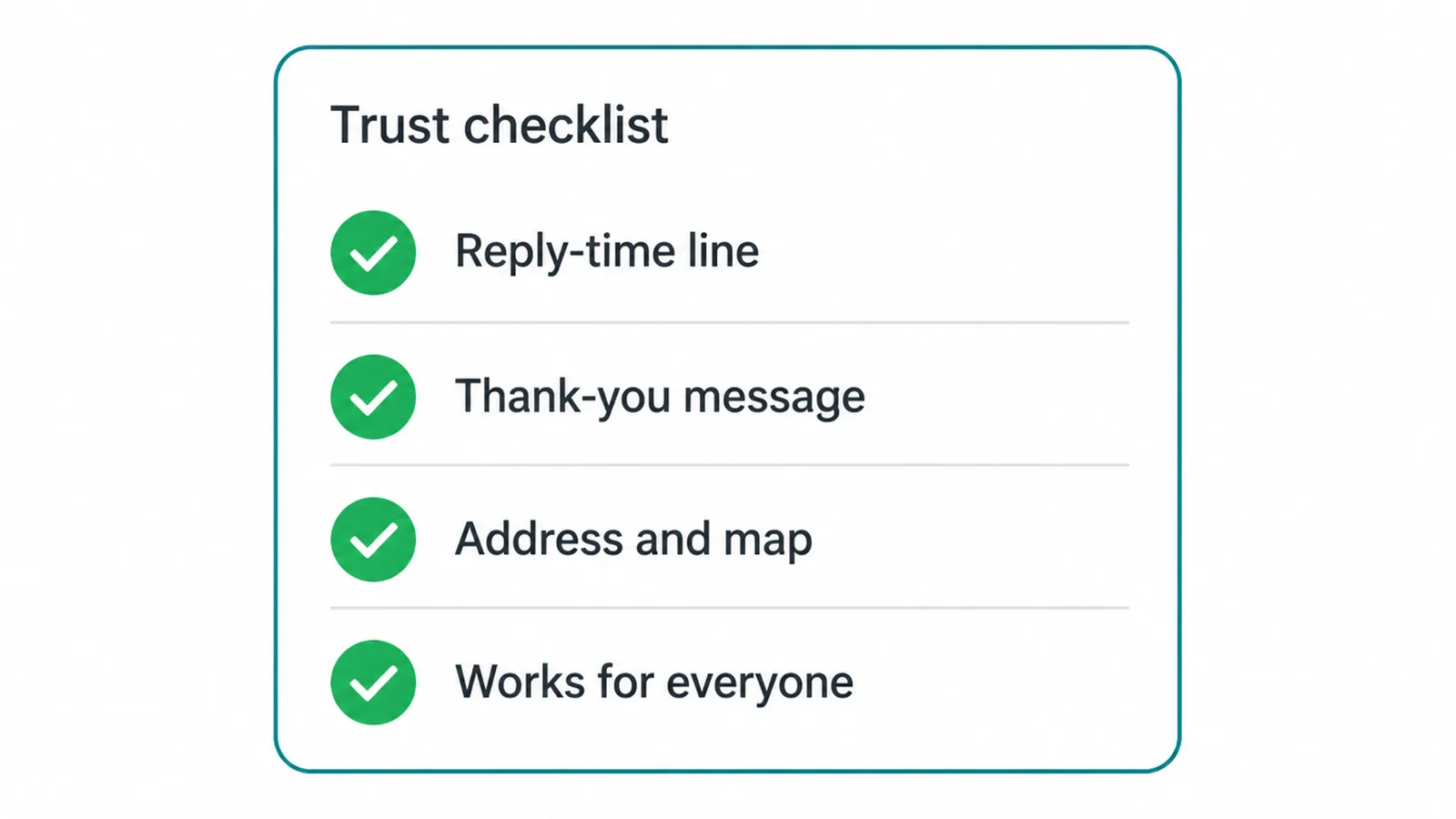
Setting a reply time is good for sales. The Harvard Business Review found that contacting a lead within an hour makes a business about seven times more likely to qualify it than waiting longer.
So promise a fast reply on the page, then keep that promise. Speed wins while the person is still thinking about you.
One more trust point: make the page usable for everyone. Clear labels, good contrast, and fields that work with a keyboard help every visitor, and they are part of basic website accessibility. A page that works for all people simply gets more messages.
6. Make it work on a phone
About half of web traffic is mobile, so the contact page must work well on a small screen. Use a single column, large tap targets, and the correct keyboard for each field.
The phone field should bring up a number pad. The email field should bring up an email keyboard. These tiny touches make filling it in feel effortless.
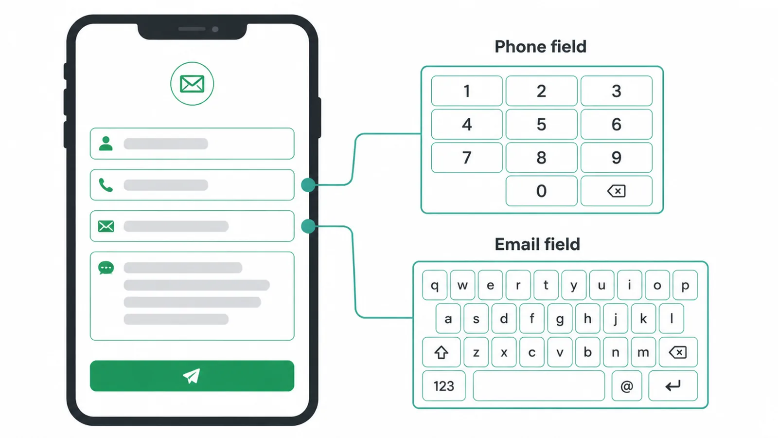
This matters because phones are already the harder place to convert. Digital Applied (2026) found that mobile lead forms convert about 32% below desktop ones. You cannot remove that gap fully, but a short, well-built mobile form closes a lot of it.
If your site is not yet built for small screens, start with our guide on how to make a website mobile friendly.
And because a slow page loses people before they ever see your form, it is worth understanding Core Web Vitals too. A fast, simple mobile contact page is one of the best investments you can make.
7. What quietly kills contact page messages
A few common mistakes quietly kill messages. Watch for these and your contact page will already beat most.
- A long form. Ten fields scare people off. Remember the drop from 23.1% to 6.9% as fields pile up.
- Blocking CAPTCHAs. Puzzles that stop bots also stop real people. Use quieter spam protection instead.
- The word "Submit". It feels like a form for a tax office. Say what the click does.
- Form only. No phone, no email. You lose everyone who prefers another way.
- No reply time. People wonder if anyone is even there.
- Broken on mobile. Tiny buttons and the wrong keyboard send phone users away.
- A page hidden in the footer. Put the contact link in your top menu where people look first.
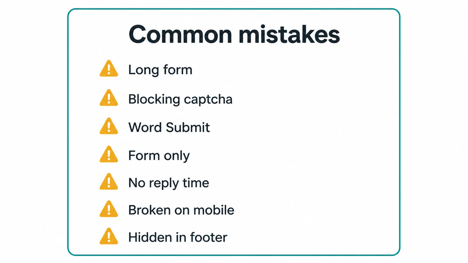
These show up again and again. For more traps to dodge across your whole site, see our roundup of common small business website mistakes.
8. Contact page checklist
Use this short checklist when you build or review your page. Tick each row and you will have a contact page that earns messages.
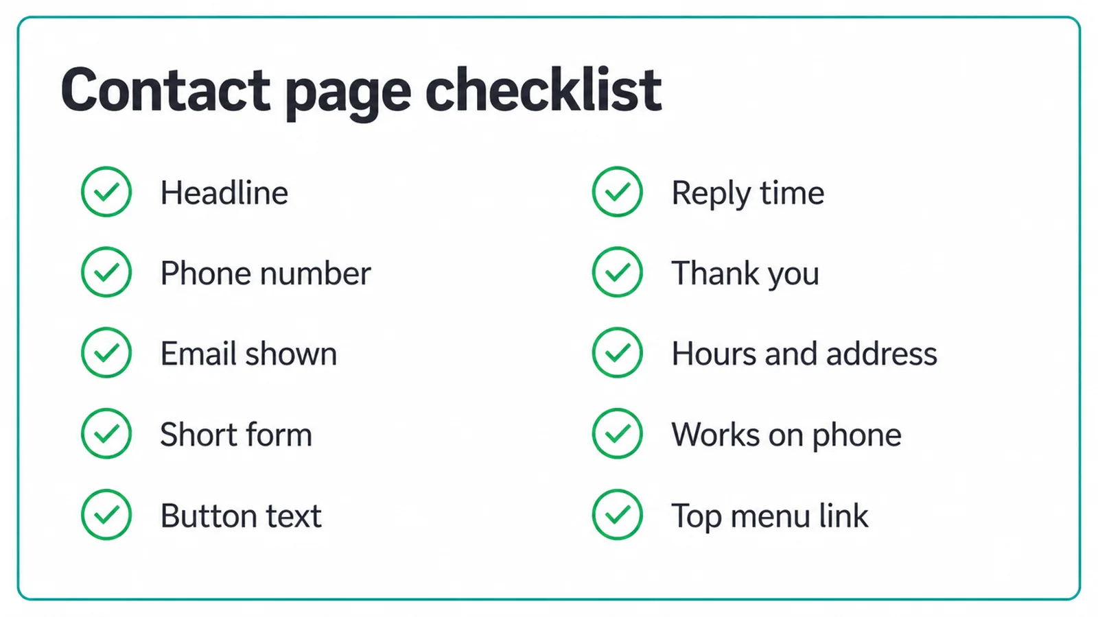
| Element | Why it matters | Done? |
|---|---|---|
| Friendly headline | Sounds human and tells people they are in the right place | |
| Phone number near the top | Gives callers a direct route without making them hunt | |
| Email address shown | Helps people who like using their own inbox | |
| Short form (3 fields) | Asks only for the details needed to reply | |
| Clear button text | "Send message" beats "Submit" and sets the right expectation | |
| Reply-time line | Sets expectations and builds trust before they hit send | |
| Thank-you message | Confirms the message went through | |
| Hours and address | Proves you are a real, reachable business | |
| Works on a phone | About half of web traffic is mobile | |
| Link in the top menu | People look for contact at the top, not in the footer |
Tick every box and you are set. If you would rather have us build a contact page that turns visitors into real messages, get in touch and we will help.
9. How Better B2C gives each audience a clear route
The same thinking runs through our client builds. The Better B2C nonprofit directory gives visitors clear routes to search the directory, register a business for free or support the organisation through donations. Its contact options sit alongside those routes, so each audience can find the right next step.
Frequently asked questions
1. What should a contact page include?
A good contact page needs a clear headline, a short form (name, email, message), your phone number, your email, your hours, and a line that says when you will reply. Give people more than one way to reach you, and make the whole thing easy to use on a phone.
2. How many fields should a contact form have?
Keep the fields you need to reply. Name, email and message are a useful starting point for a simple enquiry form. Add a phone number, budget or service only when the reply depends on it. Check form completion in your analytics before adding or removing fields.
3. Should I use a form or just an email link?
Use both. A short form gives visitors a quick way to send details, while a plain email link lets them use their own inbox. Keep both visible so the form is one option instead of the only route.
4. Should I show my phone number on the contact page?
Yes. Put your phone number near the top of the page and make it tappable on phones. This gives visitors a direct option alongside the form and email link.
5. How fast should I reply to a contact form message?
As fast as you can, ideally within an hour. Harvard Business Review research found that contacting a lead within an hour makes you about seven times more likely to qualify it than waiting longer. Speed matters most while the person is still thinking about you, so reply while the message is fresh.
6. What should the contact form button say?
Use clear words that say what happens next, like Send message or Get a quote. Avoid the word Submit, which feels cold and vague. The button text should match what the person came to do, so they feel sure about the click.
7. Where should the link to my contact page go?
Put the contact link in your main menu at the top of every page. People look for it in the top right corner first. Make it easy to find from anywhere on your site so nobody has to hunt for a way to reach you.
8. How do I make my contact page work well on a phone?
Use a single column layout, large tap targets, and the correct keyboard for each field so phones show a number pad for the phone field and an email keyboard for the email field. Mobile forms convert lower than desktop ones, so keep them short and simple to close that gap.