UX vs UI: The Difference Explained in Plain English

UX design decides what a person needs to do on your site and in what order. UI design decides how it looks and feels: type, colour, buttons, spacing. You need both, and the risk is paying for one while assuming you bought the other. Seed Light approves wireframes before visuals.

You've got a quote in front of you that mentions UX and UI, possibly as one word, and you're not sure whether you're being charged twice for the same thing.
Almost every article on this question is written for someone choosing a career. This one is written for you, the person paying the invoice.
By the end you'll know what each term covers, which of your website's problems belongs to which, and what to put in a brief so a designer quotes for the right work.
Key Takeaways
- UX is the whole experience, UI is the surface. Nielsen Norman Group define user experience as all aspects of a person's interaction with a company, its services and its products.
- People see the surface first. Layout, colour and controls shape the first view before anyone uses the interface.
- UI has measurable standards. WCAG 2.2 sets a 4.5:1 contrast ratio for normal text and a 24 by 24 pixel minimum for tap targets.
- Most sites fail them. The WebAIM Million found detected accessibility failures on 95.9% of one million home pages in February 2026, with low contrast text the most common.
- Treat the famous ROI figure with care. The "every dollar in UX returns a hundred" line is attributed to a Forrester report that sits behind a paywall, so almost nobody quoting it has read it.
What Is UX Design?
User experience design is the work of deciding what a person needs to do on your site, in what order, and making that path as short as possible.
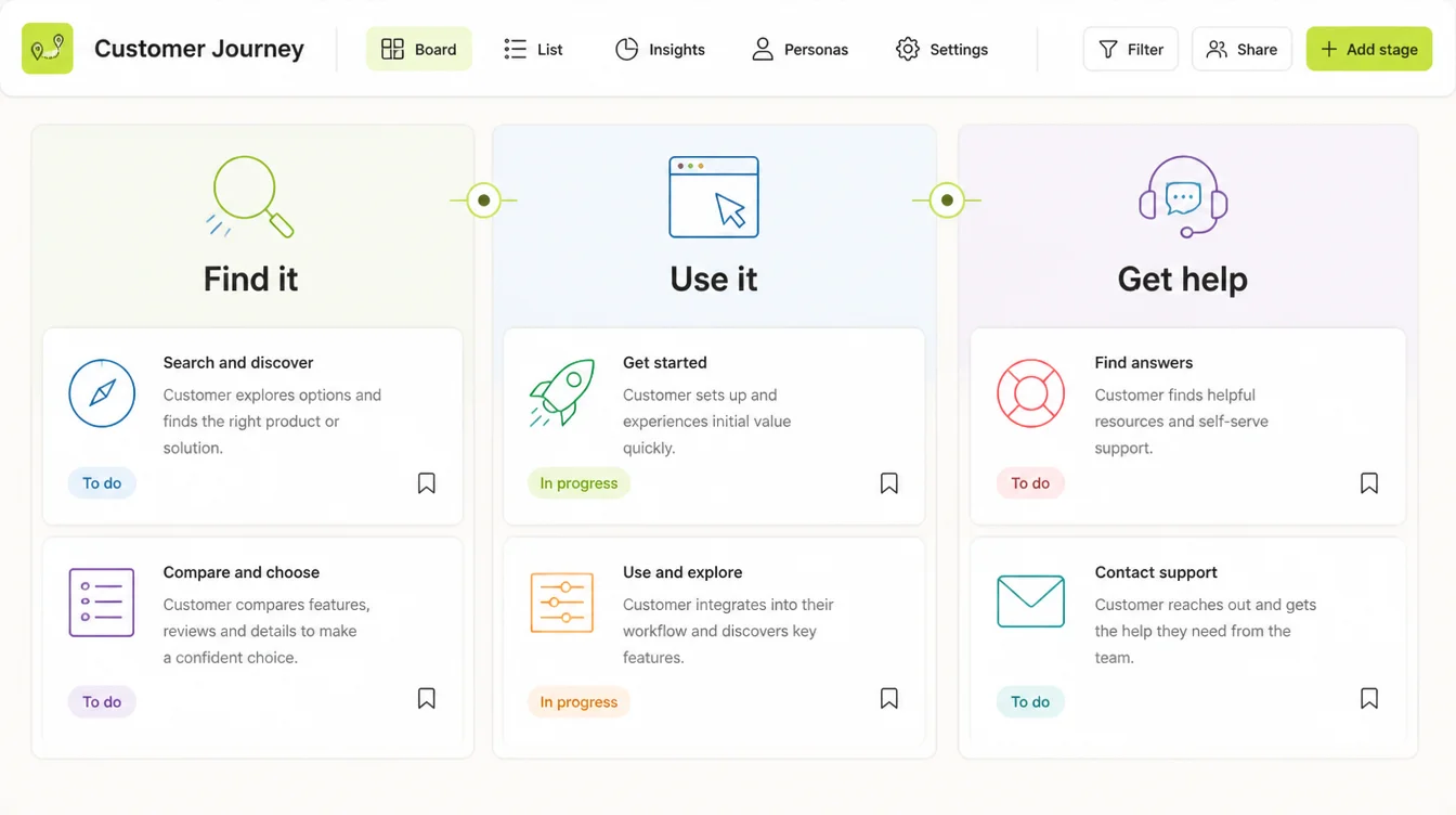
The definition the field has used since 1998 comes from Nielsen Norman Group, who say user experience "encompasses all aspects of the end-user's interaction with the company, its services, and its products".
Note what that includes. The phone call after the enquiry is part of it. So is the confirmation email.
On a website, UX work usually looks like this:
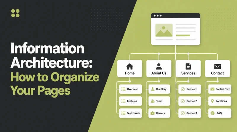
- Deciding the page list. What pages exist, and which one a first-time visitor lands on.
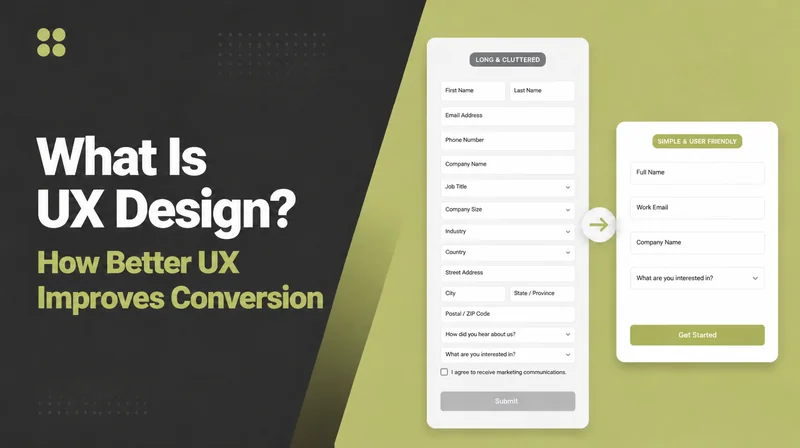
- Ordering the questions. What a form asks first, and what it could stop asking altogether.
- Wireframing. Grey boxes showing where things sit, before anyone picks a colour.
- Removing steps. Turning a five-step booking into a three-step one.
- Watching someone use it. Five people trying to book, while you keep quiet and take notes.
None of that has a visual output you'd hang on a wall. That's why it's the part clients tend to cut.
What Is UI Design?
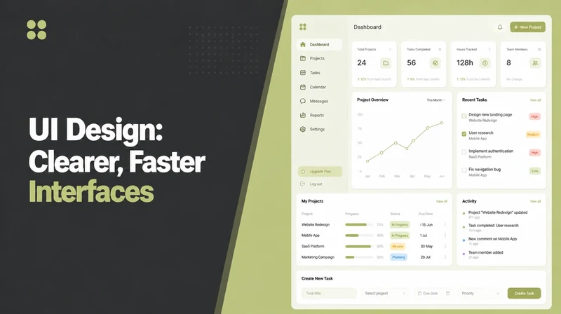
User interface design is everything a person actually sees and touches: the type, the colours, the buttons, the spacing, the states a button has when you hover over it.
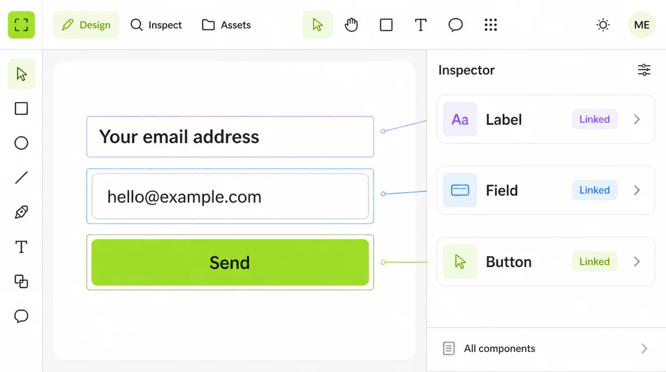
The Interaction Design Foundation describes UI design as "the process designers use to build interfaces in software or computerized devices, focusing on looks or style".
It sounds like decoration. It isn't, because it has rules you can fail.
The W3C's WCAG 2.2 standard requires a contrast ratio of at least 4.5:1 for normal text, and its target size rule sets a minimum of 24 by 24 CSS pixels for anything you tap.
Those are measurable. A designer either met them or didn't, and you can check.
Most sites don't. The WebAIM Million survey of one million home pages in February 2026 found detected failures on 95.9% of them, and low contrast text was the most common problem at 83.9%.
Why the Difference Matters When You're Paying for It
Because the two get quoted as one line and delivered as one of them.
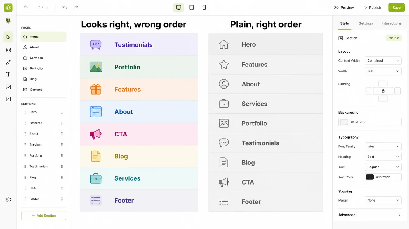
Here's the failure this distinction is for. A business pays for a redesign, gets a better looking site, and the enquiries don't move.
That happens when the money went to UI and the problem was UX. New colours on the same confusing path.
The reverse exists too. A well-ordered site that looks amateur loses people before they reach the good part.
Stanford's Web Credibility research is blunt about this. Its guidelines tell you to design a site so it looks professional, because people "quickly evaluate a site by visual design alone".
How quickly? Lindgaard and colleagues, publishing in Behaviour and Information Technology in 2006, found visual appeal can be assessed within 50 milliseconds. That's before anyone has read a word of your copy.
So you need both. The useful question isn't which matters more, it's which one your site is currently short of.
How to Brief Both on One Project
Five steps, in the order I'd run them for a small business site.
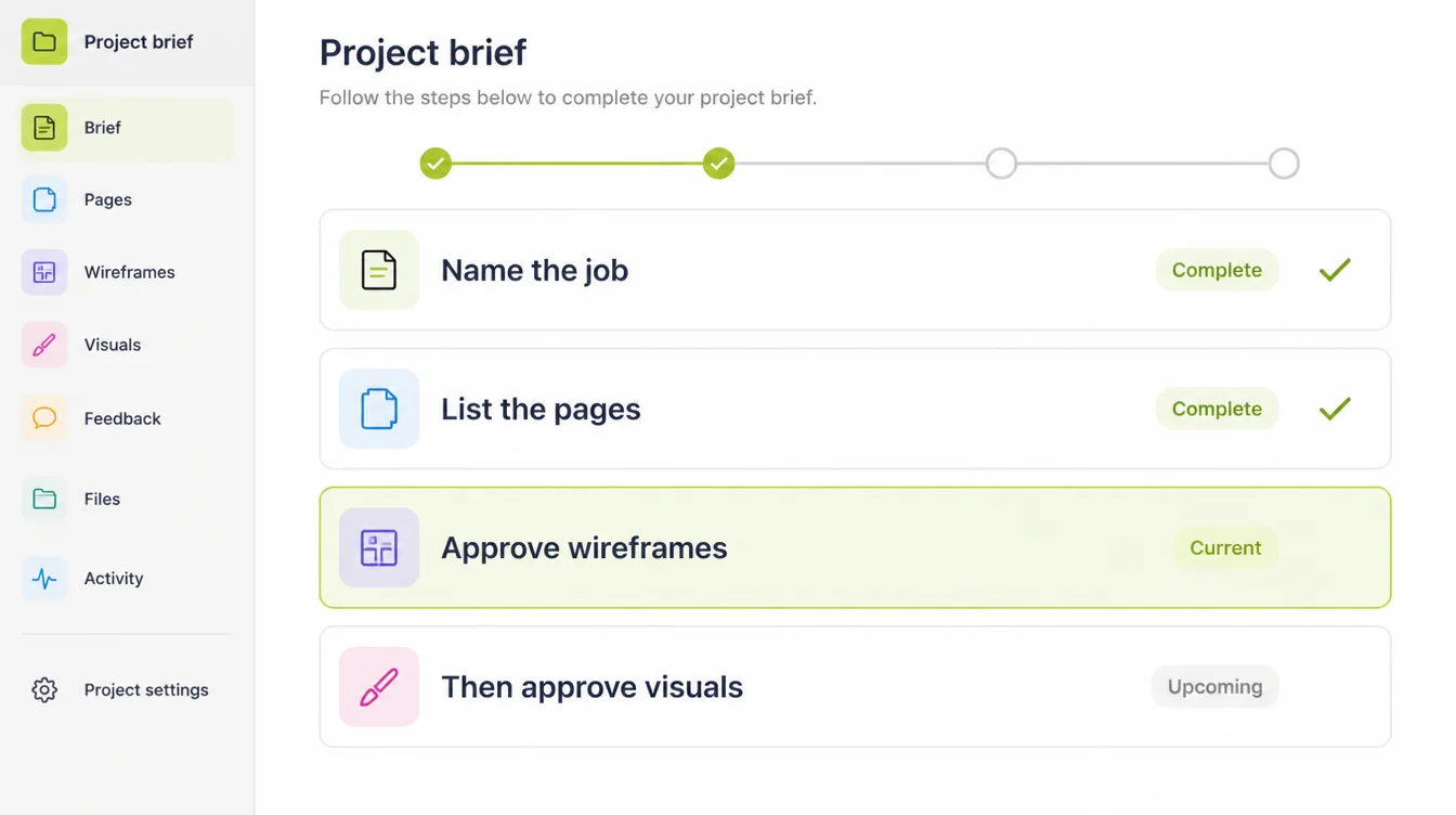
1. Name the one job the site has to do
Bookings, enquiries, quote requests, online orders. Pick one and write it at the top of the brief.
Everything after this is a decision about that job, which is what stops a project drifting into taste.
2. Write down the three questions customers always ask
Price, availability, and whether you cover their area, usually. Those three answers decide your page list.
This is UX work and you are the best person to do it. You've heard the questions.
3. Ask for the wireframes before the visuals
Grey boxes, no colours, no photos. If a designer resists, that's worth knowing early.
Approving a layout and a look at the same time means you approve neither properly.
4. Ask what the quote includes, line by line
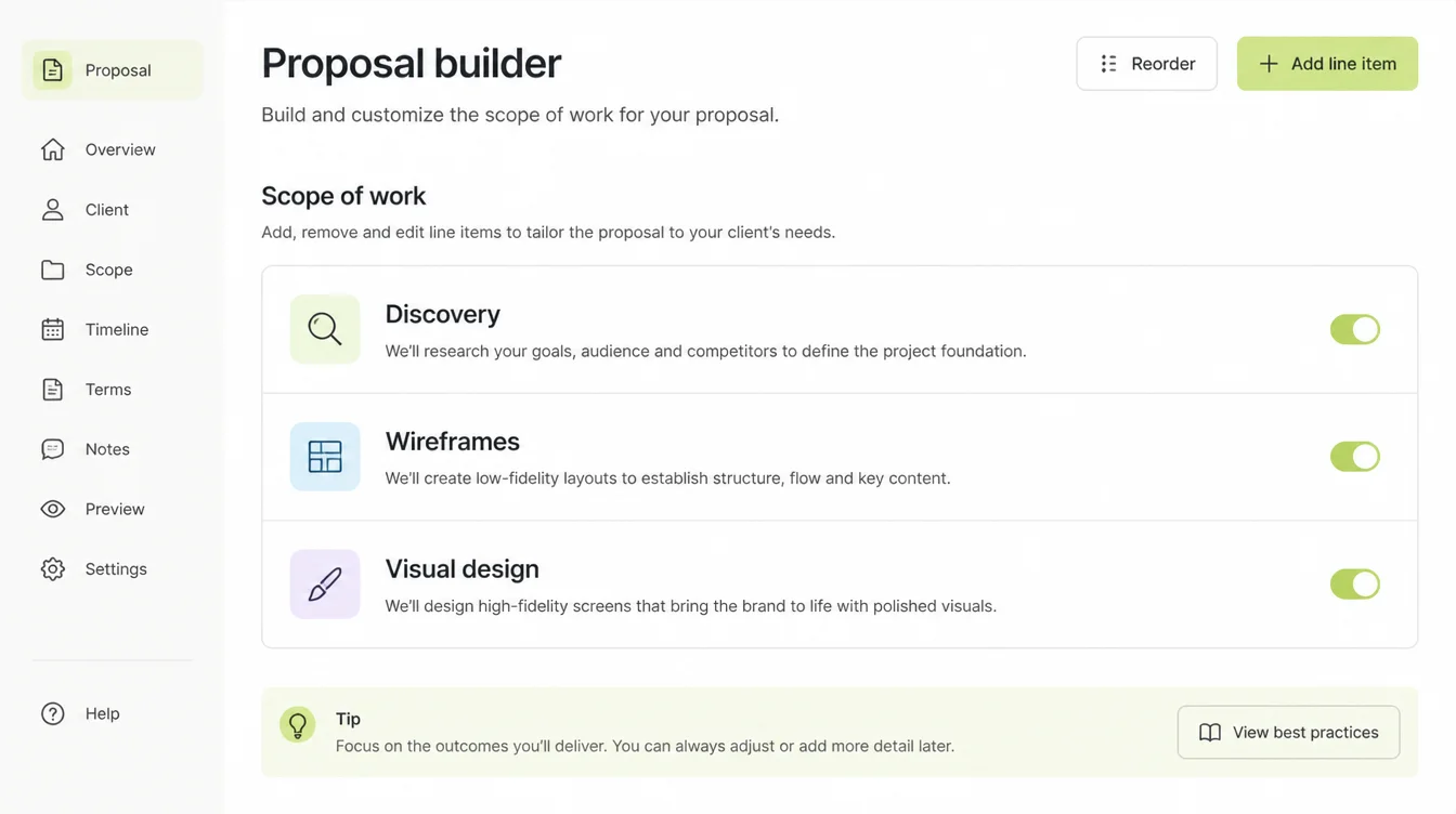
A quote covering only visual design is a fine thing to buy, as long as you know that's what it is.
Ask directly: does this include mapping the pages and the forms, or does it start from a layout I supply?
5. Test it with five people before launch
Not designers. Customers, or people who resemble them, doing the one job from step one while you say nothing.
Half an hour of this finds more than a month of internal opinions.
Signs You Have a UX Problem, Not a UI One
Look at what people do on the site, not at what the site looks like.
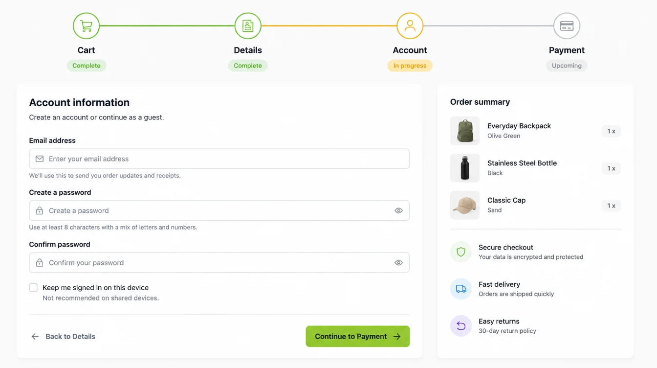
- People phone to ask something the site answers. The answer exists and nobody can find it, which is an ordering problem.
- Carts fill and don't convert. Baymard Institute's review of 50 studies puts documented cart abandonment at 70.22%, with 17% of US shoppers citing a checkout that was too long or complicated.
- Mobile behaves differently from desktop. Statcounter put mobile at 49.36% of worldwide traffic in August 2026. Roughly half of visitors worldwide arrive on a phone; check your own split.
- The site is slow at the moment of decision. Deloitte's 2020 study for Google found a 0.1 second mobile speed improvement lifted retail conversions by 8.4%.
- Enquiries arrive missing information. Your form is asking the wrong questions in the wrong order.
- Nobody scrolls past the first screen. The page is not answering the question that brought them.
Speed sits in both camps, incidentally. Google says its core ranking systems use Core Web Vitals, and the good thresholds are 2.5 seconds for largest contentful paint, 200 milliseconds for interaction to next paint and 0.1 for cumulative layout shift.
UX and UI Tools
You don't need these. It's worth recognising the names when they appear in a proposal.
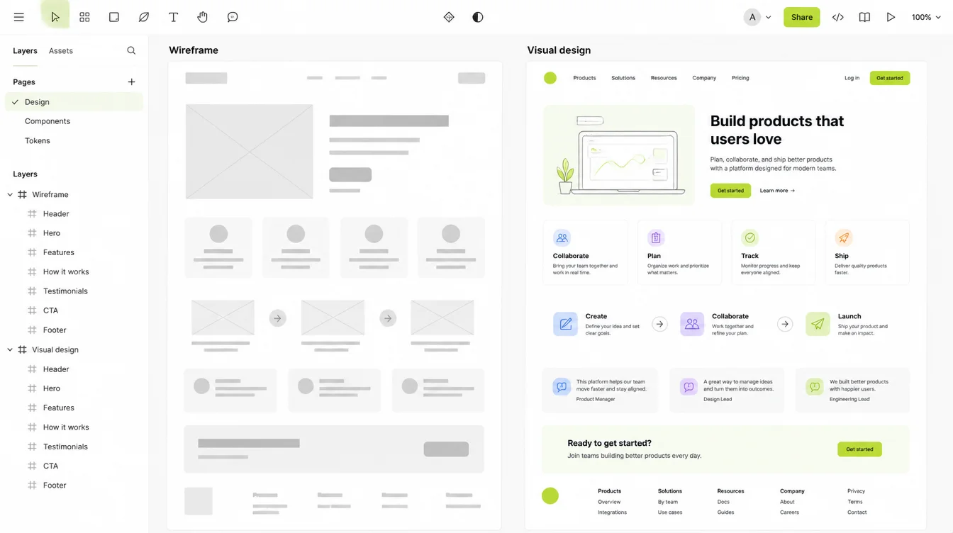
| Tool | What it is used for |
|---|---|
| Figma | Where both the wireframes and the finished visuals are drawn and shared for comment |
| A wireframing tool | Grey-box layouts approved before any visual work starts |
| Analytics | Where people actually drop off, which is the evidence a UX change needs |
| A session recording tool | Watching a real visitor struggle, which no opinion survives |
| A contrast checker | Testing text against the 4.5:1 ratio WCAG 2.2 requires |
| PageSpeed Insights | Measuring your pages against the Core Web Vitals thresholds |
If you want the longer version of either half, I've written separately on what UX design is and on UI design.
Common Mistakes Businesses Make
These are the expensive ones, and all six are avoidable at the quoting stage.
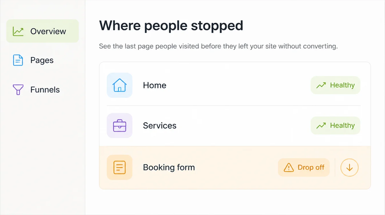
- Buying a redesign to fix a conversion problem. If people can't find the answer, a new colour scheme moves nothing.
- Approving visuals before layouts. You end up debating a shade of green while the page order goes unquestioned.
- Treating accessibility as optional polish. Contrast and tap size are written standards, and failing them shuts out real customers.
- Quoting the hundred-to-one UX return. It is attributed to a paywalled Forrester report whose public summary describes a six-step business case and no ratio, so read it before you repeat it.
- Hiring for the title instead of the work. Ask what the person will produce, not what they call themselves.
- Skipping testing because the team likes it. You know where everything is. That is exactly what disqualifies you as a tester.
One person can do both jobs well on a five to ten page site. On a booking system or a shop, the two skills start pulling apart, and that's when the split in the quote becomes worth paying for.
FAQs
What is the main difference between UX and UI?
UX is the experience of getting something done, and UI is the surface you do it through. Nielsen Norman Group define user experience as all aspects of a person's interaction with a company, its services and its products. UI design, by the Interaction Design Foundation's definition, focuses on looks or style.
Do I need both for a small business website?
Yes, but not always from two people. On a straightforward five to ten page site, one experienced designer usually handles both. What matters is that your quote covers the page and form decisions as well as the visual design, so ask which of the two it includes.
Should I fix UX or UI first?
Fix whichever your evidence points at. If people phone to ask things the site answers, or carts fill and never convert, that's a UX problem. If the site looks dated or fails contrast checks, that's UI. Analytics tells you which, and guessing is expensive.
Is UX design just wireframes?
No. Wireframes are one output. The work also covers deciding which pages exist, what a form asks and in what order, how many steps a booking takes, and watching real people attempt the task. The wireframe is where those decisions become visible.
Does UI design affect SEO?
Indirectly, through page experience. Google says its core ranking systems use Core Web Vitals, which measure loading, responsiveness and visual stability. A heavy interface that shifts as it loads can miss those thresholds, so interface decisions do end up on the SEO side of the ledger.
Conclusion
UX decides what happens and in what order. UI decides how it looks and feels while it happens.
You need both, and the risk isn't picking wrong. It's paying for one and assuming you bought the other.
So do the cheap thing first: look at your analytics, name the one job the site has to do, and work out which half is actually letting you down.
If you'd like that read done for you before you commission anything, see how we approach web design, or reach out to my team at Seed Light.