Hamburger Menu: Should You Use One on Desktop?

On desktop, show your navigation links if they fit. Nielsen Norman Group measured hidden desktop navigation being used in 27% of cases against 48% for a visible bar. Seed Light starts small business sites with a visible bar and only hides links when the bar genuinely runs out of room.
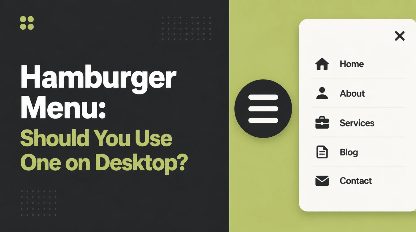
Your designer sends over the new homepage and the menu has vanished. In its place are three small lines in the top corner.
It does look calmer. You just can't tell whether that's an improvement or a problem you'll find out about in six months.
This post answers one narrow question: should the navigation on your desktop site sit behind a hamburger icon. It stays off mobile except where the comparison matters.
You'll get a decision, the evidence behind it, and an honest account of which famous hamburger statistics are real. That last part is why I wrote it.
Key Takeaways
- Show the links on desktop if they fit. Nielsen Norman Group measured desktop users as at least 39% slower when the navigation was hidden, against 15% on mobile.
- The best evidence is a decade old. That test ran in December 2015 with 99 desktop participants, and NN/g's 2025 follow up says nothing about whether task times have changed.
- Malaysia leaned desktop in August 2026. StatCounter measured desktop at 64.13% and mobile at 34.88%, but your own analytics should decide the menu.
- One famous figure is misattributed. The "adding the word Menu lifts clicks 20%" line is credited to NN/g everywhere and NN/g never said it.
- A menu you can't tab to is broken. WCAG 2.2 requires all functionality to work from a keyboard, and a custom icon button often doesn't.
What Is a Hamburger Menu?
A hamburger menu is a button of three stacked lines that hides your navigation until someone clicks it. The links still exist, one interaction away instead of on the screen.
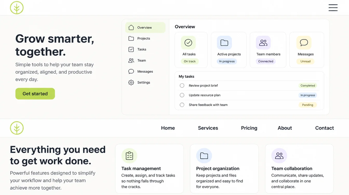
Researchers sort navigation into three types.
- Visible navigation. The links sit in the header, readable without doing anything.
- Hidden navigation. Everything lives behind one control, normally the hamburger icon.
- Combo navigation. A few important links stay visible and the rest fold into a button.
Combo often fits a business site best, and it gets skipped when the choice is framed as icon or no icon. If you're rethinking the whole header, our post on website menu design covers the structure side.
Why Desktop Is a Different Question From Mobile
On a phone there's no argument. Six labels won't fit across a 390 pixel screen, so hiding them is a necessity. A 1440 pixel desktop header has room, which turns the same choice into taste.
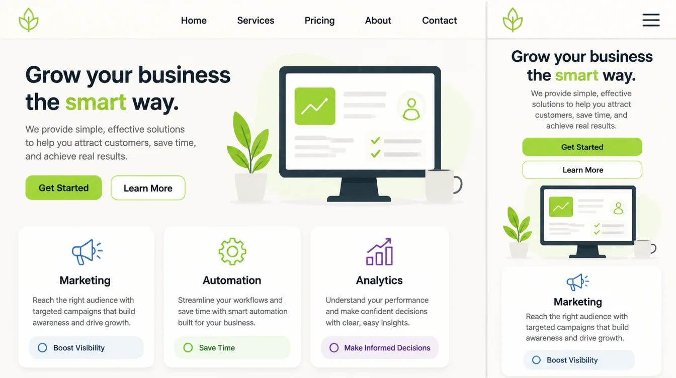
The measured penalty splits along that line. NN/g found desktop users were at least 39% slower when the navigation was hidden, while the same penalty on mobile was 15%.
Usage moved too. On desktop, people used hidden menus in 27% of cases against 48% for visible navigation and 50% for combo. Discoverability across the hidden sites dropped by over 20%.
Now the part nobody else prints. That study ran in December 2015 with 179 UK participants, 99 of them on desktop, across six sites.
It compared hidden, visible and combo navigation rather than hamburger icons specifically, and half of each participant's tasks could be finished without touching the navigation at all.
NN/g re-tested the icon in June 2025 and reported that participants correctly identified the hamburger as the main menu.
But that study looked at recognisability only. It can't tell you whether the time cost has shrunk since 2015, and it says so.
So recognition is settled and speed isn't. NN/g's own position hasn't moved: its 2024 menu guidance says hiding navigation categories under a single menu is not appropriate for desktop websites and apps.
Where the scary numbers come from
Search this topic and you'll meet dramatic figures repeated as settled fact. I checked them. Most don't survive contact with a source.
| The claim as it circulates | What it actually traces to |
|---|---|
| "Hamburger menus cut engagement" | A Zeebox A/B test was reported second hand in the press years ago. The original dataset, method and sample size are not available, and it concerned a mobile app. |
| "Facebook dropped the hamburger and engagement rose" | A press report about Facebook's iOS app, never published as data. The app kept a hamburger anyway, relabelled "More". |
| "Adding the word Menu increases clicks, per Nielsen Norman Group" | NN/g never said this. The claim traces to one developer's informal test reported in later write-ups, not to NN/g. |
| "58% of desktop sites have poor navigation, per Baymard" | Not at source. Baymard's benchmark of 343 sites says 76% perform at mediocre or worse on homepage and category navigation. |
The labelling advice is still sound. NN/g's best desktop performer used a labelled "Browse" button, while one site with a bare top-right hamburger got 17% navigation usage against a 42% average.
That icon took 33 seconds to be found. Label your control, but don't quote a number for it.
Why this matters more in Malaysia
Worldwide, Statcounter had mobile at 49.36% and desktop at 49.11% in August 2026. Near enough a coin flip.
Malaysia isn't like that. Statcounter put desktop at 64.13% and mobile at 34.88% for the same month.
That makes desktop especially important for a Malaysian audience, but check your own analytics before choosing a breakpoint or hiding links. A mobile-first build can still expand into a complete desktop layout.
How to Decide for Your Own Site
Four checks and one small experiment will settle it, without a research budget.
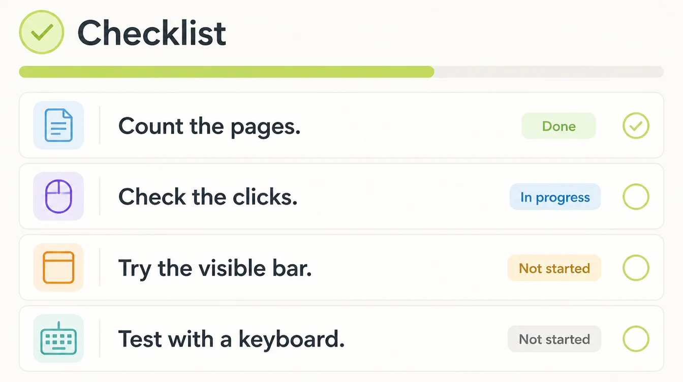
1. Count your top-level pages
Write down the sections a visitor genuinely needs. For a service business that's usually home, services, about, pricing, blog and contact.
If your list fits, hiding them buys you nothing but calm.
2. Look at what people actually click
Open your analytics and look at clicks on each header link, then note which ones nobody has touched this year.
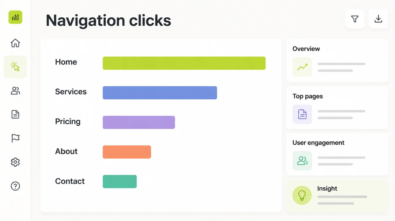
A crowded bar is often a content problem wearing a design costume.
3. Start with the visible bar
Build the visible version first and fold things away only when they won't fit.
If the bar overflows, group the overflow under one labelled dropdown rather than hiding everything. That's the combo pattern, which tested close to visible navigation.
4. Check it with a keyboard
Tab through your header and see whether you can open the menu, move through every link and close it again.
WCAG 2.2 requires that all functionality is operable through a keyboard interface, and that the focus indicator stays visible at AA.
A custom control must also expose its name, role and expanded or collapsed state to assistive technology. Icon buttons fail these more often than plain links do.
5. Change one thing and measure it
Switch the desktop header to visible links, leave everything else alone, and give it four to six weeks.
Compare clicks on your key pages before and after. One change at a time is the only way the result means anything, the same discipline that works on form design.
Navigation Patterns That Work Right Now
These are the arrangements worth trying on a small business site.
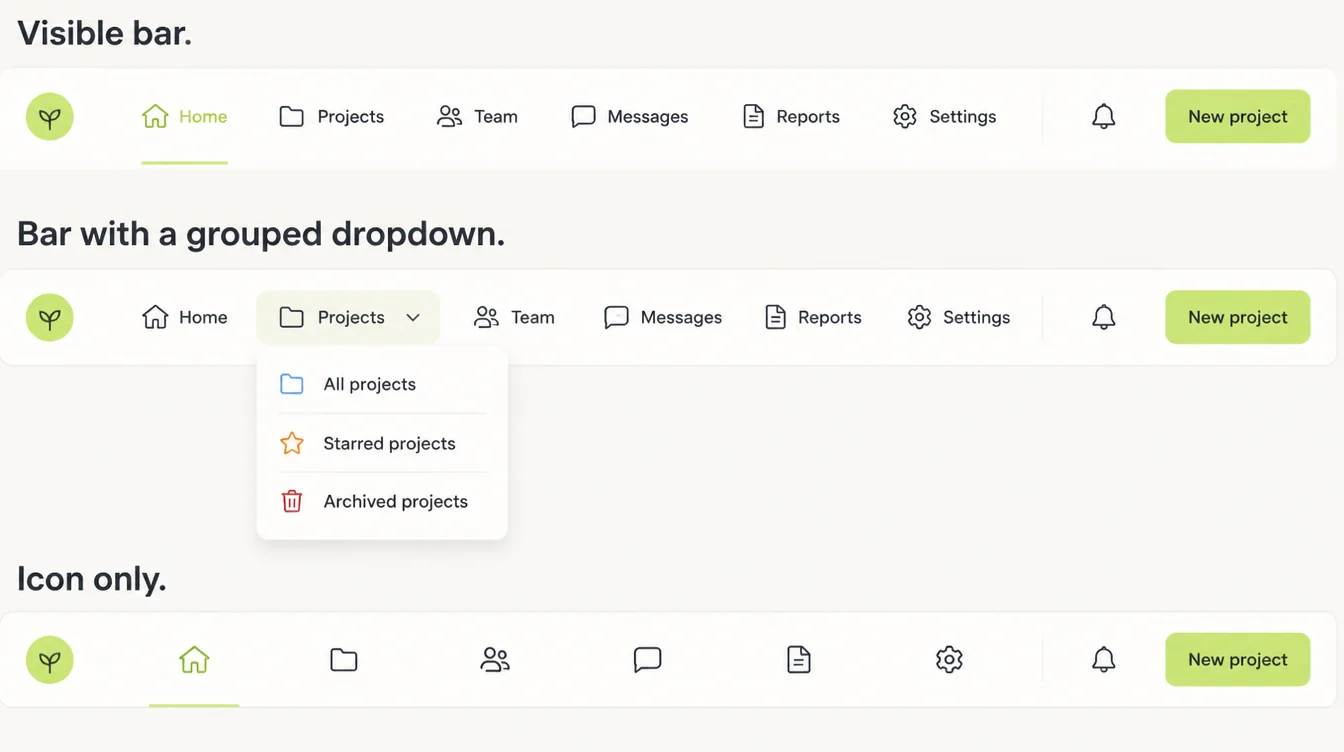
- The plain visible bar. Five or six labels in the header, and the pattern that carried the best numbers in NN/g's desktop testing.
- Visible plus a grouped dropdown. Keep the important links out and fold the rest under one labelled item. That's the combo pattern that reached 50% usage.
- A labelled button instead of a bare icon. NN/g's best desktop performer used "Browse" rather than three unexplained lines.
- The icon with the word Menu beside it. Reasonable where space is genuinely tight, though the popular 20% figure attached to it isn't real.
- A sticky header on long pages. Useful when the navigation scrolls out of reach halfway down.
- Icon only, on an app-like tool. Defensible when the screen is a working surface rather than a page someone is browsing.
Navigation Tools
Your site builder and your analytics cover almost all of it.
| Tool | What you use it for |
|---|---|
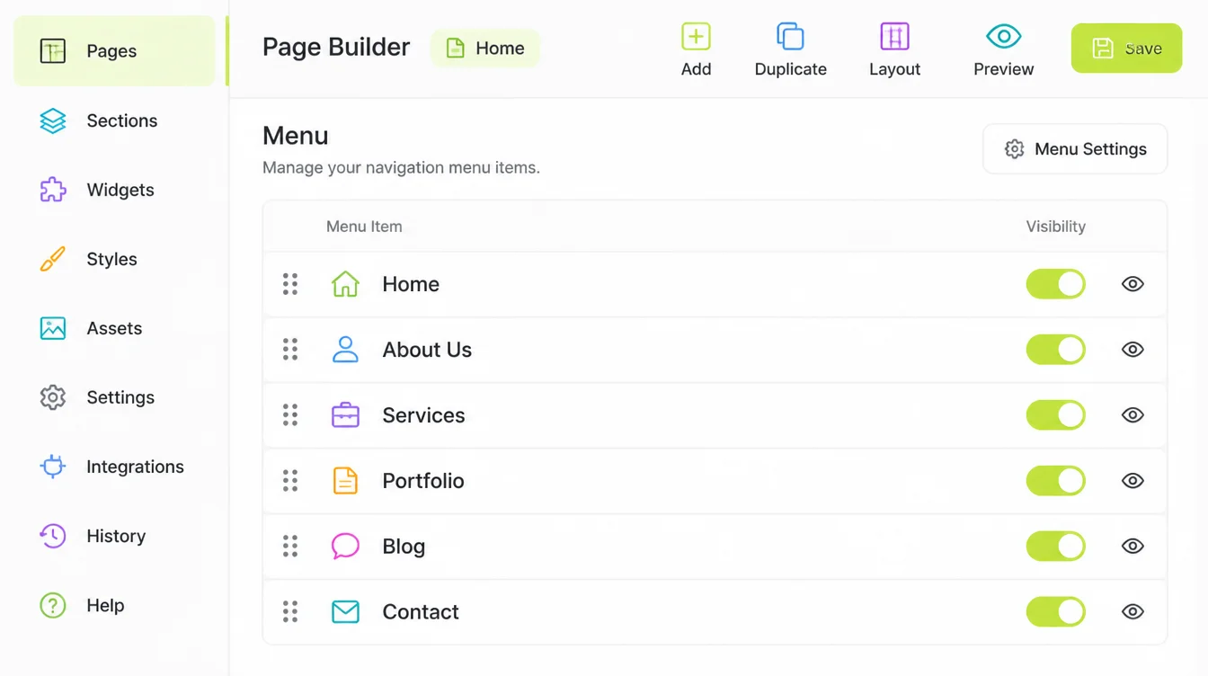
| Your CMS menu editor | Reordering top-level items and testing a visible bar without touching code |
| Google Analytics 4 | Counting clicks per navigation link so the decision uses your data, not a blog post |
| Browser keyboard testing | Tabbing the header to check focus order, visible focus and whether the menu opens |
| A screen reader | Hearing whether the button announces its name, role and expanded state |
| Chrome DevTools device toolbar | Finding the width where your bar overflows, instead of guessing a breakpoint |
| A heatmap or session tool | Watching whether people find the icon on the desktop layout |
Common Navigation Mistakes
Most navigation damage comes from a handful of ordinary decisions, and the accessibility ones are the quietest.
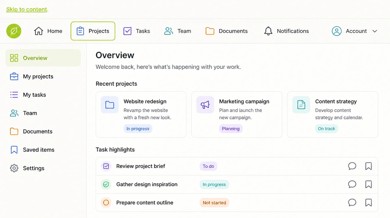
- Hiding links because the page looks busy. A crowded header usually means too many sections, and the icon hides the symptom.
- Building the menu out of things Google can't follow. Google states it can only crawl a link that's an
<a>element with anhref, so a click handler on a span is invisible to it. - Tap targets that are too small. WCAG 2.2 AA asks for pointer targets of at least 24 by 24 CSS pixels, which a thin icon and a tight dropdown both tend to miss.
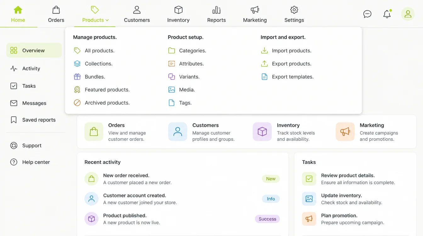
- Removing the focus outline for looks. WCAG 2.2 requires a visible keyboard focus indicator, and deleting it makes the header unusable without a mouse.
- Copying a big brand's header. A retailer with thousands of products has a navigation problem you don't have.
- Treating the icon as a finished decision. It's a layout choice you can reverse in an afternoon. Our guide to website navigation best practices goes wider on the rest.
FAQs
Is a hamburger menu bad for SEO?
Not by itself. What matters is the markup. Google says it can only crawl a real HTML link with an href attribute, so a menu built from click handlers or framework-only routes may not be followed. That holds whether the links are hidden behind an icon or sitting in plain view.
Is the 39% slower figure still true in 2026?
Nobody can say. The number comes from an NN/g study run in December 2015 with 99 desktop participants. NN/g re-tested the icon in June 2025 and found people recognise it, but that study measured recognisability only and does not report whether task times have changed.
How many links can I fit in a desktop header?
There's no fixed limit; it depends on your label lengths and logo width. Five or six short items usually fit a standard desktop header comfortably. Use your browser's device toolbar to find the width where your own bar overflows, rather than picking a number from an article.
Should I put the word Menu next to the icon?
It's cheap and reasonable. NN/g's best desktop performer used a labelled "Browse" button rather than a bare icon. Be careful with the evidence, though: the "adding Menu lifts clicks 20%" figure credited to NN/g is misattributed, and traces to one developer's five day informal test.
How should a hamburger menu work on tablets and small laptops?
Treat the breakpoint as a measurement, not a device category. Statcounter put tablets at 1.54% of worldwide page views in August 2026, so the real question is the width at which your labels stop fitting. Find that width, then switch patterns there.
Conclusion
On desktop, show the links if they fit. That's the whole answer for a site with five or six sections.
The evidence for it is real but old, and I'd rather tell you that than pretend a 2015 study settles 2026.
The trade hasn't changed: hiding navigation buys visual calm and costs discoverability.
Check your own numbers, change one thing, and give it a month. If you'd rather hand the header to someone else, see how we approach web design, or reach out to my team at Seed Light.