Key takeaways
- Show the menu on desktop. Hiding it behind a hamburger icon cut discoverability by more than 20 percent and made desktop users at least 39 percent slower in Nielsen Norman Group testing.
- Keep it to about five to seven items. Fewer choices means faster decisions. Group the rest into a dropdown.
- Make it sticky and slim. A usability study found sticky menus were 22 percent quicker to navigate.
- Size buttons for thumbs. Meet the WCAG minimum of 24 by 24 CSS pixels, and aim for a comfortable 48 by 48 dp.
- Treat mobile first. Mobile is about 63 percent of global web traffic, so the mobile menu deserves real care.
1. What good website menu design actually does
Good website menu design does three things: it shows where people can go, it shows where they are, and then it stays out of the way. That is the whole job. The menu is the one element on every page, so when it is clear, the whole site feels easy.
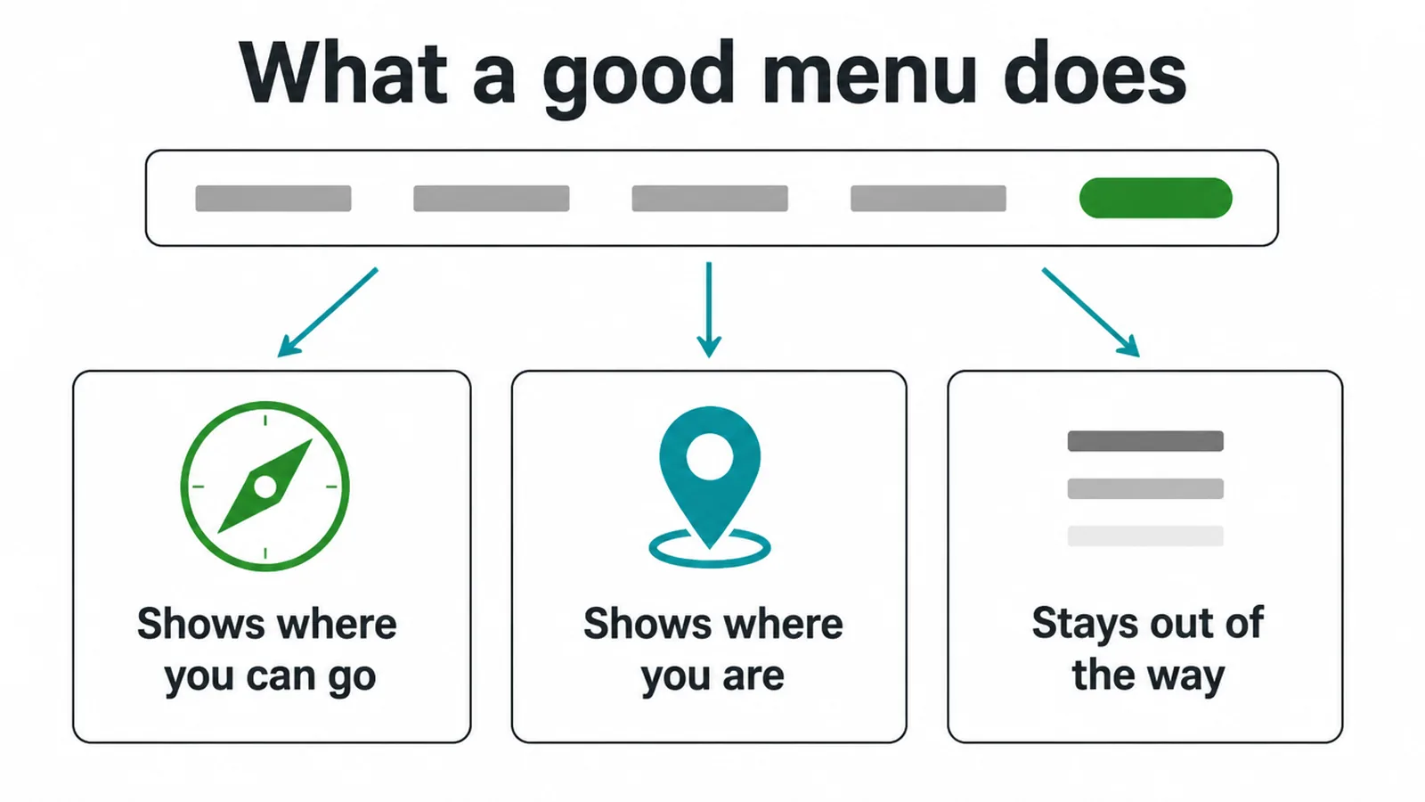
Most people miss this and try to make the menu look clever. Do not. A menu that hides or surprises people costs you. When Nielsen Norman Group hid navigation behind an icon, discoverability dropped by more than 20 percent compared to a visible menu. People simply did not find the pages.
One quick note on lanes. This post is about the menu itself: the bar, the dropdowns, the labels, the states. The bigger question of how to structure your whole site and what pages even belong in the menu is covered in our guide to website navigation best practices. If you are still planning the site from scratch, start with the small business website pillar first, then come back here to build the menu.
2. Menu types and when to use each
There are only a few menu patterns you need to know. Pick the one that fits your site, not the trendiest one. Here is the short version, then we will dig in.
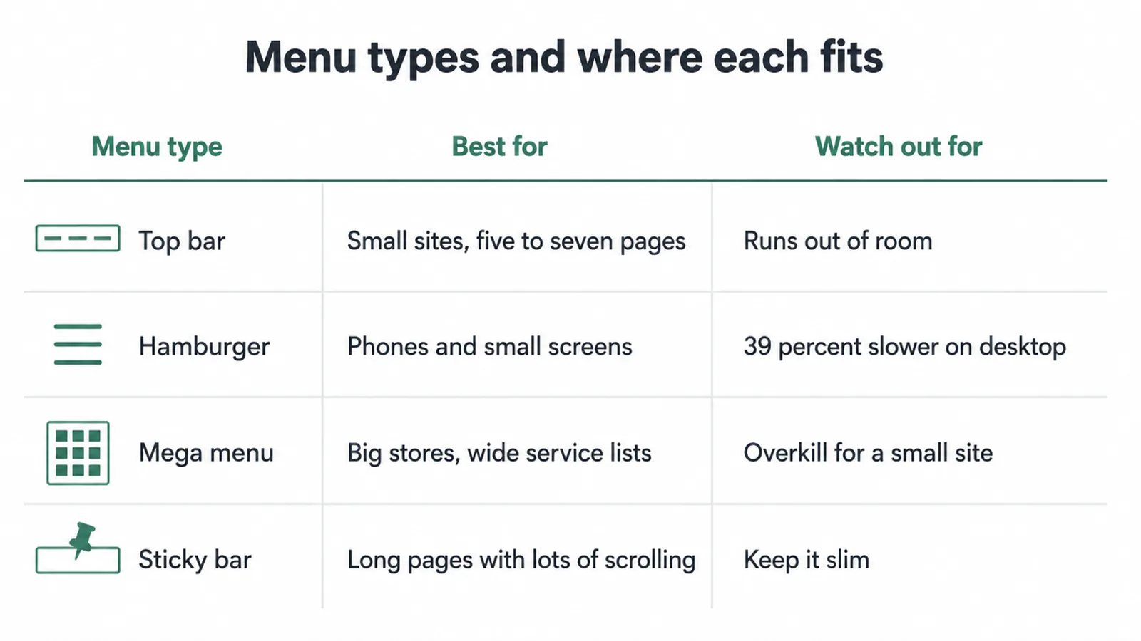
| Menu type | Best for | Watch out for |
|---|---|---|
| Top bar | Most small sites with five to seven pages | Runs out of room if you add too many links |
| Hamburger | Phones and small screens | Hurts on desktop: 39 percent slower there |
| Mega menu | Big stores or wide service lists | Overkill for a small site; can overwhelm |
| Sticky bar | Long pages where people scroll a lot | Keep it slim so it does not block the screen |
Top bar. This is the default for most small businesses. Every link sits in a row at the top, so people see all their options at once. If you have five to seven pages, this is your menu.
Hamburger. The little three-line icon. It works on phones because space is tight. It does not work on desktop. The same NN/g testing found hidden navigation made desktop users at least 39 percent slower and mobile users 15 percent slower than a combo approach. On a wide screen you have room, so use it.
Mega menu. A big panel that opens with many grouped links. Save it for sites with lots of categories, like an online store. Our store builds lean on this pattern a lot. For a small service site, a plain dropdown is plenty.
Sticky bar. The menu stays pinned as people scroll. A usability study found sticky menus were 22 percent quicker to navigate, because people never scroll back up to move around. Just keep it slim.
3. Labels and how many items to show
Keep your menu short. Aim for about five to seven items. More choices make people pause longer before they pick, an effect known as Hick's Law: the more options you give someone, the longer the decision takes. A tight menu feels fast.
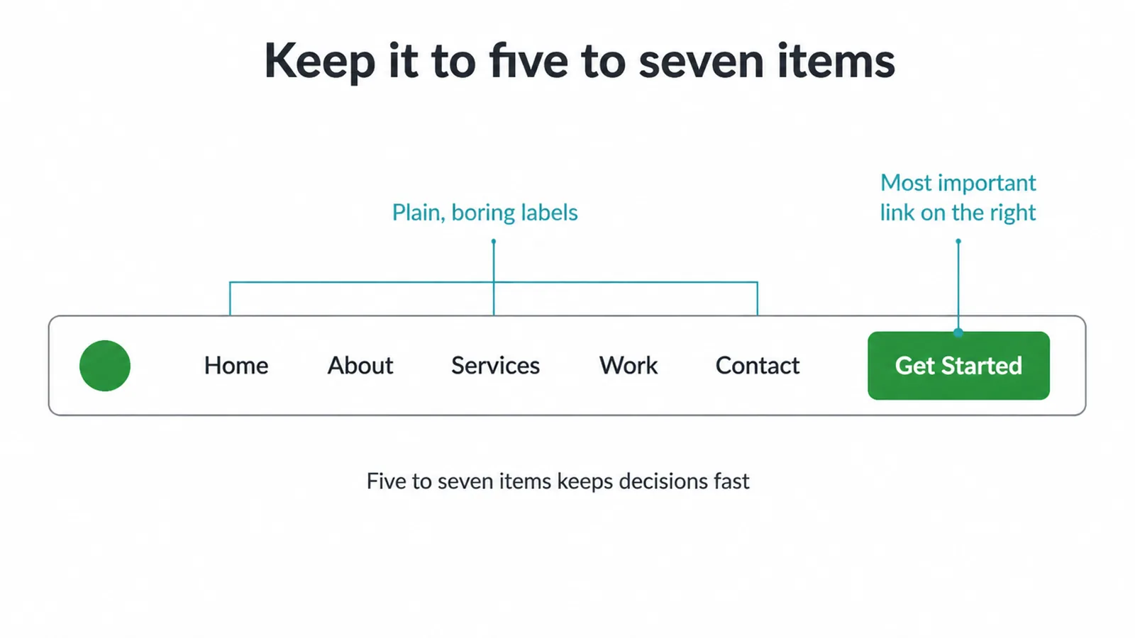
Use plain, boring labels. Home, About, Services, Work, Contact. People already know these words, so they do not have to think. Skip clever names like "The Lab" or "Our Story" unless the plain word truly does not fit. A label should tell people what they will find before they click.
Put your most important link where eyes land. On a top bar that is usually the far right, where a Contact or Get Started button stands out. If you want that link to actually pull its weight, pair it with a strong contact page design so the click leads somewhere useful. Planning the whole layout is part of our web design process, but the menu rules here apply no matter who builds it.
4. Dropdowns and mega menus done right
Dropdowns are useful when you have a few pages that belong together, like services. One level of dropdown is fine. Avoid going more than two tiers deep. A menu inside a menu inside a menu is a maze, and people give up.
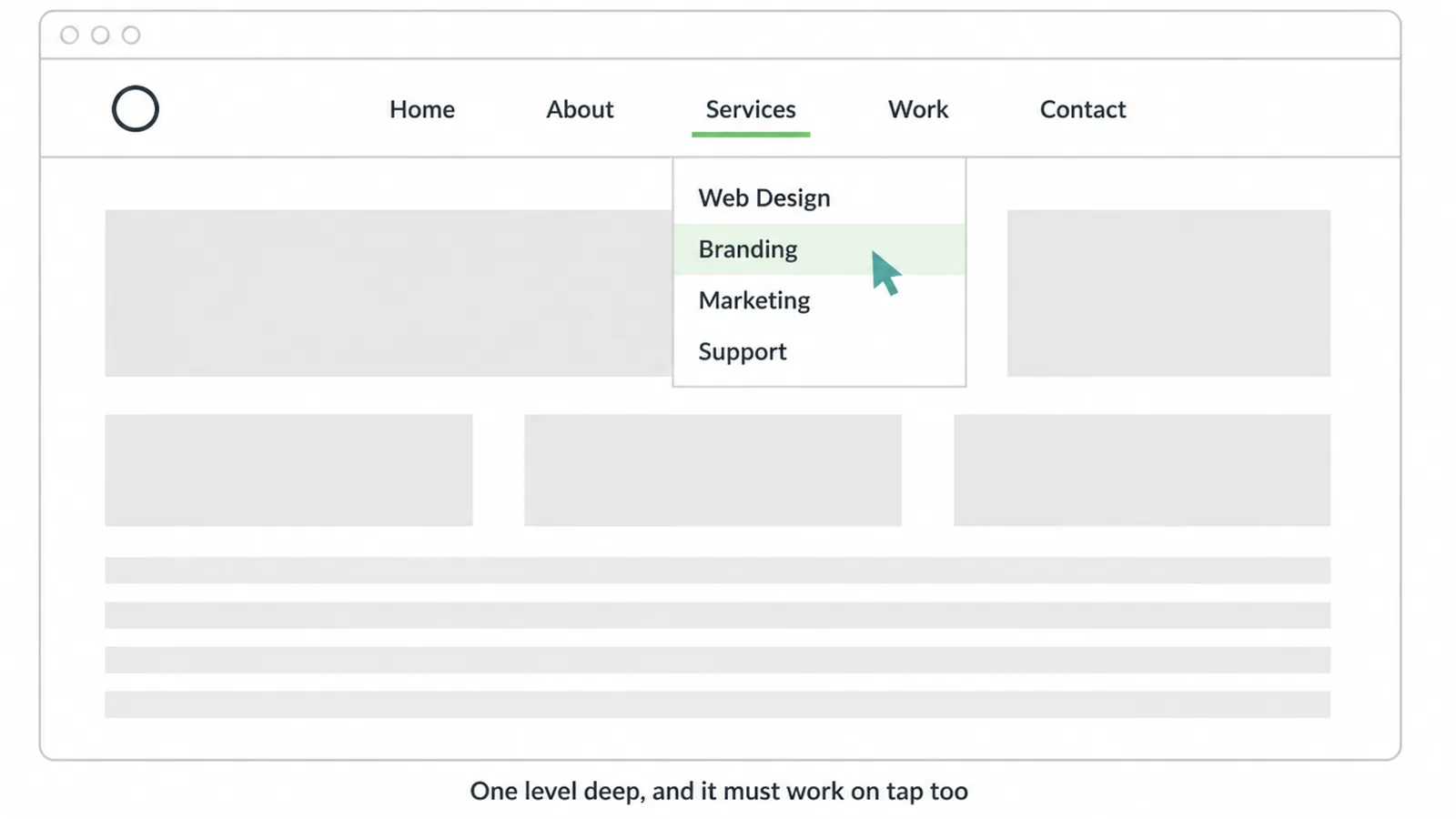
Open dropdowns on hover for mouse users, but also make them work on tap for touch screens. Many sites forget this, so the dropdown opens on hover but does nothing when a finger taps it. Always test the tap. And show people where they are: highlight the current section so the menu doubles as a "you are here" sign.
If you do use a mega menu, group links under clear headings so the big panel does not feel like a wall. Headings turn a long list into a map.
5. The mobile menu
Treat the mobile menu as a main feature, not a leftover. Mobile is now about 63 percent of global web traffic, so for most sites the phone menu is the menu most people use.
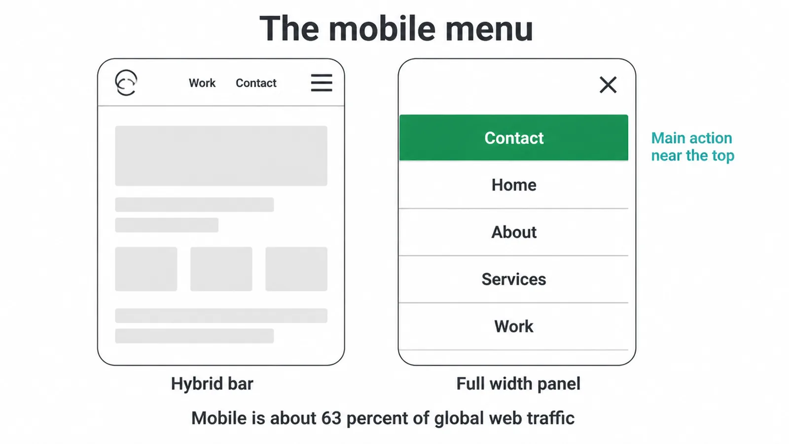
A pure hamburger hides everything behind one tap. A hybrid is better: show two or three key links plus the icon, so your most important pages are one tap away and the rest live inside the panel. When the menu opens, use a full-width panel so links are easy to read and tap. Put your main action near the top, space the items out, and give people an obvious close button.
The mobile menu is tied to your whole mobile experience. If the page itself is slow or cramped, a tidy menu will not save it. Our guide on how to make a website mobile friendly covers the rest of the picture.
6. States, tap targets, and accessibility
A menu needs clear states so people get feedback. Show a hover state when a mouse is over an item, a focus state for keyboard users, an active state on press, and a current state so people know which page they are on. Without states the menu feels dead and people are not sure if their click registered.
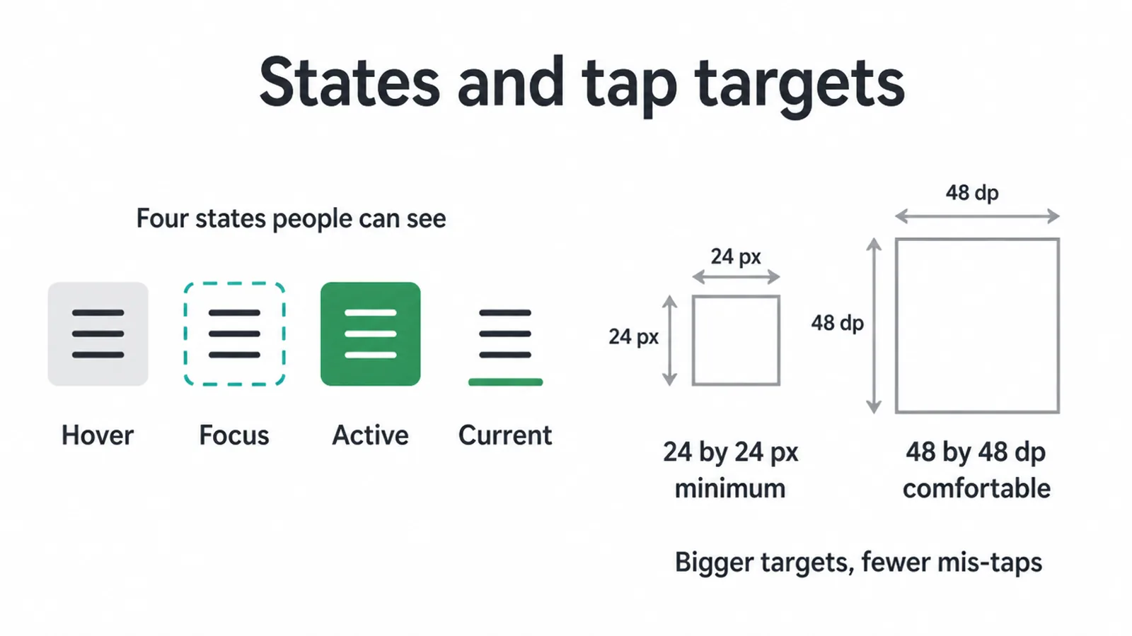
Size matters too. Make each menu item big enough to tap without missing. WCAG 2.2 sets a minimum target size of 24 by 24 CSS pixels at Level AA, and Material Design recommends a comfortable 48 by 48 dp. Bigger targets with space between them mean fewer mis-taps, and that matters most on phones.
Make the menu work for everyone. People should be able to move through it with a keyboard, with a clear focus outline they can see. That same focus thinking carries over to your button design and your broader website accessibility work. A menu that ignores keyboard and screen reader users shuts out real visitors.
7. Common menu mistakes to avoid
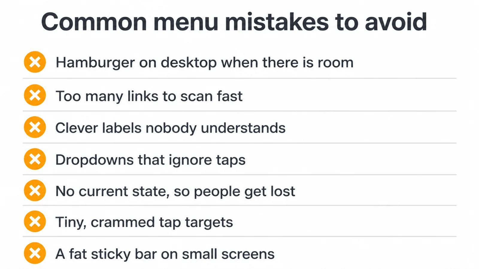
- Hiding the menu behind a hamburger on desktop when there is plenty of room.
- Stuffing in too many links so people cannot scan them fast.
- Clever labels nobody understands.
- Dropdowns that open on hover but do nothing on tap.
- No current state, so people lose track of where they are.
- Tiny, crammed tap targets that cause mis-taps on phones.
- A fat sticky bar that swallows half a small screen.
Frequently asked questions
1. How many items should a website menu have?
Aim for about five to seven top-level items. More choices make people pause longer before they pick, an effect known as Hick's Law. For most small business sites, Home, About, Services, Work, and Contact cover it. If you need more, group the extras inside a dropdown instead of stretching the bar.
2. Is a hamburger menu bad for UX?
On phones it is fine and expected. On wide desktop screens it hurts. Nielsen Norman Group found that hiding navigation behind an icon dropped discoverability by more than 20 percent and made desktop users at least 39 percent slower. On a big screen you have room, so show the menu.
3. Should a website menu be sticky?
Usually yes. A sticky menu stays in view as people scroll, so they never have to scroll back up to move around. A usability study found sticky menus were 22 percent quicker to navigate. Keep the sticky bar slim so it does not eat the screen, especially on phones.
4. Top bar or hamburger, which is better?
Use a visible top bar on desktop because people see every option at once. Use a hamburger on phones where space is tight. The best mobile pattern is a hybrid: show two or three key links plus the icon, so the most important pages are one tap away and the rest live behind the menu.
5. How do I design a mobile menu?
Open a full-width panel so links are easy to read and tap. Make each item large with space around it, put your main action like Contact near the top, and add an obvious close button. Mobile is now about 63 percent of global web traffic, so the mobile menu is not an afterthought.
6. What is a mega menu and when should I use one?
A mega menu is a large panel that shows many grouped links at once, often with headings. Use it only when you genuinely have lots of categories, like a big store or a wide service list. For a small site it is overkill and a simple dropdown works better.
7. What should menu labels say?
Use plain, boring words people already know: Home, About, Services, Work, Contact. Skip clever names. A label should tell people exactly what they will find before they click. Clear beats creative every time in a menu.
8. How big should menu buttons be?
WCAG 2.2 sets a minimum target size of 24 by 24 CSS pixels at Level AA, and Material Design recommends a comfortable 48 by 48 dp. Bigger targets with space between them mean fewer mis-taps, which matters most on phones.

About the author
Gregory Yeoh is the founder of Seed Light, a web design and digital marketing agency that has helped small businesses get found online since 2017. In his day to day work he designs and tests navigation menus across desktop and mobile, so the advice here comes from shipping real sites. If your menu is getting in the way of leads, tell us what is happening and we will help you fix it.