Button Design: Make Calls to Action Easier to Click

A good button looks clickable, is big enough to tap, says what happens when you press it, and stands out from the page. Give it real hover, focus, pressed and disabled states, keep contrast strong, and use one primary action per screen. Seed Light designs buttons this way on every build.
Key takeaways
- A button has to look clickable. In one Campaign Monitor test, switching a plain text link to a button raised click-through by 127 percent.
- Pick one main action. WordStream found emails with a single call to action increased clicks by 371 percent.
- Words matter. A ContentVerve test changing copy from "your" to "my" lifted click-through by 90 percent.
- Size and contrast are not optional. WCAG sets a 24 by 24 pixel minimum tap target and a 3 to 1 contrast floor for the shape.
- States stop people getting stuck. Build hover, focus, pressed, and disabled, and never hide a disabled button with no reason.
1. What makes a good button?
A good button looks clickable, is big enough to tap, says what happens when you click it, and stands out from the page. Get those four right and more people press it. That is the whole job of button design.
The biggest mistake we see on small business sites is a main action that does not look like a button at all. It is a plain underlined link or some faint text. People skim. If the thing they should do next does not jump out, they miss it.
There is data behind this. In one Campaign Monitor test, switching a text link to a real button raised click-through by 127 percent. Same offer, same words, just a clearer shape. A button reads as "press me," and that pull is worth a lot.
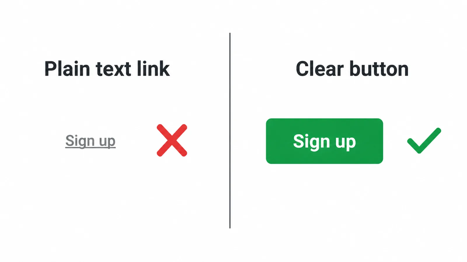
So the goal is simple. Make your main button obvious, easy to hit, and clear about what it does. The rest of this guide walks through each part. If you want the bigger picture first, our guide to small business websites sets the scene.
2. Button size and tap targets
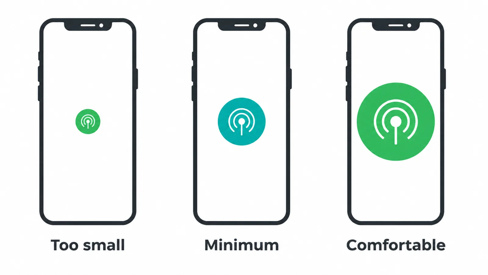
Your button needs to be easy to hit, especially on a phone. A target that is too small makes people miss, tap the wrong thing, and give up. On touch screens, fingers are blunt, so size really matters.
There is a floor and a comfortable zone. WCAG 2.2 sets the floor: a tap target should be at least 24 by 24 CSS pixels.
That is the bare minimum, not the goal. For comfort, follow the platform guides. Apple suggests targets around 44 by 44 points, and Google Material suggests 48 by 48 density-independent pixels.
A few practical rules we use on every build:
- Add generous padding inside the button so the tappable area is bigger than the text.
- Leave space between buttons so people do not hit the wrong one.
- On mobile, make the main button full width or close to it when the screen is narrow.
Buttons live inside the wider job of a phone-friendly layout. If your site still feels fiddly on mobile, start with making your website mobile friendly and the buttons will follow.
3. Contrast and color
Color is the part people fuss over most and get wrong most. There is no magic best color for a button. What matters is that your main button clearly stands out from the background and from your other buttons, and that it passes contrast.
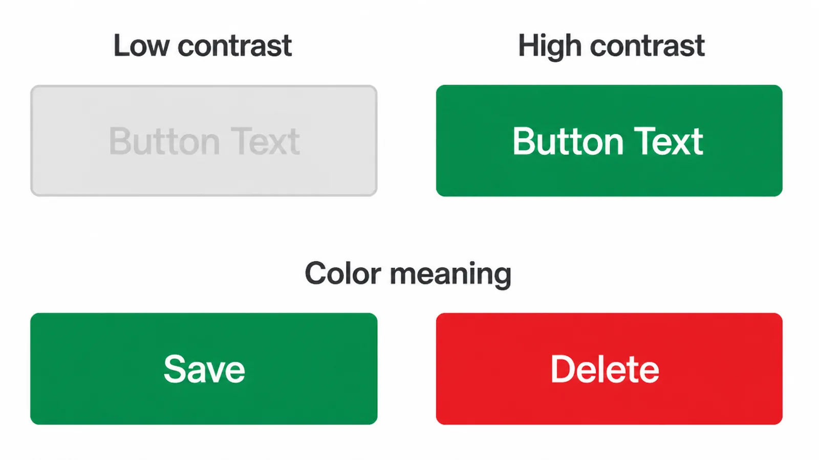
Contrast comes first. WCAG asks for at least 3 to 1 contrast between the button shape and what is around it, and at least 4.5 to 1 for the text on it (3 to 1 for large text). If your button is pale on a pale page, plenty of people simply cannot see it well.
Then think about meaning. Green tends to read as "go" and red as "stop" or "danger," so use them on purpose. A red Delete button and a green Save button help people without making them read closely.
One rule we never break: do not rely on color alone. Some people cannot tell red from green. So pair color with words, an icon, or a shape change. Color should support the message, never carry it by itself. For more on this, see our website accessibility guide.
4. Hierarchy: primary, secondary, tertiary
Not every button should shout. Good button design uses a clear pecking order so people know the one thing you want them to do. Lead with a single main action, then offer quieter choices below it.
The reason is focus. WordStream found that emails with a single call to action increased clicks by 371 percent. When you give people one obvious path, more of them take it. Too many equal buttons split attention and people freeze.
Here is the simple three-tier system we use:
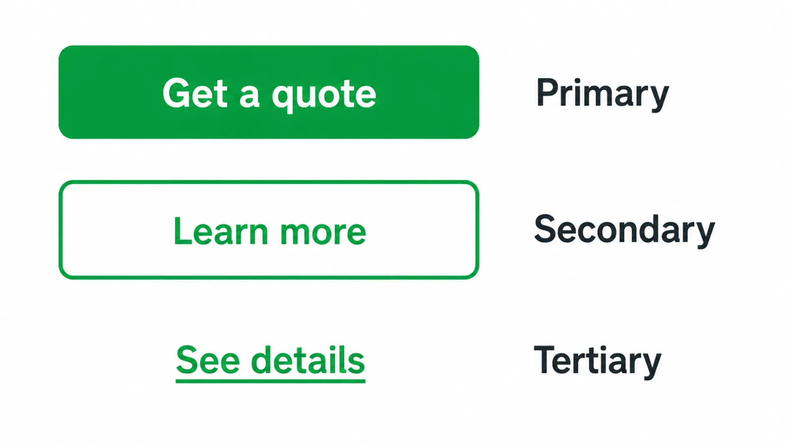
| Type | Looks like | Use it for | How many per view |
|---|---|---|---|
| Primary | Solid fill, strong color, bold | The one main action (Buy, Book, Get a quote) | One |
| Secondary | Outline or "ghost" style, no fill | A useful but less urgent choice (Learn more) | One or two |
| Tertiary | Plain text link, often underlined | Minor actions (Cancel, See details) | As needed |
Keep this consistent across the whole site so people learn it fast. If you want a hand setting up a clean, consistent system, that is part of our web design work.
5. Button copy: the words on the button
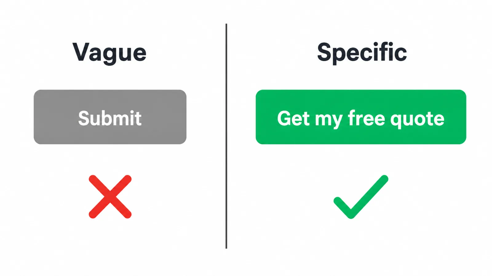
The words on a button do a lot of heavy lifting. Vague labels like "Submit" and "Click here" tell people nothing. Specific, benefit-led copy tells them exactly what they get. Start with a verb and say the payoff.
Small word changes can move clicks more than you would expect. In one ContentVerve test on Unbounce, changing a button from "Start your free trial" to "Start my free trial" raised click-through by 90 percent. Writing in the reader's voice made it feel like their choice.
HubSpot saw a bigger pattern across more than 330,000 calls to action. Personalized buttons, ones tailored to the visitor, performed 202 percent better than generic ones. The lesson is not "use one magic phrase." It is to write like a person talking to a person.
A few quick copy rules:
- Lead with a verb: Get, Book, Start, Send, Download.
- Name the benefit: "Get my free quote," not "Submit."
- Keep it short, two to four words where you can.
- Match the words to the page so there are no surprises after the click.
Your button voice is part of your wider brand voice. If your copy feels off across the site, our branding work helps line it up.
6. Button states
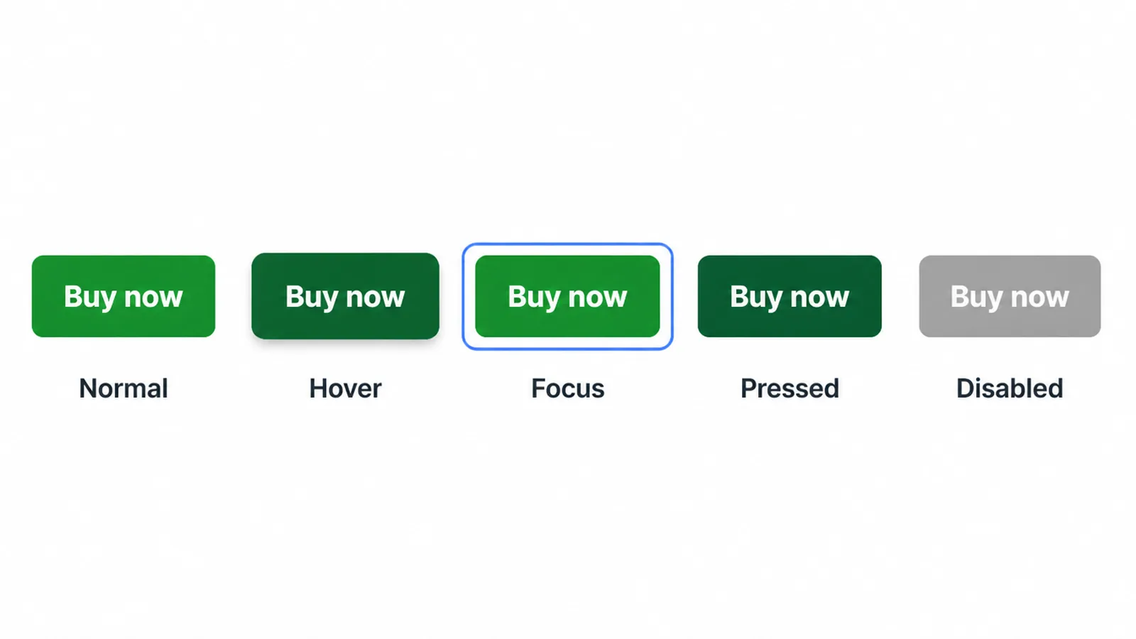
A button is not one picture. It is a set of states that respond as people interact. Skip these and your button feels dead, or worse, leaves people stuck. You need normal, hover, focus, pressed, and disabled.
Here is what each one does:
- Normal: the resting look.
- Hover: a small change (color or shadow) when a mouse is over it, so people know it reacts.
- Focus: a visible ring when someone tabs to it with a keyboard. This is the one people forget, and it is the one accessibility depends on.
- Pressed: a quick shift on click, so the press feels real.
- Disabled: a clearly different, muted look for when the action is not available yet.
Watch the disabled trap. A grayed-out button with no reason given is frustrating. People do not know why they cannot continue or how to fix it.
Better to keep the button active and show a clear message when something is missing, or explain right next to it what they still need to do. For the full keyboard and screen-reader side of this, see our accessibility guide.
7. Common button mistakes to avoid
Most button problems come down to a short list of repeat offenders. Run through it and fix any that apply to your site.
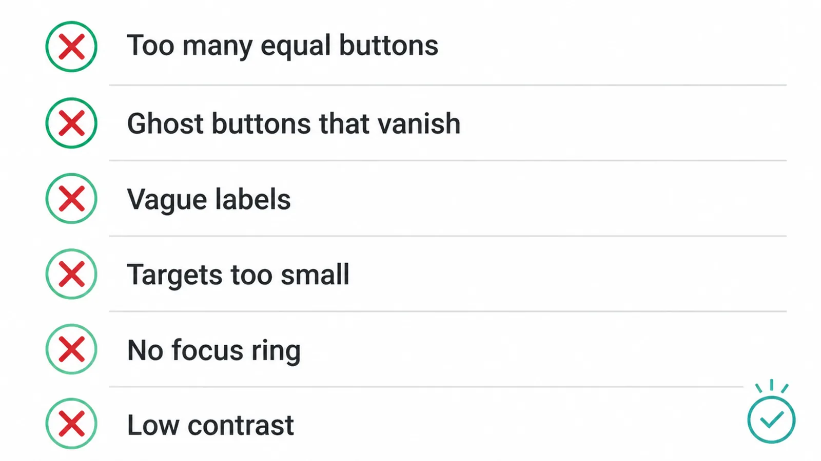
- Too many equal buttons. If everything is bold, nothing is. Pick one primary action per view.
- Ghost buttons that vanish. Outline-only buttons on a busy background can be easy to miss. Make sure they still pass contrast.
- Vague labels. "Submit" and "Click here" waste your best click. Say what people get.
- Targets that are too small. Thumbs miss tiny buttons. Stay above the comfortable size and add padding.
- No visible focus ring. Keyboard users get lost. Always keep a clear focus state.
- Low contrast. A pale button on a pale page is invisible to many people.
None of these are hard to fix, but together they quietly cost you clicks. For more of these patterns across a whole site, see our roundup of small business website mistakes. When you are ready for a fresh pair of eyes, get in touch and we will take a look.
Frequently asked questions
1. What makes a good button?
A good button looks clickable, is big enough to tap, says what happens when you click it, and stands out from the rest of the page. It also works for people using a keyboard or screen reader. When all of those are true, more people click.
2. What size should a button be?
WCAG 2.2 sets a minimum tap target of 24 by 24 CSS pixels. For comfort, follow the platform guidelines: Apple suggests 44 by 44 points and Google Material suggests 48 by 48 density-independent pixels. Aim for the larger comfortable size on touch screens, with space around each button.
3. What color should a call to action button be?
There is no single best color. Pick a color that clearly stands out from your page background and your other buttons, then check contrast. Button shapes need at least 3 to 1 contrast against their surroundings, and the text on them needs at least 4.5 to 1. Never rely on color alone to show meaning.
4. Should I use a button or a text link?
Use a solid button for your one main action and text links for smaller, lower-priority choices. In one Campaign Monitor test, switching a text link to a button raised click-through by 127 percent. A button reads as the obvious thing to do next, so it earns more clicks.
5. How many call to action buttons should a page have?
Lead with one main action per page or section. WordStream found that emails with a single call to action increased clicks by 371 percent. You can add quieter secondary options, but only one button should look like the primary choice so people are not pulled in several directions.
6. What should button text say?
Start with a verb and say what the person gets. Use specific labels like Get my free quote instead of vague ones like Submit or Click here. In one ContentVerve test on Unbounce, changing copy from your to my raised click-through by 90 percent.
7. What button states do I need?
You need a normal, hover, focus, pressed, and disabled state. The focus state is the one most people forget, and it matters because keyboard users need a visible ring to see where they are. Explain why a disabled button is disabled, or people get stuck.
8. Are rounded or square buttons better?
Neither is proven to win. Rounded corners feel friendly and modern, while sharp corners feel formal. What matters far more is that the shape clearly reads as a button, stays consistent across your site, and has enough padding to be easy to tap.