
Key takeaways
- Above the fold is what you see before scrolling. It is the screen a visitor lands on, not a fixed pixel line.
- The top still wins the most eyes. Users spend about 57 percent of their viewing time above the fold (Nielsen Norman Group, 2018), down from 80 percent in 2010.
- First impressions are instant. Visual appeal forms in about 50 milliseconds (Lindgaard et al., 2006), so the top has to land fast.
- One promise, one action. Lead with a clear headline, a short supporting line, and a single main button.
- Do not cram. A clean cut-off edge invites the scroll. People do read below the fold.
1. What does above the fold mean?
Above the fold is everything a visitor sees on your web page before they scroll. It is the part that loads in view straight away, the first screen they land on. Anything below that, the stuff you reach by scrolling, sits below the fold.
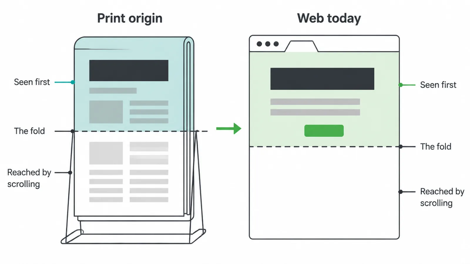
The phrase comes from print. A folded newspaper on a stand only showed its top half, so editors put the loudest headline and the biggest photo there. That was the part that sold the paper. The web borrowed the idea for the part of the screen you see before any scrolling.
Here is the key thing. The fold is not a real line drawn at a fixed point. It is just where your screen ends. Treat it as your first impression, not a wall.
For the full top-to-bottom layout of a page, see our guide to homepage design. This post stays narrow and goes deep on the fold alone.
2. Where is the fold?
There is no single fold. It moves. A wide desktop monitor shows a lot of your page before anyone scrolls. A small laptop shows less. A phone, held upright, shows far less than both.
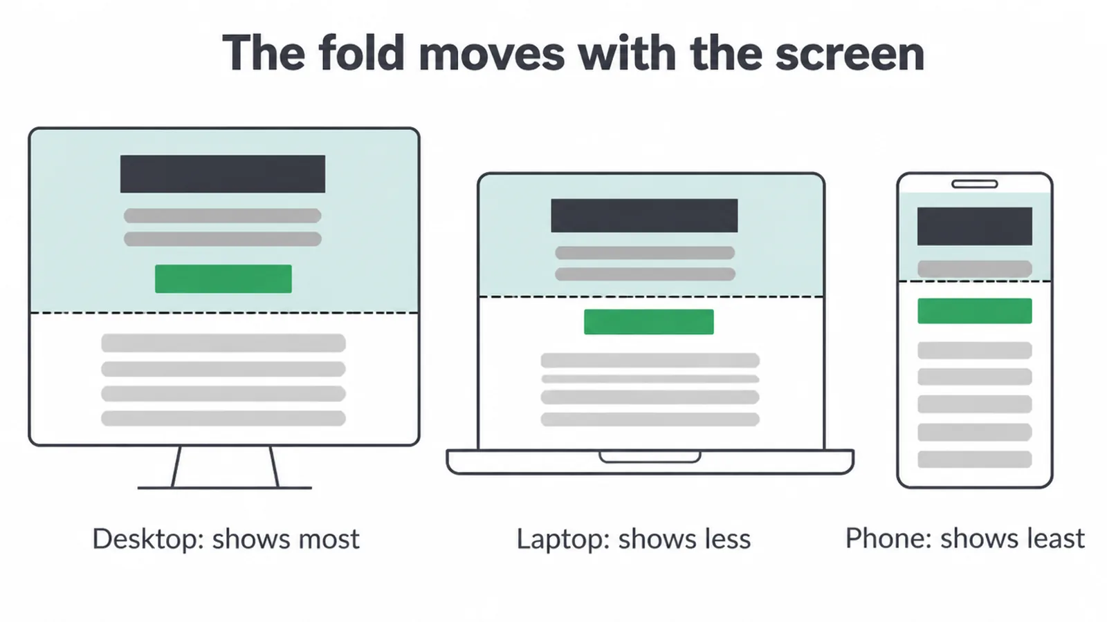
Browser chrome shifts it too. An address bar, a bookmarks row, or a tab strip all eat into the visible space. So the fold is really a range, not a line.
The honest move is to design for the smallest common screen first, then let the top breathe and grow on bigger ones. That mobile-first habit is its own craft, and we cover the build details in how to make a website mobile friendly.
Because the phone fold is so short, every pixel up top has to earn its place. One strong headline beats five weak ones. One clear button beats a row of competing links, the same rule that makes a landing page work.
3. Is the fold still relevant?
Yes and no. Yes, the top of the page still earns the most attention. No, it is not a hard cut-off, because people do scroll. Both can be true at once.
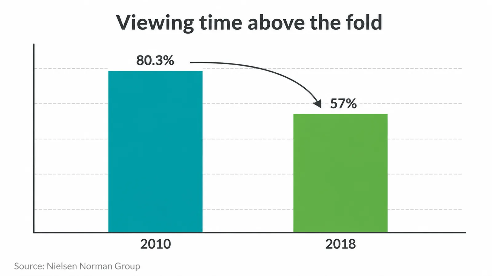
The numbers tell the story. Back in 2010, Nielsen Norman Group found users spent 80.3 percent of their viewing time above the fold. By 2018 that had dropped to about 57 percent. Scrolling became normal, so attention spread further down.
But the top still rules. In that 2018 research, 74 percent of viewing time stayed within the first two screenfuls, and the top 20 percent of a page pulled in over 42 percent of the total viewing time.
| Area of the page | 2010 | 2018 |
|---|---|---|
| Above the fold | 80.3% | ~57% |
| First two screenfuls | Most of it | ~74% |
| Top 20% of the page | Highest | 42%+ |
| Top 40% of the page | Very high | 65%+ |
Speed matters just as much as space. Visual appeal forms in about 50 milliseconds (Lindgaard et al., 2006). That is faster than a blink. And users often leave a page in 10 to 20 seconds unless something holds them, so you need to land your value within the first 10 seconds.
The fold is your one shot to make that first impression count. Getting it right is part of a sound web design process, not an afterthought.
4. What belongs above the fold?
Keep it to five things, no more. A crowded top reads like noise. A focused top reads like a clear offer.
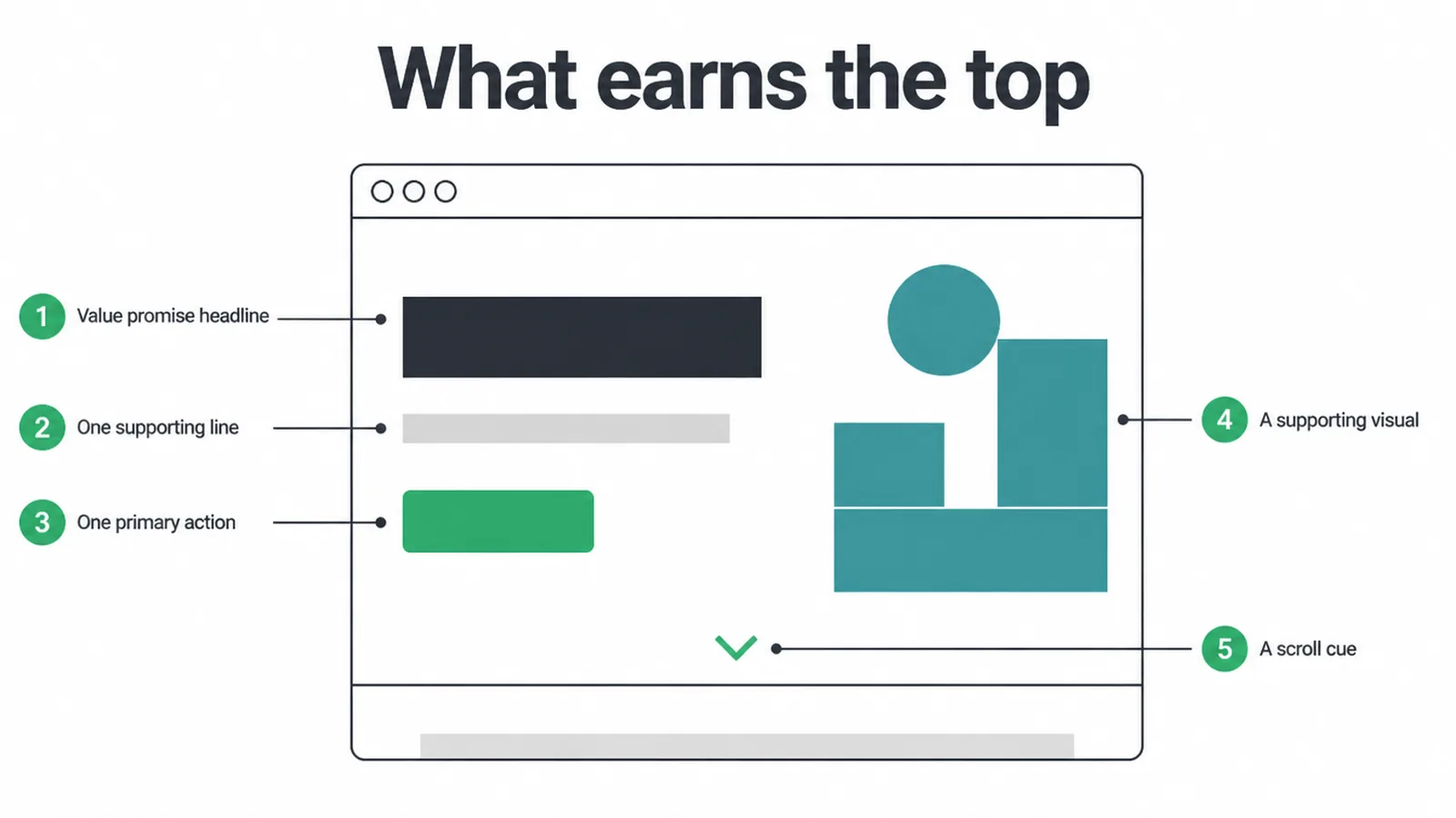
Here is the short list that earns the top:
- A value-promise headline. Say what you do and who it helps, in plain words. This is your 10-second message.
- One supporting line. A single sentence that adds proof or detail. No paragraph.
- One primary action. A single, obvious button. The look and wording of that button matter, which is why we go deep on button design on its own.
- A supporting visual. A photo, product shot, or clean graphic that backs up the promise.
- A scroll cue. A small hint, a peek of the next section, an arrow, so people know there is more.
That is it. Everything else, your features, your proof, your pricing, your story, can live below. If you want help shaping a top that actually converts, our web design service builds heroes around one clear job.
5. The myth of cramming everything up top
A lot of small business owners ask us to fit "everything important" above the fold. We get why. It feels safe. But it backfires. You cannot fit everything, and you should not try.
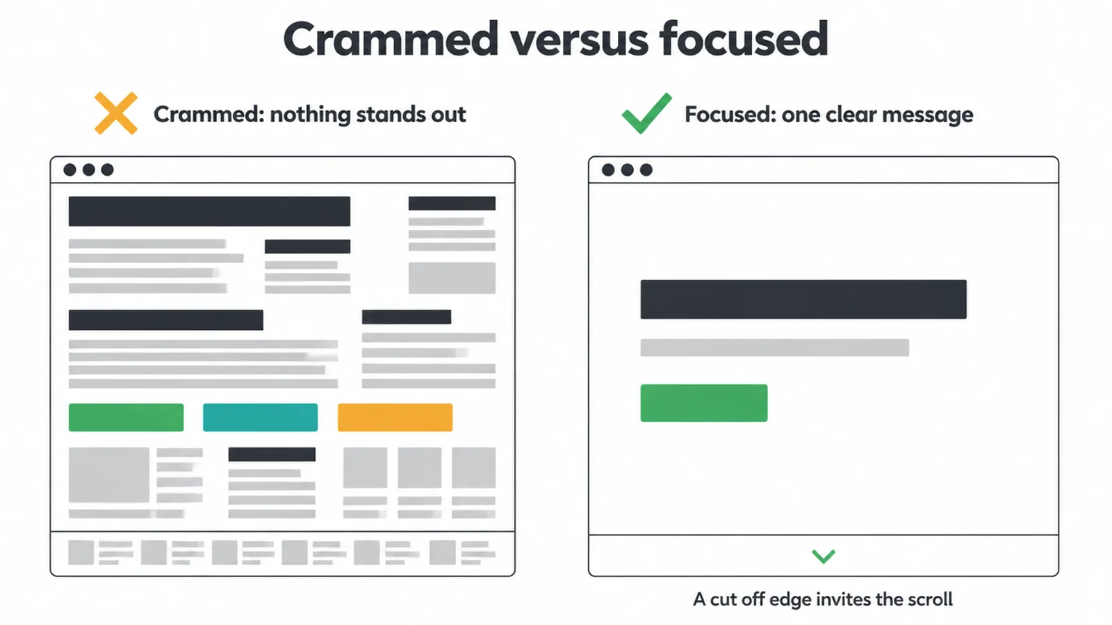
When you cram, nothing stands out. Five headlines compete, and the eye reads none of them. Three buttons fight, and the visitor clicks nothing. The room around your message is what makes it readable, which is exactly why white space in design is a feature, not waste.
Cut-off content is your friend. When a section is clearly sliced by the bottom edge of the screen, it tells people the page keeps going.
Nielsen Norman Group found the 100 pixels just above the fold get viewed 102 percent more than the 100 pixels just below it, so a smart design teases the next section into view to pull the eye down.
Stuffing the top is one of the most common small business website mistakes we fix. Less up top, more pull to scroll.
6. Does above the fold matter for SEO?
Indirectly, yes. The fold does not get its own ranking score. But what loads up there feeds a signal that does count.
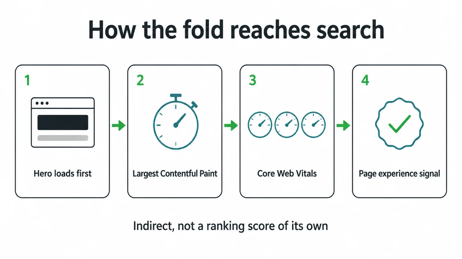
Your hero is usually the biggest thing on the screen and the first to render. That makes it drive a speed measure called Largest Contentful Paint, or LCP.
LCP is one of the Core Web Vitals, and those vitals sit inside a page-experience signal that Google's ranking systems reward. So a heavy, slow hero can drag your page experience down, while a fast, clean one helps it.
The takeaway is simple. A light, sharp top is good for visitors and good for search. Keep the hero image right-sized, skip the slow video autoplay, and load the most important content first. If you want that built into a wider plan, our SEO service ties page speed to the rest of your search work.
And remember, the fold is just one screen of a much bigger page. A small business site has to earn trust top to bottom, which we walk through in our pillar guide to small business websites.
7. What sits at the top of the Ecoledco and InfiniteMinds pages
We build page tops this way for real clients. On the Ecoledco landing page, an LED lighting brand for homes and businesses, the offer sits at the top and the range follows underneath. On the InfiniteMinds Academy page, what the courses teach leads the page, so a prospective student can self-select before scrolling.
Frequently asked questions
1. What does above the fold mean?
Above the fold means everything a visitor sees on a web page before they scroll. It is the part of the screen that loads in view straight away. Anything you have to scroll down to reach is below the fold.
2. Where did the term above the fold come from?
The term comes from print newspapers. A folded paper on a stand only showed its top half, so editors put the biggest headline and photo there to sell copies. The web borrowed the idea for the part of the screen you see before scrolling.
3. Where is the fold on a website?
There is no single fold. It moves with each screen, browser, and device. A large monitor shows a lot before scrolling, while a phone shows far less. Design for the top to work well on small screens first, then let it expand on bigger ones.
4. Is the fold still relevant?
Yes, but it is not a hard line. People do scroll. Still, the top of the page gets the most attention. Nielsen Norman Group found users spend about 57 percent of their viewing time above the fold, so the top still earns the biggest share of eyes.
5. What should go above the fold?
Put one clear promise, one short supporting line, and one main action up top. Add a supporting visual and a cue that more is below. Make it obvious what you offer and what to do next. Do not try to fit everything in.
6. Should you put everything important above the fold?
No. Cramming the top hurts more than it helps. A crowded hero has no focus, so visitors read nothing. Show one clear message and let content run past the fold. A clean cut-off edge actually invites people to scroll for more.
7. Does above the fold matter for SEO?
Indirectly. Your hero is usually the largest element that loads first, so it drives a speed measure called Largest Contentful Paint. Core Web Vitals, including that measure, are part of a page-experience signal Google's ranking systems reward, so a fast, clean fold helps.
8. What is below the fold?
Below the fold is everything you reach by scrolling down. It is not dead space. People do scroll there to read details, proof, and pricing. The top sets the hook, and the lower sections carry the supporting story.