Key takeaways
- UI design is the visual layer. It is the buttons, colors, type, spacing and icons people see and touch on every screen.
- Looks decide fast. A first impression of a site forms in about 50 milliseconds and rarely changes with more time.
- Design builds trust. In a large study, 46.1% of people judged a site's credibility partly on its visual design.
- UI is not UX. UI is what you see. UX is how the whole journey feels. You need both.
- Bad UI costs leads. About 38% of people stop engaging if a layout is unattractive.
1. What is UI design?
UI design is the visual, interactive layer of a screen. UI stands for user interface, and it is everything a person sees and touches: the layout, colors, fonts, buttons, menus, icons, spacing and the little ways things respond when you tap.
Put simply, UI design is how your website looks and how it feels to use, screen by screen.
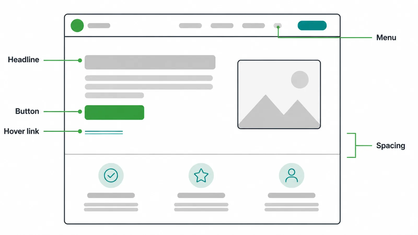
Think of your homepage. The big headline, the color of the "Book a call" button, the menu at the top, the space between sections, the way a link changes color when you hover.
Someone chose all of that. That work is UI design. It is the part of design you can point at on the screen.
Good UI design does one job above all: it makes the next step obvious. A visitor should never have to hunt for the button, squint at the text, or guess what is clickable. When the interface is clear, people relax and keep going. When it is messy, they leave.
2. UI vs UX: what is the difference?
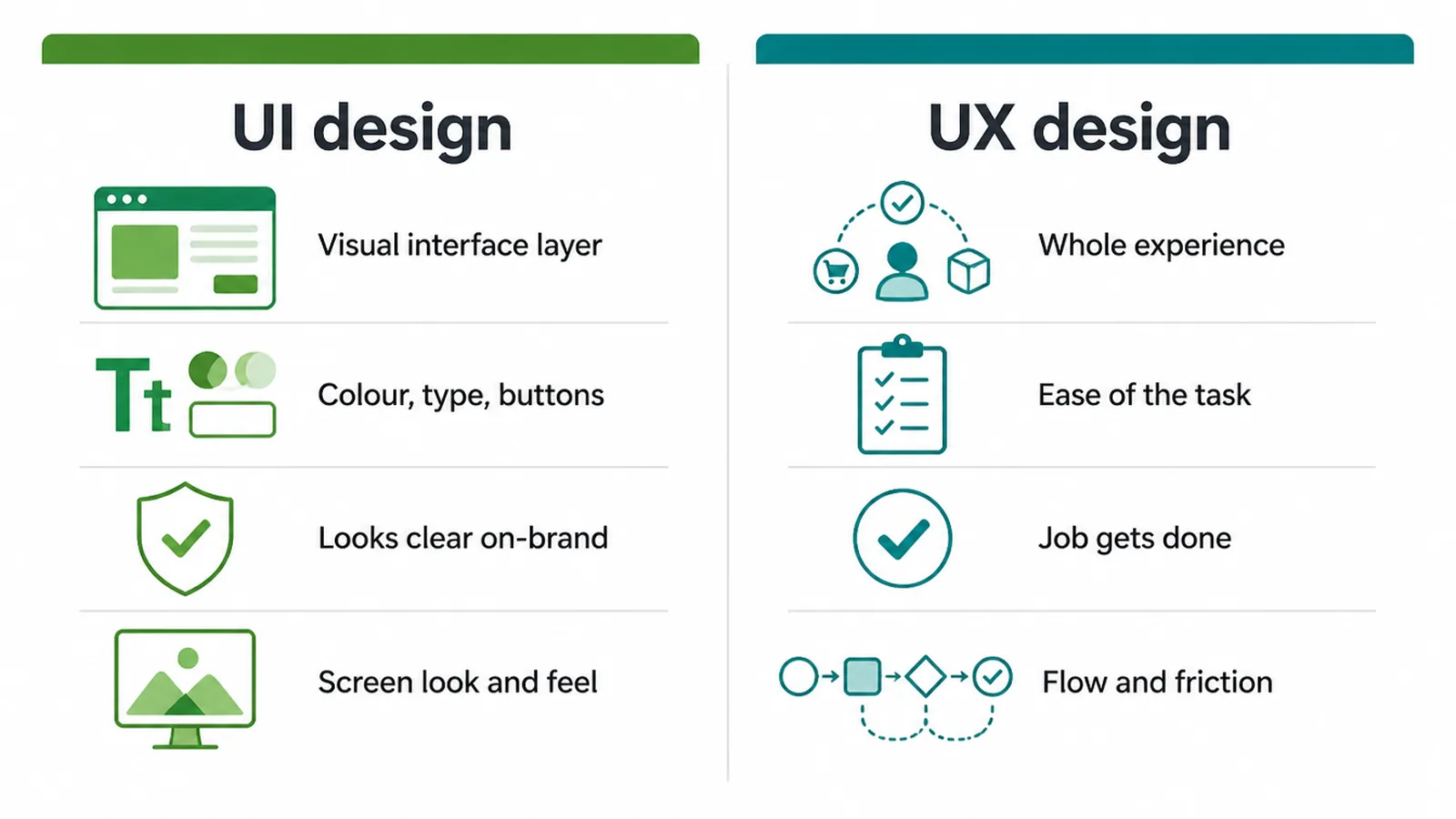
UI is what you see. UX is how the journey feels. UI design covers the visual surface, like color, type and buttons. UX, or user experience, covers the whole path a person takes to get a job done, like finding a price, booking a call, or checking out. They overlap, but they answer different questions.
Here is the short version. A beautiful button is UI. Whether tapping that button actually gets the visitor what they wanted is UX. You can have a gorgeous screen that is painful to use, and a plain screen that works perfectly.
The best sites get both right. We go deeper on the experience side in our guides to what UX design is and the core UX design principles, so this post stays on the visual layer.
| Question | UI design | UX design |
|---|---|---|
| What is it? | The visual interface layer | The whole experience and journey |
| What you notice | Color, type, buttons, spacing | How easy and clear the task feels |
| Key question | Does it look clear and on-brand? | Can people get the job done? |
| Example | The "Get a quote" button style | The path from landing to messaging you |
| Roughly owns | Look and feel of each screen | Flow, structure and friction |
3. The building blocks of UI design
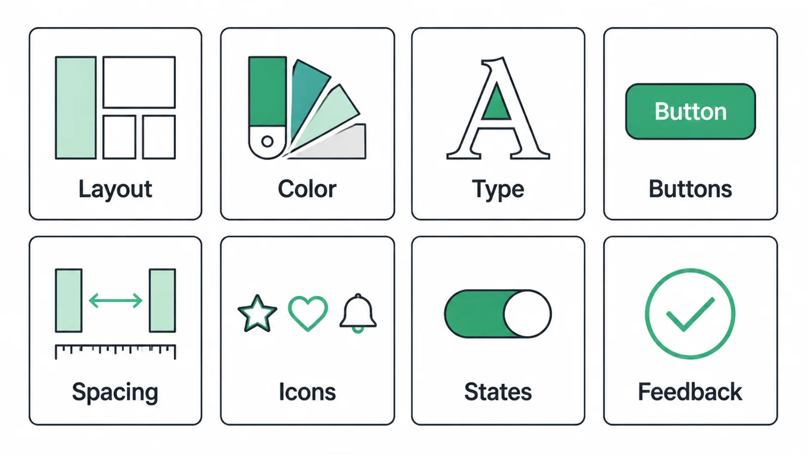
UI is made of a handful of parts. Get these right and the whole screen feels clean and easy. Get them wrong and the page feels cheap, even if the writing is good. Here are the pieces that matter most.
| Block | What it does |
|---|---|
| Layout | Where things sit on the screen and what your eye hits first. |
| Color | Carries your brand and points people to the action that matters. |
| Type | Makes words readable and sets the mood. See our guide to font pairing. |
| Buttons | The invitations to act. Worth designing carefully, as we cover in button design. |
| Spacing | Room to breathe so a page is not a wall of text. More on white space in design. |
| Icons | Small pictures that label or speed up recognition. |
| States | How things look on hover, tap, loading, disabled or error. |
| Feedback | The confirmation that a tap worked, like a tick or a sent message. |
States and feedback are the parts most small business sites forget. A button that does nothing visible when you tap it makes people wonder if the site is broken.
A short "Message sent" note after a form feels like a tiny win. These small touches are pure UI, and they decide whether a visitor trusts you enough to keep going.
4. Why UI design matters for your business
People judge your site fast, and they judge your business by how it looks. A first impression of a site forms in about 50 milliseconds, and that gut reaction rarely changes when people look longer. So before anyone reads a word, your UI has already made a promise about how serious you are.
That promise turns into trust. In the long-running Stanford study, 46.1% of people said they judged a site's credibility partly on its visual design. If the interface looks polished, people believe the business behind it is real and careful. If it looks dated or cluttered, they assume the opposite.
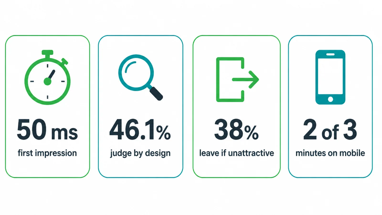
Weak UI also quietly drives people away. Adobe found about 38% of people stop engaging with a site if the content or layout is unattractive, and around 39% leave if the images will not load or take too long. Every one of those people could have been a lead.
One more thing shapes all of this: the screen. Most browsing now happens on phones, with comScore reporting nearly two of every three online minutes spent on mobile. That means your UI has to be designed for a thumb on a small screen first, not a mouse on a wide monitor.
If you are building or fixing a site, start with our small business website guide, then make sure the interface is easy on a phone using our walkthrough on making a website mobile friendly.
5. What makes a good user interface
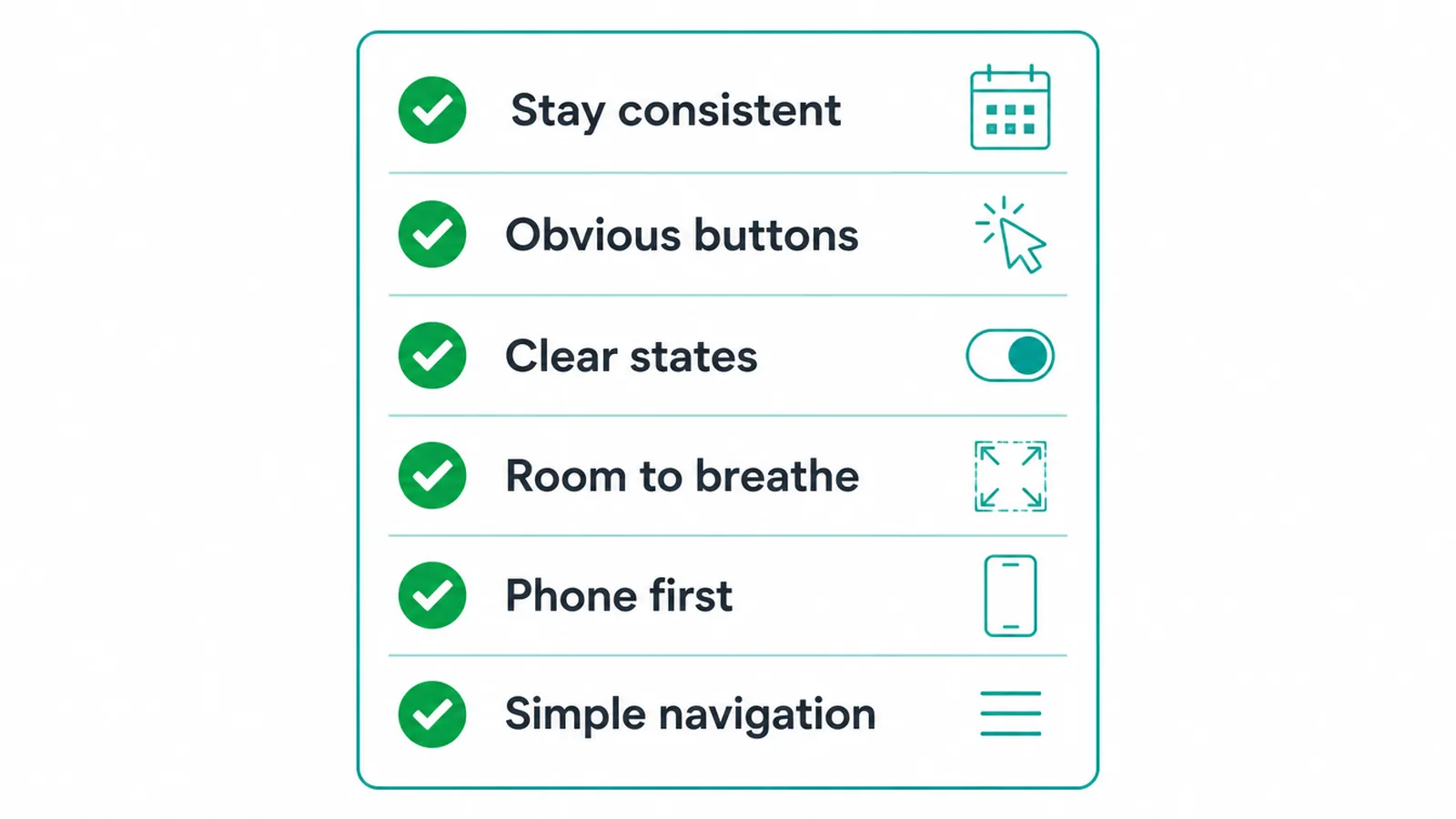
Good UI design is mostly about being clear and consistent, not flashy. You do not need a wild, original look. You need a screen that anyone can use on the first try. Here is a simple checklist you can hold your own site against.
- Be consistent. Use the same colors, fonts and button styles on every page. People already know how the web works from other sites, a pattern often called Jakob's Law, so do not surprise them. Reuse one set of components everywhere.
- Make buttons obvious. Your main action should stand out by color and size. A visitor should spot it in a second on every screen.
- Show clear states. Things should react to hover and tap, show a loading sign when busy, and explain errors in plain words.
- Give it room to breathe. Space around text and buttons makes a page feel calm and easy to scan. Crowding makes it feel cheap.
- Design for the phone first. Big tap targets, readable text, and one clear path down the screen.
- Keep navigation simple. People should always know where they are and how to get back. Our notes on website navigation best practices go deeper here.
Notice that none of this is about being clever. It is about being clear. A clean, current look that follows familiar patterns will almost always beat a "unique" design that confuses people. If you want examples of what current and clean looks like, see our guide to modern website design.
6. Should you do UI yourself or hire help?
The basics of UI design are learnable. If your site is small, you can get a long way by picking a clean template, using one or two fonts, keeping your colors consistent, and making your main button stand out. Many builders and themes hand you a decent starting point for free.
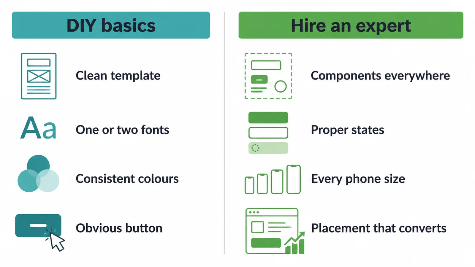
Where it gets tricky is the detail. Consistent components across many pages, proper states and feedback, a layout that holds up on every phone size, and a button placement that actually turns visitors into messages. That is where small problems quietly cost you leads, and where an experienced eye pays for itself fast.
Our honest take: if your website is meant to bring in real business, the interface is worth getting right rather than guessing.
We help small businesses with exactly this through our web design service, and you can always message us to talk through your own site. Either way, treat your UI as a working tool, not decoration.
UI design FAQ
1. What is UI design in simple terms?
UI design is the visual, interactive layer of a screen. It is the part you see and touch: the buttons, menus, colors, text, icons, spacing and the way things light up when you tap them. Good UI design makes a page look clear and feel easy to use, so a visitor knows where to look and what to do next without thinking.
2. What is the difference between UI and UX?
UI is the look and feel of the screen: color, type, buttons and spacing. UX is the whole experience of getting a job done, like how easy it is to find a price or book a call. UI is what you see. UX is how the journey feels. A pretty button (UI) is useless if it leads nowhere (UX), so you need both.
3. What does a UI designer do?
A UI designer decides how every screen looks. They choose colors, fonts and spacing, design the buttons and menus, build reusable components, and set the rules for hover, tap, loading and error states. They make sure the same patterns repeat across every page so the site feels consistent and trustworthy on both desktop and phone.
4. What are the main building blocks of UI?
The core building blocks are layout, color, type, buttons, spacing, icons, states and feedback. Layout places things on the screen, color and type carry your brand and guide the eye, buttons and icons invite action, spacing keeps it readable, states show what is happening, and feedback confirms a tap worked.
5. Why is UI design important for a small business?
People judge your site in a blink and they judge your business by how it looks. A first impression of a site forms in about 50 milliseconds, and many people decide a company is credible partly from its visual design. If your interface looks clean and works smoothly, more visitors stay, trust you and become leads.
6. Is UI the same as graphic design?
No. Graphic design is mostly visuals that get looked at, like a poster or a logo. UI design is visuals that get used. Every button, field and menu has to work when a real person taps it on a small screen, handle errors, and stay consistent across many pages. UI borrows graphic-design skills but adds interaction and states.
7. Do I need UI design for a small business website?
Yes. Even a simple site has buttons, forms and menus, and those need to be clear and easy to tap. You do not need a huge custom system. You do need consistent colors, readable type, obvious buttons and a layout that works on a phone first. Good basic UI is the difference between a visitor leaving and a visitor messaging you.
8. How does UI design affect getting leads?
UI removes friction. When the button is obvious, the form is short and the page loads fast, more people finish the action and contact you. When the layout is messy or images are slow, people leave. About 38 percent stop engaging if the layout is unattractive, so clean UI directly protects the messages and calls you would otherwise lose.