Modern Website Design 2026: What Strong Websites Need Now

Modern website design means five plain things: fast, mobile-first, readable, accessible, and built around one clear action. First impressions form quickly, and Google reports that 53% of mobile visits are abandoned past three seconds. Seed Light designs to that standard on new builds and redesigns.
Key takeaways
- Modern is a standard, not a trend. A modern website design is fast, mobile-first, readable, accessible, and built around one clear action.
- Visual appeal is rated fast. In a 2006 study, Lindgaard and colleagues found that people rated a page's visual appeal after 50 milliseconds of viewing.
- Speed is design. 53% of mobile visits are abandoned when a page takes longer than three seconds.
- Phones come first. Mobile was 49.36% of worldwide web traffic (StatCounter, August 2026), about half.
- Accessibility is not optional. 95.9% of home pages had detected failures in February 2026, so getting it right sets you apart.
1. What is modern website design?
Modern website design is a site that loads fast, works on a phone first, reads clearly, meets accessibility standards, and points every visitor toward one clear action. It is a way the site should function, not a list of visual fads.
That matters because the first screen sets the visual direction before anyone explores the rest of the site.
Most "modern web design" articles show you art galleries: wild scroll effects, huge animations, and color experiments. Those can be fun. But for a small business, a site is a tool. It should make it easy for the right person to understand what you do and take the next step. Everything else is seasoning.
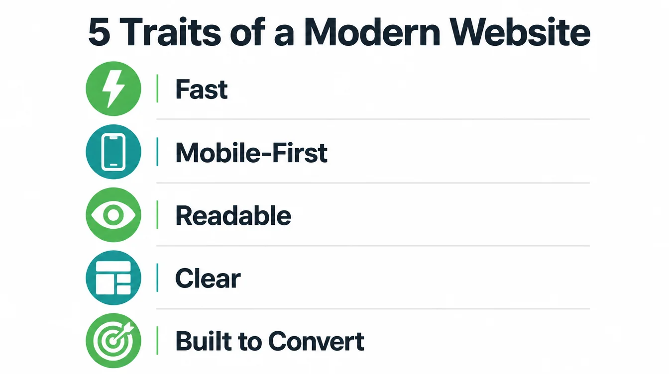
So when we say modern, we mean five plain things: fast, mobile-first, readable, clear, and built to convert. Get those right and your site will look current for years.
Skip them and no trendy effect will save it. If you want the full picture of what a small business site needs, start with our guide to building a small business website.
2. Modern is not the same as trendy
Here is the trap. Trendy dates fast. Modern lasts. A trend is a look that is popular this year and embarrassing the next. A standard is the way good sites work no matter the year. Modern website design is mostly the second kind.
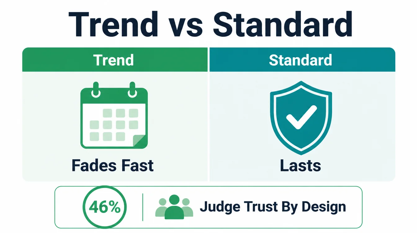
Why does this distinction matter so much? Because design carries trust. In the Stanford Web Credibility study, 46.1% of consumers judged a site's credibility partly on its overall visual design.
That is close to half of your visitors making a snap call about whether you seem legit, based partly on how the page looks and feels.
So you do want a site that feels current. But you get there by being clear, fast, and easy, not by chasing the effect everyone copied this season.
A clean layout from five years ago that loads fast and works on a phone will beat a flashy site that is slow and confusing. Build for function first. The "modern" feeling follows.
3. Trait 1: It is fast
Speed is the first trait of a modern site because it is the first thing a visitor feels. They do not read your page until it appears.
And patience online is thin. 53% of mobile visits are abandoned if a page takes more than three seconds to load. Half your visitors can leave before they ever see your offer.
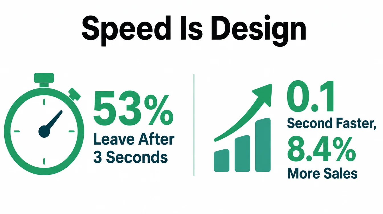
Speed decides whether people stay, and it directly affects whether they buy. Google and Deloitte found that a 0.1 second improvement in mobile load time raised retail conversions by 8.4%. A tenth of a second. That is how sensitive people are to a site that feels slow.
What makes a site fast? Compressed images, clean code, a good host, and not stacking on every plugin and tracker you can find. The numbers that matter most are called Core Web Vitals, and they are worth understanding.
We break them down in plain English in our guide to Core Web Vitals. If a "modern" design adds heavy animation or huge background videos that slow the page, it is not modern. It is just expensive to look at.
4. Trait 2: It is mobile-first
Mobile-first means you design for the phone screen before the desktop, not the other way around. This is not a preference anymore. Mobile was 49.36% of worldwide web traffic (StatCounter, August 2026), about half. Check your analytics to see the split for your own visitors.
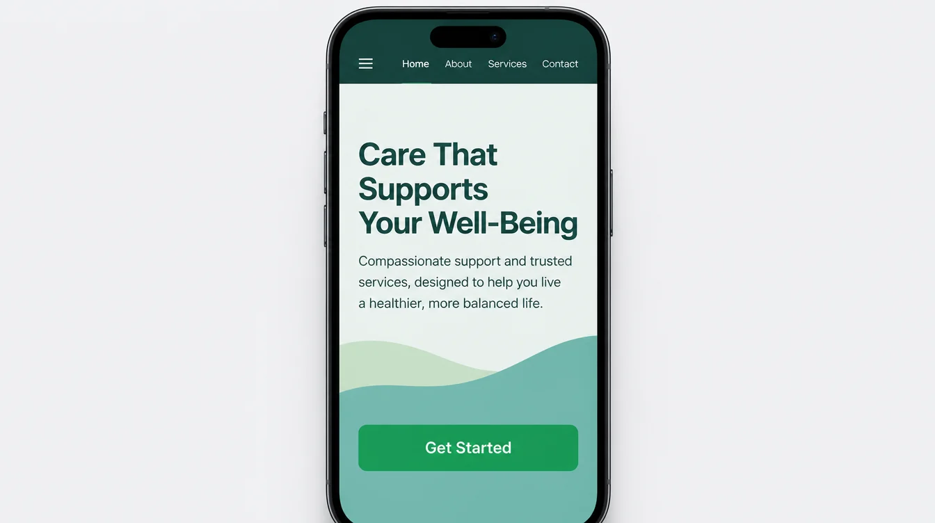
A modern mobile layout is simple. One column of content. Tap targets big enough to hit with a thumb, around 44 pixels or more. Important buttons near the bottom of the screen where the thumb naturally rests. No pinching, no zooming, no sideways scrolling. Text you can read without effort.
If you have ever tried to tap a tiny link on a cramped page and hit the wrong thing, you know how an old site feels. A modern site never does that.
For a step-by-step on getting this right, read our guide to making a website mobile-friendly. Test your own site on your phone right now. If it feels awkward, your visitors feel it too.
5. Trait 3: It is readable and accessible
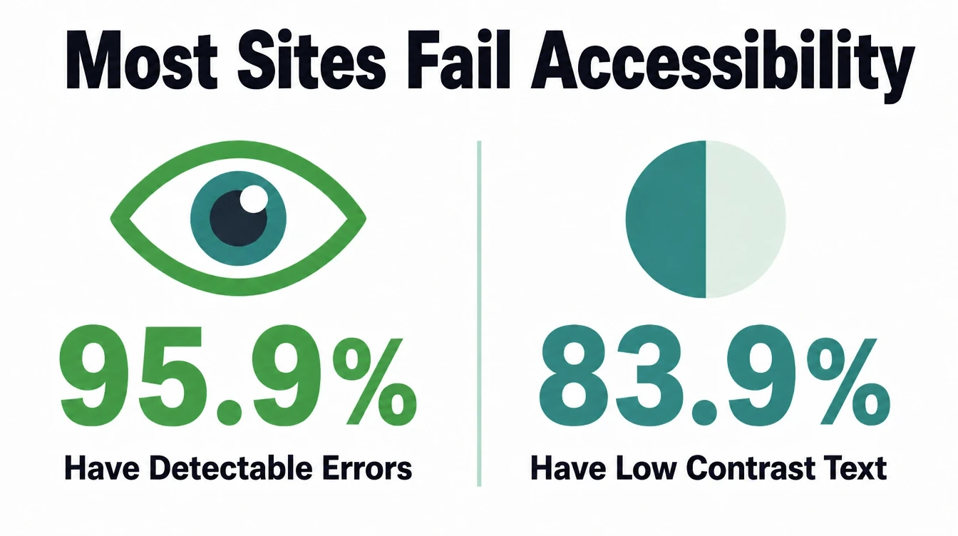
A modern site is easy to read for everyone, including people with low vision, color blindness, or a screen reader. This is the trait most small business sites get wrong. 95.9% of the top one million home pages had detected failures, averaging 56.1 errors per page (WebAIM Million, February 2026). Nearly every site online is failing.
The single most common problem is low-contrast text, found on 83.9% of home pages (WebAIM Million, February 2026). That is pale grey text on a white background, or light text on a busy image. It looks soft and stylish to a designer with perfect eyesight. It is hard or impossible to read for a lot of real people.
The fixes are simple. Use body text around 16 to 18 pixels. Use strong contrast between text and background. Add real alt text to images so screen readers can describe them.
Make sure the site works with a keyboard as well as a mouse. Accessibility is not a charity add-on. It widens your audience and it helps your search ranking. We cover the full checklist in our guide to website accessibility.
6. Trait 4: It is clear
A modern site is clear. When a visitor lands, they should know within seconds what you do, who it is for, and what to do next. Clutter is the enemy of clarity. When everything shouts, nothing is heard.
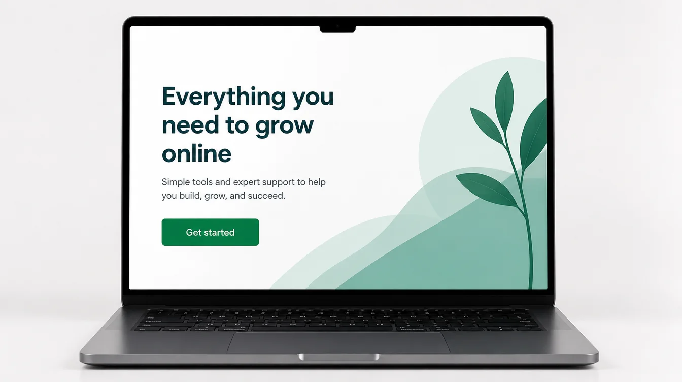
Clarity comes from a few habits. Give the page white space so elements can breathe. Carry one main message per page instead of trying to say everything at once.
Use a visual hierarchy, where the most important thing is the biggest and boldest, and supporting details are smaller. Cut the stock-photo clutter and the wall of menu links.
This is where good design and good branding meet. A clear site reflects a clear brand: a consistent look, a simple set of colors, one voice. If your message and your visuals are scattered, the page feels scattered too.
Our branding work exists to make that core message sharp before it ever hits a layout. When you are tempted to add one more thing to a page, ask if it helps the visitor decide. If not, leave it out.
7. Trait 5: It is built to convert
A modern site has a job. For a small business that job is usually to turn a visitor into a lead or a customer. So a modern design is built around one primary action and removes everything in the way of it.
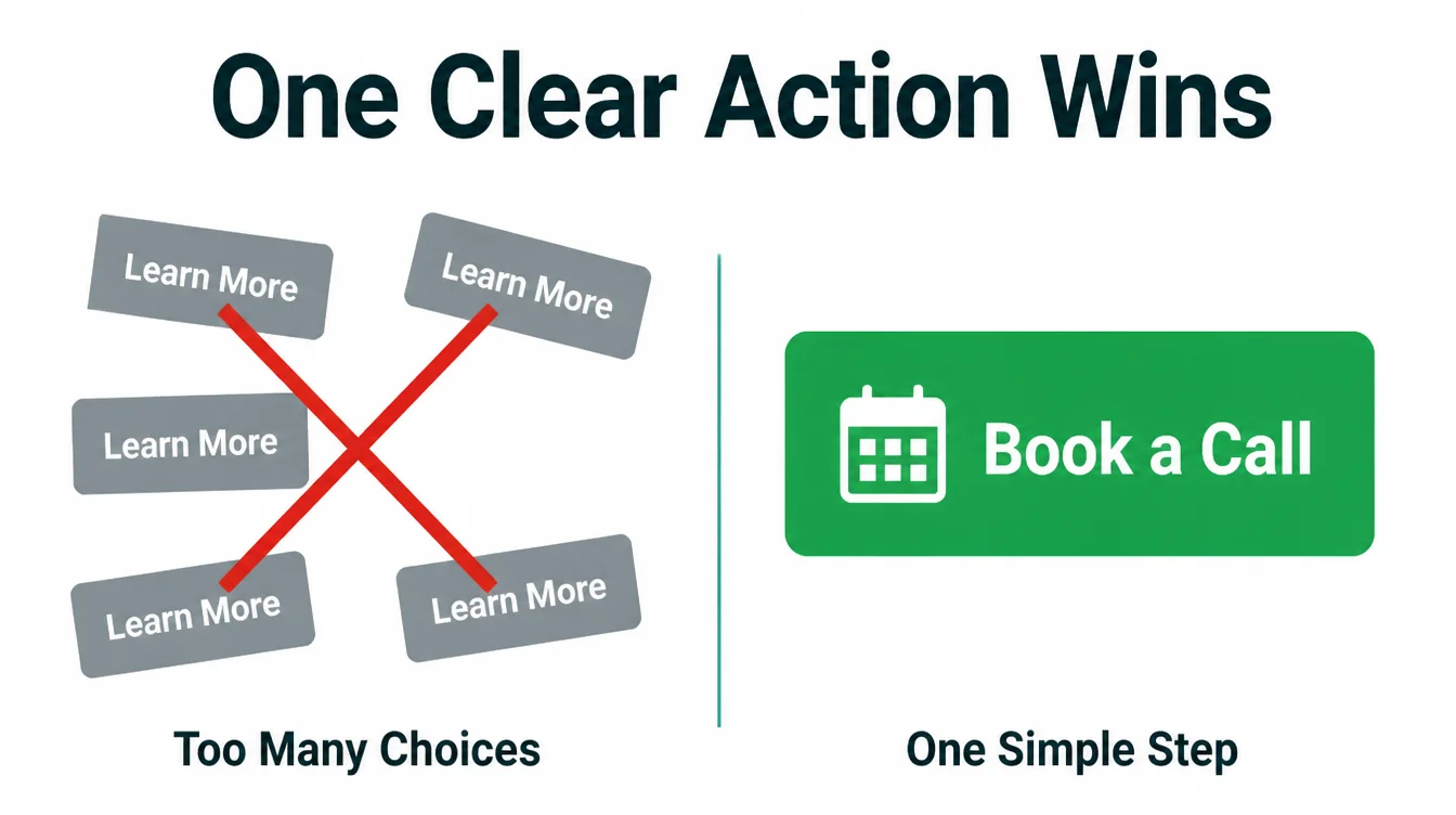
That means one clear main button per page. "Book a call." "Get a quote." "Order now." Not five buttons of equal weight that leave people frozen.
It means short forms that ask for only what you truly need, because every extra field loses people. It means putting the next step where people already are, instead of making them hunt for it.
Conversion is where speed, mobile, readability, and clarity all pay off at once. A fast, clear, phone-friendly page that asks for one simple action will out-earn a beautiful page that does none of those things.
This is the whole point of how we approach web design: a site that looks good and quietly does its job. A pretty site that brings in nothing is just an expensive brochure.
8. Modern vs outdated, side by side
The line between a modern and a dated site usually comes down to a handful of choices. Here is a quick comparison you can run against your own site.
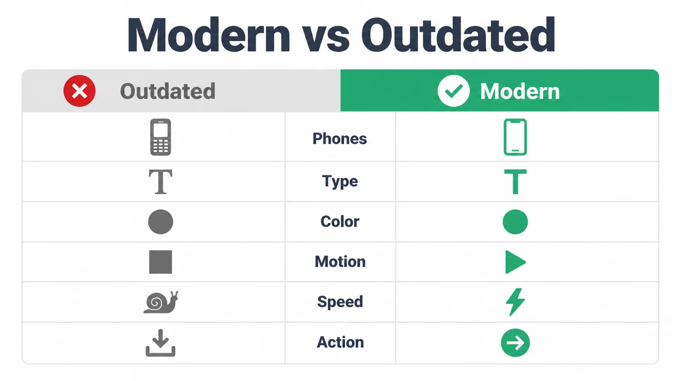
| Area | Outdated site | Modern site |
|---|---|---|
| Phones | Pinch and zoom, sideways scroll, tiny links | Designed for the phone first, single column, big tap targets |
| Type | Small text, many mismatched fonts | Large readable text, one simple type system |
| Color and contrast | Pale low-contrast text, clashing colors | Strong contrast, a small consistent color set |
| Motion | Auto-playing sliders and heavy effects | Restrained motion that helps understanding |
| Speed | Slow, heavy, plugin-stuffed | Fast, compressed, light |
| Action | Many competing buttons, no clear next step | One clear primary action per page |
If your site lands in the left column on more than a couple of rows, it is quietly costing you. Many of these are the same issues we flag in our roundup of common small business website mistakes. The good news is that every one of them is fixable.
9. Trends worth using in 2026
Trends are seasoning, not the meal. Used well, on top of the five traits, they can make a site feel fresh. Used as a substitute for function, they make a site worse. Here are the ones worth a look this year, and the rule for each.
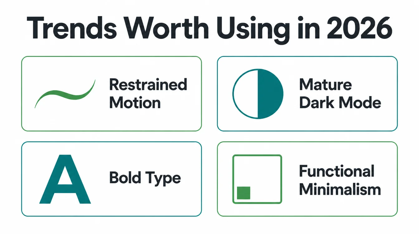
- Restrained motion. Small, purposeful animation that guides the eye is good. Heavy scroll effects that lag on a phone are not. If it slows the page, cut it.
- Mature dark mode. Dark mode has grown up and many people prefer it. Offer it if your audience wants it, but never let it hurt contrast or readability.
- Bold, confident type. Large headlines with a strong, simple typeface read as current. This costs nothing and helps clarity.
- Functional minimalism. Strip a page to what the visitor needs. This is the most "modern" trend there is, and it makes the site faster too.
Notice that the best trends all serve speed and clarity. The dangerous ones fight them. When you pick a platform and theme, the same logic applies: choose tools that stay fast and easy to maintain.
If you are weighing your options, our comparisons of Wix vs WordPress and WordPress vs Webflow can help you choose without getting trapped by a slow setup.
10. How to get there, in order
In our work building small business sites, the mistake we see most is starting with looks. A team picks a flashy template, falls in love with an effect, and bolts the content on later. The site ships, looks pretty in a screenshot, and brings in nothing. Modern design works in the opposite order.
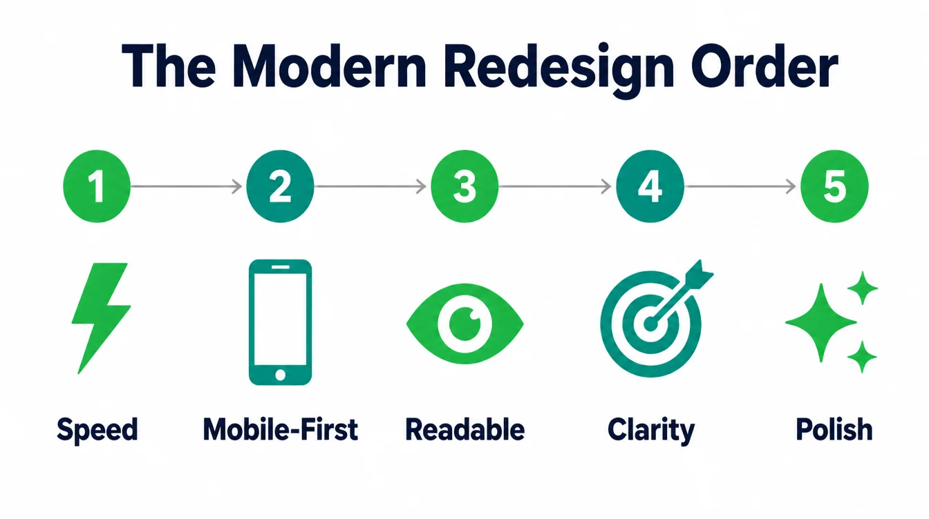
Here is the priority order we recommend. Fix speed first, because nothing else matters if people leave before the page loads. Make it mobile-first second, since about half of web traffic is mobile.
Make the text readable and accessible third. Then sharpen the message so the page is clear. Only then add the visual polish and the few trends that fit your brand.
You can do a lot of this yourself with the right tools and patience. If you would rather hand it off, the key is choosing a partner who builds for results. Our guide on how to choose a web design company walks through what to ask.
And if you want a clear-eyed look at your current site, you can always tell us what you are working on. Either way, build for the visitor first. The modern look takes care of itself.
Frequently asked questions
1. What is modern website design?
Modern website design is a site that loads fast, works well on a phone first, reads clearly, meets accessibility standards, and points every visitor toward one clear action. It is a standard for how a site should function, not a list of visual trends. Looks matter, but they sit on top of speed, structure, and usability.
2. What makes a website look modern?
A modern look comes from generous white space, one clear message per page, a simple type system with large readable text, a small consistent color set, and restrained motion. The page should feel calm and uncluttered. When the layout makes the next step obvious and nothing fights for attention, a site reads as current and trustworthy.
3. What makes a website look dated?
A site looks dated when it is hard to use on a phone, when text is tiny or low contrast, when the page is slow, and when it is crammed with competing buttons, banners, and pop-ups. Heavy stock photos, cluttered sidebars, and tiny tap targets also age a site quickly. Most dated sites have a usability problem.
4. How often should I redesign my website?
Most small business sites benefit from a meaningful refresh every two to three years, with smaller updates in between. The trigger is rarely a calendar date. Redesign when the site is slow on phones, when text and layout feel cramped, when you cannot edit it easily, or when it is no longer bringing in leads. Function and results matter more than age alone.
5. Does website design affect trust and sales?
Yes. A share of visitors judge a business partly on how its site looks. Design also affects sales through speed. Even a tenth of a second faster on mobile has been linked to higher conversions in retail. A clear, fast, trustworthy site makes it easier for people to choose you.
6. Do I need a dark mode or animations to look modern?
No. Dark mode and animation are options, not requirements. A bright, simple site with no animation can look fully modern if it is fast, mobile-first, and clear. Use motion only when it helps a person understand the page, and add dark mode only if your audience wants it. Never add either if it slows the site down.
7. Should I use a template or a custom design?
A good template can produce a modern site if it is fast, responsive, and accessible, and if you keep the layout clean. A custom design helps when you need a distinct brand, unusual features, or tight control over speed and conversion. Many small businesses start on a strong template and move to custom work as they grow.
8. What are the signs my website needs updating?
Update your site if it is slow, if it is awkward to pinch and zoom on a phone, if the text is small or low contrast, if you cannot make edits yourself, or if visitors land and leave without taking action. A drop in leads, even with steady traffic, is one of the clearest signs the design is getting in the way.