Key takeaways
- Microcopy is the tiny UI text on buttons, labels, errors, empty states, and confirmations. It quietly decides whether someone finishes or leaves.
- Tiny words move big numbers. In one test, swapping a button word from "your" to "my" lifted clicks 90 percent.
- Personal beats generic. Personalized calls to action convert 202 percent better across more than 330,000 tested CTAs.
- Buttons should say what happens next, not "Submit." Form hints should come before mistakes, and errors should say what went wrong and how to fix it.
- Reassurance lines near a button remove the last bit of doubt right where people click.
1. What is microcopy?
Microcopy is the tiny text scattered across your site that tells people what to do and what to expect.
It is the words on your buttons, the labels on your form fields, the hint under an input, the error when something goes wrong, the message on an empty screen, and the "thank you" after a sign-up. These tiny words decide whether someone finishes a task or quietly gives up and leaves.
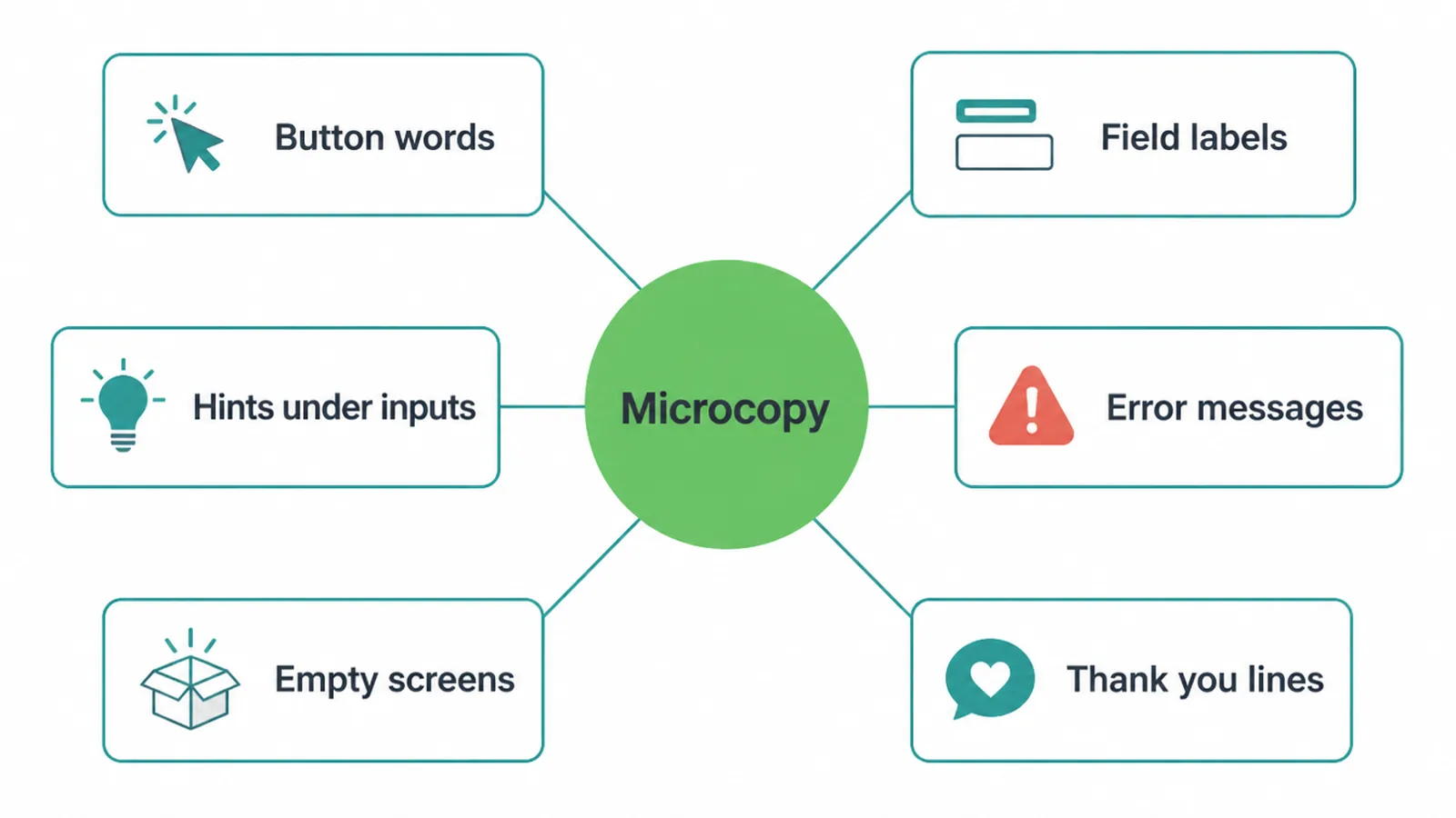
People sometimes mix up microcopy and UX writing. Here is the one-line difference. Microcopy is the tiny text itself. UX writing is the wider job of planning and testing all the words across a product.
Microcopy is one piece of that bigger job. On a small business site, the same person usually does both, and that person is often you.
Most owners spend weeks picking colors and fonts, then write "Submit" on the button and call it done. That is backwards. The words are what people actually read in the moment they decide. Get them right and the rest of your design works harder.
2. Do tiny words really change anything?
Yes, and the numbers are not small. In one well-known test, a landing page changed a single button word from "Start your free trial" to "Start my free trial." That one swap, from "your" to "my," lifted clicks by 90 percent. Nothing else on the page moved. Just the pronoun.
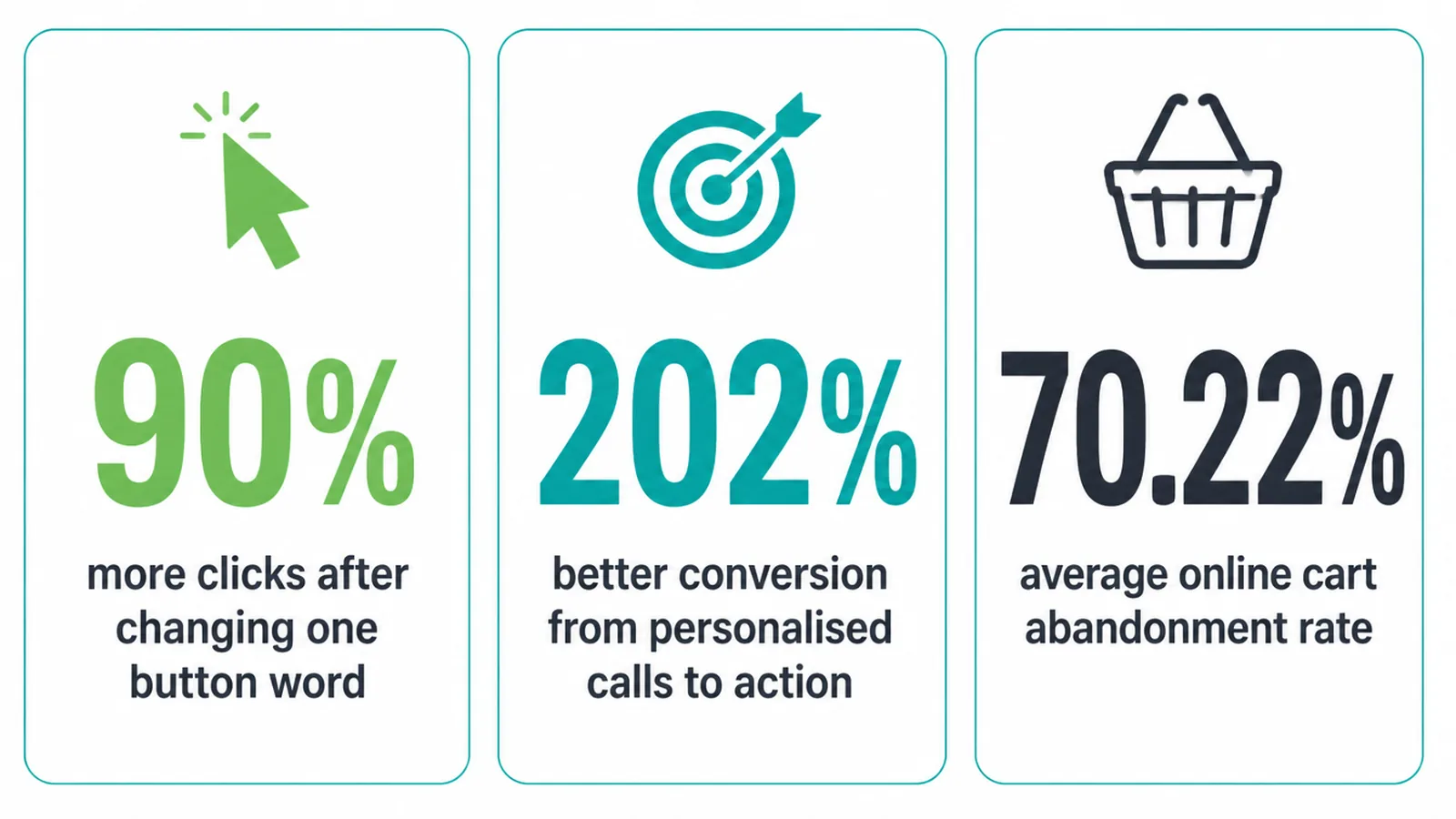
The pattern holds at scale too. HubSpot looked at more than 330,000 calls to action and found that personalized ones, the kind that speak to the person and their goal, convert 202 percent better than generic ones. Words that feel written for one person beat words written for everyone.
And the cost of bad words is real. Across 50 studies, the average online cart abandonment rate sits at 70.22 percent.
A lot of that is friction your words can fix: confusing labels, scary errors, and steps that feel longer than they are. Microcopy will not fix everything, but it removes the small doubts that pile up into a closed tab.
3. Button labels: say what happens next
Your button is the most important sentence on the page. It should say what the person gets after they click, not the action the computer takes. "Submit" tells me nothing. "Get my free guide" tells me everything.
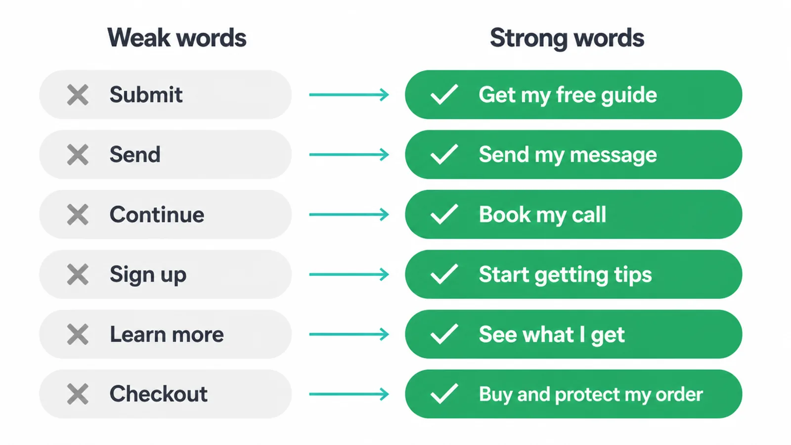
Two simple rules. First, lead with the benefit, the thing the person actually wants. Second, write it in first person where it fits, using "my" instead of "your." That small shift makes the button feel like the person is speaking, not being told.
We dig deeper into wording and placement in our guide on strong call to action examples, and into how the button should look in button design. Here we stay on the words.
| Where it sits | Weak words | Strong words |
|---|---|---|
| Lead magnet | Submit | Get my free guide |
| Contact form | Send | Send my message |
| Booking | Continue | Book my call |
| Newsletter | Sign up | Start getting tips |
| Pricing page | Learn more | See what I get |
| Cart | Checkout | Buy and protect my order |
4. Form microcopy: help before, not after
Forms are where people quit. The fix is to help them before they make a mistake, not scold them after. Good form microcopy has three layers: plain labels, a helpful hint, and a kind error if something still goes wrong.
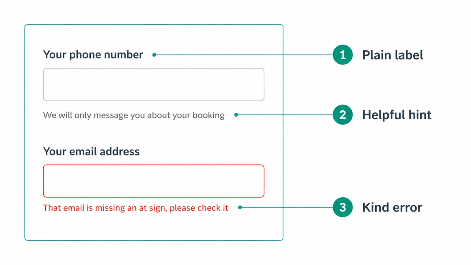
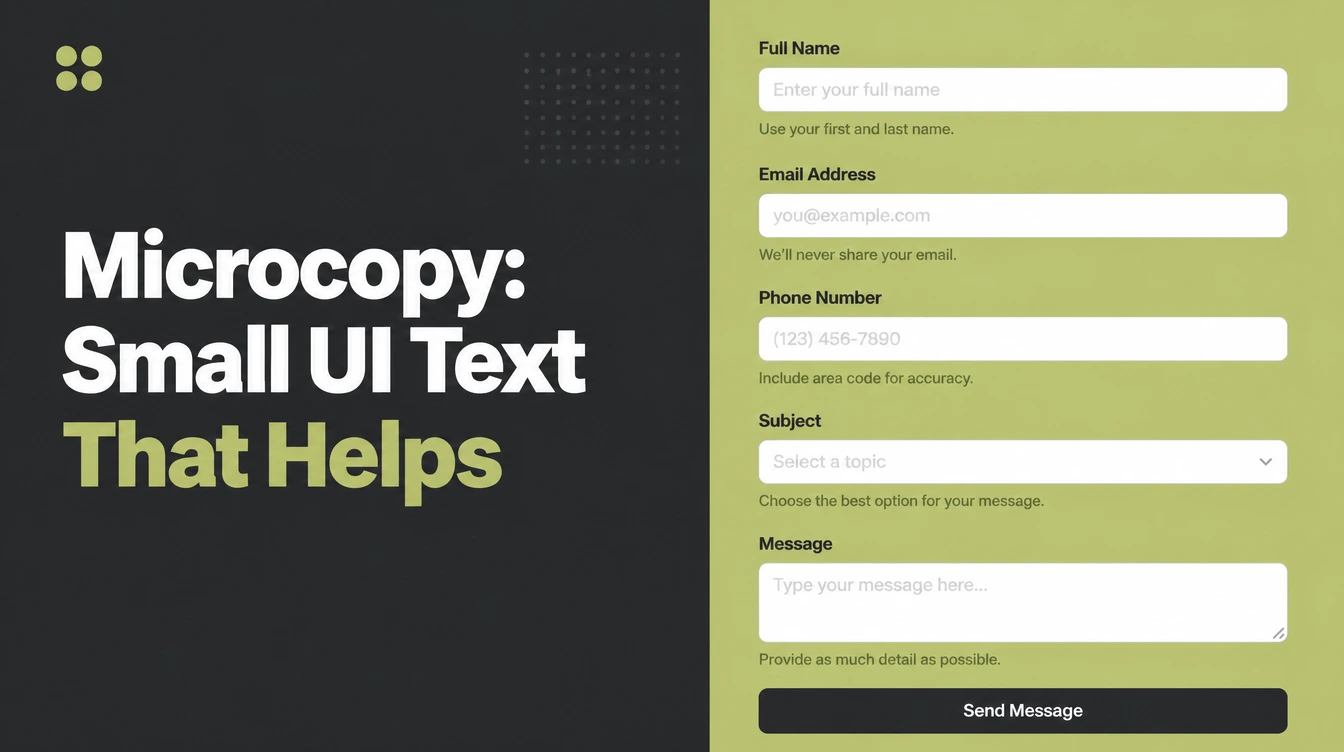
Start with the label. Use the words a customer would use, like "Your phone number," not "Tel." Then add a short hint where it helps, like "We will only message you about your booking." That one line answers the worry before it appears.
The structure of the form itself matters just as much, and we cover that in website form design.
When something does go wrong, the error should do two jobs: say what went wrong and how to fix it, in plain words, right next to the field. "Invalid input" helps nobody.
"That email is missing an at sign, please check it" gets the person moving again. Checking the field the moment someone finishes typing helps too. In one study, this kind of inline validation gave 22 percent more successful completions and 42 percent faster filling.
This matters because friction sends people away. In Baymard's research, 18 percent of shoppers abandoned an order because the checkout was too long or complicated, and 15 percent left because of site errors. Clear labels and kind errors are cheap. Lost orders are not.
5. Empty states, confirmations, and 404s
Some screens are easy to forget, and those are exactly the ones that quietly hurt you. The first is the empty state, the screen someone sees before there is anything to show. A fresh dashboard, an empty cart, a "no results" page.
A blank screen feels broken. Good empty-state microcopy explains what goes here and gives one clear next step. Instead of a lonely "No items," try "Nothing saved yet. Browse the guides to add your first one."
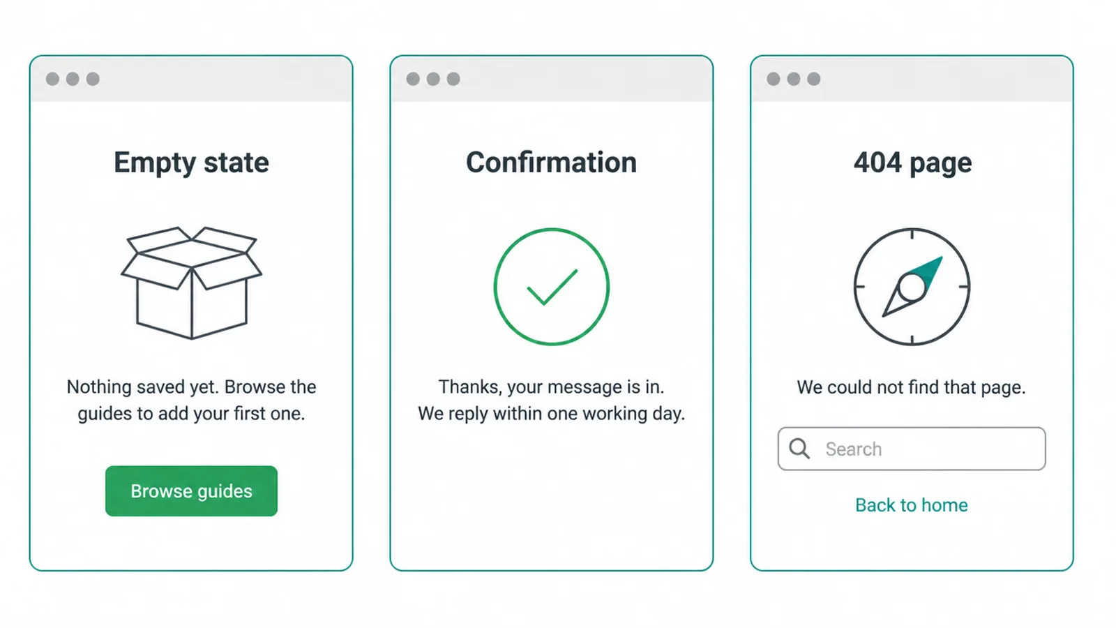
The second is the confirmation. After someone sends a form or buys, do not leave them guessing. A warm, specific line ("Thanks, your message is in. We reply within one working day.") tells the person it worked and what happens next. Silence makes people resend, worry, or leave.
The third is the 404 page, the screen for a link that no longer exists. Most are cold and useless.
A friendly one says "We could not find that page," then offers a search box or links back to your main pages. A good 404 turns a dead end into a soft landing instead of an exit.
6. Reassurance: the line that beats the last doubt
People hover over a button and hesitate. They are not unsure about you. They are unsure about one small thing: will this cost me, will it spam me, will it take forever. Reassurance microcopy answers that worry at the exact moment it appears.
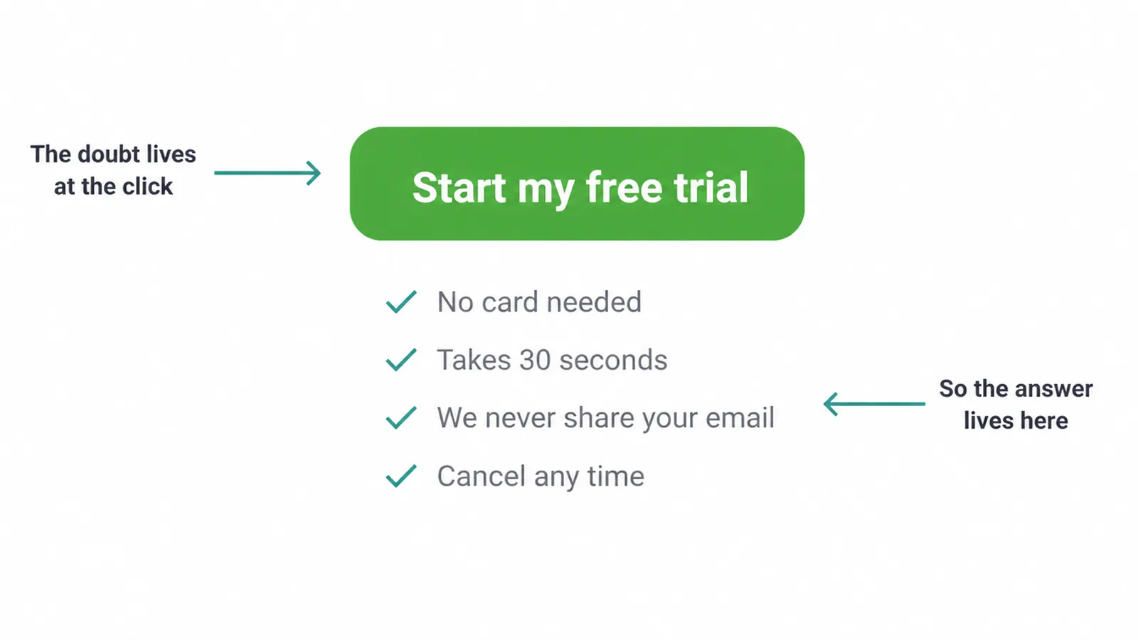
These are the short calming lines you place directly under a button. "No card needed." "Takes 30 seconds." "We never share your email." "Cancel any time." Each one removes a single fear.
Put it under the button, not in a footer where nobody reads it. The doubt lives at the click, so the answer should live there too.
You do not need many. Pick the one or two worries your customers actually have and answer them in plain words. This is some of the cheapest, fastest conversion work you can do on a small business website, and it costs you only a few minutes of honest thinking.
7. How to write microcopy that works
You do not need to be a writer. You need to be clear. Here is the whole method in plain steps.
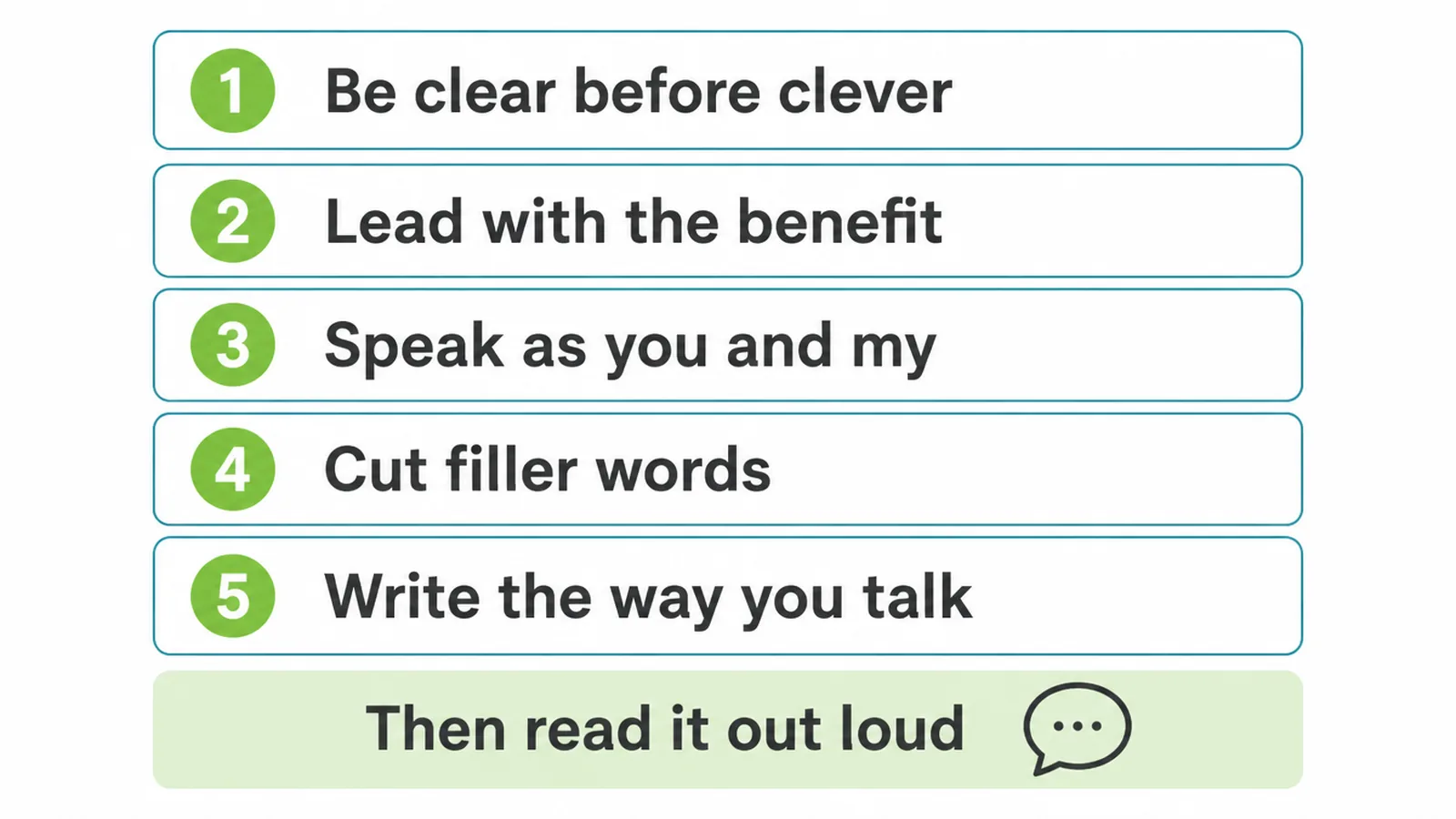
Be clear before clever. A clever line that confuses people loses every time to a plain one. Lead with the benefit, the thing the person wants, not the thing your software does. Speak as "you" and "my," so the words feel personal.
Cut filler words like "please note that" and "in order to." And write the way you talk. If you would not say it to a customer across a counter, do not put it on the button.
The fastest test is to read it out loud. If it sounds stiff, robotic, or salesy, simplify it. Microcopy is part of how your whole site feels to use, which is really the heart of user experience design.
When the tiny words are kind and clear, the whole journey feels easy, and easy is what gets people to finish.
Want a second pair of eyes on the words across your site? That is part of what our web design work covers, and you can always tell us what is stuck and we will point you to the quick wins.
Microcopy FAQ
1. What is microcopy?
Microcopy is the small bits of text scattered across a website or app. It covers button labels, form fields and hints, error messages, empty states, confirmation lines, and the short reassurance text near a sign-up. These tiny words guide people and decide whether they finish a task or give up and leave.
2. What is the difference between microcopy and UX writing?
Microcopy is the tiny text itself, the actual words on a button or error. UX writing is the wider practice of planning, writing, and testing all the words in a product so the whole journey makes sense. Microcopy is one part of UX writing. In a small business, the same person often does both.
3. What should a button say instead of Submit?
Say what happens after the click. Instead of Submit, use Get my free guide, Send my message, or Book my call. First-person, benefit-led words feel personal and clear. They tell the person exactly what they get, which makes the button easier to trust and easier to tap.
4. How do you write a good error message?
A good error message says what went wrong in plain words and how to fix it. Skip codes and blame. Instead of Invalid input, write That email is missing an at sign, please check it. Place the message right next to the field it belongs to so the person finds the fix without hunting.
5. What is an empty state?
An empty state is the screen someone sees before there is anything to show, like a fresh inbox, an empty cart, or a no-results page. A blank screen feels broken. Good empty-state microcopy explains what goes here and gives one clear next step, so the person knows what to do.
6. Does microcopy affect conversions?
Yes. In one test, changing a single button word from your to my lifted clicks by 90 percent. Personalized calls to action have been shown to convert 202 percent better than generic ones. Small word changes remove doubt and friction, so more people finish what they started.
7. What is reassurance microcopy?
Reassurance microcopy is the short, calming line near a button that answers a worry before it stops someone. Lines like No card needed, Takes 30 seconds, or We never share your email remove fear at the exact moment of doubt. Place it directly under the button where the person is about to click.
8. Who writes the microcopy on a small business website?
Usually the owner or whoever builds the site. You do not need a copywriter. You need clear thinking and plain words. Write the way you talk to a customer, then read it out loud. If it sounds stiff or clever instead of clear, simplify it until a busy person could follow it in one glance.