

Key takeaways
- Start with one or two colors and give each a job. Primary, secondary, accent, and a neutral canvas. The neutral does most of the work.
- Split the page with 60-30-10. Roughly 60 percent neutral, 30 percent secondary, 10 percent loud accent. It builds hierarchy for you.
- Pick colors by fit, not by meaning. Research finds brand-color preference hinges on whether a color feels appropriate for the brand, which predicts response better than the color itself.
- Readability is the hard filter. Low-contrast text sat on 83.9 percent of the top one million home pages, the most common failure of all. Check contrast before you ship.
- Contrast beats hue for buttons. The accent that gets clicked is the one that stands out, not a specific lucky color.
1. How do you pick a website color scheme?
To pick a website color scheme, start with one or two brand colors, give each color a clear job, split the page with the 60-30-10 rule, and check that every pairing is readable.
That is the whole method. Most people stall because they treat color choice as a mood board, when it is really a set of small, ordered decisions.
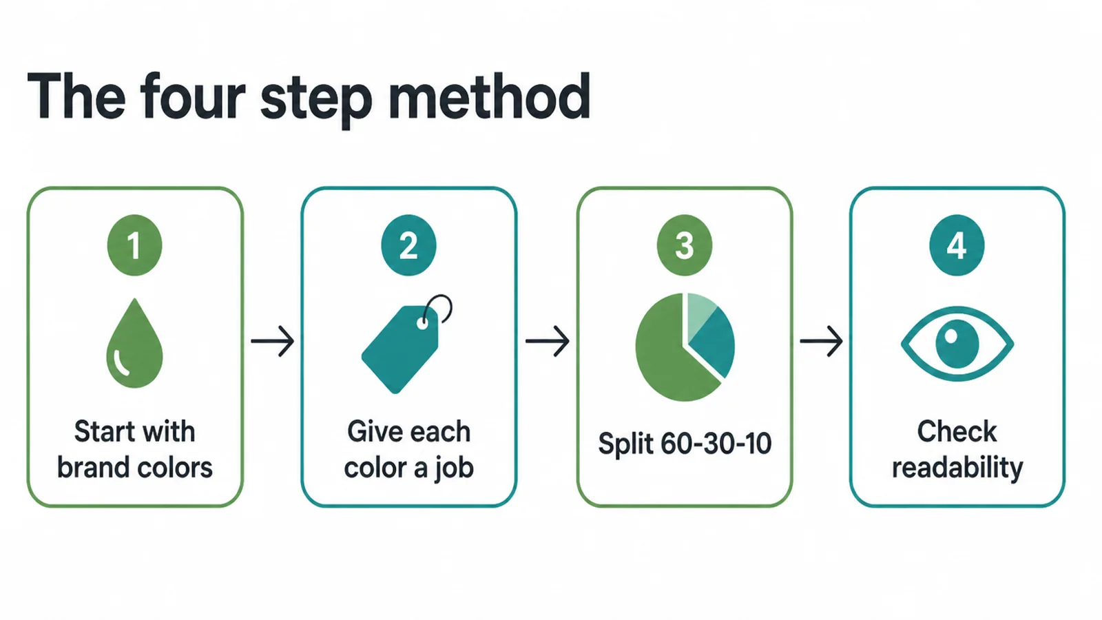
The good news is you do not need to be a designer. You need a system. The rest of this guide walks through that system: roles first, then the 60-30-10 split, then an honest look at color psychology, then the readability check that most websites skip.
We use the same steps when we plan a palette for a small business website, and they hold up whether you have a logo already or you are starting from scratch.
2. Give every color a job
A palette is not a pile of colors you like. It is a small cast where each color has one role. Get the roles right and the page almost designs itself. Get them wrong and even nice colors fight each other.
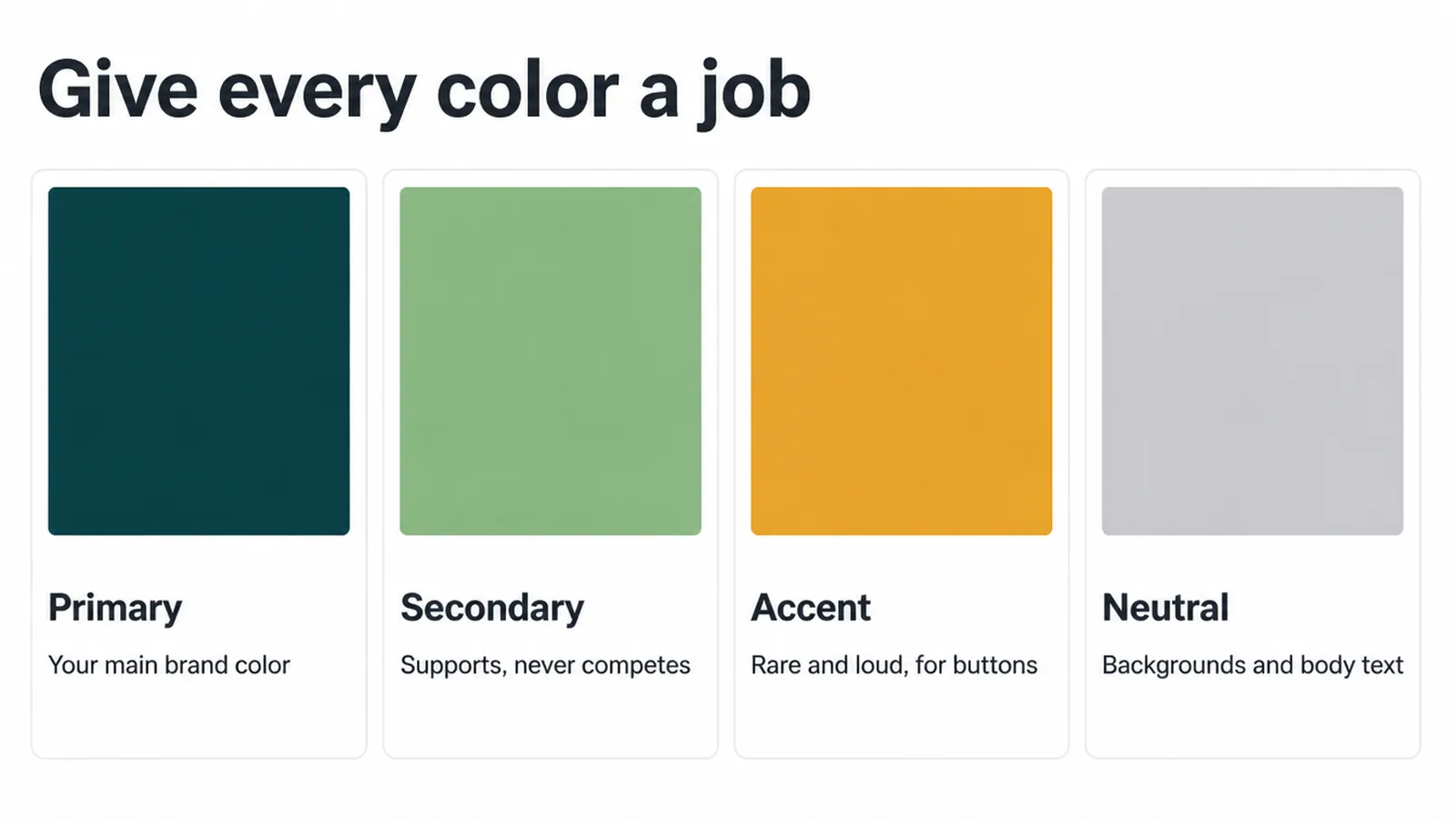
Here are the four roles you need:
- Primary. Your main brand color. The one people remember. Often this is your logo color.
- Secondary. A supporting color that adds variety without stealing attention. It backs up the primary, it does not compete.
- Accent. Rare and loud. You save this for buttons and links you want clicked. If everything is loud, nothing is.
- Neutral. White, off-white, grey, near-black. This is the quiet color that carries backgrounds and body text.
The trap most small businesses fall into is spreading the bright brand color everywhere. The neutral should do most of the heavy lifting. The accent should appear in only a few deliberate spots.
If you are also nailing down logo colors, type, and tone at the same time, that is really a branding job, and our branding work exists for exactly that step. Once the roles are set, the rest is just deciding how much of each to show.
3. The 60-30-10 rule
The 60-30-10 rule is a simple way to decide how much of each color shows up. About 60 percent of the page is your dominant color, usually the neutral.
About 30 percent is the secondary. The last 10 percent is the loud accent. That split creates a visual order without you having to think hard about it.
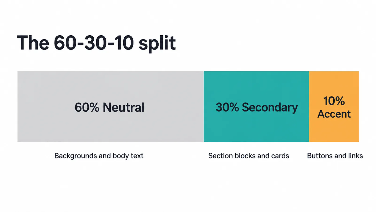
Why it works: the eye needs a place to rest before it can notice what matters. A big calm neutral gives that rest, and then the tiny 10 percent accent pops. This is the same reason generous white space in design makes a page feel premium. Color and space both control where attention lands.
Treat it as a guideline, not a law. Some clean, modern sites run closer to 70-25-5. The point is the spirit: one color dominates, one supports, one shouts. Here is how the roles map to the split.
| Role | Its job | Page share | Where it lives |
|---|---|---|---|
| Neutral | Calm canvas, rest for the eye | About 60 percent | Backgrounds, body text, large sections |
| Secondary | Supports the brand, adds variety | About 30 percent | Section blocks, cards, headings, icons |
| Accent | Pulls clicks, stands out | About 10 percent | Buttons, links, small highlights |
| Primary | The color people remember | Woven across the above | Logo, key headings, brand moments |
4. Color psychology, honestly
Most color advice online is too confident. You have seen the charts: blue means trust, green means calm, red means urgency. The honest version is more useful and a little less tidy.
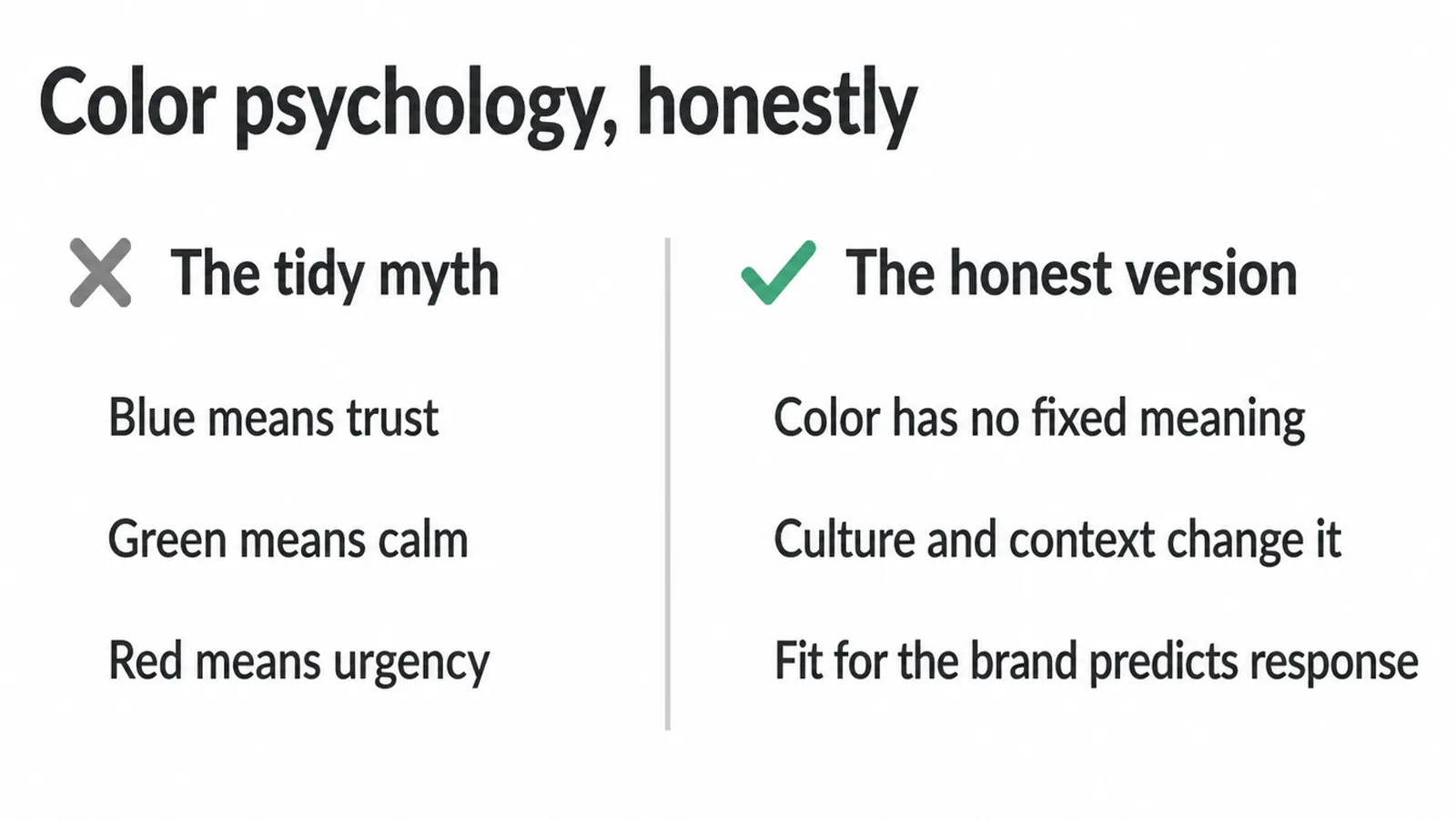
Research summarized by Help Scout finds that brand-color preference hinges on the perceived appropriateness of the color for the brand, and that fit predicts how people respond better than the color itself does.
In plain words: the question is not "what does this color mean," it is "does this color fit what I sell." A soft pastel can be perfect for a baby brand and wrong for a power tool. Same color, different fit, different result.
The other honest point: color has no fixed universal meaning. Culture and context change how a color reads. That is why "blue equals trust" falls apart the moment you cross a market or an industry.
So do not chase a color because a chart told you it means something. Chase the color that fits your brand, then make sure it does not get in the reader's way, which is the next step.
5. Make your colors readable
This is the step that separates a palette that works from one that just looks nice in a mood board. Readability is the hard filter, and most sites fail it.
Low-contrast text was found on 83.9 percent of the top one million home pages, making it the single most common accessibility failure on the web.
That matters because people decide fast. A visual first impression forms in about 50 milliseconds. If your light grey text on a white background is a struggle to read in that instant, the color "vibe" you worked on never gets a chance.
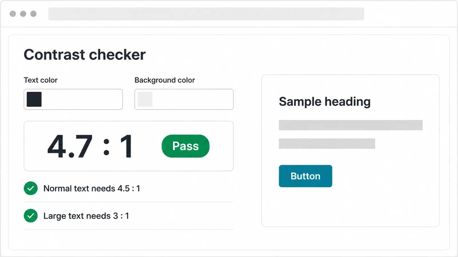
The fix is a number, not a feeling. The accessibility standard (WCAG) asks for a contrast ratio of at least 4.5 to 1 for normal text and 3 to 1 for large text.
You do not have to calculate that yourself. Free contrast checkers do it instantly: paste your text color and background color, and they tell you pass or fail.
Run the check on every pairing: body text on its background, headings on theirs, button text on the button color, link color on the page.
Color is one of the biggest accessibility wins you can make, and our guide to website accessibility covers the rest. Fix contrast and you have already beaten most of the web.
6. Build your palette for free
You can put this together today without spending anything. Here is the order that keeps you out of trouble.
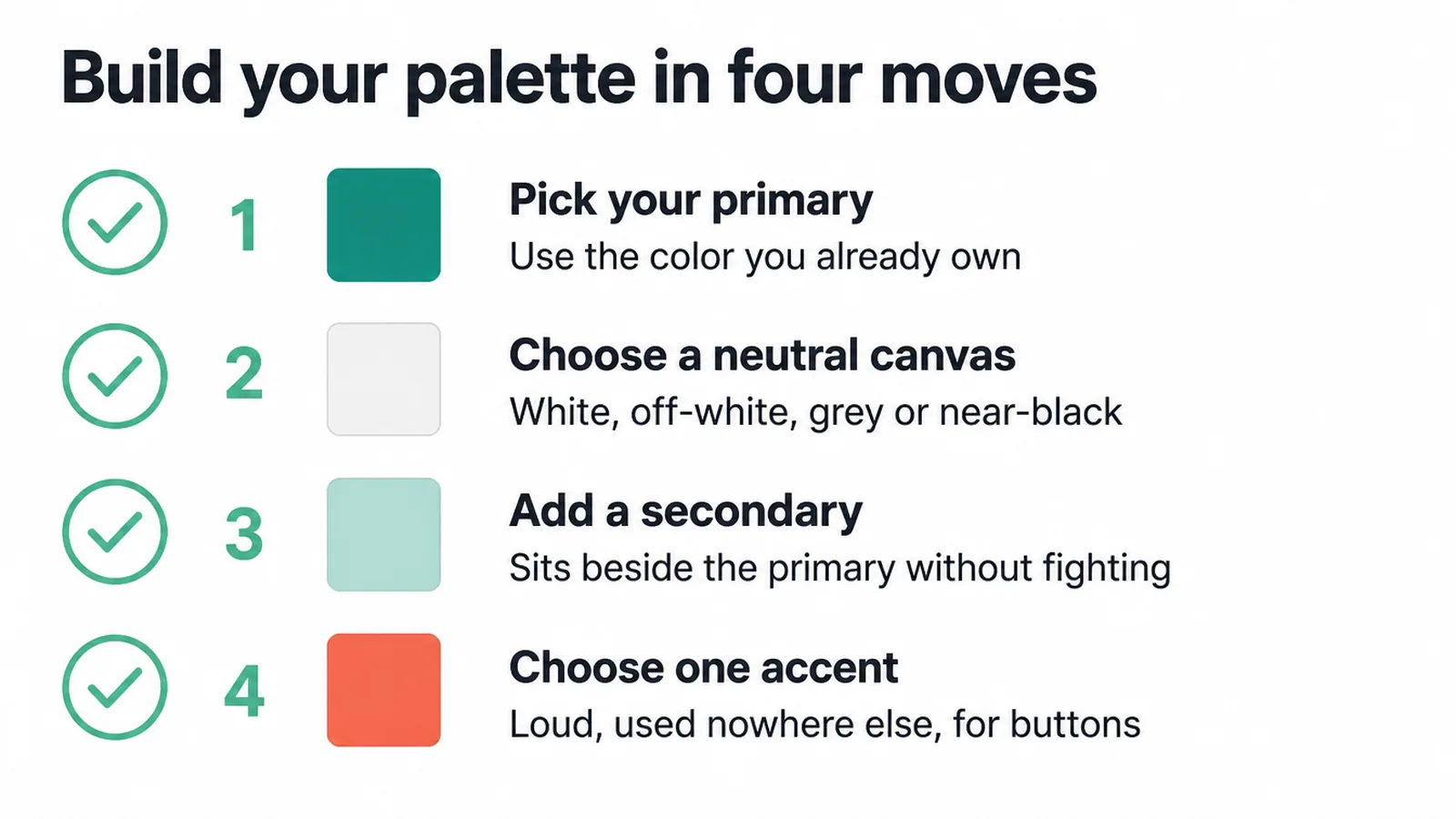
- Pick your primary. Use the color you already own. Your logo color is the obvious start. If you do not have one, choose the color that best fits what you sell.
- Choose a neutral canvas. White, off-white, light grey, or a deep near-black. This is your 60 percent. It should be easy on the eyes.
- Add a secondary. Something that sits next to the primary without fighting it. Free tools like Coolors or Adobe Color suggest matches in seconds.
- Choose one accent. Loud, and used nowhere else, so the eye lands on it. This is your button color. Run it through a contrast checker against the button text before you settle.
Then test it on a real page. Drop the colors onto one heading, one block of body text, and one button. That tiny preview tells you more than any palette grid.
The accent that gets clicked is the one that stands out, which is why good button design leans on contrast more than on any specific lucky color.
One last thing: color rarely works alone. The same care you give your palette should go into your type, because the two together set the whole tone.
If you are choosing fonts at the same time, our notes on font pairing pair neatly with this. Get the roles, the split, the fit, and the contrast right, and you have a color scheme that looks intentional and reads cleanly on every screen.
Frequently asked questions
1. How many colors should a website use?
Most sites work well with two to four colors plus a neutral. A common build is one primary brand color, one secondary, one loud accent for buttons, and a neutral canvas for backgrounds and text. More than that gets hard to control and starts to look messy. Fewer is usually cleaner.
2. What is the 60-30-10 rule?
The 60-30-10 rule is a simple split for a balanced palette. About 60 percent of the page is one dominant color (usually a neutral), 30 percent is a secondary color, and 10 percent is a loud accent reserved for the things you want clicked. It builds hierarchy automatically, but it is a guideline, not a law.
3. How do I choose colors that match my brand?
Start with the one or two colors you already own, like your logo color. Then ask whether each color feels right for what you sell, because perceived appropriateness predicts how people respond better than the color itself. Add a neutral and one accent, then check that every text and color pair is readable.
4. What colors convert best?
There is no single magic color that converts best. What matters is contrast and standing out. Your main button should be a color that nothing else on the page uses, so the eye lands on it. The exact hue matters far less than whether it clearly pops against everything around it.
5. Do website colors affect trust?
Color has no fixed universal meaning, and culture and context change how it reads, so claims like blue equals trust are too simple. What builds trust is a palette that fits your brand and is consistent and readable. People form a visual first impression in about 50 milliseconds, so a clean, fitting palette helps more than any one trust color.
6. How do I make my colors accessible and pass a contrast check?
Run every text-on-background pair through a free contrast checker. WCAG asks for a contrast ratio of at least 4.5 to 1 for normal text and 3 to 1 for large text. Low-contrast text is the most common accessibility failure on the web, so this single check fixes the issue most sites get wrong.
7. What is the difference between primary, secondary, and accent colors?
The primary is your main brand color and the one people remember. The secondary supports it and adds variety without competing. The accent is rare and loud, saved for buttons and links you want clicked. A neutral, like white, off-white, or grey, does the quiet background and text work.
8. Should I use my logo colors everywhere?
No. Your logo colors are a starting point, not the whole palette. Using a bright brand color across every background and block usually hurts readability and tires the eye. Let a neutral carry most of the page and use your brand color in smaller, deliberate places.