


Key takeaways
- Speed is a design decision. Every hero image, font file and script is a choice with a measurable cost, and Google publishes the thresholds.
- Accessibility stopped being optional. 95.9% of home pages tested by WebAIM failed automated checks, and low contrast is the single most common fault.
- The phone is the main screen. Mobile is 52.57% of worldwide traffic, and Google ranks the mobile version of your site.
- Pages are now written to be quoted. AI answers lift short, self-contained passages, so the first paragraph of a page has a new job.
- Pick two or three. Ten trends applied at once produce a cluttered site. Fix the problems you can name.
Most trend lists are a mood board. This one is a checklist. Every item below is either something you can measure on your own site today, a rule a browser or a regulator now enforces, or a change in how people find you.
The web design trends 2026 worth your money are the ones that change a number, so each section says which number it changes and links to the source.
Read it once, pick two, and ignore the other eight until those two are done.
1. Pages get written to be quoted, not only ranked
Search stopped being a list of ten blue links. Fewer searches end in a click at all: SparkToro found 58.5% of Google searches ended without one in 2024 (SparkToro, 2024).
When an AI Overview appears, Seer Interactive measured organic click-through of 0.52% for brands not cited in it, and 35% higher click-through for brands that were (Seer Interactive, 2025).
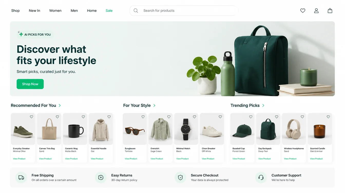
That changes the shape of a page. Put a plain, complete answer in the first paragraph under the heading, in one or two sentences that make sense lifted out of context.
Name the business inside it, because a passage with no name attached gets used without credit. Keep the question in the heading and the answer directly underneath.
This is a writing change, which is why most redesigns miss it. Our guide to ranking in AI Overviews covers how to structure a page for it, and what SEO is covers how the pieces fit together.
2. Speed became a design constraint, not a developer problem
You cannot design a page and then ask someone to make it fast. The weight is decided when you choose the hero video, the three custom fonts and the fourth tracking script.
Google publishes the thresholds openly: main content should appear within 2.5 seconds (Google Search Central), and a page should respond to a tap within 200 milliseconds to count as responsive (web.dev).
The commercial cost is measured too. Google's own guidance states that "53% of visits are likely to be abandoned if pages take longer than 3 seconds to load" (Google AdSense Help).
Shopify tracked its live stores over 28 days in early 2026 and found "for every 100 milliseconds slower a store loads, conversion tends to be about 3.5% lower" (Shopify, 2026).

The practical version of this trend is subtraction. One hero image instead of a carousel. Two font weights instead of six. Analytics and a chat widget, not five tags nobody reads. Our guide to Core Web Vitals explains what each number means and how to read your own.
3. Accessibility moves into the build
The evidence here is blunt. WebAIM tested a million home pages in February 2026 and found 95.9% had detectable failures against WCAG 2, up from 94.8% the year before, with an average of 56.1 errors per page (WebAIM Million, 2026).
Low contrast text was the most common fault, on 83.9% of pages. Missing image alt text was on 53.1%.
None of those are hard problems. They are decisions made once, in the design file, and repeated across every page. Pick text colours that clear the contrast threshold, label every form field, give buttons real text, and write alt text as you add images.
There is a legal edge to this too. The European Accessibility Act covers e-commerce, banking, transport and telephony services, and member states had to write it into national law by June 2022 (European Commission). If you sell to Europe, this is a requirement. Our guide to website accessibility lists the checks in order.
4. Phone-first, because the phone is the main screen
Mobile devices account for 52.57% of worldwide web traffic and desktops for 45.93%, on StatCounter's latest published month (StatCounter, July 2026). Google indexes the mobile version of your site to decide your rankings (Google Search Central).
So the mobile layout is the real design, and the desktop one is the variation. That flips the usual order of work. Set the type size, the tap targets and the reading order at 390 pixels wide first, then let the layout open up on bigger screens.
Check the boring things on a real handset: is the phone number tappable, does the menu open with a thumb, can the form be filled in one hand. Our guide on making a website mobile friendly covers the full list.
5. Type carries the design
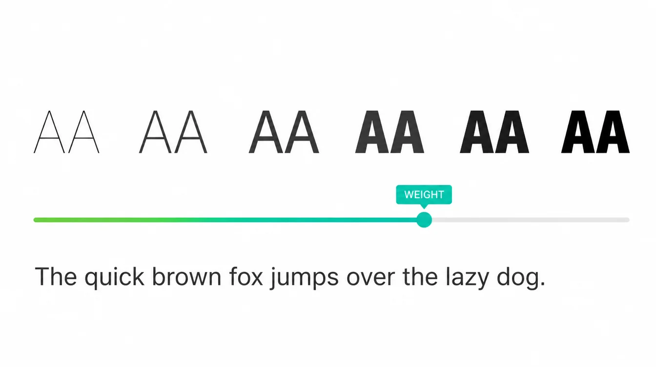
Large, confident headings are doing the work that decorative graphics used to do. One reason is speed: text costs nothing to load compared with imagery, and a single variable font file can cover every weight from light to heavy instead of shipping six separate files.
The other reason is comprehension. A visitor decides whether they are in the right place from the first heading. If it names what you do and who it is for, they stay. If it says "welcome to our website", they leave.
Keep body text at 16 pixels or larger, keep line length near 70 characters, and check the contrast while you are choosing the colour.
6. Motion gets quieter
Scroll-triggered animation is still everywhere, but the fashion has moved from spectacle to feedback. Motion that confirms something happened, such as a button state or an item added to a basket, helps. Motion that delays the content the visitor came for costs you.
Browsers now carry the setting that decides this for you. When someone has switched on reduced motion in their operating system, prefers-reduced-motion tells your site, and a well-built page honours it (MDN). Content stays visible and usable, the movement simply stops.
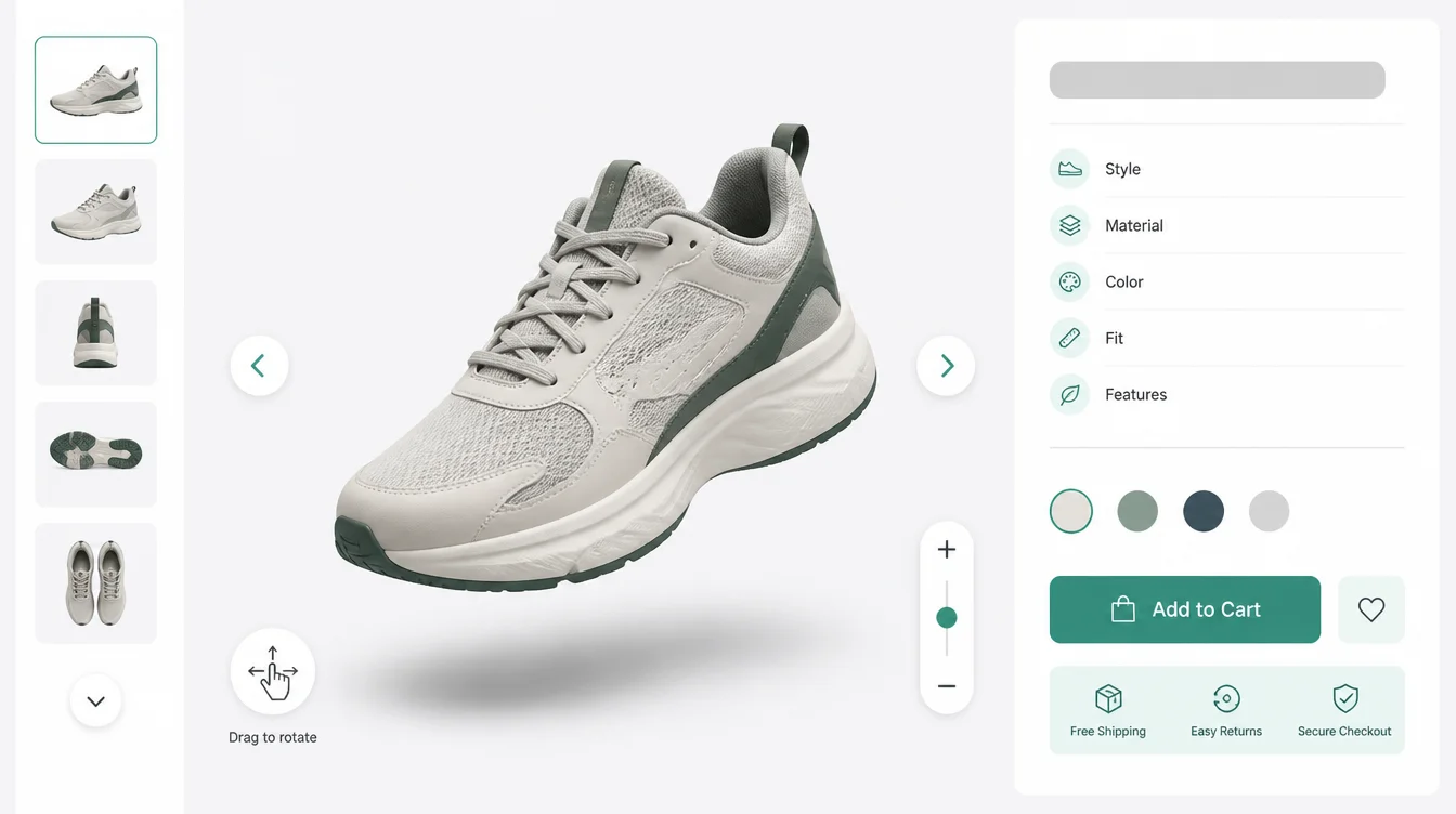
The same rule applies to 3D and WebGL. On a product page where someone wants to inspect the item before buying, an interactive view answers a real question. On a homepage it is a heavy loading screen wearing a costume.
7. Dark mode follows the system, not a toggle
Dark mode is now a setting people carry with them. The browser exposes it through prefers-color-scheme, so your site can match whatever the visitor already chose (MDN), and CSS has a light-dark() function that lets one colour value serve both.
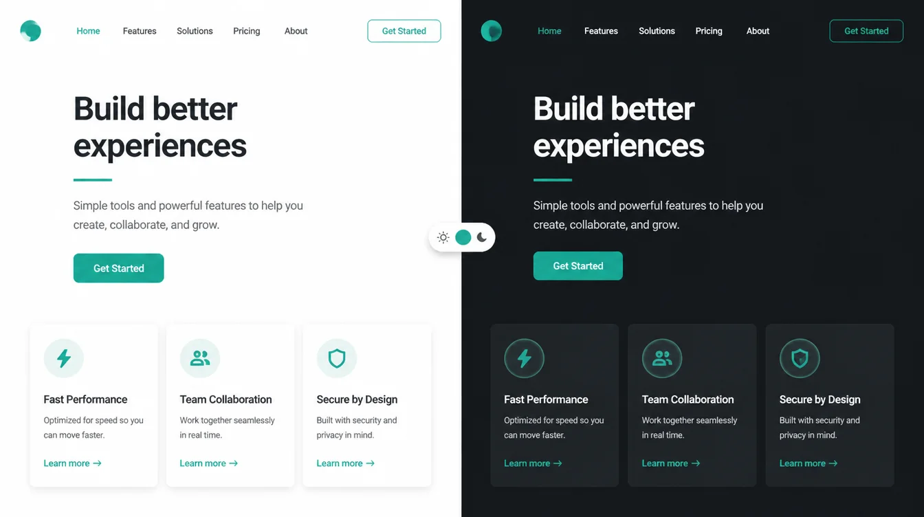
The trap is contrast. A dark theme is where low contrast text creeps in, and that is already the most common accessibility failure on the web. If you build a dark scheme, test it with the same contrast checker you used on the light one.
Half a dark mode is worse than none. If your buttons, forms and error messages have not been styled for it, leave the feature out.
8. Checkouts and forms get shorter
Baymard's review of 50 studies puts the average documented cart abandonment rate at 70.22% (Baymard Institute). Seven in ten filled baskets never turn into a sale, and most of the loss happens on the last few screens.
The design response is to strip. Guest checkout, one column, the payment methods people actually use, the total visible with delivery included, and no field that does not change what you ship or how you contact them. The same logic applies to a contact form: every extra field is another reason to close the tab.
Buttons deserve the same attention, since they are where the decision happens. Our guide to button design covers size, wording and placement, and our list of small business website mistakes covers the rest of the leaks.
9. Proof replaces polish
Stock photography and vague claims have stopped working, because every competitor has the same ones. What earns trust now is specific and checkable: real photos of the work, named customers, a full address, a phone number that rings, prices explained rather than hidden.
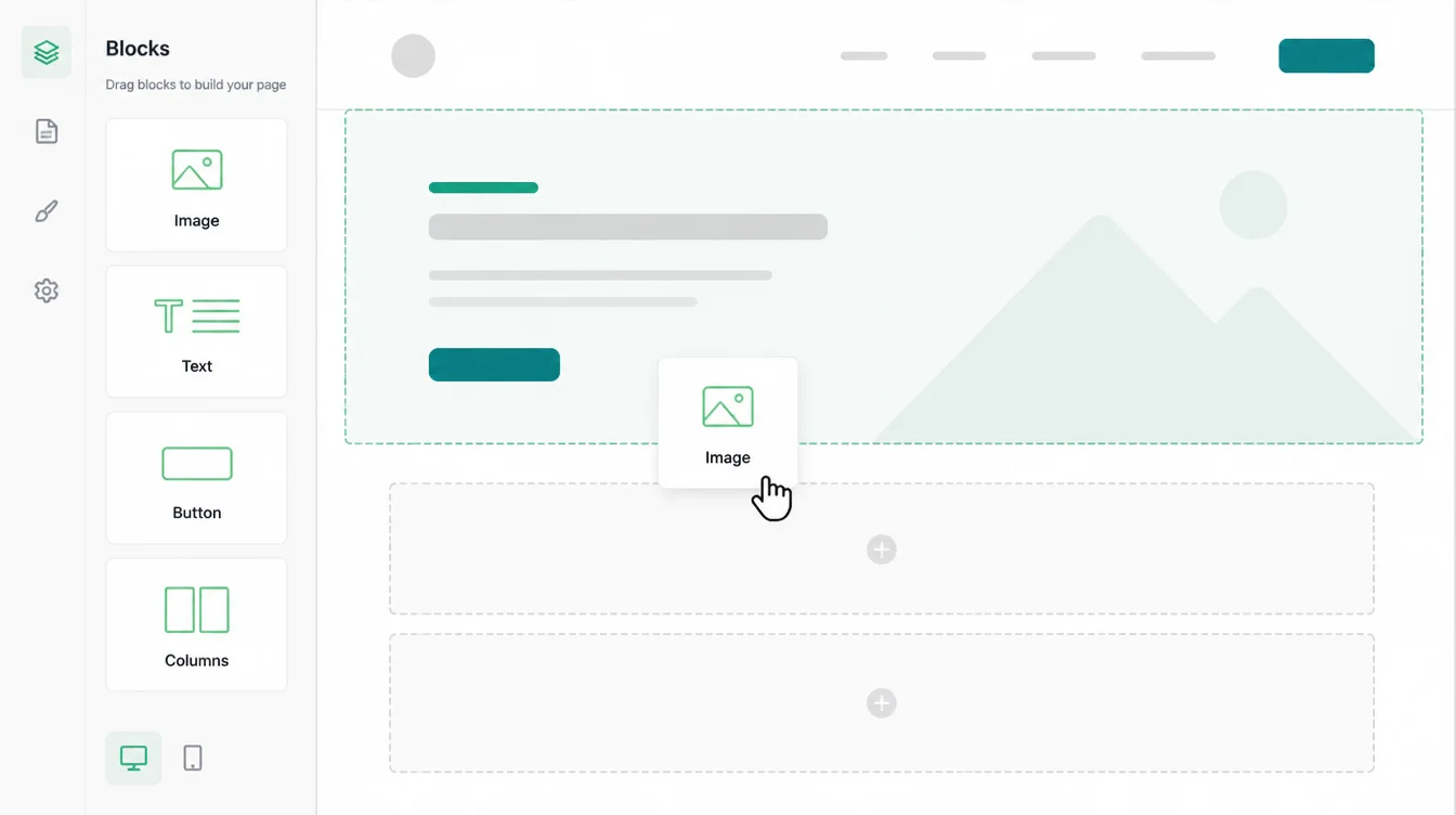
There is a straight line between this trend and the tools. No-code builders such as Webflow and Framer made a smart-looking site cheap to produce. Once everyone looks smart, looking smart stops being evidence. Show the work instead, the way our recent work page does.
10. Personalisation gets simpler
The version of personalisation that survived is small. Show returning visitors what they looked at last time. Put the location someone searched for at the top of the page. Answer a common question with a chat reply that hands over to a person when it cannot help.
Wiring those pieces together is ordinary automation work now, connecting a form to a calendar, a CRM and a notification. It costs a fraction of what a custom recommendation engine costs, and for most small businesses it is the whole benefit.
Skip anything that needs a large amount of your own data to work. If you get 300 visitors a week, a model has nothing to learn from.
11. How to choose which of these to do
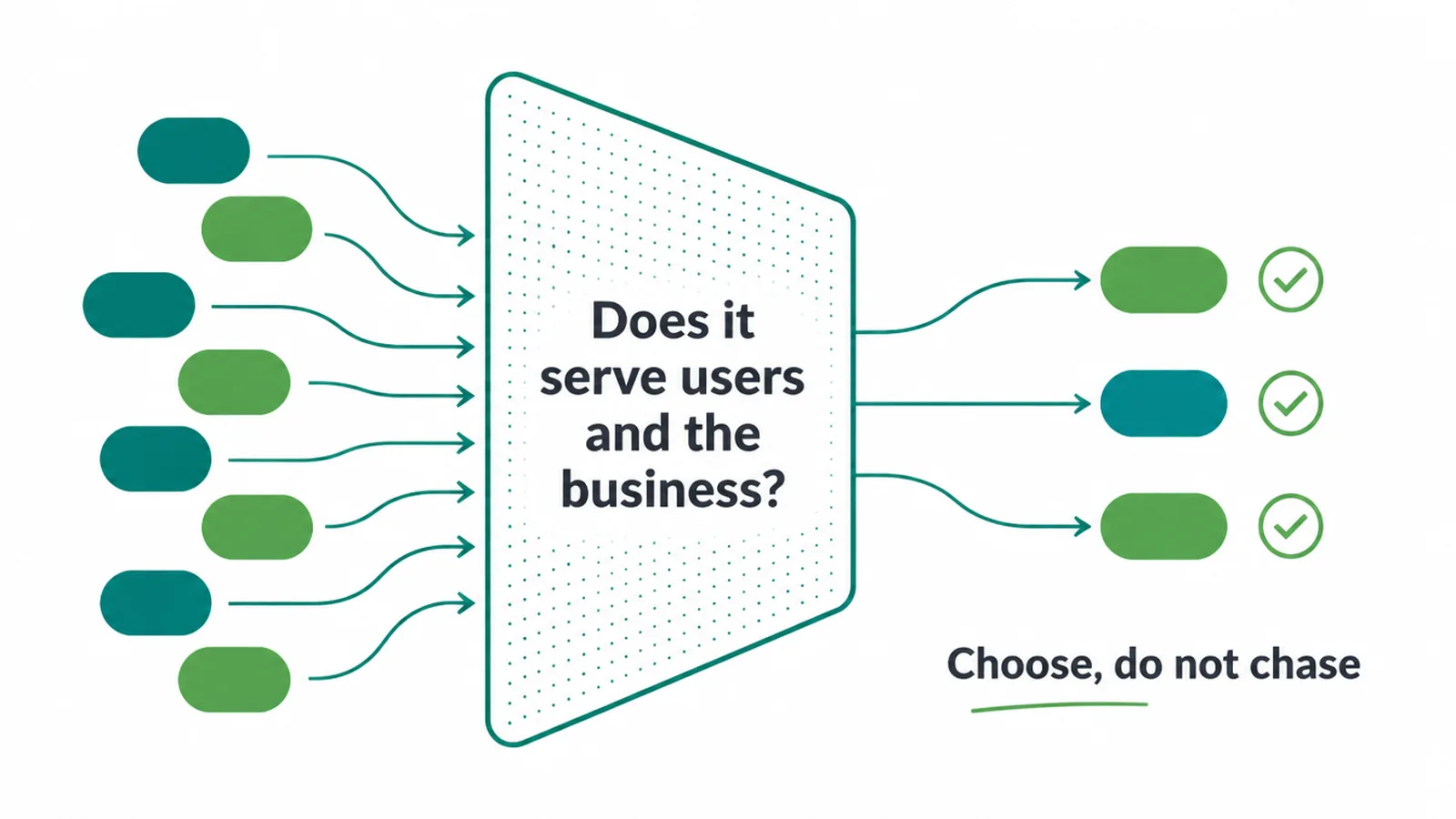
Ten trends is nine too many for one budget. Sort them by the problem you can already name.
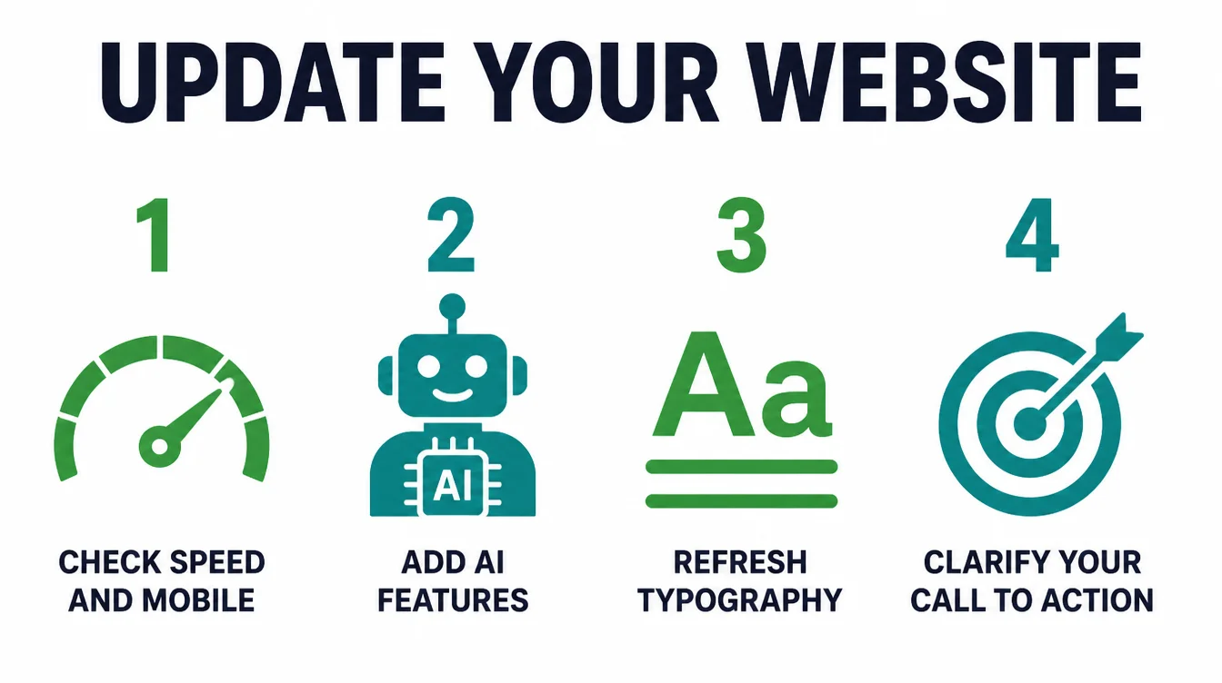
- Slow on a phone, or a high exit rate on mobile: trends 2 and 4.
- Traffic arrives but nobody contacts you: trends 8 and 9.
- Rankings flat while competitors appear in AI answers: trend 1.
- Customers report they cannot read or use something: trend 3.
- The site looks dated next to the competition: trends 5, 6 and 7.
Run the slowest page through PageSpeed Insights before you decide anything. If the list of fixes runs to a page, a website redesign usually costs less than patching the same site for another year, and our guide to when a website needs a redesign helps you tell the two apart.
Frequently asked questions
1. What are the biggest web design trends in 2026?
The ones with evidence behind them. Pages built to load fast and respond within 200 milliseconds, layouts designed for a phone first, accessible markup, clear typography, and copy written so an AI answer can quote it. Dark mode, restrained motion and simple personalisation matter too, but they sit under those five.
2. Do I need to follow every web design trend?
No. Chasing all ten gives you a cluttered site and a spent budget. Pick two or three that fix a problem you can name, such as a slow phone page, an unreadable contrast level, or a form nobody finishes. A focused site beats a fashionable one every time.
3. How do I modernise my website without a full rebuild?
Measure first, then fix in order. Run your slowest page through PageSpeed Insights, check the contrast of your text, cut the fields on your main form, and rewrite your top three pages so each answers one question in the first paragraph. Those four jobs cost a fraction of a rebuild.