Website Footer Design: What Belongs Down There

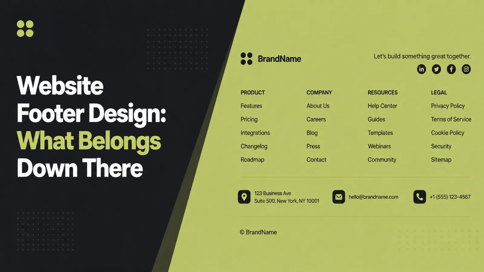
Website footer design comes down to three things: the footer carries the contact details, the pages people hunt for, and the legal links, grouped into columns rather than dumped in a row. Seed Light treats it as the second navigation, because a visitor who scrolls to the bottom has usually decided and is now looking for a phone number.
Nobody sits down to design a footer. It accumulates.
A link gets added because it had nowhere else to go, then another, then a row of icons, and after three years the bottom of the site is a storage cupboard with a copyright line.
This guide covers what a footer is actually for, why most get ignored, and how to group one so it does some work.
Key Takeaways
- Treat it as second navigation. People who reach it have usually decided.
- Contact details belong there. Phone, address and hours in full, rather than a link to a page.
- Group into columns. A labelled group is read; a long row is scanned past.
- Cut what nobody clicks. A shorter footer makes the remaining links findable.
- Check it on a phone. It stacks, and the tap targets get small.
Good website footer design is mostly subtraction. A footer is useful in proportion to how little it contains.
The exception is contact information, which belongs there in full and is the most common thing missing.
What Website Footer Design Is For
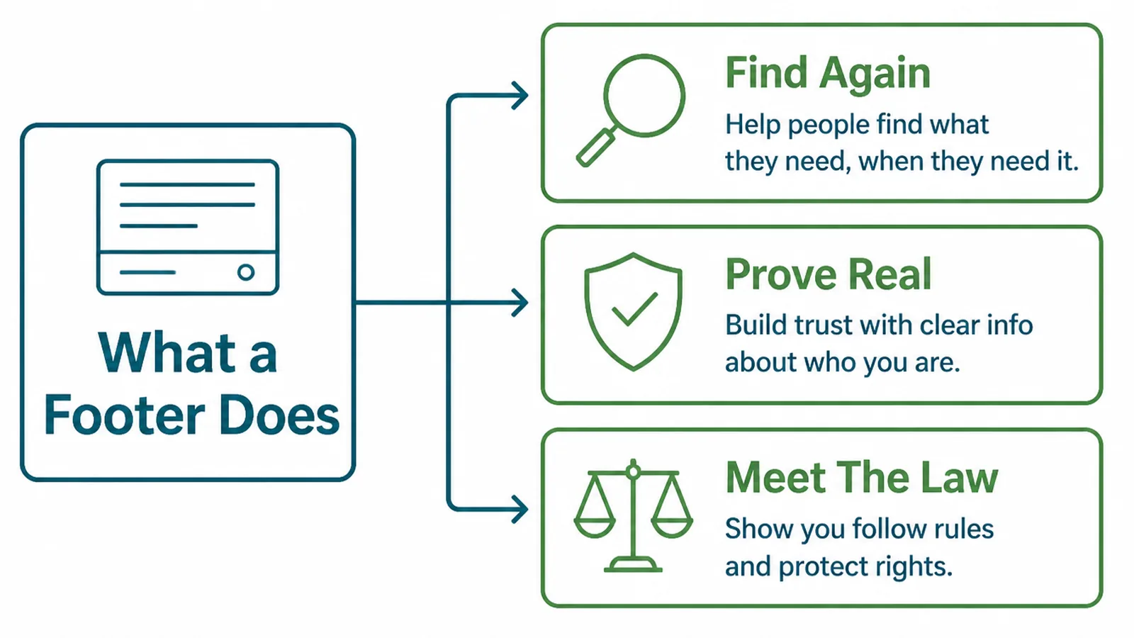
A visitor scrolls to the bottom for one of three reasons, and each one wants something different.
- They want to make contact. They have decided, and they are looking for the quickest route.
- They are hunting for a page. Usually one the main navigation does not show.
- They want to check something. Opening hours, where you are, or whether you are a real company.
That first group is the one that pays for the footer. Somebody who scrolled past everything and is still with you is as close to an enquiry as a page gets.
Which means a phone number in the footer is worth more than any other element in it. Make it tappable, and put the address and hours beside it rather than behind a link.
The third group is worth designing for too. A visitor checking whether you are a real company is reassured by an address, a registration line and hours that look maintained.
Why Footers Get Ignored
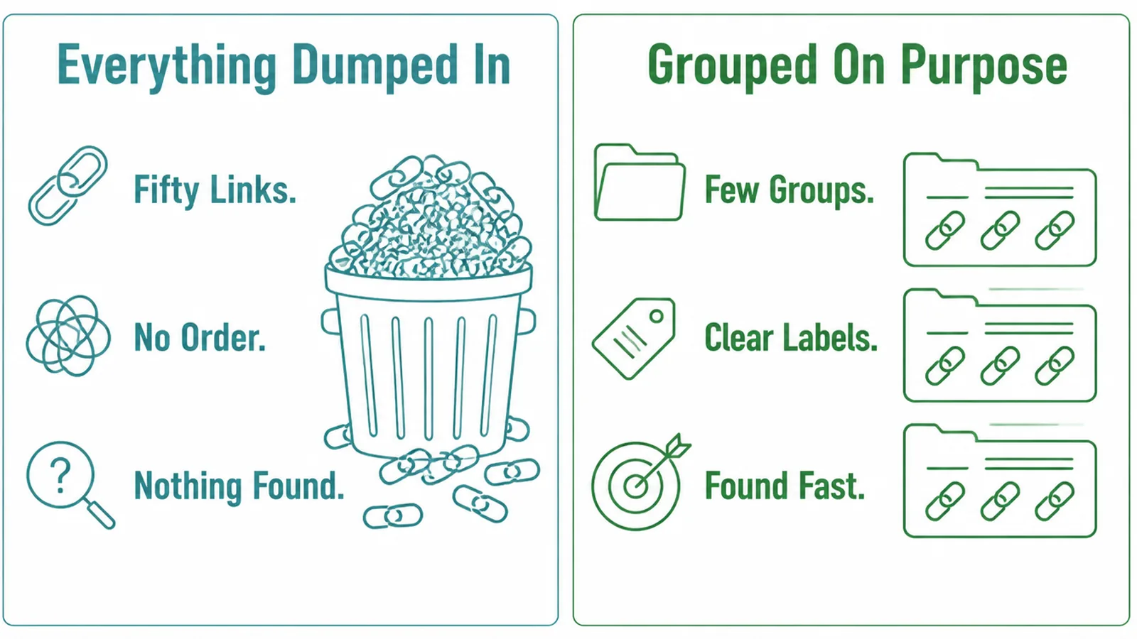
An ignored footer is almost always an ungrouped one: twenty links in a single run, in the order they were added, with no headings.
The eye treats that as a block of texture rather than a list. Nothing stands out, so nothing is read, so the next link gets added to a thing nobody reads.
The second cause is duplication. A footer that repeats the main menu exactly adds nothing, and it uses the space the useful links needed.
Grouping fixes most of it in an afternoon. Three or four labelled columns turn the same content into something a visitor can scan in a second.
The labels do the work. "Services", "Company", "Contact" tell somebody where to look without reading a single link.
There is a third cause, and it is the quiet one. Footers are usually edited once at launch and then only added to, so nothing is ever removed and the useful links sink.
How To Build A Website Footer, Step By Step
Three steps. The first decides the content, the second the shape, the third catches what desktops hide.
1. Decide What Must Be There
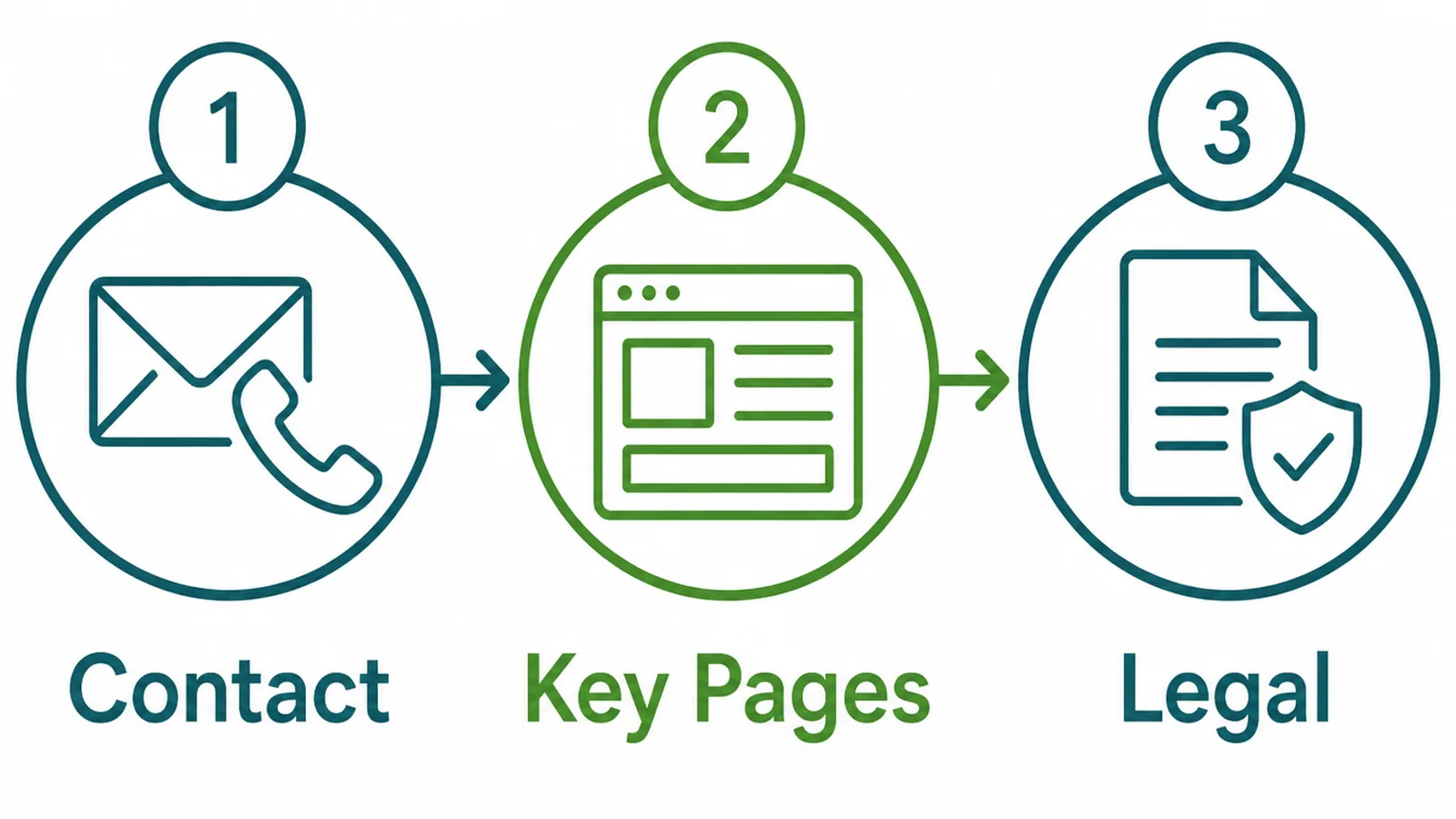
Start from the three things that genuinely belong, then argue about everything else.
- Contact. Business name, phone, email, address, hours. Written out, not hidden behind a link.
- Key pages. The ones people go looking for: services, work, about, careers if you hire.
- Legal. Privacy policy, terms, and anything your trade or your market requires.
Write the list before you look at the current footer, so the existing links have to earn their place rather than inherit it.
Then check it against reality. Your analytics will tell you which footer links are actually clicked, and the answer is usually three of them.
Keep the list short enough that a stranger could read the whole footer in one pass. Good website footer design is a short list somebody finishes, not a complete one they abandon.
2. Group It Into Columns
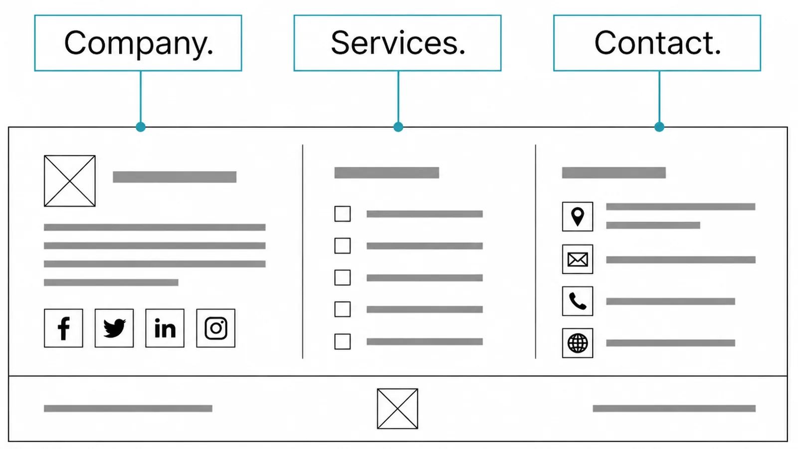
Three or four columns is the shape that works, because it matches how people look rather than how the content was written.
- Company. About, work, careers, anything about who you are.
- Services. The handful you actually want people to read, not every page you own.
- Contact. The details in full, with the phone number first.
Give each column a short heading and keep them to a similar length. A column with eleven links beside one with two looks broken and reads worse.
If one group will not fit, that is usually a sign the group is really two. Split it, or accept that some of those pages belong in the main navigation instead.
Resist the urge to link every service. A footer listing thirty pages is a sitemap, and a sitemap belongs on its own page.
Put the copyright line, the legal links and any credit on a thin row underneath, smaller and quieter than everything above it.
Generate the year rather than typing it. A footer still claiming last year is the clearest possible sign that nobody has looked at the site since.
3. Check It On A Phone
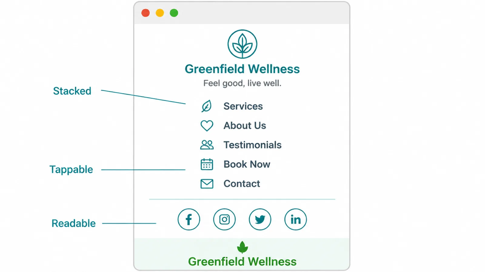
Columns stack on a narrow screen, and a footer that looked tidy becomes a long tail of links nobody scrolls through.
- Stacked. Check the order it falls into. Contact should not end up last.
- Tappable. Links far enough apart to hit, and a phone number that dials on a tap.
- Readable. Small is fine, invisible is not. Grey on grey fails in sunlight.
On a phone, the footer is often the only navigation a visitor can see. It sits where their thumb already is, and the menu at the top does not.
Test it outdoors once. Contrast that looks refined on a desk disappears on a screen at midday, and the footer is where the smallest text on the site usually lives.
While you are there, tap every link with a thumb rather than a fingertip. Footer links sit close together, and the one people want is often the one hardest to hit.
Footer Ideas That Work Right Now
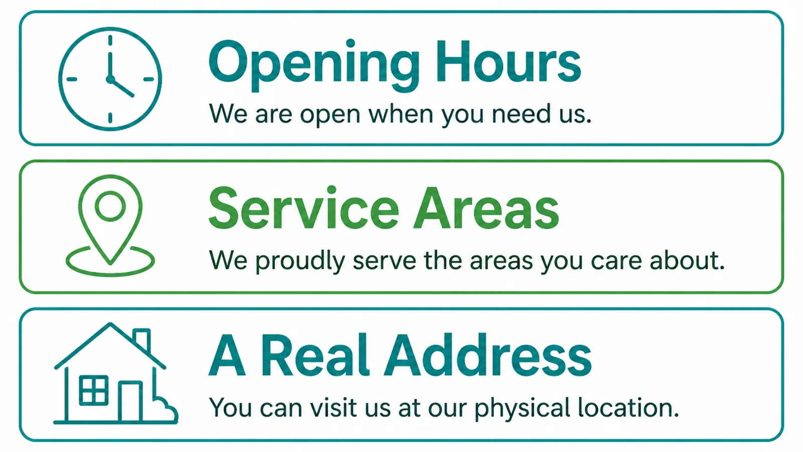
Once the basics are in place, three additions tend to be worth their room.
- A short line about the business. One sentence saying what you do and where, for anyone arriving mid-site.
- A map link. If people visit you, a tappable link to directions saves a search.
- One call to action. A single button, repeating the action the page above was asking for.
The one-sentence description does more than it looks. Plenty of visitors land on an inner page from search, and the footer is where they confirm what sort of business they are reading.
Say where you work as well as what you do. For a local business that one clause answers the question behind most enquiries. People want to know whether you cover them.
Keep it to a line. Two sentences in a footer is a paragraph, and a paragraph down there will not be read.
Keep social links small and current. An icon leading to a profile last used in 2023 answers a question you would rather nobody asked.
Footer Building Tools
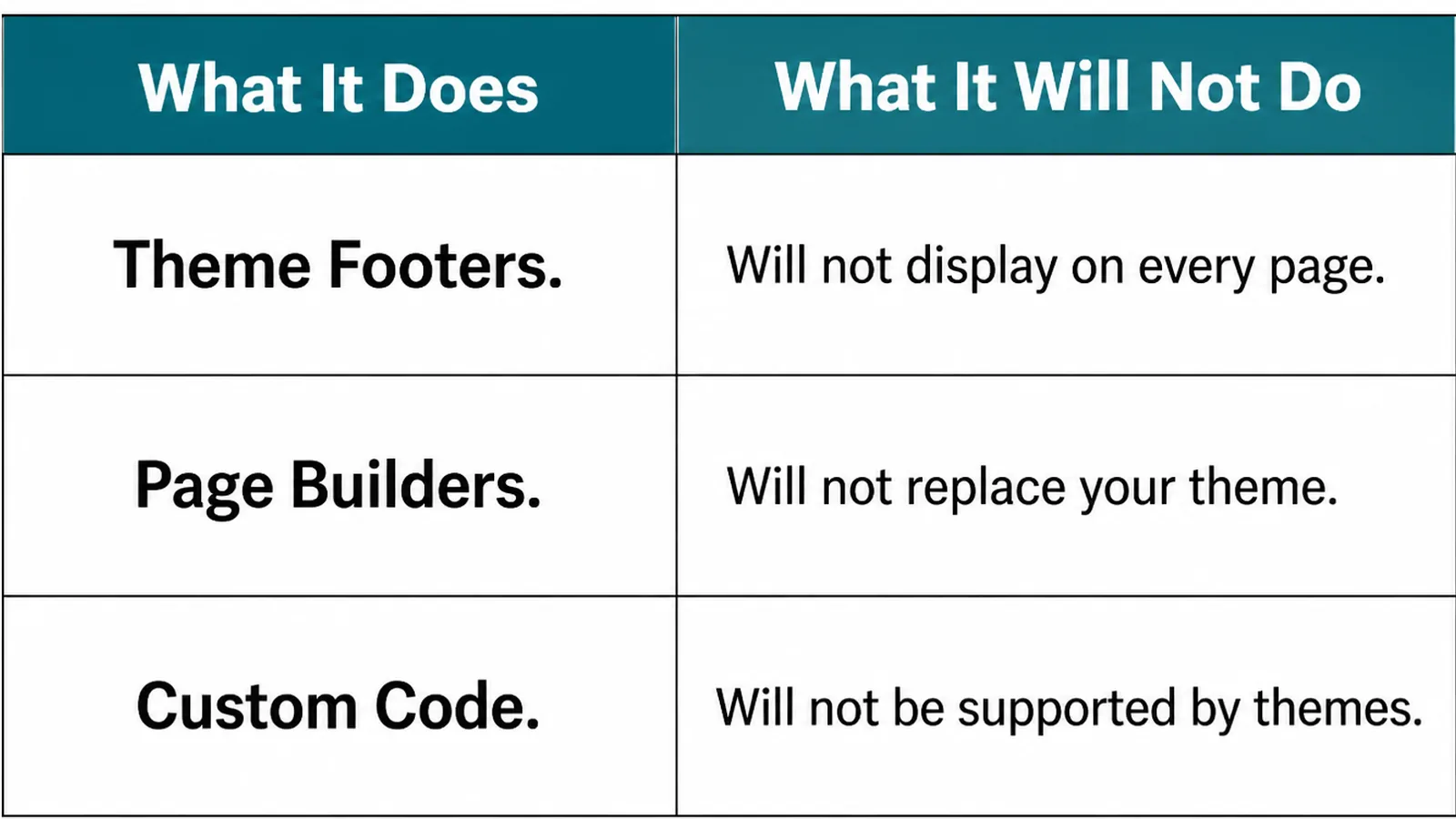
| What it does | What it leaves to you |
|---|---|
| Theme and page builders give you a footer area to edit once | Deciding what goes in it, which no template can answer |
| Analytics shows which footer links are clicked | Removing the ones nobody touches, which takes nerve |
| Accessibility checkers catch contrast and link labels | Reading it outdoors, where the real failure happens |
One technical note worth knowing: most sites keep the footer in a single global template, so one edit changes every page. That is a convenience and a risk, since a broken link there is broken everywhere.
Check the footer after any theme or plugin update. It is the part of a site that changes silently and the part nobody looks at.
Keep a note of what the footer should contain, somewhere outside the site. Rebuilding it from memory after a theme change is how a phone number goes missing for a month.
Common Footer Mistakes
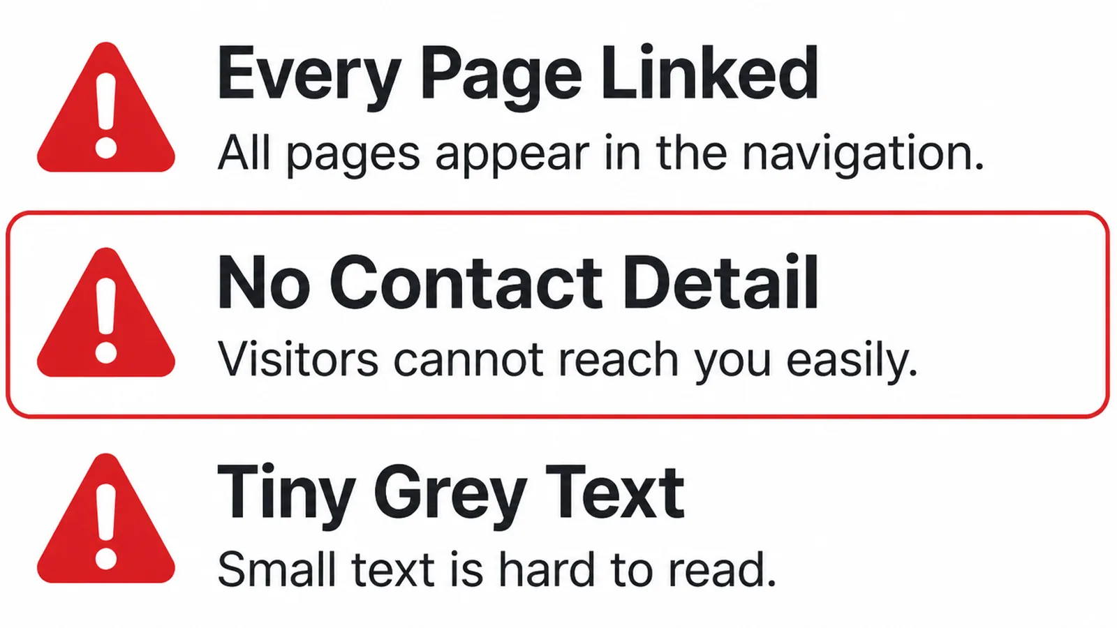
- No contact details. A link to a contact page instead of the phone number itself.
- Everything dumped in. Thirty links in one run, unlabelled, in the order they were added.
- Stale content. Last year's copyright, a closed service, a social icon pointing nowhere.
A fourth is specific to local businesses and costs more than it should: an address in the footer that does not match the one on your Google listing or your invoices.
It happens after a move, when the site is updated and something else is not. Check every place your address appears on the same afternoon, then write the list down for next time.
Small differences in how a street or a unit number is written create a long tail of confusion. Pick one way of writing your address and use it everywhere, starting with the footer.
FAQs
What must a footer contain?
Your business name, a way to make contact, and the legal pages that apply to you. Everything after that is a judgement call about which pages people hunt for at the bottom, and the honest way to answer it is to look at what visitors actually click.
Should every page be linked in the footer?
No. A footer holding fifty links is a list nobody reads, and it makes the useful links harder to find. Link the pages people go looking for, group them by what they are, and let the main navigation and search handle the rest.
Does the footer matter for SEO?
A little, and less than people hope. Footer links are a normal part of a site's structure, so they help pages be found. Stuffing the footer with town names or service phrases is an old tactic that reads badly to a visitor and does nothing useful.
Where should social links go?
In the footer, small, and only for accounts you actually post to. A link to an abandoned profile sends somebody away from your site to a page whose last update was two years ago, which answers a question you would rather they did not ask.
Conclusion
Website footer design is one list, grouped into columns, with the contact details written out in full.
Decide what must be there, label the groups, then look at it on a phone in daylight. Cut whatever nobody clicks, and keep cutting every time something new gets added.
If your footer has been accumulating for a few years, see how we approach web design, or get in touch and we will tell you which half of it to remove.