How to Design a Pricing Page

Pricing page design answers three things: what each option costs, what is inside it, and who it suits. Seed Light builds one around those three questions rather than around three columns, because most service businesses quote per job and a plan table forces them to invent tiers nobody wanted.
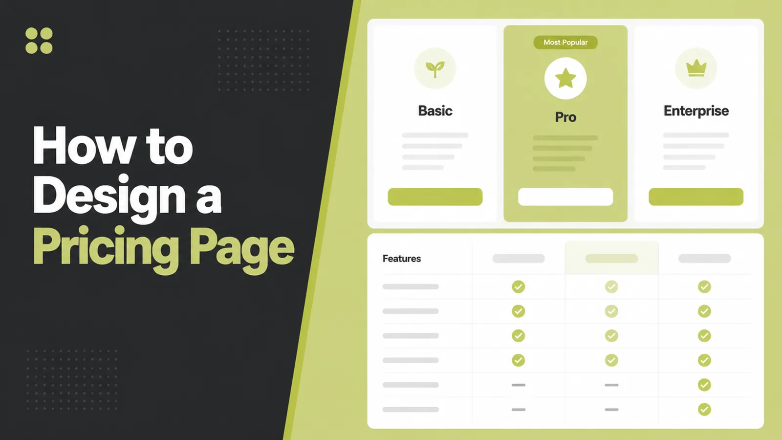
The default pricing page is three columns with the middle one highlighted. It was designed for software subscriptions, and it gets copied by businesses that do not sell subscriptions.
The result is a page with invented tiers, a Professional plan nobody asked for, and a reader who still does not know what their job would cost.
This guide covers what a pricing page has to answer, when columns are the wrong shape, and how to lay one out for work that is quoted.
Key Takeaways
- Answer three questions. What it costs, what is in it, who it suits.
- Three columns is a convention. Show the options you actually sell.
- Quoted work still needs a page. Explain the method and show examples.
- List the extras. Hidden add-ons make the headline price look dishonest.
- Put the doubts on the page. The questions people ask before buying.
Pricing page design is mostly about removing hesitation. Every unanswered question is a reason to close the tab and think about it later.
Later rarely arrives, so the page has to do the work while somebody is still interested.
What Pricing Page Design Has To Answer
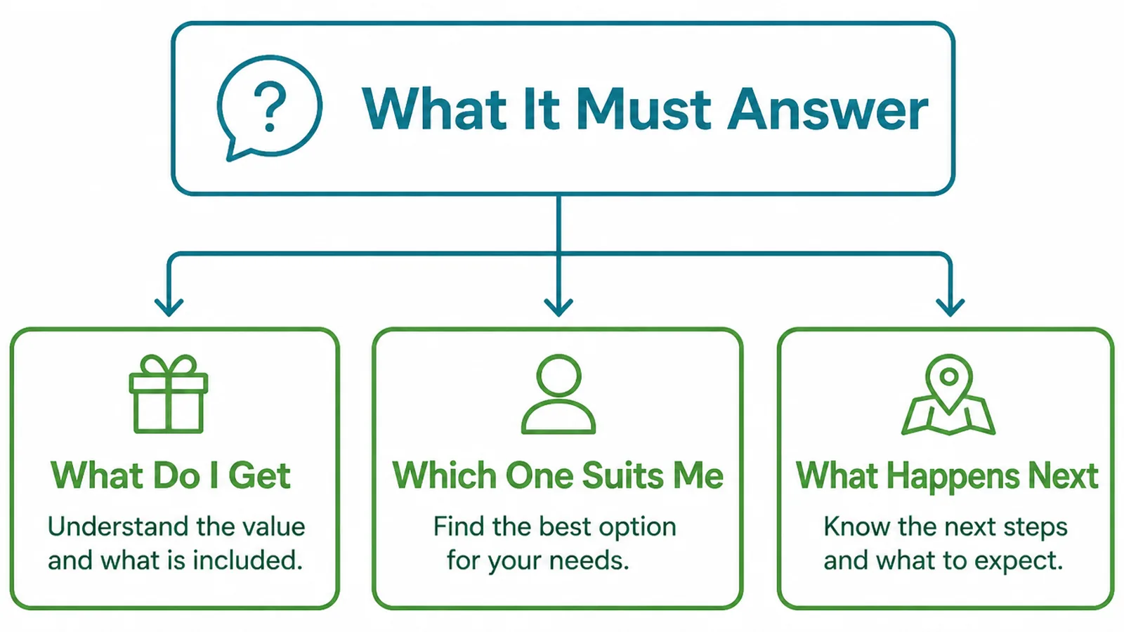
A visitor on a pricing page has already decided they are interested. They are now checking whether this is for them.
- What does it cost. A figure, a range, or a clear statement of what drives it.
- What is included. Specific enough to picture, not a list of abstractions.
- Who is it for. So the reader can place themselves without doing arithmetic.
The third is the one that makes a page easy to choose from. One line per option saying who it suits does more than any amount of feature comparison.
Write that line in their terms. "For a business with one location and a handful of services" places somebody instantly; "for growing teams" places nobody.
Then make the differences between options obvious. If two options differ by one thing, say that one thing rather than repeating twelve shared features in both columns.
Good pricing page design is largely this: making the comparison take seconds rather than minutes. A reader who has to study the page will usually choose the cheapest option or none.
Why Three Columns Are Not Always Right
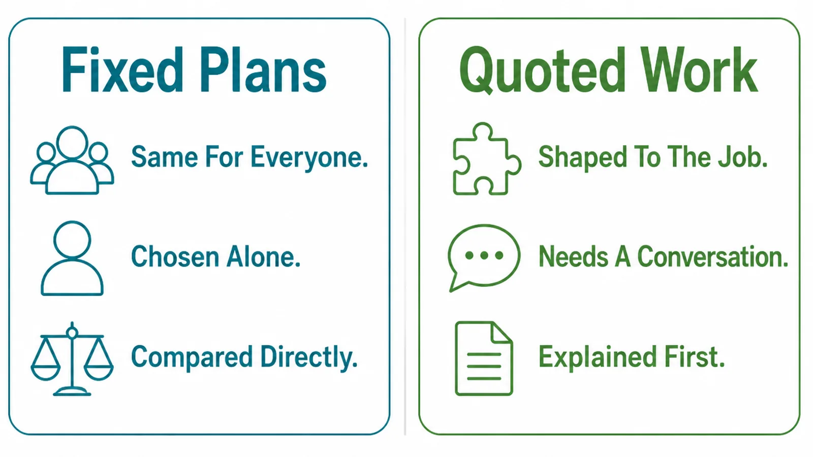
Plan columns work when the thing being sold is genuinely standardised and repeatable. Software, memberships and packaged services fit that shape.
Most service businesses do not. The work varies by access, scope and condition, and squeezing it into three tiers means inventing boundaries that do not exist.
The invented middle tier is the giveaway. It exists because the layout wanted three columns, and it usually collects features from both sides without being anybody's answer.
A quoted service deserves a page that explains quoting. That is not a weaker page, it is an honest one, and the reader can still tell whether they can afford you.
Where you do have real packages, show them. Mixed is fine too: two fixed options and a line saying larger jobs are quoted is a perfectly good pricing table.
Fixed options have a quiet benefit as well. They give a reader a reference point, so the quoted work no longer feels like an unknown number waiting at the end of a conversation.
How To Build A Pricing Page, Step By Step
Three steps. The first is a writing job, the second a layout job, the third the one most pages skip.
1. Say What Each Option Includes
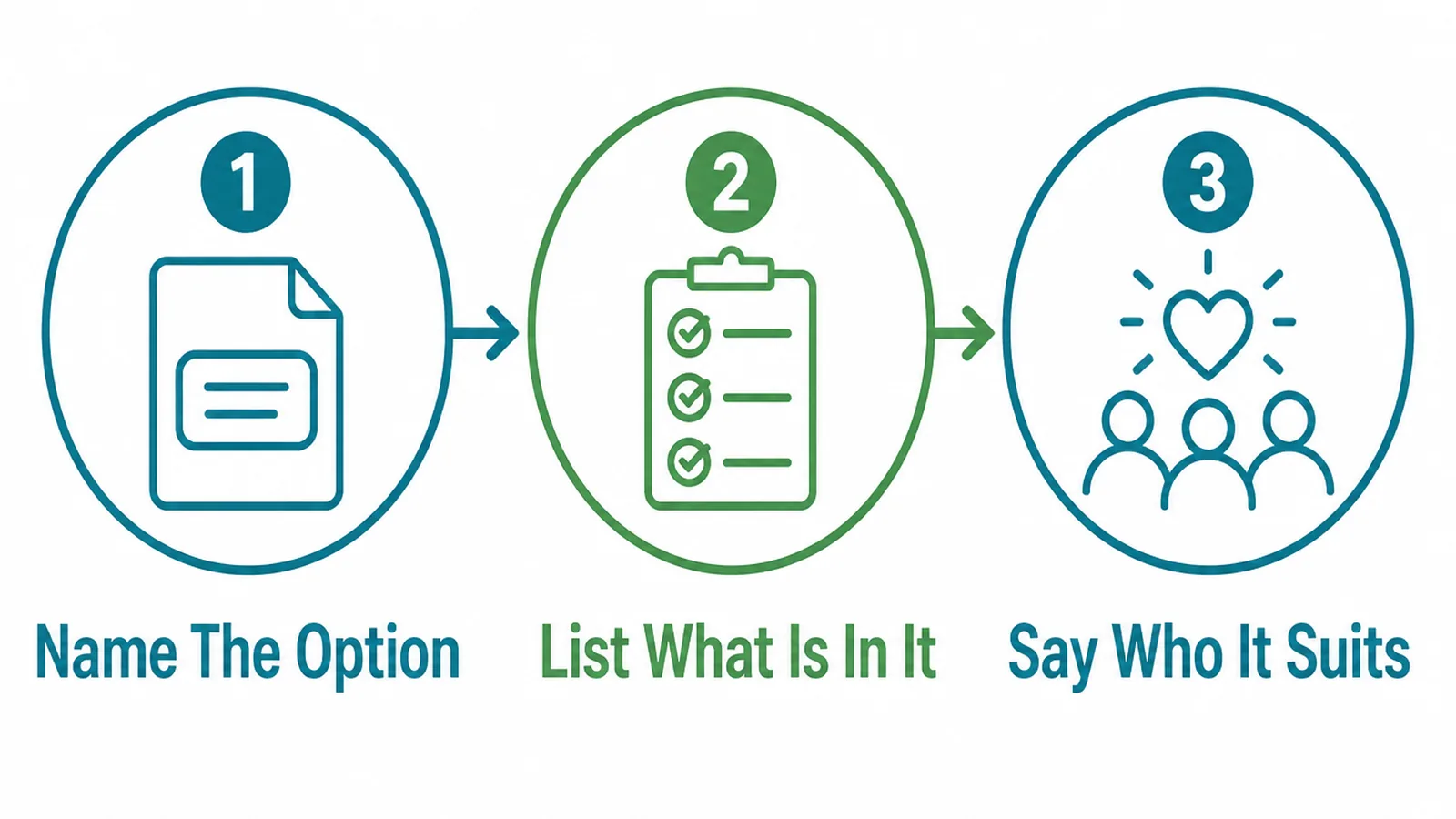
Before any layout, write each option out in plain text.
- Name the option. After what it is, not after a metal. "Single location" beats "Silver".
- List what is in it. Concrete items somebody could tick off at the end of the job.
- Say who it suits. One line describing the customer who should choose it.
Names matter more than they look. Metals and tiers force a reader to decode a hierarchy, while descriptive names let them recognise themselves immediately.
Keep the inclusion lists parallel. If one option lists five things and another lists eleven, the comparison becomes a reading exercise rather than a choice.
Write the lists before the page exists, in a document. Laying out columns tends to make you write to the space available rather than to what the option contains.
Name what is excluded as well, once, under the options. It prevents the most common complaint after a quote lands.
2. Lay The Page Out
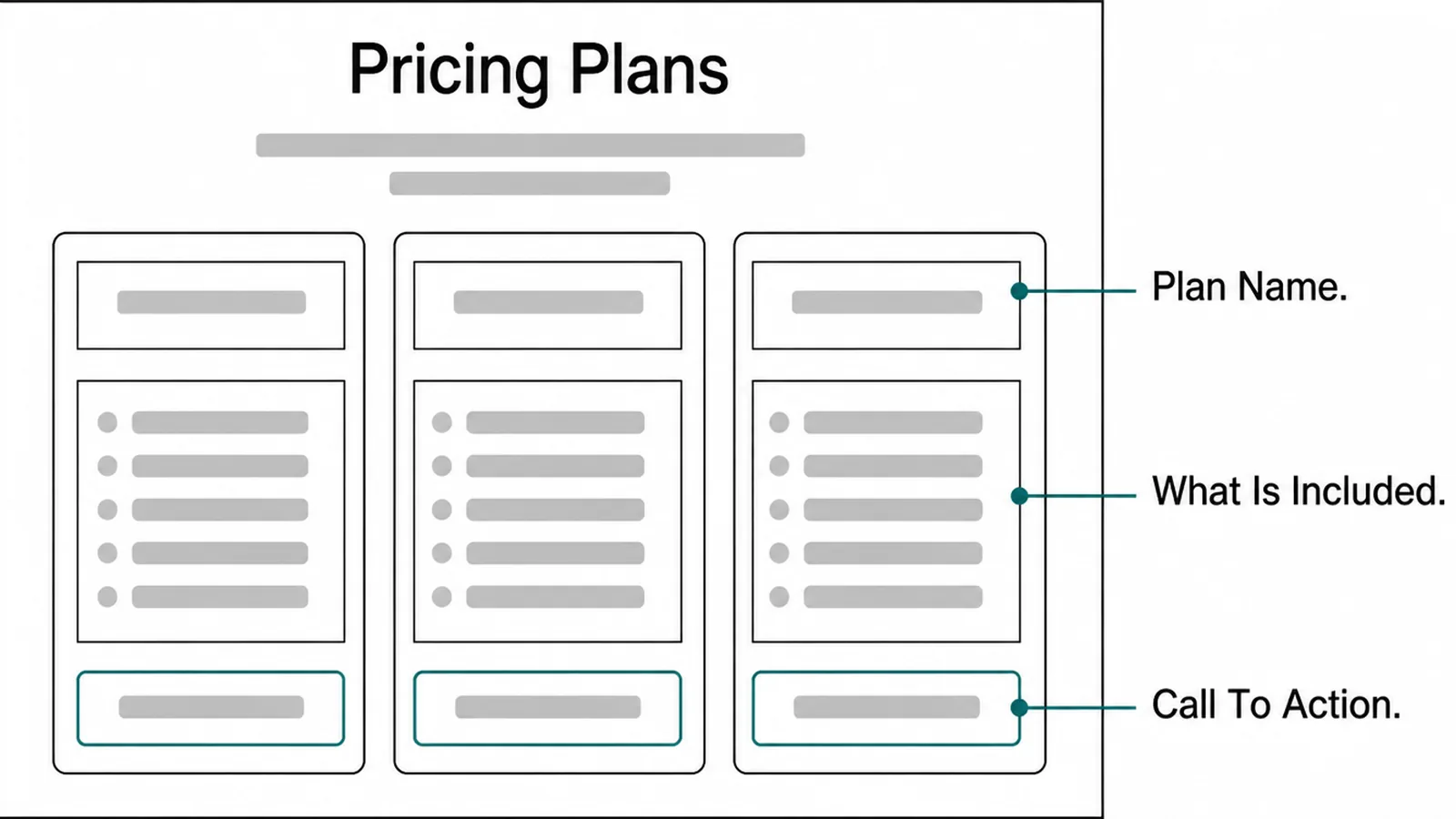
Layout is where a clear list becomes a hard page, usually through decoration.
- Plan name. At the top, with the price directly beneath it and nothing between them.
- What is included. Short lines, same order in every option, differences obvious.
- Call to action. The same wording in each column, and the same destination.
Avoid making one option visually louder unless you genuinely recommend it. A highlighted column is a recommendation, and readers treat it as one.
If you do recommend one, say why in a line rather than relying on a coloured border. A reason is persuasive where a highlight is only decoration.
Keep the buttons identical too. Different wording in each column suggests the options work differently when they do not.
On a phone the columns stack, so whichever option sits first is read first. Decide that order deliberately rather than letting the desktop layout pick it.
Check the stacked version on a real handset. Plan comparison tables are the layout that breaks most often on a narrow screen, and the break is invisible from a desk.
Put the currency and the period beside every figure. A number alone invites the wrong assumption, and the wrong assumption arrives as a complaint.
3. Answer The Doubts On The Page
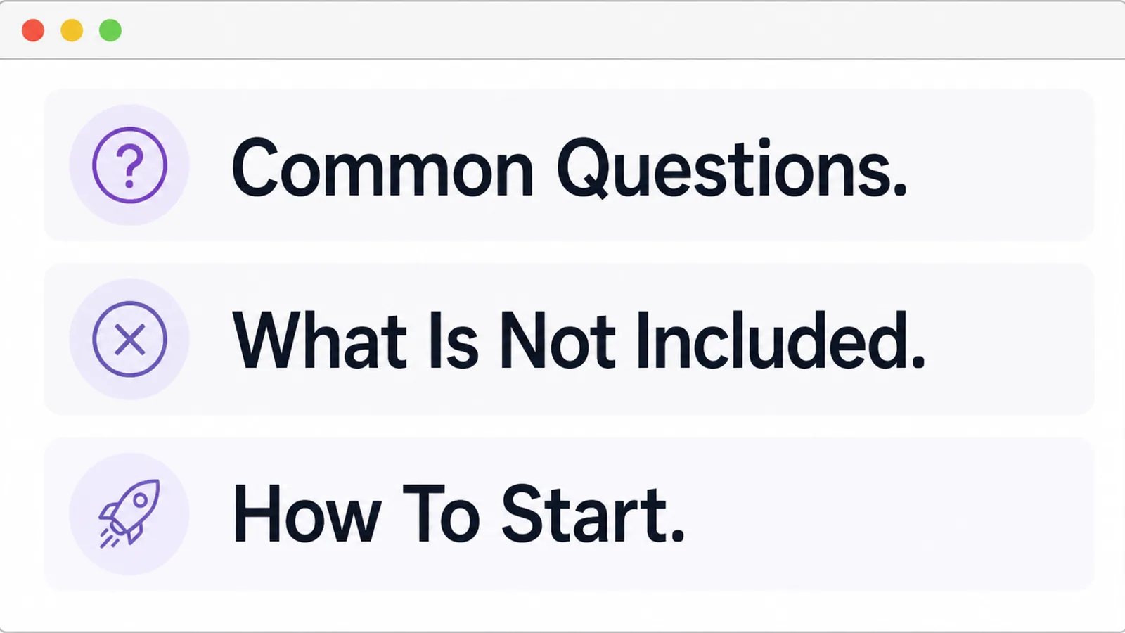
Under the options, answer the questions somebody is holding when they look at a price.
- Common questions. Payment terms, what happens if the job changes, how long it takes.
- What is not included. Stated plainly, so nothing arrives as a surprise.
- How to start. The first small step, described as something easy to do today.
This section is where a pricing page earns its keep. The options tell somebody what things cost; this part tells them whether to trust the numbers.
Write the awkward answers too. What happens if they want to stop, what is refundable and what is not, and who owns what at the end.
Keep each answer short. Two or three sentences, in the same voice as the rest of the site.
Put the questions in the order people ask them. Payment terms usually come first, and an answer buried at the bottom reads as a reluctance to give it.
What Makes A Page Easy To Choose From
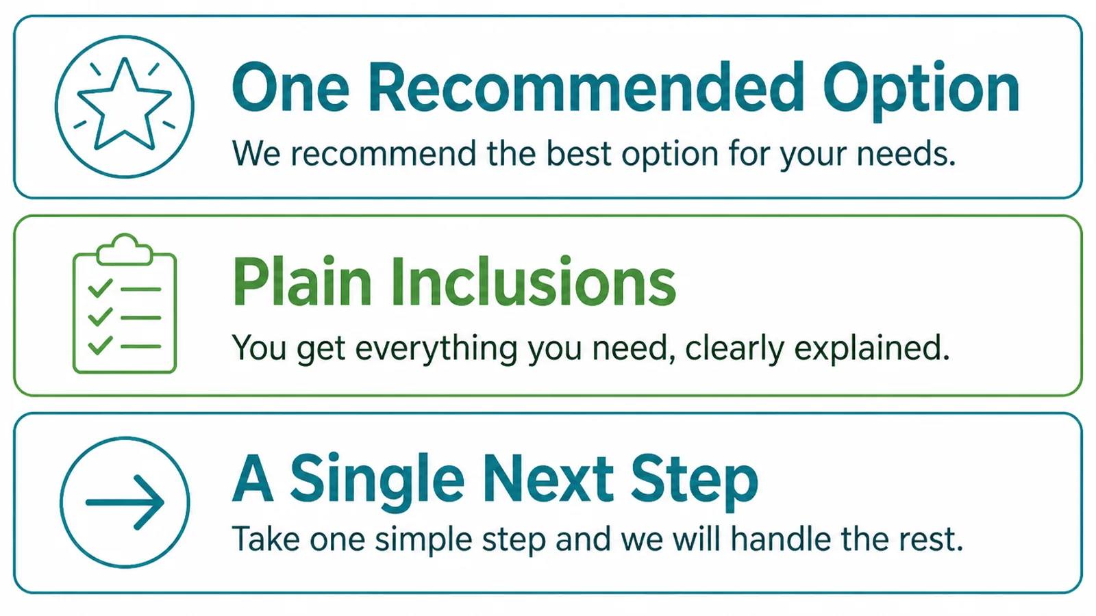
When two pricing pages carry the same information, these three decide which one is easier to use.
- Comparable. Same order, same wording, differences where the eye expects them.
- Specific. Items a customer can picture rather than categories they have to interpret.
- Decidable. A line per option saying who it is for, so nobody has to weigh features.
Specific is the hardest to hold on to. "Full support" means nothing; "replies within one working day, by phone or email" means something a reader can check you against.
Read each line and ask whether a competitor could claim it word for word. If they could, it is not telling anybody anything.
Fewer options usually help. Where a page has six, most readers pick the cheapest or leave, and the middle four exist mainly to slow the decision down.
If you genuinely sell six, group them. Two or three families with a short explanation each is easier to read than six parallel columns of similar text.
Pricing Page Tools
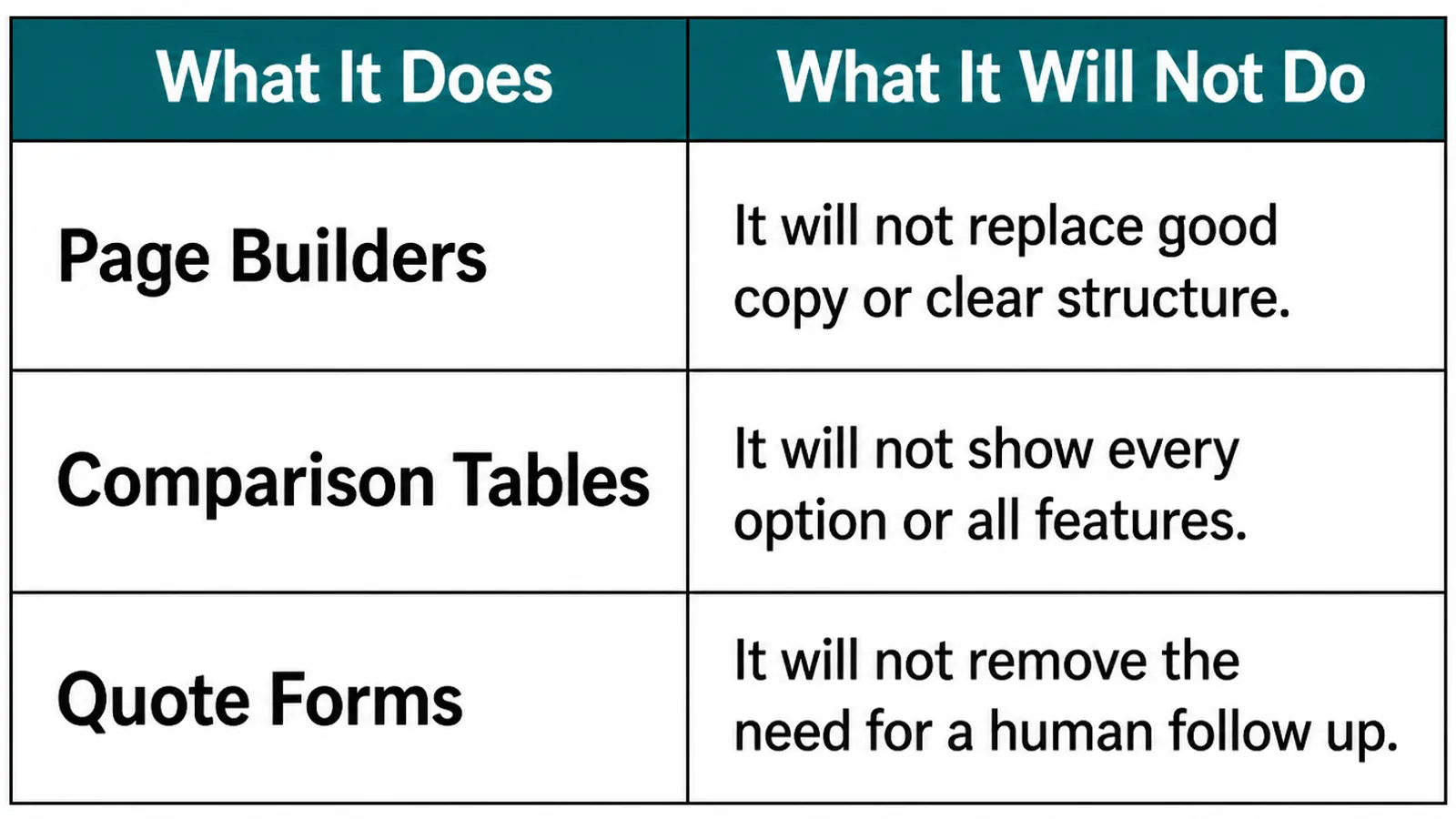
| What it does | What it leaves to you |
|---|---|
| Pricing table blocks lay out columns and keep them aligned | Deciding how many options you actually sell |
| Quote calculators let a visitor estimate their own job | Getting the maths right and keeping the figures current |
| Analytics shows how far down the page people get | Working out which unanswered question stopped them |
A calculator is useful and carries a risk. Anything it produces reads as a quote, so the assumptions behind it have to be visible and the figures have to be maintained.
If the price changes, both the page and the calculator change on the same afternoon. A calculator quoting last year's rates is worse than no calculator.
Common Pricing Page Mistakes
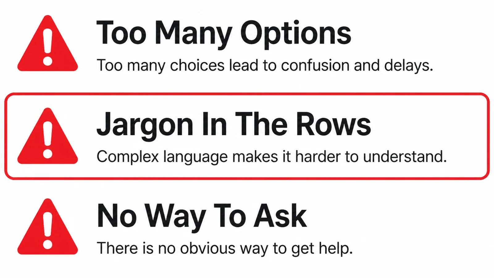
- No prices anywhere. A page about packages that never mentions money.
- Invented tiers. Three columns because the layout wanted three columns.
- Hidden extras. Set-up fees and add-ons that only appear in the quote.
A fourth is feature lists written for yourself. Twelve identical lines in all three columns, with the one real difference buried in the middle of them.
Show what differs first, then what is shared. A reader comparing options is looking for the difference, and the shared list can sit underneath for anybody who wants it.
If the page is part of a wider rewrite, writing copy for a service business covers how the service pages that feed it should read.
FAQs
Should I show prices at all?
Show something about money, even where you cannot show a figure. A from price, a typical range, or an explanation of what drives the cost all let a reader decide whether to enquire. A page with no price signal makes every conversation start there.
How many plans should I show?
As many as you genuinely sell. Three is a convention rather than a rule, and inventing a third tier to fill a column produces an option nobody chooses and a page that is harder to read than a simple list of two would have been.
What if every job is quoted?
Then the page explains how you quote. Show what drives the price, a worked example or two with real figures, and what a typical job has cost. That answers the reader's question honestly, without pretending that work which varies by scope is standardised.
Where do the extras belong?
On the page, near the plan they attach to. Hiding add-ons until the quote stage saves nobody time and reads as a surprise. Listing them makes the base price credible and lets somebody price their own version before they call.
Conclusion
Pricing page design is three answers: what it costs, what is inside it, and who each option suits.
Write the options in plain text first, lay them out so the differences are where the eye expects them, then answer the awkward questions underneath instead of leaving them for the call.
If your work is quoted rather than packaged, see how we approach web design, or get in touch and we will help you show the method instead of inventing tiers.