What Is a Wireframe and Why Skipping It Costs You

What is a wireframe? It is a plain layout showing what goes on a page and in what order, with no colour, fonts or images. Seed Light wireframes before designing because feedback on a grey sketch is about priority, and feedback on a finished design is about taste.
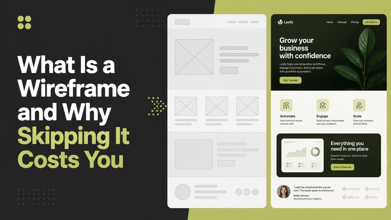
A wireframe is a grey sketch of a page. No colour, no photographs, no fonts anybody chose.
That sounds like a step worth skipping, and it is the step that decides whether the design conversation is about priority or about personal taste.
This guide covers what a wireframe settles, what skipping it costs, and how to make one in an hour without any design software.
Key Takeaways
- A wireframe settles order, not appearance. What is on the page and what comes first.
- Grey is the point. Nothing to react to except the structure.
- It is cheap to change. Moving a box takes a minute, moving a built section takes a day.
- One per template is enough. Home and one service page set the pattern.
- Paper counts. The conversation matters more than the tool.
Everybody has an opinion about colour. Almost nobody volunteers an opinion about what should come second on the page.
A wireframe forces that second conversation to happen while it is still cheap. That is the entire reason it exists.
What Is A Wireframe, Exactly
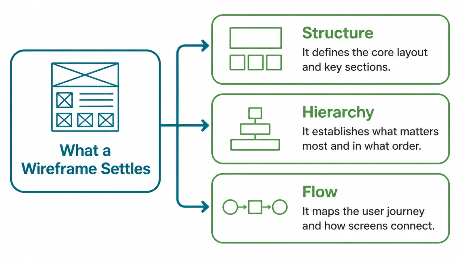
A website wireframe answers three questions and deliberately refuses to answer any others.
- What is on the page. Every section, named, with nothing hidden in a "and some content here".
- What order it comes in. Which section a visitor meets first, second and last.
- What each section contains. A heading, some text, an image, a button, a list.
It does not answer what any of it looks like. No colours, no typefaces, no real photographs, and that restriction is the feature.
A low fidelity wireframe is usually boxes with labels inside them. It can be drawn on paper in ten minutes, and a drawn one often gets better feedback than a neat one.
Tidiness invites approval. A rough sketch invites the argument you actually need to have.
So what is a wireframe for, in one line: it is the cheapest possible version of the page, made to be disagreed with.
Why Skipping It Costs More
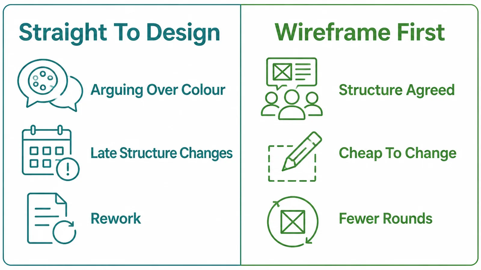
Design straight into colour and the first review becomes a conversation about the photograph and the shade of the button.
The structural question, whether the proof should sit above the services list, never gets asked. It gets discovered two weeks later when somebody says the page does not feel right.
Changing it then means redrawing finished work, re-cropping images and rebuilding sections. The same change on a wireframe is one box moved up.
There is a second cost, and it is quieter. A page designed without a plan ends up with whatever the template offered, so three different businesses end up with the same section order for no reason anybody can name.
Your page order should come from what your customers need to know, in the order they need it. That is a decision about your business rather than about web design.
Wireframing first also makes the copy easier to write. A writer with a labelled structure knows how many words each section needs.
It makes quoting easier too. A supplier looking at a blocked-out page can see the real amount of work, instead of pricing a page count and hoping.
How To Make A Wireframe, Step By Step
Three steps, an hour, and no design software unless you want it.
1. List What The Page Must Do
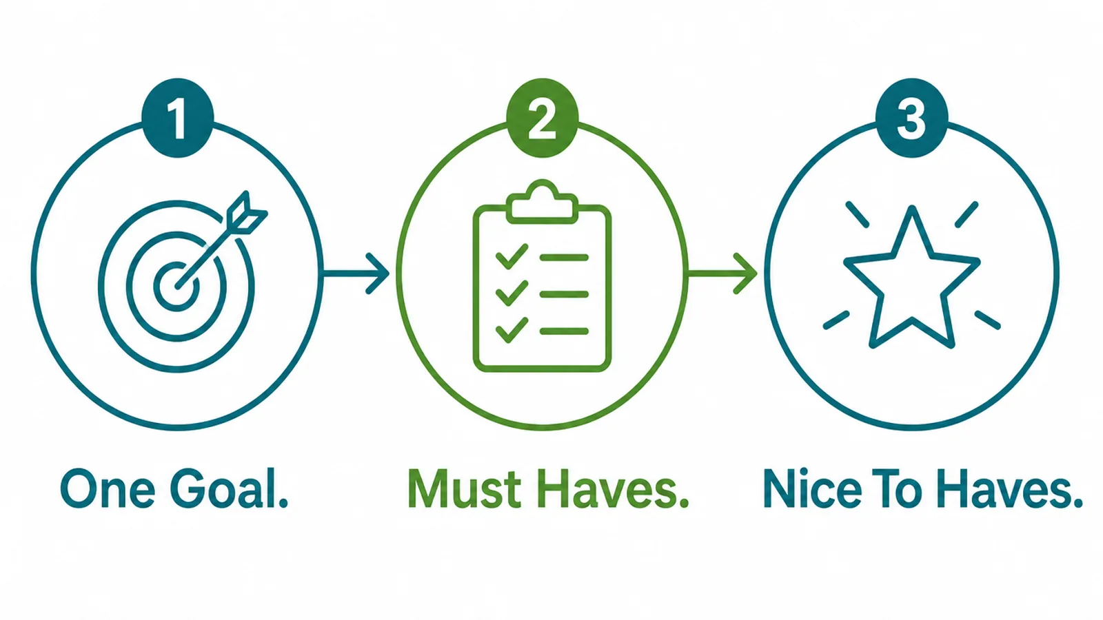
Before drawing anything, write the page's job at the top of a sheet of paper.
- One goal. The single thing this page exists to make happen.
- Must haves. What the visitor needs before they can do that thing.
- Nice to haves. Everything else, written down so it can be left out honestly.
Most pages carry two or three things in the first list and a dozen in the second. Writing both is what makes the cutting possible later.
Keep the nice-to-haves visible rather than deleting them. A list everybody can see stops the same suggestion arriving three times from three people.
A page with two goals has none. If the list genuinely needs two, that is usually two pages.
Write the goal in the visitor's terms rather than yours. Not "show our range", but "help somebody decide which service they need".
2. Block Out The Page
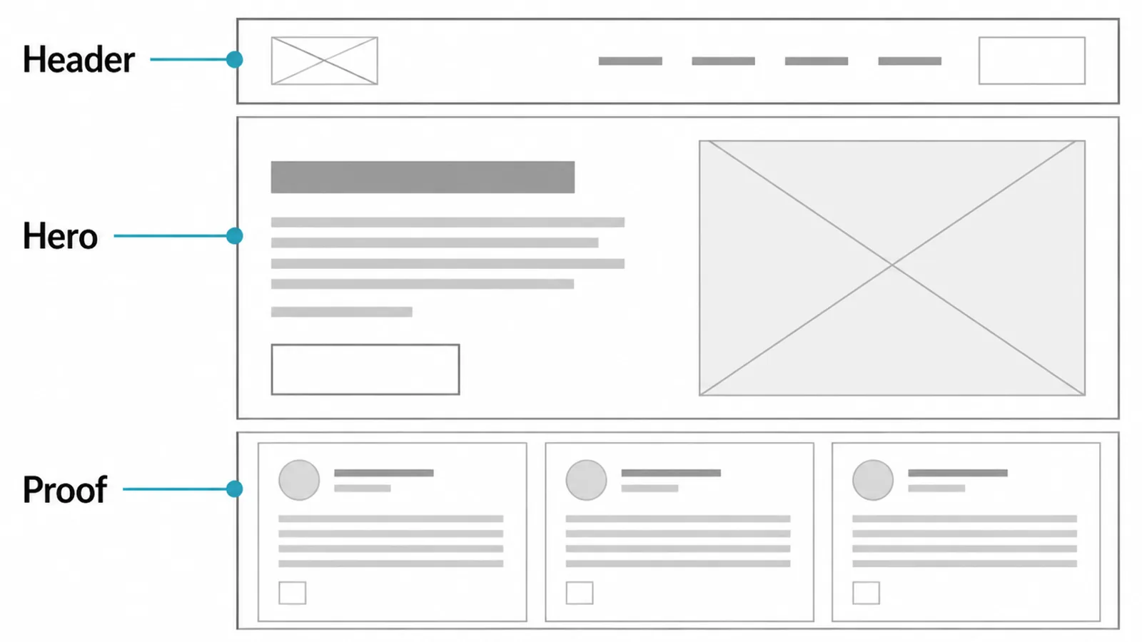
Now draw boxes, top to bottom, one per section, each labelled with what it holds.
- Header. Logo, the few links that matter, and a way to make contact.
- Hero. What you do, who for, and the action, inside one screenful.
- Proof. The evidence that makes the hero believable, as close to it as possible.
Keep going down the page, naming every block. Where you would write "content", stop and decide what the content actually is.
Mark roughly how much room each block needs as well. A section with four sentences and one with forty behave very differently once they are real.
Draw it at phone width first. Most visitors arrive on a phone, and a layout that works in a narrow column almost always works when it widens.
Then sketch the wide version beside it. The question to settle is what sits side by side on a desktop and what simply stacks.
If a section cannot be named, it does not belong on the page. That rule removes more filler than any amount of editing later.
3. Review Before Any Colour
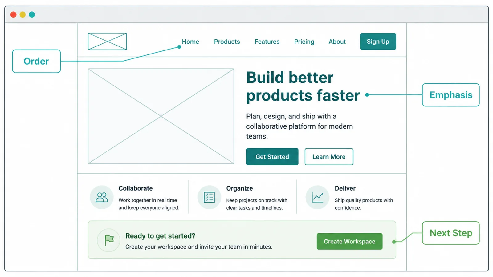
Show the wireframe to somebody who was not in the room when it was drawn, and ask three questions.
- Order. Does anything need to come earlier, and what would you move up.
- Emphasis. Which block looks most important, and should it be.
- Next step. If you wanted to act, where would you go.
Expect somebody to say it looks unfinished. Agree, and ask the questions anyway; the grey is doing its job.
If the answer to what is a wireframe for ever becomes "to show the client something", it has stopped working. It is a tool for deciding, not for reassuring.
Do the review in person or on a call if you can. Written feedback on a grey sketch tends to arrive as a list of things that look wrong.
Fix what comes back, then move to design with the structure settled. Feedback on a finished design should be about craft, not about what is on the page.
Wireframe Ideas That Work Right Now
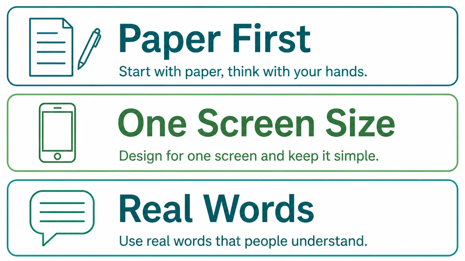
Three approaches cover almost every small business project.
- Paper first. Six sketches in ten minutes, then redraw the one that works.
- One template per page type. Home, service, article, contact, and nothing else.
- Annotate instead of explaining. Write the reason beside the box, not in a separate note.
Annotation is the habit worth keeping. Six months later, nobody remembers why the testimonials sit where they do, and the note beside the box answers it.
One template per page type keeps the site coherent as it grows. New pages inherit a structure somebody already thought about, instead of being invented on the afternoon they are needed.
It also makes the build quicker. A developer working from four agreed templates can reuse most of the work across forty pages.
Keep the sketches. They are the clearest record of what the page was supposed to achieve, and they make the next redesign far quicker.
Store them with the brief rather than in somebody's notebook. A wireframe that cannot be found is a decision that has to be made again.
Wireframing Tools
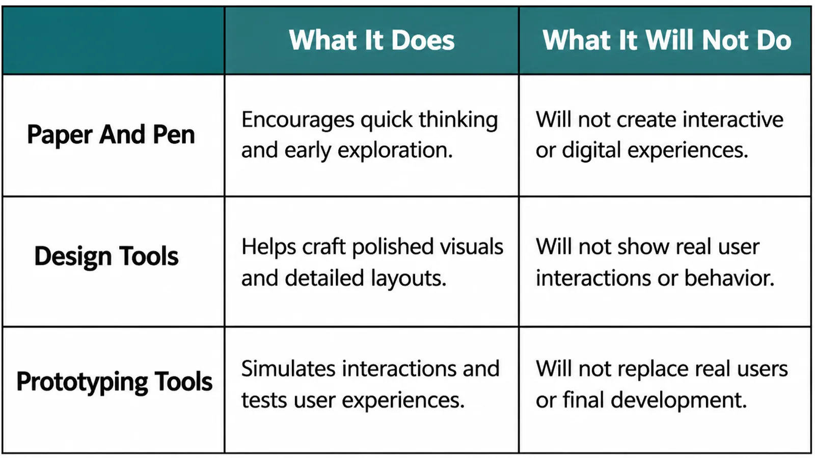
| What it does | What it leaves to you |
|---|---|
| Paper and a pen produce rough layouts in minutes | Photographing them so somebody else can comment |
| Design tools give tidy boxes, reusable blocks and sharing | Resisting the urge to start styling inside them |
| Page builders let you block out a page in the real site | Keeping it grey long enough to review the structure |
The risk with the last two is the same: it is easy to start choosing colours and call it a wireframe. The moment there is a brand colour on the screen, feedback changes subject.
If you use a design tool, work in one grey and one type size. The restriction is doing the work.
Share it as an image rather than a link into the tool. People comment more freely on something that looks provisional than on something that opens in software they do not use.
Common Wireframe Mistakes
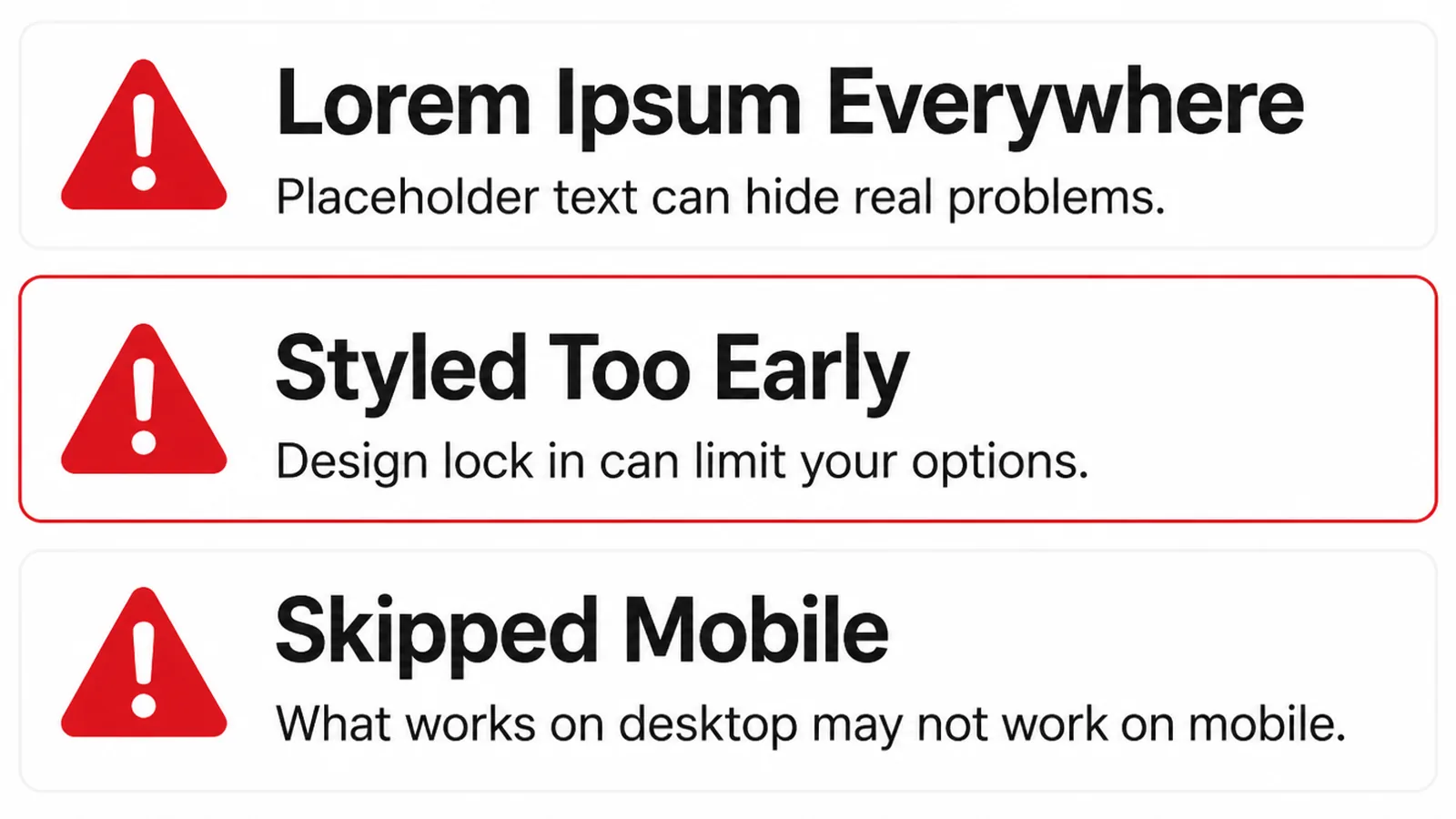
- Adding colour too early. The review becomes a discussion about taste.
- Vague blocks. A box labelled "content" that nobody has to think about yet.
- Desktop only. A layout that falls apart the first time it is seen on a phone.
A fourth is treating the wireframe as a contract. It is a plan, and plans survive contact with real copy about as well as any other plan.
Keep the agreed goal fixed and let the layout move. The thing you promised the page would do is the part worth defending.
When the words arrive and a section turns out to need twice the room, change the layout. The wireframe exists to make that change cheap, not to forbid it.
FAQs
Do I need a wireframe for a small site?
For the home page and one service page, yes. Those two set the pattern every other page follows, so an hour spent on them saves rework across the whole site. Pages that repeat an agreed pattern rarely need one of their own.
What is the difference between a wireframe and a mockup?
A wireframe shows what is on the page and in what order, in grey boxes. A mockup shows how it will look, with real colour, type and images. The first is a decision about priority, the second about appearance, and doing them together is how both get rushed.
Should a wireframe include real copy?
Real headlines help, placeholder body text is fine. A headline you might actually publish tests whether the layout survives a long sentence, while filler paragraphs stop people reading the words when they are supposed to be judging the structure of the page.
Can I make a wireframe myself?
Yes, on paper. Boxes and labels are enough to settle what belongs above the fold and what order the sections come in. The point of the exercise is the conversation it starts with whoever has to agree, rather than the neatness of the drawing itself.
Conclusion
A wireframe is a grey plan of a page, and it is the cheapest place to have the argument about what matters.
Write the page's job, block it out top to bottom in labelled boxes, then review it before a single colour appears. Fix the order there, where fixing costs minutes.
If you would like the structure settled before the design starts, see how we approach web design, or get in touch and we will sketch your main page with you.