Brand Identity: What It Is and How to Build One

Brand identity is the toolkit you design to show your brand: name, logo, colours, fonts, imagery, and the way you write and speak. It splits into visual identity, what people see, and verbal identity, how you sound. Using both consistently is what makes people remember you. Seed Light builds identities and the sites that carry them.
Key takeaways
- Identity is the system you design. Name, logo, colour, type, imagery and voice, chosen on purpose and written down.
- The brand is the perception you earn. You cannot draw it. It is the feeling people carry about you.
- Identity has two halves. Visual (what people see) and verbal (how you sound). Both must feel like one personality.
- Consistency is what makes it work. A cohesive identity used the same way everywhere builds recognition and trust.
- Colour meanings are not laws. They shift by culture and audience, so test how real customers react.
1. What is brand identity?
Brand identity is the toolkit you build to show your brand to the world.
Think of every part someone can see or hear when they meet you: your name, your logo, the colours you pick, the fonts your words sit in, the style of your photos, and the way you talk. Bundle all of that together on purpose and you have a brand identity.
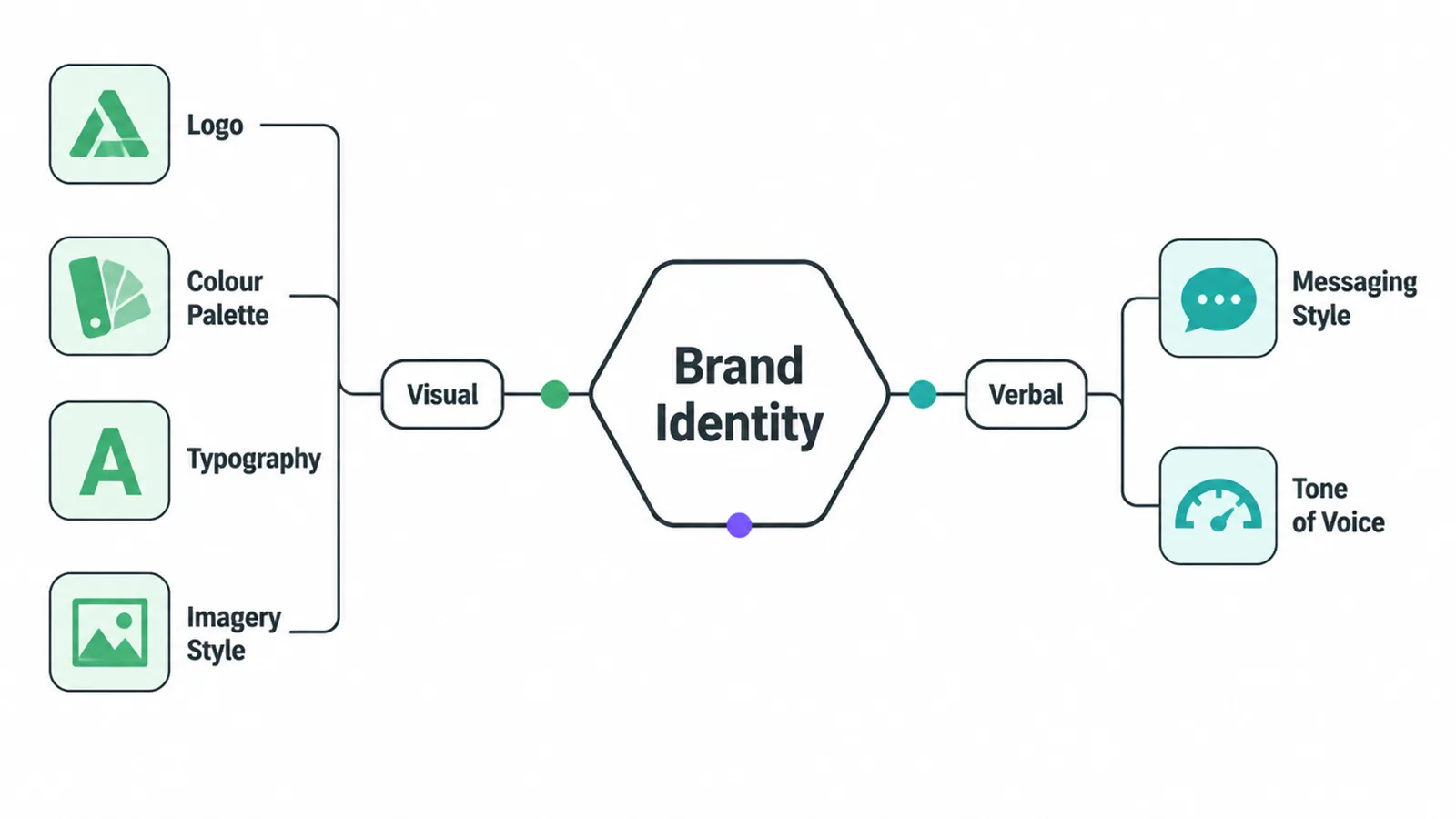
It splits neatly into two halves. There is your visual identity, which is everything people see, the logo, the colours, the type, the imagery.
Then there is your verbal identity, which is how you sound, your tone, your words, your tagline. Both halves matter. A sharp logo paired with cold, stiff writing feels off, because the two are telling different stories about the same business.
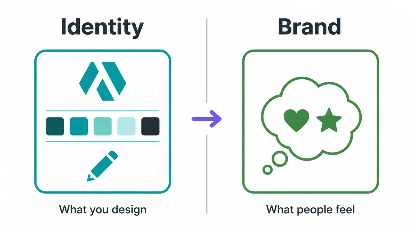
Here is the key thing. Your identity is the part you control. You cannot reach into someone's head and set their opinion of you.
But you can choose exactly what your logo looks like, which three colours you use, and how you greet a new customer. Get those choices right and used the same way, and you nudge the perception in the direction you want.
2. Brand identity vs the brand vs branding
These three words get blurred all the time, so let us pull them apart, because the whole subject makes more sense once you do. The brand is the perception. The identity is the designed system. Branding is the ongoing act of building and using that system over time.
The brand is the perception
Start with the brand. The Nielsen Norman Group describes a brand as "a subjective perception of value based on the sum of a person's experiences with a product or company", and puts it plainly: "Brand is not made of visuals or words alone, it's not a logo or a slogan" (Nielsen Norman Group).
In other words, your brand lives in people's heads, not in your logo file.
Seth Godin frames it the same way, calling a brand "the set of expectations, memories, stories, and relationships that, taken together, account for a consumer's decision to choose one product or service over another" (quoted by Canva).
The identity is the system you design
So if the brand is the perception, the brand identity is the set of tools you use to shape it. And branding is the verb, the day-to-day act of designing, applying and repeating that identity until it starts to mean something.
A cohesive identity does not guarantee a strong brand. But a messy, inconsistent one almost always weakens the brand you are trying to build.
For the bigger picture on all of this, our guide to small business branding pulls the pieces together.
3. The elements of a brand identity
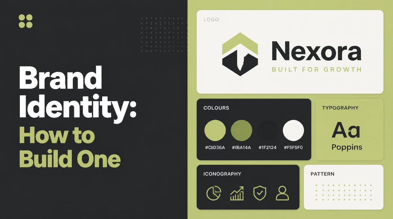
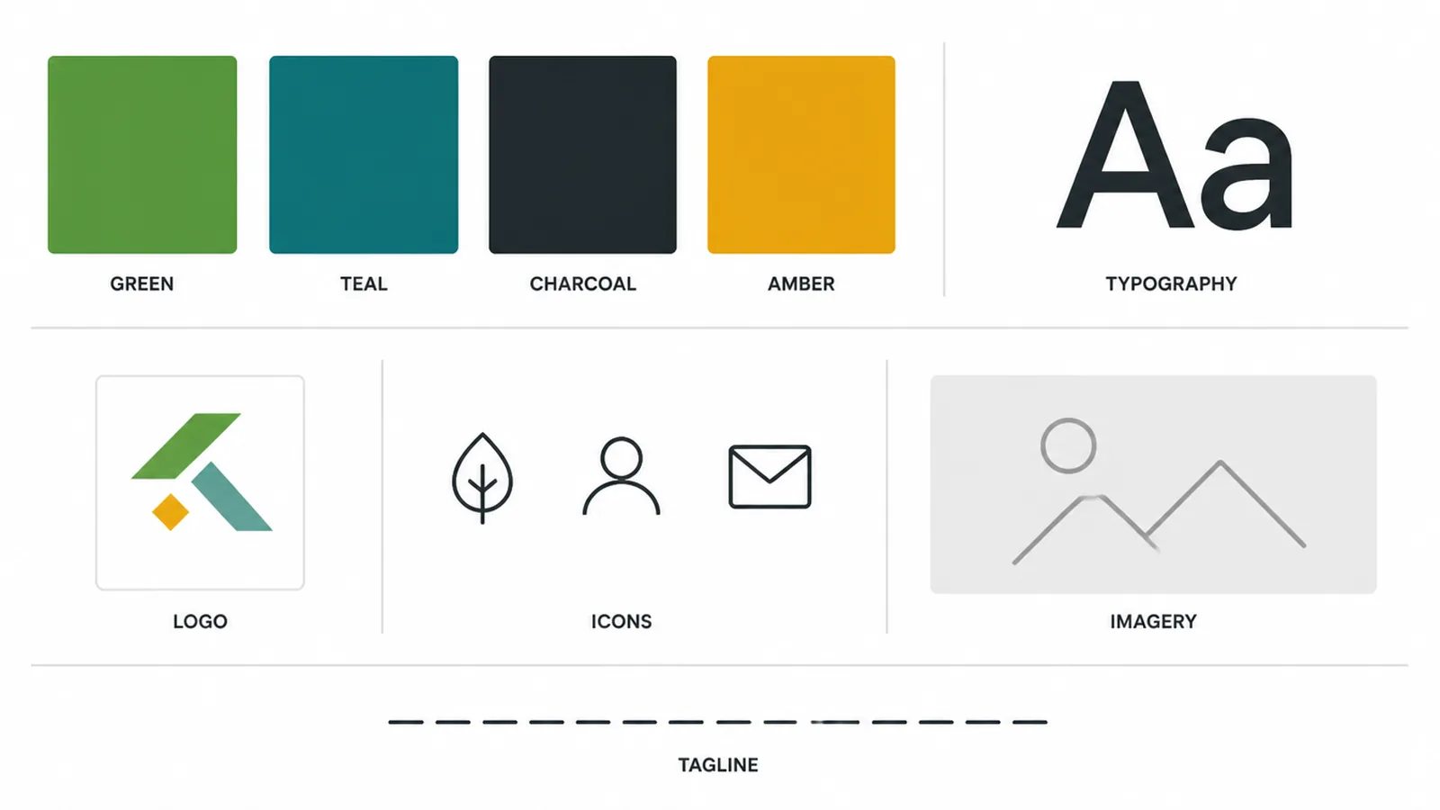
A brand identity is made of a handful of parts, and each one does a small job. You do not need all of them on day one, but knowing the full set helps you plan. Below is the whole system in plain words, from the name people say to the little shapes that add flavour.
Your name is the word or words people call you. Your logo is the mark that stands for the whole thing at a glance. Your colour palette is a small, fixed set of colours you reuse everywhere.
Your typography is the fonts your words live in. Your imagery style is the look of your photos and graphics. And your brand voice is how you sound in writing, your tone and word choices. The table sums it up.
| Identity element | What it is |
|---|---|
| Name | The word or words people call you |
| Logo | The mark that stands for the brand at a glance |
| Colour palette | The small set of colours you use everywhere |
| Typography | The fonts that carry your words |
| Imagery style | The look of your photos, illustrations and graphics |
| Icons and graphics | Small repeatable shapes that add flavour |
| Brand voice | How you sound in words, your tone and word choices |
| Tagline | A short line that sums up what you offer |
4. Visual identity vs verbal identity
The two halves of an identity are worth calling out on their own, because most people think about one and forget the other. Visual identity is everything seen: the logo, the colours, the type, the imagery.
Verbal identity is everything heard or read: your voice, your tone, your word choices, your tagline. Both should feel like the same person talking.
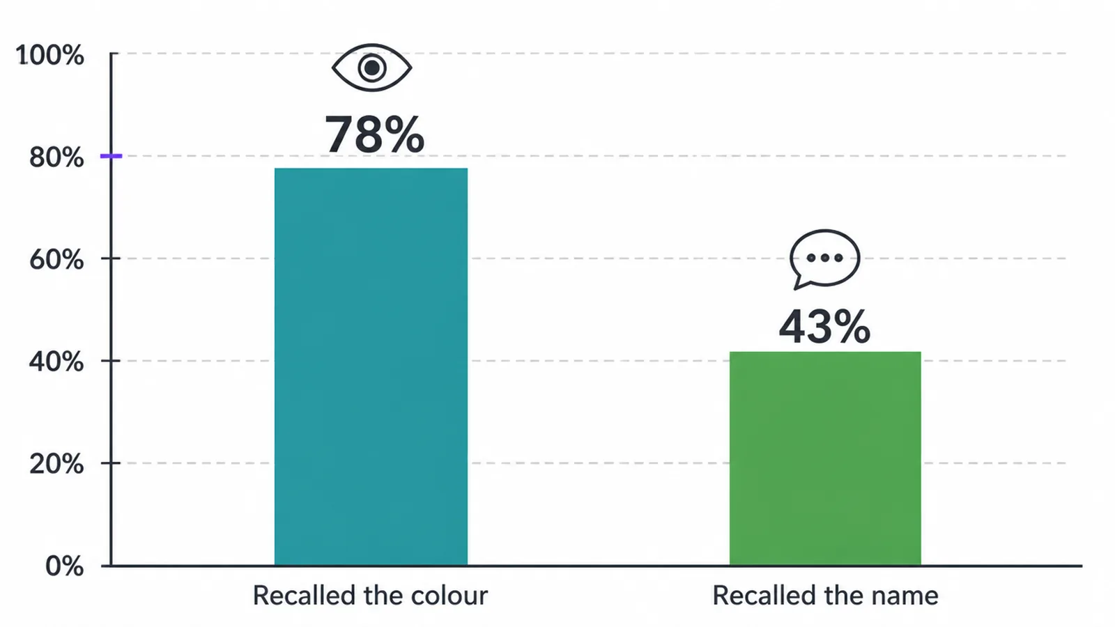
Visual cues stick in the memory, which is why the look side gets so much attention. A Reboot Online survey of more than 2,500 consumers showed people fictional company logos, then asked what they remembered. Seventy-eight per cent could recall the logo's primary colour, while only 43% could remember the name (Reboot Online).
That tells you a distinctive, consistent look is worth the effort. It does not mean colour alone builds a brand, and it is not a promise of any set boost in recognition.
It simply shows the visual side does real work, so give the verbal side just as much care and they will pull in the same direction.
5. How brand identity connects to strategy
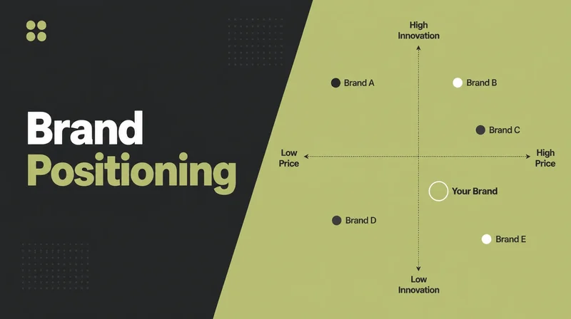
An identity should express a strategy, not float free of one. Before you pick a colour or a font, you want to know a few things: why the business exists, who it is for, how you sit against the competition, and what personality you want to come across.
Those decisions come first. The visuals and the voice are how you make them visible.
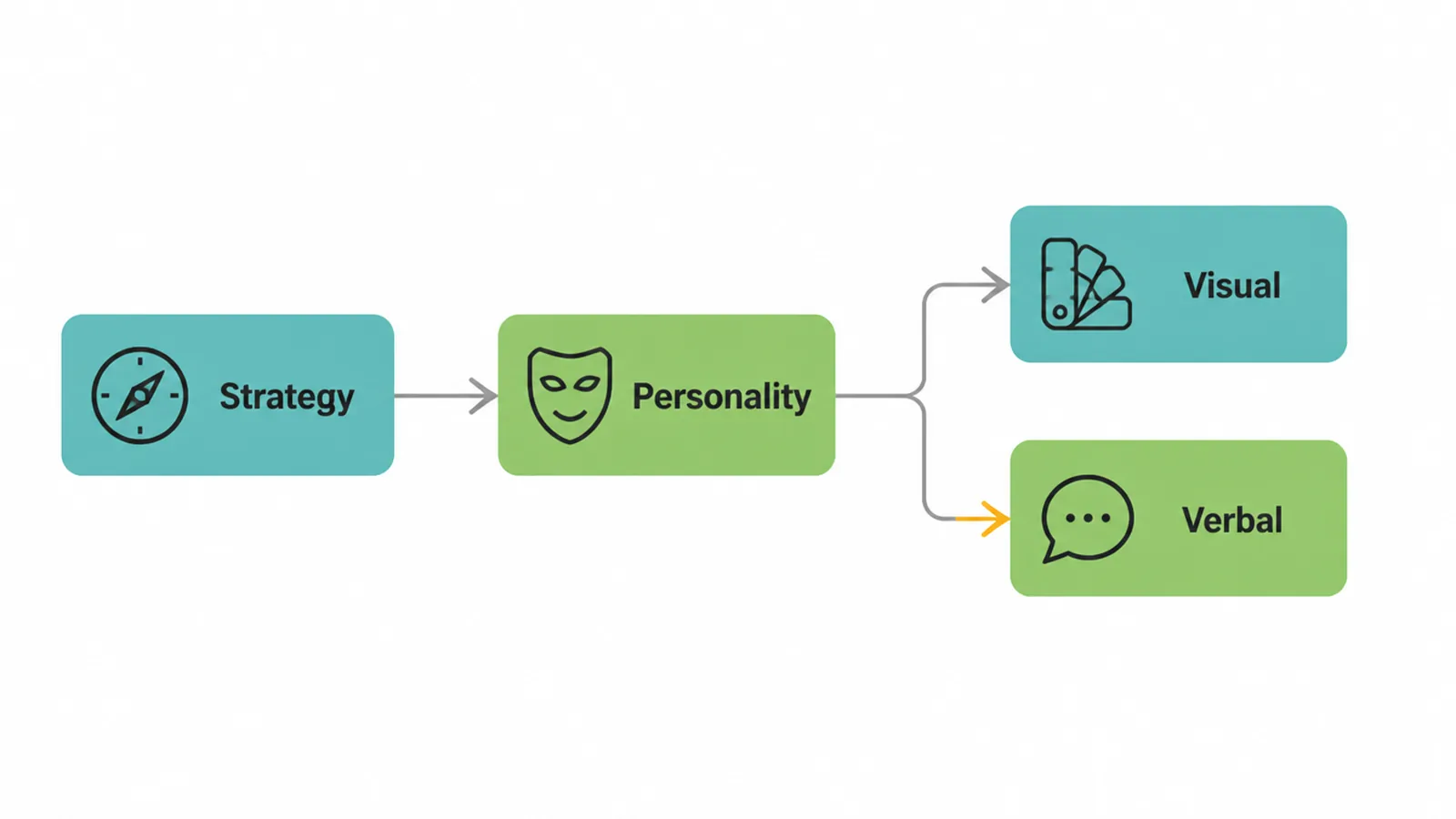
Skip that step and you get an identity that looks nice but says nothing. It could belong to any business in your field, because it was not built to express anything in particular.
Design the identity to fit the strategy and every choice has a reason behind it. Our guide to brand strategy covers how to set that foundation, so the look and the words have something solid to stand on.
6. How to build a cohesive brand identity
Here is a simple order to work through. You do not need a big budget or a huge team. You need clear choices, made once, and written down so you can reuse them.
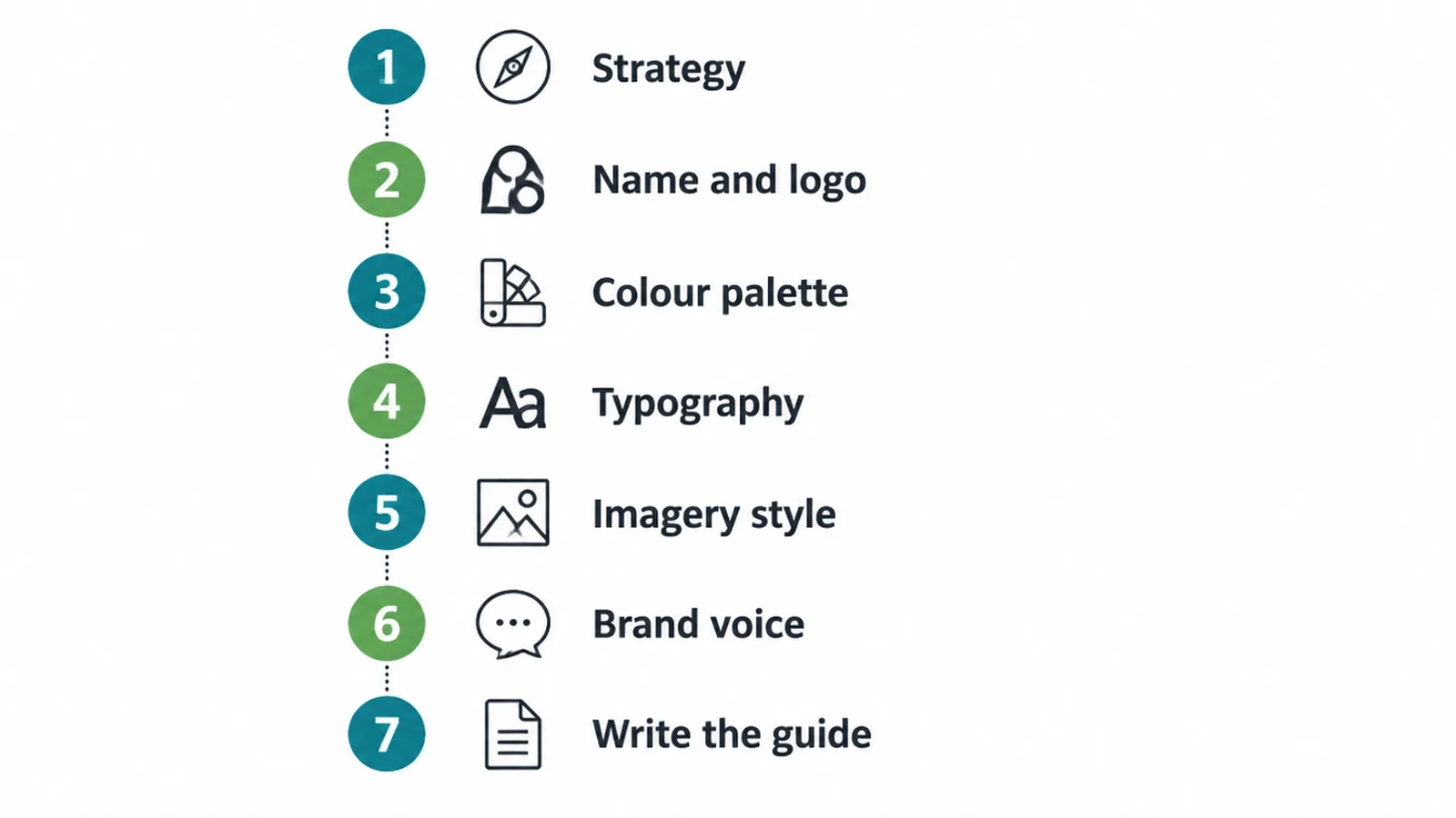
- Get clear on strategy and personality. Decide who you serve, what you stand for, and how you want to feel to people. This steers everything else.
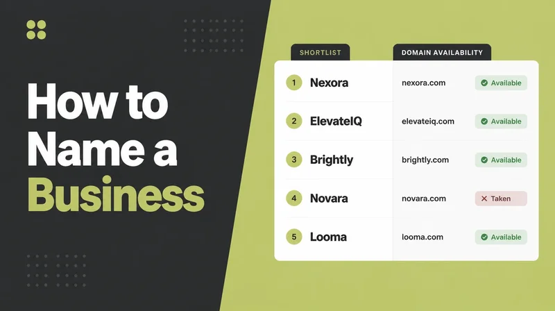
- Choose a name and logo direction. Settle the name, then a mark that reads well small and stands for the whole business at a glance.
- Build a small colour palette. Two or three core colours plus a neutral is plenty. Colours carry common associations, but those vary by culture and audience, so treat them as a starting point you can test.
- Pick one or two fonts. One for headings, one for body, is enough. More than that and things start to look messy.
- Set an imagery style. Decide the look of your photos and graphics, so they all feel related instead of random.
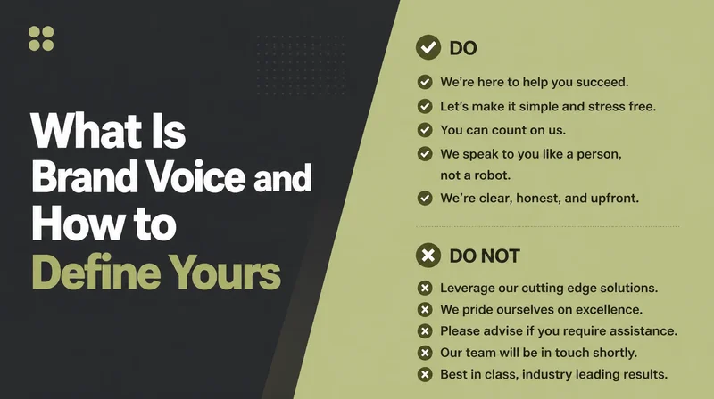
- Define your voice. Write down how you speak, a few words you use, a few you avoid, and the tone you aim for.
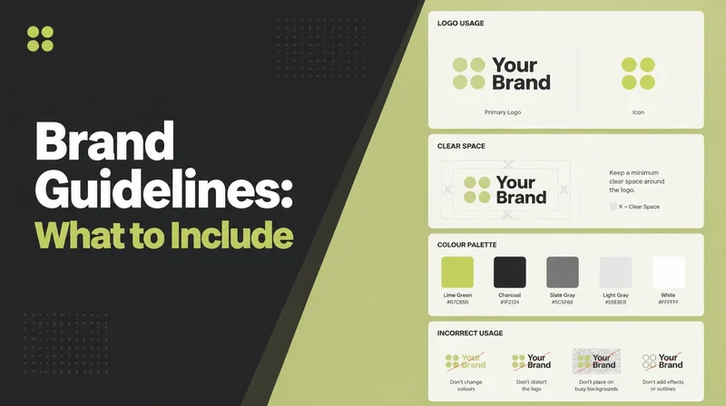
- Write it all into a short guide. One clear document that anyone can follow. That is what turns a set of choices into a system people can actually use.
Small budget? Start lean. One strong logo, two or three colours, one or two fonts, and a short voice guide will carry you a long way. You can grow the system later. If you would rather have a hand building it properly, our branding service does exactly this.
7. Why consistency matters
This is the payoff. An identity only works if you use it the same way everywhere.
The Nielsen Norman Group makes the point well: "Only when all three brand components, visuals, tone, and behaviors, are present and true to the core brand message, do customers have a consistent user experience across interactions with a company or product" (Nielsen Norman Group).
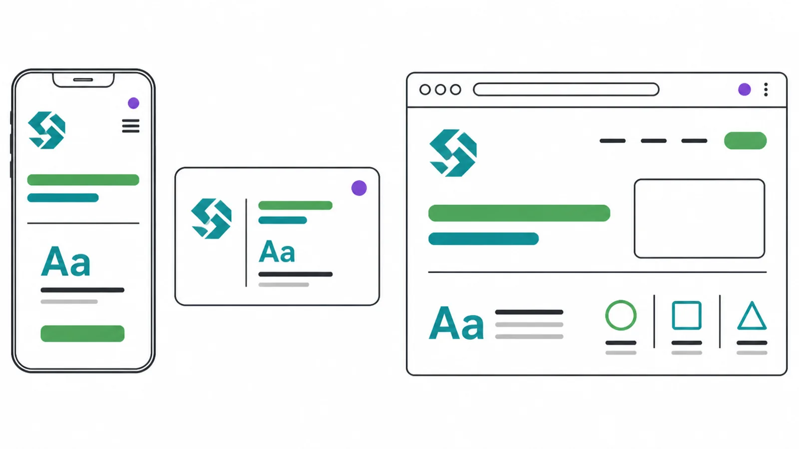
Line them up and people get the same feeling every time they meet you. That repetition is what builds recognition and trust.
The reverse is just as true. When your website looks one way, your social posts another, and your emails a third, people quietly start to doubt you. It feels sloppy, and sloppy feels risky. So keep it tight.
Reuse templates so every post and page matches. Save one brand file everyone works from. And put one person in charge of the rules, so the identity does not drift a little every time someone new touches it.
8. Common brand identity mistakes
Most identity problems come from a short list of slip-ups. Watch for these.
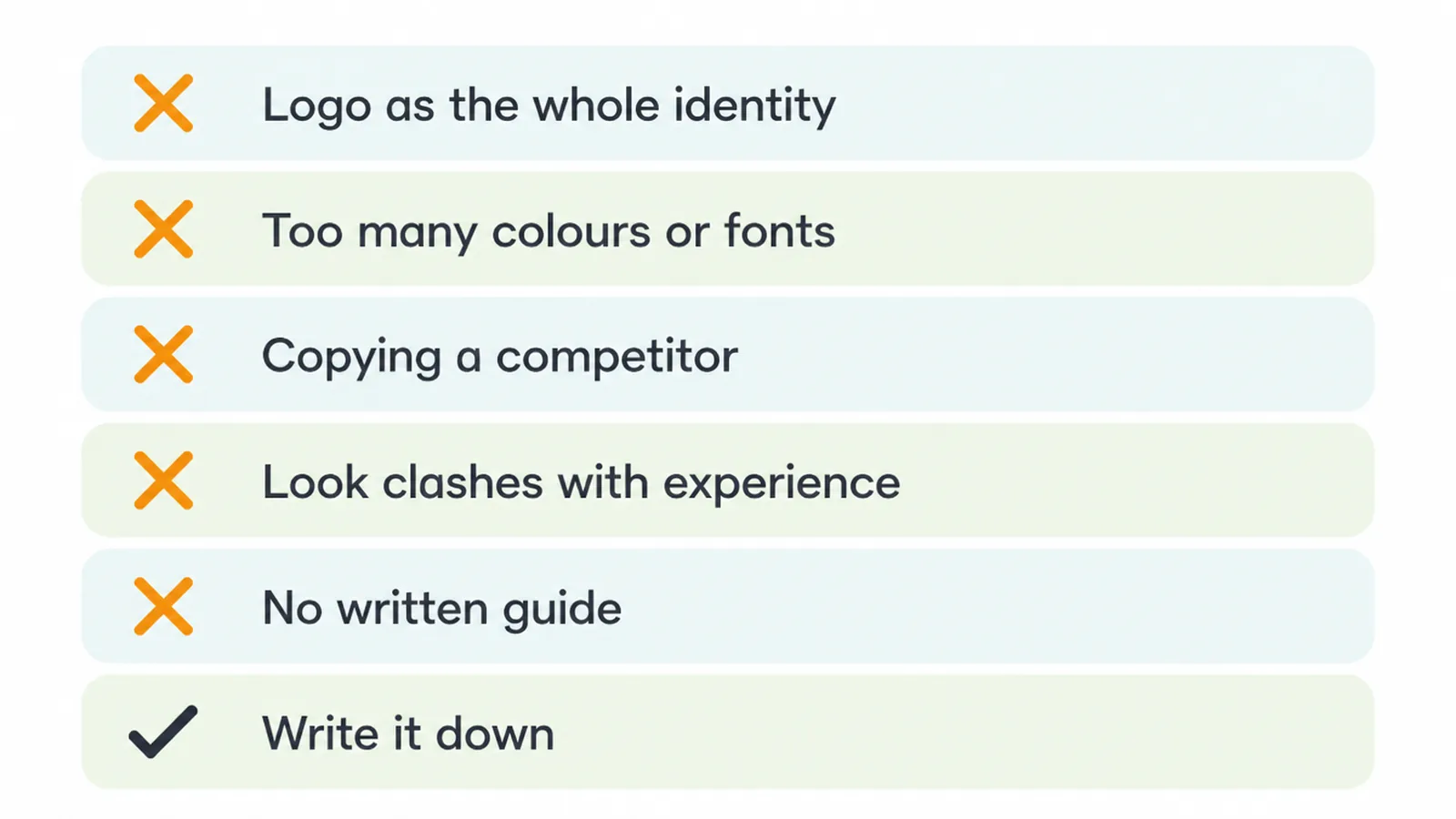
- Treating the logo as the whole identity. A logo is one piece. On its own it cannot carry a brand.
- Too many colours or fonts. A crowded palette looks busy and is hard to reuse. Keep it small.
- Copying a competitor. If you look like them, you help them, not you. Aim to be distinct.
- A look that clashes with the real experience. A slick identity over a poor service just sets people up to be let down.
- No written guide. With nothing to follow, everyone improvises, and the identity falls apart channel by channel.
Frequently asked questions
1. What is brand identity in simple terms?
Brand identity is the set of visible and verbal parts you design to show your brand. It includes your name, logo, colours, fonts, imagery, and the way you write and speak. It is the toolkit people see and hear.
2. What is the difference between brand and brand identity?
Your brand is the perception in people's minds, the feeling and reputation they carry about you. Brand identity is the system you build on purpose to shape that perception. You design the identity, you earn the brand.
3. What are the main elements of a brand identity?
The core parts are your name, logo, colour palette, typography, imagery style, and brand voice. Some businesses add a tagline, icons, patterns, and photography rules. Together they form one connected system.
4. Is a logo the same as a brand identity?
No. A logo is one piece of a brand identity, not the whole thing. A full identity also includes colour, type, imagery, and voice. A logo on its own cannot carry a brand.
5. What is the difference between visual identity and brand identity?
Visual identity is the design side, logo, colour, type, and imagery. Brand identity is broader and also covers the verbal side, your voice and words. Visual identity sits inside brand identity.
6. How do I keep my brand identity consistent?
Write down your elements in a short brand guide, then use them the same way on every channel. Set clear rules for logo, colour, fonts, and tone, and reuse templates so every post and page matches.
7. Do colours have fixed meanings in branding?
Not exactly. Colours carry common associations, but those shift by culture, context, and audience. Treat colour meaning as a helpful starting point, then test how your real customers react rather than trusting a fixed rulebook.
8. Can a small business build a brand identity on a budget?
Yes. Start with one strong logo, two or three brand colours, one or two fonts, and a short voice guide. Keep it simple, write it down, and stay consistent. You can grow the system later.
See our branding service if you want help building a clear identity.