Key takeaways
- Checkout is where paying customers leak out. The average documented cart abandonment rate is 70.22% (Baymard).
- You cannot fix everyone. Around 43% are just browsing and were never going to buy today. Fix the rest.
- Surprise costs are the number one killer. 40% leave because extra costs turned up late. Show the full price early.
- Cut the friction: offer guest checkout, halve your form fields, add trust signals, and accept the payment methods people actually use.
- Checkout fixes recover buyers you already paid to attract, which is often cheaper than chasing more traffic.
Checkout optimization is fixing the last few steps of buying, from cart to payment, so more of the people who already want your product actually finish paying. It matters because the checkout is where ready buyers leak out. The average documented cart abandonment rate sits at a painful 70.22% (Baymard).
Some of that is unavoidable, because a big chunk of shoppers were only browsing. But a large share leave for reasons you can fix: surprise costs, forced accounts, a long form, or a page that feels unsafe.
This guide walks the reasons people quit, then hands you a checklist to plug each leak. If you want the whole-site picture first, start with our guide to how to increase website conversion rate.
1. What is checkout optimization?
Checkout optimization means making the path from cart to confirmation as smooth and trustworthy as possible. It is a narrow, high-value slice of conversion work. These people already added something to their cart. They raised their hand. Your only job now is to not get in their way.
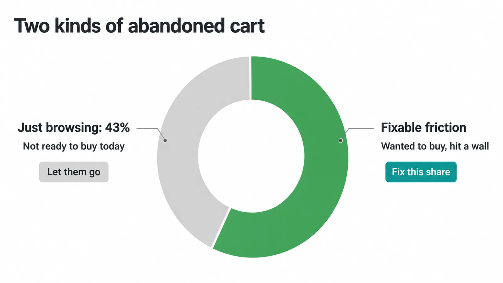
Here is the honest part. Not every abandoned cart is a lost sale you could have saved. Around 43% of people abandon simply because they were browsing, comparing, or not ready to buy yet (Baymard). No checkout tweak wins those back today, and chasing them is a waste of energy.
So split the problem in two. There is the unavoidable share, the window shoppers, and there is the fixable share, the people who wanted to buy but hit a wall. Checkout optimization targets that second group. Get it right and you turn near-misses into orders, using traffic you already have.
2. Why do customers abandon checkout?
People abandon for a small set of very human reasons, and Baymard has measured them. When you set aside the browsers, here is why the ready-to-buy crowd walks away. Read this list once and you will spot your own weak points.
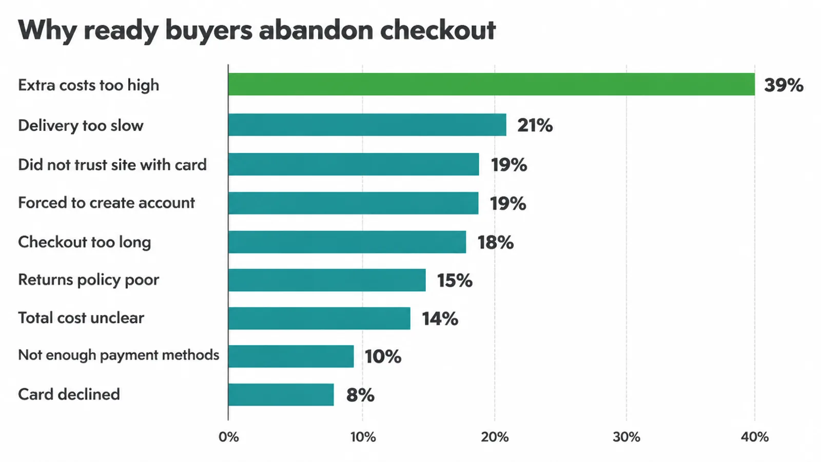
- Extra costs too high, 39%. Shipping, tax or fees appeared late and felt like a sting.
- Delivery was too slow, 21%. The wait did not match what they wanted.
- Did not trust the site with card details, 19%. The page felt unsafe or unfamiliar.
- The site wanted them to create an account, 19%. A forced sign-up before buying.
- Checkout was too long or complicated, 18%. Too many steps and fields.
- Returns policy was not satisfactory, 15%. The risk of buying felt too high.
- Could not see or calculate the total cost up front, 14%. No clear running total.
- Not enough payment methods, 10%. Their preferred way to pay was missing.
- Card was declined, 8%. A payment error with no easy recovery.
All figures above are from Baymard. Notice a pattern. Most of these are about cost surprises, friction and trust, not price. People do not leave because your product costs too much. They leave because the buying felt worse than it needed to. That is good news, because every one of these is fixable.
3. The checkout optimization checklist
This table is the spine of the whole post. Each row is a fix, why it matters, and a quick way to check whether your own checkout passes. Run through it with your phone in hand and buy something from your own store. You will find at least one leak you did not know about.
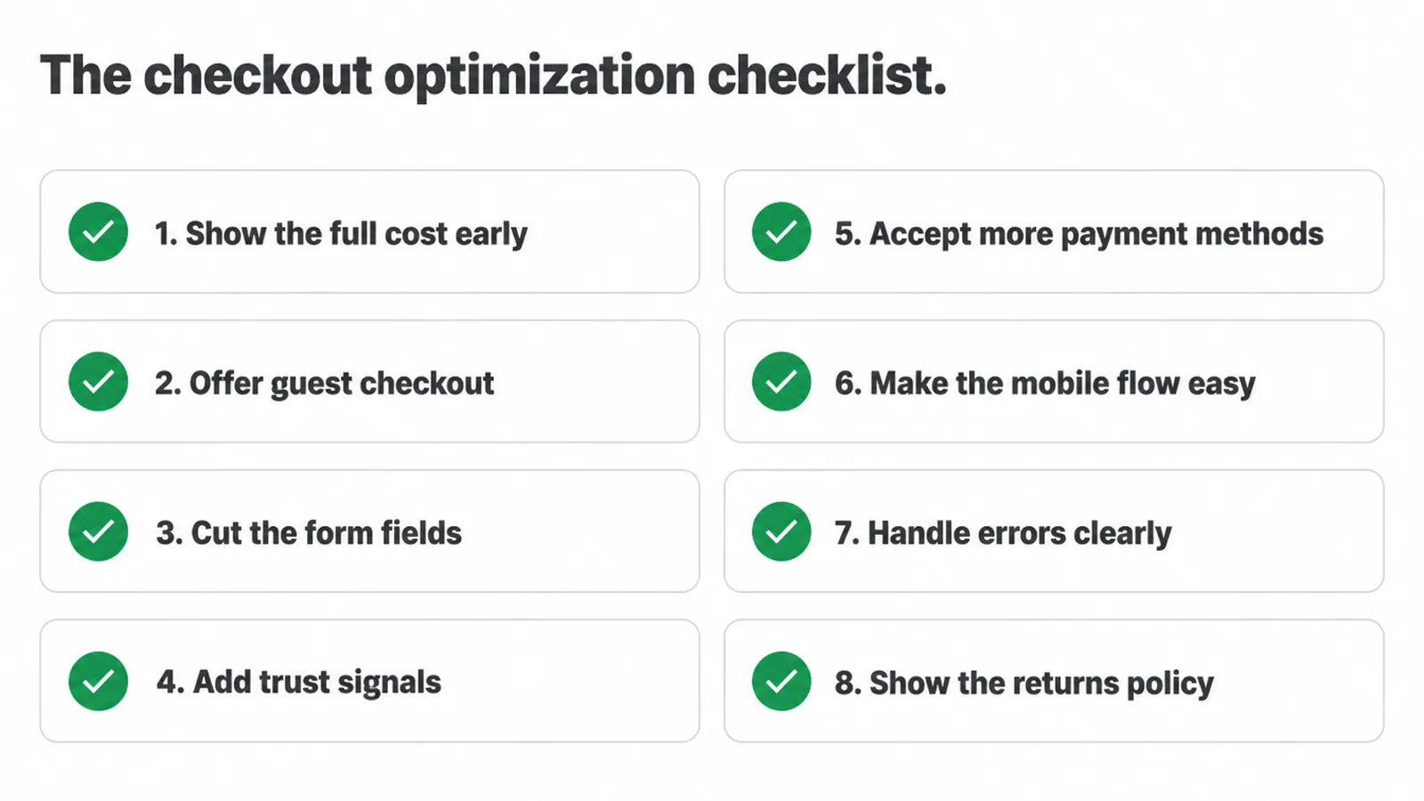
| Fix | Why it matters | Quick check |
|---|---|---|
| Show the full cost early | 40% abandon over surprise extra costs | Is shipping and tax visible before the payment step? |
| Offer guest checkout | 18% abandon over forced account creation | Can a stranger buy without making an account? |
| Cut the form fields | Long checkouts drive 18% away | Count your fields. Can you halve them? |
| Add trust signals | 19% do not trust the site with card details | Are payment logos and security cues on the page? |
| Accept more payment methods | 10% leave when their option is missing | Are major cards plus a wallet or two supported? |
| Make the mobile flow easy | Most shopping happens on phones | Is it one column with big tap targets and autofill? |
| Handle errors clearly | A declined card at 8% often means a lost sale | Do errors keep the data and say what to fix? |
| Show the returns policy | 15% abandon over an unclear returns policy | Is your returns promise easy to find at checkout? |
4. Guest checkout: stop forcing accounts
Forcing people to create an account before they can pay is one of the most common own goals in ecommerce. Nearly one in five shoppers, 18%, abandon their cart when a site demands account creation (Baymard).
Think about it from their side. They just want the product. You are asking them to invent a password and hand over more of themselves before they have even paid. Many will simply close the tab.
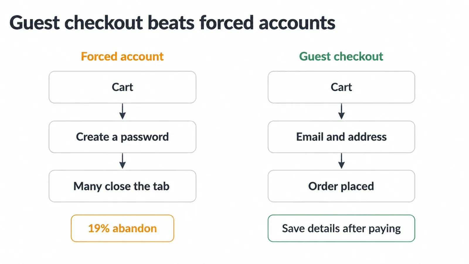
The fix is easy. Offer guest checkout as the default, front and centre. Let people buy with just an email and a delivery address. Then, on the thank-you page after they have paid, invite them to save their details for next time with one click.
Framed that way it feels like a helpful shortcut, not a toll gate. You still capture the account, you just do it after the sale instead of holding the sale hostage for it.
5. Reduce your form fields
Every extra field is a small chance for someone to give up. The average checkout asks for around 11.3 form fields, yet the source puts the number most sites actually need at 8 (Baymard).
A long, complicated checkout is a stated reason 18% of shoppers walk away (Baymard). Length feels like effort, and effort at the finish line is where people quit.
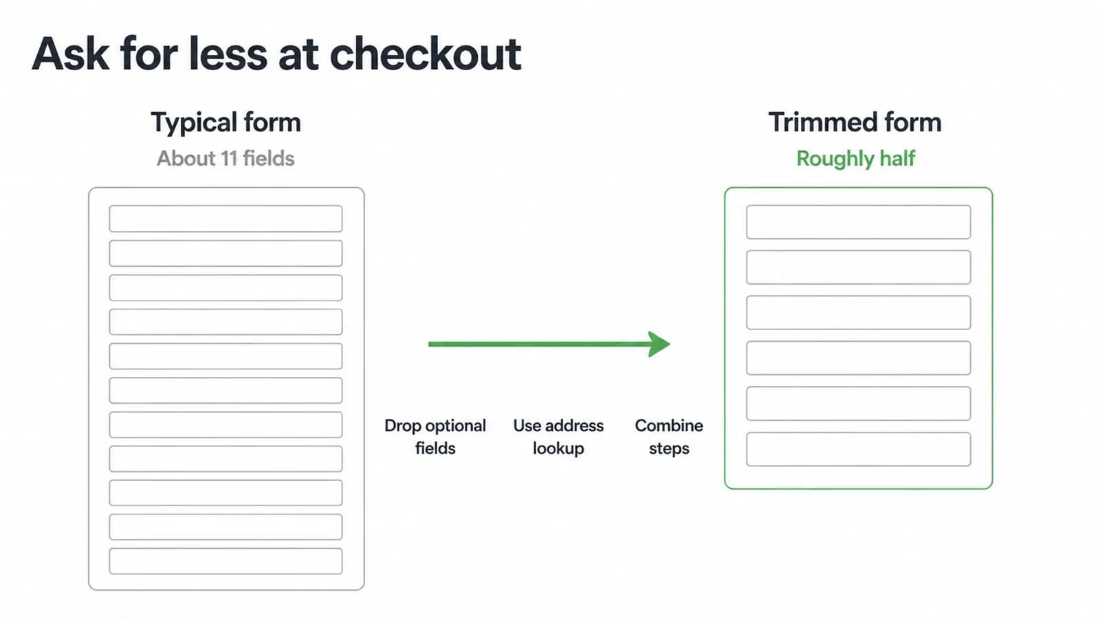
Start by cutting the fat. Do you really need a separate company name, a second address line by default, and a phone number? Make optional things optional, or drop them.
Then work smarter with what is left.
- Use an address lookup so a postcode fills the street for them.
- Set billing to match shipping unless they say otherwise.
- Combine steps where it makes sense, so a name-and-email page and a delivery page become one clean screen.
- A short progress cue helps too, so people can see the end is near.
The goal is not a magic number of fields. It is asking for the least you need, phrased so it feels effortless.
6. Show shipping, tax and fees before the last step
This is the big one. Surprise costs are the single most common reason people abandon a cart. A full 40% leave because extra costs like shipping, tax or fees were too high, and another 12% quit because they could not see or work out the total cost up front (Baymard).
The damage is rarely the amount itself. It is the ambush. Someone builds a total in their head, gets to the last step, and the number jumps. That feels like a trick, so they leave.
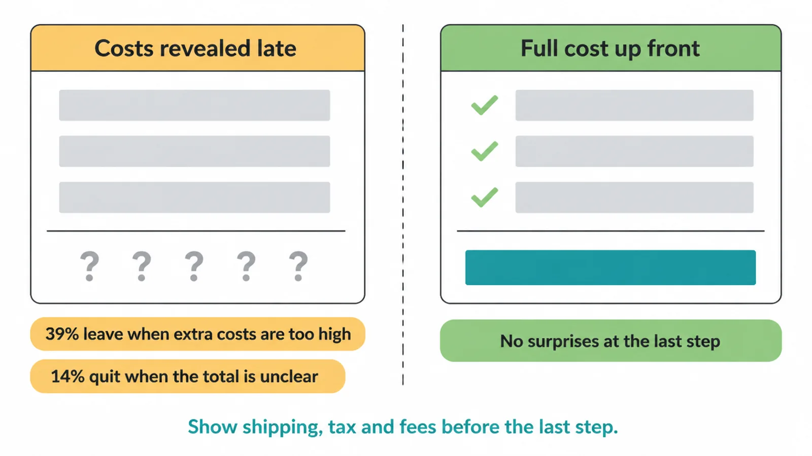
Fix it by being upfront. Show shipping and tax as early as you can, ideally on the product page or the cart, not buried on the final screen. A simple shipping estimator by postcode works well.
If you offer free shipping over a threshold, say so loudly, because it nudges people to add more. Keep a running total visible the whole way through so there are no jumps at the end.
Shipping is a topic all its own, and getting it right lifts the whole checkout, so see our guide to ecommerce shipping for the full playbook.
7. Build trust at the payment step
Handing over card details is the scariest moment of any purchase. Around 19% of shoppers abandon because they did not trust the site enough to enter their card information (Baymard).
This is not about being dishonest. It is about small cues that make an honest store look risky: a cluttered page, no recognisable payment logos, a design that feels a bit off.
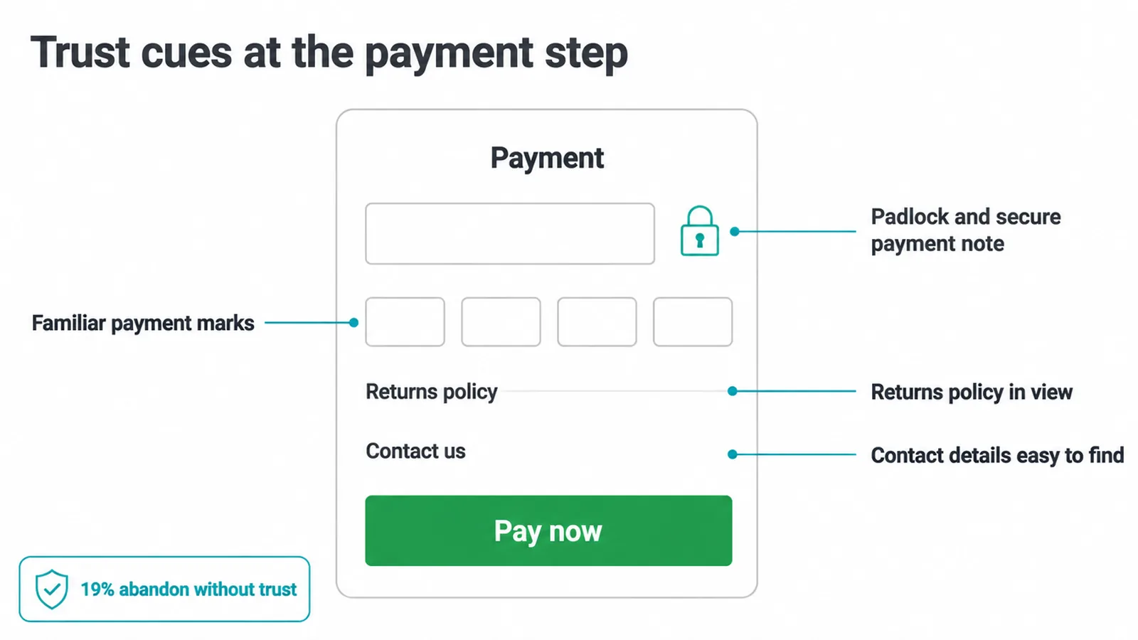
Reassure people with clear, honest signals.
- Show the logos of the cards and wallets you accept, since familiar marks calm nerves fast.
- Add a small security cue near the card field, like a padlock and a short line about secure payment.
- Keep the page clean and professional, because polish reads as safe.
- Make your returns policy and contact details easy to find right there at checkout, so if a worry pops up, the answer is one glance away.
None of this changes your product. It just removes the doubt standing between a ready buyer and the pay button.
8. Offer the right payment methods
If someone reaches the payment step and their preferred way to pay is missing, some of them will simply give up.
Too few payment methods is a listed reason 10% of shoppers abandon their carts (Baymard). It is a quiet leak, because you never see the person who wanted to pay one way and could not.
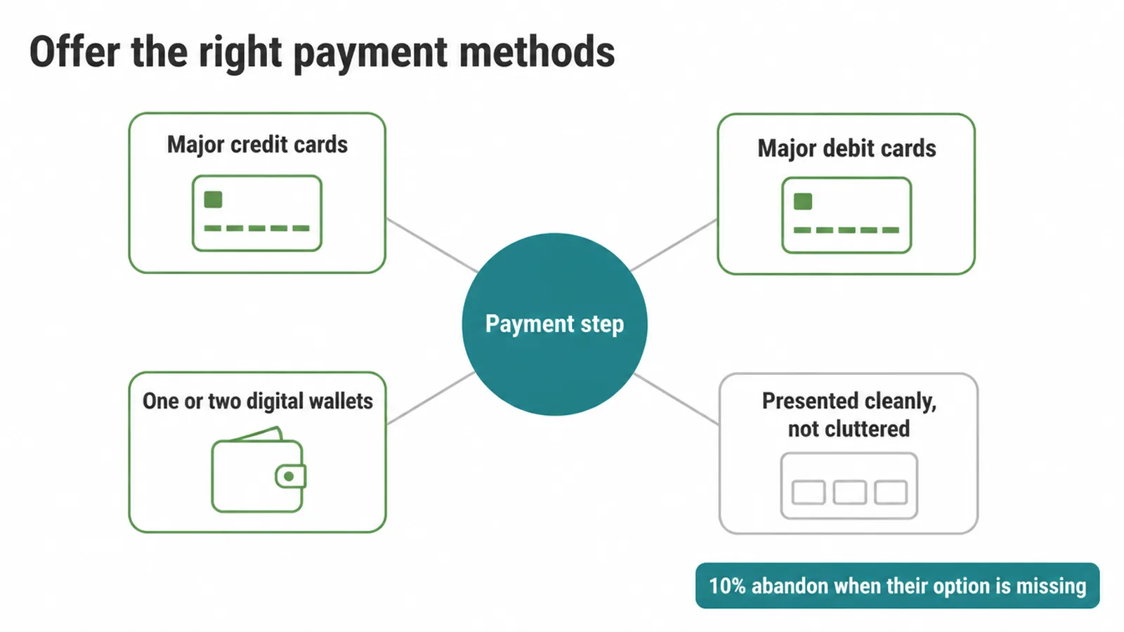
The fix is balance, not everything under the sun. Cover the basics well: the major credit and debit cards, plus one or two digital wallets your customers actually use. Wallets are worth it because they skip the card typing entirely, which is a gift on mobile.
But do not overload the page with a dozen logos either. Too many choices can slow people down and clutter your trust cues.
Look at who your customers are, pick the handful of methods that fit them, and present those cleanly. The aim is that whoever lands on your payment step finds a familiar option waiting.
9. Make mobile checkout effortless
A large and growing share of shopping happens on phones, so a fiddly mobile checkout is a fiddly checkout for most of your customers. Small screens punish every mistake.
A cramped form, tiny buttons, or a layout that fights the thumb will bleed sales you would never lose on desktop. Mobile is where a long checkout and small tap targets do the most harm.
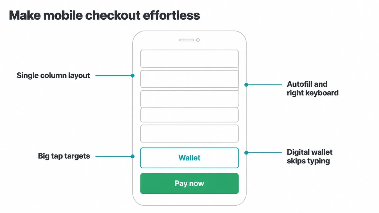
Design the phone flow deliberately.
- Use a single column so people never pinch or scroll sideways.
- Make tap targets big and well spaced so fat fingers do not misfire.
- Turn on autofill and the correct keyboard for each field, so a number pad shows for the card and the email keyboard shows for the email.
- Lean hard on digital wallets here, because a wallet button skips typing a card on a tiny screen and feels almost instant.
Many of the same rules that make a landing page convert on mobile apply to checkout too, so our landing page best practices guide is worth a read alongside this.
10. Handle errors without punishing people
Errors happen. A typo, a wrong card number, a declined payment. Around 10% of shoppers abandon after a card is declined (Baymard), and a clumsy error page turns a fixable slip into a lost sale.
The worst version wipes the whole form and dumps a red message that says nothing useful. People do not re-type everything. They leave.
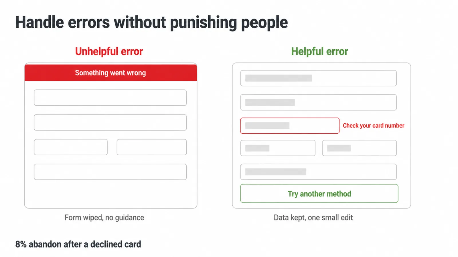
Treat errors as a moment to help, not scold. Validate fields inline as people go, so they see a problem the instant it happens, not after they hit pay. Always keep the data they already entered, so a fix is one small edit, not a fresh start.
Write plain, specific messages that say exactly what to change and how. When a card is declined, say what to try next. Suggest checking the details or trying another method, and keep the order ready to complete. Small kindnesses at the error step recover buyers who were one tap from paying.
11. The payoff of a smoother checkout
Here is why this work pays off better than most marketing. Everyone at your checkout is a buyer you already earned. You spent time and money getting them to add to cart.
Fixing the checkout does not chase new strangers, it rescues the ready buyers you were quietly losing at the finish line. That is often cheaper and faster than buying more traffic, because the people are already there, wallet out.
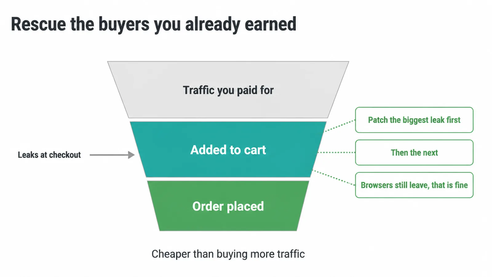
Work down the checklist, patch your biggest leak first, then the next. You cannot win back the browsers, and that is fine. Aim at the fixable share and you turn near-misses into orders month after month.
If your store needs the whole checkout rebuilt properly rather than patched, that is what we design for when we build an online store.
12. What we changed in the Ban Zen Motors and Thamlev checkouts
This is the work we do on client stores. Ban Zen Motors, an automotive parts retailer, had its checkout designed and tested at phone width first, because that is where most of the traffic is.
On Thamlev, an accessories store, the checkout was cut to the fewest steps that still collect what an order needs.
FAQ
1. What is checkout optimization?
It is improving the final steps of buying, from cart to payment, so more people who add to cart actually complete the purchase. It targets the specific reasons shoppers abandon at checkout.
2. Why do customers abandon checkout?
The top reasons are extra costs that appear late, being forced to create an account, a slow or complicated checkout, not trusting the site with card details, and not seeing the full cost early. Many also abandon simply because they were only browsing.
3. Should I offer guest checkout?
Yes. Forcing account creation is a common reason people abandon. Offer guest checkout and invite account creation after the purchase instead.
4. How many form fields should checkout have?
As few as possible. Many checkouts ask for around double what they need, so remove optional fields, use address lookup, and combine steps where you can.
5. How do I build trust at checkout?
Show clear pricing with no surprises, display accepted payment logos and security cues, make your returns and contact details easy to find, and keep the page clean and professional.
6. Does mobile checkout matter?
Very much. A large share of shopping happens on phones, so large tap targets, autofill, digital wallets and a short single-column flow prevent avoidable drop-off.
7. What payment methods should I accept?
At least the major cards and one or two digital wallets your customers use. Too few payment options is a listed reason people abandon carts.
8. How do I reduce cart abandonment?
Show the full cost early, allow guest checkout, cut form fields, add trust signals and more payment methods, and fix errors clearly. You cannot stop browsers, but you can win back the ready-to-buy shoppers.
About the author
Gregory Yeoh is the founder of Seed Light, which builds websites and runs marketing for small businesses. Most checkouts have at least one avoidable leak doing most of the damage, usually a surprise cost or a forced account. We wrote this to help you spot yours without wading through jargon. If you want a hand turning your checklist into a checkout that actually converts, tell us where you are losing sales and we will help you plug the leak.