Ecommerce Conversion Rate Optimization: Find the Leaks

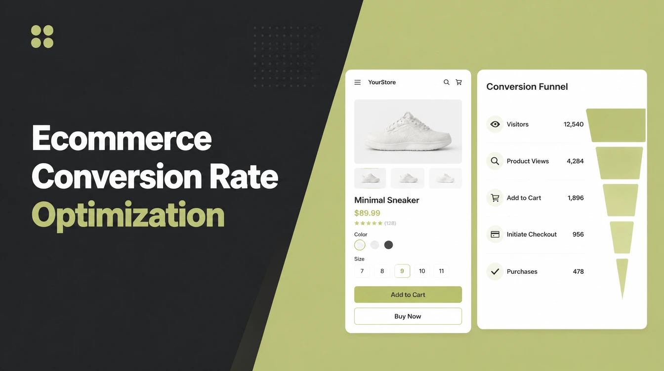
Ecommerce conversion rate optimization means getting more of the visitors you already have to buy. Work in order: product pages, cart and checkout, speed on mobile, search and navigation, then trust signals. Test changes instead of guessing. It is the cheapest growth you own, because the traffic is already paid for. Seed Light does this for stores.
Key takeaways
- Checkout and cost surprises leak the most. Baymard puts the average online cart abandonment rate at 70.22 percent (Baymard), and most reasons are fixable.
- Speed matters, especially on mobile. A 2020 Google and Deloitte study found that a 0.1 second faster mobile store lifted retail conversions by 8.4 percent (Google and Deloitte).
- Your product page does the selling. Images are where 56 percent of desktop users start (Baymard).
- Site search needs attention. Baymard found that many ecommerce search experiences are mediocre or worse (Baymard).
- Fix known friction first, test second. The studies already tell you what breaks trust and slows checkout.
Ecommerce conversion rate optimization means getting more of the visitors you already have to buy. You do not chase more clicks. You take the people who already landed on your store and remove the little roadblocks between them and a paid order.
That is the whole job, and it is the cheapest growth you own, because the traffic is already bought and paid for.
This guide is store-specific. It walks the exact ecommerce buying journey where money leaks: product page, cart, checkout, speed, search, and trust. If you want the broad rules that apply to any website, our companion post on how to increase website conversion rate covers the general side. Here, we stay on the shop floor.
1. What ecommerce conversion rate optimization actually means
Picture your store as a funnel. Visitors pour in at the top. Orders trickle out at the bottom. Between the two, every step quietly loses some people. A slow product page loses a few.
A cart that hides shipping loses more. A long checkout form loses the rest. CRO is just plugging those leaks so more of the same visitors make it all the way through.
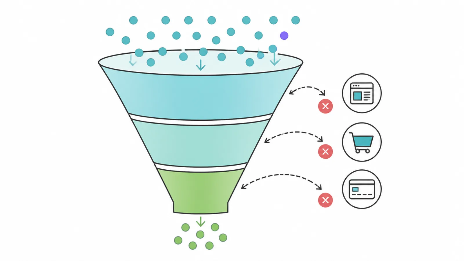
Here is why it beats buying more ads. If you double your traffic but your funnel still leaks the same way, you pay twice as much to lose the same share of people. Fix the funnel and every visitor, paid or free, is worth more.
Small gains stack up too. A little more from the product page, a little more from the cart, a little more from checkout, and the compound effect is real.
For the broader principles behind all of this, see our guide to how to increase website conversion rate. The rest of this post gets specific to selling products.
2. Start with your product pages
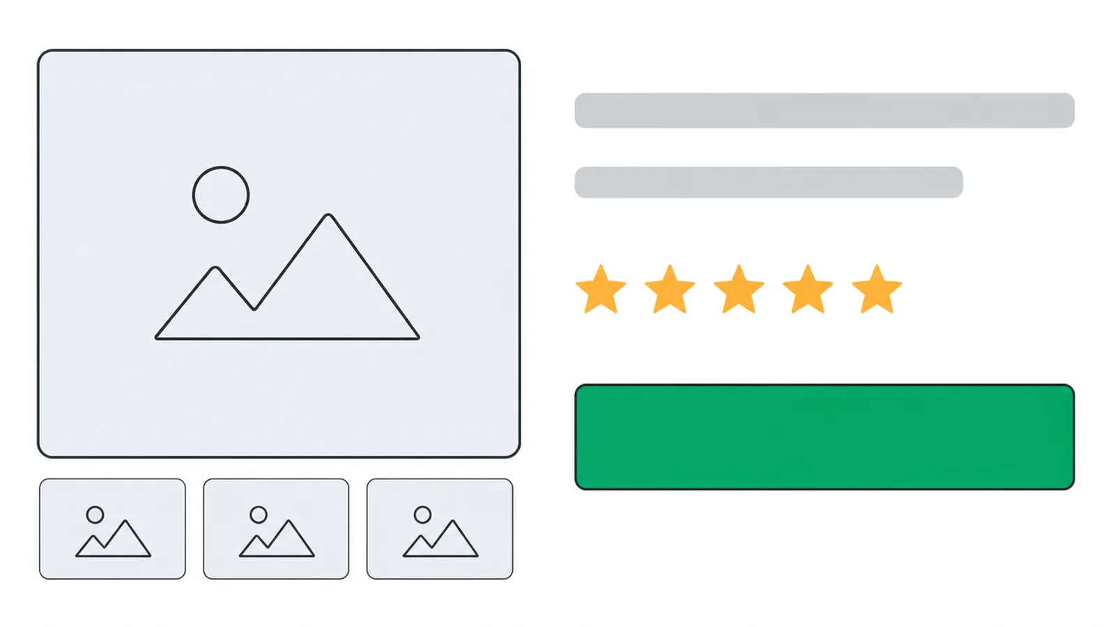
The product page is where the decision happens, and images do the heavy lifting. On a product page, images are the first thing 56 percent of desktop users go to (Baymard). People want to see the thing before they trust you with their money.
Yet most stores get this wrong. Only 18 percent of ecommerce sites have an acceptable or good product page experience, which means 82 percent have serious issues, and the average site carries 24 structural usability problems on that one page (Baymard).
Make the page earn its keep
- Show several angles, let people zoom in, add scale so they know the real size, and use a short video where it helps.
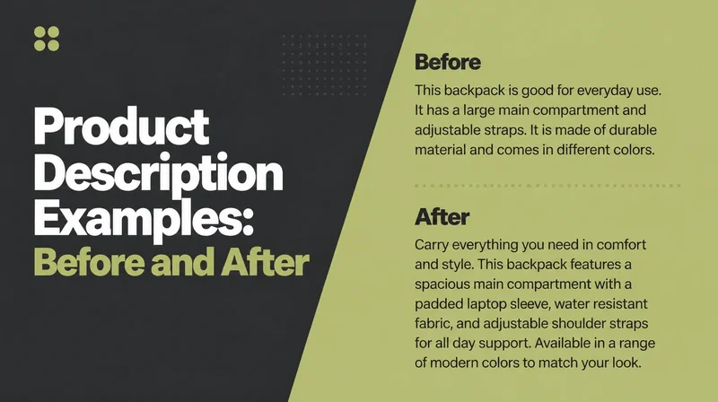
- Write product descriptions that lead with the benefit, not a wall of specs.
- Put reviews on the page, because they build trust and add content that helps the page get found.
- Keep one primary call to action, the buy button, and make it obvious.
- Be clear about stock and delivery so nobody has to guess.
If you also want these pages pulling in search traffic, our guide to product page SEO shows how to get them found in the first place.
3. Fix the cart and checkout (where the money leaks)
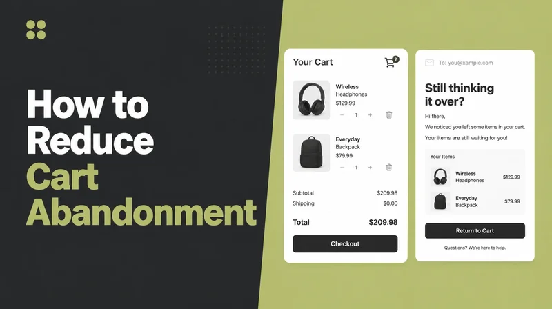
This is the big one. The average documented cart abandonment rate across 50 studies is 70.22 percent (Baymard). Seven in ten carts get filled and then left. The good news is that the reasons are known and fixable.
Setting aside people who are just browsing, the top reasons shoppers bail are:
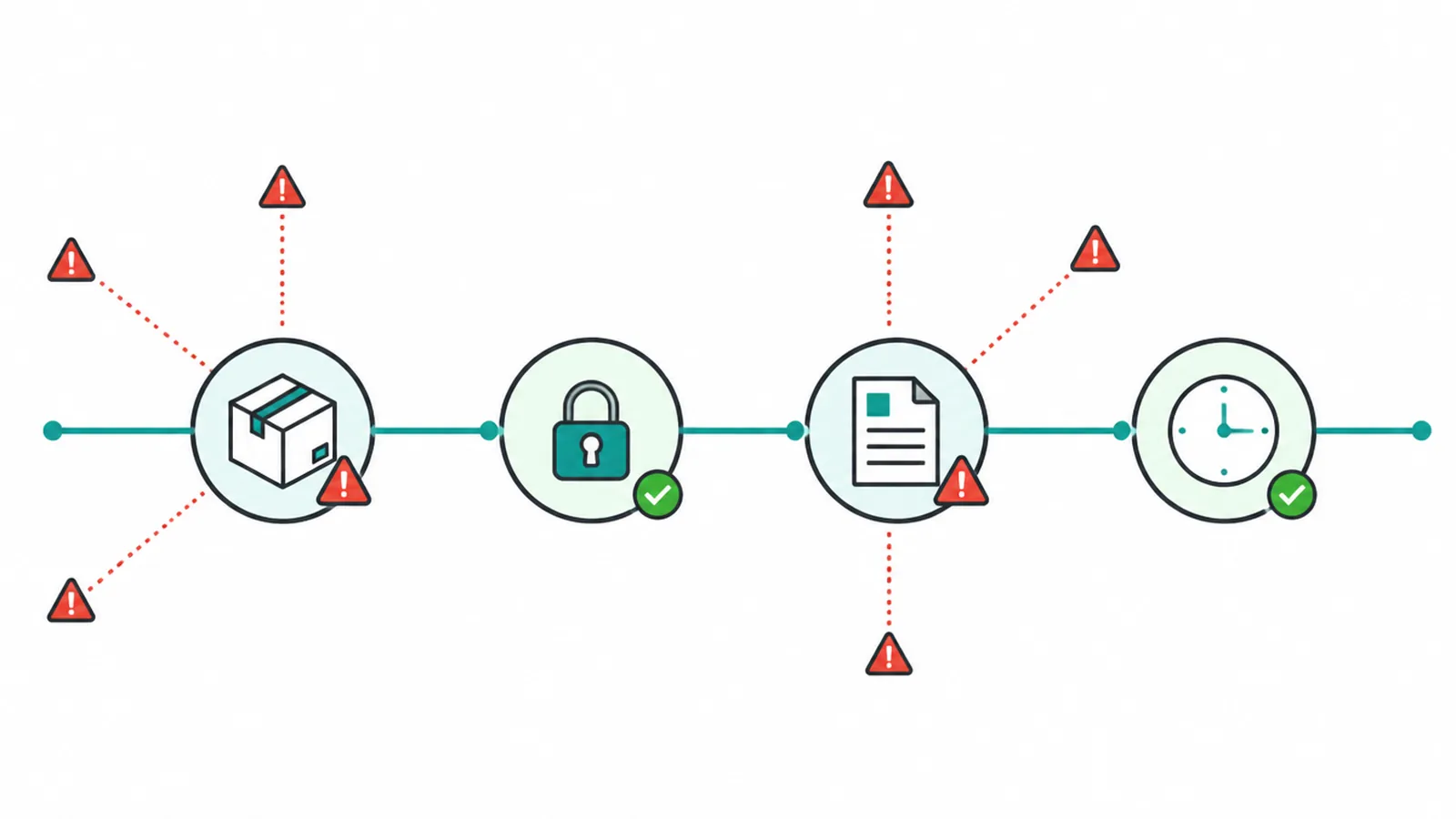
- 40 percent because extra costs like shipping, tax and fees were too high
- 20 percent because delivery was too slow
- 19 percent because they did not trust the site with their card
- 18 percent because they were forced to make an account
- 17 percent because checkout was too long or complicated (Baymard)
Show costs early and cut the form down
Read that list again and the fixes write themselves. Show all costs early, right in the cart, so nobody gets a nasty surprise at the last step. Offer guest checkout so people are not forced to sign up.
Cut the form down. Baymard's 2024 benchmark found that the average checkout has 11.3 fields, while about 8 are needed (Baymard).
Add clear trust cues at the payment step to calm the card worry, and offer express and wallet payment so paying is one tap. This is worth real money: the average large site can gain a 35.26 percent lift in conversions through better checkout design alone (Baymard).
For the step-by-step on the payment flow, see our checkout optimization guide, and for the wider journey plus recovery, read how to reduce cart abandonment.
4. Make it fast, especially on mobile
Speed is not a nice-to-have. It sells. A 2020 Google and Deloitte study across 37 brands found that a 0.1 second improvement in mobile site speed raised retail conversions by 8.4 percent and lifted average order value by 9.2 percent (Google and Deloitte). That is a tenth of a second doing real work.
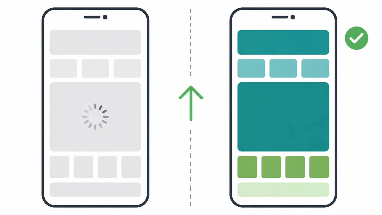
Mobile needs its own checks. People shop on their phones on the bus, in a queue and while distracted, so test the whole buying journey on a real phone.
So compress your images to WebP, lazy-load anything below the fold, and trim the apps and scripts loading in the background. Make buttons big and thumb friendly.
Offer express pay so a phone buyer does not have to type an address. And remember that for ad traffic the product page speed matters more than the homepage, because that is where paid visitors land.
5. Help people find products: search and navigation
If a shopper cannot find the product, they cannot buy it. Someone using your search box is telling you what they want, so the search experience deserves proper attention.
Yet most stores let them down: 46 percent of desktop, 58 percent of mobile and 64 percent of app ecommerce sites have mediocre or worse search (Baymard).
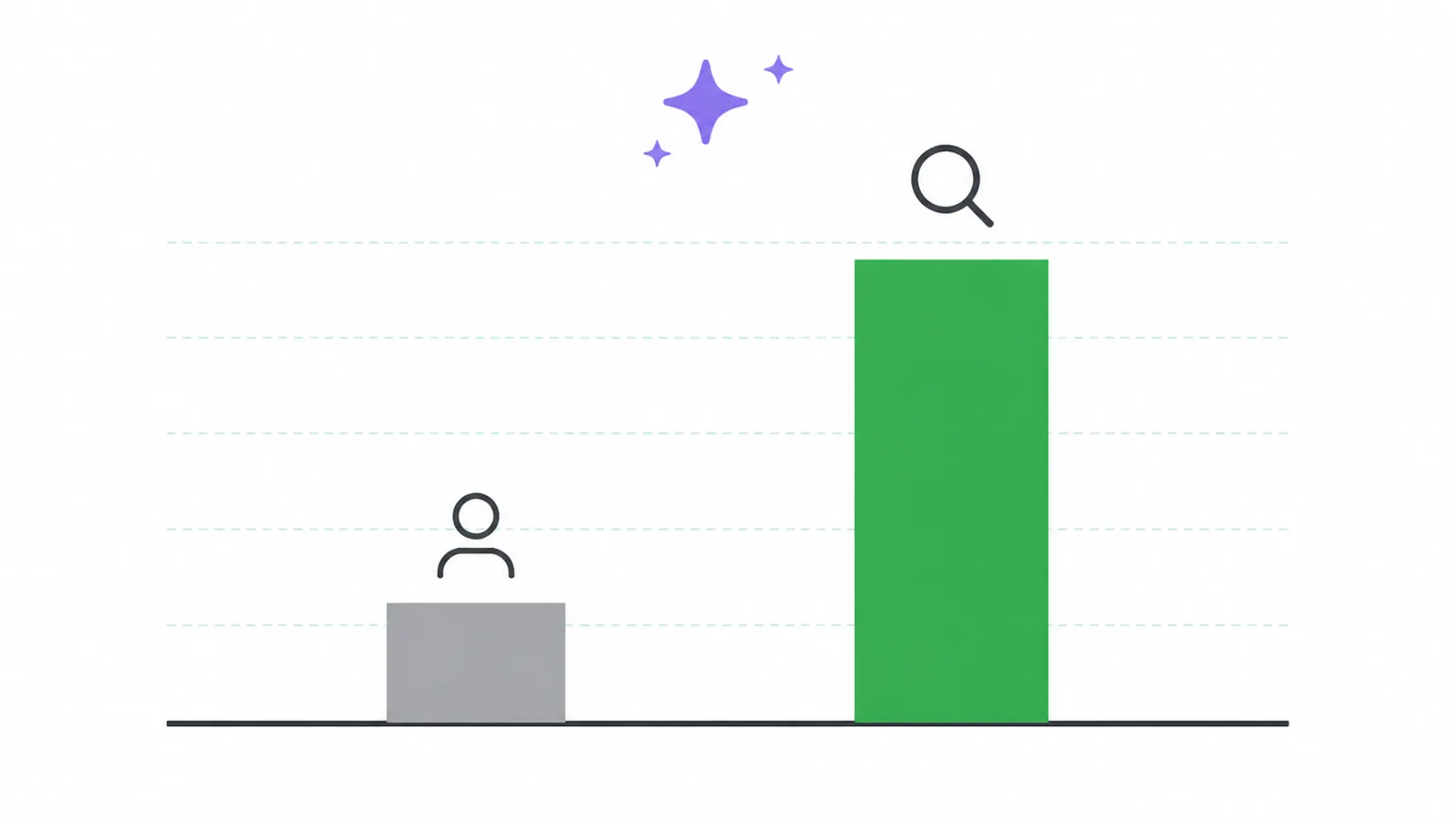
So give search the attention it earns. Put a prominent search box near the top of every page. Handle typos and synonyms, so a misspelled word or a different name for the same thing still returns the right products.
Add useful filters for size, colour, price and whatever else matters in your category. Keep categories clear and shallow so people can browse without getting lost. And when someone runs a search, keep their query in the box so they can tweak it instead of starting over.
6. Build trust so strangers feel safe buying
A stranger is about to hand over card details to a shop they may have met five minutes ago. Your job is to make that feel safe.
It shows up in the abandonment data: 19 percent walk because they do not trust the site with their card, and 13 percent because the returns policy put them off (Baymard). Trust is not fluff. It is money.
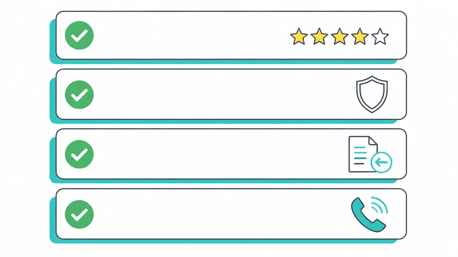
Small signals do a lot here. Show real reviews and ratings on product pages. Make your returns and shipping policy easy to find and easy to read, so nobody is scared of getting stuck.
Put security cues at the payment step, so the card worry eases right where it counts. List real contact details, a phone or email, so you look like a real business. A proper About page helps too. None of this is expensive, and together it turns a nervous browser into a confident buyer.
7. Test changes instead of guessing
Here is the order that works. Fix the known friction first. You do not need to test whether hidden shipping costs or forced accounts hurt you, because the studies above already answered that.
Ship those fixes, then measure. Only after the obvious wins are in should you reach for testing, and then use it for the calls you are genuinely unsure about, like a new headline, a different button colour, or a reworked page layout.
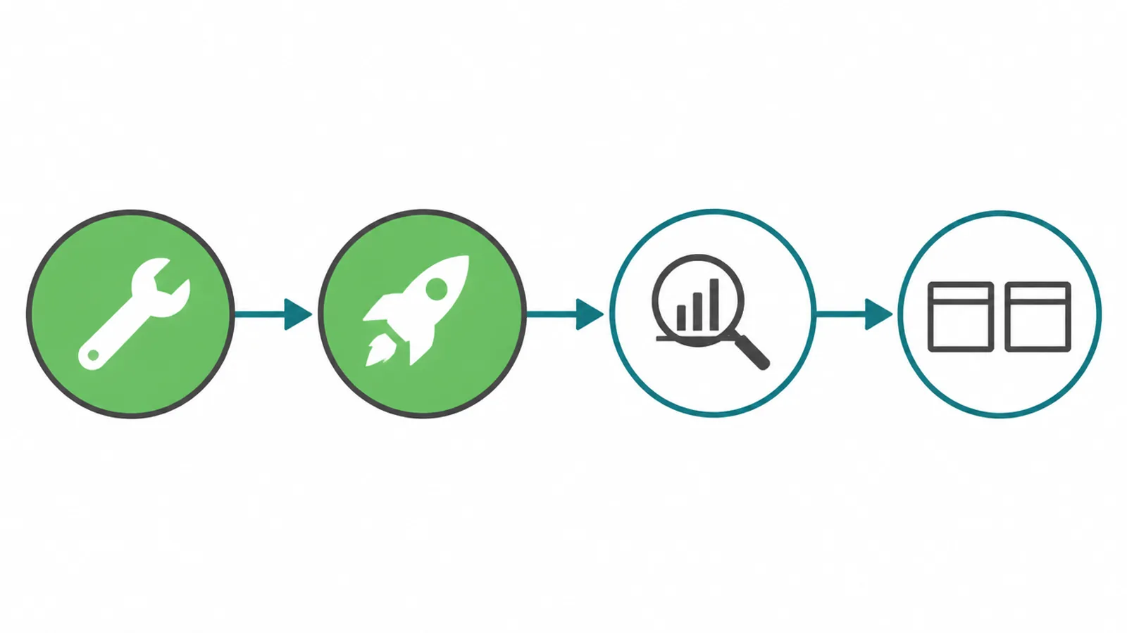
When you do test, keep it clean. Change one thing at a time, so you know what caused the result. Wait for enough people to see both versions before you believe the numbers, because a small sample lies.
And keep a simple log of what you changed and what happened, so you build a record instead of running in circles. You do not need fancy tools to begin. Fix the friction, then test the doubts.
8. An ecommerce CRO checklist
Here is the whole guide on one page. Work down it in order, top of the funnel to bottom, and fix the step that leaks the most for your store first.
Each row is a place money slips out and the reason it is worth your time. Print it, tick it off, and come back to it next month to see what moved.
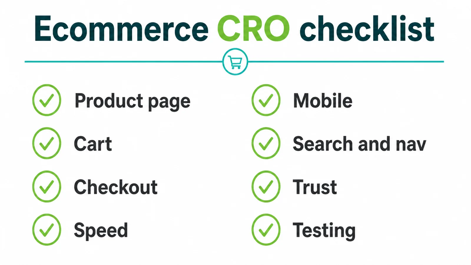
| Funnel step | What to fix | Why it matters |
|---|---|---|
| Product page | Multiple clear images, benefit-led copy, reviews, one primary CTA | Images are where 56 percent of users start (Baymard); most sites have weak product pages |
| Cart | Show shipping, tax and fees before checkout; save the cart | Extra costs are the number one abandonment reason at 40 percent (Baymard) |
| Checkout | Guest checkout, short form, trust cues, wallet pay | Forced accounts (18 percent) and long forms (17 percent) drive abandonment; better checkout can lift conversions 35.26 percent (Baymard) |
| Speed | WebP images, fewer scripts, fast product pages | 0.1 second faster mobile lifted conversions 8.4 percent (Google and Deloitte) |
| Mobile | Big buttons, express pay, short forms | Check your own mobile journey for friction |
| Search and nav | Prominent search, typo tolerance, synonyms, filters | Many search experiences are mediocre or worse (Baymard) |
| Trust | Reviews, clear returns and shipping, security cues | Distrust (19 percent) and poor returns policy (13 percent) cost orders (Baymard) |
| Testing | Fix known friction first, then A/B test | Guessing wastes the traffic you already paid for |
9. When to get help
Some leaks you can patch yourself in an afternoon. Others are structural, baked into a slow theme, a clunky checkout flow, or a store that was never built to sell in the first place.
When the problem is the foundation, it is worth getting a store built to convert from the ground up. If that sounds like you, take a look at our ecommerce website design work, or just tell us where you are losing sales and we will help you find the leak.
10. What the Thamlev and Ban Zen Motors work shows
On Thamlev, we used strong imagery, clear specifications and focused product pages to help shoppers understand and compare each scooter.
Ban Zen Motors is a motorcycle dealer. We organised its range with clear categories, search, filters and useful model information so buyers can browse, check details, then buy, enquire or visit a branch.
Frequently asked questions
1. What is ecommerce conversion rate optimization?
It is the work of getting more of the visitors your store already has to buy, instead of paying for more traffic. You do it by removing friction step by step, from the product page through the cart and checkout, so more people finish their order.
2. What is a good ecommerce conversion rate?
There is no single magic number, and it varies a lot by product type and traffic source. A more useful goal is to beat your own past rate month on month. Track it, change one thing at a time, and watch the trend rather than chasing a benchmark.
3. Why do people add to cart but not buy?
The biggest reasons are surprise costs at checkout, a checkout that feels too long, being forced to create an account, and not trusting the site with card details. Baymard puts the average cart abandonment rate at 70.22 percent, and most of those reasons are fixable.
4. What has the biggest impact on ecommerce conversions?
For most stores it is the checkout and the cost surprises around it. Baymard found the average large site can lift conversions by about 35 percent through better checkout design alone. Show all costs early, allow guest checkout, and cut the form down.
5. Does site speed really affect ecommerce sales?
Yes, a lot, especially on mobile. A 2020 Google and Deloitte study found that improving mobile site speed by just 0.1 seconds raised retail conversions by 8.4 percent and average order value by 9.2 percent.
6. How do I improve conversions on mobile?
Treat mobile as a main screen, then check your own analytics to see how your customers shop. Make buttons big and thumb friendly, speed the pages up, offer express and wallet payment, and keep the checkout form as short as you can.
7. How is store CRO different from general website CRO?
General CRO is about any site turning visitors into leads or contacts. Store CRO follows the buying journey where money actually leaks, product page, cart, checkout, trust, and payment, so the fixes are specific to selling products online.
8. Do I need A/B testing tools to improve conversions?
Not to start. Fix the obvious friction first, since studies already show what breaks trust and slows checkout. Once the easy wins are in, use testing to settle changes you are unsure about, and only trust a result once enough people have seen both versions.