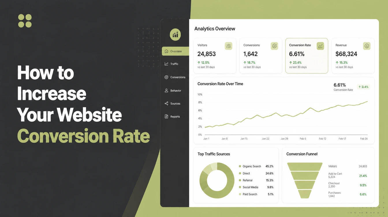
How to Increase Your Website Conversion Rate

Raise your conversion rate by fixing leaks before buying more traffic. Find the page with the most visitors and the biggest drop-off, give it one clear action, speed it up, cut form fields, then test one change at a time. Seed Light works pages in that order for small business clients.
Key takeaways
- Fix the leaks before you buy more traffic. Find the page with the most visitors and the biggest drop-off, and start there.
- One clear action per page. Every page should ask for one thing, with a button that says exactly what happens next.
- Speed and mobile are not optional. Mobile was 49.36% of worldwide web traffic (StatCounter, August 2026), about half, so a slow or broken phone experience loses real customers.
- Shorter forms convert better. The average online checkout uses 11.3 form fields when about 8 would do (Baymard, 2024). Every extra field costs you.
- Prove it with a test. Change one thing at a time and compare, so you know what actually helped.
1. What conversion rate really means
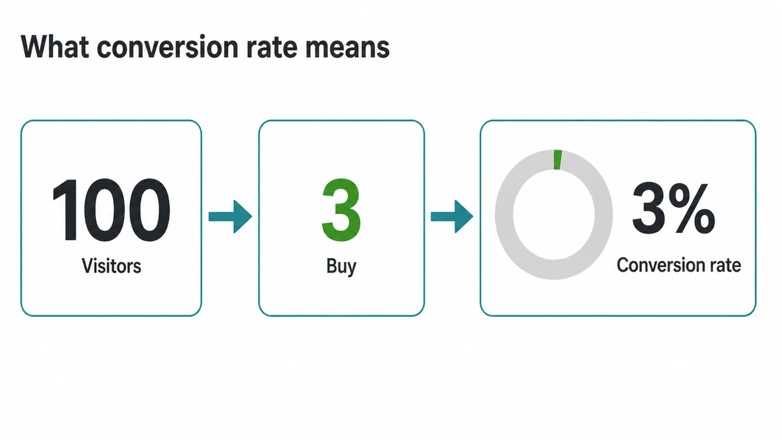
Your conversion rate is the share of visitors who do the thing you want. If 100 people visit and 3 buy, that is a 3% conversion rate. Knowing how to increase your website conversion rate starts with being clear about which action counts.
Not every page has the same job. Some conversions are big, like a sale or a booking. Some are small steps toward it, like joining your email list or starting a chat.
Both matter. A blog post might just aim to get you to read the next thing. A pricing page aims for a signup. When each page has a clear job, you can measure it.
If you run a single campaign landing page, the rules are a bit different. Read landing page best practices for that one page. And if you want the bigger picture of how strangers turn into buyers over time, our guide to the marketing funnel stages shows where each page sits in the journey.
2. Step 1: Find the leak before you fix anything
Do not guess. Look at your data first. Most sites have one or two pages where people arrive and then quietly leave. Fix those, and you get the biggest win for the least effort. Optimising a page nobody visits is wasted work.
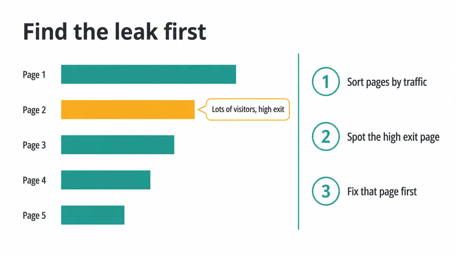
Open your analytics and sort pages by traffic. Find the page with lots of visitors and a high exit or bounce rate. That is your leak.
If you have not set up proper tracking yet, do that now. Our step-by-step on how to set up Google Analytics 4 shows you how to see which pages people land on and where they drop off.
Once you know your worst page, you can watch it improve after each change. Without a baseline, you are just decorating.
3. Step 2: Give each page one clear action
When a page asks for five things, people do none of them. Pick the single most important action for each page and make it obvious. That is one of the fastest ways to lift conversions.
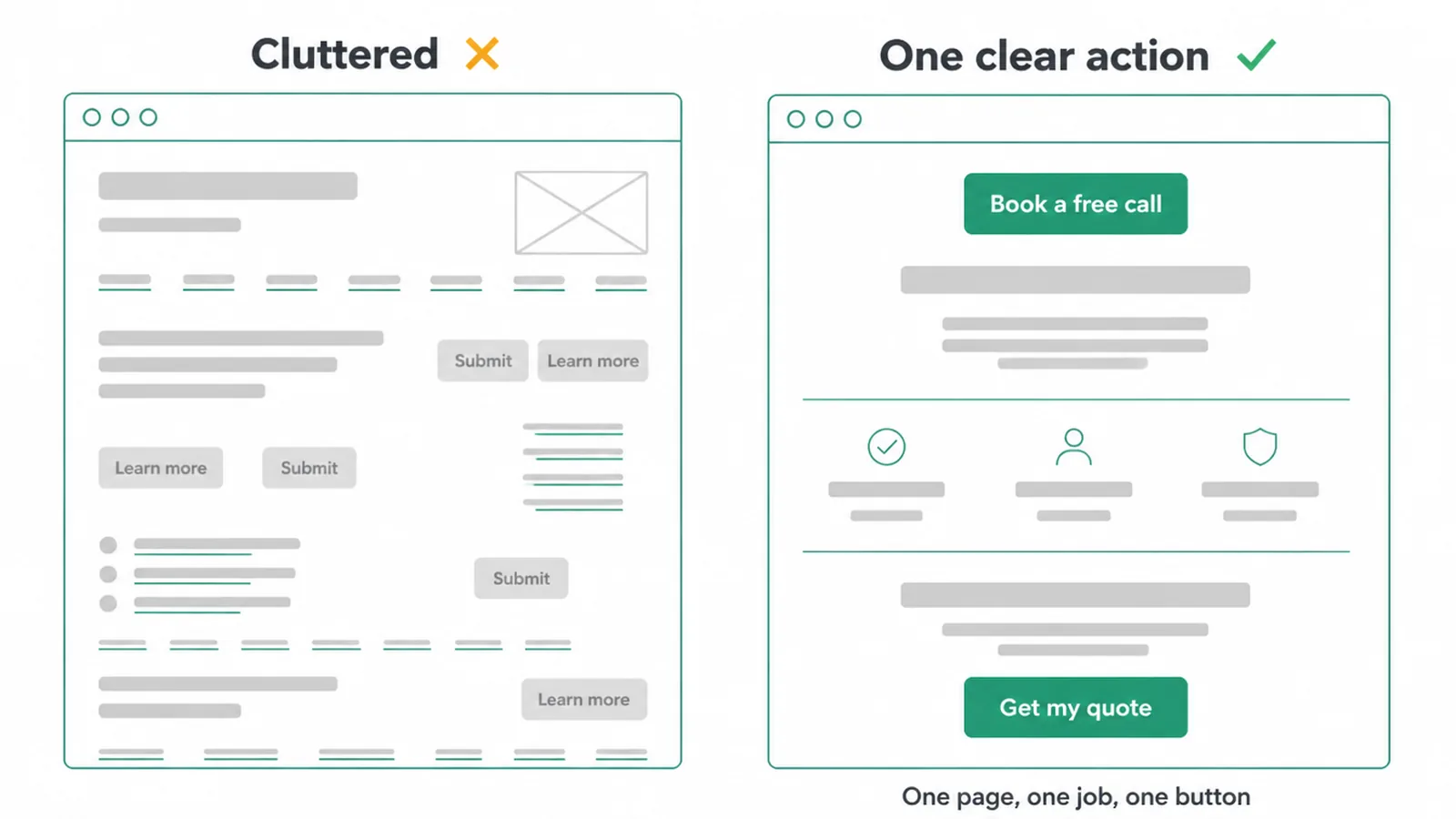
Cut the clutter. Remove links, buttons and offers that pull attention away from the main action. Then make your button specific. "Book a free call" beats "Submit". "Get my quote" beats "Learn more". Tell people exactly what happens when they click.
Put that one action high on the page, and repeat it further down for people who scroll. One page, one job, one clear button.
4. Step 3: Fix speed and mobile
A slow page loses people before they even see your offer. Speed and mobile are not extras, they are the floor. Mobile was 49.36% of worldwide web traffic (StatCounter, August 2026), about half, so a hard-to-use phone experience affects a large share of potential customers.
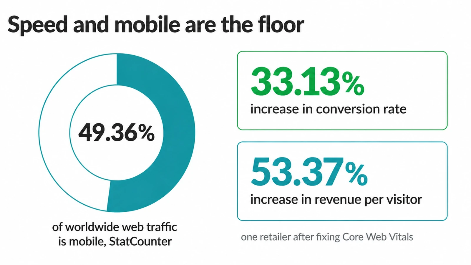
Speed matters too. When Rakuten 24 fixed its Core Web Vitals, that test recorded a 33.13% increase in conversion rate and a 53.37% increase in revenue per visitor (web.dev, 2022).
That is their result on their site, not a promise for yours, but it shows the direction: faster pages hold attention. Google has collected more speed case studies that point the same way.
Test your site on a real phone. Fix slow images, tiny tap targets and text you have to pinch to read. Our guide on how to make a website mobile friendly covers the checklist. If the site is old and fighting you, a proper web design rebuild is often faster than patching.
5. Step 4: Shorten your forms
Every field you add is another reason to quit. The average online checkout uses 11.3 form fields when most need about 8 (Baymard, 2024). The same idea applies to a contact form: name, email and one message box is often all you need.
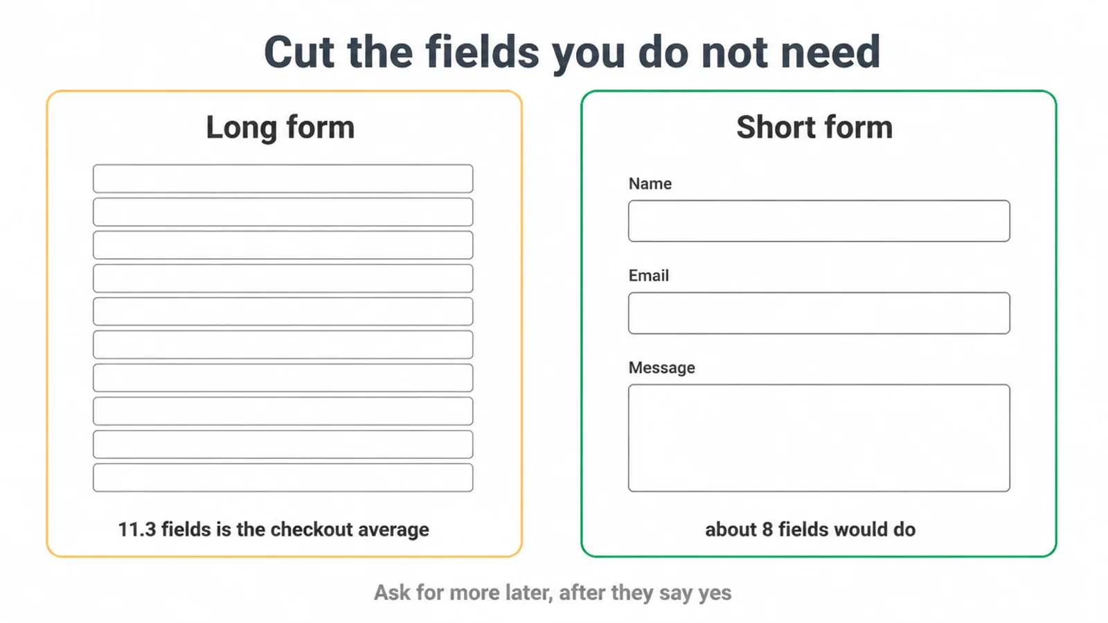
Ask yourself, do you truly need this field to make the sale or the call? If not, cut it. You can always ask for more later, once someone has said yes. Phone numbers, company names and "how did you hear about us" fields quietly cost you customers.
For online stores, the drop-off is real. Baymard's rolling research puts the documented average cart-abandonment rate at 70.22%. A shorter, clearer checkout is one of the few things you fully control.
6. Step 5: Add proof and trust
People hesitate when they are not sure they can trust you. Proof lowers that fear, so more people say yes. This costs you nothing but a bit of effort.
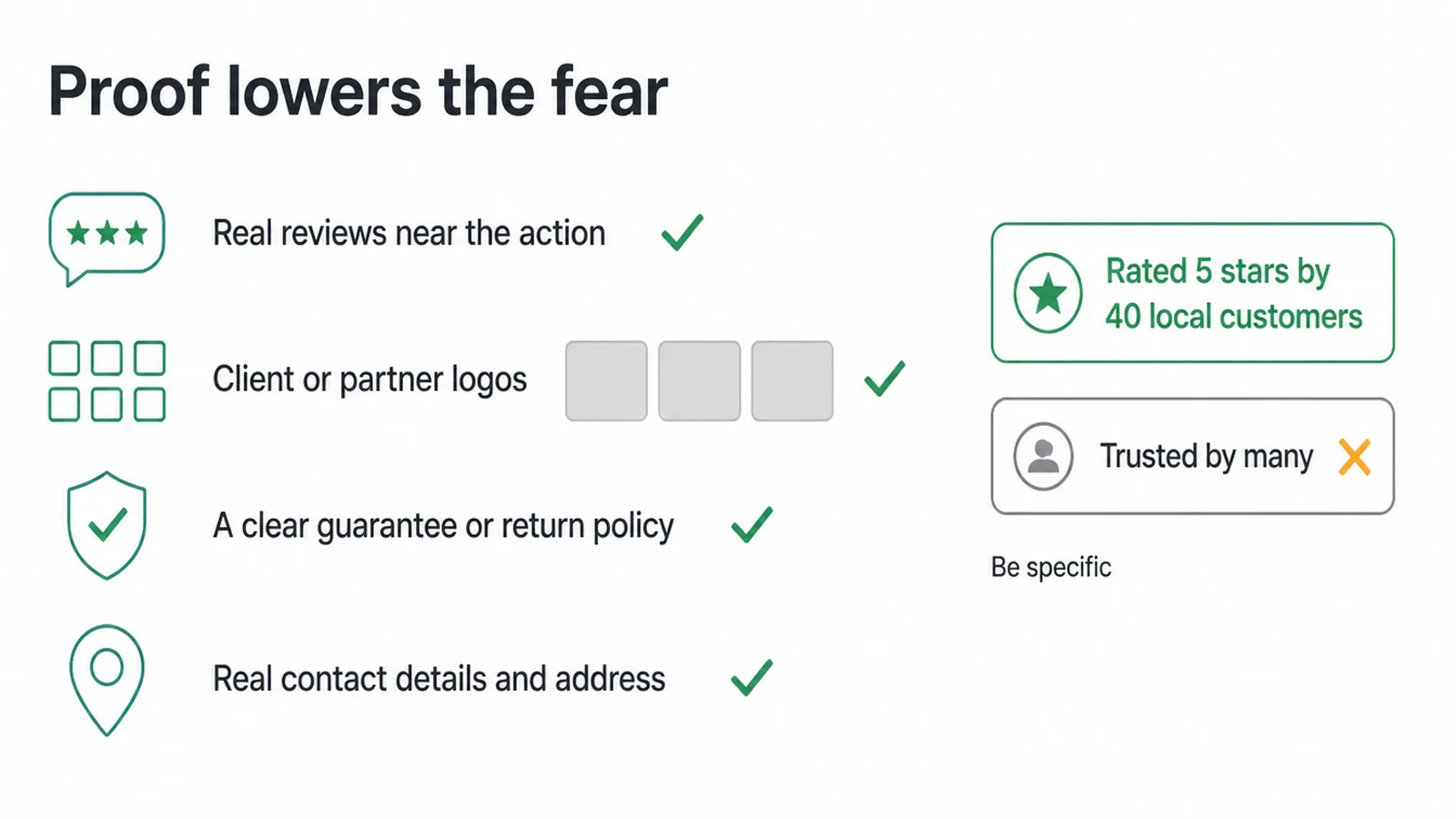
Show real reviews and testimonials near the action, not buried on a separate page. Add logos of clients or partners if you have them. Display a clear guarantee or return policy so the risk feels small. Put your real contact details, address and a photo of the team where people can see them.
Be specific. "Rated 5 stars by 40 local customers" beats "trusted by many". Numbers and named proof feel true. Vague claims feel like filler.
7. The common leaks and how to fix them
Most conversion problems fall into a short list. Here is how to spot each one and what to do about it.
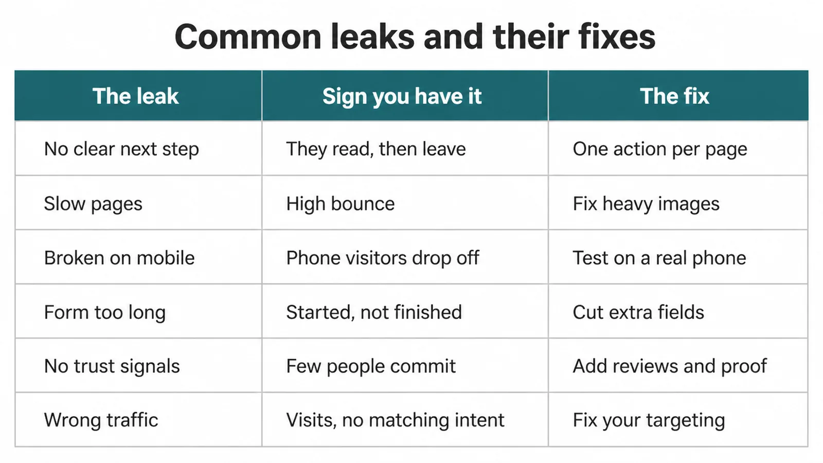
| The leak | Sign you have it | The fix |
|---|---|---|
| No clear next step | Visitors read, then leave without acting | Pick one action per page and make the button specific |
| Slow pages | High bounce, people leave before the page loads | Fix heavy images, test Core Web Vitals, simplify the page |
| Broken on mobile | Phone visitors drop off far more than desktop | Test on a real phone, fix tap targets, text and layout |
| Form too long | People start the form but do not finish | Cut fields to only what you need to make the sale or call |
| No trust signals | Traffic is fine but few people commit | Add reviews, guarantees, real contact details near the action |
| Wrong traffic | Lots of visits, almost no matching intent | Fix your targeting and messaging so the right people arrive |
8. Step 6: Test so you know what worked
Do not trust a hunch. Prove your change helped. The only way to learn is to change one thing at a time and compare the result.
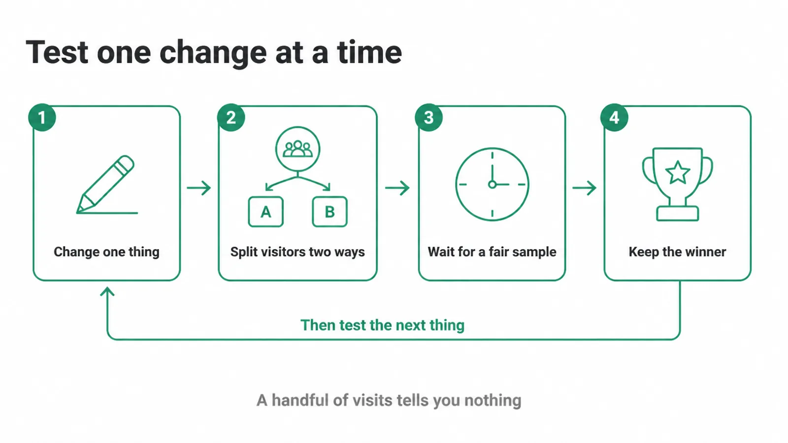
Change one variable, like a headline or a button, then compare before and after. If you have enough traffic, run an A/B test that splits visitors between the two versions at the same time. Either way, give it long enough to reach a fair sample. A handful of visits tells you nothing.
Keep the winner, then move to the next test. Small, proven wins stack up. Guessing and rebuilding everything at once teaches you nothing, because you cannot tell which change did the work.
9. When to do it yourself and when to get help
Many of these fixes are DIY. You can shorten a form, sharpen a button, add reviews and test a headline this week. Start there and measure each change.
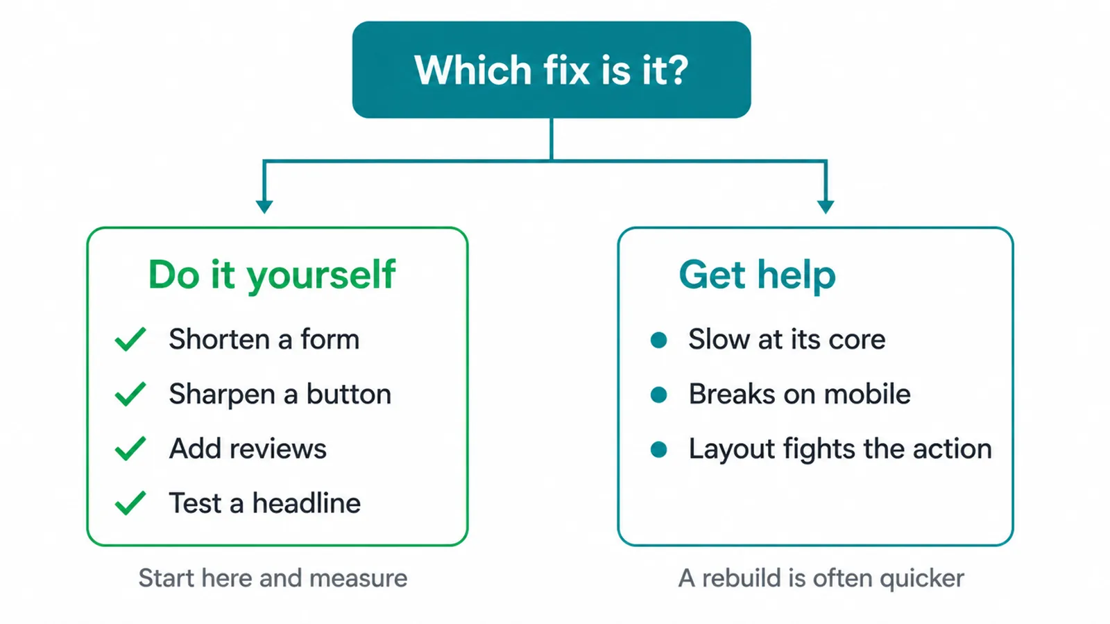
Some jobs are bigger. If your site is slow at its core, breaks on mobile, or the whole layout fights against a clear action, patching gets tiring fast. A proper rebuild or a full conversion pass can be quicker and cleaner.
That is where a fresh web design approach pays off. And if you want the wider view of how these pieces fit your marketing, our guide to digital marketing for small business ties it together.
Want a second set of eyes on your worst-performing page? Get in touch and we will take a look. No pressure, just a clear next step.
Frequently asked questions
1. What is a good website conversion rate?
There is no single good number, because it depends on your industry, traffic source and what counts as a conversion. Instead of chasing an average, measure your own rate now and aim to beat it. Set up tracking so you know your real baseline before you change anything.
2. How do I increase my conversion rate?
Find where people drop off, give each page one clear action, cut friction like speed, mobile and long forms, add proof, then test one change at a time and keep what wins.
3. Why is my website not converting?
Usually one of these: an unclear next step, slow or broken-on-mobile pages, no trust signals, a form that asks for too much, or the wrong traffic. Check the drop-off page first before rebuilding anything.
4. Does site speed affect conversions?
Yes. Faster pages hold attention and reduce drop-off. Google's own case studies show real gains when speed was improved, and Rakuten 24 saw a 33% conversion-rate lift after fixing Core Web Vitals.
5. How many form fields should I use?
As few as you truly need. The average checkout uses 11.3 fields when about 8 would do, and for a contact form a name, email and one message field is often enough. Every extra field costs you conversions.
6. How do I know what to fix first?
Look at your analytics for the page with the most traffic and the biggest drop-off, and fix that. Do not optimise a page nobody visits.
7. How do I test changes?
Change one thing at a time, compare before and after, or run an A/B test if you have enough traffic, and give it long enough to reach a fair sample. One change at a time is how you learn what actually worked.
8. How long until I see results?
The time needed to see a conversion-rate change depends on your traffic. A page needs enough visits and completed actions to separate a real change from random noise. Keep the test running until the evidence is strong enough to support a decision.