Landing Page Best Practices: What to Review

A landing page works when it asks for one action. Match the headline to the ad that sent the visitor, repeat one call to action, cut every competing link, write at a plain reading level, and load the main content in under 2.5 seconds. Seed Light builds pages around a single goal.
Key takeaways
- One goal, one CTA. A landing page asks for a single action. Repeat the same button, but never split attention with competing offers.
- There is no universal "good" rate. The median page converts at 6.6%, but real pages range from about 3.8% to 12.3% by industry, so build well instead of chasing a number.
- Message match wins. The headline must echo the ad or email that sent the person. A mismatch sends them straight back.
- Write plainly. Pages at a 5th to 7th grade reading level convert at 11.1%, far above "professional" language at 5.3%.
- Speed and mobile are not optional. About half of web traffic is mobile, and a fast page should load its main content in 2.5 seconds or less.
1. What is a landing page?
A landing page is one page built for one campaign with one goal. Someone clicks an ad, an email, or a link, lands here, and is asked to do a single thing. That could be booking a call, downloading a guide, or starting a free trial. It is not your homepage and not a brochure.
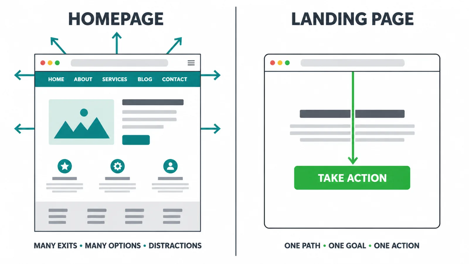
A homepage helps people explore many things. It has a menu, lots of links, and many possible next steps. A landing page does the opposite. It hides distractions and points everything at one action.
If you are still building out the basics of your site, our guide to a small business website covers the wider picture, and our web design team builds pages around a single goal.
2. Rule one: one goal, one call to action
This is the rule that matters most. Decide the one action you want before you write a single word. Every section then earns its place by helping with that action. If a block does not move the person closer to clicking the button, cut it.
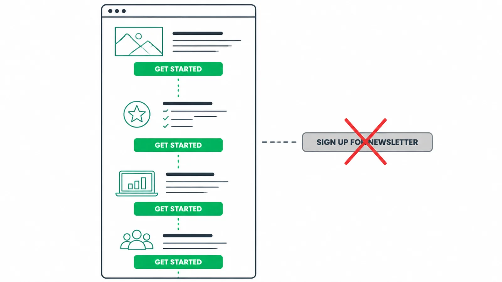
Use one primary call to action. You can repeat the same button two or three times down the page, which is good, but it must always ask for the same thing.
The moment you add a second different offer, you split attention and people freeze. Treat the single CTA as a best practice, not a number to debate.
Write the button so it says the action and the value. "Get my free quote" beats "Submit". "Book a call" beats "Learn more". Make it big, make it stand out in colour, and make it impossible to miss. If a visitor only reads the headline and the button, they should still understand the deal.
3. Match the message to the ad
Message match means the landing page headline echoes the exact promise that sent the person here. If your Google ad says "Same-day plumbing in Penang", the page headline should say the same thing. When the words match, the visitor relaxes. They know they are in the right place.
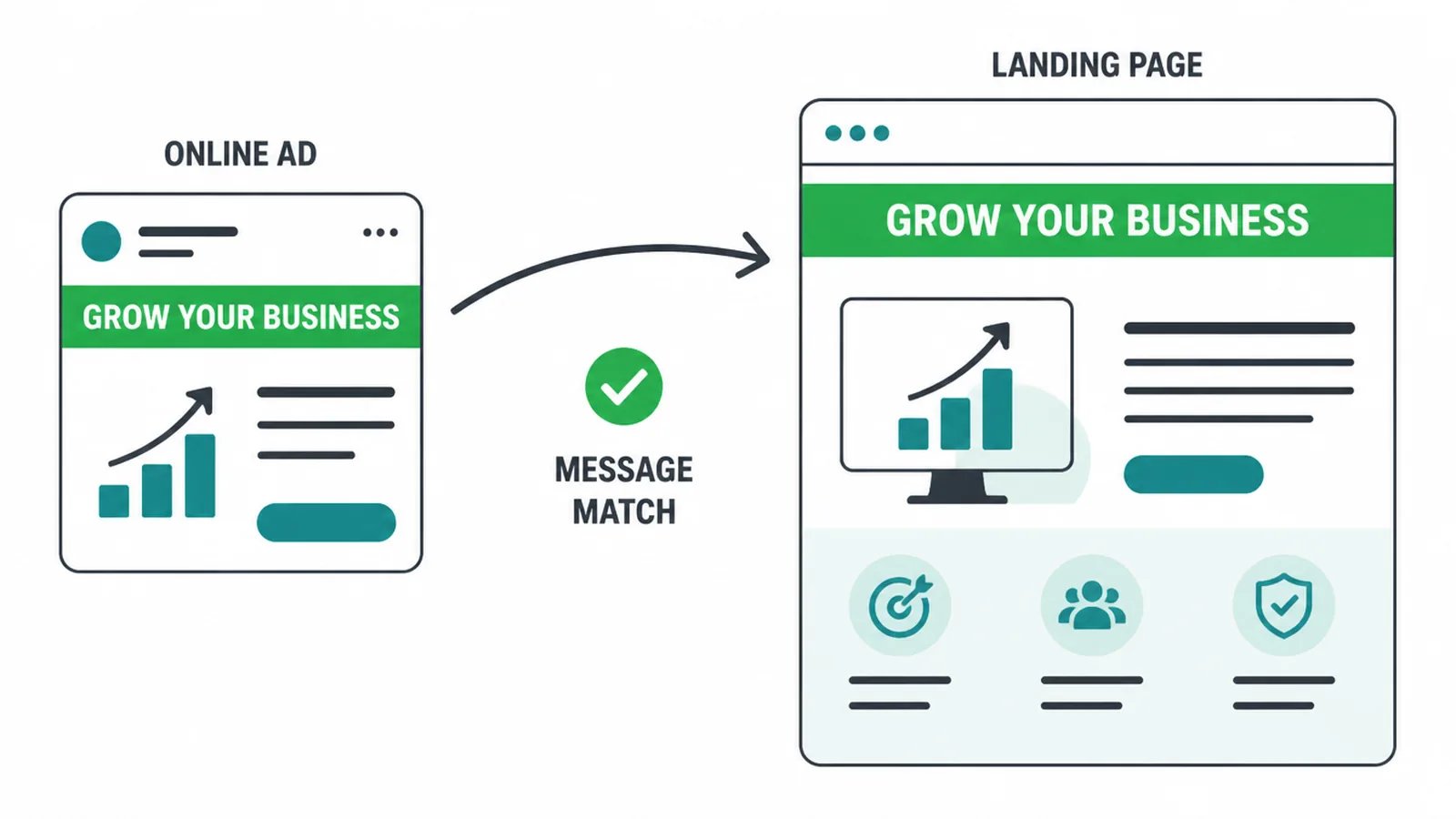
When the words do not match, people bounce. They clicked because of a specific promise, and a vague or different headline breaks the link in their head. This is one of the most common reasons paid traffic fails. The targeting was fine, the page just did not keep the promise.
So write the ad and the page together, not weeks apart. Keep the headline, the offer, and even the image consistent from click to page.
If you run paid traffic, our guide to Google Ads for small business pairs well with this. Our digital marketing team builds the ad. For the page, see our landing page design service.
4. Get the above-the-fold right
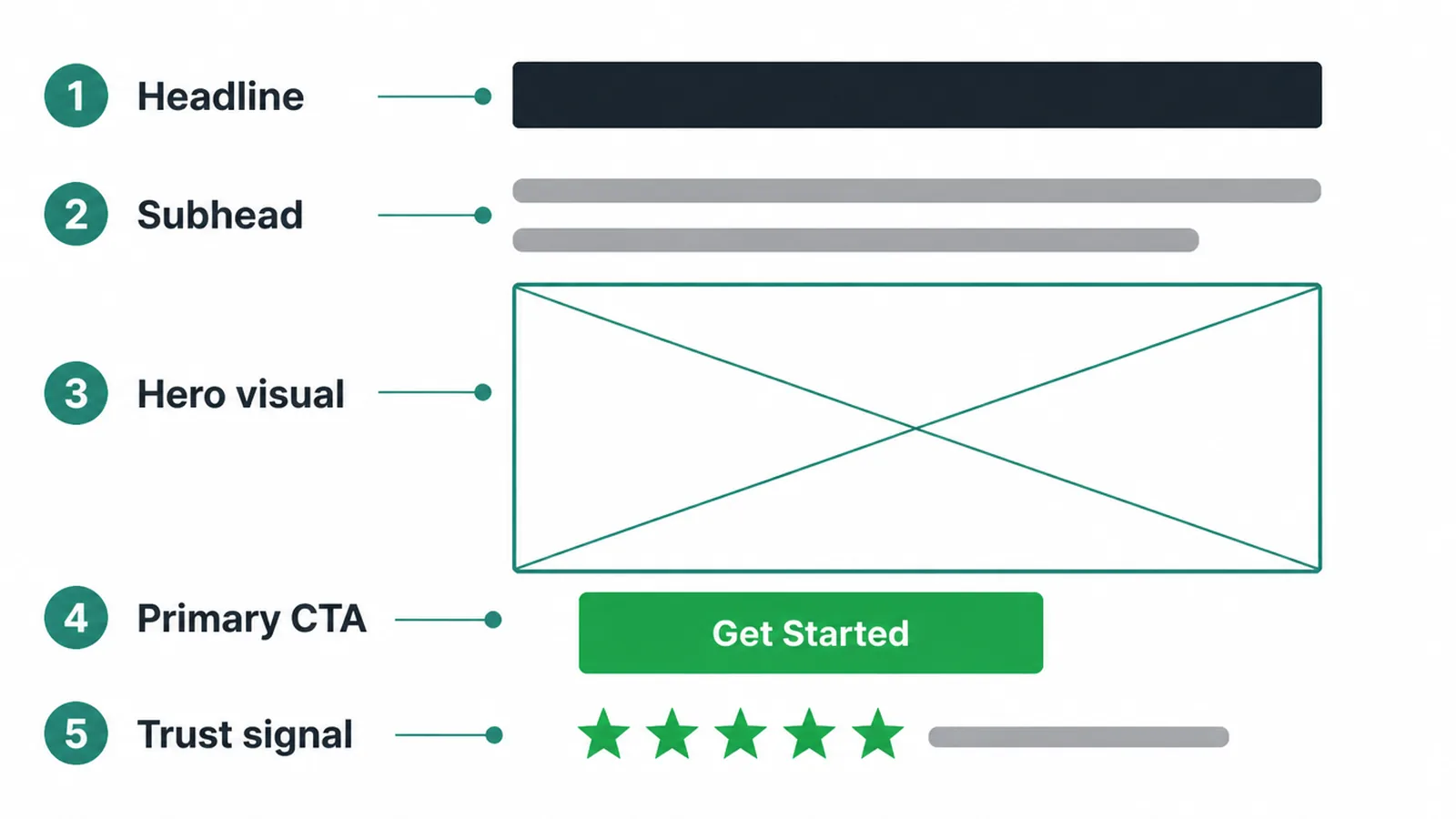
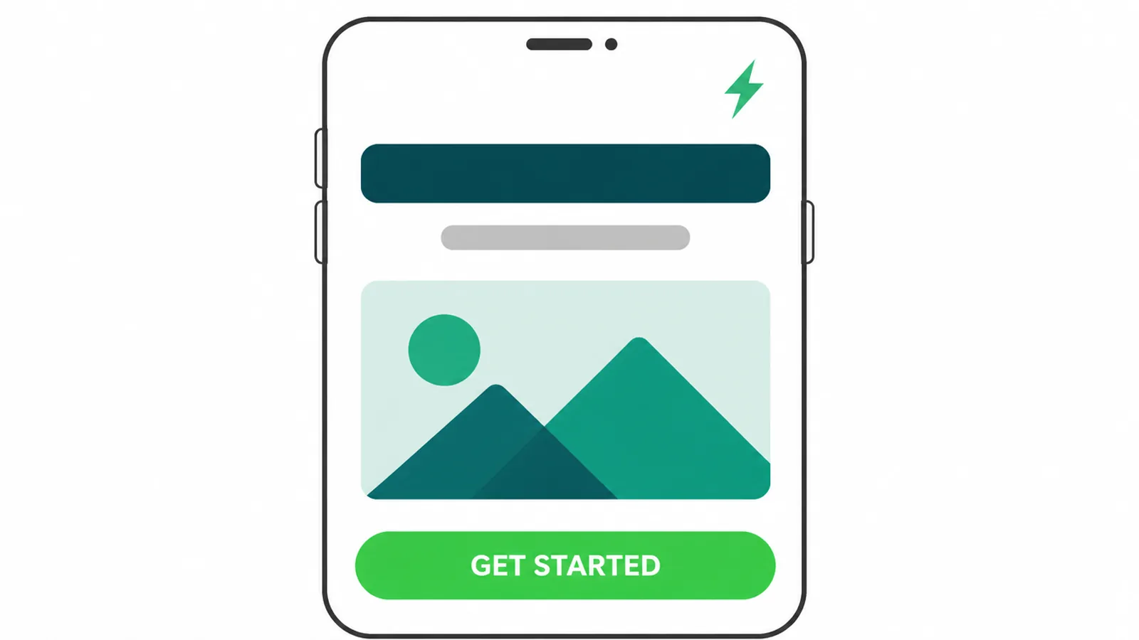
Above the fold is what people see before they scroll. It has seconds to make sense. Five things should be visible without scrolling: a clear headline, a short subhead, a relevant hero visual, your primary CTA, and one trust signal. If those five are clear, you have earned the scroll.
Keep the language plain here above all. Pages written at a 5th to 7th grade reading level convert at 11.1%, far above pages written in "professional" language at 5.3% (Unbounce). Short words win. Your headline should state the main benefit in one breath.
The subhead adds one line of detail. The hero visual should show the product, the result, or the offer, not a random stock photo. Put the button right there so the eager visitor never has to hunt.
5. Lead with the benefit, not the feature
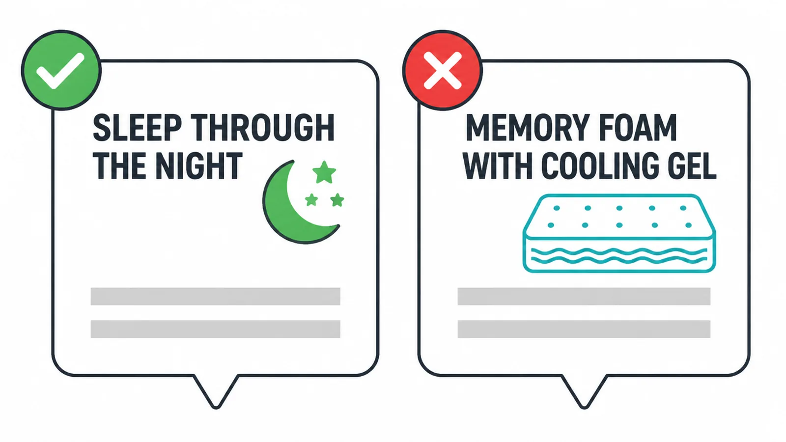
People do not buy features. They buy the result the feature gives them. So lead with the outcome. "Sleep through the night" beats "memory foam with cooling gel". Say what changes for the visitor, then back it with the feature if you need to.
Write short. Lead with the point of each section. Speak straight to "you". Use bullets, headings, and white space so a skimmer still gets the message.
Remember the reading-level number: plain copy at a 5th to 7th grade level converts more than twice as often as stiff, formal copy. If a sentence makes you sound clever but slows the reader, cut it.
6. Show proof, never fake it
Strangers do not trust claims. They trust other people. So show proof near every decision point. Real testimonials with full names and a specific result work best. Add client logos, star ratings, review counts, a guarantee, or a recognised badge. A photo or video review beats a quote in italics.
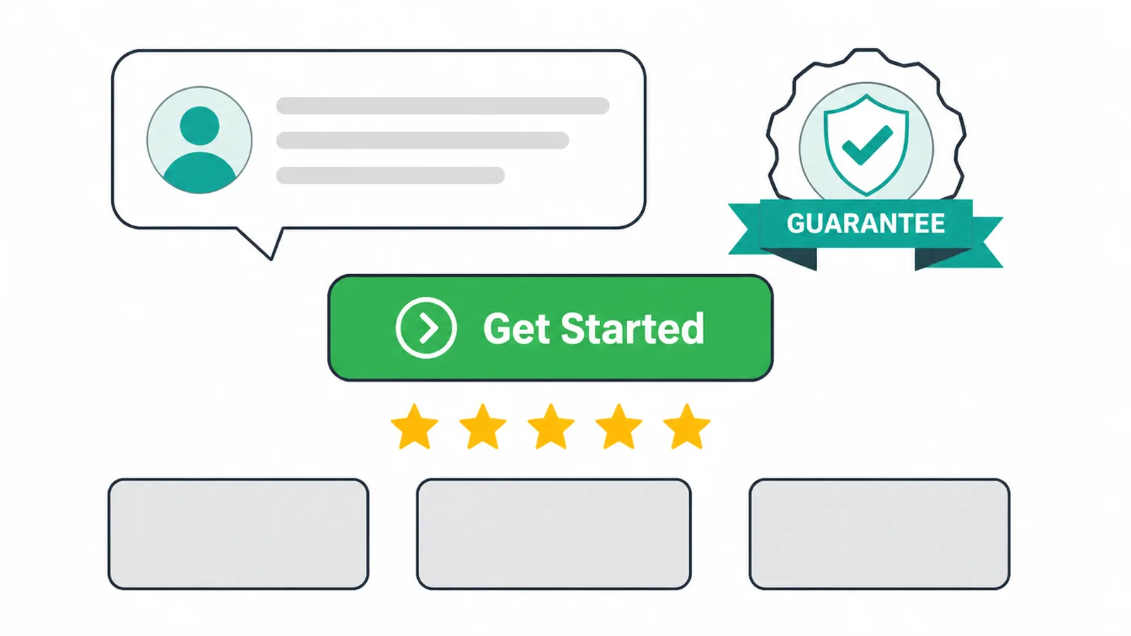
Place the proof where the doubt is, which is right next to the call to action. Someone is about to fill in your form, and a short line that says "Trusted by 200 local businesses" can be the nudge that tips them. Sprinkle small proof points down the page too.
One hard rule. Never invent proof. Do not buy reviews, do not make up a number, and do not borrow a logo you have no right to use.
Fake proof is easy to spot and it destroys trust faster than no proof at all. If you do not have testimonials yet, use what is honestly true, such as years in business or a clear guarantee.
7. Remove friction from the form
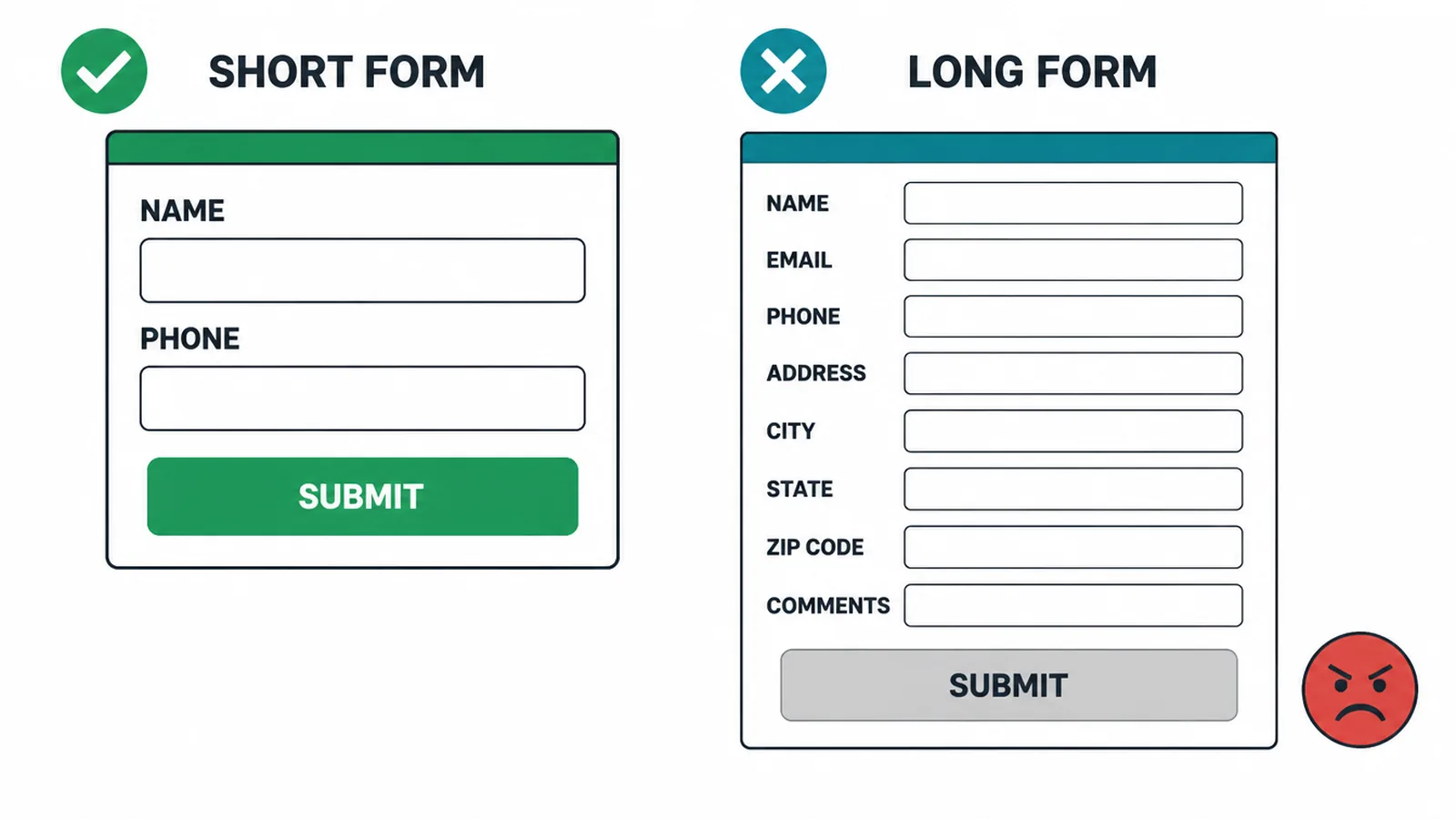
Friction is anything that makes the visitor stop and think. The biggest source is your form. Ask only for what you can actually act on.
A name and one way to reach them is often enough to start a real conversation. Every extra field is one more reason to give up, so treat short forms as a best practice.
Friction also hides outside the form. On paid-traffic and campaign pages, remove the main navigation menu and most footer links. Every extra link is an exit. You spent money to get this click, so do not hand the visitor ten ways to wander off.
Give them one decision: do the thing, or leave. To see where the landing page sits in the bigger picture, our overview of digital marketing for small business ties the parts together.
8. Make it fast and mobile-friendly
About half of your visitors are on a phone. About half of all web traffic worldwide is mobile, at about 49.36% versus 49.11% on desktop (StatCounter, August 2026). If the page is hard to use on a small screen, you are losing half your traffic before they read a word. Design for the thumb first.
Speed matters just as much. A good Largest Contentful Paint, which is when the main content shows up, is 2.5 seconds or less at the 75th percentile (web.dev). Slow pages lose people who never even see your offer.
Compress images, cut heavy scripts, and test on a real phone over mobile data. Buttons should be big enough for a thumb, and the form should be easy to fill on a small keyboard. Our guide on how to make a website mobile-friendly walks through the fixes.
9. Landing page conversion checklist
Run your page against this before you send any traffic to it. If every row passes, you have a solid page. If a row fails, that is your first thing to fix.
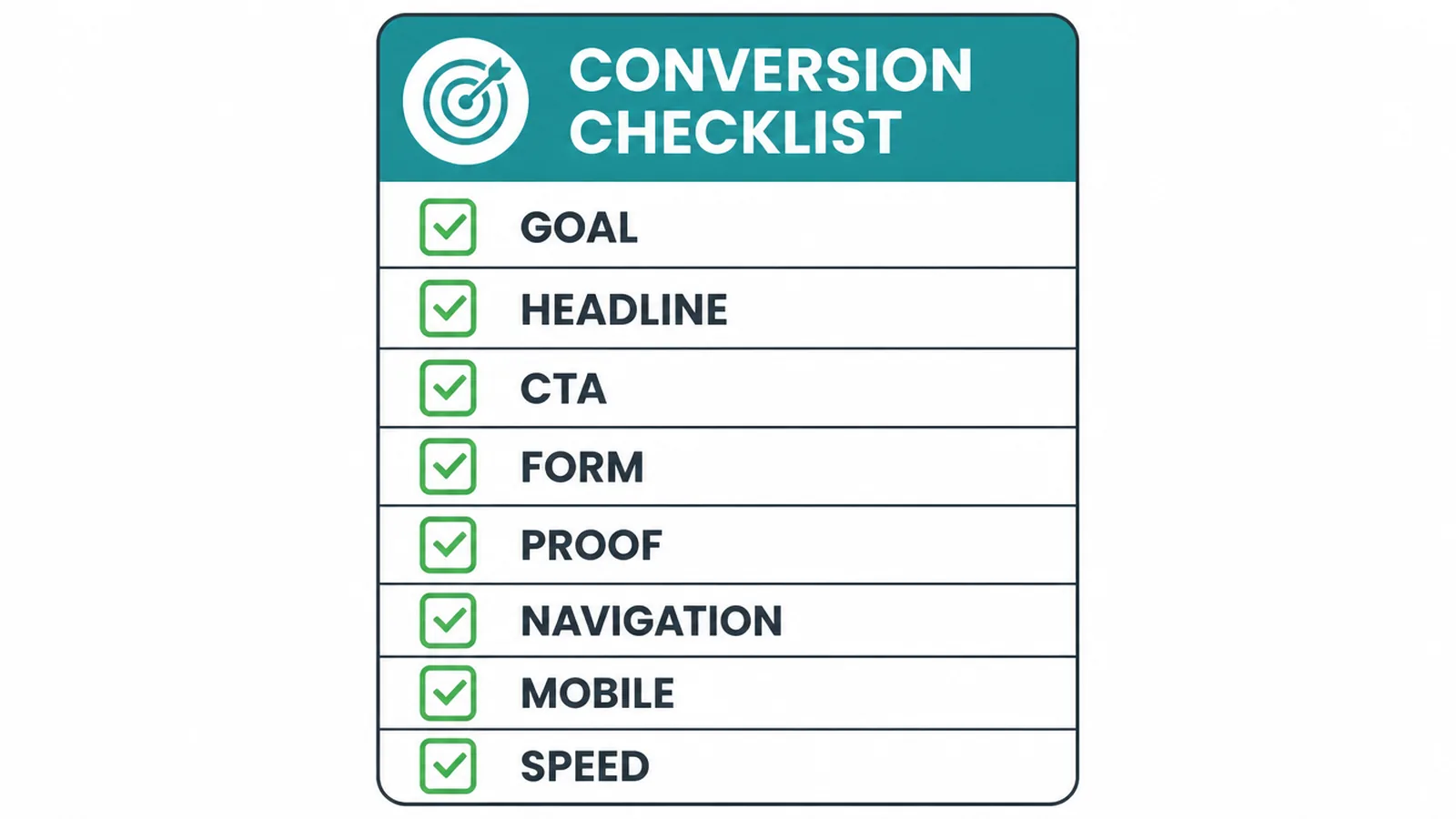
| Element | What good looks like | Quick check |
|---|---|---|
| Goal | One clear action the whole page is built around | Can you say the goal in one sentence? |
| Headline | States the main benefit and matches the ad | Does it echo the link that sent them? |
| CTA | One primary button, action plus value, repeated | Is there only one thing being asked? |
| Form | Only fields you will actually use | Could you remove a field and still follow up? |
| Proof | Real testimonials, logos or reviews near the CTA | Is the proof honest and verifiable? |
| Navigation | Menu and stray links removed on paid pages | How many ways are there to leave? |
| Mobile | Thumb-friendly layout and buttons | Have you tested it on a real phone? |
| Speed | Main content loads in 2.5 seconds or less | Does it load fast on mobile data? |
10. Do and don't
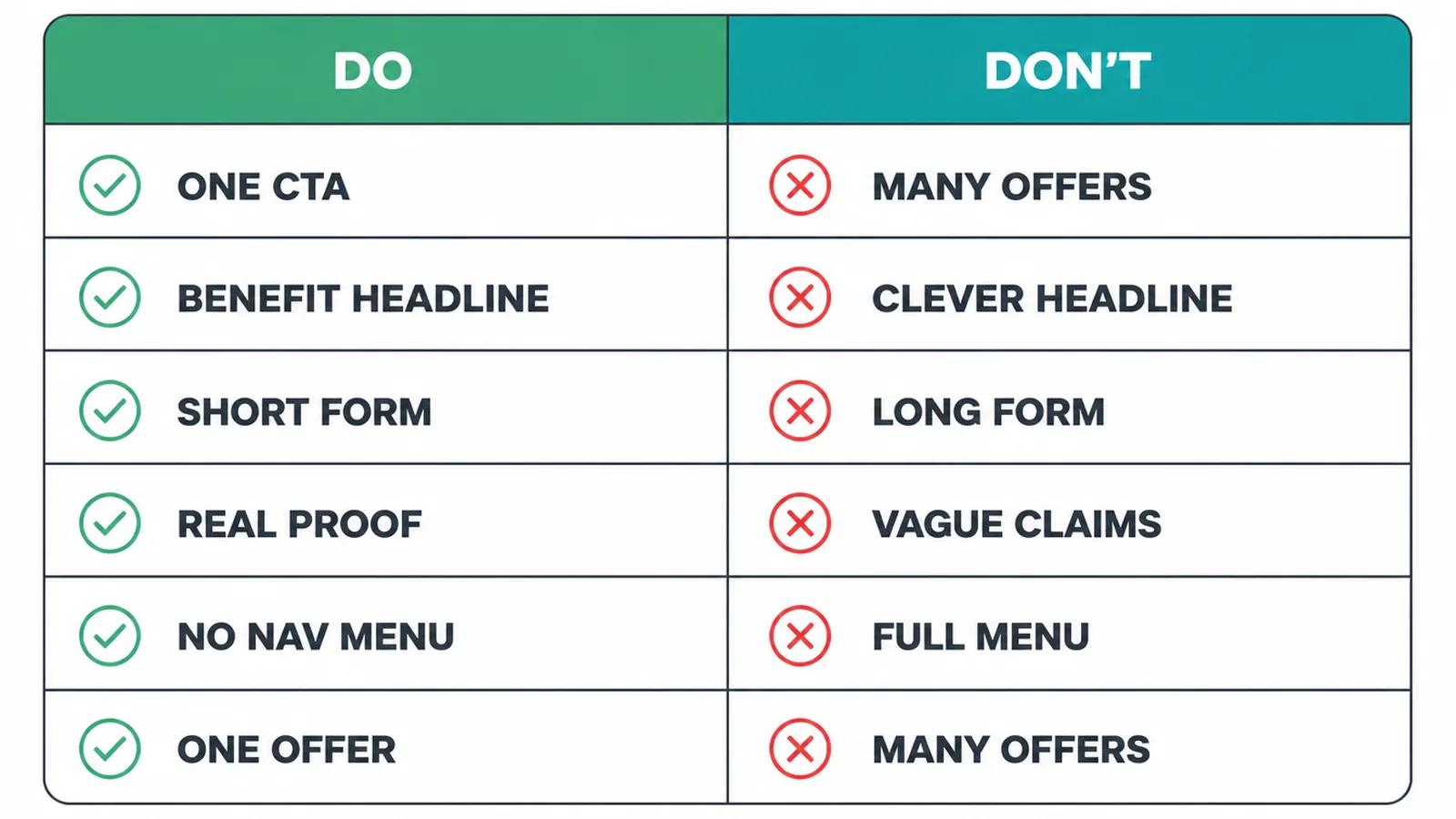
The same rules, side by side, so they stick.
| Do | Don't |
|---|---|
| One primary call to action | Several competing offers |
| A benefit-led headline | A clever headline no one understands |
| A short form with only needed fields | A long form that asks for everything |
| Real proof with names and results | Vague claims or invented numbers |
| Navigation removed on paid pages | A full site menu on a campaign page |
| One focused offer per page | Many offers fighting for attention |
11. Test, then trust the numbers
Even a good page can do better. If yours is not converting, start with the usual culprits: a message that does not match the ad, an unclear offer, a slow or clunky mobile experience, a form that is too long, or no proof. Fix the obvious one first.
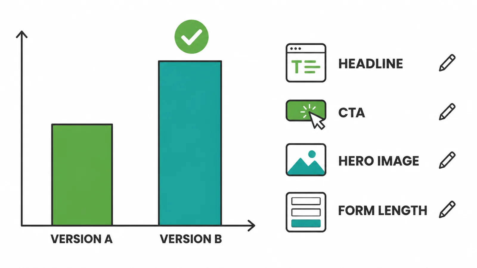
Then test properly. Change one thing at a time, such as the headline, the CTA wording, the hero image, or the form length. Send real traffic to both versions and let the numbers decide, not your opinion.
Change two things at once and you will never know which one helped. A landing page is the decision stage of your funnel, so it helps to know what happens before and after it. Our guide to the stages of a marketing funnel shows where the page fits.
12. Want a page built to convert?
A landing page that converts is the result of one goal, plain copy, honest proof, and a fast mobile build. That is craft, not luck, and it is what our landing page design service does every week.
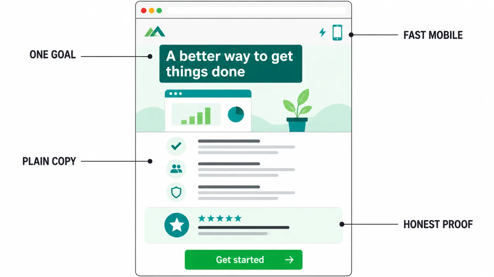
We design the page and we drive the traffic to it, so the ad and the page pull in the same direction. If you want a hand, talk to us and we will take a look at your goal and build around it.
Two of ours work exactly this way. The Ecoledco page puts the offer at the top and repeats the same action at the points a reader is most likely to take it. On InfiniteMinds Academy, FAQs answer enrolment questions before the enquiry, and clear enquiry and application routes make the next step obvious for parents and carers.
Frequently asked questions
1. What makes a landing page convert?
One clear goal, one primary call to action, a headline that matches the ad or link that sent them, an above-the-fold benefit, proof, and as little friction as possible.
2. How is a landing page different from a homepage?
A homepage helps people explore many things. A landing page asks for one action and usually hides the main navigation.
3. How many CTAs should a landing page have?
One primary action. You can repeat the same button several times down the page, but it should always ask for the same thing.
4. How long should a landing page be?
As long as it needs to answer the visitor's questions and no longer. Low-commitment offers can be short, while expensive or complex offers usually need more.
5. Do I need to remove the navigation menu?
Usually yes for paid-traffic and campaign pages, because every extra link is a way to leave without converting.
6. How many form fields should I use?
Ask for the fewest fields you can act on. Every extra field is friction, and a name and one contact method is often enough to start.
7. Why is my landing page not converting?
The most common causes are a message that does not match the ad, an unclear offer, a slow or clunky mobile experience, a form that is too long, or no proof.
8. How do I test a landing page?
Change one thing at a time such as the headline, CTA, hero image or form length, send real traffic to both versions, and let the numbers decide.