Logo File Formats Made Simple

Logo file formats come in two kinds. Vector files such as SVG and EPS redraw at any size, and raster files such as PNG and JPG are fixed grids of pixels. Seed Light keeps a vector master for every client, because everything else can be made again from it.

A printer asks for your logo in vector. Somebody emails back a PNG from a website, and the job stops for three days.
This guide covers what the formats actually are, which files to ask for, and how to store them so the right one is easy to find.
By the end you will know which file to send to a printer, which to put on a website, and which one you must never lose.
Key Takeaways
- There are only two kinds of file. Vector redraws at any size, raster is a fixed grid of pixels.
- SVG scales without loss. Vector images can be rendered at any size without loss of quality.
- The vector master is the one that matters. Everything else can be exported again from it.
- A white box means a JPG. That format cannot store a transparent background.
- Name the files for people. A folder of untitled exports is the reason the wrong one gets used.
Nobody needs to understand image compression to run a business. You do need to know which file to send when somebody asks, and that comes down to a single distinction.
Logo File Formats: The Two Kinds
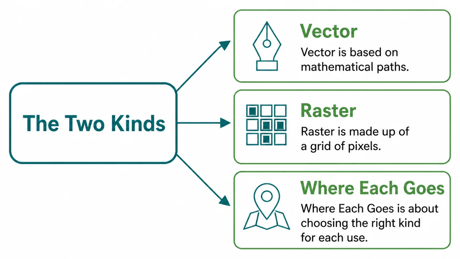
A vector file stores your logo as instructions. A circle here, a curve there, this colour inside it.
Because it is instructions, the computer redraws it at whatever size it is asked for. On a business card and on the side of a van, it is the same file.
A raster file stores a fixed grid of coloured dots. That grid has a size baked into it, and enlarging the file means inventing dots that were never recorded.
So the rule is short. Vector for anything that might be resized or printed, raster for a fixed slot on a screen.
The common vector formats are SVG, EPS and AI. The common raster ones are PNG, JPG and WebP. Nearly every logo problem is one of those six in the wrong place.
The names tell you less than you would hope. A PDF can hold either kind, so a PDF from a designer is usually vector and a PDF someone made by scanning a letterhead is not.
When you are unsure, open the file and zoom in hard. Vector edges stay crisp however far you go, and raster edges turn into squares.
That test takes five seconds and it settles most arguments with a printer before they start.
Why The Wrong File Looks Wrong
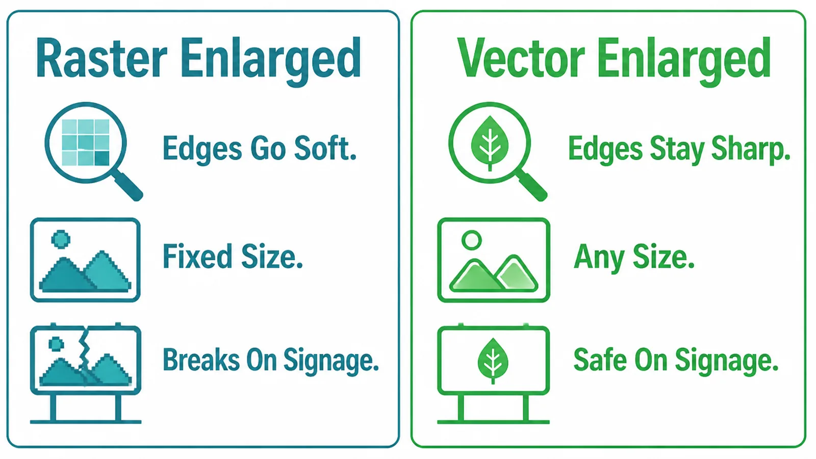
Enlarge a raster logo and the edges go soft. The grid is being stretched, so the software fills the gaps with its best guess.
On a screen at small sizes nobody notices. On a printed banner everybody does, and by then it has been paid for.
The second problem is the white box. JPG cannot store transparency, so the space around your mark is saved as white pixels.
Put that on a coloured background and the box appears. It is not a mistake in the design, it is the format doing exactly what it can do.
If your logo has a white rectangle behind it, you are using a JPG, and the fix is a different file rather than a redesign.
There is a third problem that only shows up in print. Screens mix colour with light and printers mix it with ink, so a file set up for one can shift slightly in the other.
It is rarely dramatic. It is usually a brand blue that arrives a shade duller than the website, which nobody can explain and everybody notices.
Ask your designer for print versions at the same time as the web ones, and the question never comes up.
How To Get The Right Logo File Formats
Three steps. Ask for the full set, store it so people can find it, and write down where each one belongs.
1. Ask For The Right Set
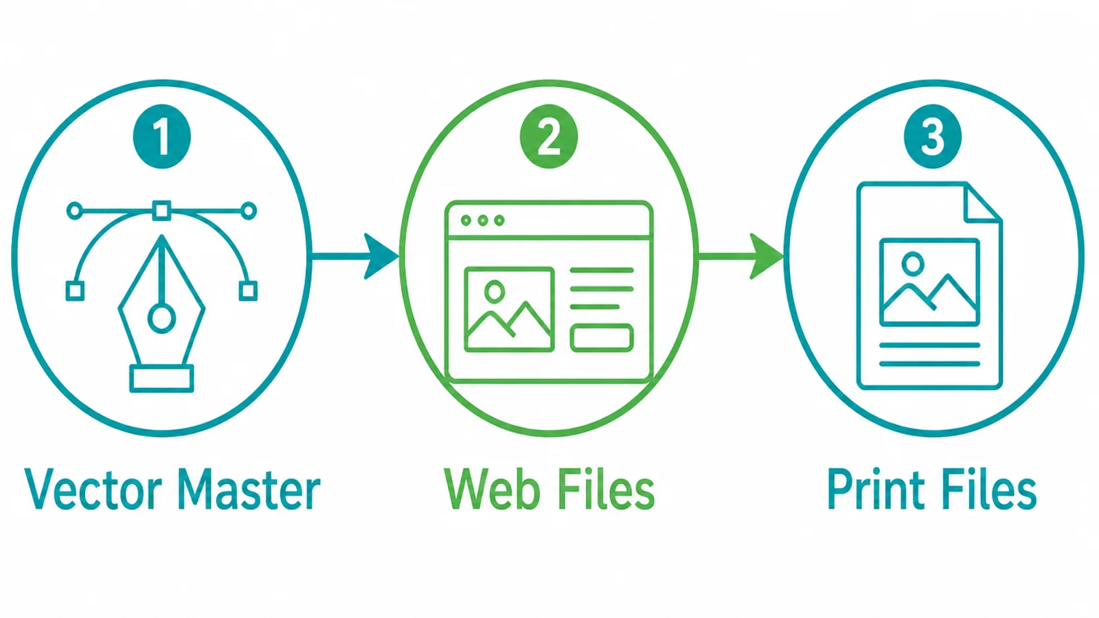
When a logo is designed, ask for three things rather than whatever lands in your inbox.
- The vector master. The editable file the logo was drawn in, usually AI or an editable SVG.
- Web exports. SVG and transparent PNG, in the colour versions you actually use.
- Print exports. EPS or PDF, set up for print rather than for a screen.
Ask while the project is live. Designers move on, and a year later the file you need is on a laptop you cannot reach.
Print files are worth naming separately because print uses different colour. A logo exported for a screen can arrive on a brochure looking slightly off, and nobody can say why.
2. Name And Store Them
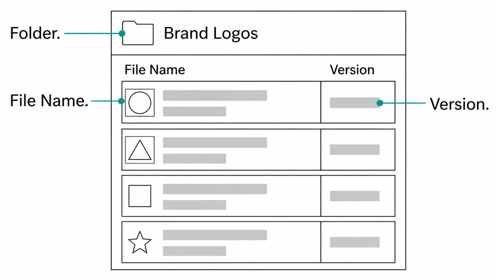
Most logo trouble is not technical. It is a folder of twelve files called logo final, logo final 2 and logo FINAL new.
Name each file for what it is and where it goes:
- The brand. So the file still makes sense when it is sitting in somebody else's downloads.
- The variant. Full colour, single colour, reversed for dark backgrounds.
- The format. Visible in the name, not only in the icon.
Keep one folder as the source of truth and share it. If the real logo lives in an email thread, the wrong one will be used eventually.
Give the folder to the people who actually need it. The printer, the sign writer, whoever runs your social accounts, and anybody who makes a document with your name on it.
Date the folder rather than the files. When the logo is updated, the old set moves into an archive folder and the current one keeps its name, so nothing downstream has to be relinked.
3. Say Where Each One Is Used
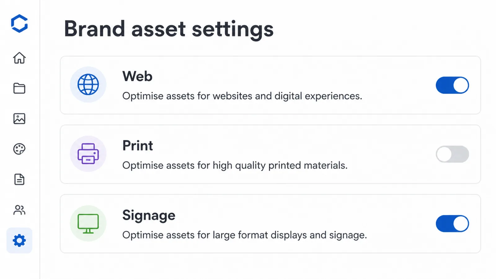
A list of files is not instructions. Write one line for each place the logo appears, and name the file that belongs there.
Web, email signature, print, signage, social profile. Five lines covers almost every small business.
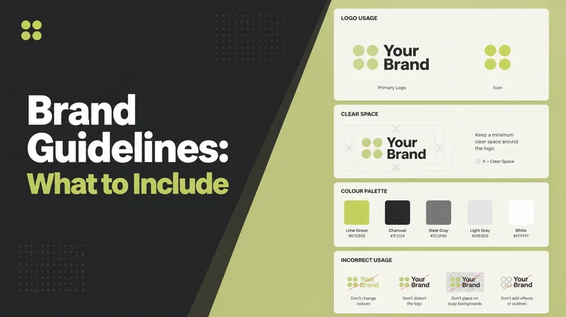
While you are writing it, add the two rules people most often get wrong. The smallest size the logo may be used at, and the amount of clear space to leave around it.
Keep all of it beside the files rather than in a document nobody opens. A rule that lives somewhere else is a rule that gets broken by accident.
The Logo File Formats Worth Having

- A vector master. The editable original. Everything else can be made again from it, and nothing can be made without it.
- A transparent web file. SVG where possible, PNG where not, so the logo sits on any background without a box.
- A single colour version. One flat colour, for stamps, embroidery, engraving and anywhere printing in full colour is not an option.
The single colour version is the one most businesses discover they do not have, usually on the afternoon somebody needs it.
A reversed version is worth adding as a fourth. That is the logo drawn for dark backgrounds, so it does not disappear on a black footer or a photograph.
Both are quick for a designer to make while the file is open in front of them. Both are slow and expensive to commission on their own, months later.
Logo Tools
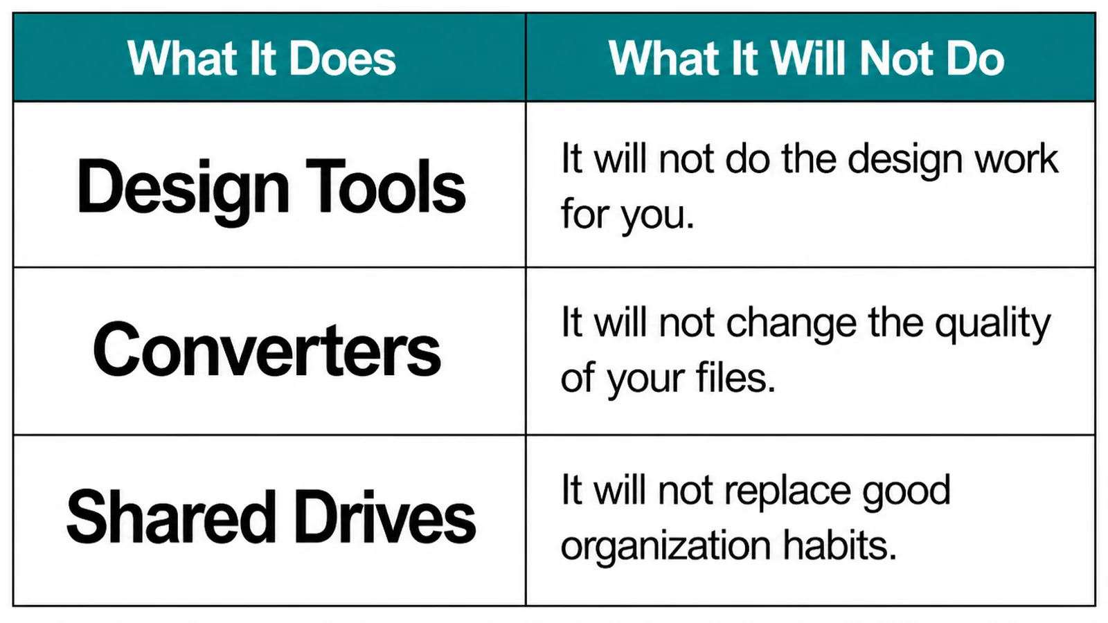
| Tool | What it will not do |
|---|---|
| Design tools | They will not turn a blurry picture back into a real vector file. |
| Converters | They will not add detail that the original file never contained. |
| Shared drives | They will not name your files or decide which version is current. |
Converting a PNG to SVG is the request we hear most. It traces the edges, and the result is an approximation of your logo rather than your logo.
Sometimes it is close enough to use and sometimes it is not, and you cannot tell from the thumbnail. Curves go slightly lumpy and the type is usually the part that gives it away.
If the original is genuinely gone, have the logo redrawn properly instead. It costs an hour of a designer's time and you end up with a master you can keep.
Common Mistakes
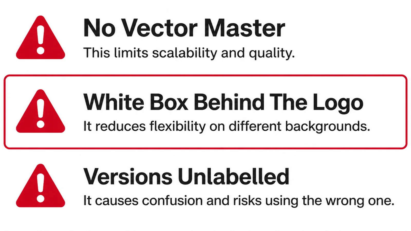
- No vector master. Every future job starts with somebody redrawing the logo from a picture of it.
- A white box behind the logo. A JPG used where a transparent file was needed, visible on every coloured background.
- Versions unlabelled. Nobody can tell which file is current, so the wrong one ends up on something printed.
None of these are design problems. They are filing problems, and they are cheap to fix on a quiet afternoon.
Start by finding the oldest file you have and working forwards. The master is usually in the original handover email, still sitting in somebody's inbox.
If it genuinely is not there, say so out loud now rather than discovering it the week you order signage.
FAQs
What is the difference between a vector and a raster logo?
A vector file stores the shapes as instructions, so it can be redrawn at any size. A raster file stores a fixed grid of pixels, so enlarging it means inventing pixels that were never there. That is why one stays sharp on a van and the other does not.
Which logo file should I use on my website?
Use SVG where you can, because it stays sharp on every screen and the file is usually small. Keep a transparent PNG as a fallback for places that will not accept SVG, such as some email signatures and older third party platforms.
Why does my logo have a white box around it?
You are almost certainly using a JPG. That format cannot store transparency, so the empty area around the mark is saved as white and appears as a box on any coloured background. Replace it with a transparent PNG or an SVG.
Do I own my logo files?
That depends on what you agreed with the designer, so check the contract rather than assume. Ask specifically for the editable vector master, not only the exported images. Without it, any future change to the logo means somebody redrawing it from a picture of the finished artwork.
What is the smallest size my logo should be used at?
There is no universal number, because it depends on how much detail your mark carries. Print it small, look at it from arm's length, and find the size where it stops being legible. Write that number down and put it in your brand guidelines.
Conclusion
Two kinds of file, one master, and a folder somebody else can use. That is the whole subject.
Get the vector master while the designer is still on the project, export the web and print versions from it, and write one line saying where each file belongs.
If your logo files are a mess and you would rather not sort them out, see how we handle branding, or get in touch and we will tell you what is missing from your set.