How to Design a Website Form People Finish

Website forms that convert ask only for what you need to reply, keeps its labels visible, and says what happens after sending. Seed Light treats the confirmation as part of the form, because silence after submitting is what makes people send the same enquiry twice.

You can watch it happen in any session recording. Somebody reaches the enquiry form, reads the fields, and leaves without typing anything.
This guide covers why that happens and what to change. It deals with which fields earn their place, how the form should be laid out, and what has to happen the moment somebody presses send.
By the end you will have a form that asks for less and gets answered more often.
Key Takeaways
- Every field is a request. Ask only for what you need to write a useful reply.
- Labels stay visible. Accessibility guidance asks for labels or instructions whenever content needs input.
- Placeholder text is not a label. It vanishes the moment somebody starts typing.
- Errors belong beside the field. Not in a red block at the top that leaves people hunting.
- The confirmation is part of the form. Silence after sending is why the same enquiry arrives twice.
A form is the narrowest point on a website. Everything you spend on getting people there passes through it, and it is usually the piece nobody has looked at in two years.
What Website Forms That Convert Have To Do

A form has three jobs, and they are easy to say out loud.
It collects the smallest amount of information that lets you reply properly. It explains itself without anyone having to guess. It confirms that the message arrived.
Most forms do the first job badly, because the fields were added one at a time by different people. The sales team wanted a budget range, somebody wanted a dropdown for how they heard about you, and nobody removed anything.
The third job gets skipped altogether. The page reloads, something changes slightly, and the sender is left wondering whether to send it again.
It helps to picture the person on the other end. They are on a phone, probably doing something else, and they have three other tabs open with three other businesses in them.
They are not evaluating your form. They are deciding whether getting a quote from you is more effort than getting one from somebody else.
That is the standard a form is really held to. Not whether it works, but whether it is the easiest of the three open tabs.
Why Every Extra Field Costs You
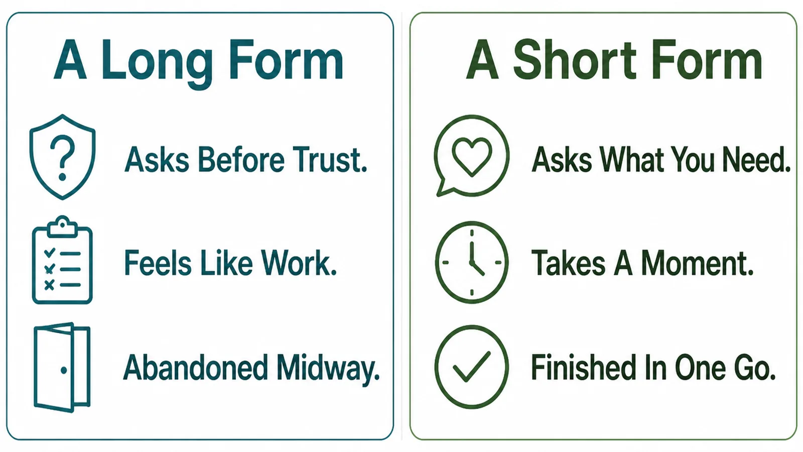
Each field is a small request, and the reader is deciding whether you have earned it yet.
Name and email are easy. A phone number is a bigger ask, because it means a call. A budget range is bigger still, because most people genuinely do not know and are worried about guessing wrong.
The trade is real in both directions. Fewer fields means more enquiries and slightly less detail in each one. More fields means fewer enquiries that are easier to quote.
The question is not which form is shorter, it is which questions you have earned the right to ask yet. Anything you can ask in the reply does not need to be on the form.
There is a second cost, and it is quieter. A long form filters out the careful people as well as the casual ones, because careful people stop when they are unsure of an answer.
A budget dropdown is the clearest example. Somebody who has never bought this before genuinely does not know, so they guess high and leave, or they guess low and never hear from you.
If you need that answer, ask it in the reply where you can explain the ranges. The form is the wrong place for a question that needs context.
How To Build Website Forms That Convert
Three decisions. What to ask, how to lay it out, and what the sender sees afterwards.
1. Decide What You Actually Need
Write down the reply you would send to a perfect enquiry. Then look at which fields you actually used to write it.
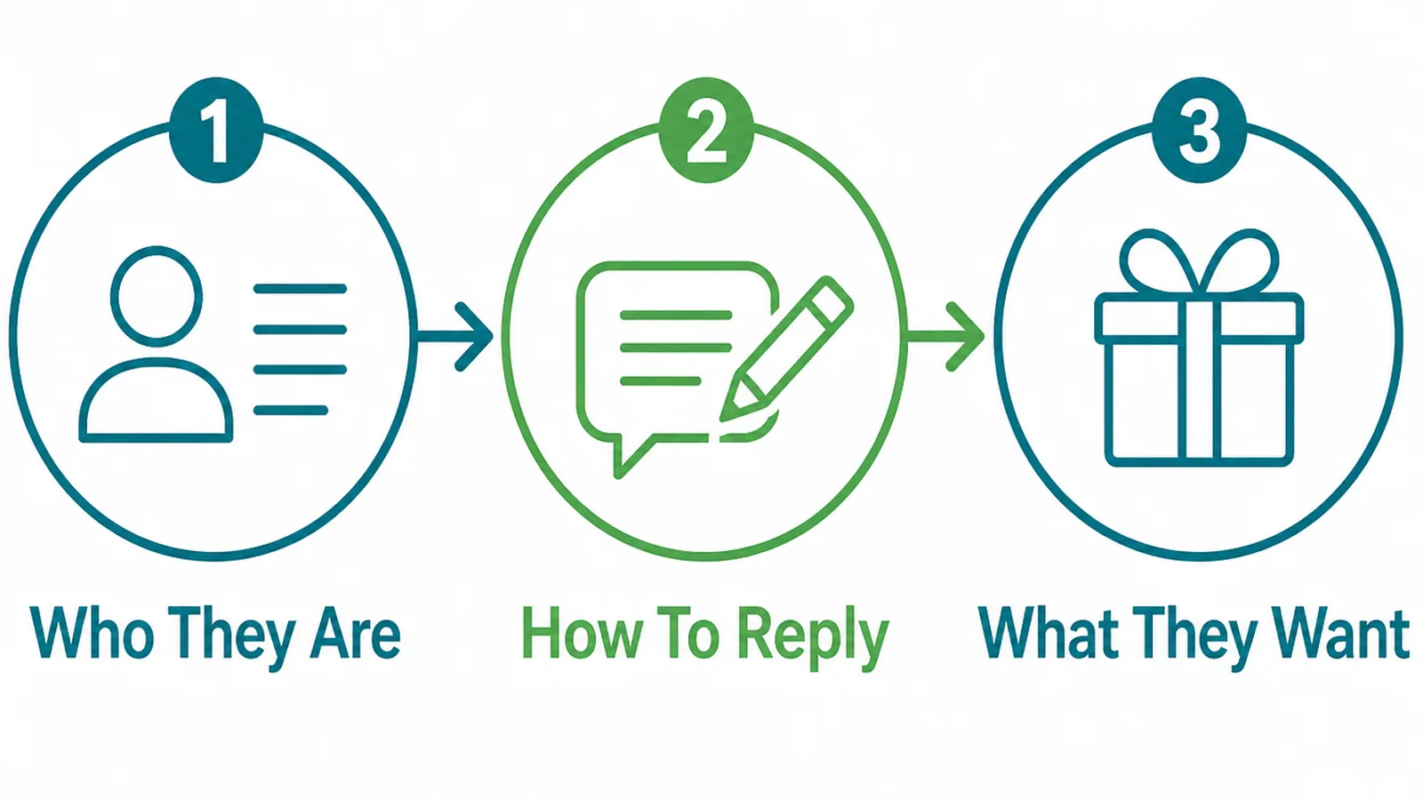
For most service businesses the answer is three things:
- Who they are. A name, so the reply is not addressed to nobody.
- How to reach them. One method, chosen by them, not two because you prefer one.
- What they want. One open box, which tells you more than any dropdown you could design.
Anything left over goes on a list of things to ask in the reply. That list is usually longer than people expect, and none of it was urgent.
If a field is genuinely required for a quote, keep it and say why beside it. People will give you more when they can see the reason.
2. Lay The Form Out
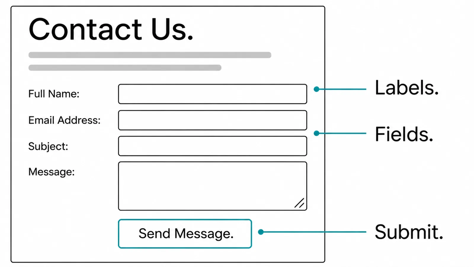
Put the label above the field, in text that stays there. Accessibility guidance asks for labels or instructions wherever content requires input, and a label that disappears when typing starts is not doing that job.
Use one column. Two columns make people zigzag, and on a phone they collapse into an order nobody chose.
A few details that change the experience more than they look like they should:
- Mark the optional ones. Marking every required field with an asterisk tells the reader almost nothing when all of them have it.
- Size the box to the answer. A postcode field as wide as the page suggests you want more than a postcode.
- Put errors next to the field. A red summary at the top makes people hunt for the thing they got wrong.
Then use the form on your own phone, on mobile data, as though you were a customer. Most of what is wrong with a form is obvious within thirty seconds of doing that.
Watch what the keyboard does. A phone number field that opens a letter keyboard is a small thing that makes a person feel the site was not built for them.
Check the submit button too. If it sits below the fold with no sign anything is beneath it, some people will fill the form in and never press it.
3. Say What Happens Next
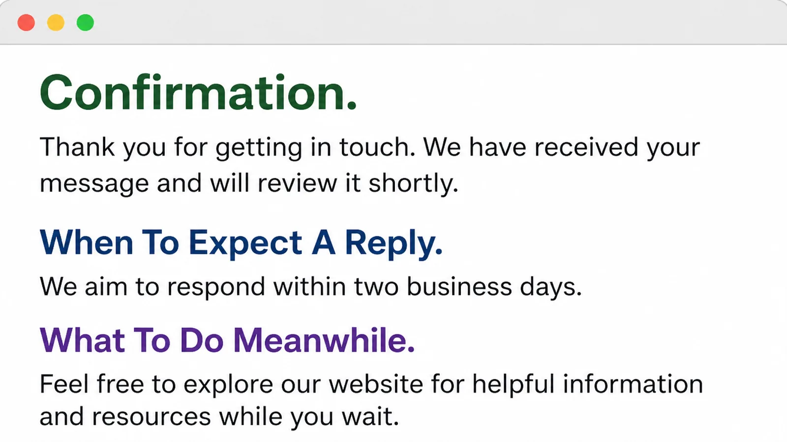
Pressing send is the moment the sender loses all information. They cannot tell whether it worked, whether you received it, or whether anything happens now.
Answer all three. Confirm the message arrived, say roughly when somebody replies, and give one useful thing to do meanwhile.
Be honest about the timing rather than impressive. If you answer enquiries at the end of the day, say that. A promise the business cannot keep is worse than no promise, and the first reply is where it gets tested.
Send the same confirmation by email too. People close tabs, and an email is the only copy they keep.
That email is also useful to you. It gives the enquiry a thread, so when somebody replies to it a week later the whole conversation is in one place.
Keep it plain. A confirmation that arrives as a designed newsletter looks like marketing and gets filed as marketing. That is the one folder you do not want it in.
What Makes Website Forms That Convert Easy

- Visible labels. Each field keeps its name while somebody is filling it in and when they go back to check.
- Helpful errors. The message says what to do, not that something is invalid, and it sits beside the field that caused it.
- One clear button. A single action, labelled with what it does, rather than a send button next to a reset button nobody wanted.
None of these need a redesign. All three can usually be fixed in an afternoon on a form that already exists.
Form Tools

| Tool | What it will not do |
|---|---|
| Form builders | They will not decide which fields deserve to be there. |
| Spam filters | They will not catch every message, and they sometimes catch real ones. |
| Notification tools | They will not make anybody read the notification or reply to it. |
A form tool is a delivery mechanism. The decisions that make a form work sit before the tool and after it, in what you ask and how fast you answer.
Common Form Mistakes
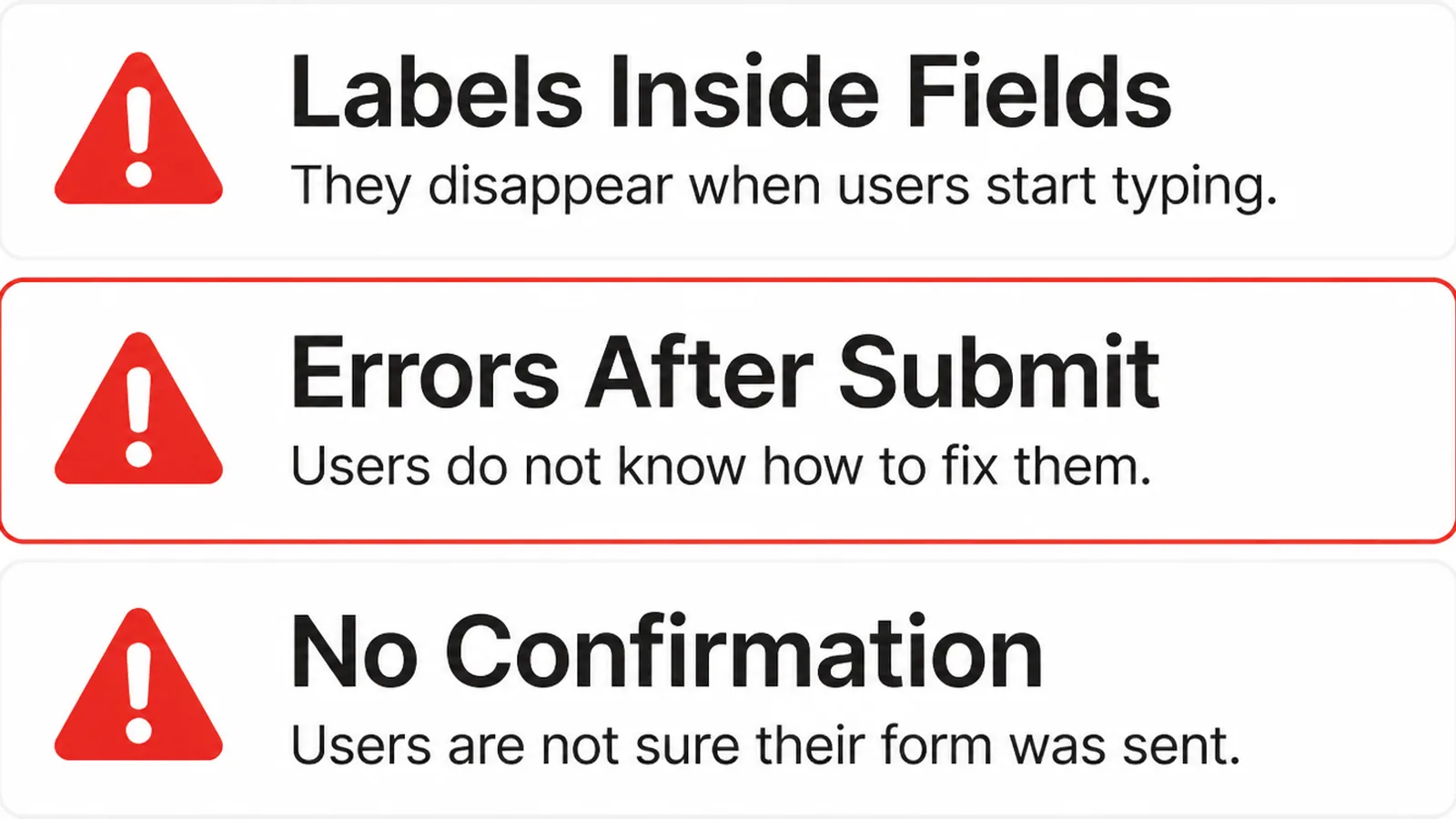
- Labels inside fields. The placeholder is doing a label's job, so the field goes anonymous the moment typing starts.
- Errors after submit. Everything is accepted until the end, then the page reloads and the reader hunts for the problem.
- No confirmation. The sender gets no sign it worked, so they either send it twice or assume you are closed.
They share a cause. The form was tested by somebody who already knew the answers, filling it in quickly on a laptop that had everything saved.
There is a fourth worth watching for, because it hides. Forms break quietly after a plugin update, and nothing tells you, because a form that sends nothing looks exactly like a quiet week.
Send yourself a test enquiry once a month. It takes a minute and it is the only way to find out before a customer does.
FAQs
How many fields should a contact form have?
Ask only for what you need to write a useful reply. For most service businesses that is a name, one way to reach them, and a line about the job. Everything else can be asked in the reply, when the person is already talking to you.
Can I use placeholder text instead of labels?
It is a poor substitute. Placeholder text disappears the moment someone starts typing, so the field loses its name exactly when they are checking their answer. Keep a visible label above the field and use the placeholder for an example, if you use one at all.
Should a form be one page or several steps?
One page suits a short enquiry form, because the reader can see how much work they are agreeing to. Steps suit genuinely long forms, such as a booking with options. Splitting a five field form into three screens makes it feel longer, not shorter.
Do I need a captcha on my contact form?
Only if you are actually getting spam. A captcha adds a task for every genuine enquirer to solve somebody else's problem. Try a honeypot field or server side filtering first, since neither of those asks the visitor to do anything at all.
What should the thank you page say?
Confirm that the message arrived, say roughly when somebody will reply, and give one thing to do meanwhile. Without those three the sender has no way of knowing whether it worked. That is why the same enquiry often arrives twice.
Conclusion
A form that people finish is mostly a form that asks for less and explains itself.
Cut the fields to what you need for a reply, keep the labels visible, put the errors where the mistake is, and tell people what happens after they press send.
If you want somebody to look at yours, see how we approach web design, or get in touch and we will tell you which fields we would remove first.