7 Types of Logos and When to Use Each One

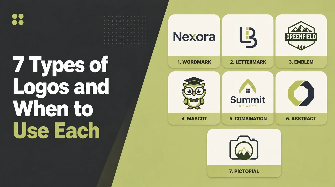
The seven standard logo types are the wordmark, lettermark, pictorial mark, abstract mark, mascot, combination mark and emblem. Pick by name length and how well known you already are: new businesses do best with a wordmark or a combination mark. Seed Light tests every mark small and in one colour.
Key takeaways
- Seven standard types: wordmark, lettermark, pictorial mark, abstract mark, mascot, combination mark and emblem.
- New or unknown business? A wordmark or a combination mark usually fits best, because people can read who you are.
- Icon-only marks (pictorial and abstract) only pay off once people already know your brand.
- Emblems are the hardest to shrink, so the fine detail can blur at small sizes like favicons.
- A good logo works small and in one colour, so test every option at avatar size before you fall in love with it.
1. The seven types of logos: the short answer
There are seven standard types of logos: wordmark, lettermark, pictorial mark, abstract mark, mascot, combination mark, and emblem (ManyPixels). The right one for you depends on two things: your business name, and how well-known you already are. That is the whole decision in a nutshell.
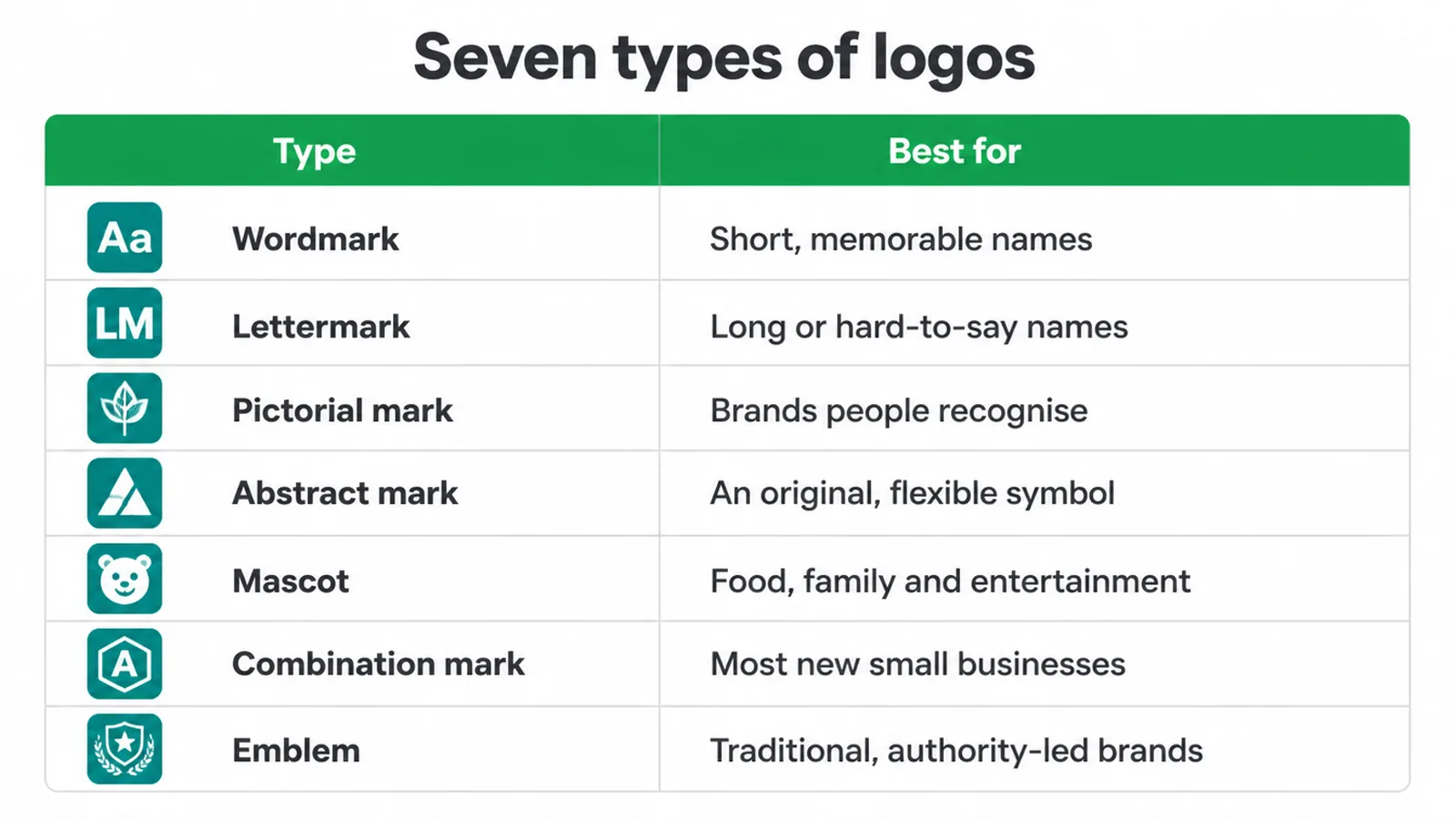
This guide is for owners choosing a logo for a new business, or planning a rebrand. Below is a quick table so you can spot your likely pick in ten seconds.
Then we go one type at a time, in plain words, with the kind of business each one suits. No hype, no jargon, just what actually works.
| Type | What it is | Best for |
|---|---|---|
| Wordmark (logotype) | Your full business name in a distinctive typeface | Short, memorable names worth seeing in full |
| Lettermark (monogram) | Just the initials or first letters | Long or hard-to-say company names |
| Pictorial mark (brand mark) | A picture of a real object that stands for the brand | Brands people already recognise |
| Abstract mark | A made-up shape that suggests an idea, not a real object | Brands wanting an original, flexible symbol |
| Mascot | An illustrated character that fronts the brand | Food, family and entertainment brands |
| Combination mark | A name and a symbol used together | Most new and growing small businesses |
| Emblem | The name set inside a badge or seal | Traditional, authority-led brands |
2. Wordmark (logotype)
A wordmark is your brand name spelled out in a distinctive typeface (ManyPixels). No symbol, no icon, just the name done well.
Think of a fashion label or a tech brand where the styled name is the logo. The type does all the work, so the font choice, spacing and any small custom tweak carry the whole personality.
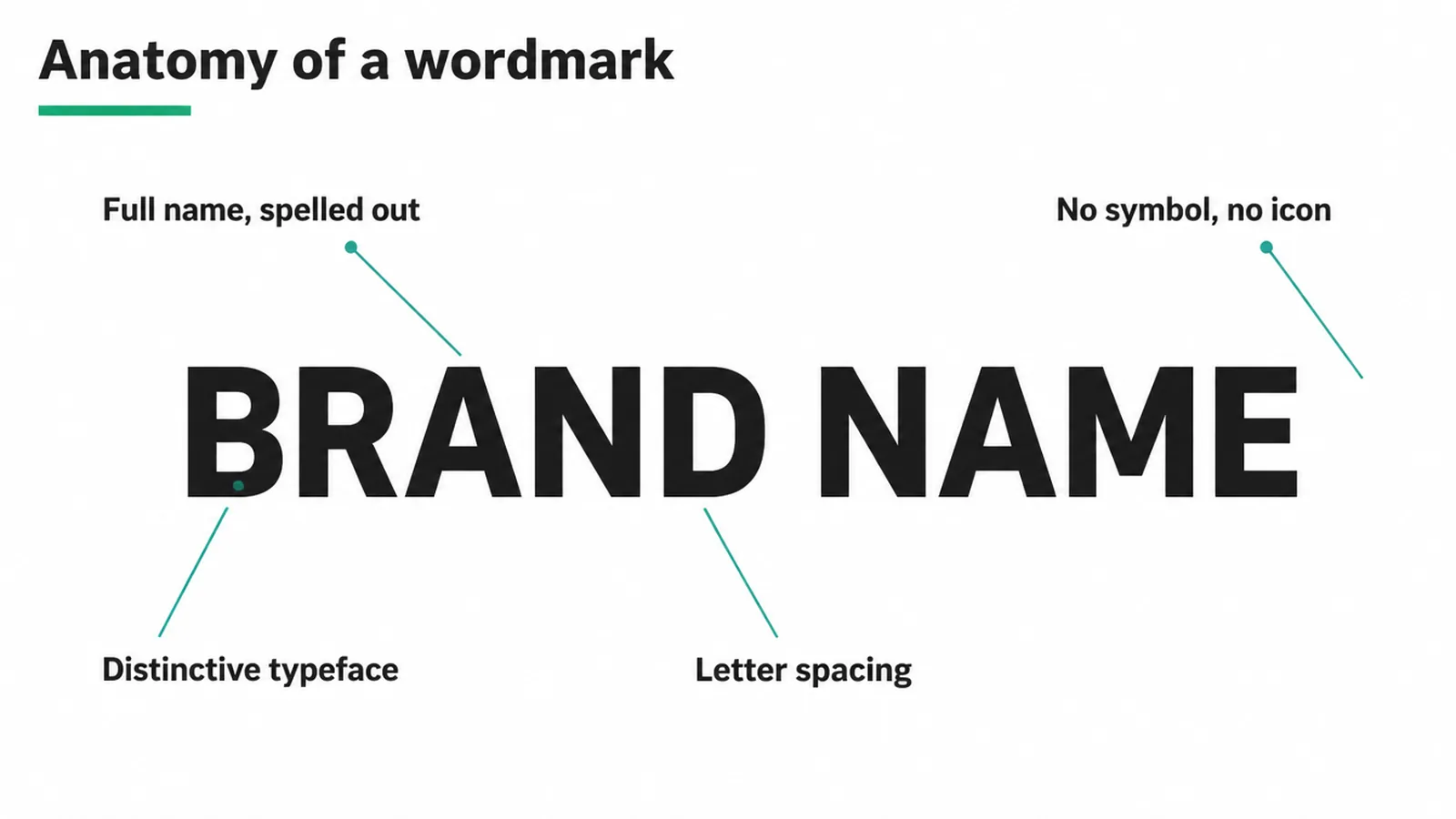
This type works best when your name is short, memorable and worth seeing in full. A punchy two-word name reads well and sticks. A wordmark also teaches people your name every time they see it, which is gold for a young brand nobody knows yet.
The catch: a long name can get cramped, and a plain font choice can look generic. A wordmark still has to pass the basics, so read our guide on what makes a good logo and check it works small and in one colour.
3. Lettermark (monogram)
A lettermark uses your initials or first letters instead of the full name (ManyPixels). Three long words become three tidy letters. It is a monogram, so the letters are styled to feel like a mark in their own right.
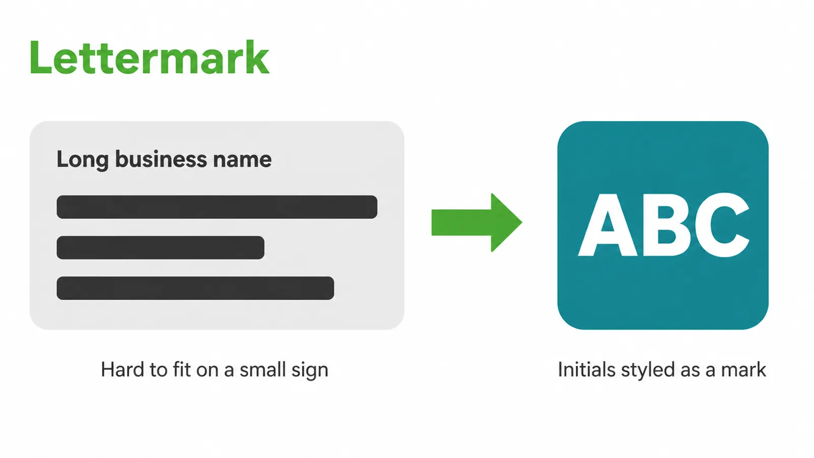
Reach for a lettermark when your full name is long or hard to say. A mouthful of a company name is a pain on a small sign or a phone screen, and initials fix that fast.
The trade-off is meaning. On its own, a set of initials tells a stranger nothing about what you do, so a lettermark leans on you already being known, or on strong support from the rest of your brand. New and unknown? A lettermark alone is a harder start than a name people can actually read.
4. Pictorial mark (brand mark)
A pictorial mark is a recognisable icon or graphic of a real object that stands for the brand (ManyPixels). A bird, an apple, a shape you could name out loud. It is a picture of a real thing, and that picture becomes shorthand for the whole company.
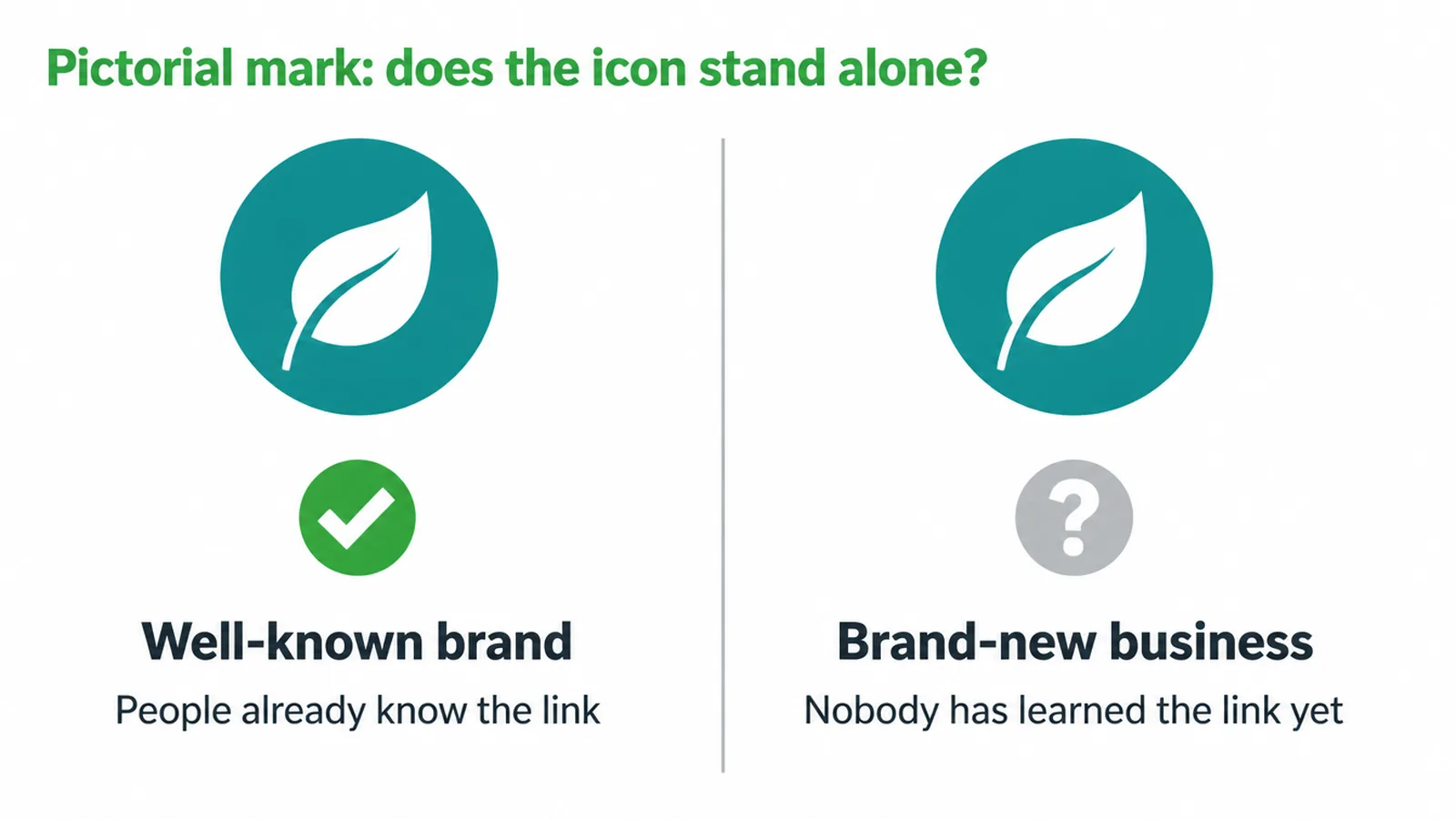
Here is the honest bit. A pictorial mark suits businesses people already recognise. The reason is simple: a symbol with no name attached only means something once the link is set in people's heads.
A sportswear brand can use a bare icon because millions already know it. A brand-new shop cannot, because nobody has learned the link yet.
If you love the idea of an icon but you are just starting out, that is a strong nudge towards pairing it with your name (see the combination mark below).
5. Abstract mark
An abstract mark uses shapes and forms in a non-literal, conceptual way to build an original visual language (ManyPixels). It is not a picture of anything real. It is a made-up shape that suggests an idea, a feeling or a bit of movement. That freedom is the whole appeal.
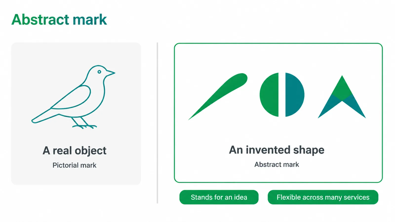
Because it is invented, an abstract mark can stand for a big idea without being stuck to one literal object. That makes it flexible, and great for companies that do many things.
The flip side matches the pictorial mark: it needs strong design and real recognition to land. A random shape means nothing until people connect it to you, so a fresh brand gets less mileage from one on its own. Give it time, or give it your name alongside.
6. Mascot
A mascot is an illustrated character that acts as the face and personality of the brand, and it works well in food and entertainment (ManyPixels). Think of a friendly character on a cereal box or a sports team. The mascot gives your brand a face people can like, wave at and remember.
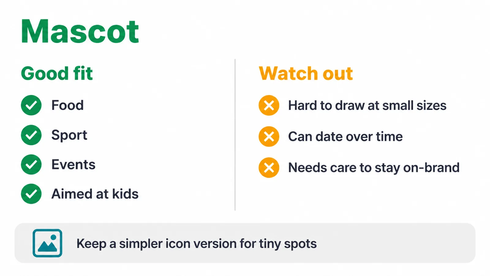
A mascot is personality-forward, so it shines for brands that want to feel warm, fun or family-friendly. It is brilliant for anything aimed at kids, and for sport, events and food.
The downsides are practical. A detailed character is a lot to draw at small sizes, it can date over time, and it needs care to stay on-brand across every use. Many owners keep a simpler icon version for tiny spots, and save the full character for the big, playful moments.
7. Combination mark
A combination mark merges a wordmark or text with a symbol or image, and companies often keep more than one official version (ManyPixels). You get the name and the symbol working as a pair. People can read exactly who you are, while the symbol quietly builds recognition every time it shows up.
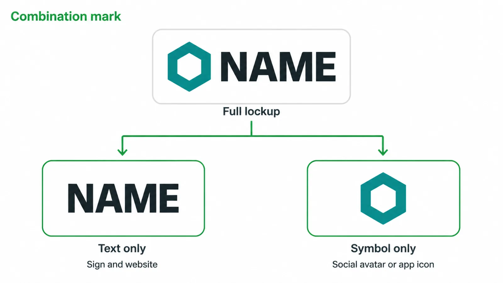
This is usually the most versatile type, because it can be split so the text or the symbol is used on its own as the business grows (GoDaddy). Full lockup on your sign and website. Just the symbol for a social avatar or app icon.
That flexibility is exactly why a combination mark suits most new and growing small businesses. It reads clearly today, and it leaves you room to lean on the symbol alone once you are better known.
Your logo is one piece of a bigger picture, so make sure it fits the rest of your small business branding.
8. Emblem
An emblem places the brand name inside a frame, badge or decorative shape, a traditional look whose versatility can be limited at small sizes (ManyPixels).
Picture a crest, a seal or a round badge. The name and any extra detail live inside one contained shape, and that gives an instant sense of heritage and authority.
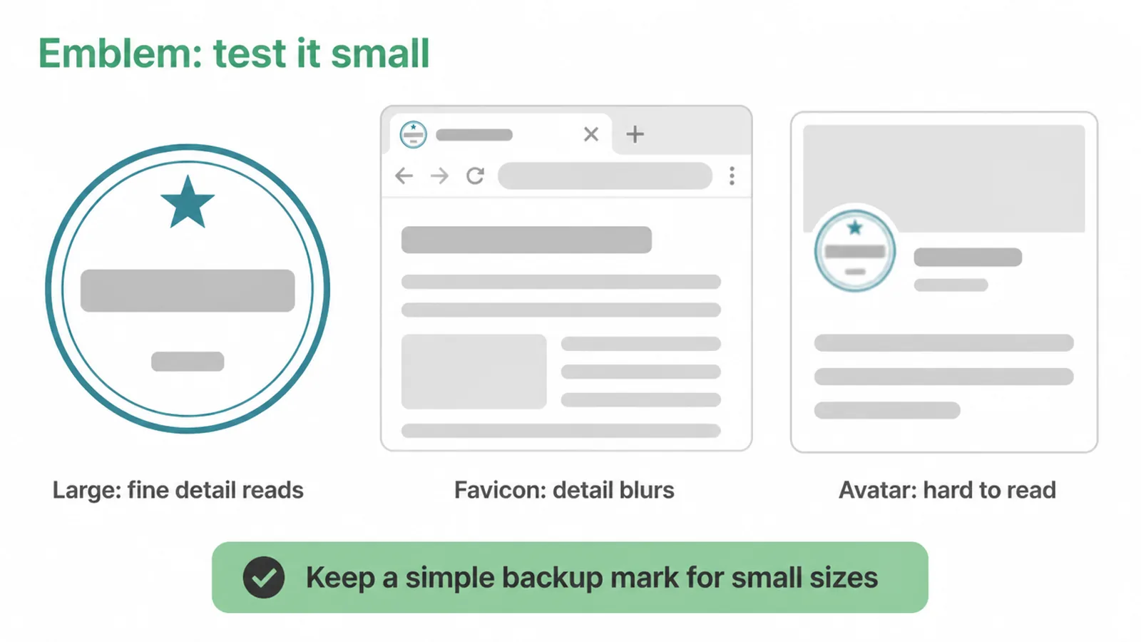
Emblems look established and serious, which is why schools, cafes and craft brands love them. But they are the hardest type to scale down.
Fine lines, textures and small text like a "year established" line can blur or disappear at favicon or avatar sizes, so designers make simplified or icon-only versions to cope (Looka). An emblem is not a bad choice. It just asks for a simple backup mark so it still reads when it is tiny.
9. Which logo type should you choose?
Match the type to your situation.
- Starting a new business nobody knows yet? Go with a wordmark or a combination mark, so people can read your name while the brand sinks in.
- Got a long or hard-to-say name? A lettermark trims it to clean initials.
- Already have a symbol people recognise? A pictorial or abstract mark can carry the load on its own.
- Want warmth and character, especially for food, kids or events? A mascot brings a face.
- After a heritage, authority feel? An emblem does it, as long as you keep a simple icon version for small sizes.
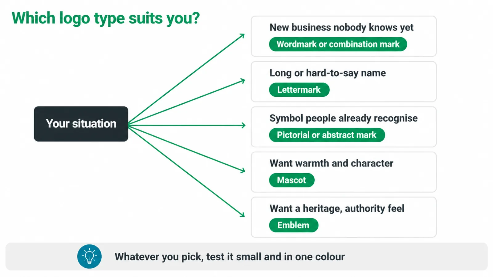
And whatever you pick, test it small and in one colour first. Remember your logo is only one part of the whole picture, so treat it as a piece of your wider brand identity, not the entire job.
Frequently asked questions
1. What are the main types of logos?
There are seven standard types: wordmark, lettermark, pictorial mark, abstract mark, mascot, combination mark, and emblem. Most small businesses land on a wordmark or a combination mark.
2. What is the difference between a wordmark and a lettermark?
A wordmark spells out your whole business name in a set typeface. A lettermark uses just the initials. Pick a lettermark when your full name is long or hard to say.
3. What is the difference between a pictorial mark and an abstract mark?
A pictorial mark is a picture of a real thing, like a bird or an apple. An abstract mark is a made-up shape that stands for an idea.
4. Which type of logo is best for a small business?
Usually a combination mark or a wordmark. A combination mark gives you a name plus a symbol, so people can read who you are while the symbol builds recognition over time.
5. What is the most versatile type of logo?
The combination mark. Because it has both text and a symbol, you can use the full lockup on signs and the site, then use just the symbol for a social avatar or app icon.
6. Why do icon-only logos not work well for new brands?
A plain symbol only means something once people already link it to you. A brand-new business has no such memory yet, so a name or a name-plus-symbol reads far more clearly.
7. Are emblem logos a bad choice?
Not bad, just harder to shrink. Emblems pack the name inside a badge, and the fine detail can blur at small sizes like favicons, so many owners keep a simple icon version too.
8. Can I change my logo type later?
Yes. Many brands start with a combination mark and later drop the text once the symbol is well known. Plan for that from the start and you avoid a painful rebrand.
See our logo design service if you want help choosing and building the right mark.