What Makes a Good Logo? The 5 Classic Principles

A good logo passes five checks: simple, memorable, versatile, appropriate and timeless. It should scale to an app icon, be sketchable from memory, hold up in one flat colour, suit your audience, and still look right in ten years. Seed Light judges every mark against those five before it ships.
Key takeaways
- Simple: easy to recognise at a glance and to draw from memory.
- Memorable: it sticks after one look and stands apart from rivals.
- Versatile: it works at any size and in one flat colour.
- Appropriate: the feel fits your business and your audience.
- Timeless: it leans on fundamentals, so it does not date fast.
- A logo does not have to picture what you do, and strategy comes before the drawing.
A good logo is simple, memorable, versatile, appropriate and timeless. That is the short answer. Simple so people can take it in fast. Memorable so it sticks after one look.
Versatile so it works small and in one colour. Appropriate so the feel matches your business. Timeless so it does not look old in a year. Pass those five checks and your logo is doing its job.
Here is the honest bit up front. A logo is a mark of recognition, not a full advert. It is one part of your brand, sitting on top of your positioning, your colours and your voice.
If you want the wider picture, our guide to small business branding covers how the logo fits with everything else. This post stays focused on the mark itself: what makes it good, and how you can test your own in a couple of minutes.
You do not need to be a designer to judge a logo. The principles below have been used by professional designers for decades, and you can apply each one with a plain question. Let us walk through them.
1. The five principles of a good logo
These principles are not something we made up. They come from decades of design craft. One of the clearest voices on the subject was Paul Rand, the designer behind marks for some of the biggest names of the 20th century.
In his 1991 essay for AIGA, "Logos, Flags, and Escutcheons," Rand listed distinctiveness, visibility, usability, memorability, universality, durability and timelessness as the qualities behind an effective logo (Paul Rand).
That is a strong foundation, and the table below turns it into checks you can run yourself.
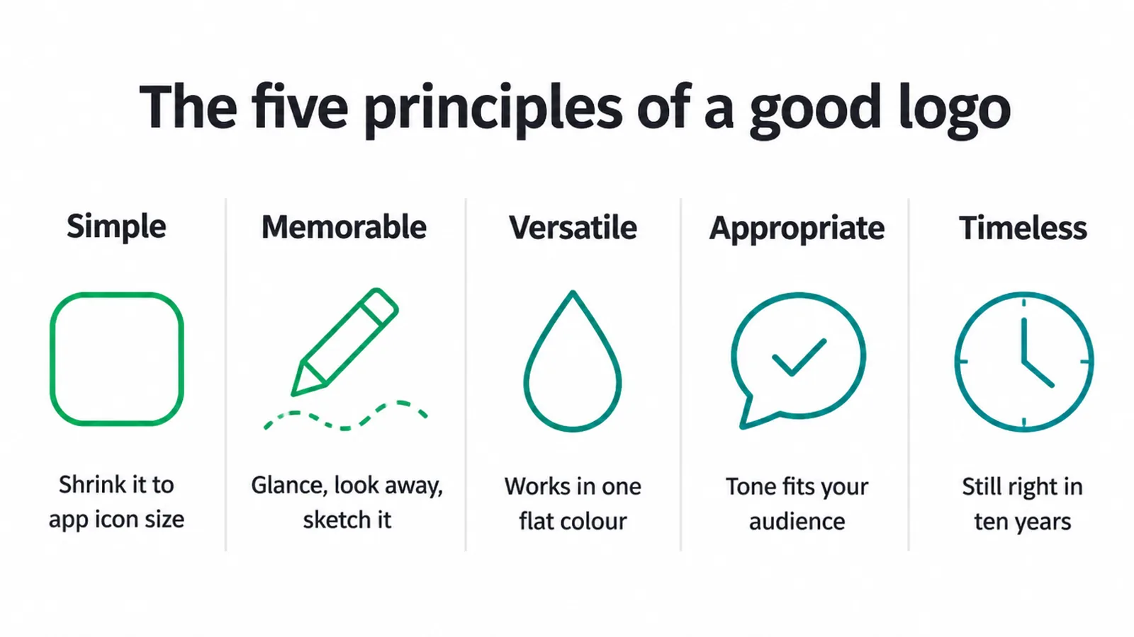
| Principle | Why it matters | How to test it |
|---|---|---|
| Simple | Easy to recognise and recall, and it scales anywhere. | Shrink it to app-icon size. Is it still clear? |
| Memorable | People remember you and can re-find your brand. | Glance for two seconds, look away. Can you sketch it? |
| Versatile | Works on a sign, a screen, a stamp and a stitch. | Does it hold up in one flat colour and in black and white? |
| Appropriate | The tone fits your business and your audience. | Show it to a target customer. Does the feel match? |
| Timeless | It does not date, which saves costly re-dos. | Would it still look right in ten years? |
2. Simple beats clever
Simplicity is the one that carries the most weight. A simple logo is easier to recognise, easier to recall, and easier to reproduce anywhere. It also scales without falling apart.
A simple mark can shrink to a tiny app icon or blow up to a billboard and still read cleanly, which is exactly why simplicity aids memorability and versatility. A busy, detailed logo turns to mush the moment it gets small.
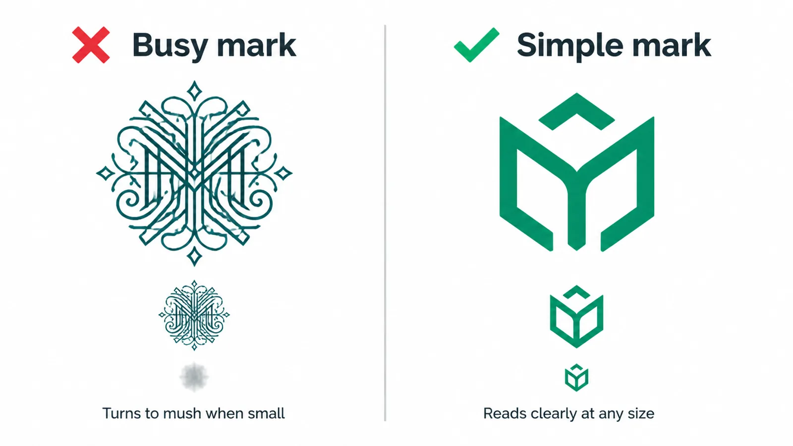
Simple does not mean boring or lazy. It means every part earns its place. Strip out the extra shading, the third font, the little decorative flourishes that add nothing.
The same restraint applies to colour. Fewer colours keep a logo clean and cheap to print, and they force the shape to do the work. When you are deciding on a palette, our guide on how to choose brand colours walks through picking a small, sensible set of colours.
3. It should be memorable and distinctive
A good logo sticks. You see it once, and it leaves a trace you can call up later. The fastest way to test this is the memory sketch.
Glance at your logo for two seconds, look away, then try to draw it. If you can rough it out, it is memorable. If you cannot, it is probably too complex or too generic.
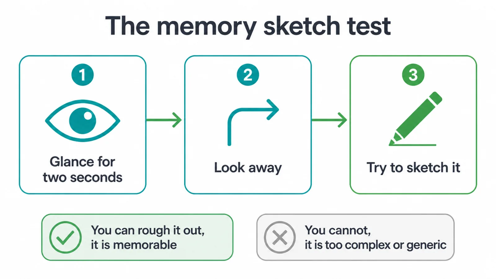
Distinctiveness is the other half of this. Your mark needs to stand apart from your competitors, not blend into them. If your logo looks like a slightly different version of the other three shops on your street, it is not helping anyone find you.
Paul Rand's mandate was that a logo must be distinctive, memorable, and clear, and those three pull in the same direction. A mark that is clearly its own thing is the one people remember and come back to.
4. It has to work everywhere
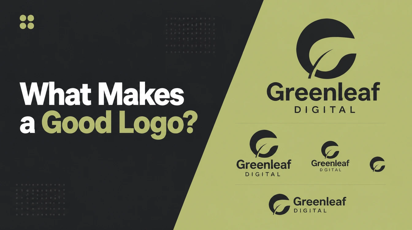
Your logo will show up in places you have not thought of yet. A tiny favicon in a browser tab. A one-colour stamp. A stitched patch on a shirt. A black-and-white receipt. A giant sign. It has to hold up in all of them, and the quickest way to check is the one-colour test.
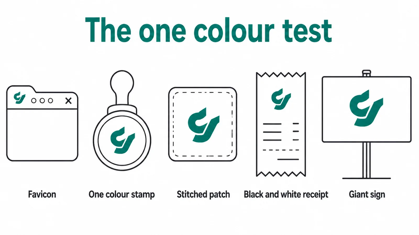
The one-colour test
The test is simple: does your logo still read clearly in one flat colour, or in plain black and white? A good logo should work in monochrome, not only in colour.
If your mark falls apart without its gradient, its shadow, or its five colours, it is too fragile. Get it working in one colour first, then colour becomes a bonus on top.
This is the flip side of the colour advice in our brand colours guide: pick a palette you love, but never let the logo depend on it to be readable.
The files you hold
Versatility also depends on the files you hold. Ask your designer for a vector master file, such as an SVG or EPS, which scales to any size without blurring. Add PNGs with transparent backgrounds and a plain one-colour version, and you can use the logo anywhere without going back to the drawing board.
5. It should fit your business
Appropriate means the feel of the logo suits your business and the people you want to reach. A law firm and a children's party brand should not feel the same.
One wants to signal trust and steadiness, the other wants to signal fun and warmth. The colours, the shapes and the type all carry that tone, and getting it wrong sends the wrong message before anyone reads a word.
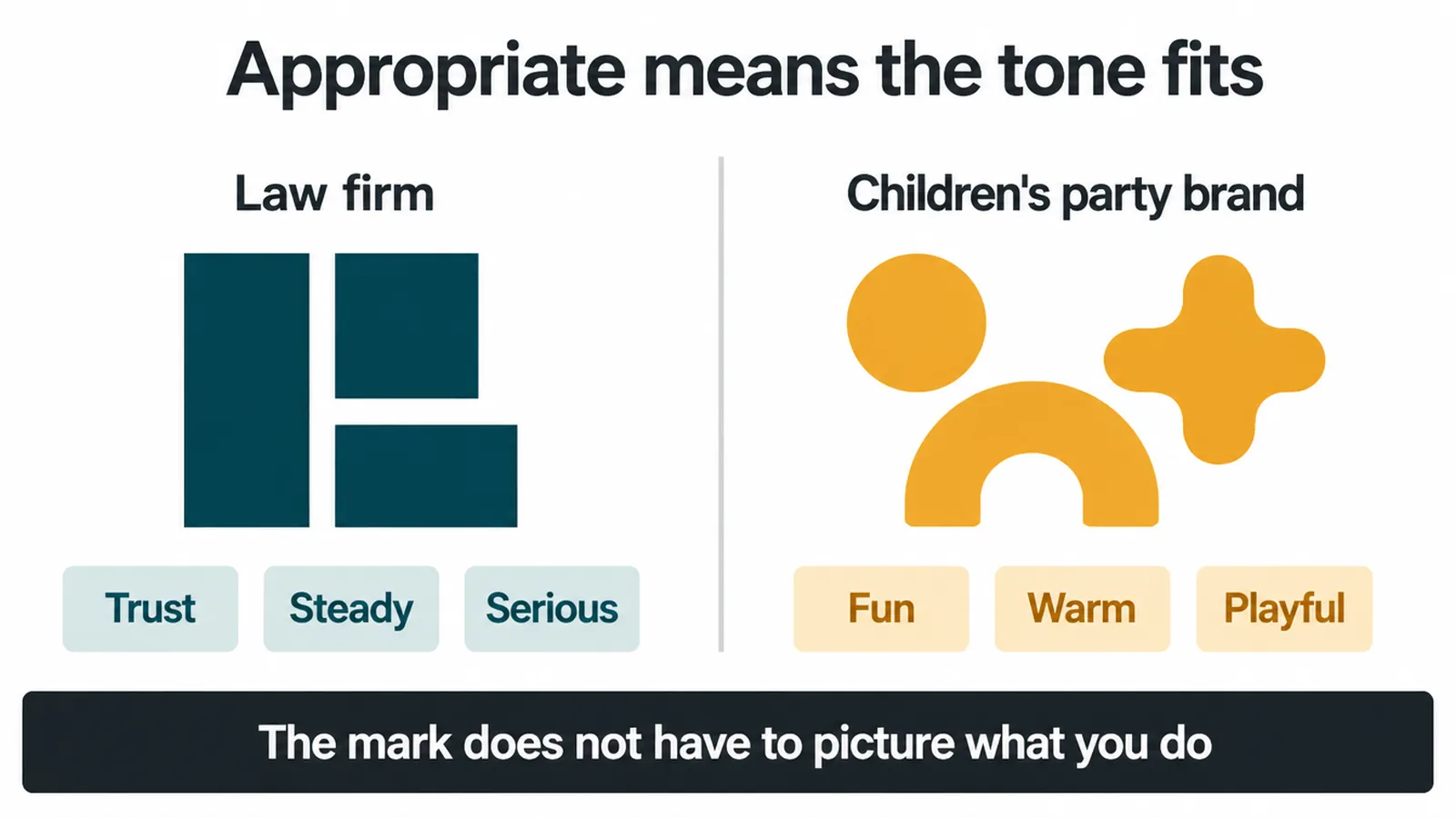
A logo does not have to picture what you do
Here is the part that surprises people. A logo does not have to picture what you do. Rand's point was that a logo derives its meaning from the quality of the thing it symbolises, not the other way around.
In plain words: the mark gets its meaning from your business over time. You do not need a coffee cup in your cafe logo or a house in your property logo. Appropriate is about the right feeling, not a literal picture.
Choosing the right kind of mark for your business is a decision in itself, and our guide to the types of logos lays out the options, from wordmarks to abstract symbols.
6. It should be timeless
Trends are tempting and they are a trap. A style that feels fresh today can look tired within a year or two, and a logo you re-do every couple of years never builds recognition.
That is why the advice is to favour fundamental shapes and classic proportions over trendy treatments. A trend can even be out of fashion by the time your project ships.
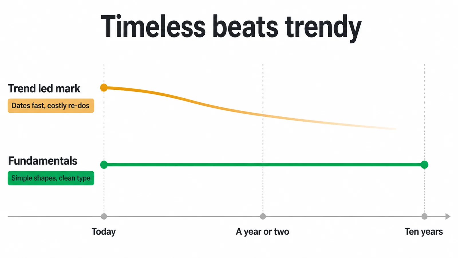
Timeless does not mean dull or dated, though. You can add a subtle modern touch, a considered typeface or a clean bit of geometry. The core just needs to still work in ten years.
If you would be embarrassed to still be using it a decade from now, it is chasing the moment instead of building something that lasts. Aim for a mark you can grow into, not one you will grow out of.
7. The seven ways weak logos go wrong
Most weak logos fail in the same handful of ways. Here is the quick list to check yourself against:
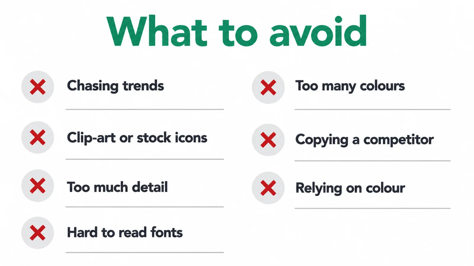
- Chasing trends. Fashionable looks date fast and force expensive re-dos.
- Clip-art or stock icons. The generic globe or swoosh everyone else uses makes you forgettable.
- Too much detail. Fine lines and busy shapes vanish when the logo gets small.
- Hard-to-read or gimmicky fonts. If people squint to read your name, the type is fighting you.
- Too many colours. A rainbow is hard to print, hard to reproduce, and rarely necessary.
- Copying a competitor. Looking like the shop next door helps them, not you.
- Relying on colour. If the mark dies in black and white, it is too fragile.
8. How a good logo gets made
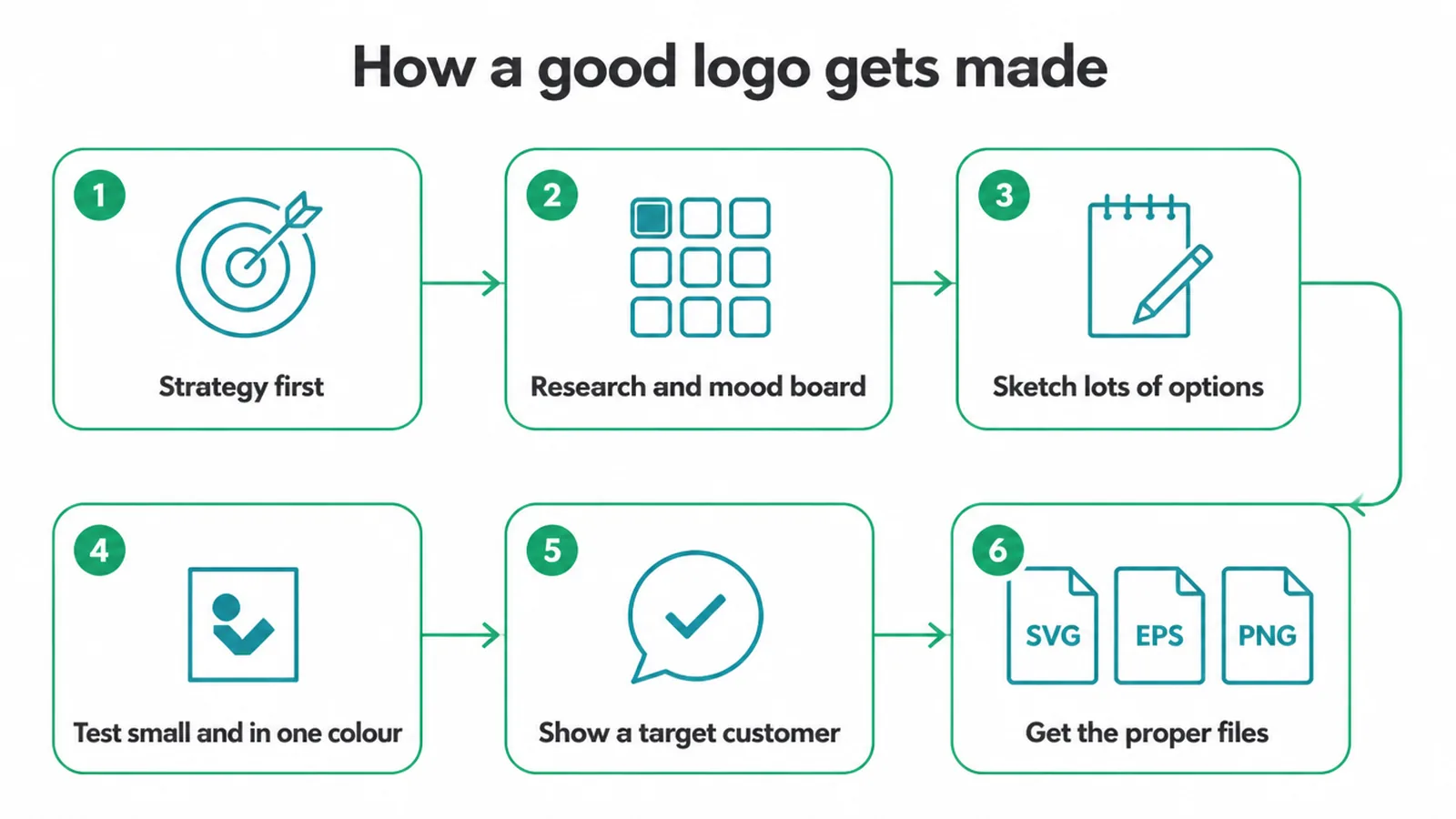
A good logo does not start with a drawing. It starts with strategy. As the standard advice goes, it is pointless trying to work out what something should look like until you understand what the point of it is.
So the first step is understanding the business, the audience and the tone before anyone opens a design tool. This is the same groundwork we cover in small business branding, and skipping it is why so many logos miss.
From sketches to final files
After the thinking, the making follows a rough path:
- A quick round of research and a mood board to set the direction.
- Then sketching, lots of options, because the first idea is rarely the best one.
- Then testing the strongest options small and in one colour, to catch the ones that fall apart.
- Then showing them to a real target customer to check the feel lands.
- Finally, getting the proper files so you can actually use the thing.
One last honest note. A logo is not a brand. It is the mark that sits on top of a brand. A strong logo on a weak business will not save it, and a plain logo on a clear, well-run business does just fine. Treat the logo as one important piece, not the whole job.
9. Audit your own logo in two minutes
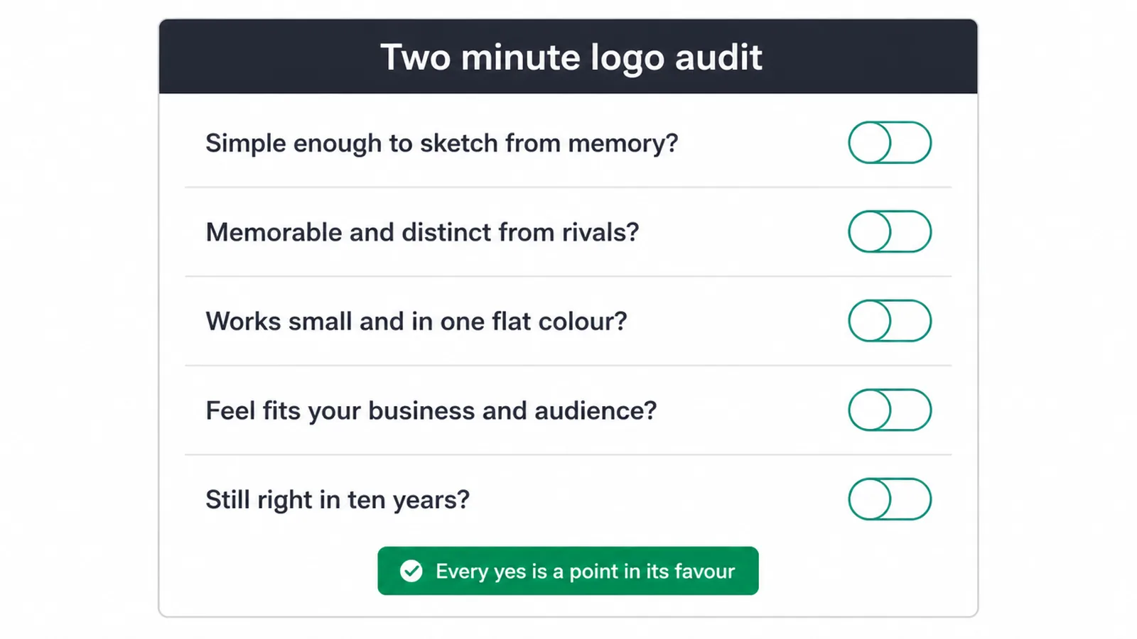
You can audit your own logo in about two minutes. Run it through the five checks. Is it simple enough to sketch from memory? Is it memorable and distinct from your rivals? Does it work small and in one flat colour?
Does the feel fit your business and your audience? Would it still look right in ten years? Every yes is a point in its favour. A no tells you exactly what to fix.
If your logo stumbles on a few of those, it might be time for a fresh mark that passes all five. That is the kind of work our branding service is built for.
Want a straight opinion on what you have now? Tell us about your business and we will help you get a logo that earns its place.
FAQ
1. What makes a logo good?
A good logo is simple, memorable, versatile, appropriate, and timeless. Simple so people recall it, memorable so it sticks after one look, versatile so it works small and in one colour, appropriate for your business and audience, and timeless so it does not date fast. If it passes those five checks, it is doing its job.
2. Does a logo have to show what my business does?
No. A logo does not need to literally picture your product or service. Many strong logos are just a name or a simple mark. The logo gets its meaning from the business over time, not the other way around, so a clear, distinctive mark beats a busy literal picture.
3. What is the one-colour or black-and-white test?
It is a simple check: does your logo still read clearly in one flat colour, or in plain black and white? If it only works with gradients, shadows, or many colours, it is too complex. A logo that works in one colour will hold up on a stamp, a receipt, an embroidered shirt, and a favicon.
4. How simple should a logo be?
Simple enough to recognise at a glance and to draw from memory. A good guide: if you cannot describe it in one short sentence, or it turns to mush when shrunk to the size of an app icon, it is too detailed. Strip out anything that does not earn its place.
5. Should I follow current logo design trends?
Be careful. Trends date fast, and a look that feels fresh today can feel old within a year or two. Lean on solid fundamentals, simple shapes, and clean type instead. You can add a subtle modern touch, but the core should still work in ten years.
6. What are common logo mistakes to avoid?
Too much detail, clip-art or stock icons everyone else uses, hard-to-read or trendy fonts, too many colours, and copying a competitor. Also avoid a logo that only looks good large or only in full colour. Each of these hurts recognition or ages the mark.
7. How many colours should a logo use?
Usually one or two. Fewer colours keep the logo clean, cheaper to print, and easy to reproduce anywhere. Always make sure it also works in a single flat colour and in black and white, then colour becomes a bonus on top.
8. What files should I get from a logo designer?
Ask for a vector file (such as SVG or EPS) that scales to any size without blurring, plus PNGs with transparent backgrounds, and a one-colour and black-and-white version. Vector is the master file. With those you can use the logo anywhere from a business card to a sign.