What Makes a Good Website

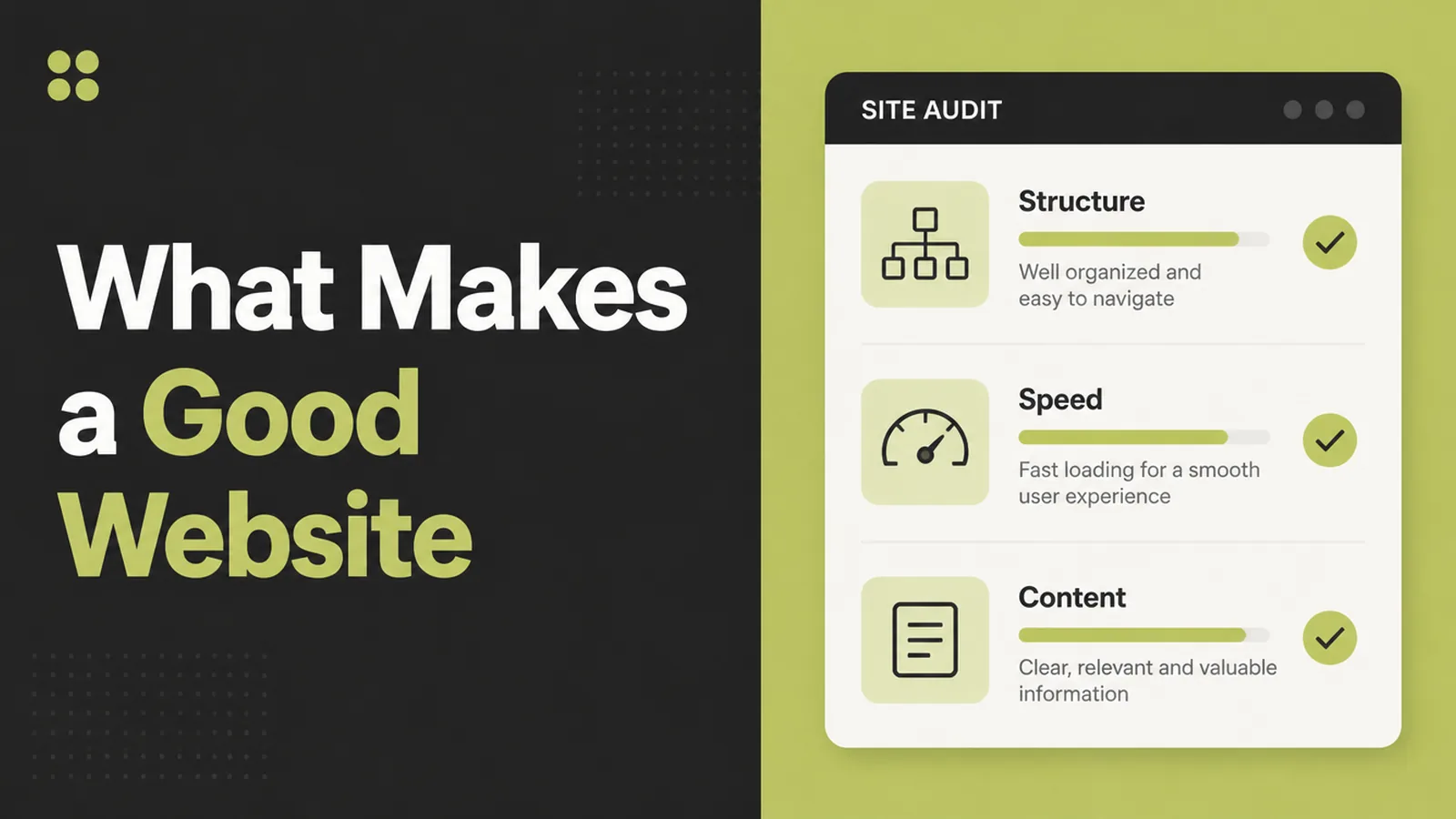
What makes a good website is three answers: what you do, proof you can do it, and an obvious next step, delivered quickly on a phone. Seed Light judges a site on those before anything visual, because a beautiful page that loads slowly and hides its phone number still sends people back to the results.
Everybody can point at a bad website. Far fewer can say what the good one is doing differently.
That gap is why so many redesigns change the colours, the photographs and the font, and leave the enquiries exactly where they were.
This guide covers the three things a good site actually achieves, why appearance is the smallest of them, and the order worth fixing them in.
Key Takeaways
- Three jobs only. Say what you do, prove it, make the next step obvious.
- Speed is a feature. A page nobody waits for is a page nobody reads.
- Judge it on a phone. One screenful, held at arm's length, is the real test.
- Contact details are not a page. They belong wherever somebody decides.
- Fix before you rebuild. Most sites need an afternoon, not a project.
What makes a good website is mostly unglamorous. It is clarity, speed and an obvious next step, in that order.
Design still matters, and it matters as the thing that makes those three easy rather than as the thing being judged.
What Makes A Good Website: What Good Means
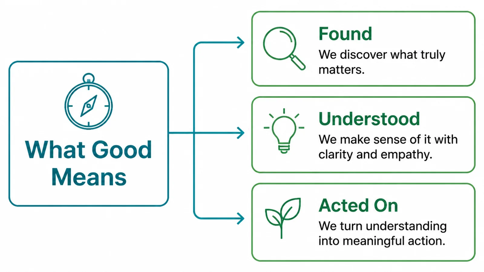
A visitor arrives with a question and a short temper. The site either answers quickly or loses them to the next result.
- It says what you do. In the first screenful, in their words rather than yours.
- It proves you can. Work you have done, named customers, photographs of the real thing.
- It makes acting easy. One obvious action, available wherever somebody is convinced.
Those three are the whole definition. A site can be plain and do all three; a site can be beautiful and do none.
It is worth checking yours against them honestly, section by section. Most pages have a section that serves none of the three and has been there for years because nobody questioned it.
Ask what makes a good website in your trade specifically, because the proof differs. A builder shows finished work, an accountant shows credentials, a clinic shows the room somebody will sit in.
The three jobs stay the same. What changes is which evidence a customer in your trade finds convincing.
Why Pretty Is Not Enough
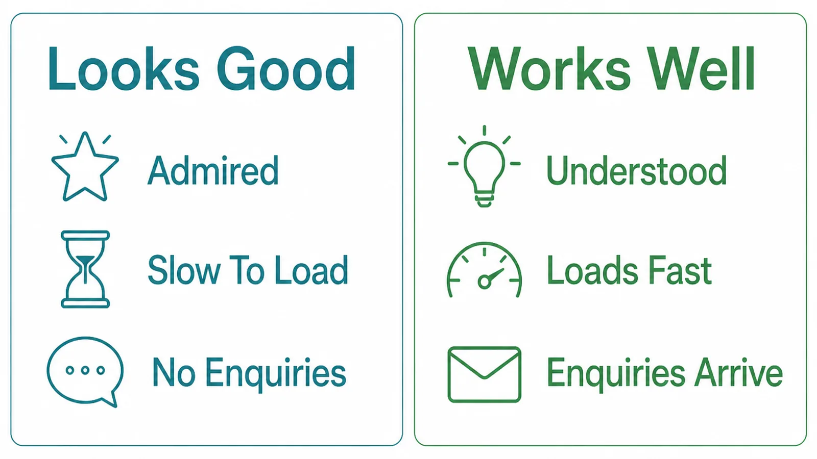
Appearance earns attention. It does not answer questions, and attention without an answer is a visitor leaving politely.
The common failure is a hero section that looks superb and says nothing: a large photograph, a short abstract line, and no mention of the service or the place.
The second failure is weight. Large images, several fonts and a carousel make a page that looks considered and loads like a brochure arriving by post.
A good website is one a visitor can use badly and still succeed. Skimming, on a weak connection, half distracted, and they still find what you do and how to reach you.
That is a higher bar than looking good, and it is a much cheaper one to meet.
None of this argues for an ugly site. Appearance buys you the few seconds in which the three answers have to land, and a dated page spends those seconds apologising.
How To Make A Good Website, Step By Step
Three passes, in this order. Each one is cheap, and each one is usually worth more than the redesign people reach for first.
1. Fix What People See First
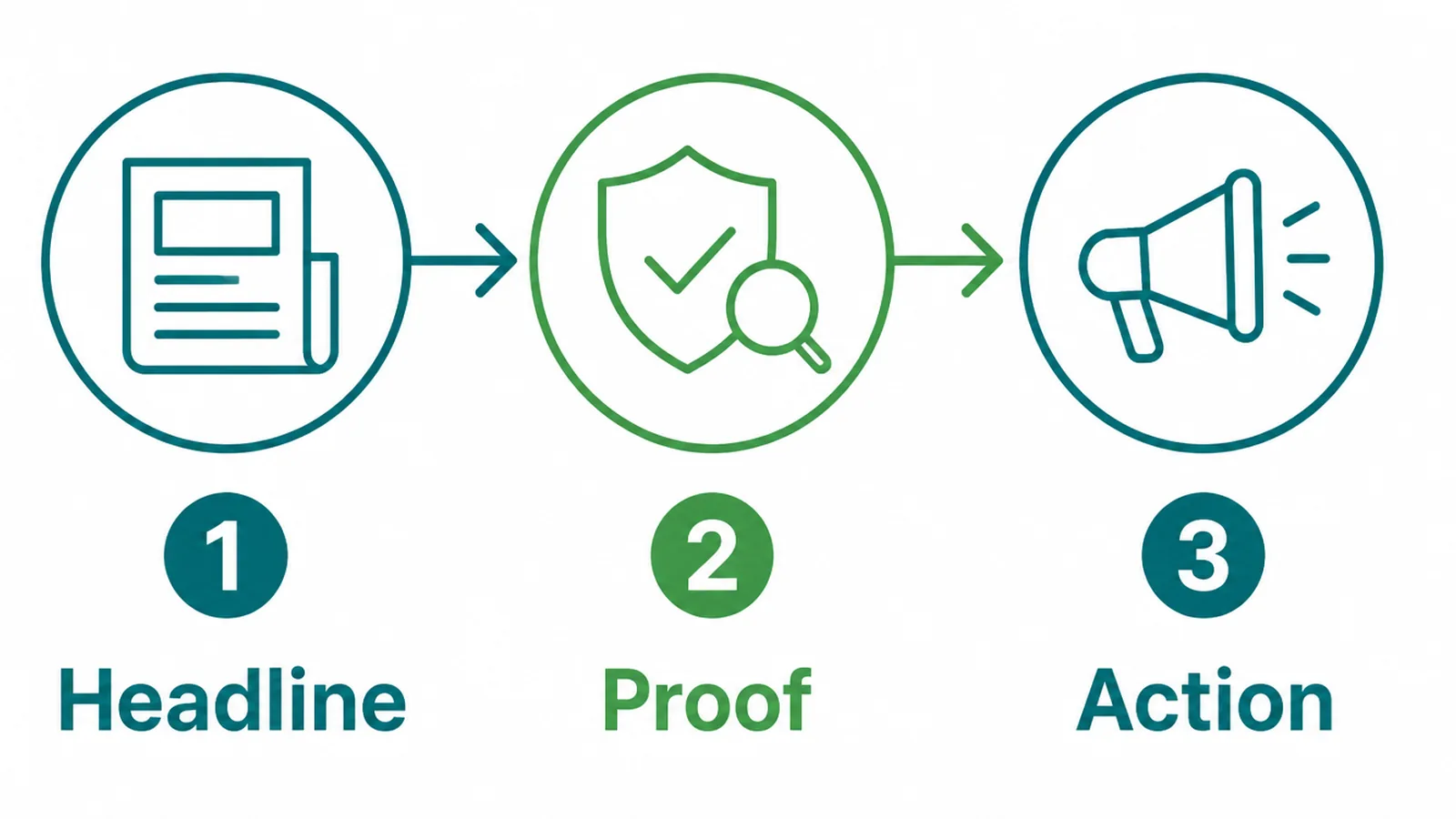
Open your home page on a phone and look at what fits without scrolling. That is the whole first impression.
- Headline. What you do and who for, in plain words, not a slogan.
- Proof. One line or one image that makes it believable immediately.
- Action. A tappable way to start, visible without scrolling.
Most sites fail on the first. They open with a welcome, a value, or a photograph of a building, and the service appears somewhere further down.
Read your own first screen as somebody who has never heard of you. If the only thing it establishes is that you exist, it is doing a quarter of its job.
Shorter is usually better here. One line that lands beats three that have to be read in order.
Name the place as well, if you serve one. A visitor deciding between three firms is also deciding who is near enough to turn up.
2. Make It Load Quickly
Speed is not a technical nicety. It is whether the page exists for somebody on a train.
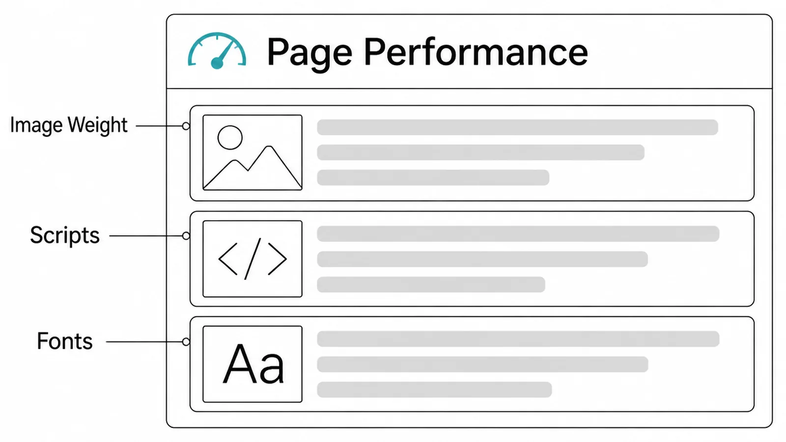
On a small business site the weight almost always comes from the same three places.
- Image weight. Photographs uploaded at camera size and scaled down in the browser.
- Scripts. Chat widgets, pop-ups, trackers and plugins, each loading its own code.
- Fonts. Several families and weights, each a separate download before text appears.
Fixing the images is usually an afternoon and makes the largest difference. Removing one abandoned plugin often makes the second largest.
Neither needs a redesign. Both can be done on the site you already have, by whoever maintains it, without changing a single word of the copy.
Test it on a phone on mobile data, not on your office connection. Your connection is the one condition that does not matter.
3. Make It Easy To Act
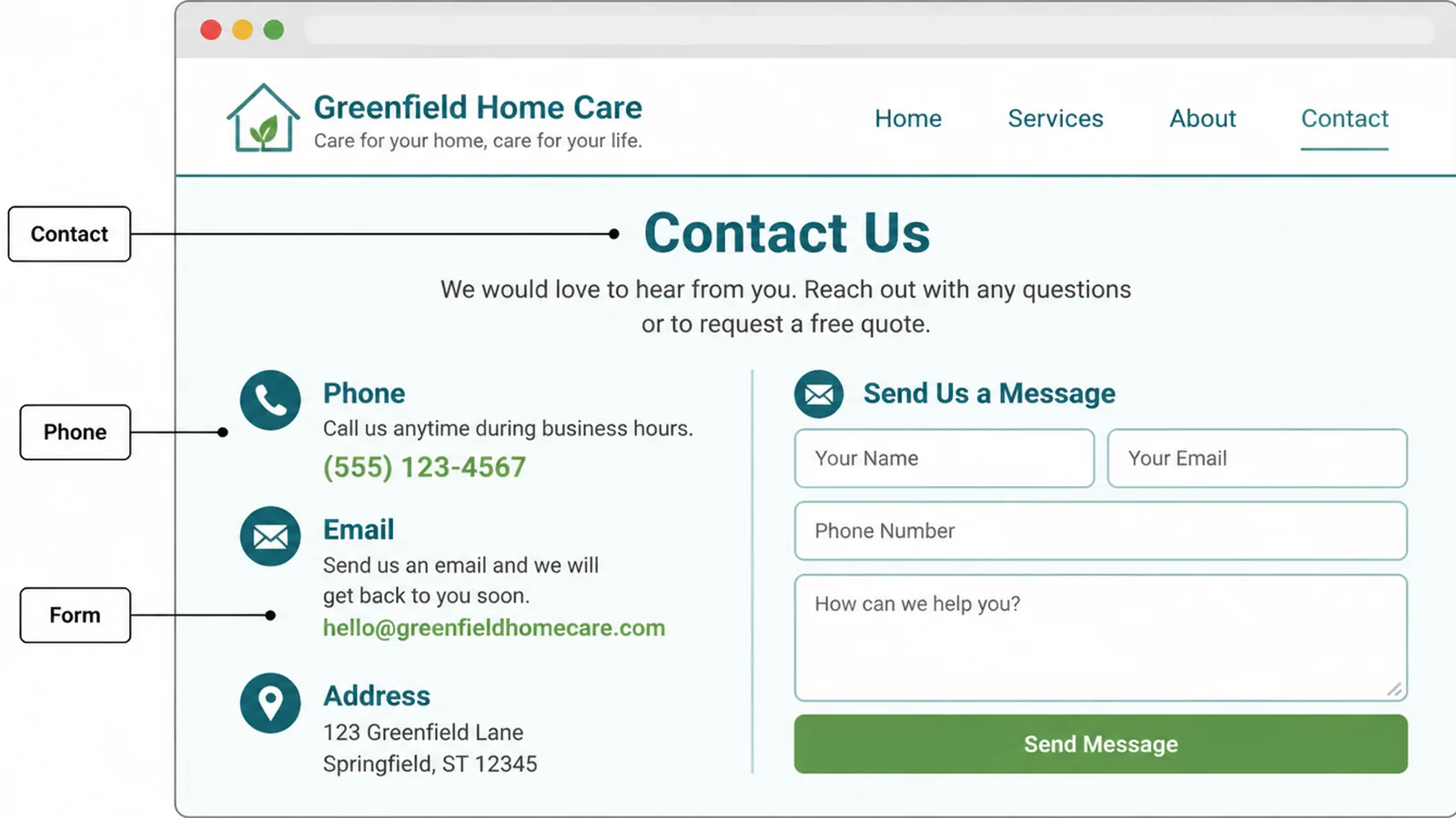
An effective website makes the next step available at the moment somebody decides. That moment is rarely the bottom of the page.
- Contact. Visible in the header, repeated at the end of every service section.
- Phone. A tappable number on mobile, not an image or a line of plain text.
- Form. Short, with a confirmation that tells the sender what happens next.
Offer two routes at most. Three or four equally loud options is a decision, and a decision is friction.
Pick the route you actually answer fastest and make that one loudest. An email address you read twice a week should not be competing with a phone in your pocket.
Then test it yourself every month. A silent contact form looks exactly like a quiet month, and the difference is weeks of enquiries.
Say what happens after somebody sends it, too. A line promising a reply within a working day does more for an anxious enquirer than a nicer button ever will.
Website Quality Ideas That Work Right Now
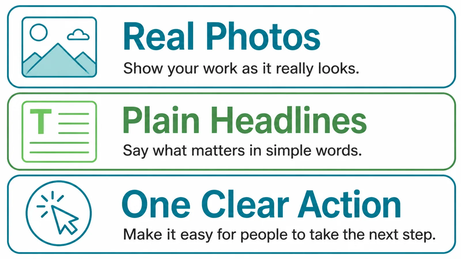
If you want to improve website quality this week rather than this quarter, start here.
Pick one, do it today, and look at the page again tomorrow. Small reversible changes teach you more about your own site than a month of planning.
- Rewrite the first screenful. The service, the place, and one reason to believe you.
- Replace stock photographs with your own. Real work beats a better-lit stranger.
- Delete a section nobody reads. Usually the one that was added to fill space.
Each of these is reversible, and that is what makes them worth trying. A rebuild is not.
Photographs of your own work are the cheapest credibility available to a small business. They cannot be bought by a competitor, and they tell a visitor exactly what they would be getting.
A phone from the last few years is enough. Daylight, a tidy background, and the thing itself in focus beats a staged photograph of somebody else's premises.
Caption them with what they are. A picture of a finished job says more when the line underneath names the job, the place and roughly when.
Website Quality Tools
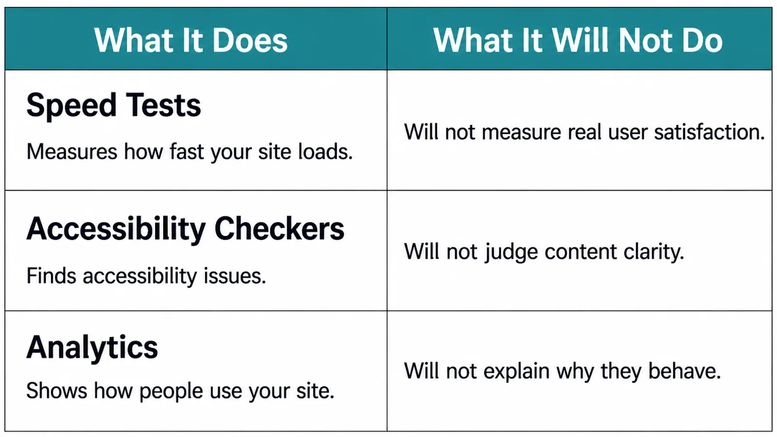
Tools measure. None of them decides what the page is for.
| What it does | What it leaves to you |
|---|---|
| Speed tools report load times and what is slowing a page | Deciding which of the heavy things you actually need |
| Analytics shows which pages get read and which get left | Working out why, which the numbers never say |
| Accessibility checkers find contrast, labels and heading faults | Fixing them, and the ones no checker can detect |
A score is not the goal. A perfect speed score on a page that does not say what you sell is a well-optimised failure.
Take the opposite order. Get the page saying the right thing, then make it fast, then measure to confirm you did not undo anything.
Use the tools to find candidates, then decide with your eyes. The reason a page underperforms is usually visible in ten seconds of reading it as a stranger.
Check the same pages every few months rather than once. Website quality drifts quietly as photographs are added, plugins accumulate and prices change.
Common Website Mistakes
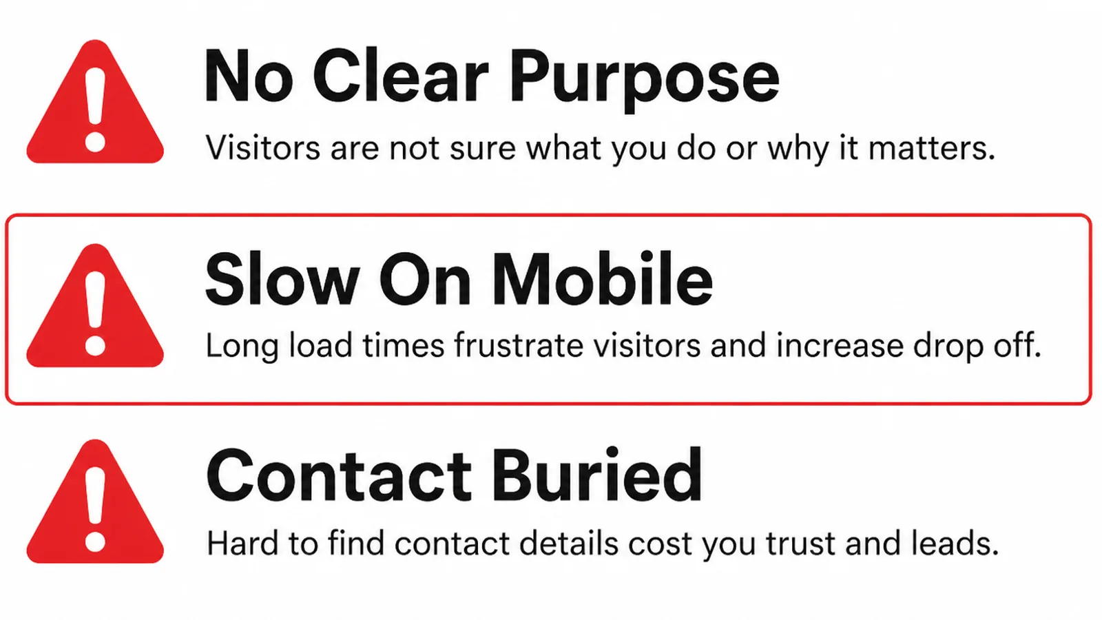
- Hidden contact details. One page, one form, no phone number, no address.
- Slow heavy pages. Full-size photographs and four plugins nobody remembers installing.
- No proof. Claims about quality with nothing a visitor can check.
A fourth deserves naming because it is so common in small businesses: the site that was finished once and never touched again.
An hour every quarter prevents most of it. Open the site as a stranger, check the prices and the hours, click the contact form, and fix whatever is now untrue.
Old prices, closed services and a copyright year from three years ago all say the same thing to a visitor, which is that nobody is minding the shop.
FAQs
How many pages should a good website have?
As many as there are things a customer needs to decide. For most small businesses that is a home page, one page per service, a page about the people, proof of work, and contact. More pages are worth adding when each answers a real question rather than filling a menu.
Does a good website need to be custom built?
No. Plenty of effective sites run on ordinary templates, because the things that decide the outcome are the words, the speed and the clarity of the next step. Custom work earns its place when the template fights what you actually need to show.
How often should a website be redesigned?
Less often than most people think. Rebuild when the site cannot do something the business now needs, or when it has become slow or unmaintainable. Rebuilding because it looks dated usually resets what was working and solves nothing anybody measured.
What matters most on a phone?
The first screen and the contact method. Most visitors arrive on a phone, see one screenful, and decide. If that screen says what you do and gives a tappable way to reach you, the rest of the site has a chance to be read at all.
Conclusion
What makes a good website is three answers delivered quickly: what you do, why you can be believed, and what to do next.
Fix the first screenful, make the page light, and put the action where people decide. Those three cost an afternoon each and settle most of what a redesign was going to promise.
If you would like a second opinion on yours, see how we approach web design, or get in touch and we will tell you which of the three is costing you most.