Mobile SEO: Improve Phone UX, Speed and Search Visibility

Mobile SEO is making your site rank and work for people searching on phones. Google indexes the mobile version of every site now, so the phone page decides your rankings. Keep content parity with desktop, load fast, and make everything usable with one thumb. Seed Light builds phone-first sites for small businesses.
Key takeaways
- Speed is the first test. 53% of mobile visitors leave a page that takes longer than 3 seconds to load, so a slow phone page bleeds traffic before Google even ranks it.
- Google ranks your phone version. Google uses the mobile version of your content for indexing and ranking.
- Keep the same content on mobile. Hiding text or links on the phone version can drop them from Google's view.
- Mobile UX is a signal. Big tap targets, readable text, and no full-screen popups all help.
- Phones drive local wins. Most "near me" searches end in a visit fast, and that traffic is mobile.
1. What is mobile SEO?
Mobile SEO is making your site rank well and work well for people searching on phones. It is the same SEO you already do, just judged on the small screen. Google reads the phone version of your site first, so the way your page looks and loads on a phone shapes where you rank.
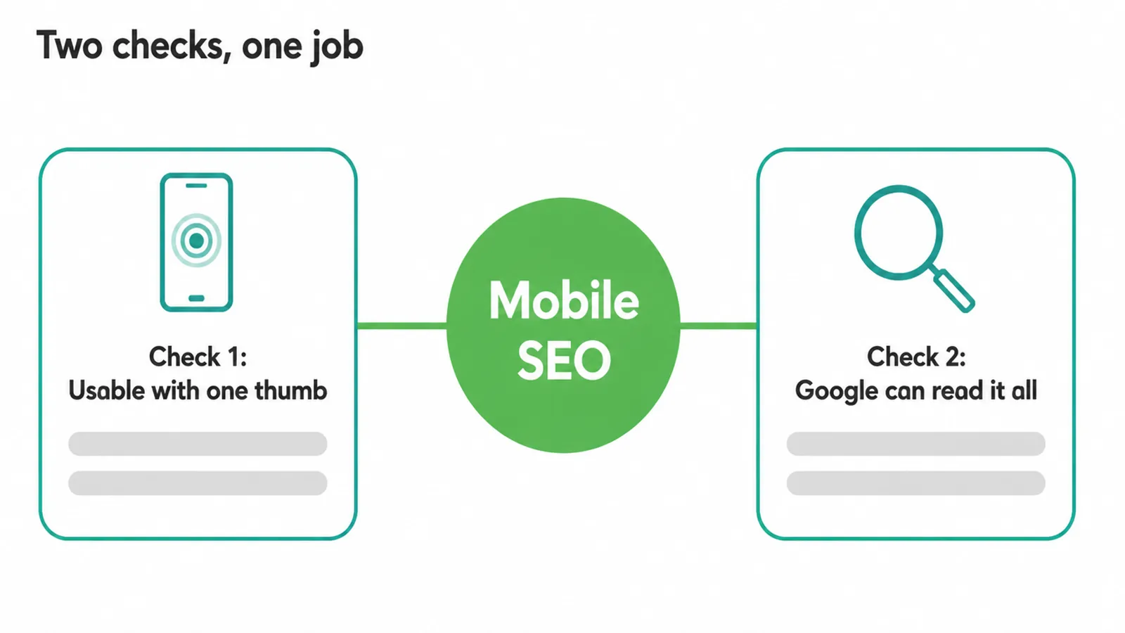
Think of it as one job with two checks. Can people use your page on a small screen with one thumb? And can Google read everything it needs on that same screen? When both are true, mobile SEO takes care of itself.
When one breaks, your rankings slide even if your desktop site looks great. If the mobile version is beyond patching, a website redesign is usually cheaper than years of workarounds. If you want a partner to handle this end to end, our SEO service covers it.
2. Why mobile-first indexing changes everything
Mobile-first indexing means Google ranks the phone version of your site, not the desktop one. Google uses the mobile version of your content for indexing and ranking. This is not optional or coming soon. Mobile-first indexing finished rolling out after July 5, 2024, so it applies to every site now.
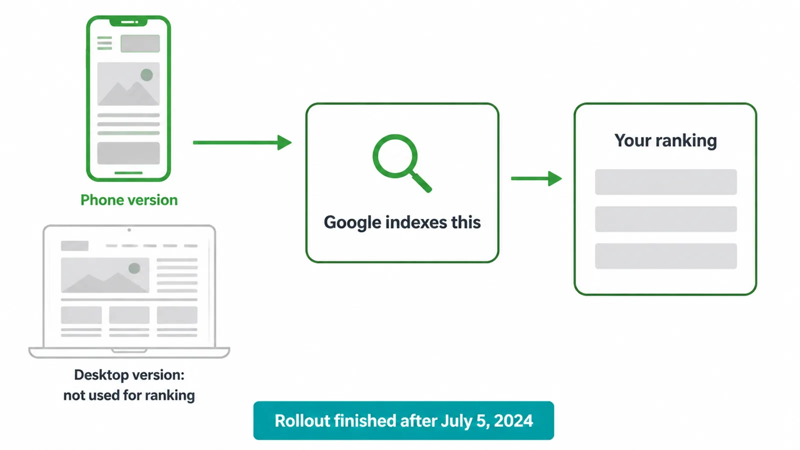
Here is why it matters. If your mobile page is thinner than your desktop page, the thin version is what ranks. If a key paragraph or link only shows on desktop, Google may act as if it does not exist.
The phone version is the real version in Google's eyes. To get the thinking behind a phone-first build, read our take on mobile-first design. And if you want the bigger ranking picture, see how to rank higher on Google.
3. Mobile speed and Core Web Vitals
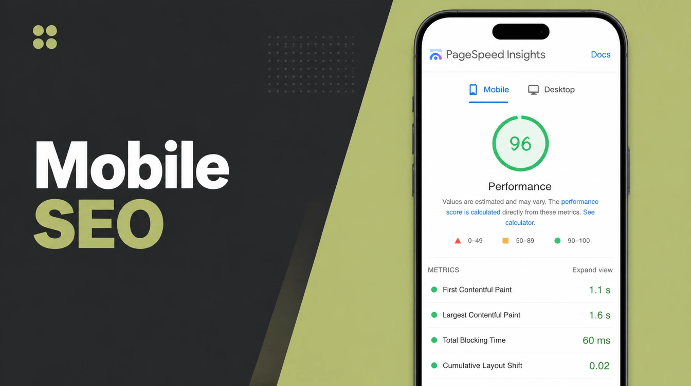
Speed is the first thing mobile SEO tests, because slow pages lose people and rankings together. 53% of mobile visitors leave if a page takes longer than 3 seconds to load. That is half your traffic gone before they read a word.
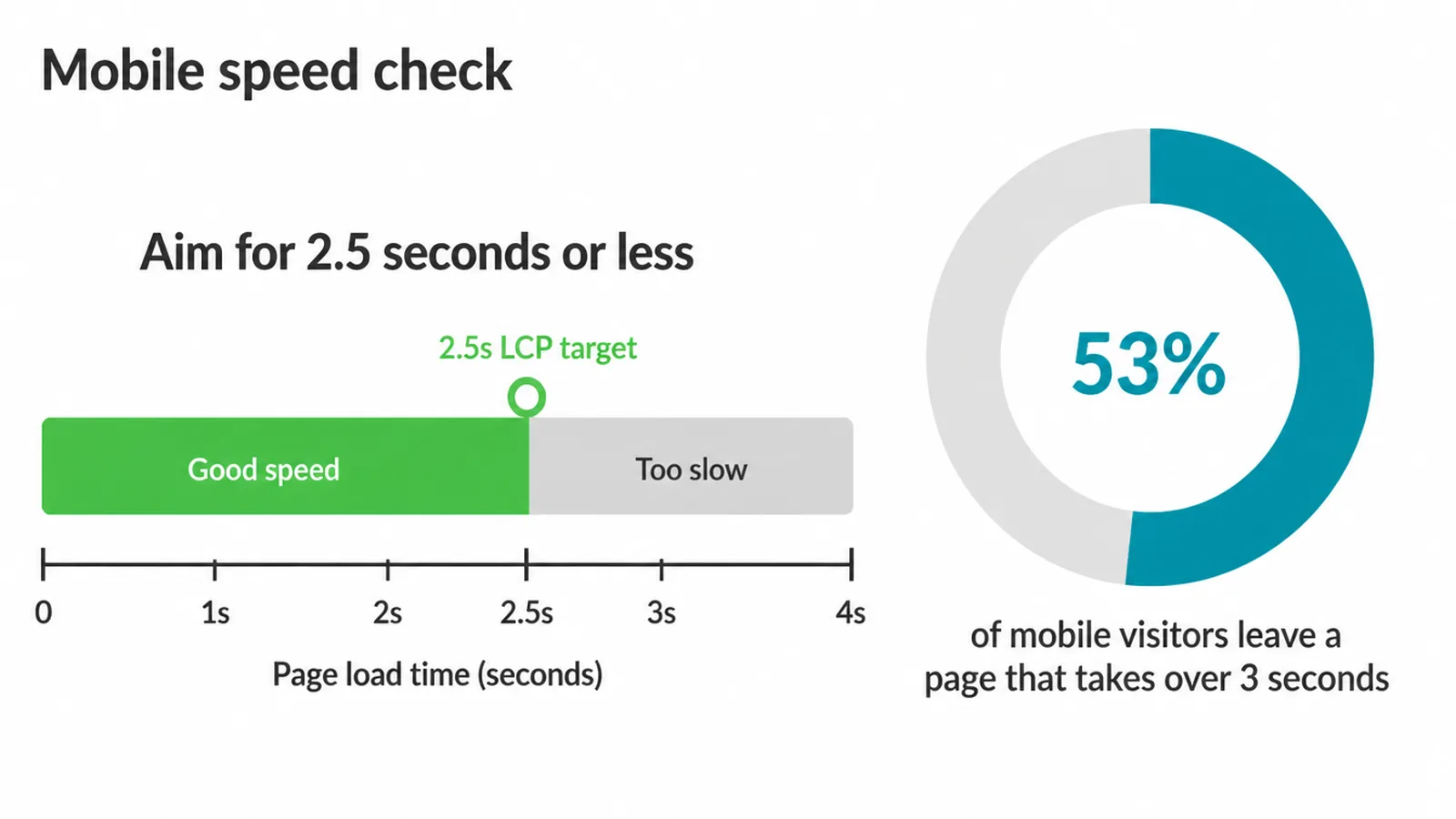
Google measures this with Core Web Vitals. The main one to watch is Largest Contentful Paint, which is how long your biggest piece of content takes to show. Google says to aim for an LCP of 2.5 seconds or less.
Phones get tested on slower connections, so a page that feels snappy on your laptop can still fail on a mid-range phone.
Check your scores in Google Search Console, and for a plain rundown of each metric, read Core Web Vitals explained. To see where your own pages stand today, run one through our free Core Web Vitals checker.
4. Mobile UX signals that help rankings
Mobile SEO also rewards a page that is easy to use with a thumb. Google's mobile-friendly basics are simple. Make buttons and links big enough to tap, around 48 pixels. Keep body text readable, near 16 pixels. Stop sideways scrolling. And never block the screen with a full-page popup.
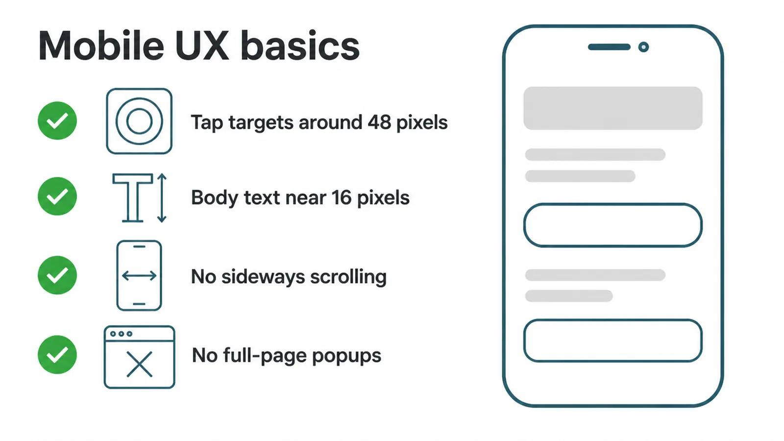
That last point has teeth. Google demotes pages with intrusive popups on mobile that cover the main content. A small cookie notice or an age check is fine.
A full-screen offer blocking your article the second someone lands is not. For the step-by-step build side, follow our guide on how to make a website mobile-friendly.
5. Keep your mobile content the same
Content parity is the rule that quietly sinks a lot of sites. Google says to make sure your mobile site has the same content as desktop. Same text, same headings, same images, same links, same structured data. If the phone version is stripped down, Google ranks the stripped-down version.
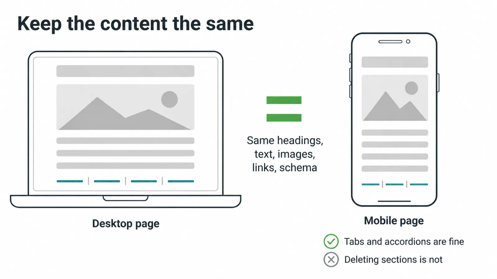
This trips people up because hiding feels harmless. It is not. You can tuck content into tabs or accordions, that is fine, because the words are still in the page. What hurts is removing whole sections from the mobile layout to make it "cleaner".
Keep your titles, meta descriptions, internal links, and schema identical across both. The cleanest way to guarantee this is responsive design, where one page reshapes to fit any screen instead of you running two separate versions.
6. Winning local searches on phones
If you serve a local area, mobile SEO and local SEO are the same fight. People search on their phones while they are out, and they act fast.
76% of people who do a "near me" search visit a business within a day, and 46% of all Google searches have local intent. That is a huge slice of demand, and almost all of it is mobile.
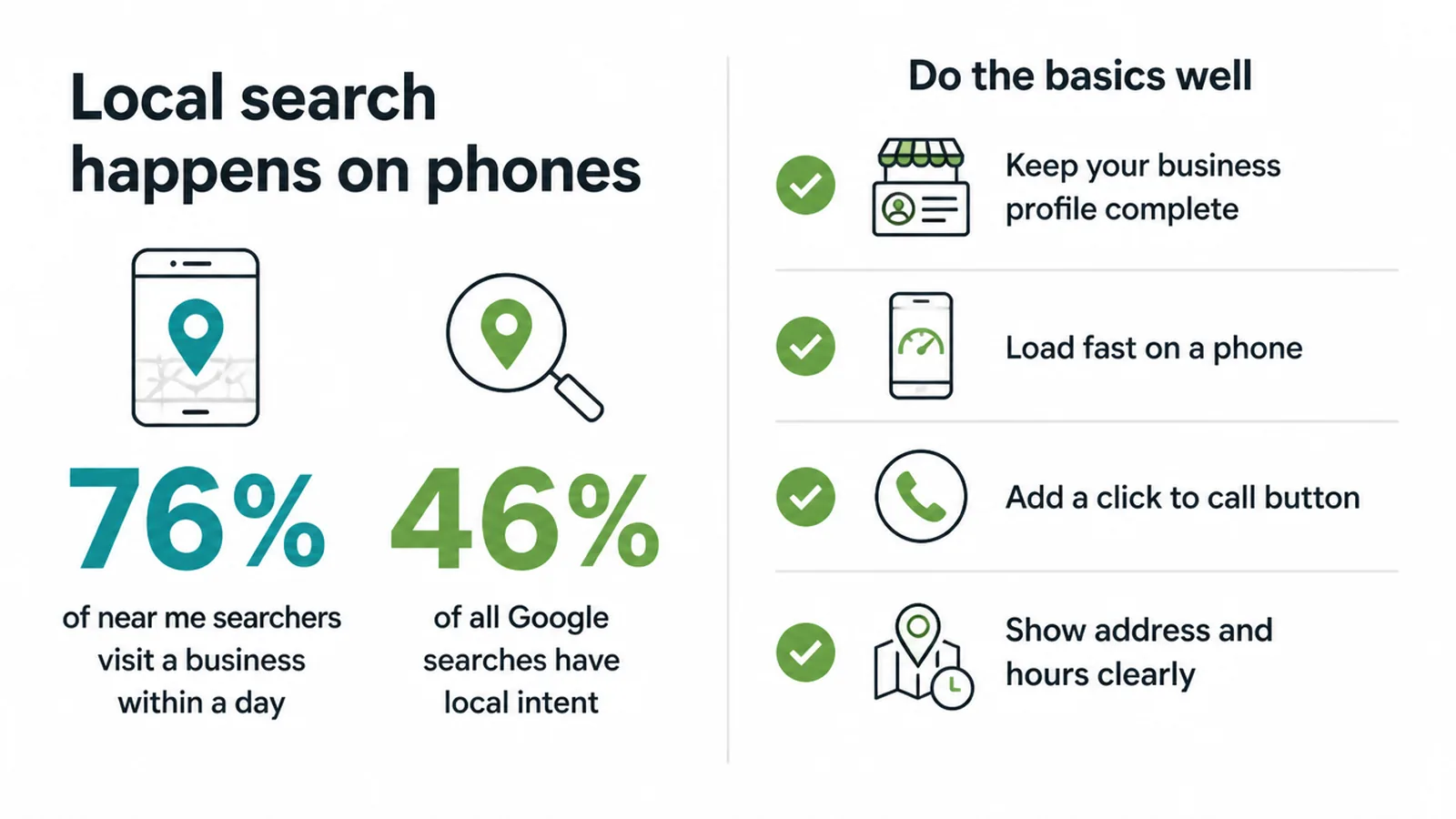
To catch it, do the basics well. Keep your Google Business Profile clean and complete. Make your pages load fast on a phone. Add a click-to-call button so a thumb tap starts a call. Show your address and hours without a hunt. For the full playbook, read local SEO for small businesses.
7. Common mobile SEO mistakes (and quick fixes)
Most mobile SEO problems come from a short list of repeat offenders. Here are the ones we see most, why they hurt, and the fastest fix for each.
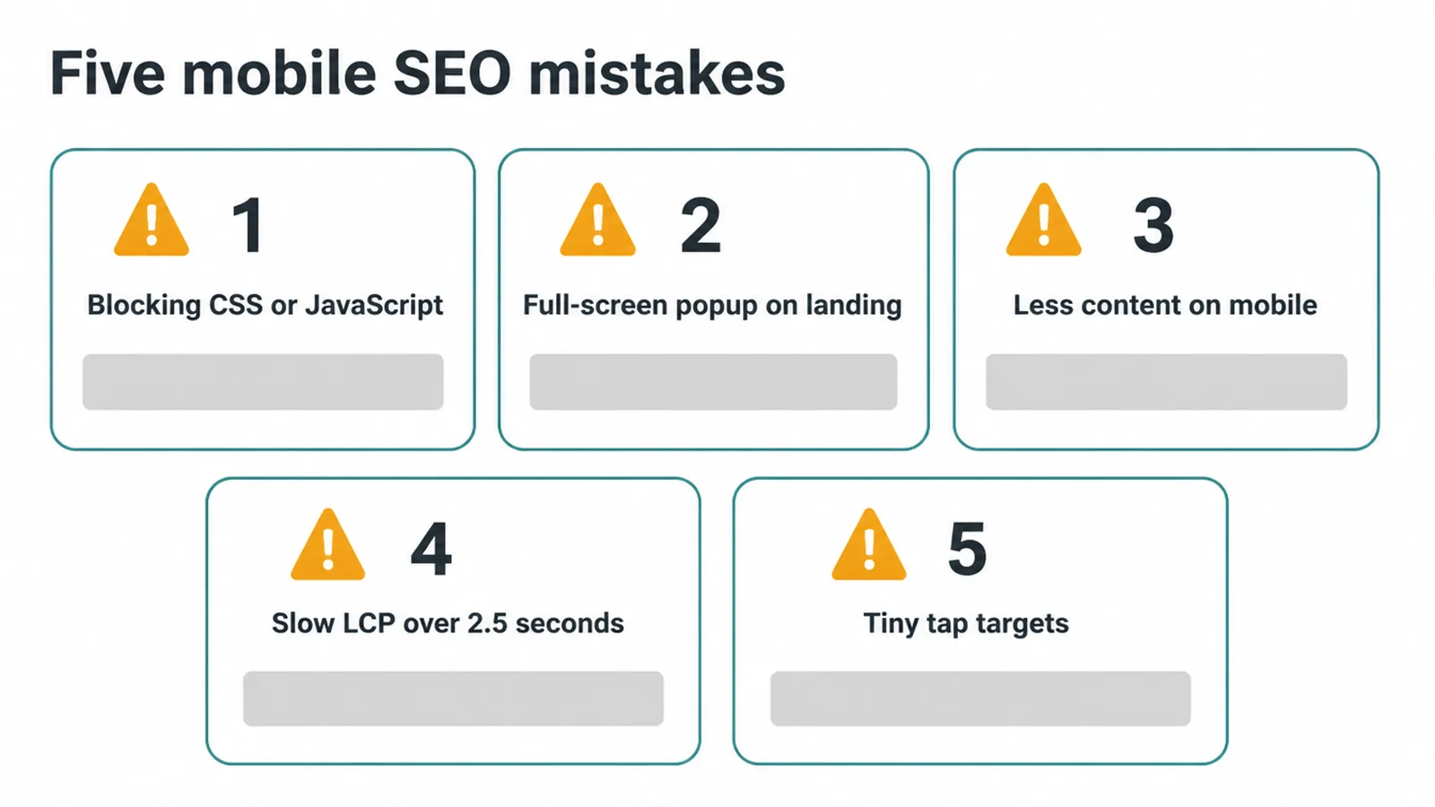
| Mistake | Why it hurts | Quick fix |
|---|---|---|
| Blocking CSS or JavaScript files | Google can't render your page the way users see it, so it may misjudge or under-rank it | Let Googlebot fetch your CSS and JS, then check the live page in Search Console |
| Full-screen popup on landing | Google demotes intrusive popups that cover the content on mobile | Swap it for a small banner or trigger the offer later, after a scroll |
| Less content on mobile | The thin phone version is what ranks, so missing text drops from Google's view | Match mobile to desktop, use accordions instead of deleting sections |
| Slow LCP over 2.5 seconds | Half of mobile visitors bounce, and speed is a ranking signal | Compress images, lazy-load below the fold, cut heavy scripts |
| Tiny tap targets crammed together | Visitors mis-tap and leave, hurting your mobile-friendliness signal | Make buttons around 48 pixels with clear space between them |
None of these are hard to fix once you spot them. Run through the list, patch what is broken, then keep an eye on your scores. For more traps to avoid, see our roundup of small business SEO mistakes.
Mobile SEO FAQ
1. What is mobile SEO?
Mobile SEO is making your site rank well and work well for people searching on phones. It is the same SEO you already know, just judged on the small screen. Google reads the phone version of your site first, so a slow or thin mobile page can drag your rankings down.
2. What is mobile-first indexing?
Mobile-first indexing means Google uses the mobile version of your content to index and rank your site. Whatever shows on the phone version is what Google judges. The rollout finished after July 5, 2024, so this now applies to every site on the web.
3. Does Google rank the mobile or desktop version of my site?
Google ranks the mobile version. Since mobile-first indexing finished, Google reads, indexes, and ranks the phone version of your pages. If your mobile site hides text, links, or images that your desktop site shows, Google may never count them.
4. Does mobile speed affect rankings?
Yes. Speed is part of Google's page experience signals, and phones are tested on slower connections. A page that loads fast on your laptop can feel slow on a mid-range phone on patchy data. Slow pages also lose visitors before Google even gets a vote.
5. What is content parity in mobile SEO?
Content parity means your mobile site shows the same content as your desktop site. Same headings, text, images, links, and structured data. Google recommends this directly. Hiding content inside tabs or accordions is fine, but stripping it out of the mobile page is not.
6. Do popups hurt mobile SEO?
Popups that cover the main content right when a visitor lands can hurt you. Google demotes pages that use intrusive interstitials on mobile. Small banners, cookie notices, and age checks are fine. A full-screen popup blocking your content is the problem.
7. What is a good mobile load time?
Aim for your main content to appear in about 2.5 seconds or less. Google's Largest Contentful Paint target is 2.5 seconds or under for a good score. Anything slower starts to cost you visitors and ranking signals, especially on phones.
8. Is responsive design good for SEO?
Yes. Responsive design uses one set of pages that reshape to fit any screen, so your mobile and desktop content stay the same by default. That makes content parity easy and gives Google one clean version to crawl. It is the simplest setup to keep mobile SEO healthy.